Considering the task. An idea is born instantly: to show the Red Building of the National University of Kiev in the logo. The building is one of the city’s symbols, visible from anywhere in the park. Preparing the first sketches.
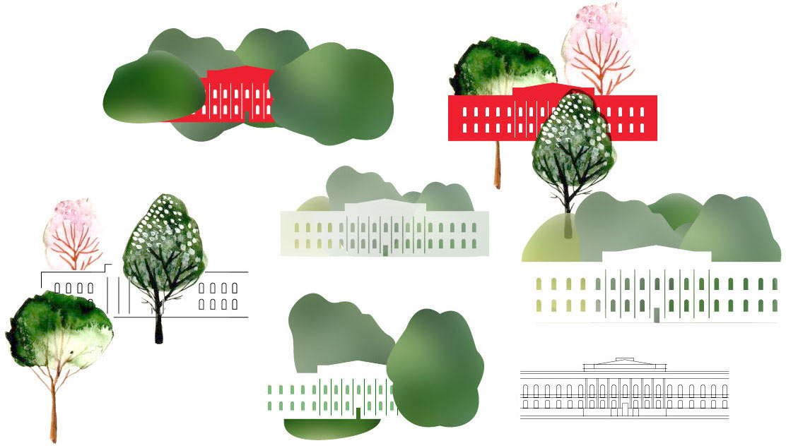
Choosing the red building and watercolor illustrations. Moving the trees to the foreground, adding perspective. Deciding that we will be using different objects in the foreground for different seasons and activities. Testing the logo on a playbill.
Trying to make a step to the side.
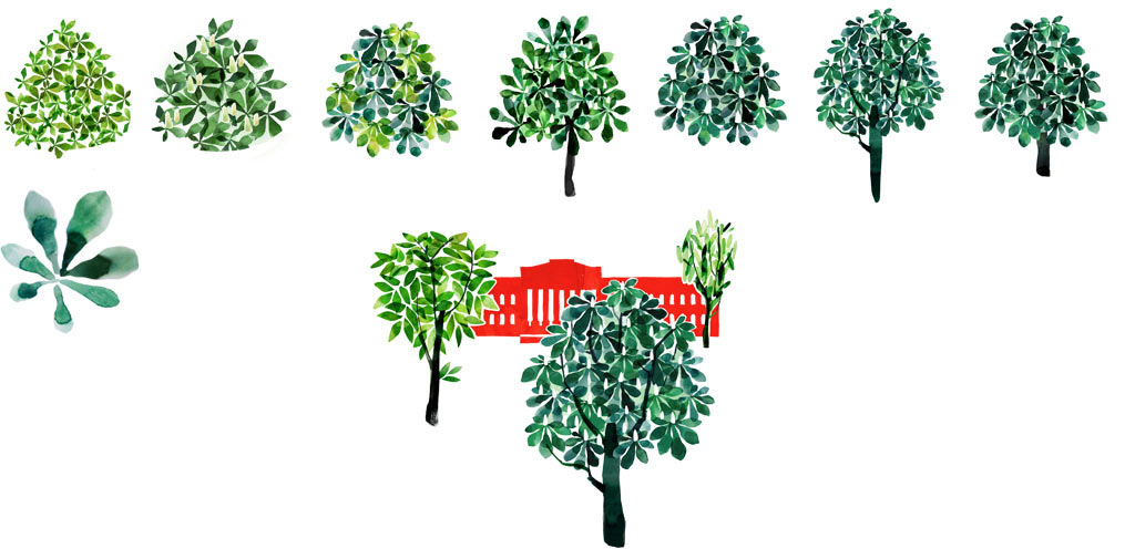
Nope. The watercolor illustrations are definitely better. Asking the illustrator to prepare the summer and the winter versions of the logo. Drawing the university building, searching for the shape of the trees.
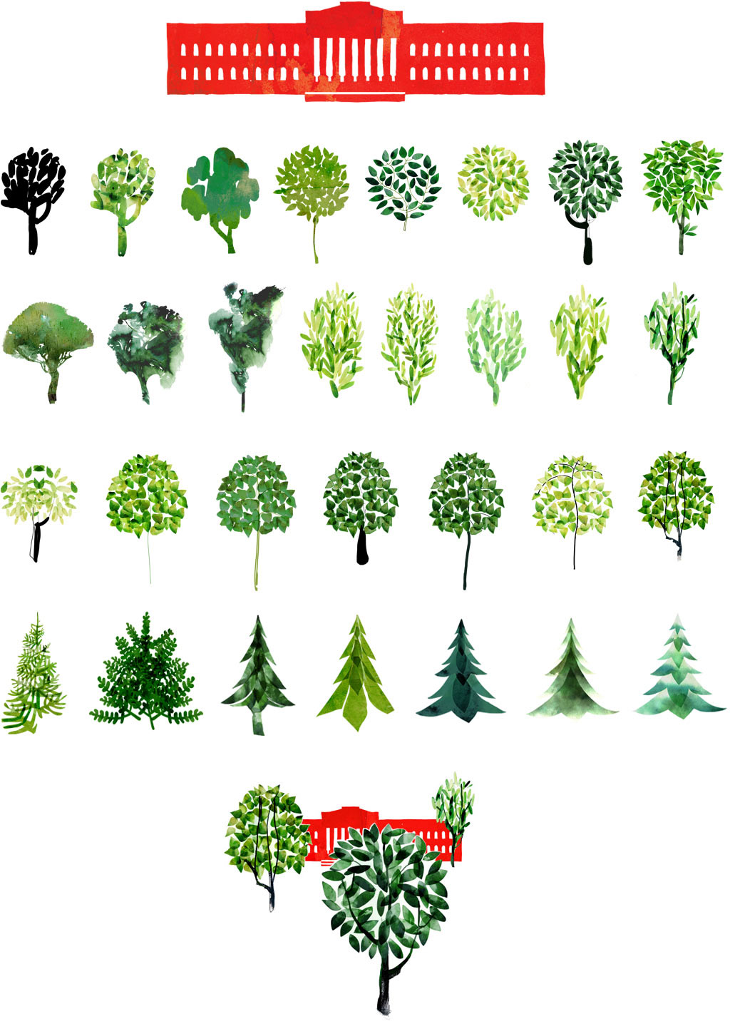
The art director asks to draw a chestnut tree.
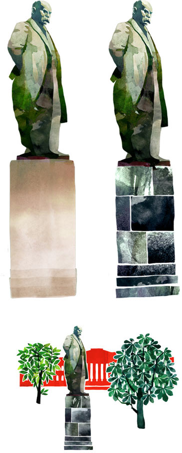
Creating a version with the Shevchenko monument.
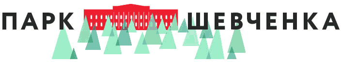
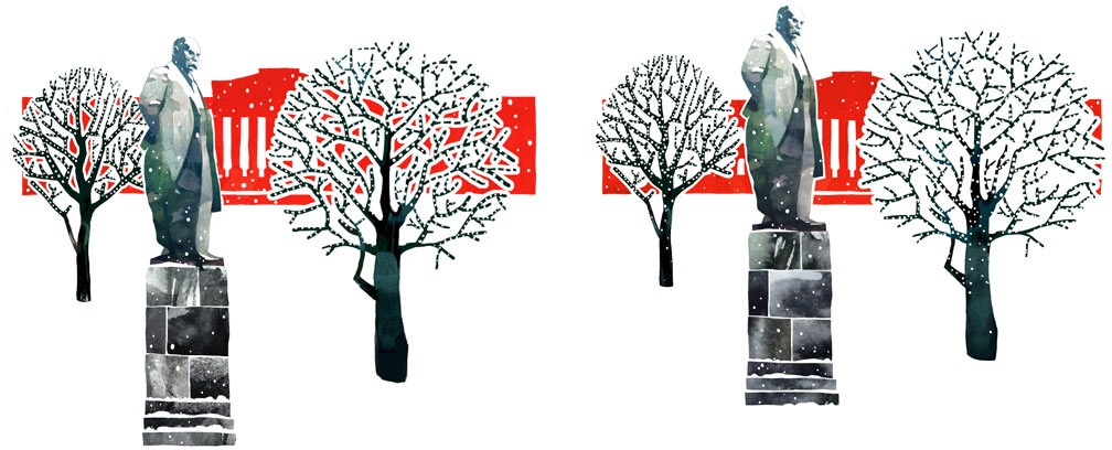
Assembling the winter logo.
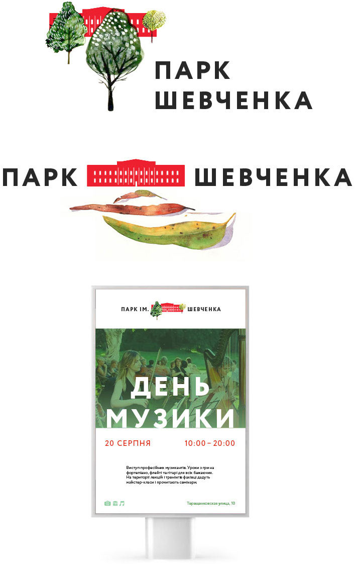
Meanwhile, the type designer creates the text.
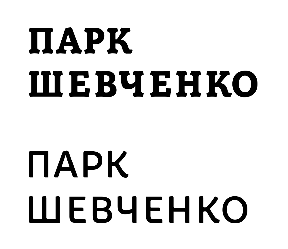
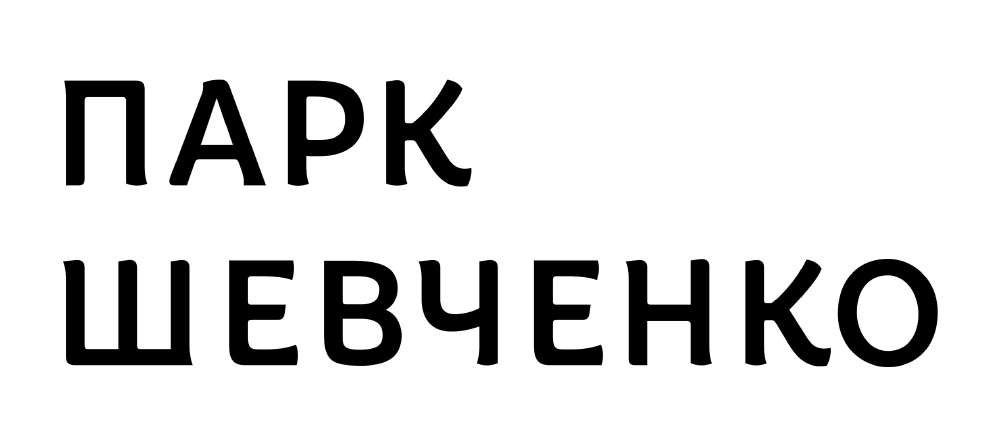
The art director chooses the bottom version. Adjusting the details.
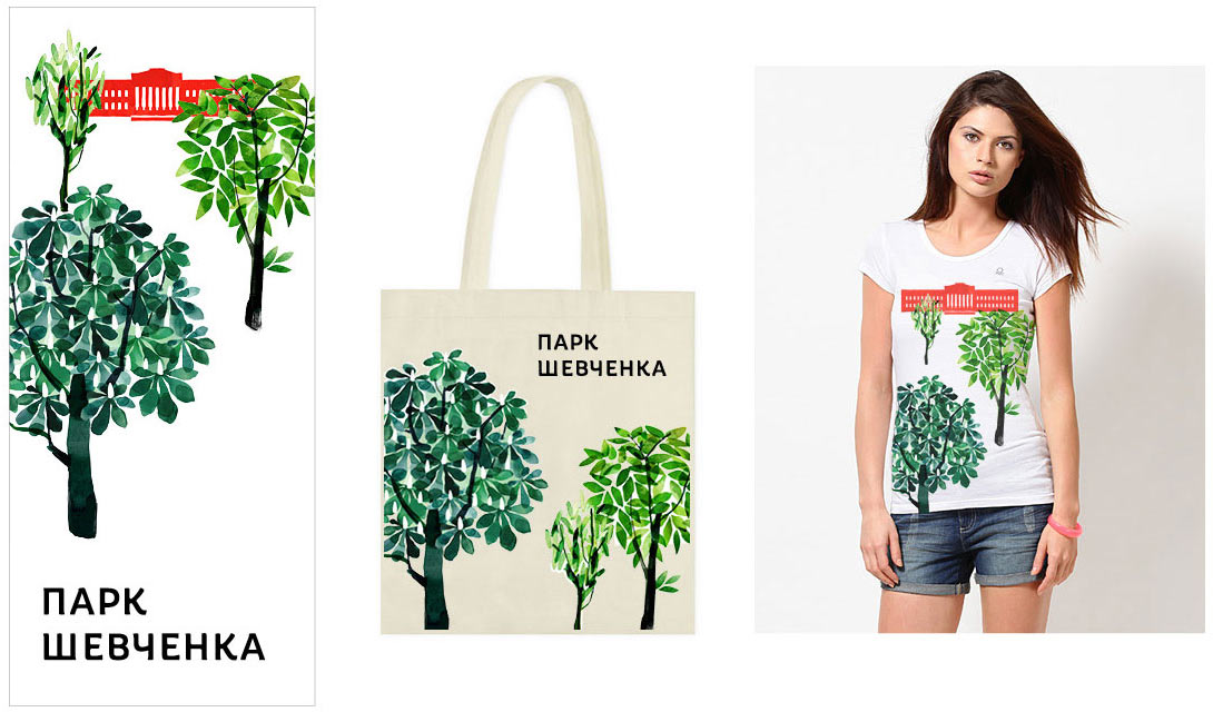
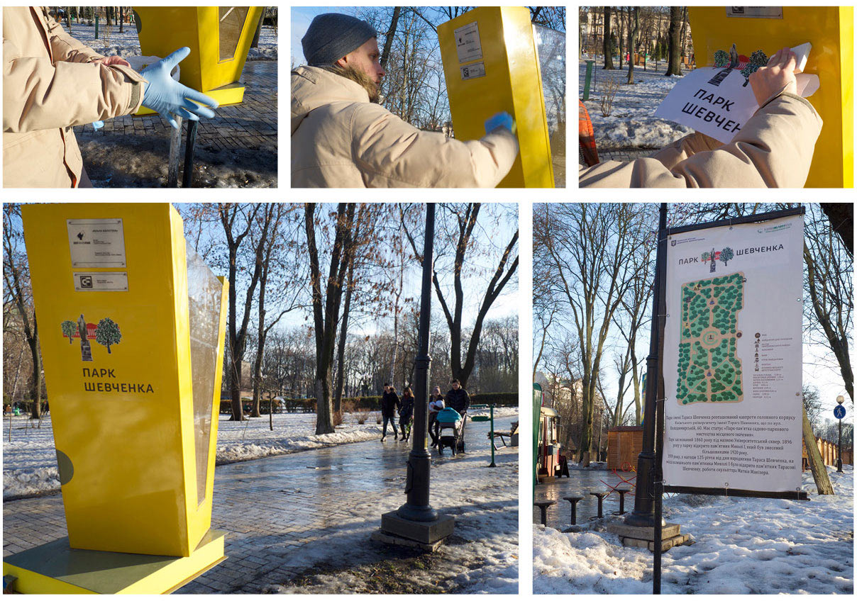
Testing how the graphics will look on banners and various objects.
At this time, the designer goes to learn silkscreen printing and decides to use the newly acquired skills to work on the park’s logo.
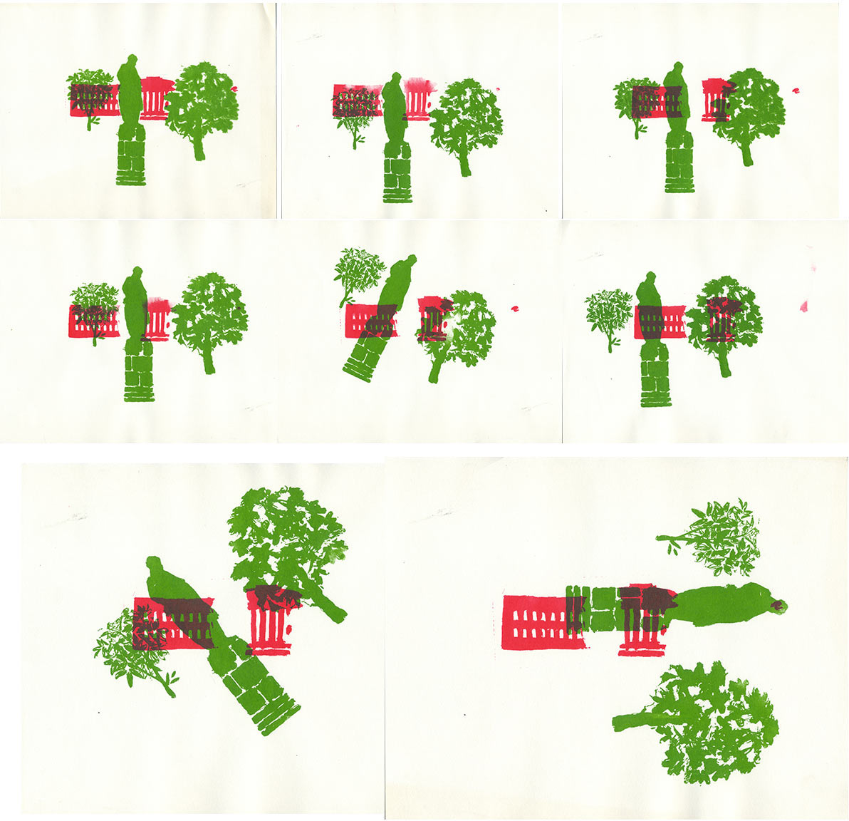
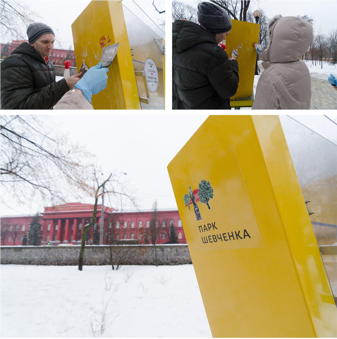
Time to test the logo in place. Printing a test batch of stickers and going out to decorate the park.
Preparing the announcement.