Client: Our company System Integration and Power Engineering (SIPE) specializes in development of automated control systems for technological processes and power supply for industrial enterprises up to 10 kV including the supply of instruments and controls, control cabinets, switchboards, air separation units as well as installation supervision and commissioning. We are working with European companies, so would like to see two versions of the logo in two languages (our English name is System Integration and Power Engineering (SIPE)). It would be great to get a memorable symbol, similar to those of Gazprom, Twitter, Sberbank...
We see the logo as laconic, modern, technological, serious and stable. We want it to reference our professional activity. We work in various industries: chemistry, oil and gas, manufacturing of construction materials (brick, aerated concrete blocks), water treatment, woodworking, which means we need something universal. As for the colors, we would prefer them to be bright. We work with equipment of grand European companies: Siemens, Schneider, ABB, OBO Betterman, Emerson, Hachlange. We would like our logo to look respectable among these names. Designer: I’ve integrated energy into the system.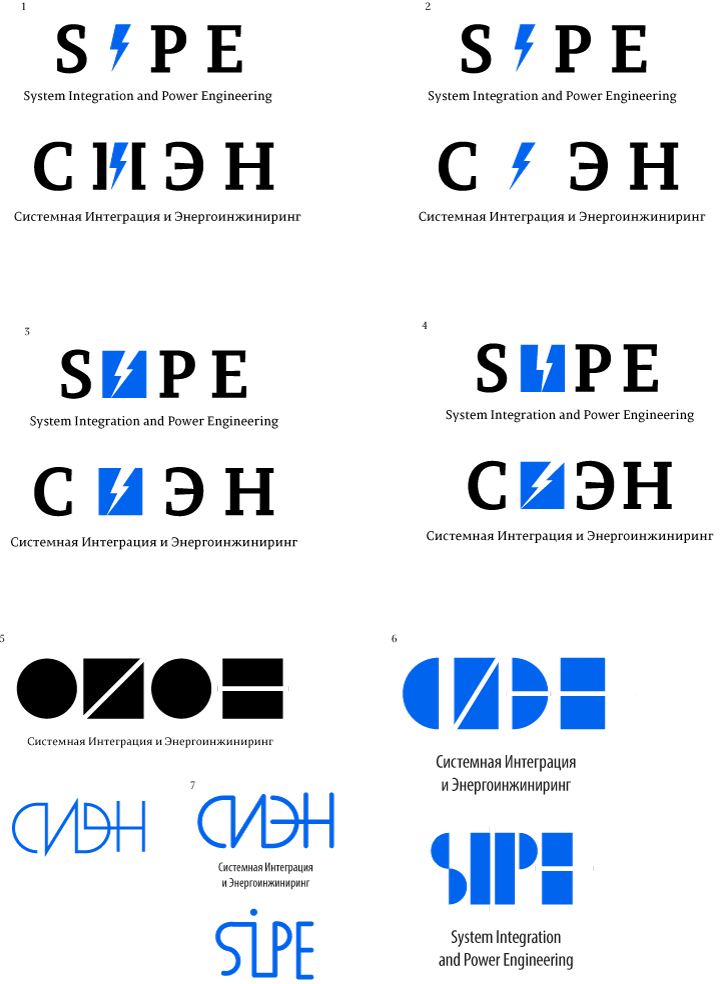
Art director: It has to be more interesting than a lightning.
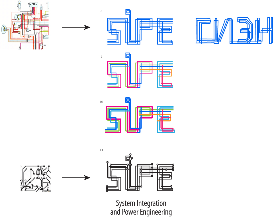
Designer: How about lines/wires? Art director: Looks like an Etch A Sketch drawing.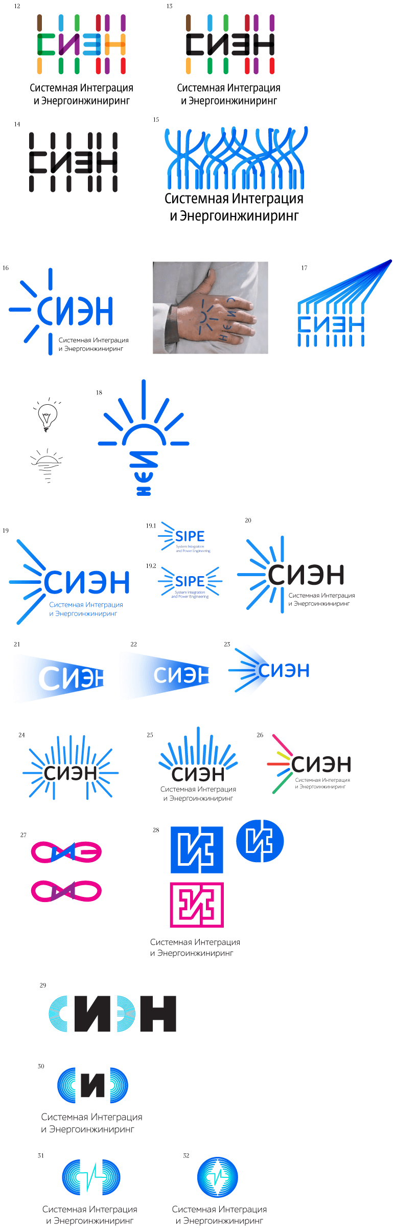
Art director: 32 is OK.
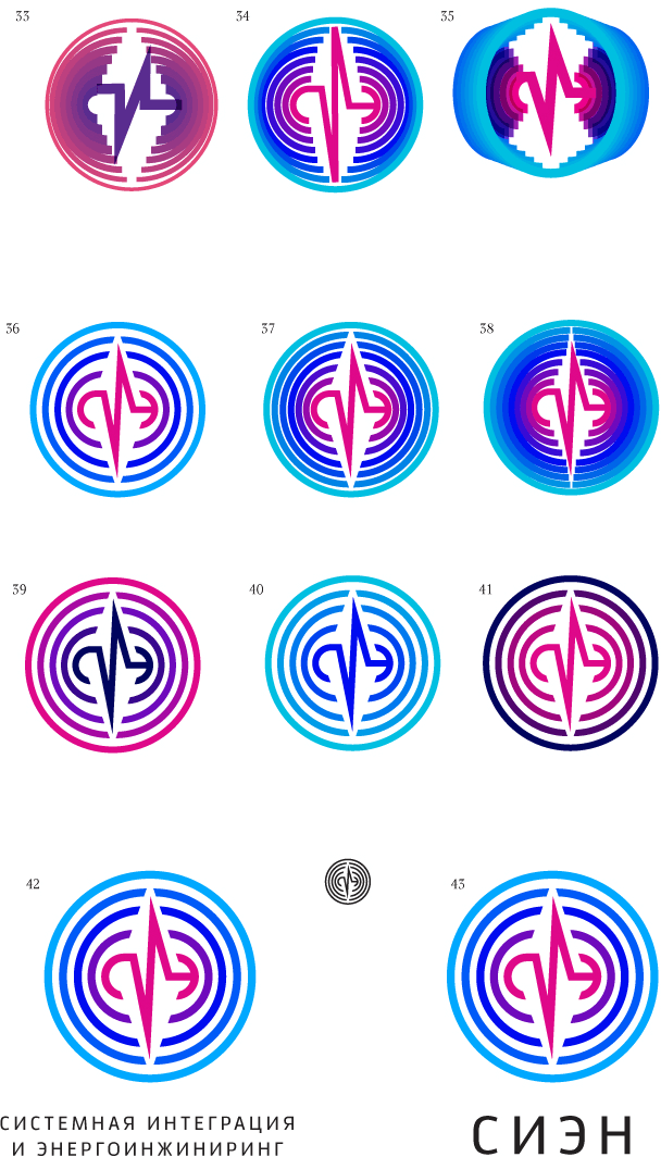
Art director: 42.
Art director: 45.
