The making of the Sokolniki park website
It’s the first days of spring of 2015. Meeting with the park’s team, discussing the changes that have happened and their plans for future development.
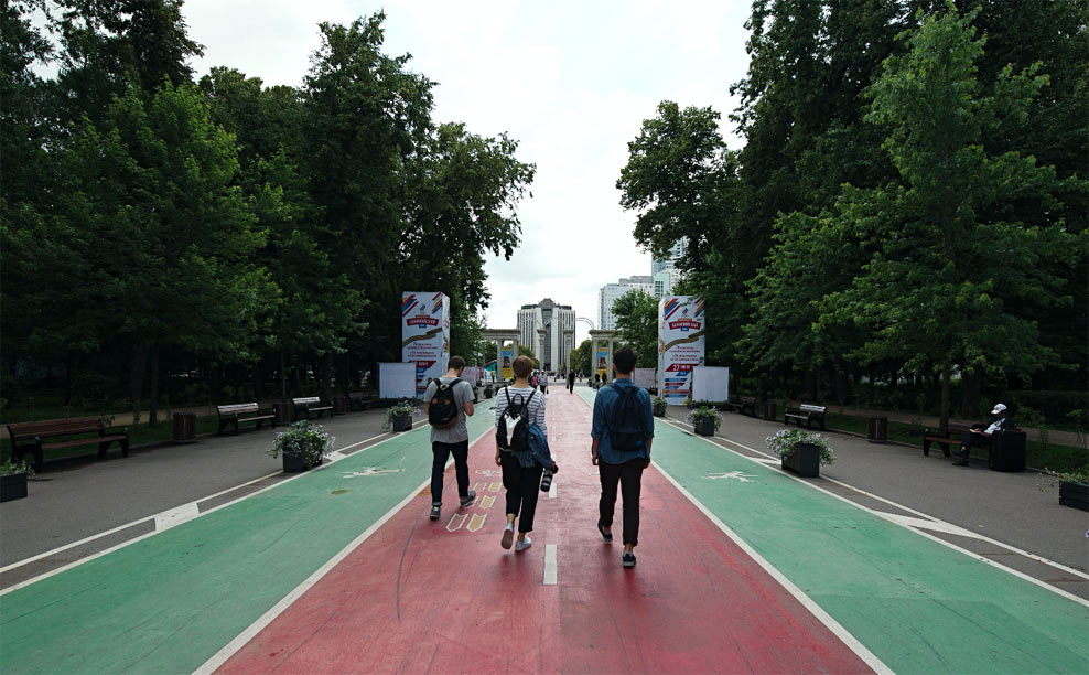
The park has changed considerably in the last couple of years. Following the trend of updating Moscow’s parks, large-scale renovations have been made in Sokolniki: it now has pleasant rest zones with benches, free wifi, showers, a library with a coworking space, an open-air cinema and space for handicapped people. It’s actually difficult to come up with something that the park doesn’t have.
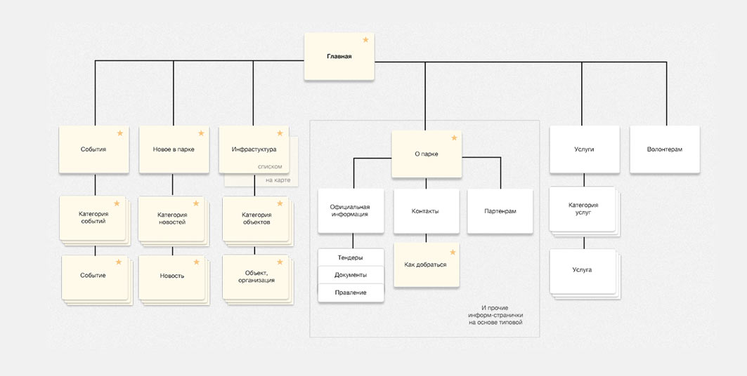
The old website concealed visitor information in the For Visitors section, behind several navigation levels. Deciding to bring the visitor information to the front and make all legal and partner sections secondary.
Coming up with a rough site map and marking all key sections.
Sokolniki is a family-friendly park with well-developed infrastructure. It houses more than 120 objects and hosts several events every day. There are children’s playgrounds, a skate park for teenagers, a chess and checkers club, dancing stages, kebab and Pyanse cafés. Most people don’t even know the park has all that. Setting one of our tasks: to raise visitors’ awareness.
Deciding to build the new website around answering the question “What can we do in the park?” Today, on weekends or on a specific date.
Looking at all possible pastime activities.
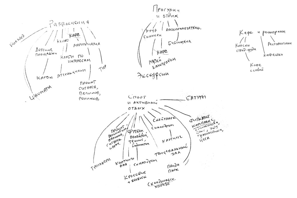
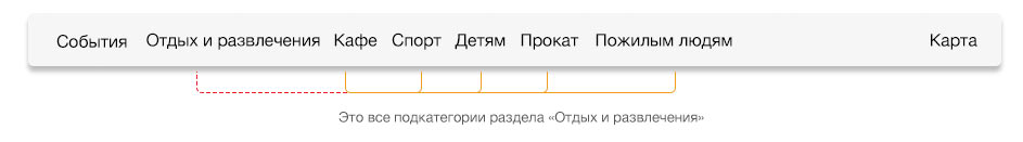
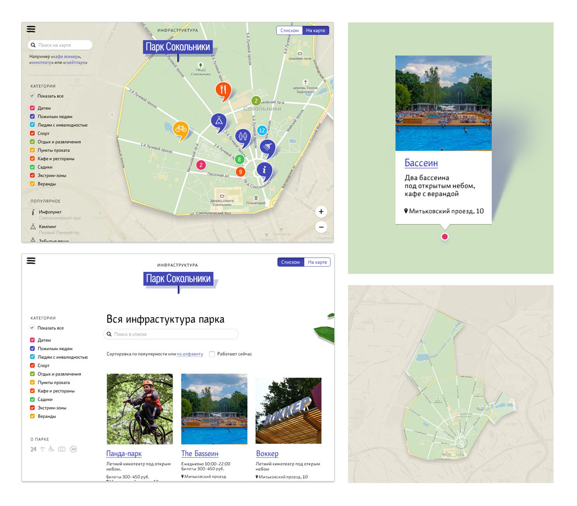
Thinking how to organize navigation by objects and activities. We need to help visitors find what they need while also mentioning all the new additions and less-known recreation and entertainment ideas.
How can you find something for teens? A “Youth” tab? But that’s so old school! Nobody will go there to find information about the skate park. And what about bicycle rental, is it a sport, recreation or entertainment? Depends on the type of bike and how fast you pedal. And drinking a coffee with a croissant, is it Cafés and Restaurants or Entertainment? Surely, both.
The tortoise and the hare
Realizing that there is no distinct line between recreation, entertainment, eating and sports. But what else is there in this cloud of possible options?
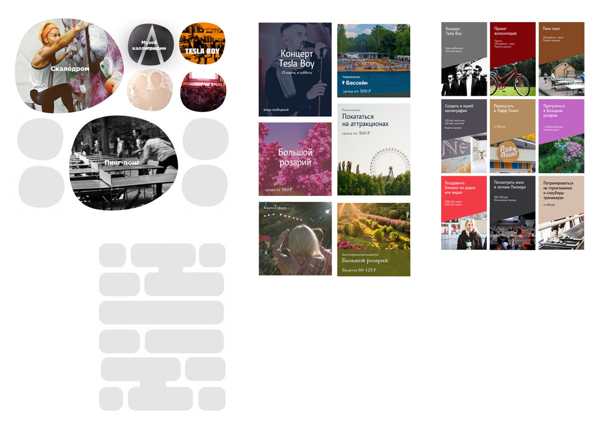
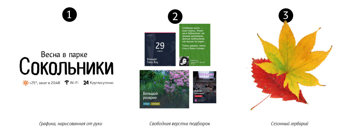
For example, there is the required level of activity, sweating vs no sweating. Pedaling a bike means spending time more actively than sitting at a library. Looking at all the objects in the park through the prism of this metaphor. Coming up with a fun slider borrowed from video editing software. Slow motion vs timelapse. Using an Iconwerk slider to illustrate the idea.
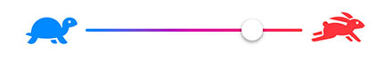
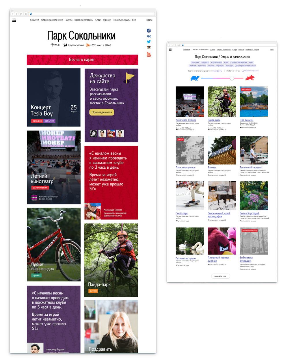
All the “relaxed” activities will be on the tortoise side. They will include all the sights to see, the library, the zones where you can seat on a bench and quietly rest. All the active options will be next to the hare: trampolines, extreme sports, the skate park, bicycle rental, amusement rides. The default position of the slider in the middle will show all the options in a single feed. This mixed list of results will help visitors discover something new.
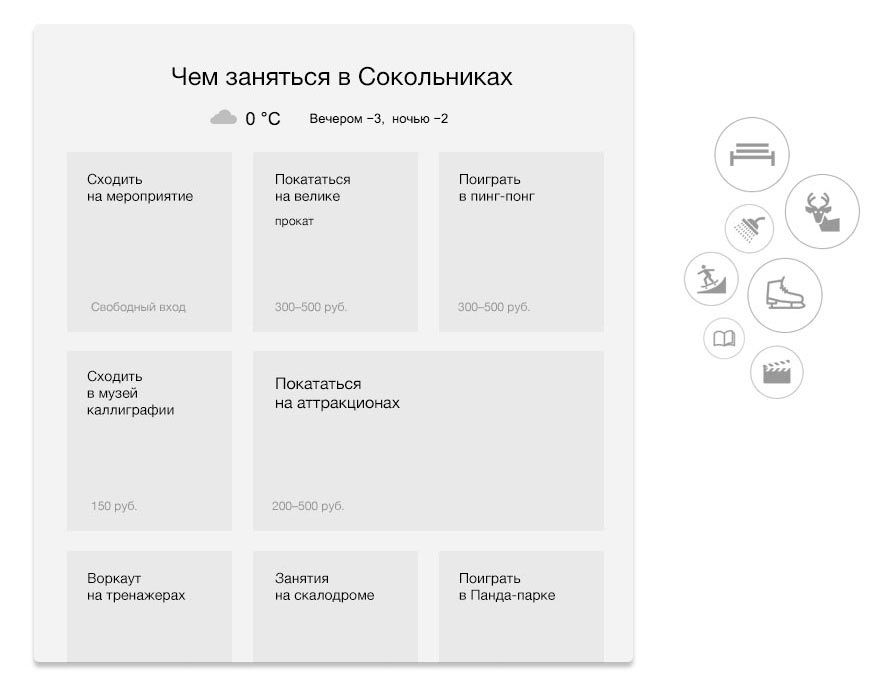
Weather outside
The life of the park is closely connected with the season, the weather and the time of day. Coming up with a list of “What to do in Sokolniki” ideas for the main page. The list will be mixed: one part of it will be generated automatically based on the season, weather and time of day. The other part will be added by editors who can decide whether some of the objects or events need more attention from the visitors.
Linear routes
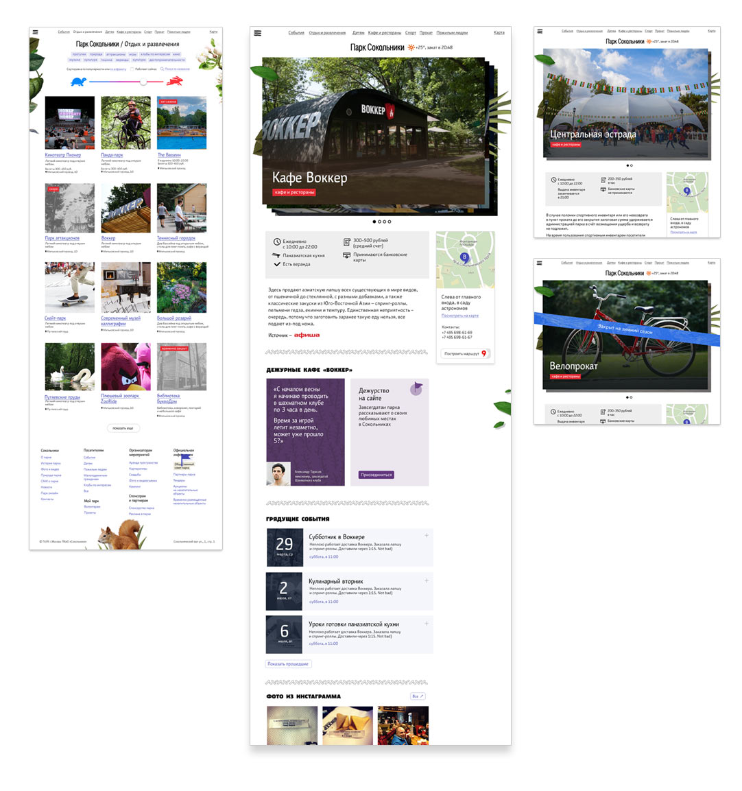
Of course, all of this is not enough, linear navigation routes are also needed. There will be a For Children tag for parents, a Cafés and Restaurants tag for the hungry and a Sports tag for athletes. They will all work in tandem with the slider.
Basic features
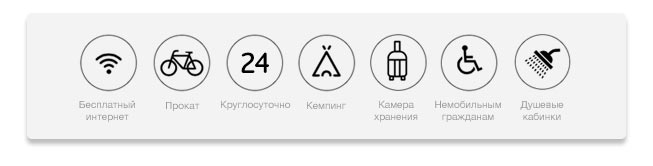
When you make a spontaneous decision to go for a walk in a park (especially if you are visiting a city), you want to be able to quickly get information about a few basic things. Does the park have rental facilities? What about wifi? Is the park open around the clock or does it close at eight? It would be great to see the answers to these questions right on the main screen, without having to go through all the pages or drowning in the parallax scroll effect of the main page that you are trying to load on a poor connection on your mobile cursing its creators. In fact, the same can be applied to websites of public transportation authorities, hostels, coworking spaces and airports.
Adding a block right on the main page to show the basic information.
Graphic language
At the start of the project, Sokolniki didn’t have a corporate identity. There was a logo that even the park’s management didn’t like, and there were plans to announce a competition for corporate identity ideas, but that was to come later. That was it.
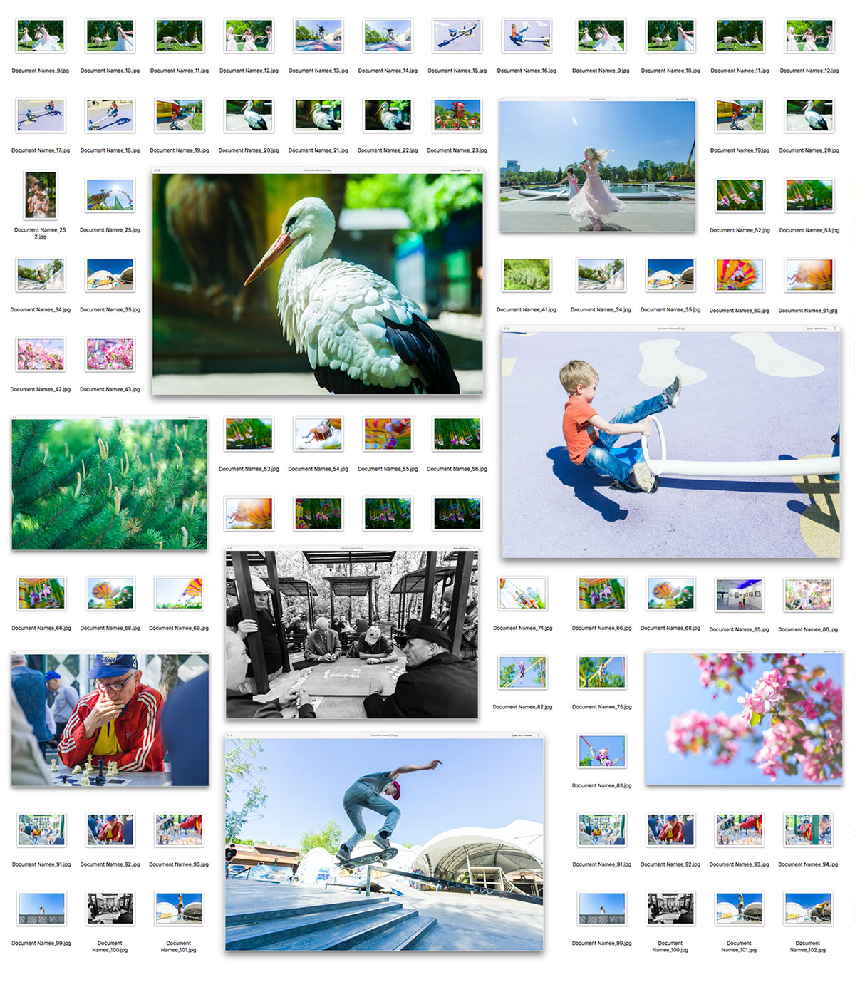
Walking around the park with the photographers to collect the first visual materials.
Testing a grid for the activities.
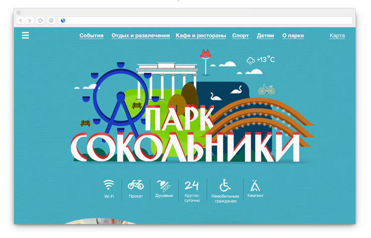
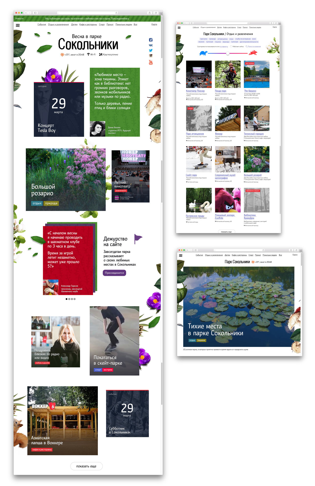
We get an idea to highlight the concept of the “live collection of activities” with a seasonal visual theme. Trying an approach with a seasonal illustration of the park and lettering in place of the logo.
Or an abstract illustration based on the “textures” of the park.
Nope, we definitely won’t use the Soviet stylization. We also don’t want it to take so much space on the main screen. Moving our activities list up higher. As for the logo, simply drawing the current version by hand, that will do for now.
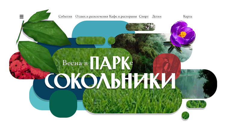
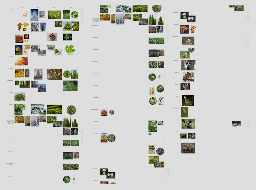
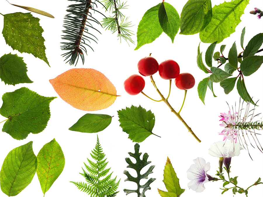
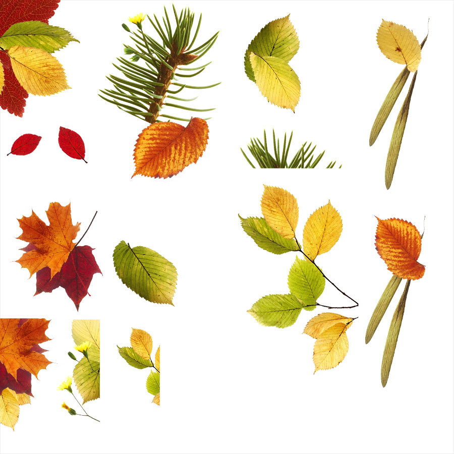
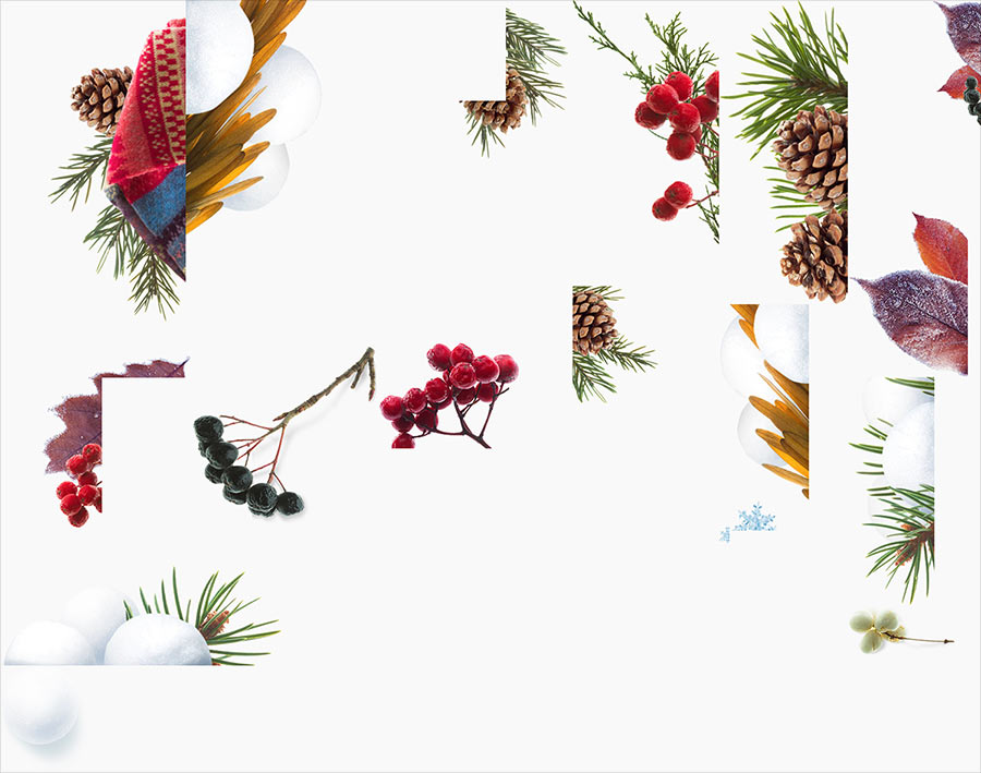
The nature of Sokolniki is incredibly rich: trees, flowers, plants, rare birds and animals. Trying the idea of a “herbarium,” collages of seasonal flora and fauna.
Simultaneously “thinking outside the box” by breaking down the rhythm of the grid to get rid of monotonous squares and make the page look more lively. The cards will be scattered on the table and differ by size.
Formulating the first version of the main principles of the graphic language.
Apart from seasonal decorations, we will also use themes for main holidays: the New Year, the International Women’s Day, the Victory Day, etc. Assembling all the mock-ups into a prototype. Adding more life: some of the cards will be videos.
Getting the client’s approval for the conceptual ideas and starting development.
Development. Part 1
Planning main navigation routes on the website.
Park objects.
Events at the park.
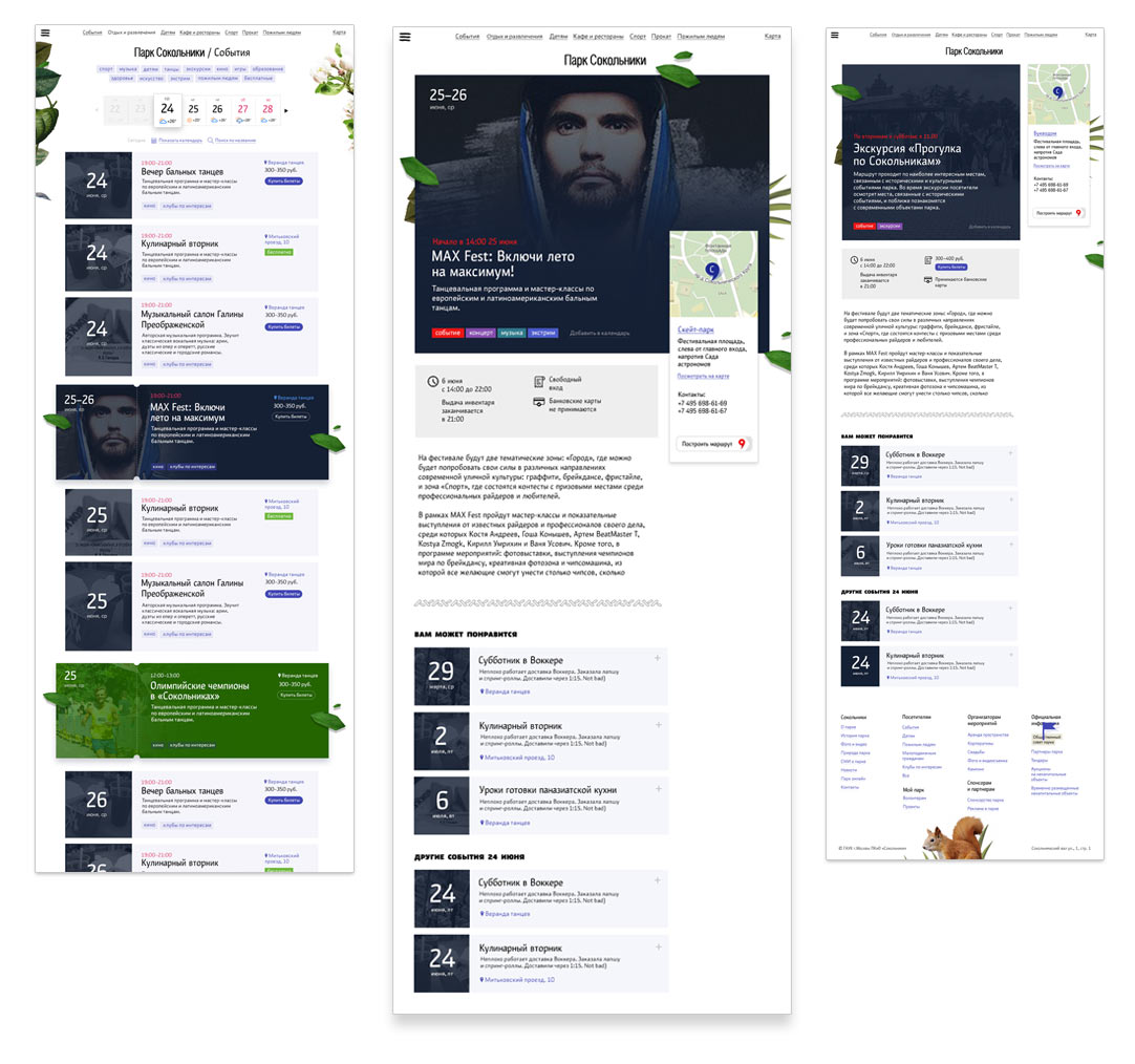
All objects on a map or in a list.
Creating a list of information blocks for pages based on our ideas.
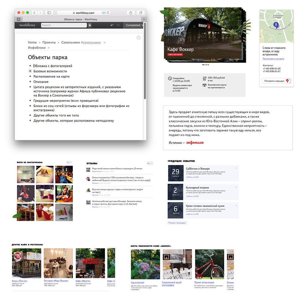
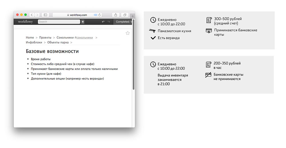
Inventing the “basic features” information block for an object and an event.
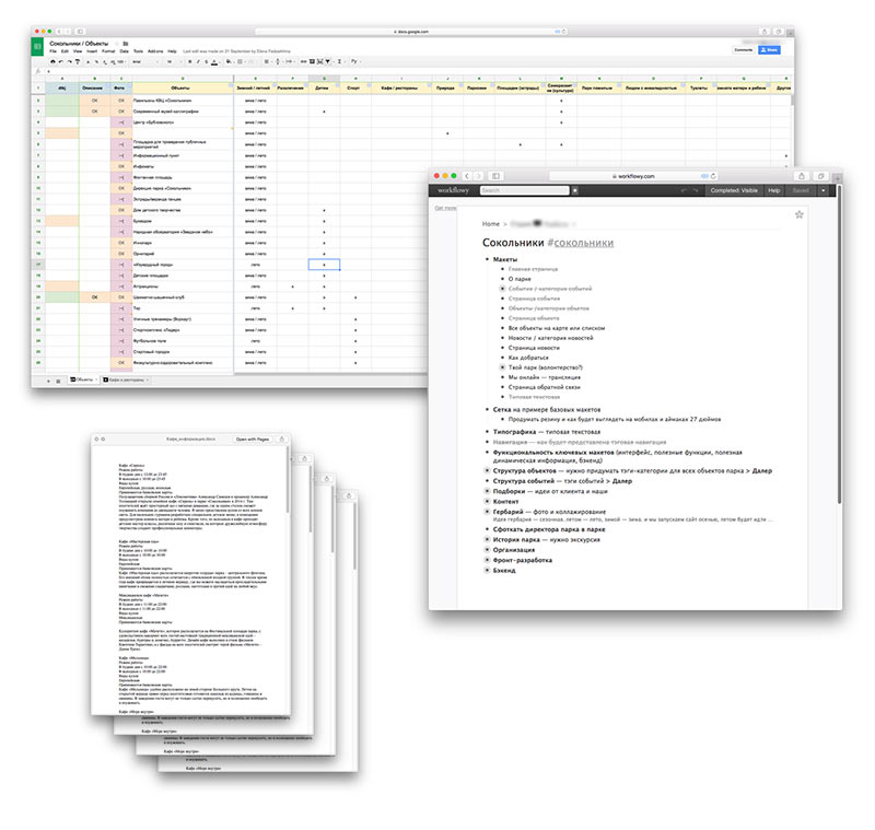
Asking the content manager and the editor to start collecting all the required information.
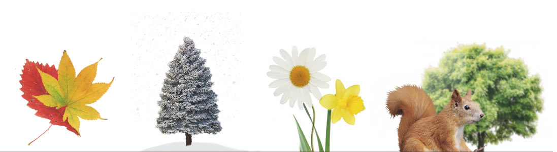
Putting together lists of seasonal plants in the park for the “herbarium” photo shoots.
When the weather permits, making regular visits to the park to collect materials, take pictures and record videos.
Meanwhile, the first yellow leaves start to appear in the park’s alleys.
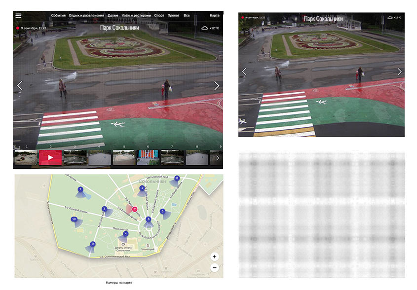
Creating the Park Online section which would feature live video from 36 webcams installed in the park. If the cursor doesn’t move for a while, navigation elements will disappear and the entire screen will turn into a large TV.
Technologies
Trying not to use server-side templates by creating a single-page website to make sure it’s fast and smooth on all screens, especially since almost half of the visitors use mobile devices.
At the core of the website is a React-enabled frontend, which allows each page to download only the lacking parts and make changes accordingly (for example, by displaying a preloader animation while a page loads). Another benefit of this solution is that it allows the designer to move around blocks on pages without asking the programmer for help.
The programmers are working on the database, the admin panel and on typesetting the standard templates. The photographers make regular trips to the park to take photos of the flora and the fauna. The content managers and the editors prepare the texts. The designer is working on the remaining key templates.
Rebranding
Meanwhile, the park holds an open competition for the development of the park’s corporate identity. According to the competition rules, the winners are selected by an independent panel of professional designers. The judges have no idea of our work on the website and act impartially. We also make no effort to influence the selection.
Studying the winning concept.
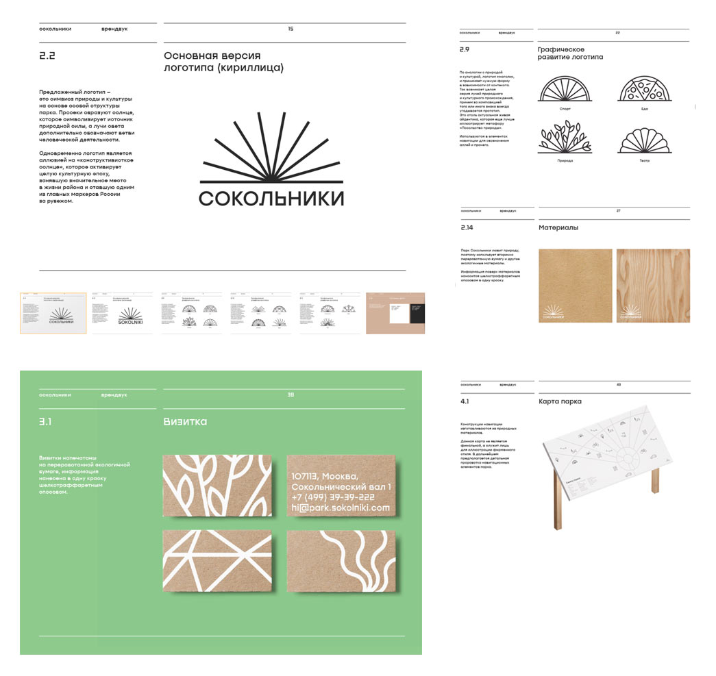
Most of the website’s templates are already typeset and we are getting close to launching the beta version. Holding an urgent meeting with the authors of the brand book and the park’s management to find a way to combine our graphic language principles and synchronize development.
Development. Part 2: Launching the Beta
The work on the corporate identity and of the website move in parallel. Sketches of key pages of the website are created at the studio. The rest will be fixed after typesetting. Asking the corporate identity team for information on typefaces, logo proportions, icons and corporate colors of the park—everything we will need to launch the first version of the website.
Meanwhile, the photographers prepare the autumn herbarium.
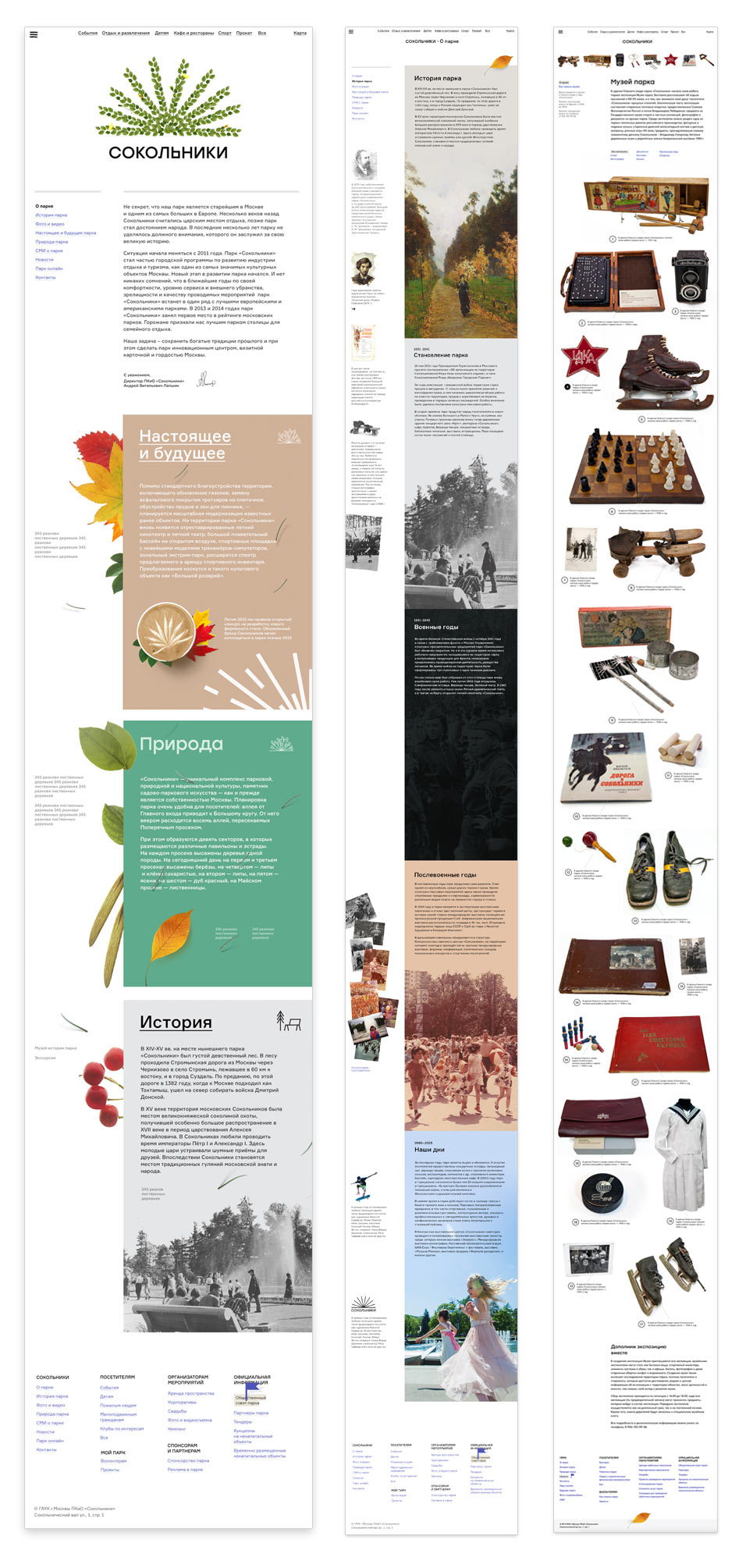
Working on the information sections of the website. Deciding to add a feed with the major epochs of the park history. Each epoch is illustrated by an image of the park made at that time. The 19th century is represented with paintings which are replaced by black and white photos at the beginning of the 20th century. All the way up to the HD videos of today.
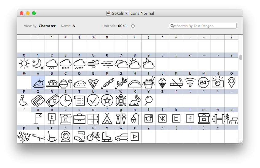
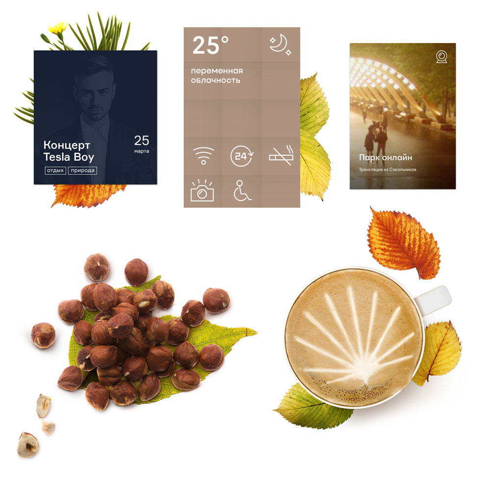
Getting corporate icons from the corporate identity team. Bundling them up into an iconic typeface to make them easy to use.
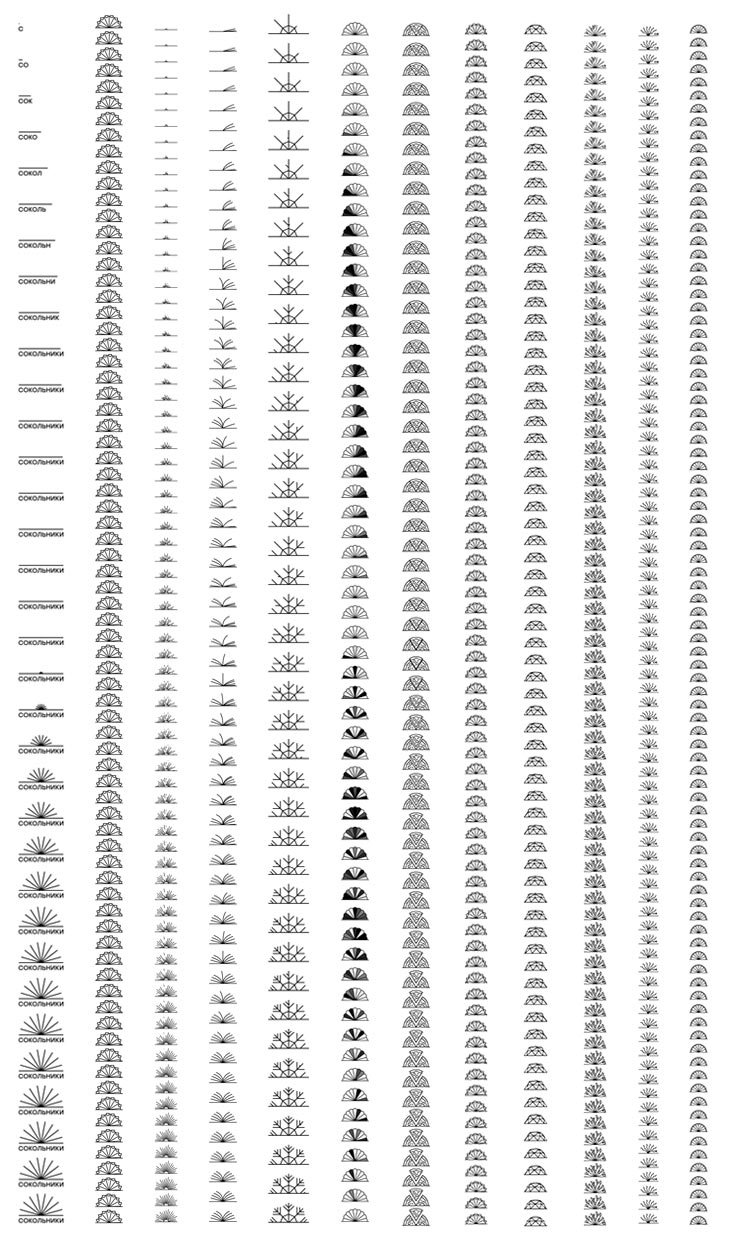
The park’s new logo is a series of animated symbols for various contexts. On key pages of the website the logo will match the theme and will be animated while the page is loading. Putting together animation frames to be able to control its speed with a script.
Updating the blocks in accordance to the new style and preparing the missing technical graphics as well as videos for the cards.
The corporate identity team sends over the first version of the rules for use of graphic elements. Updating all the typefaces on the website and finding a bunch of bugs and discrepancies.
A winter season opening press conference is being planned at the park. Quickly updating all the templates, launching the beta version of the website and preparing a presentation for the press conference.
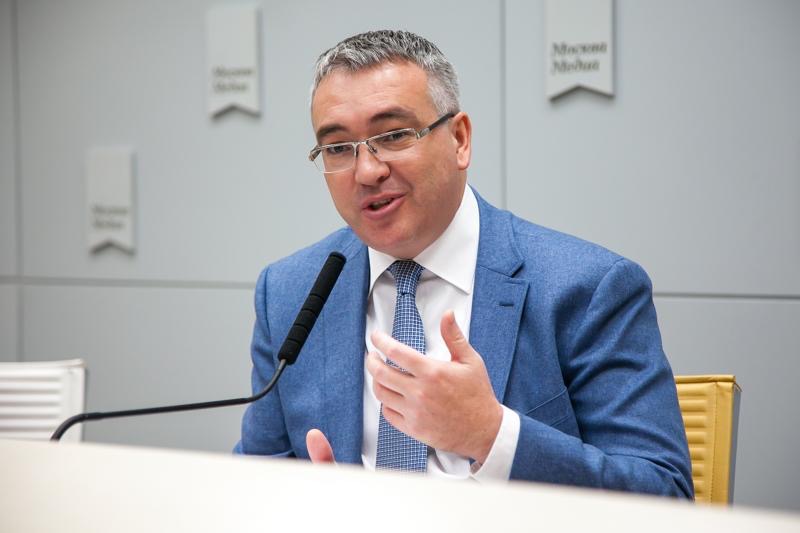
Park director Andrey Lapshin and the team present the new version of the website to Moscow journalists.
Meanwhile, the technologists are busy fixing thousands of bugs.
The winter is approaching and with it the launch of the final version of the website. Preparing a new herbarium, fixing the last remaining bugs and moving the website to the main domain.
Recalling all the project milestones.
