The making of the Terra-Ski Park corporate identity
Overview Process
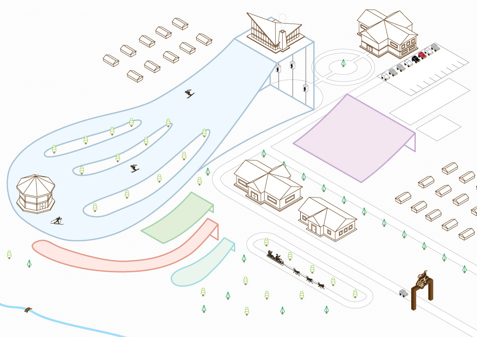
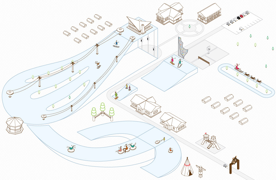
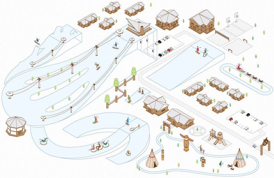
A new park with a mountain, chairlifts, ski tracks and other interesting things is being built near Nizhny Novgorod. The park has an unusual feature: it will be home to huge fluffy Alaskan Malamute dogs. They will be the park’s live mascots.
So cool! Drawing the first sketches with and without dogs. The art director chooses a couple of them.
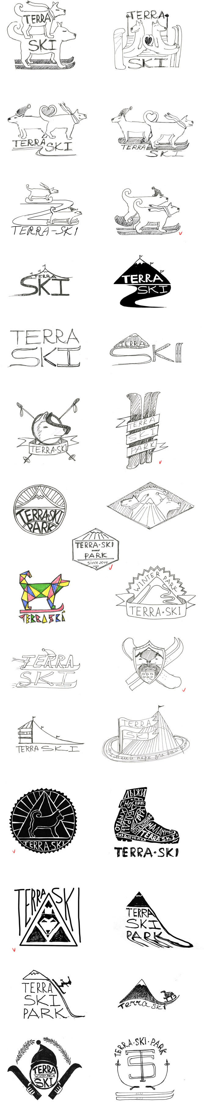
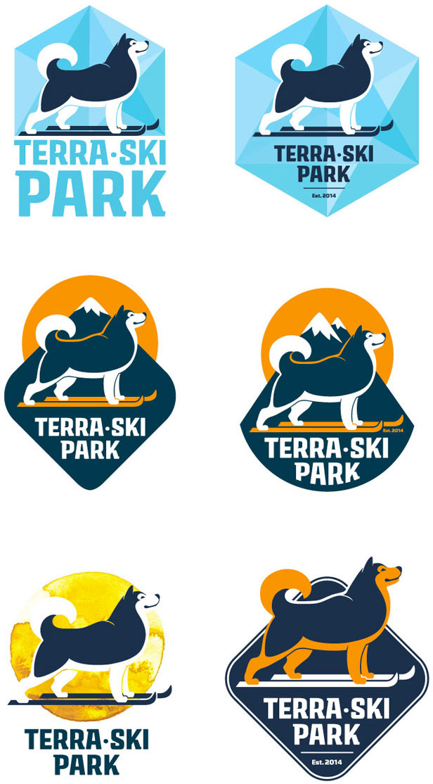
Drawing the images in a variety of styles and presenting to the client.
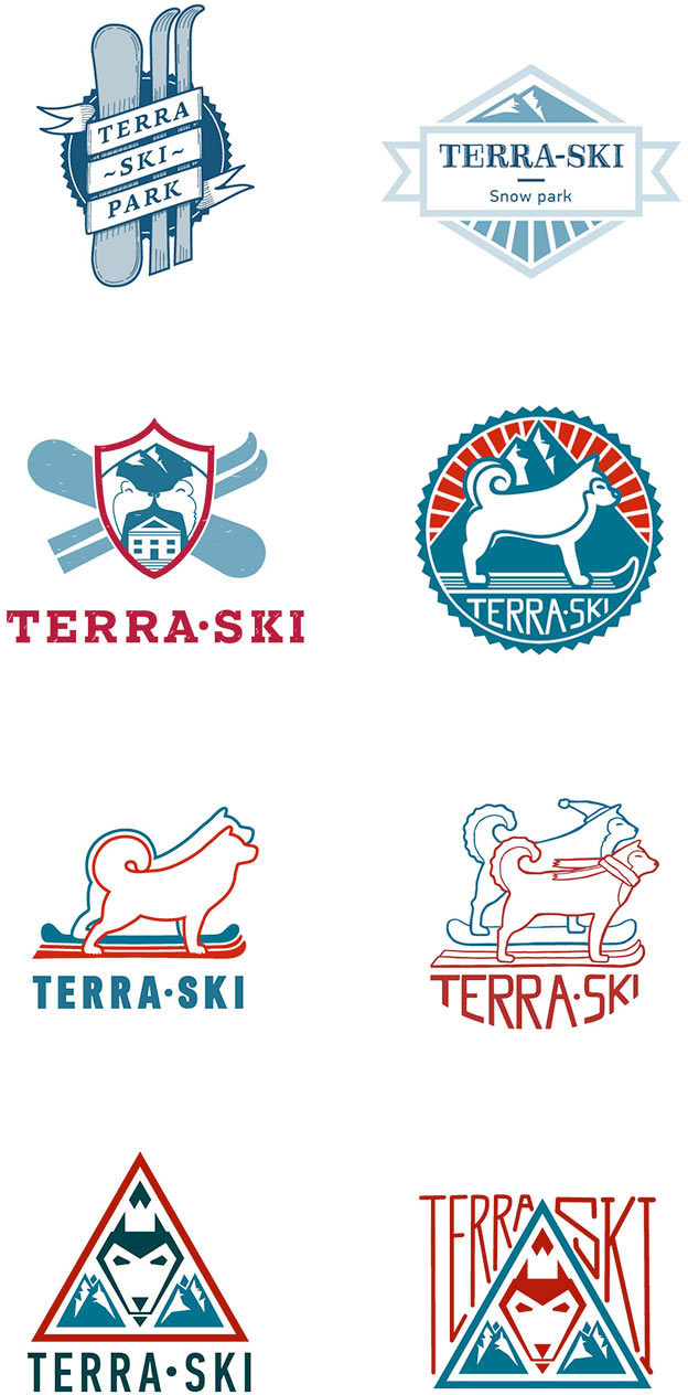
The client likes the round emblem with the dog, mountain and sun, but doesn’t like the way the dog is drawn.
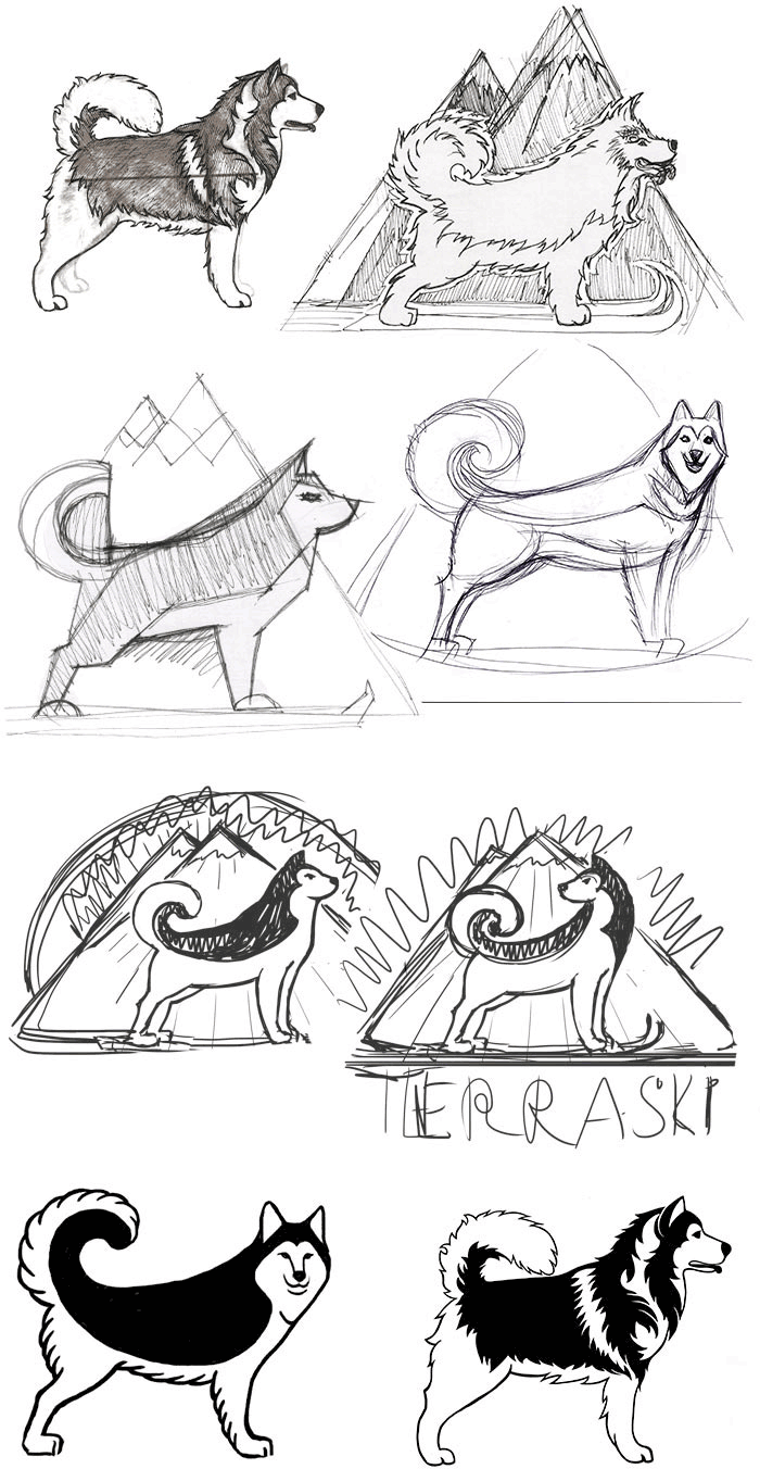
Looking at pictures of Malamutes and searching for the suitable style. Trying different ways to combine visual elements and colors.
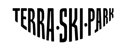
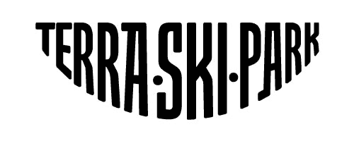
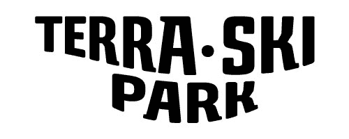
Meanwhile the type designer works on the text part of the logo.
The long search finally bears fruit and we find what we were looking for.
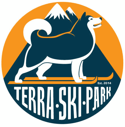
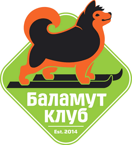
Art director: The mouth looks like this dog is suffering.
Designer: Then let’s make it smile.
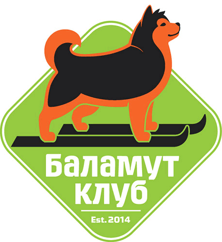
Showing to the client again.
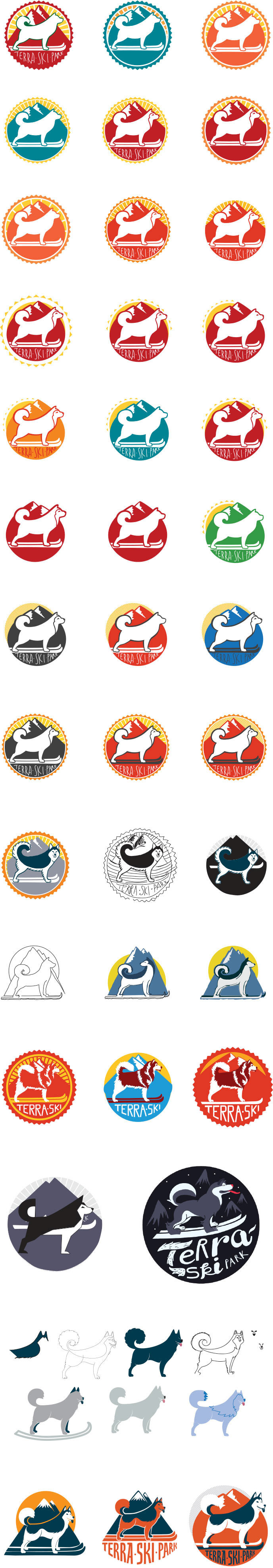
The Malamute came out great but the background could be better. Trying out different variants from which the client picks one.
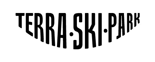
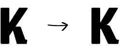
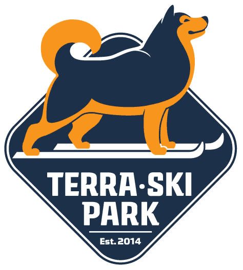
The art director asks to slightly change the shape of the letters K.
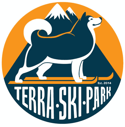
The logo is ready.
Thinking about the overall style of the park.
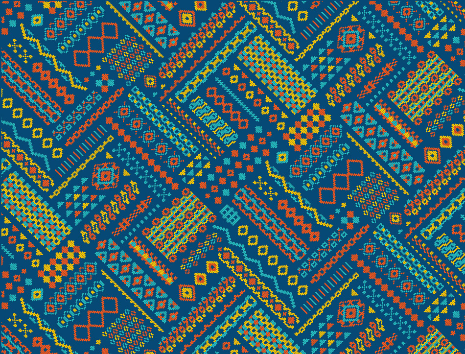
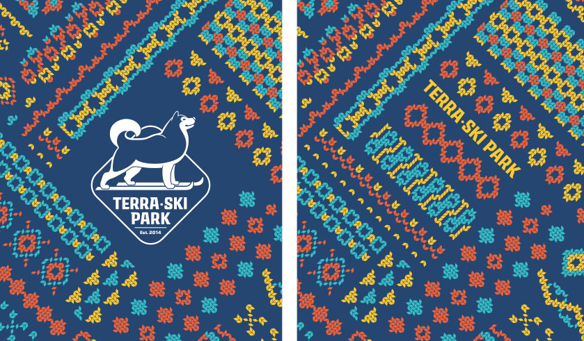
Designer: I suggest we use “knitted” motifs. First of all, it’s a winter park, so we need to add some warmth and coziness. Secondly, the “knitted” style really suits the wooden architecture and atmosphere of the park.
The art director and the client approve.
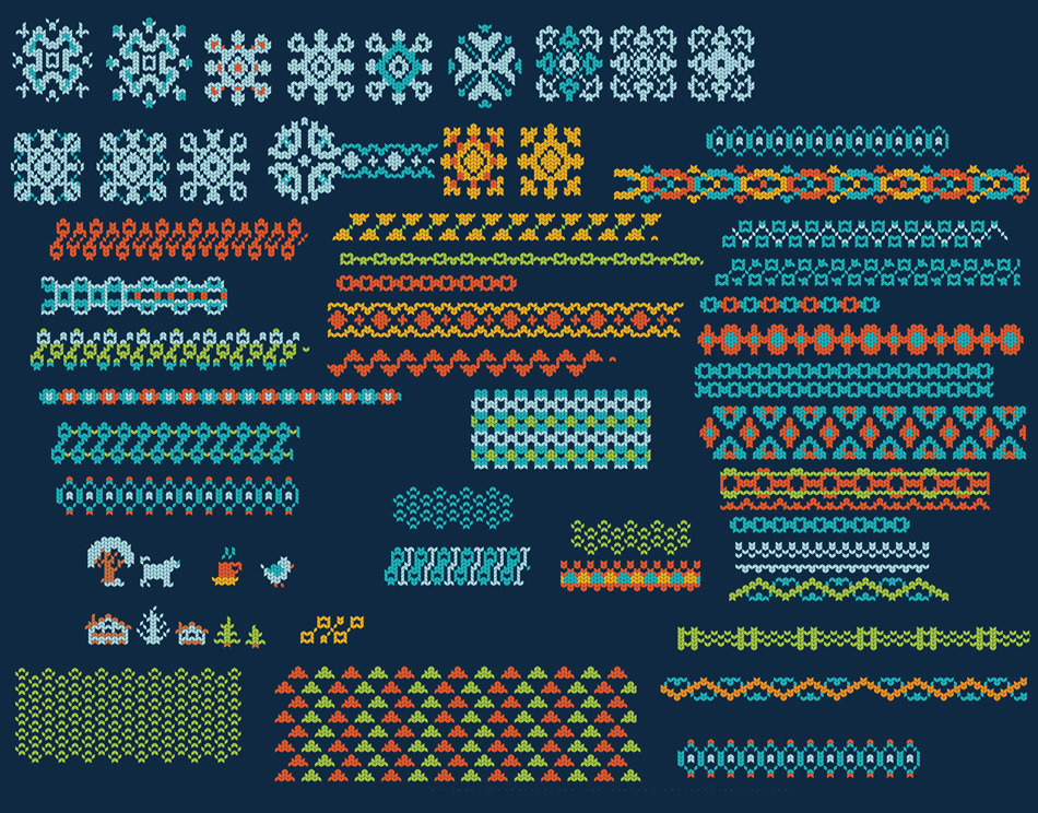
Asking the illustrator for help in creating the pattern and “knitted” visual elements. The illustrator sends in the first variants of borders and patterns.
Trying to find the best way to inscribe the logo in the pattern.
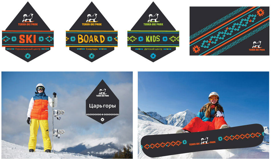
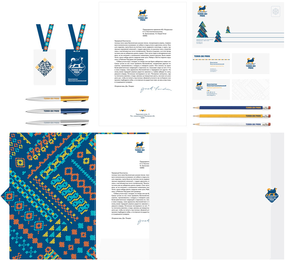
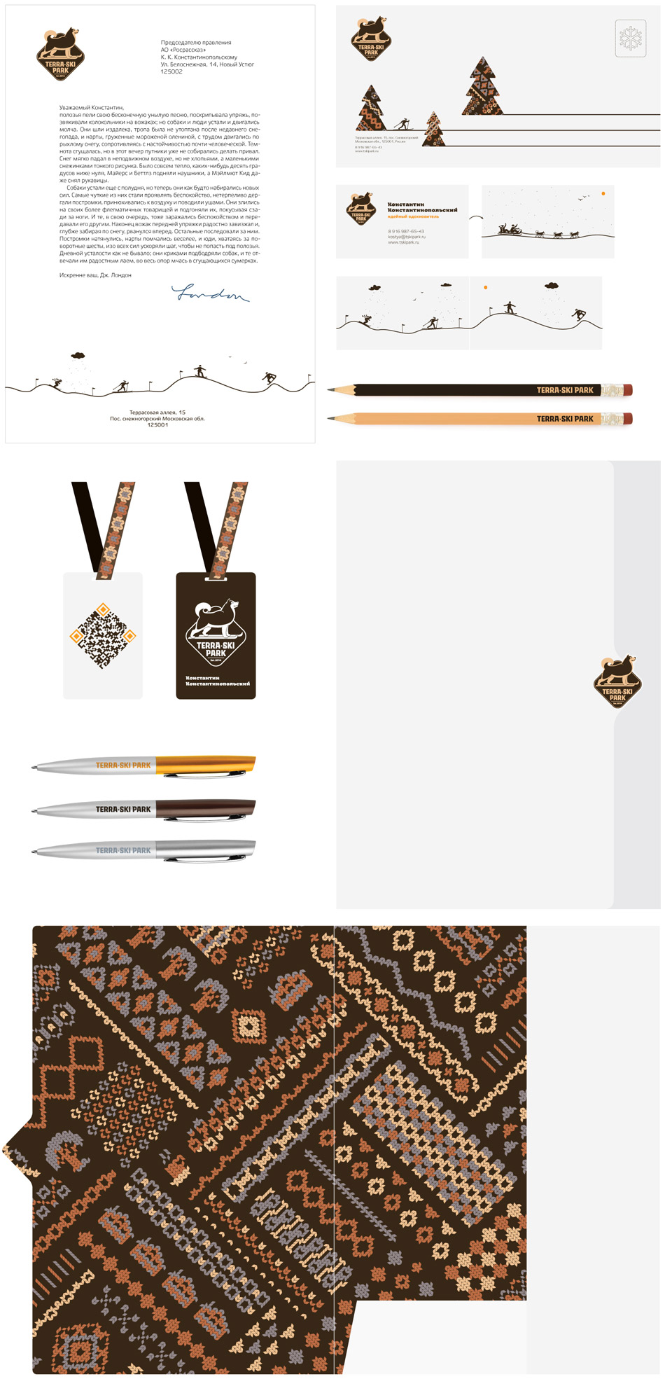
Starting to work on the corporate stationery.
It looks all right, but the client doesn’t like the blue color. The winters in Russia are quite harsh: gray muddy skies, dirty snow—all this evokes sadness. That’s why the logo has to be warm and sunny.
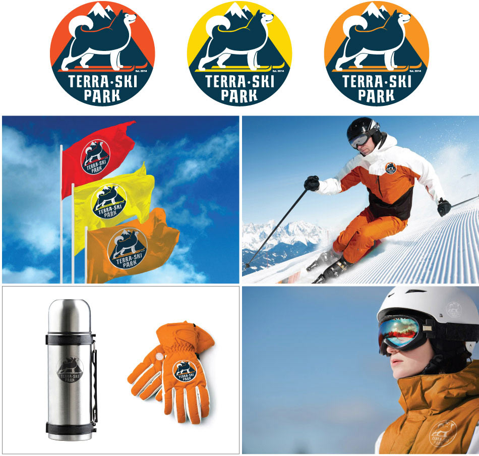
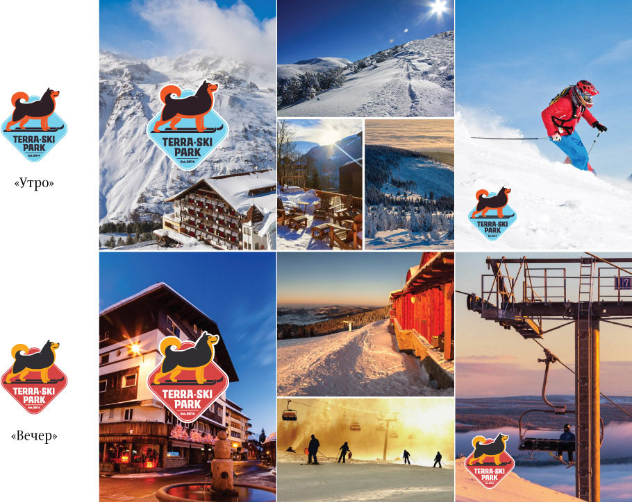
Suggesting to use two color schemes with the code names “Morning” and “Night.” Wouldn’t it be cool if the color scheme of the corporate identity changed with the time of day?
Warmer, but still not it.
Digging deeper. For the outdoor use we need something bright and fun, like ski suits. And for interior decoration and stationery design we are looking for something expensive, strict and reserved.
Just what we need.
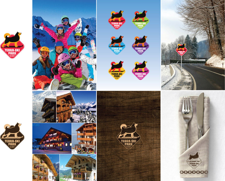
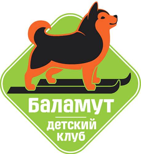
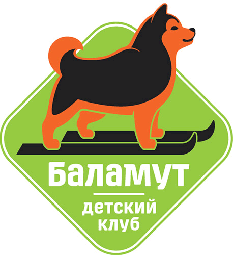
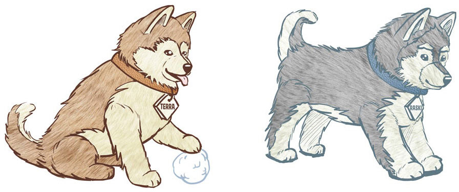
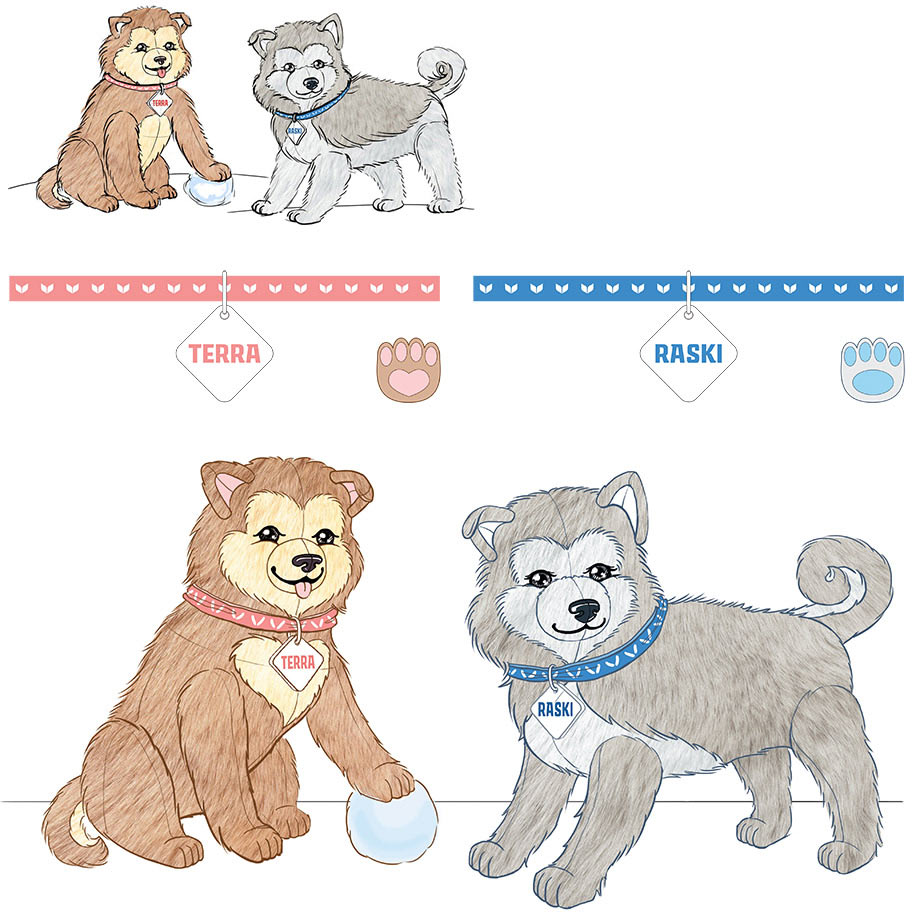
Now we need to create the logo of the Balamut children’s club based on the main logo.
Choosing the colors, the type designer creates the text, the designer replaces the adult dog with a puppy.


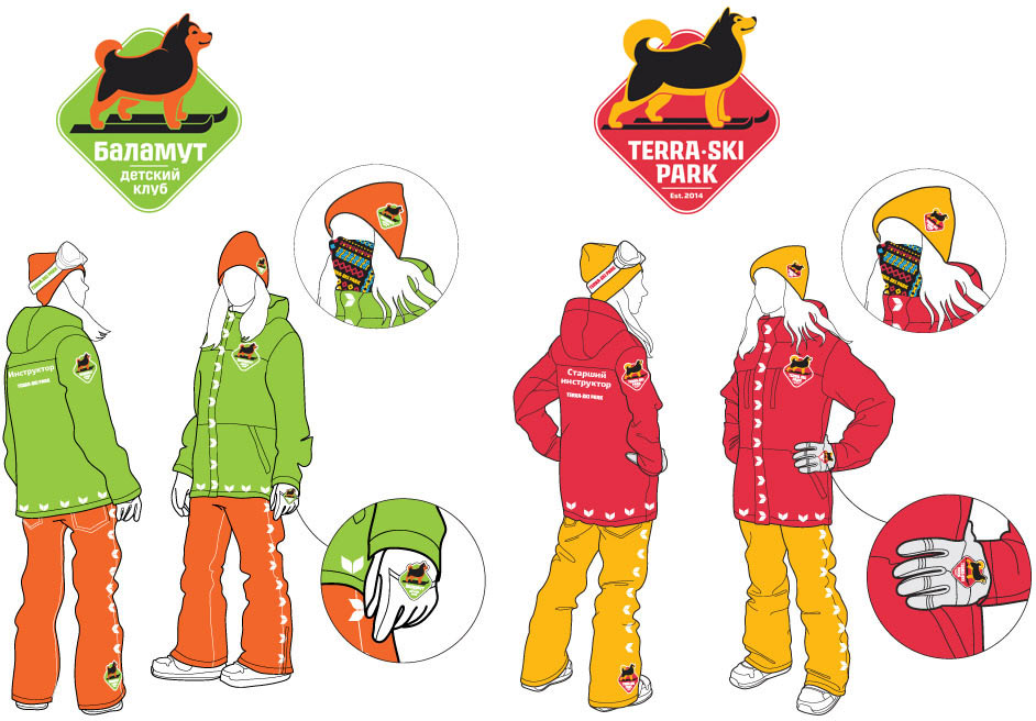
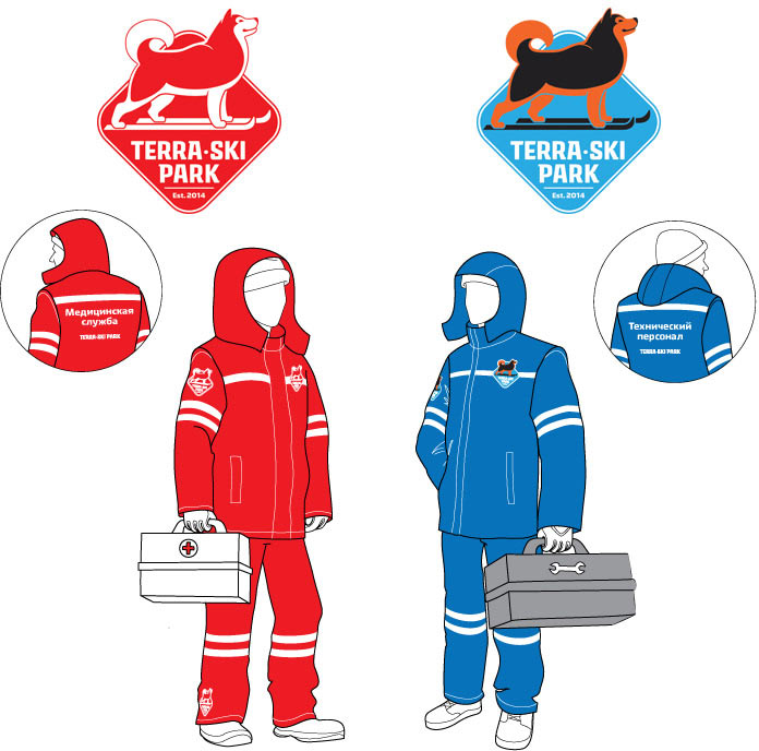
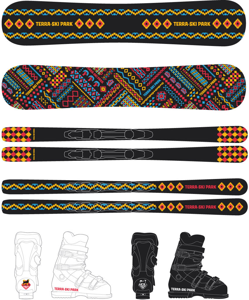
Thinking about how uniforms of instructors, technical and medical staff might look.
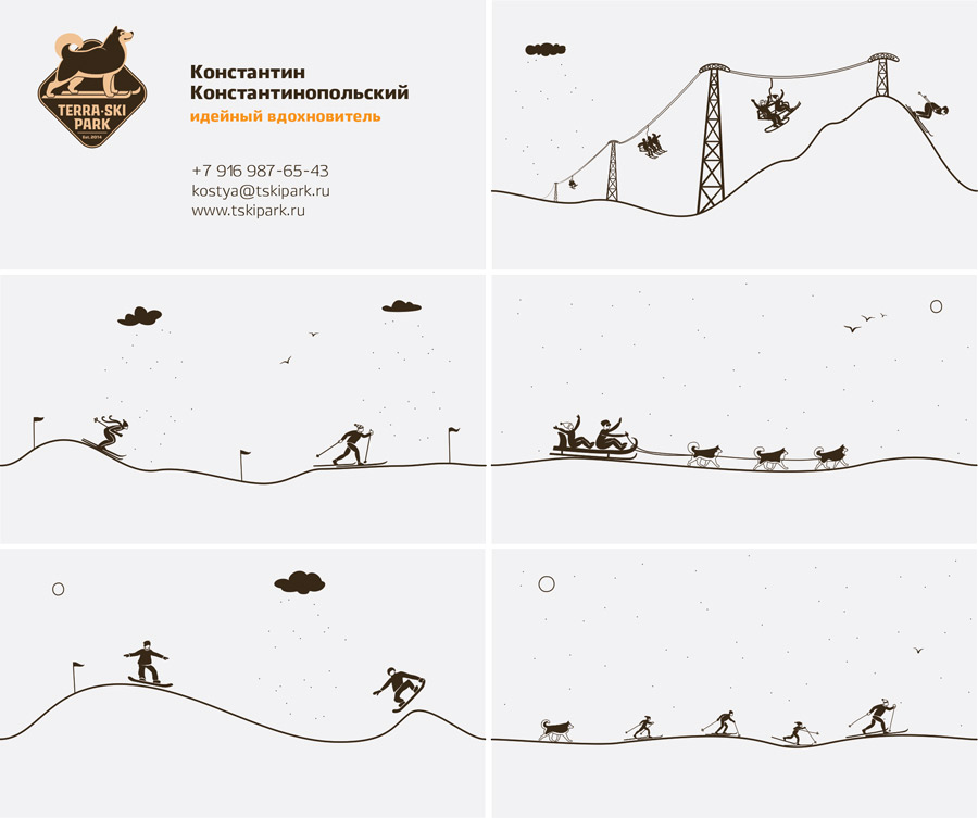
Getting back to the stationery. Here is a cool idea for business cards: let’s make drawings on the back sides of the cards individual for each employee. This way when several cards are put together, they form an endless story about the park.
Drawing, assembling, adding the “knitted” elements. The result is strict, tasteful and reserved.
Using the “knitted” patterns to design souvenir products.
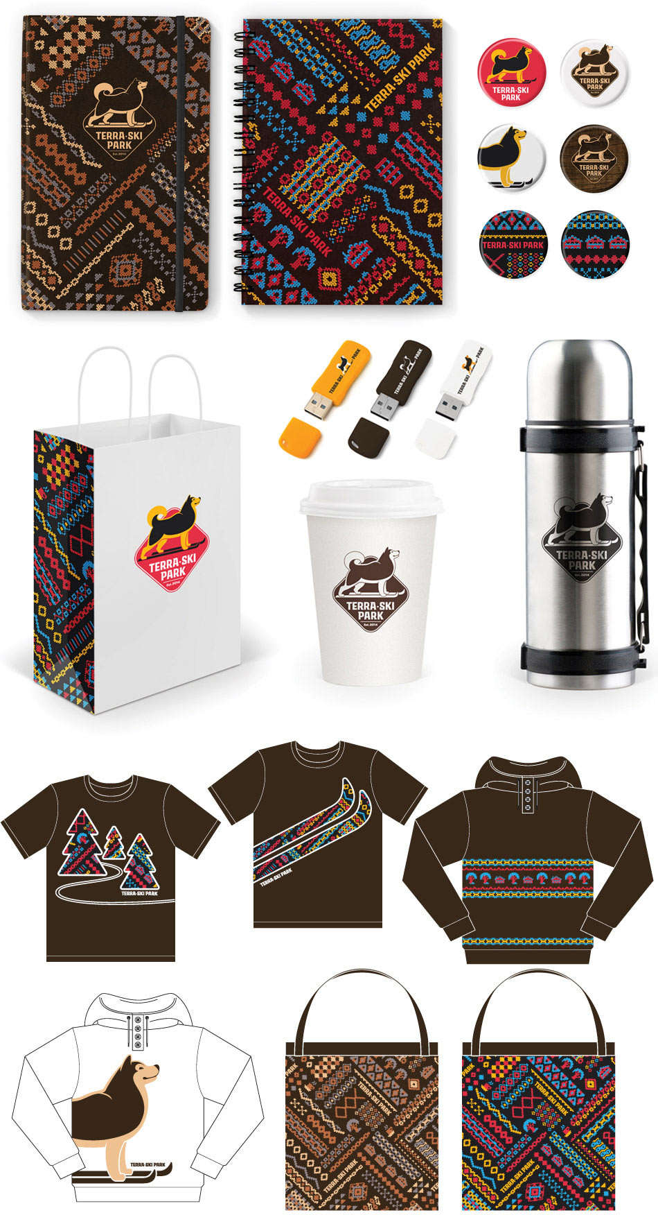
There is also the plan to sell toys of Terra and Raski puppies at the park. Drawing the first sketches.
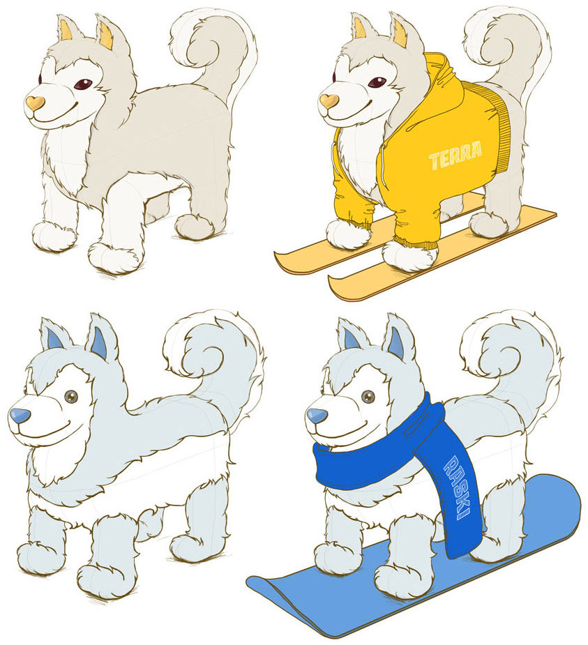
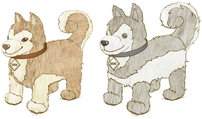
Not what we need. The toys have to look like real puppies, not cartoons. Searching for images and finding them.
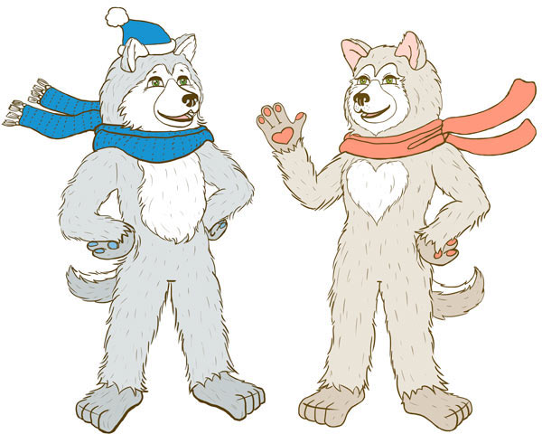
We also need to create sketches of mascot costumes. The characters have to be kind and fluffy.
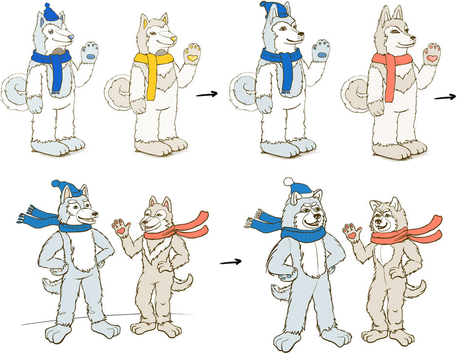
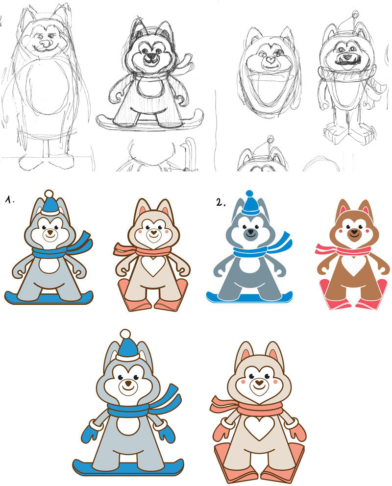
These guys need to be stylized for the website as well. Deciding to add more cuteness here.
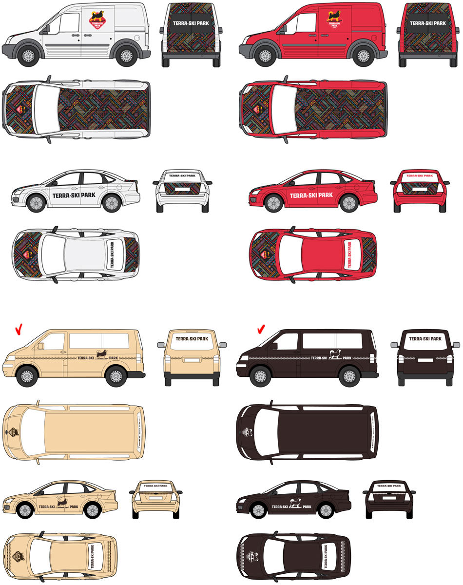
Thinking about the design of the park’s vehicles. Settling on the more reserved cream and brown tones.
Drawing the map of the park that would help present the project to future partners.