Visual identity   Navigation  

Three Sisters recovery center visual identity

Overview   Process  

Task: to create a brand name and visual identity for a recovery center.

Three Sisters is a recovery center in a Moscow suburb where guests regain their strength and well-being after surgeries, illnesses, or traumas. The center’s brand name, logo, and visual identity were designed in our studio.
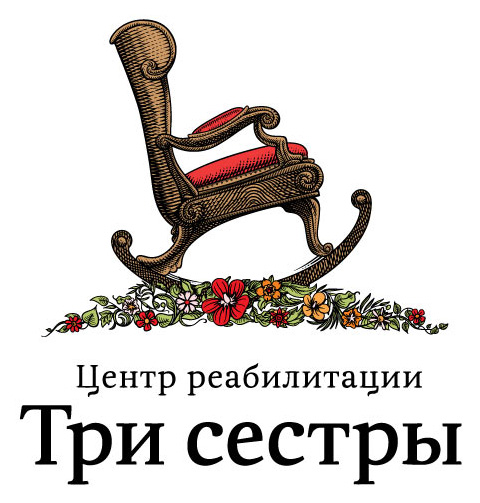
three sisters logo color
The logo suggests comfort and relaxation in a soothing natural setting
three sisters logo black three sisters logo short
Black and white and abbreviated variants of the logo
Release date: January 25 2012

Cast:

artistic director
first art director
second art director
designer
technical designers
type designer
illustrators
metteur-en-pages
typesetters
copywriters
editor
project managers
Typeface: Meringue
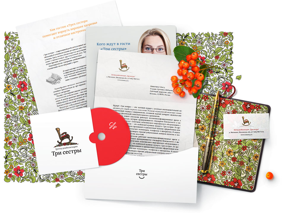
three sisters docs
Complete company documentation
three sisters bc
This business card really rocks
three sisters room
Guest room sample interior

Order a design...