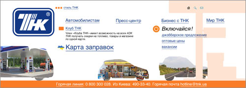
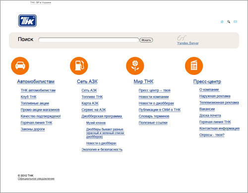
Deciding on the main sections: a gas stations map, promos and news.
Making a rough sketch.
Getting rid of the useless map of Ukraine and replacing it with a large illustration.
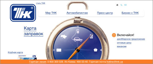
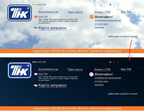
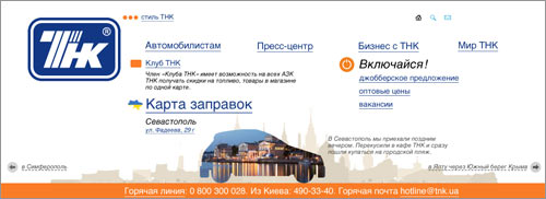
Brighter, but still doesn’t make much sense. Adding an interactive feature—now a user can move a little car from city to city learning the addresses of new gas stations.
The time of day also changes.
What if we use the outlines of cars as frames for pictures?
An outline on an outline.
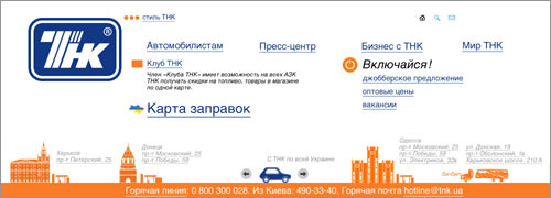
Placing the map of the website to the bottom of the page.
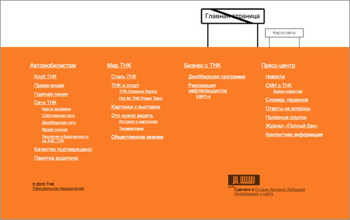
Nope, it should be on top.
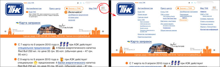
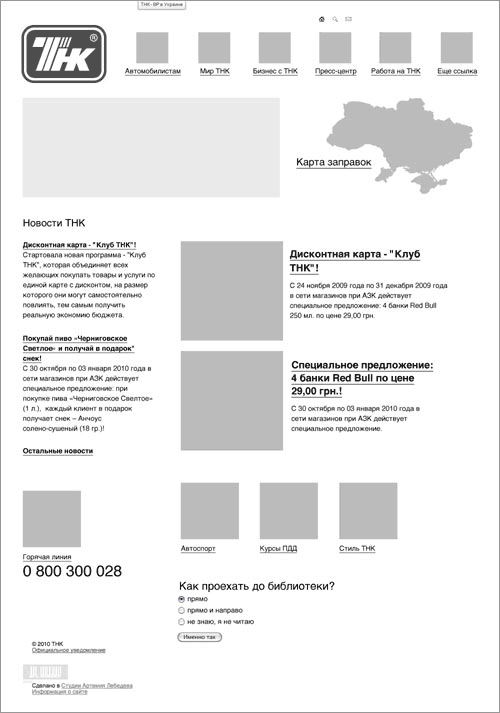
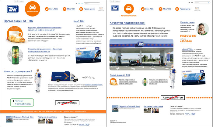
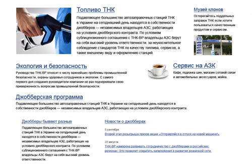
The news section and illustrations with outlines get rejected by the client. Putting the porn promo section on top.
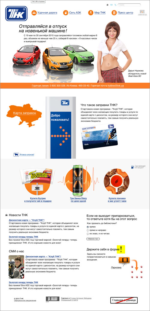
Now the center of the page looks like salad. Rearranging the benefits section and combining the pillar with the logo.
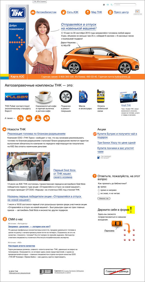
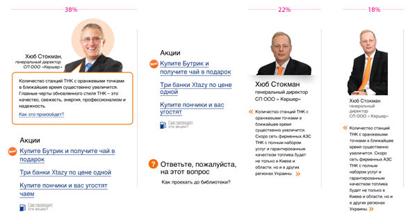
Client: Everything is fine, but we need to add a portrait of the CEO along with a small statement.
Putting the guy in the right column. Deciding that one-fifth of the screen would be enough for him.
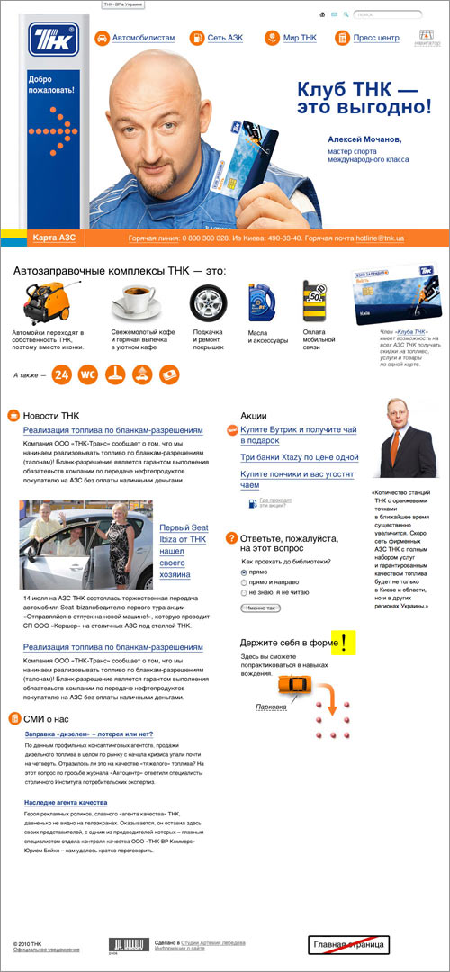
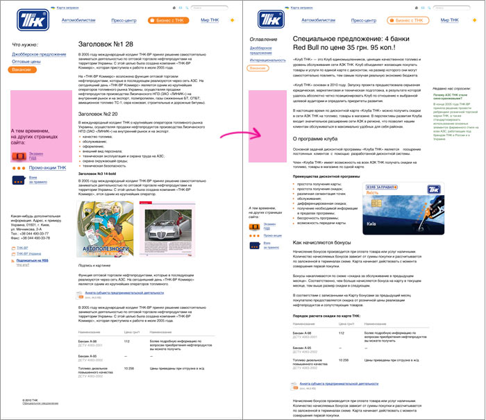
While we were designing, a new promo was launched. Putting the new illustration in the header.
Starting to work on details.
Not enough icons (and by the way, what does the second to last one depict: a dumpling or a pillow?)

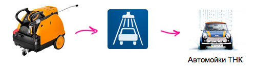
Drawing the car wash illustration.
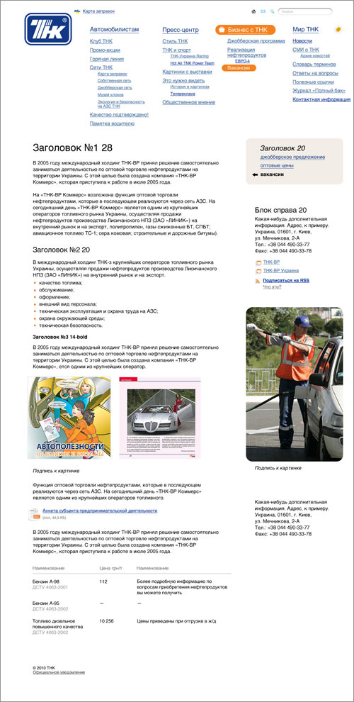
Designing the inner pages
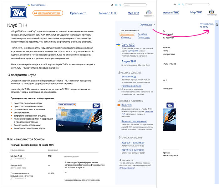
Working on the pages layout. Putting the website map in a drop-down box on the top of the page.
Ending up with an awkward space on the left and the menu that got lost in the right column. Moving the menu to the left. Narrowing down the width of the column.
There’s still too much space on the left. Putting the content back.
Placing the navigation menu with context-dependent elements in a box that can be hidden if not needed.
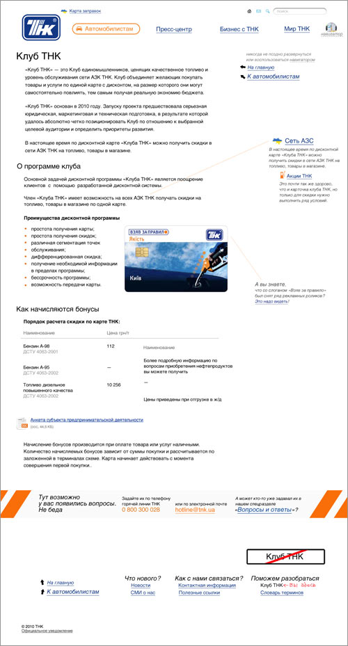
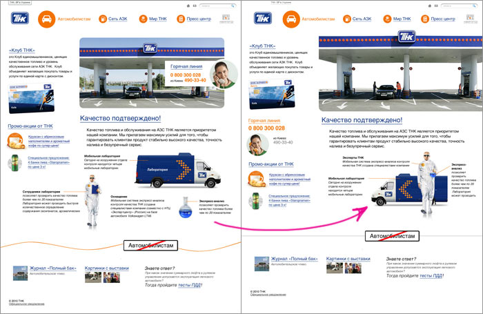
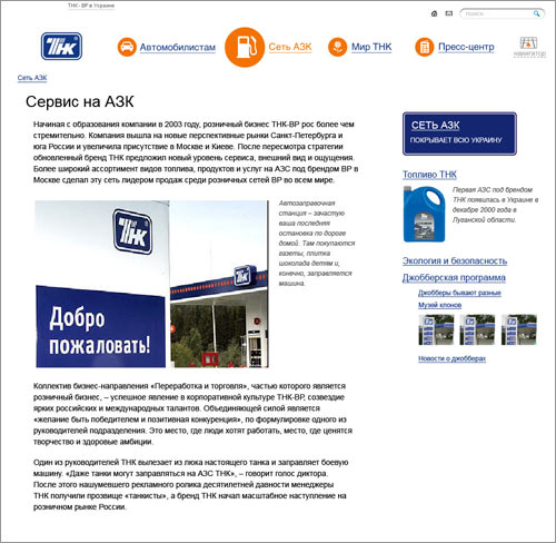
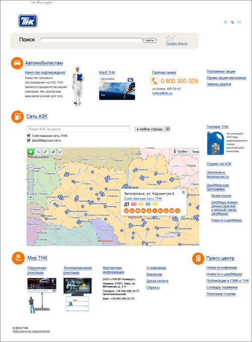
Making custom layouts for all top-level pages. For example, the users section used to be all about promos, but now we’ve shifted the emphasis to quality control.
Moving the illustrations closer together.
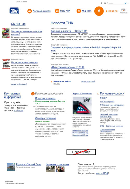
Nailing the press penter section on the first try.
Having some trouble with the gas stations map.
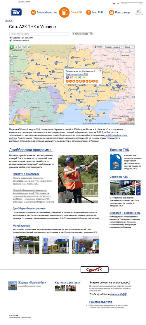
Too much attention given to jobbers. Swapping the jobbers and fuel sections.
Now the links to the services and ecology sections have dropped too low. Moving the jobbers section to the bottom of the page.
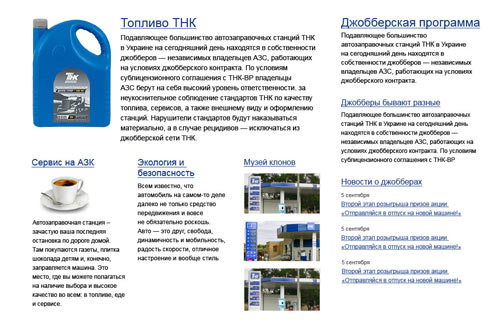
The clone museum now gets more attention than the services section. Swapping their positions.
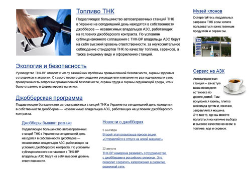
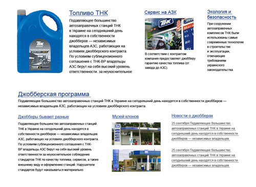
Breaking up the boring two-column layout.
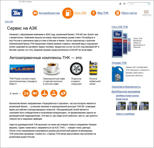
In the services section we could’ve done with an illustration.
But we wanted to make a page describing the services in detail, so we brought in the icons from the main page.
Adding comments.
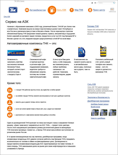
Eventually deciding on a simple list.
Designing the search page combined with the website map.
A stock solution to start with.
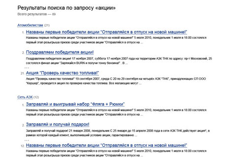
Improving visibility.
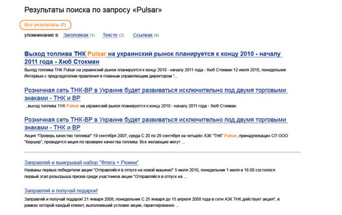
Structuring search results
The first approach—a simple list sorted by whether the word is mentioned in a headline, link or text.
Adding sorting by the main sections.
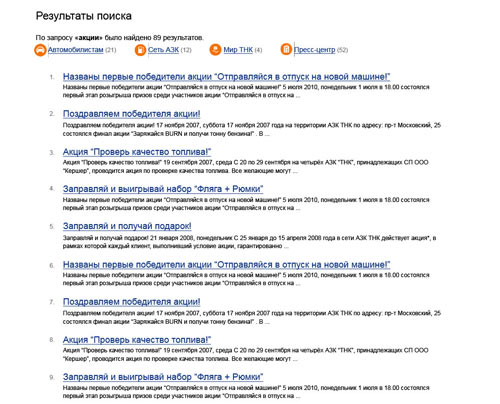
Bringing in levels and deciding to display only the first three results in each group.
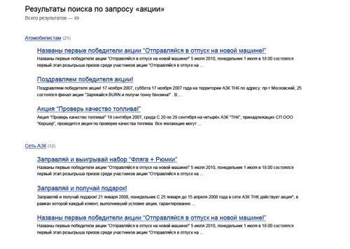
Now the links with the sections names can be expanded to display all results without reloading the page.
Only the first two and the last result in each section are displayed.
And now for dessert.
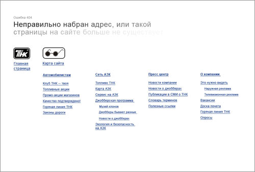
Designing a 404 page
First the designer roams in the dark of misunderstanding the essence of the task.
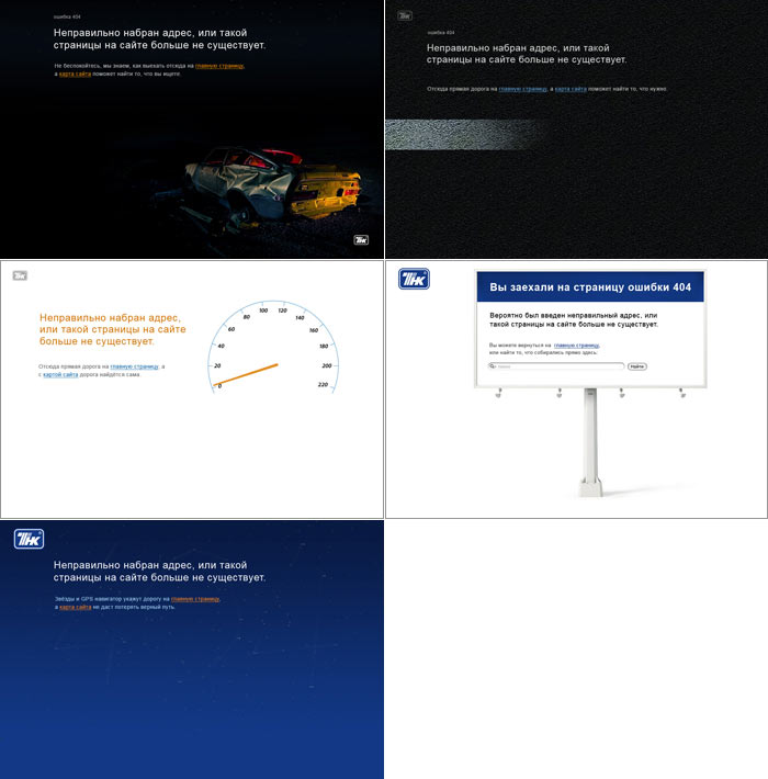
Then he falls into despair.
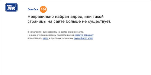
It’s ok. Filling the page with the website map, adding details. Done!
Let’s ride! :-)