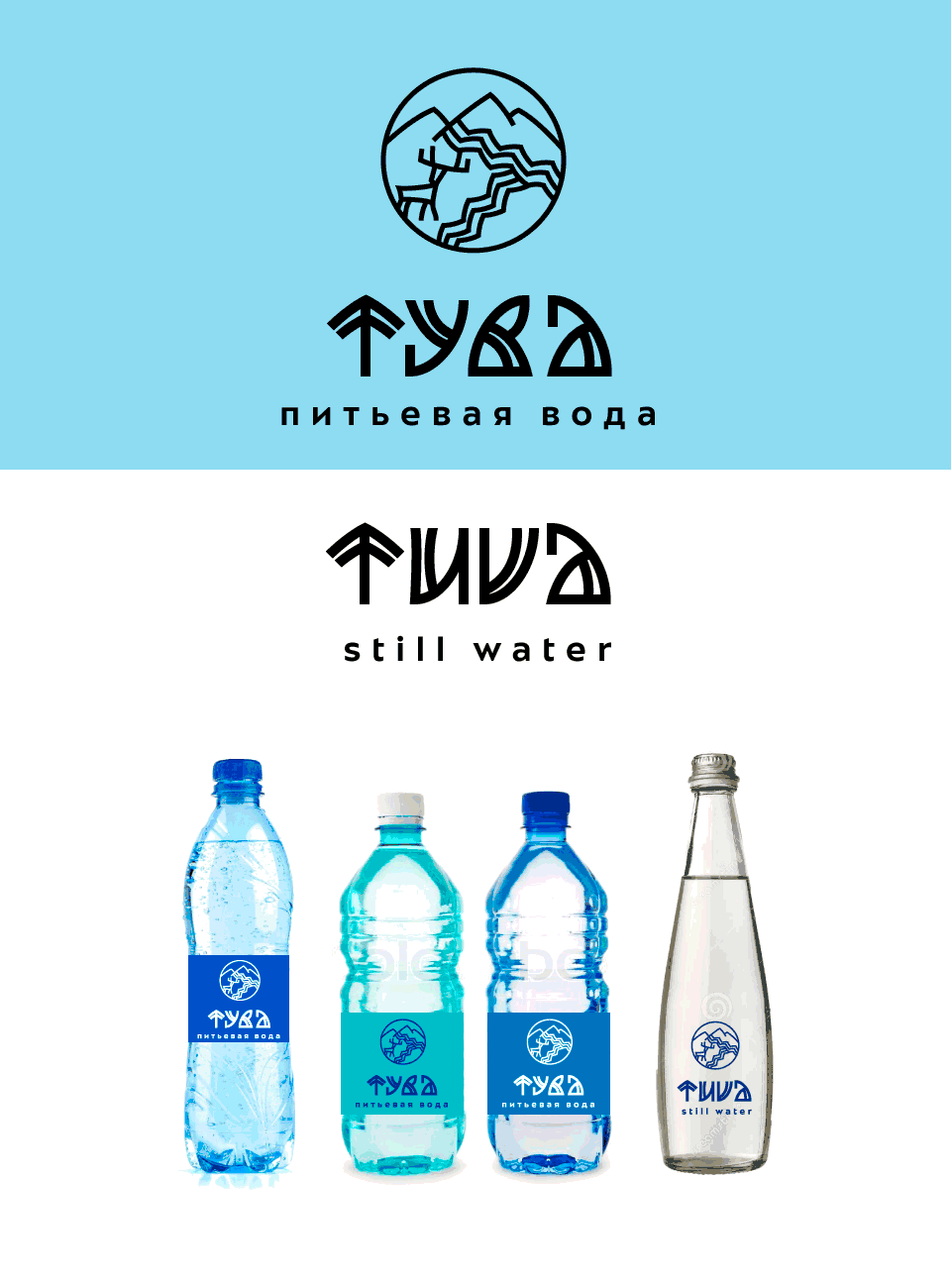
Client: We are going to produce mineral table water from Tuva mountain sources under the brand Tuva. The water will come in plastic bottles conveniently shaped for holding in hand. At the same time we want to position ourselves closer to the premium segment.
The well and the plant are located in a picturesque mountainous region of Tuva with untouched nature, complete with taiga and mountain tundra. Surrounded by the Sayan mountains it is abundant in beautiful lakes and deer can be often seen in the area. The local population herds reindeer, they live in raw-hide tents. In the winter, the temperature can reach −50°C.
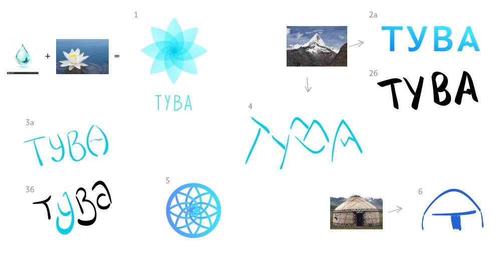
First designer: This is what I have for now: a mountain reflected in a lake, plus one can also see a T and an A if they try. Should I develop this further?
Art director: This is B-class.
First designer: This is B-class.
Art director: Not bad but more appropriate for a makeup brand.
Second designer: Whoosh.
Art director: Too simple.
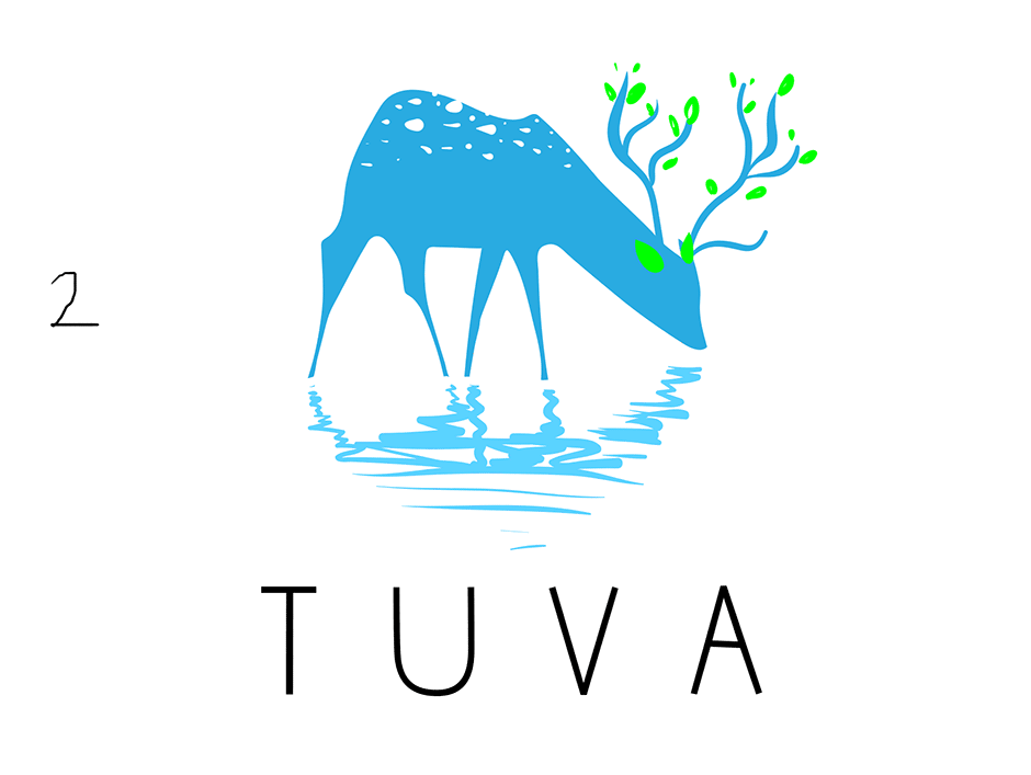
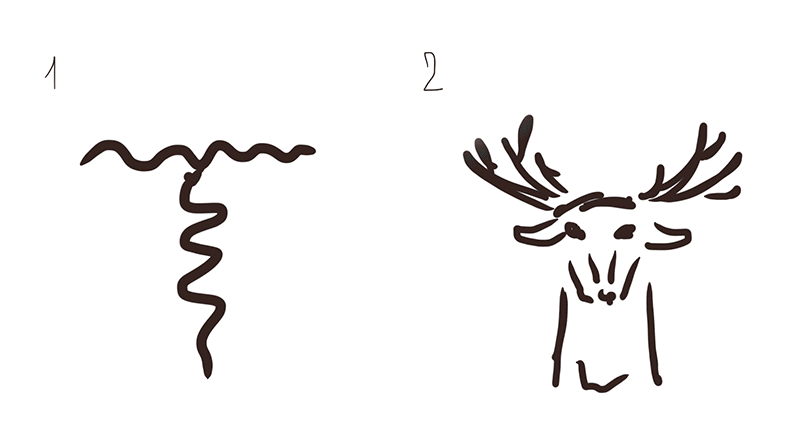
Third designer: A drinking deer plus the Sayan mountains in the counterform.
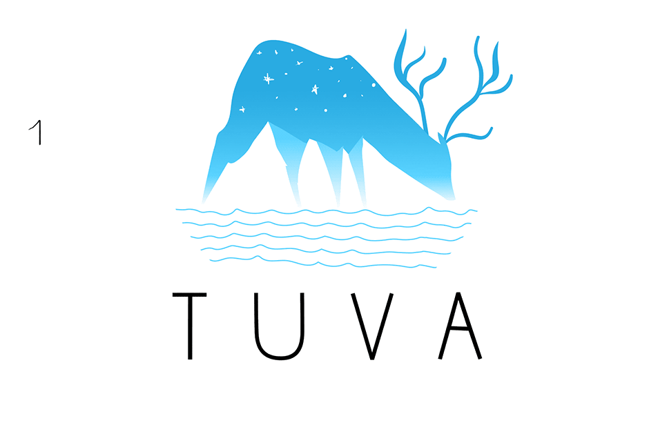
Art director: Not bad. What if you make the mountains more noticeable and the deer secondary?
Third designer: Or tree antlers.
Art director: Sure, and stick a thermometer showing −50°C in his ass.
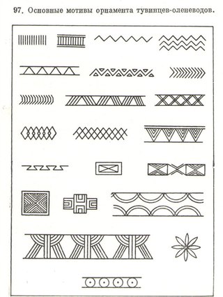
Fourth designer: Maybe, we can use national Tuva ornaments and patterns? Although it won’t be easy to create an English version of each of them. Worth looking into? Or does it look like Russian Kvas written in old Russian script?
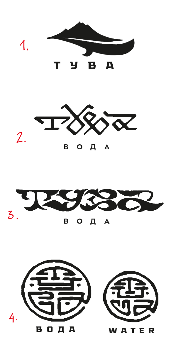
Art director: It’s too much.
Fourth designer: Here’s another design with mountains and ornamental letters.
Art director: Hello 1960s!
Art director: What does it have to do with reindeer herders?
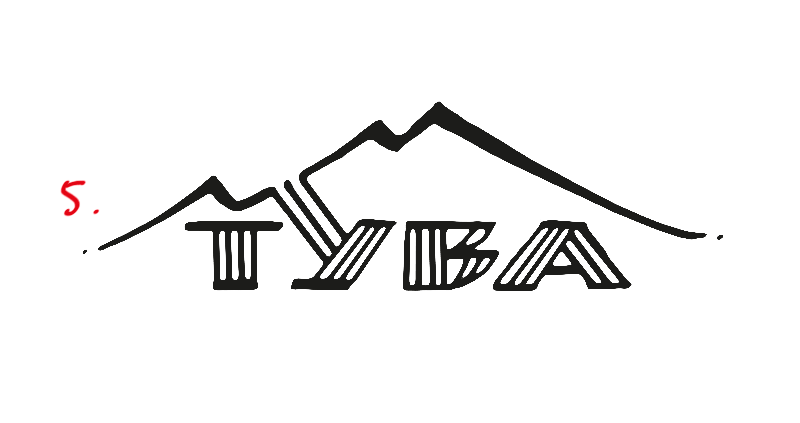
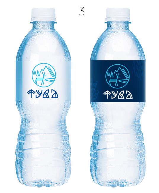
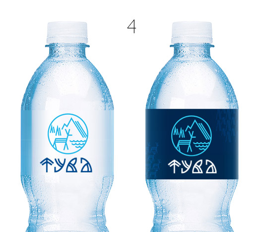
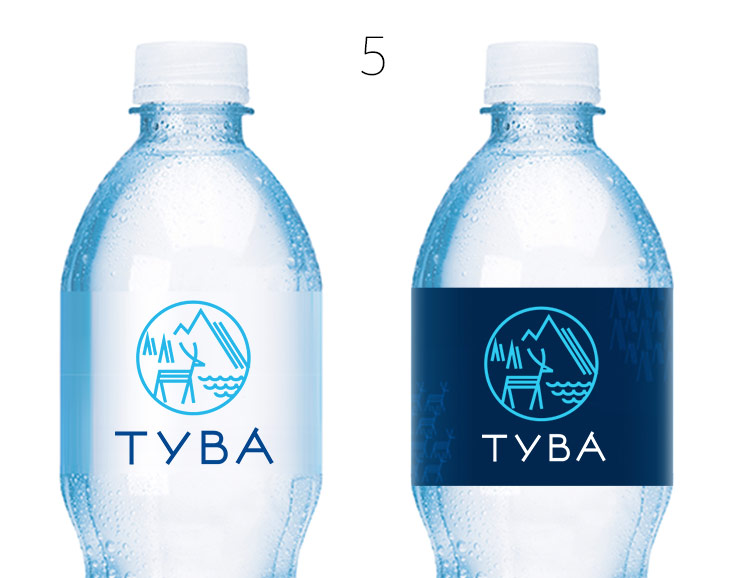
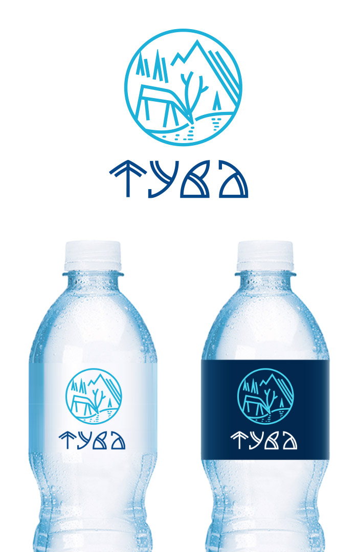
Fourth designer: Here’s another logo with ethnic features: mountains, rivers, deer. A nice emblem for a bottle cap. The name can be easily written in English.
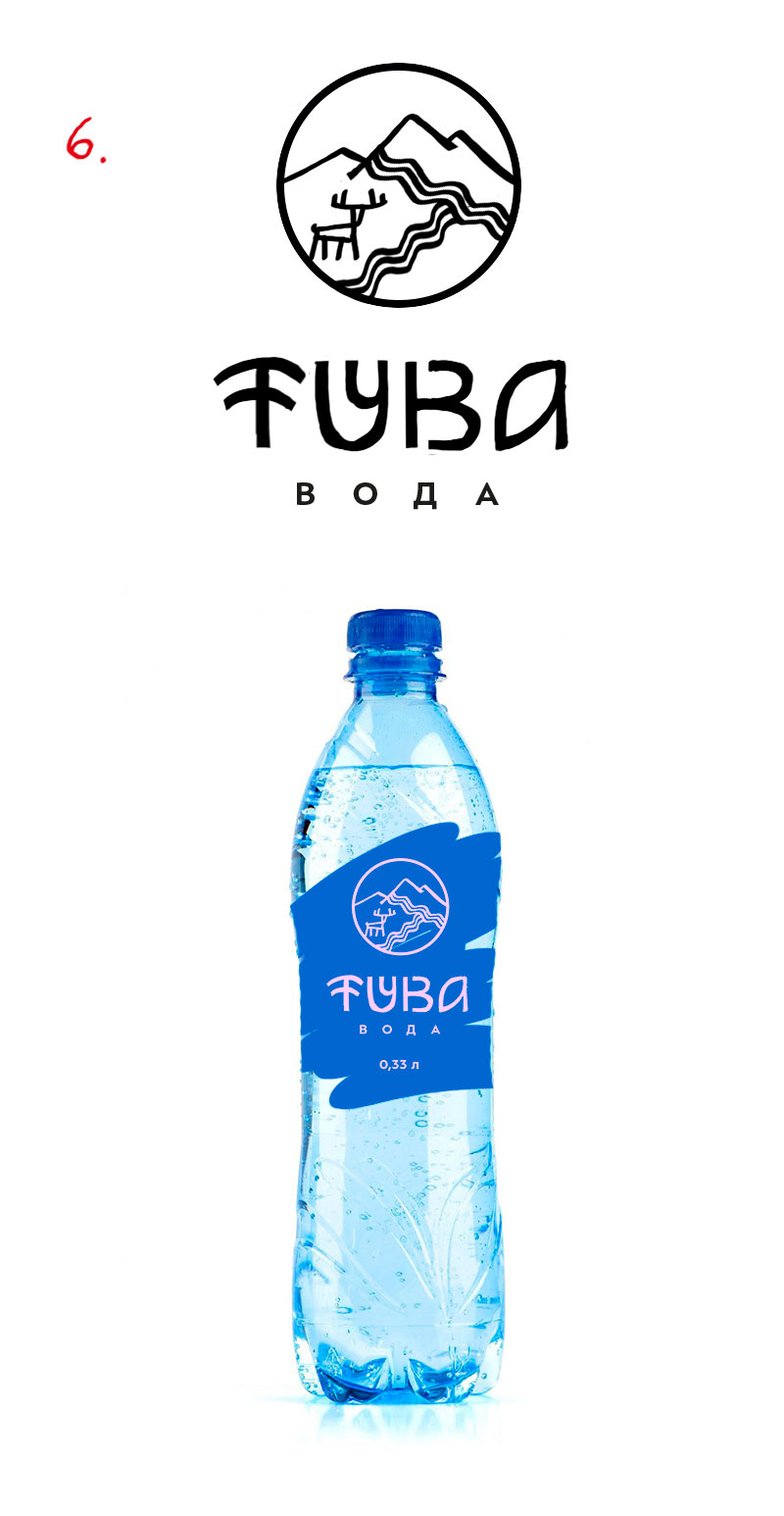
Art director: That’s better.
Art director: This goes in the short list.
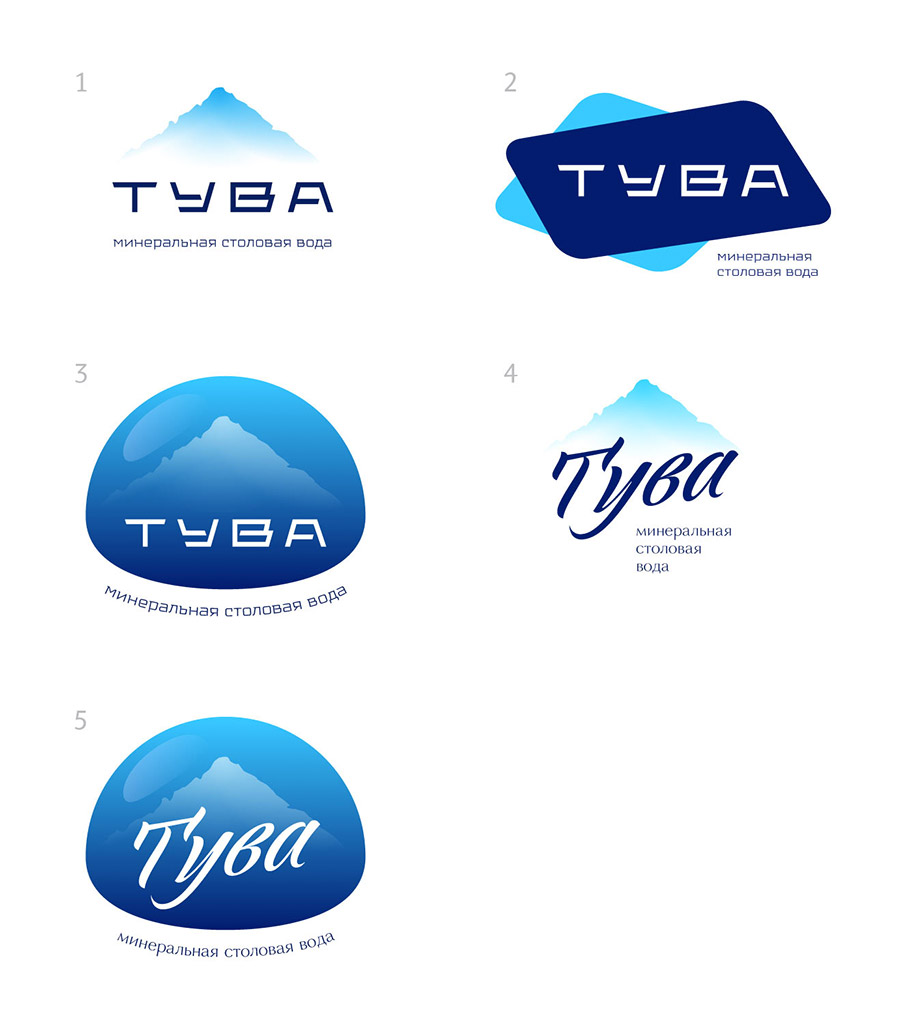
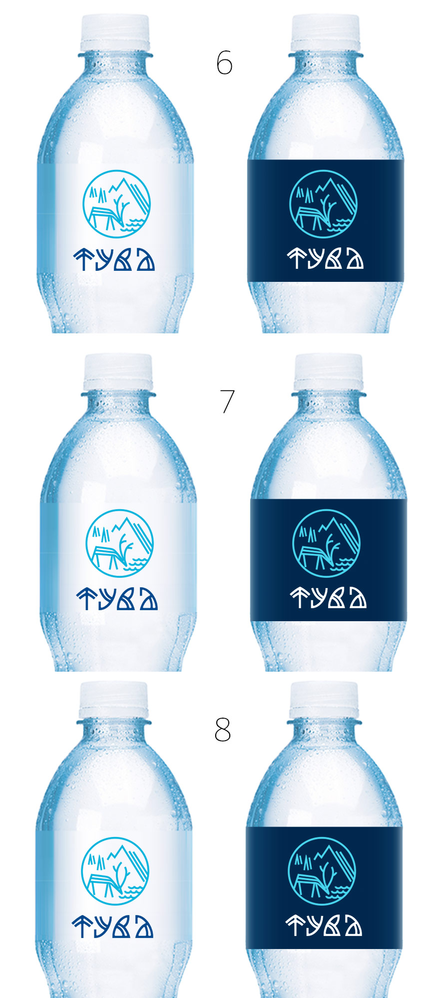
Fifth designer: First ideas.
Art director: Nope.
Fifth designer: More sketches: a T-reflection-source-corkscrew and a T-deer.
Art director: A corkscrew. No.
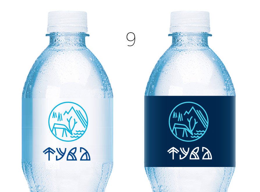
First designer: What about this?
Art director: Not bad, but you have to get rid of the sanitary pad and the ciliate.
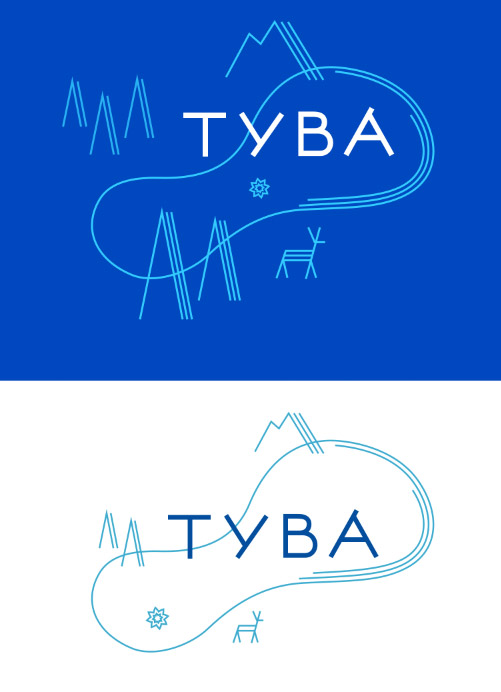
First designer: This any better? I can also generate patterns from these elements.
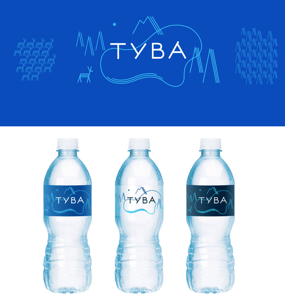
Art director: Just make sure it doesn’t read Tuvalu. You can combine it with Yaroslav’s idea.
First designer: Combined with Yaroslav’s letters.
Art director: I can’t see the lake.
First designer: What about this?
Art director: OK, but the deer is too dorky.
Art director: Maybe the deer can drink from the lake?
First designer: Different antlers.
First designer: Or maybe the striped deer is too strange? Here it is without stripes.
Art director: The one with stripes looks like a chipmunk. I don’t like that the water looks like sea. Let’s go with a mirror surface of the lake reflecting the deer.
First designer: One with ripples and one smooth.
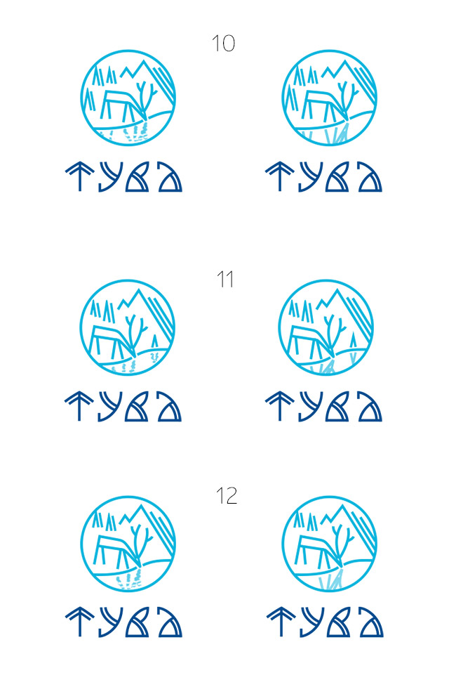
Art director: 11.
First designer: Here, I improved the reflection.
Art director: OK.
