Span

Solution
Span is a family of variable typefaces combining the traditional shapes of block antiquas of the 19th century with the geometry of modern digital type.
Historical context
In the 19th century, technical progress allowed printing texts in greater numbers, although the quality of printing has sharply declined. Thin and refined letters of classical antiquas could not withstand the pressure of modern equipment, ripping paper and breaking down.
The second half of the 19th century saw the appearance of quality implementations of more massive and contrasting typefaces that printed better and were slower to wear out. Thin serifs evolved into rectangles leading to the name “block antiqua.”
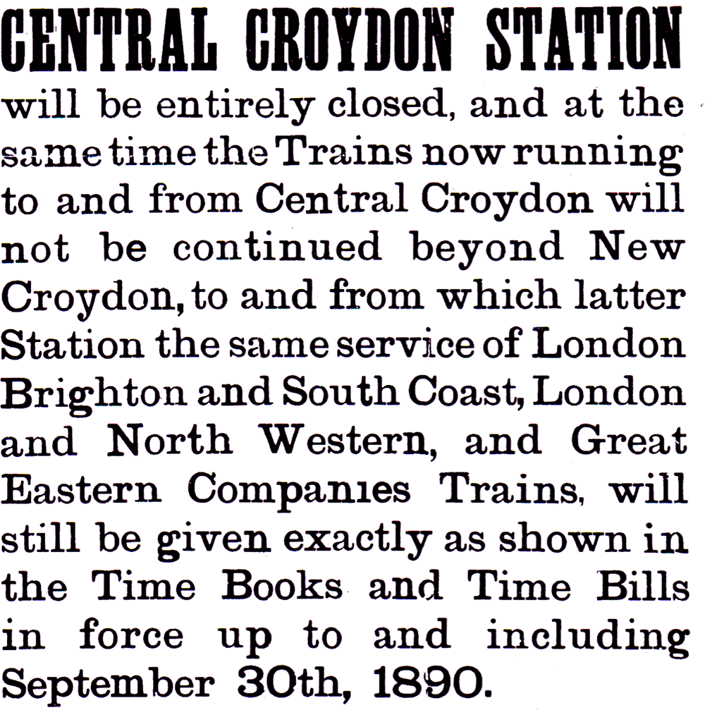 Clarendon in straight matter, 1890, fragment, Wikipedia
Span is based on the cult typefaces of the era, Clarendon and Century Schoolbook, but at the same time is not their typical revival. Span borrows their best traits: the characteristic expressiveness and readability, but otherwise distances itself far enough to avoid associations with the past.
Span references historical typefaces but is completely devoid of antiquity, looking nothing like a historical stylization.

Character geometry

The structure of terminals, punctuation mark elements and accents tends to have the same weight and geometry.

Rounded serifs indicate that this is not a regular block antiqua.

The inner space of letters strives for symmetry, giving the characters monumentality upon closer inspection.


The high level of readability is achieved by dynamic proportions, low contrast and the perfect rhythm of inner and outer elements in letters.
Span is available in two styles: regular and italic, both variable in saturation.
Character set includes expanded Latin and Cyrillic alphabets, fractions and mathematical symbols.

