iPhone Android
The making of the VDNH iPhone app
Starting by going to VDNH and getting to know the complex.
Defining key scenarios and creating a flowchart.
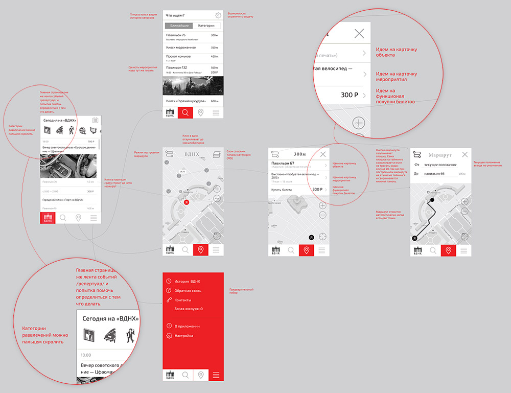
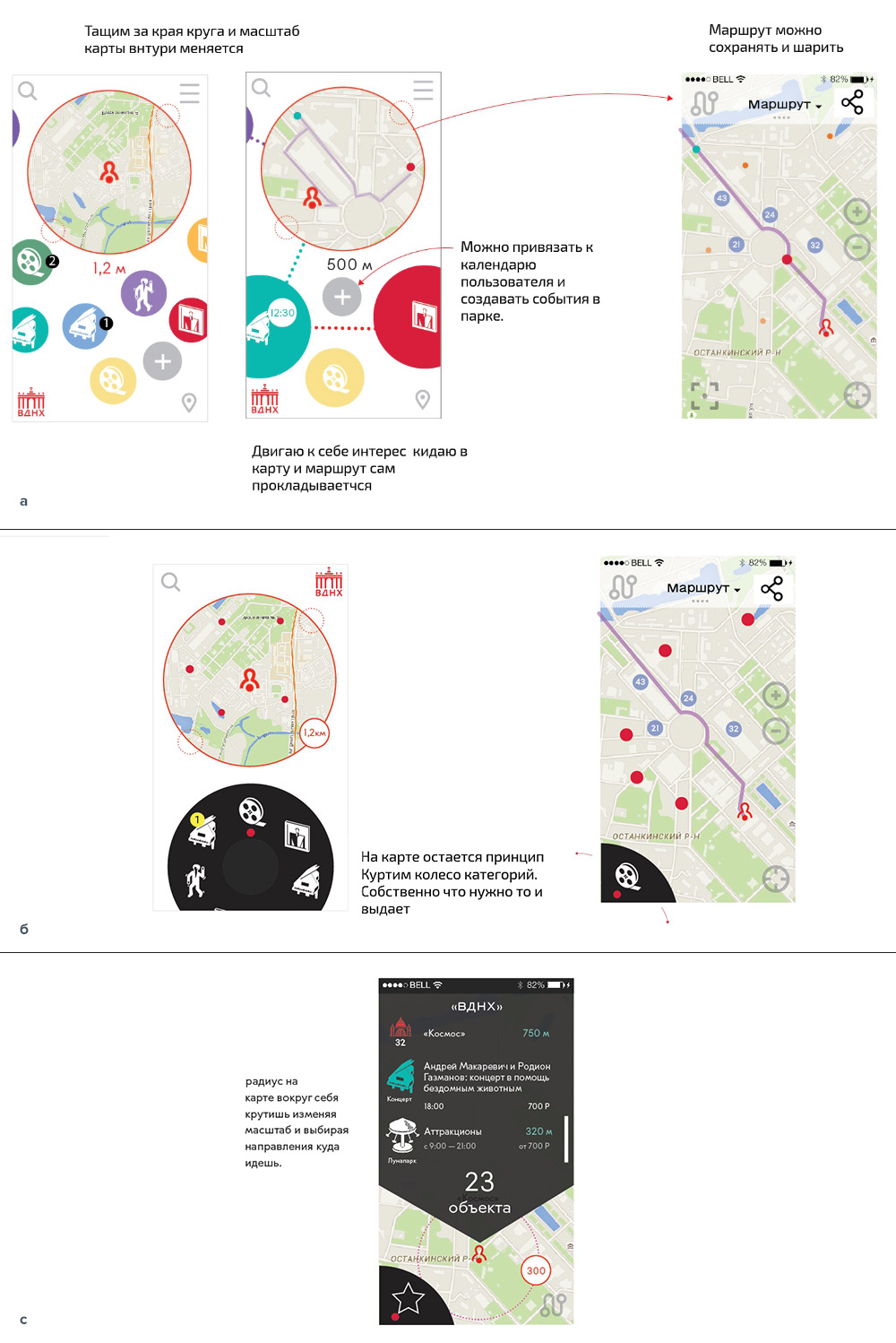
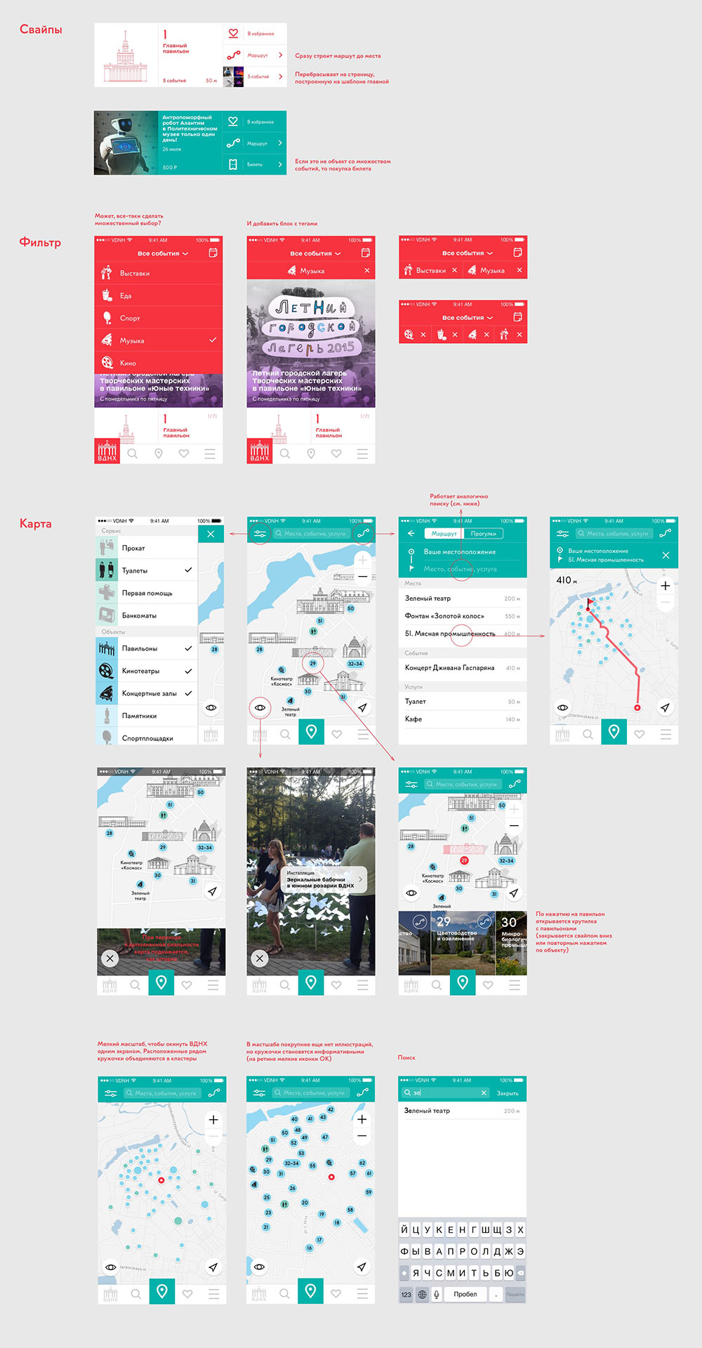
Coming up with various interaction mechanics for the main screen.
The art director asks to make the main screen calmer and easier to understand.
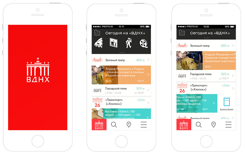
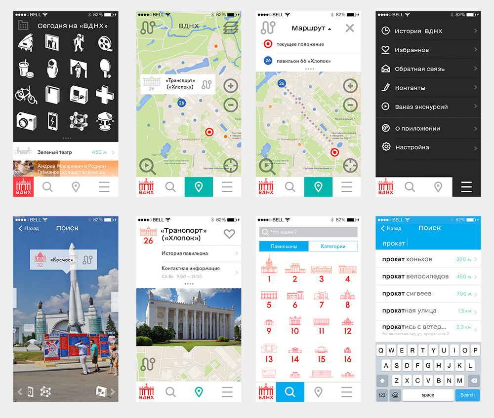
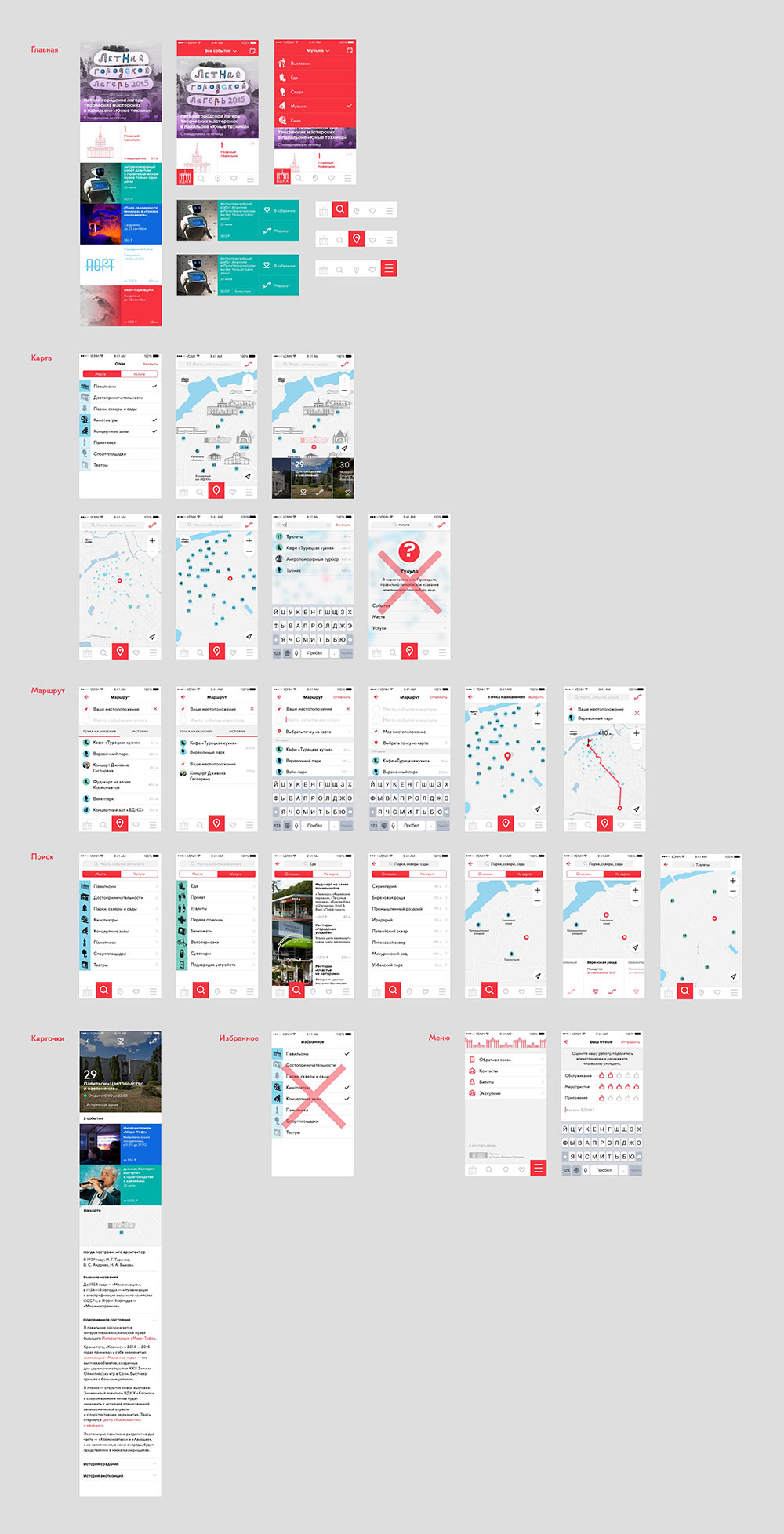
The overall approach is approved. Drawing the rest of the screens and assembling a prototype.
The art director asks to put everything into a presentation and demonstrate to the client. Doing so keeping in mind future evolution of the app.
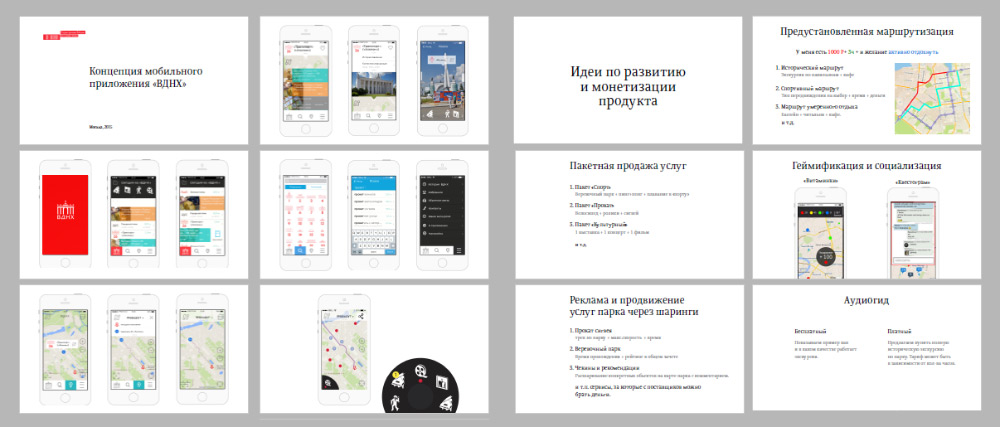
Recording a screencast using the prototype and presenting.
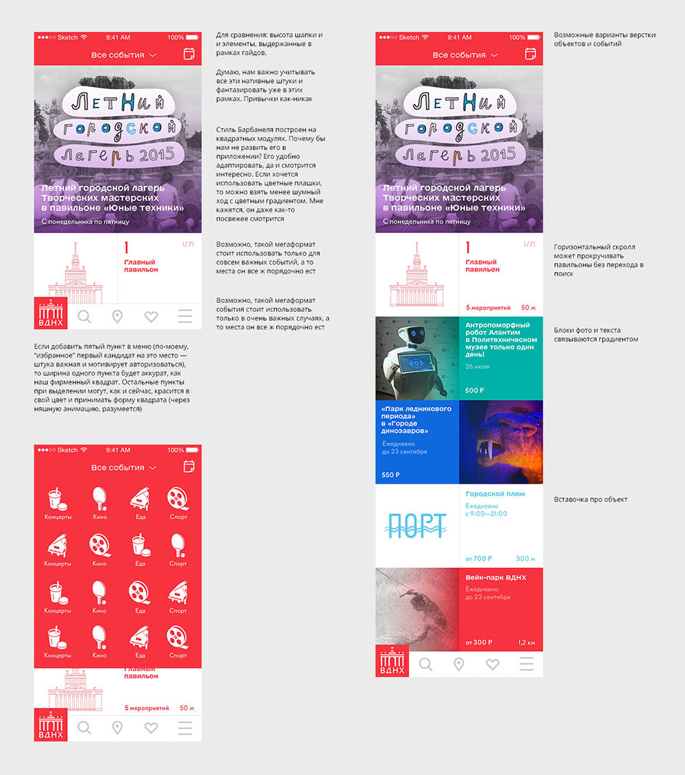
The client approves the concept. Moving on. Making another approach. Trying to typeset the feed using square modules and to follow the app development guidelines.
Getting the art director’s approval and working on other screens.
Color coding for sections turns out to be awkward. Going with a unified look for everything.
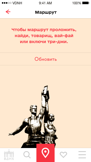
Thinking about error screens.
Designer: What if we use Soviet-era posters and Mayakovsky-inspired poems?
Art director: Bleh, it’s stylization.
Trying to come up with an interesting loading screen and feed refresh animation.
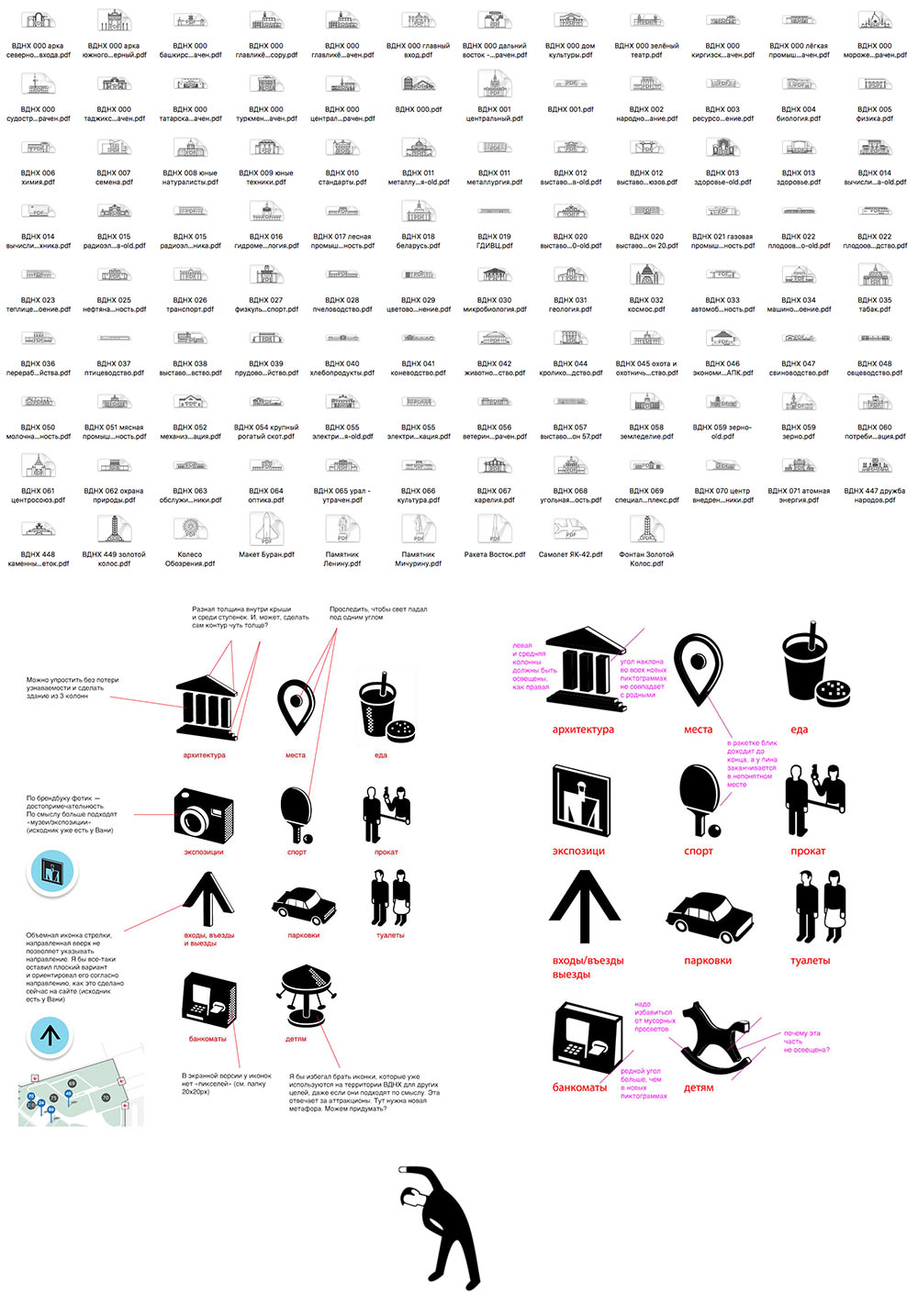
Simultaneously preparing technical graphics: object illustrations for the map and the missing icons.
Talking to the developer.
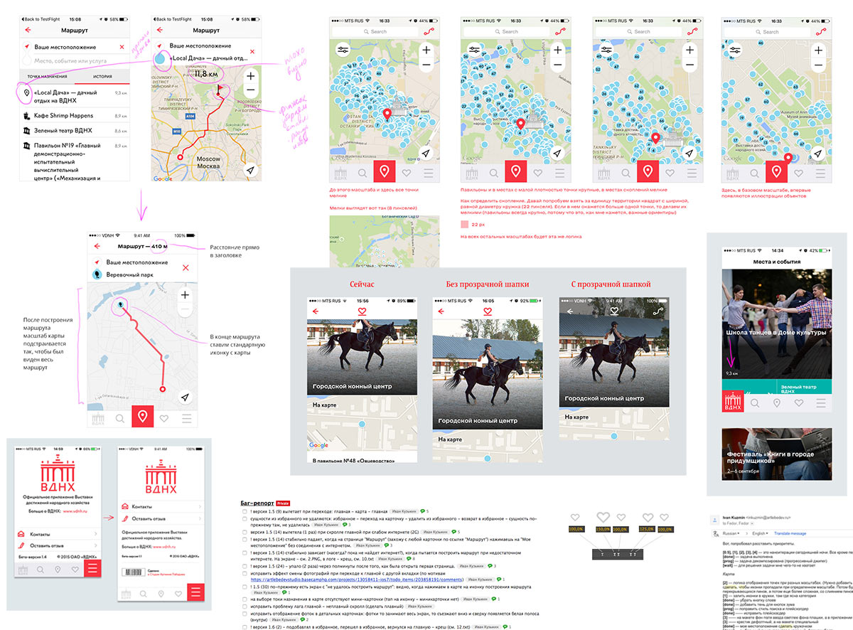
Finalizing the remaining screens, working on the animation and preparing the announcement.
