Task:
to invent a name and a logo for a microfinancing organization.
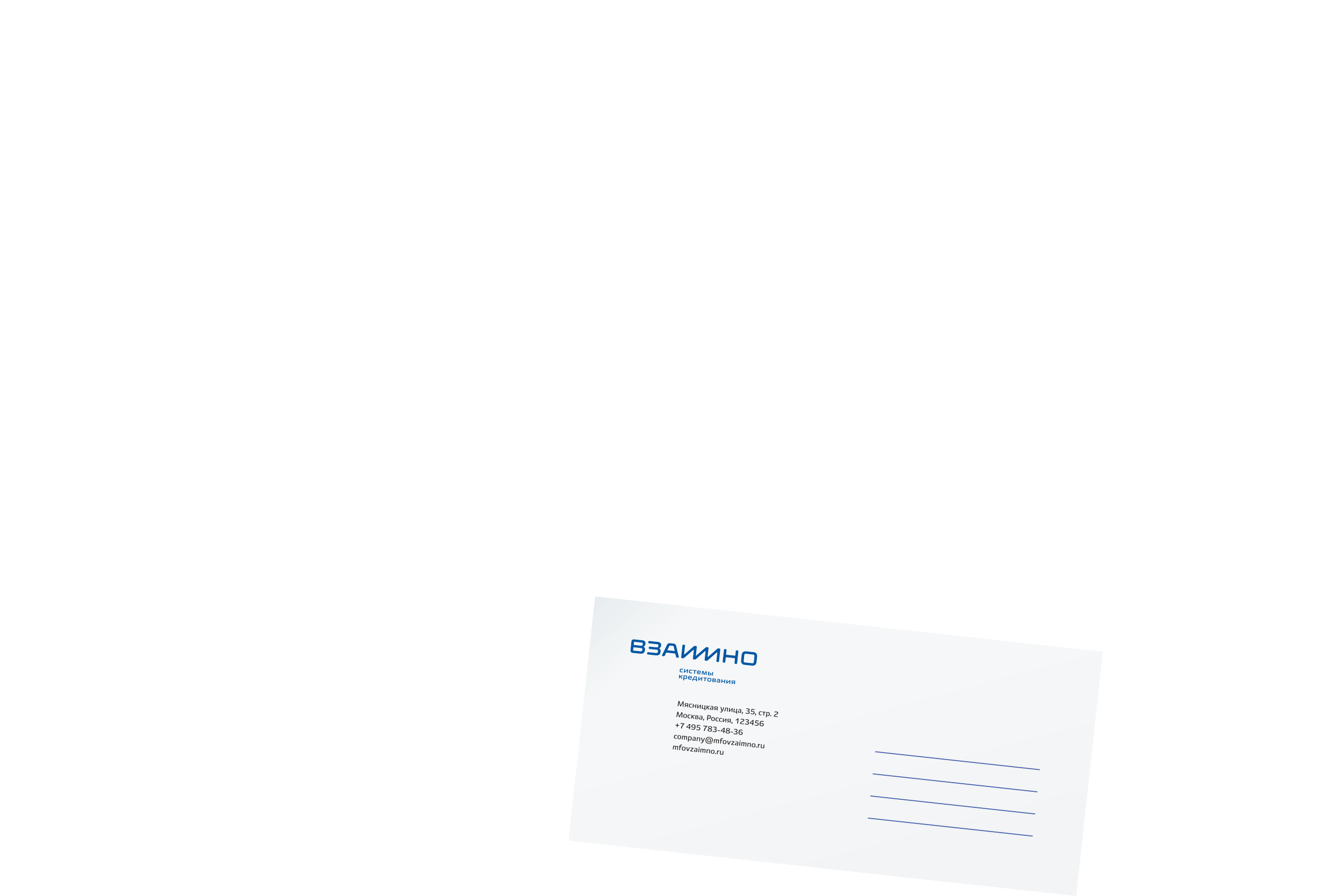
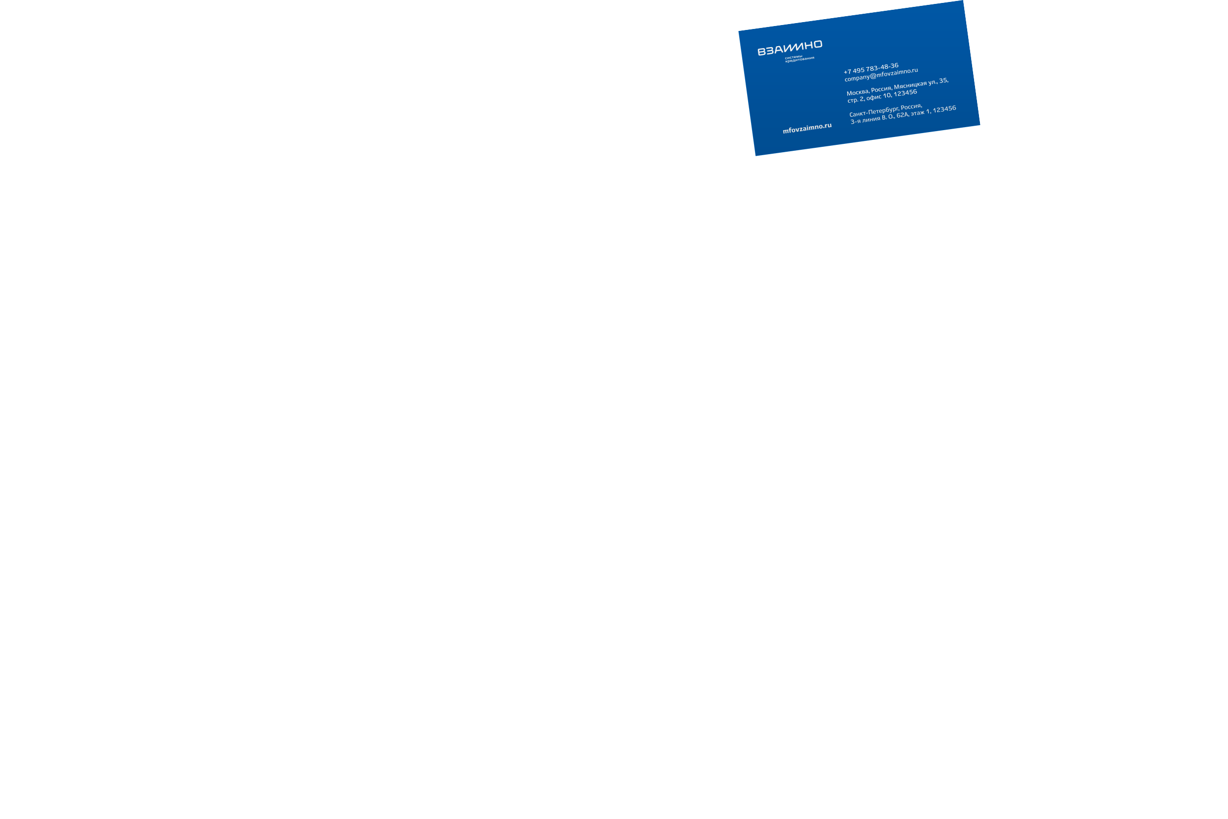
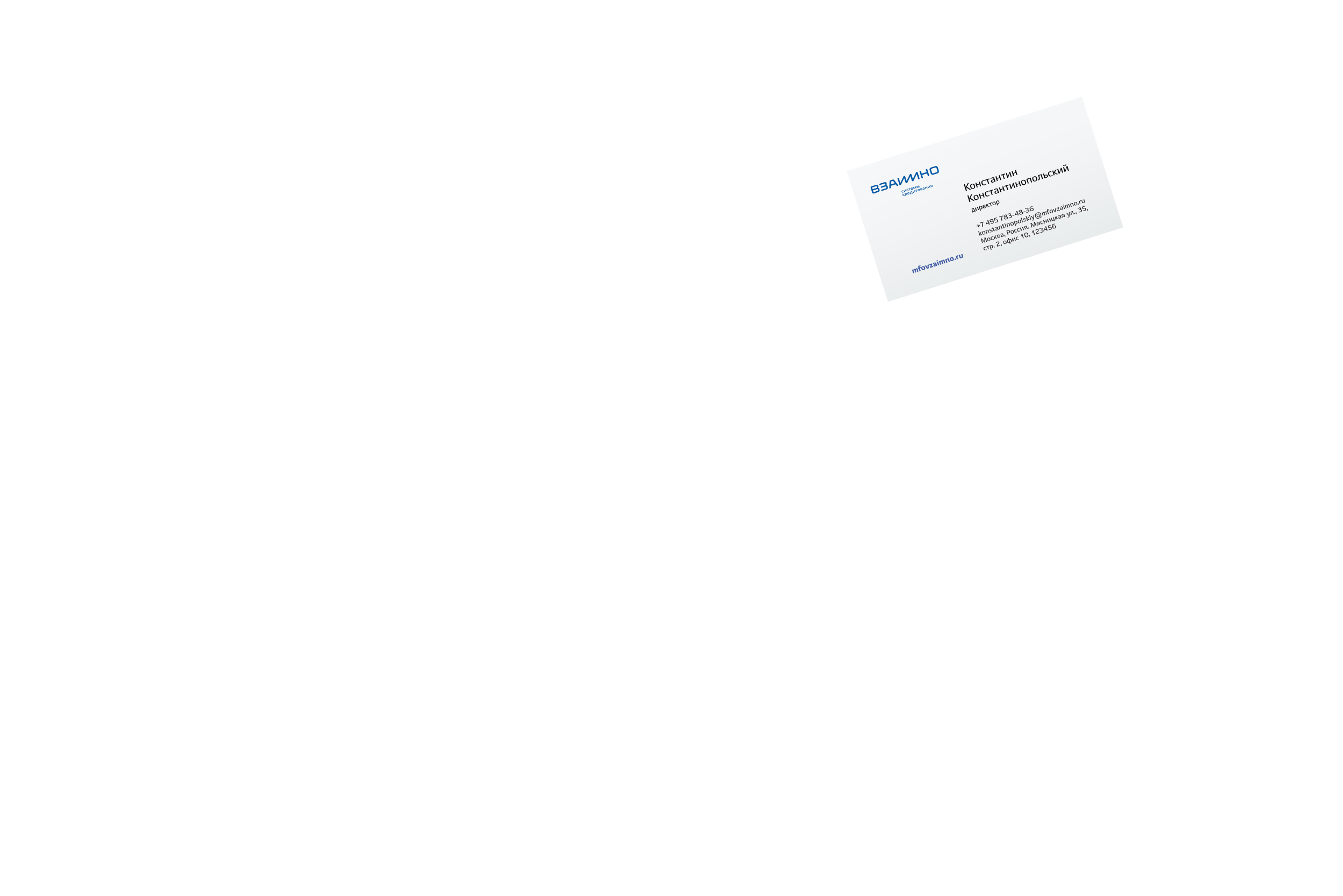
Vzaimno Loan Systems issues loans to cafés, stores, flower shops and other small businesses quickly and without hassle.
We came up with a name and a logo communicating stability and friendliness towards clients.

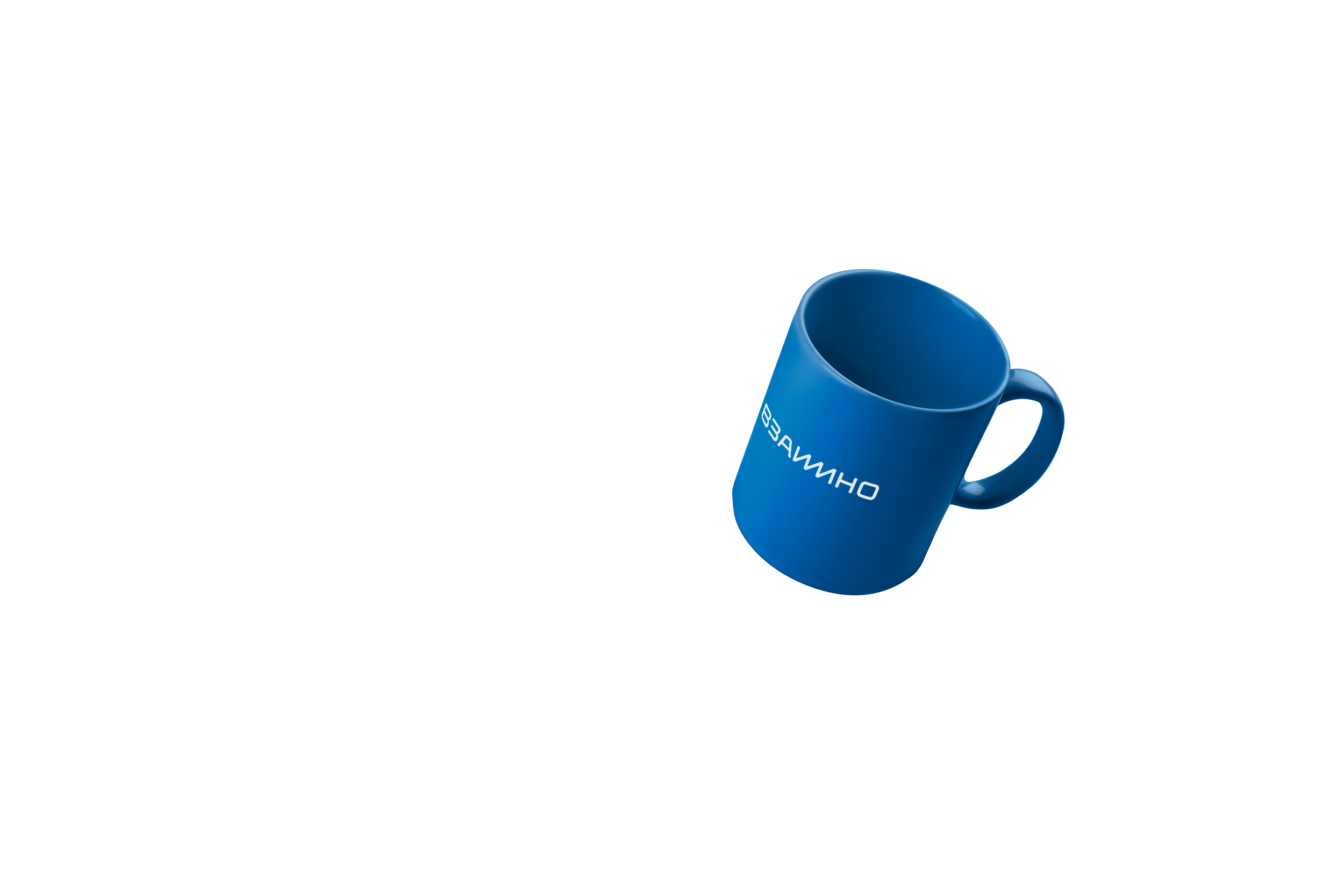
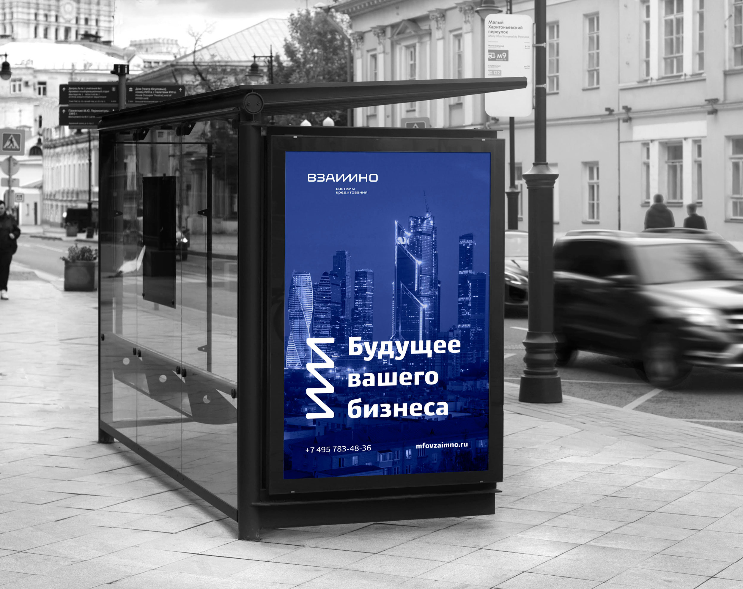
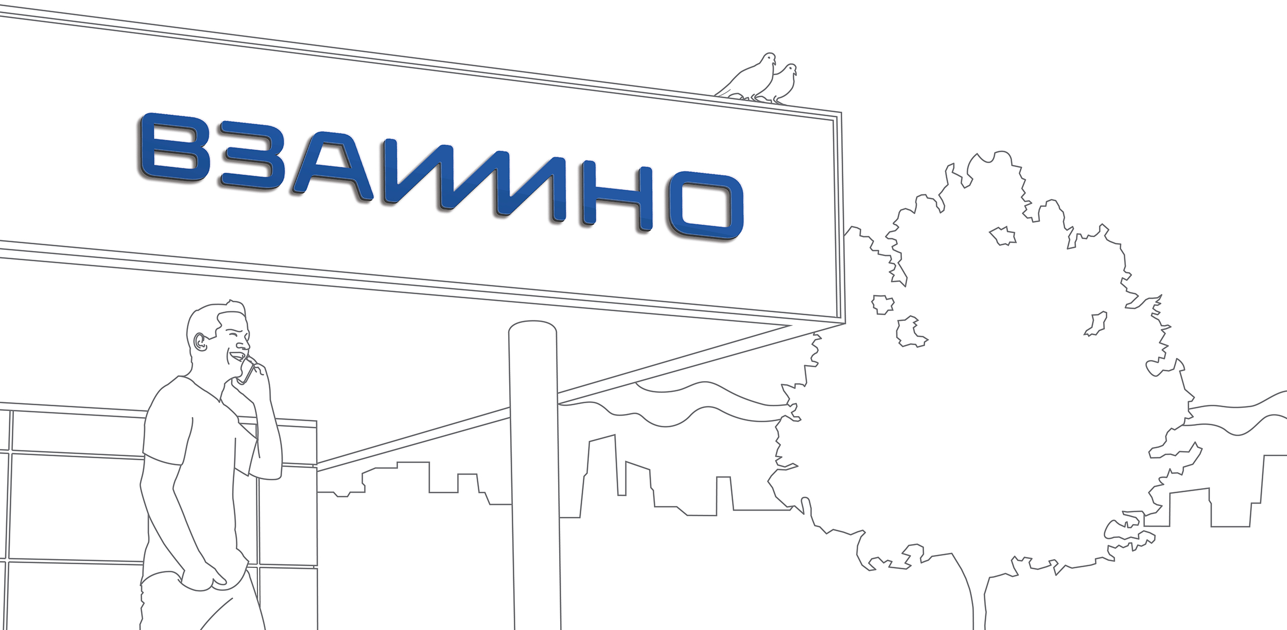
For the logo we came up with an interesting graphic solution: a lightning made of the letters и and м. It makes the logo look like a lifeline that ties together a small business and the loan system.
Or a continuous financial wave, depending on how you look at it.
The lightning-shaped element is used on souvenirs and advertising media. The symbol is used to emphasize interesting and important information.
art director
designer
- Egor Kosolapov
type designer
- Taisiya Lushenko
copywriter
- Ivan Tikhomirov
project managers
- Maksim Pushnov
- Alla Bryuzgina
