Client: WazzApps is a mobile games development studio. We invent and create games ourselves. We are based in Novosibirsk. The average age of our employees is 27.
Our mission is to charge players with emotions every day. Our principles are to accumulate knowledge and share it and to continuously improve the level of our games. Otherwise it’s impossible to survive. We are trying to be different and bring something new to the industry. To be bold, ambitious, relevant, high-tech and witty. It seems we are the most high-tech studio in Novosibirsk.
We came up with our name and logo two years ago. We think by now both have become outdated. We hope you can grasp our image and help us with a new logo and style. We’ll be happy to see our style on hoodies, t-shirts, spinners and stickers for employees.
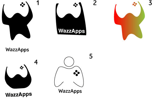
First designer:
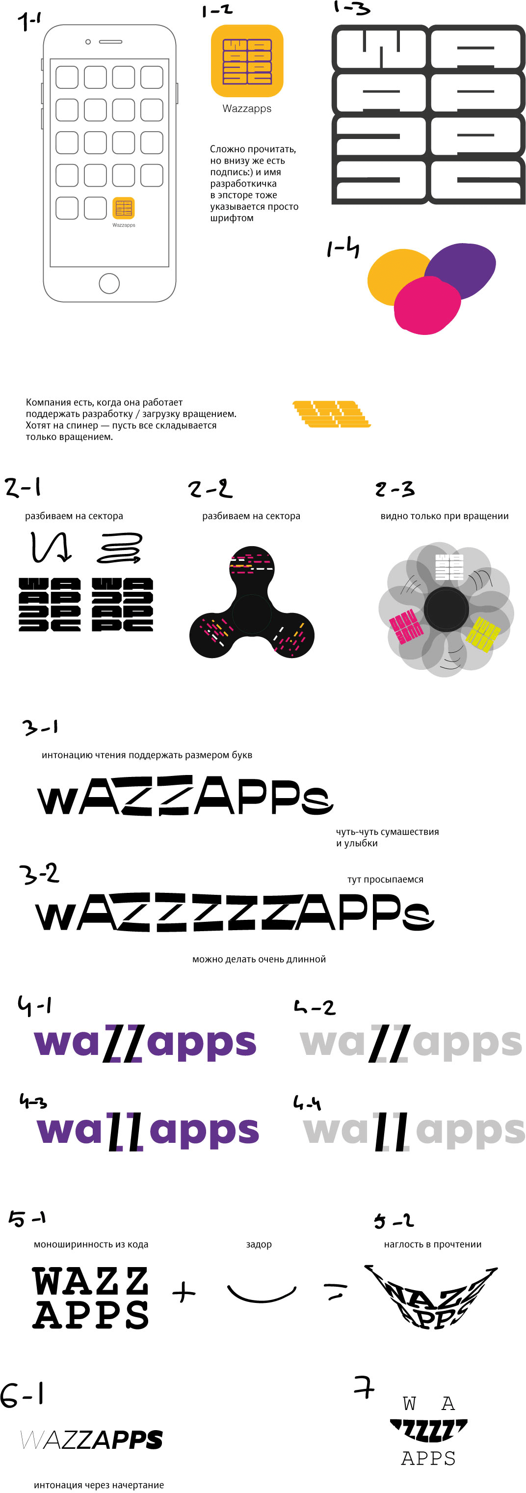
Art director: The first one is good, but the Z and S should be readable.
Second designer: Buttons. Design 1 with an analog joystick.
Art director: Nope.
Second designer: More.
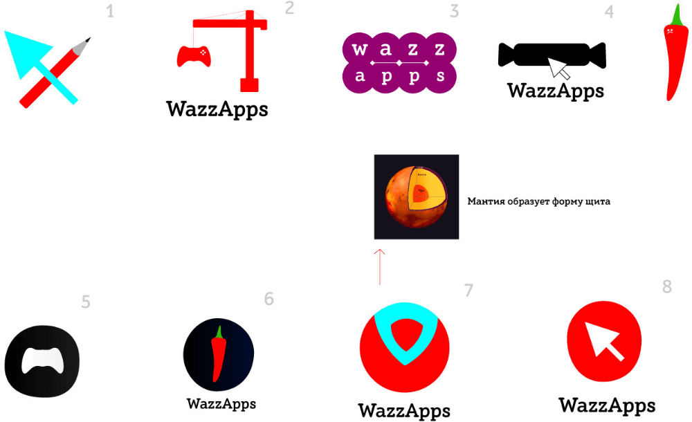
Art director: It’s just random pictures.
Second designer: And these too?
Art director: Yep.
Third designer:
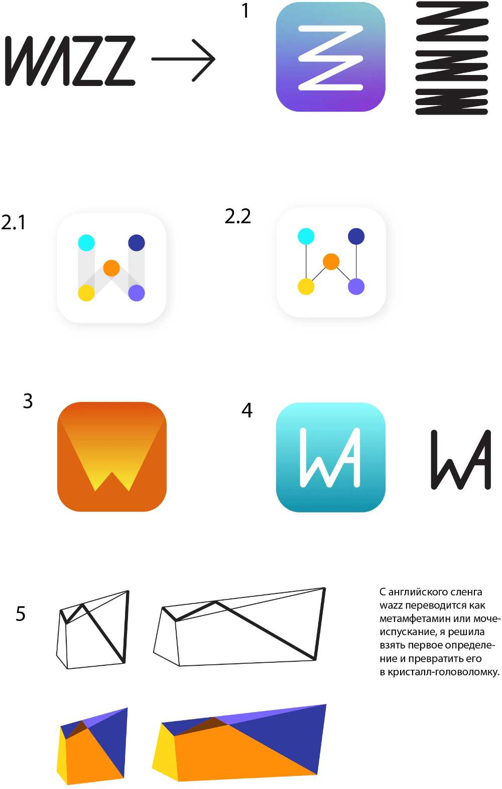
Art director: 2.1 isn’t bad. But to use meth as an argument for a design is quite weird.
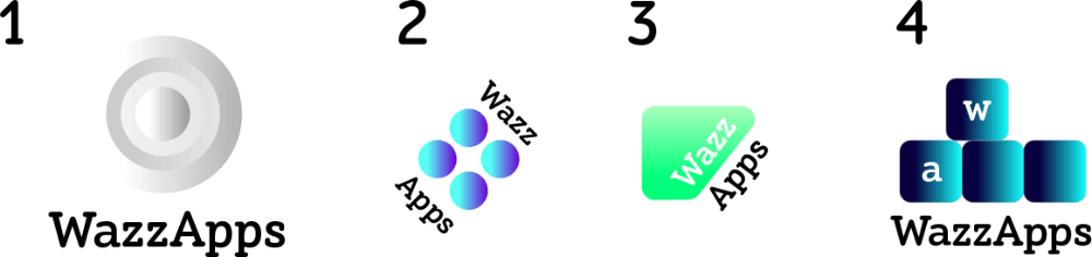
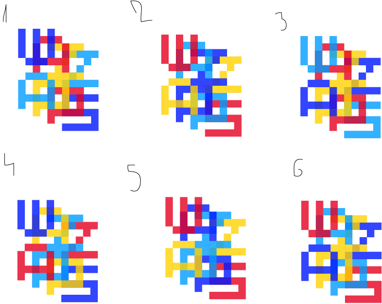
Fourth designer:
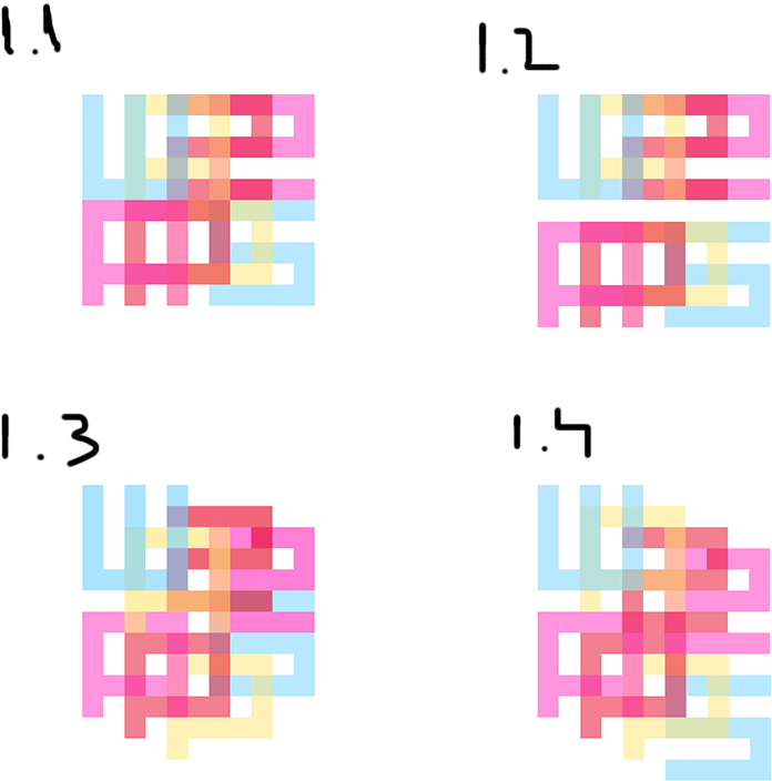
Art director: 1.4 is OK. You need to cut off a pixel from left and right at the bottom of the W. And use less gentle colors.
Second designer: Counterform with a joystick/gamepad.
Art director: No.
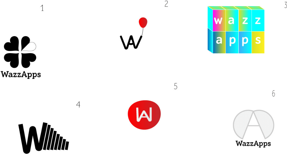
Fourth designer:
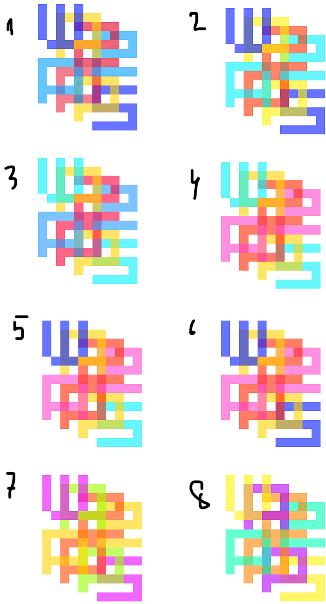
Art director: 1 is OK. Let’s remove two top side pixels from the A.
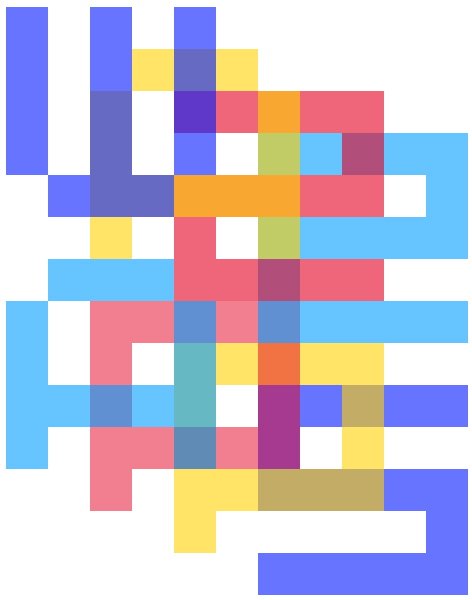
Art director: Now make the Z with a one-pixel diagonal line.
Art director: The cross in the center shouldn’t be red. Also, use bolder colors.
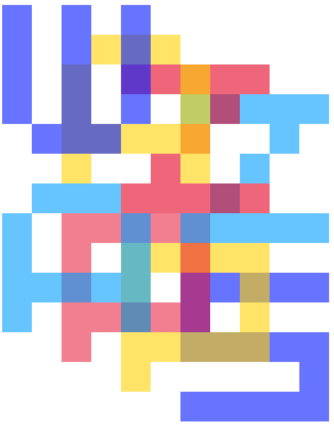
Art director: 1 isn’t bad. I want similar colors not to touch, which means you need to redistribute or change them. Also highlight the first A by making it more contrasting against the W under it.
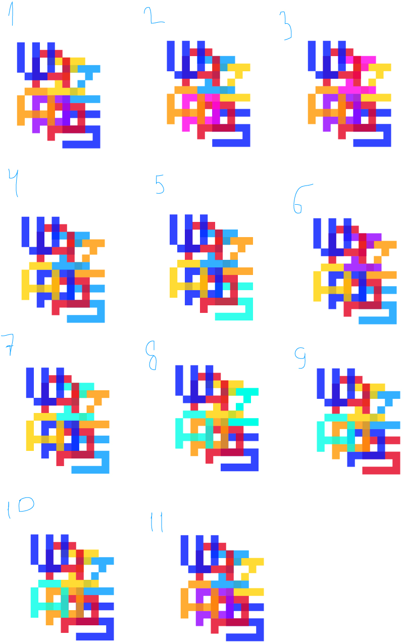
Art director: 11.
