The making of the Bolshoi Theater logo
Overview Process
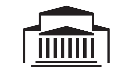
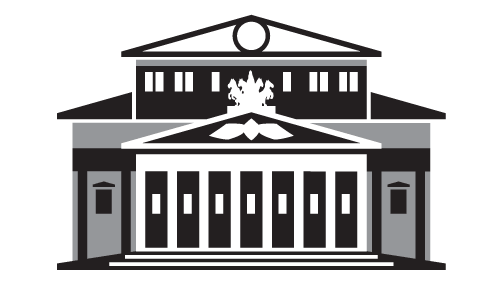
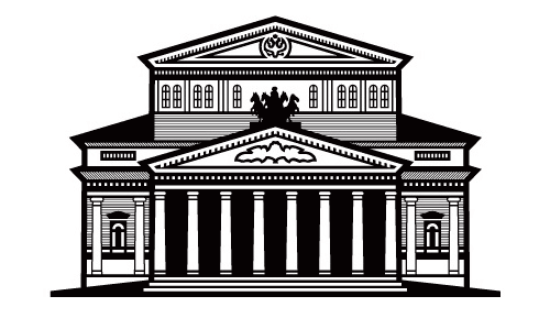
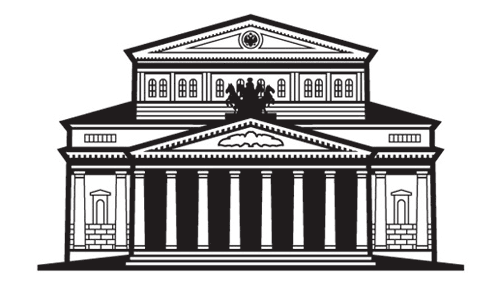
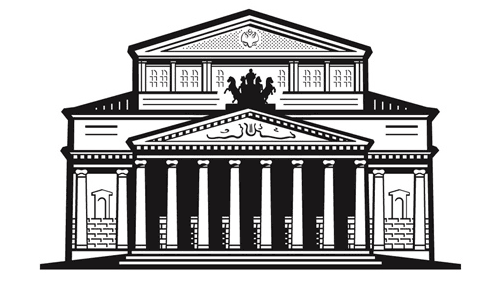
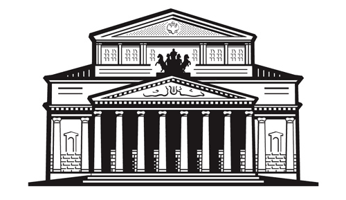
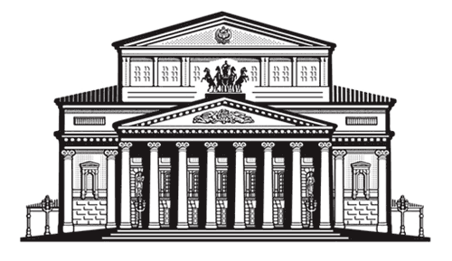
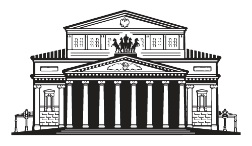
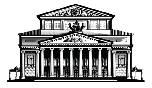
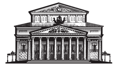
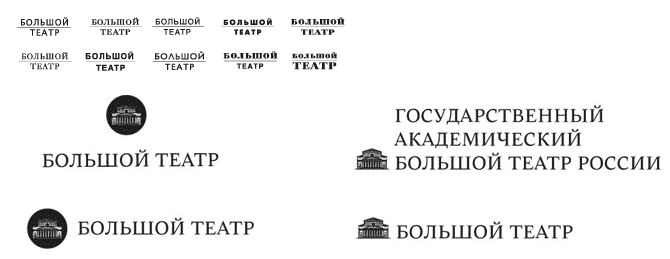
The Bolshoi Theater logo circa 1991 (left) was designed by Valery Akopov and updated by Yuri Grymov (right) twelve years later. The former one was good all around, while the latter was subjected to bitter, thorough, and well-deserved criticism by the design community. It was claimed that a free photo-bank ornament was used around the logo.

We undertook this project fully realizing the responsibility.
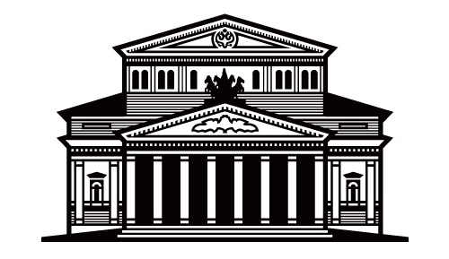
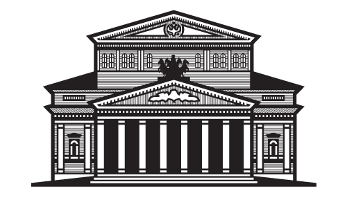
Our first probing sketches. The need for the building was clear even at this early stage.
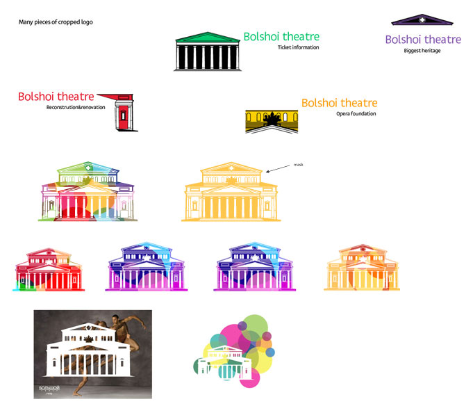

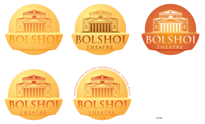
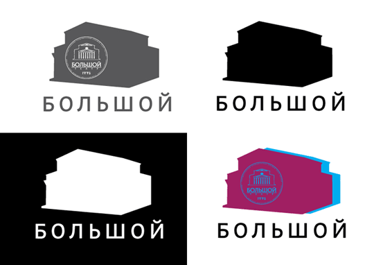
Image as a muse. Bolshoi makes you think of music, dance, sophisticated details, whirling, and soaring. We should try to convey the message through a set of wonderful ligatures.

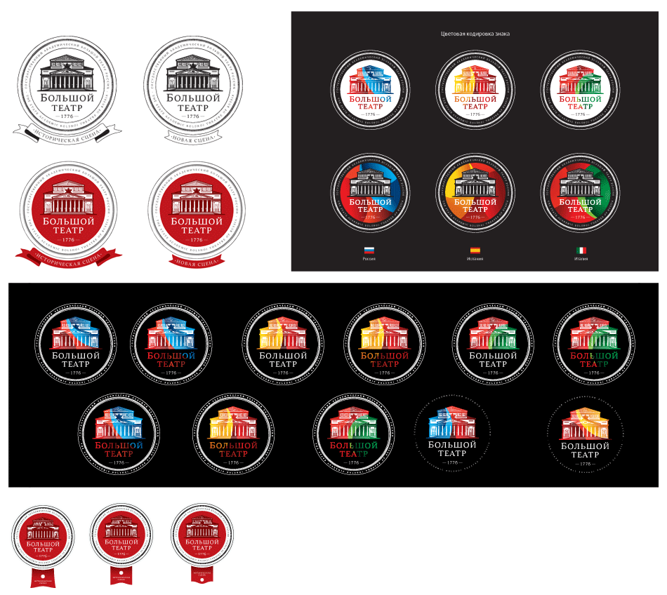
Since theater productions mean very active use of light and color, we’re also trying to paint the logo.
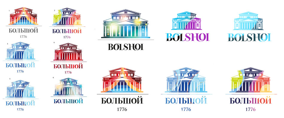
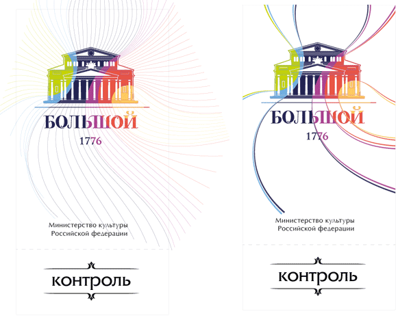
First presentation:
The main concept is approved by the Theater administration. Moving on to the next phase.
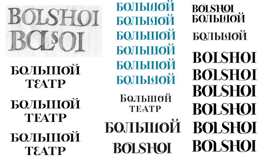
Working on those ligatures. The Latin alphabet collaborates smoothly thanks to its roundish and open letters. The Cyrillic set of characters proves to be a problem, refusing to flow gracefully and sticking out awkwardly from the line of vertical strokes instead. The ligatures do not look natural.
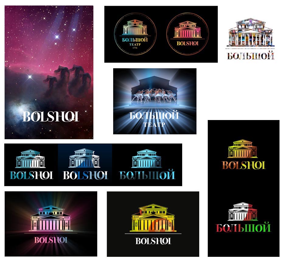
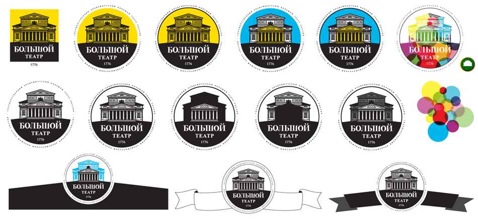
Meanwhile, we tried sending our logo spinning around a circle. The Theater owns a registered trade mark and a round logo shape was one of the main requests from the customer.
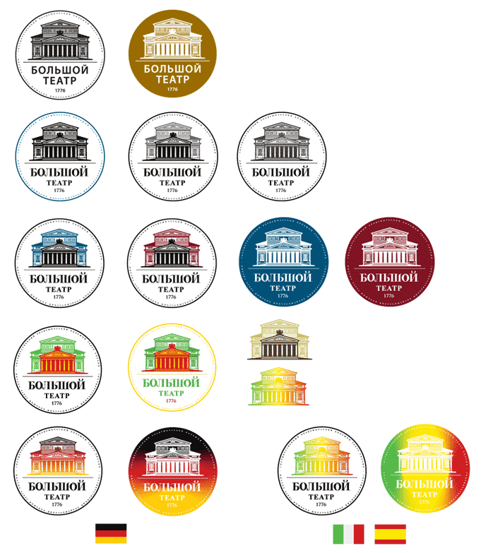
Should we ground the theater more?
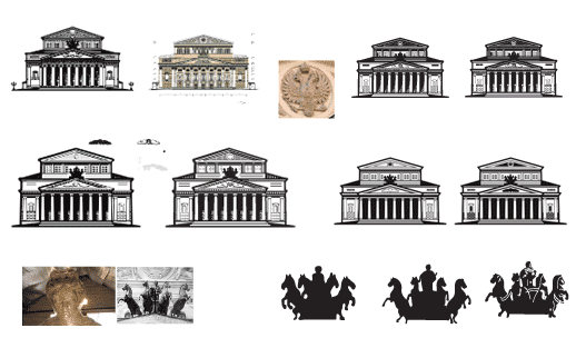
Pediments and quadrigas:
Not satisfied with the layout so far, we keep on improving it. We try moving the script around and adding decorative elements around the building.
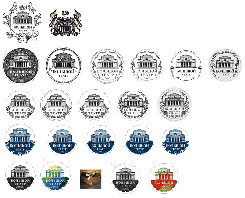
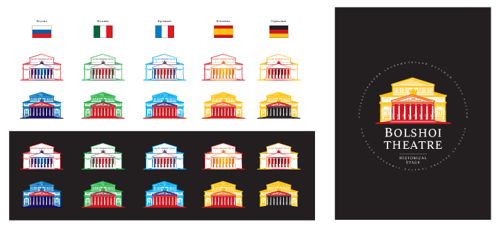
Where to put the date Bolshoi was founded? Painting the facade different colors.
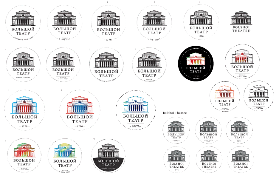
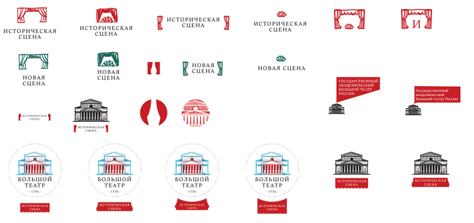
The logo could come with the stage name—how to marry the two?
Continuing our search for the perfect script. Changing the handwriting.
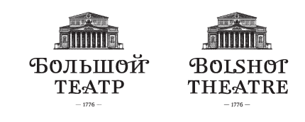
No, Bolshoi deserves something more grand.
The curved text appears very weak. Reinforcing it with a line.
The result feels very American. Thinking it through.
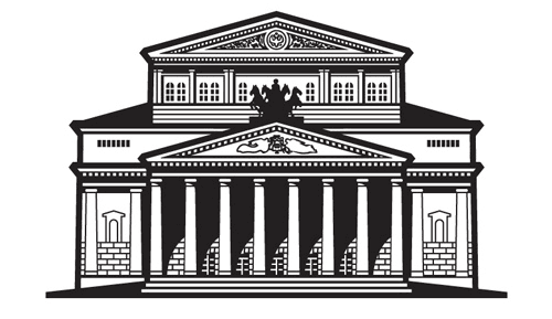
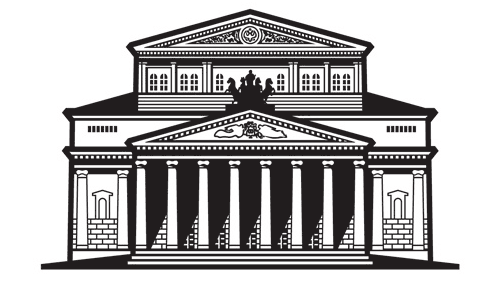
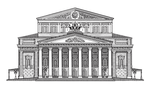
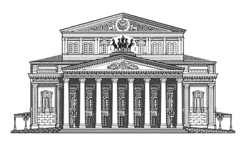
Remember the facade? It has to be drawn sunlit and with realistic shadows, just like we see it looking at the real thing.
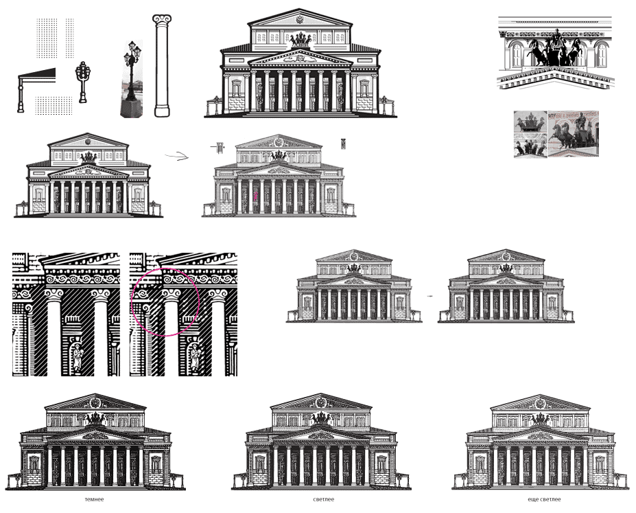
Facade in progress:

Good idea: let’s make a version with Muses. The illustrator goes on a field trip to study the tympanum, where Muses can be founded holding lyre and laurel wreath. Most likely the Ladies are Thalia (the Muse of Comedy) and Melpomene (the Muse of Tragedy).
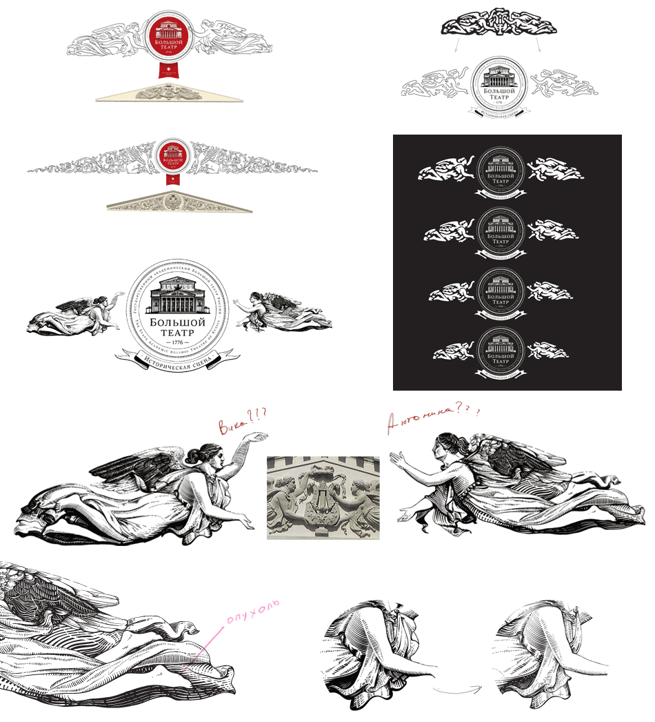
Muses’ evolution:

Putting together a logo version for small applications.
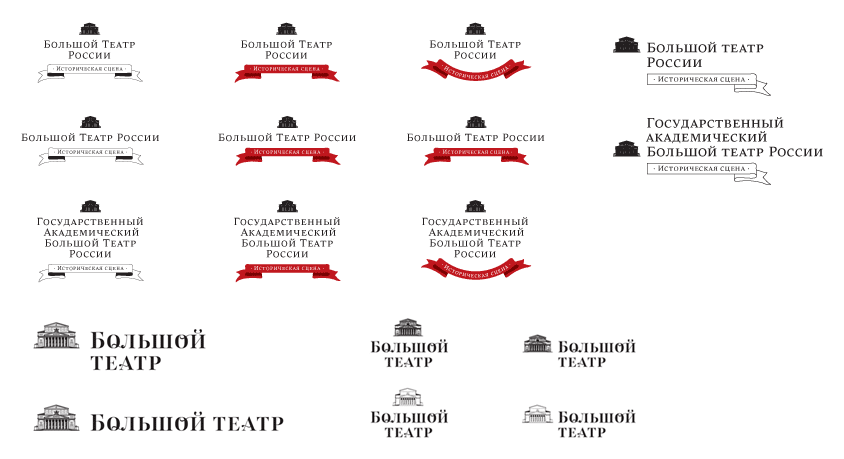
Painting continues.
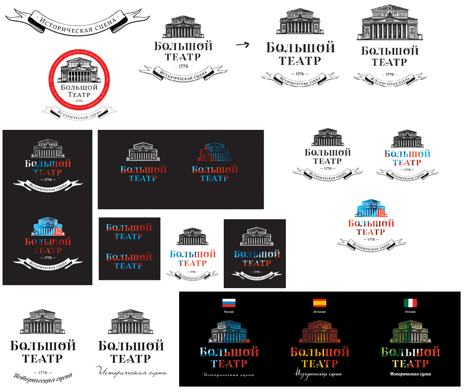
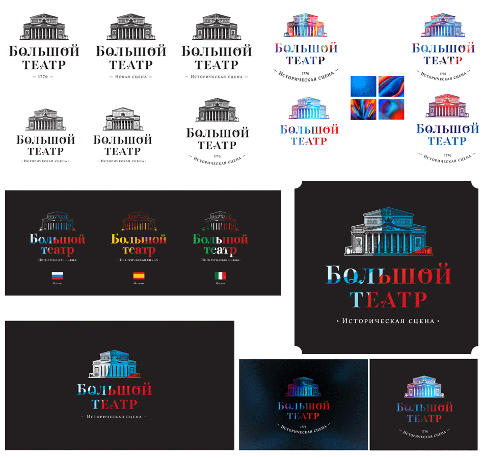
Forgetting the ligatures and creating the text line from scratch.
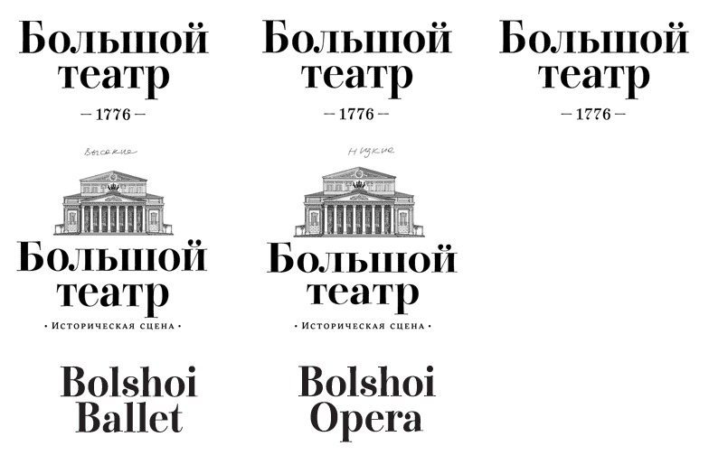
Finish up the logo in a nice circular package.
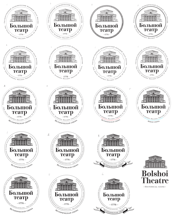
Nice line:
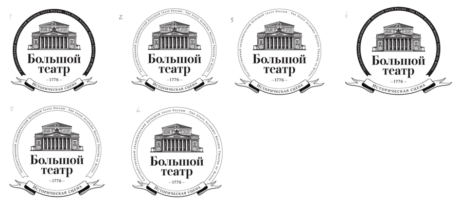
Smoothing out the wreath.
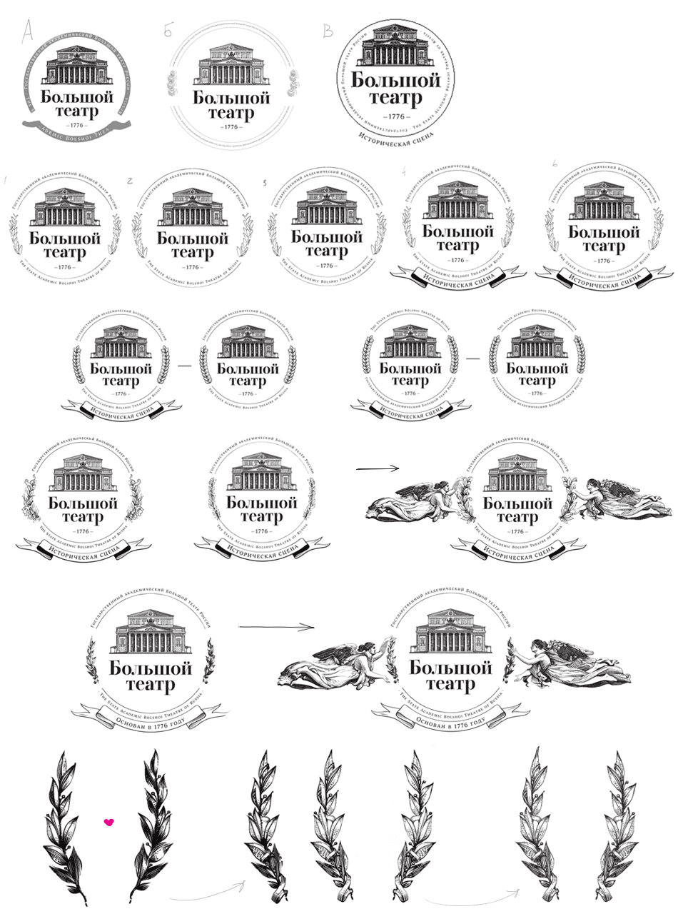
Putting the whole thing together.
