
Making of panoramic images for Federation Tower website. Part Three
Part One Part Two Part Three Part Four
|
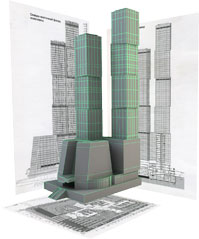
The panorama from the previous parts is to serve as background for the new group of skyscrapers. There actually is a 3D model of the complex—the one used in the video. 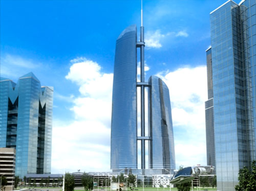 |
|
It doesn’t produce too much of an impression—just another ordinary soviet-like video. Visualization could have been done a lot better, so we will have to fix things a little bit. And afterwards we’ll do some thorough retouching. The perspective doesn’t seem too bad. Lets get to work.
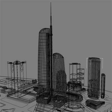
We open one of the scenes:
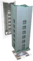
The plan is to emphasize the height of Federation Tower by making its model almost twice bigger. Doing this appears to be quite troublesome as the model has numerous surfaces and objects, 3D-Max involves loads of resources—it all gets incredibly slowed down. Moreover, we need to see at least some prototype of the scene (shapes of buildings, lighting and things like that), but now it’s a mess of polygons.
|
|
|
|
What kind of modeling is that, anyway? |
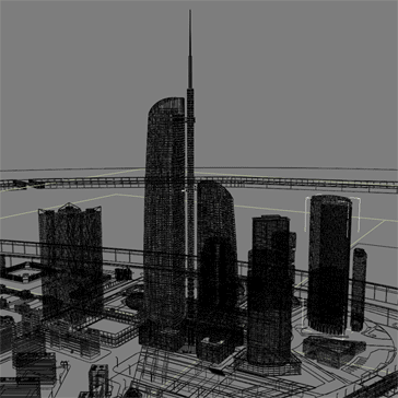
We ease up the scaffolding on the skyscrapers so that the lag is not that bad when we move around the scene. Then, we set up a camera and bring in the panorama. |
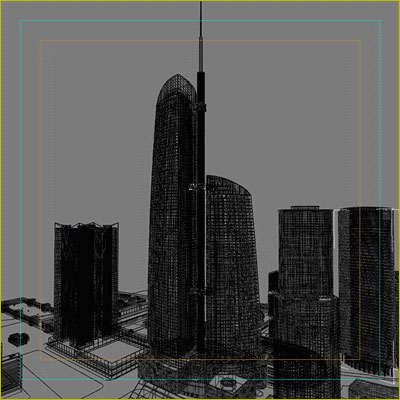
We go on to employ the full-weight models trying to visualize this eyesore.
That’s what we get :-(
It takes about an hour to visualize each image of 2000×2000 pixels. That’s a total of 10 hours to finish all of them. Imagine what happens if we add on some cars and trees. This is way too much for 10 images and we still have to correct the little things before the retouching. I guess visualization for the video was done by means of a render farm. We didn’t have it at the Studio at the moment—it was just on its way to us.
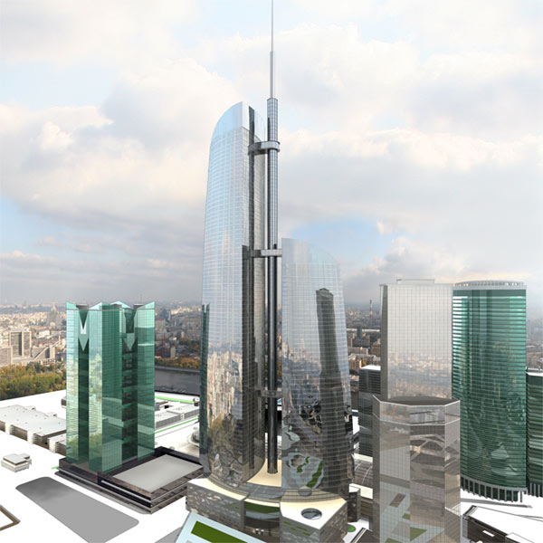
Conceivably, one such image could be doctored of course, but that would engulf a lot of time and we still had 10 of them to go. Besides, frankly speaking, there is not much to touch up really. It can hardly be called architecture. Say, the tower itself perhaps could do, but the rest of the buildings look more like glass barns, which fails the whole scene. And the tower itself, being doubled in size, mangles still the already lame composition and proportions. Putting make-up on a dead man won’t bring him to life.
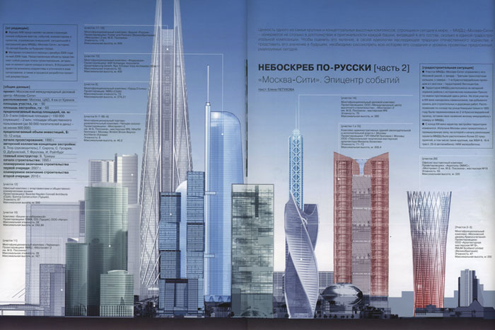
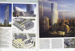
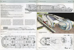
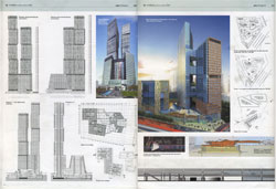
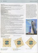
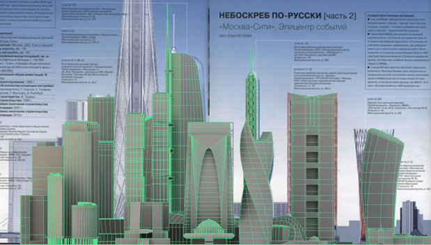
Starting over lets find out how this group of skyscrapers is supposed to look. Luckily, Ilya Mikhailov happens to have the issue of ARCH magazine containing the announcing article about Moscow City International Business Center with total cost of 10-12 million dollars.
Suppose event this amount will be insufficient to build the center, then you may gather why they cut expenses on visualization.
The two-page spread reveals the lack of skyscrapers in the prepared scene. And even the models present are absolutely inaccurate.
Anyhow, it becomes clear that we don’t have any decent material to work with. All the 3D modelers are busy with other projects, so I’m bound to start from scratch on my own. I’m running out of time and I want to stay alive, too. Well, the magazine sure is not the best guidance, but I’ve no other choice.
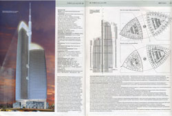
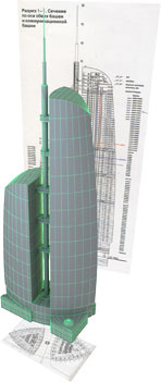
Having scanned the magazine, we start modeling the skyscrapers—there we have charts, sectional and perspective views and the coffee grounds.
|
|
|
|
|
|
|
|
|
|
|
|
|
|
|
|
|
|
|
|
|
|
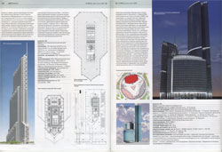
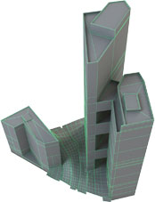
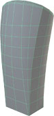
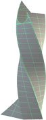
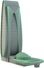
This skyscraper was not in the magazine. We came across the image by chance. |
It’s modeled by sight. Looks like it, but what it looks like from the other side (the one we need) remains a mystery. |
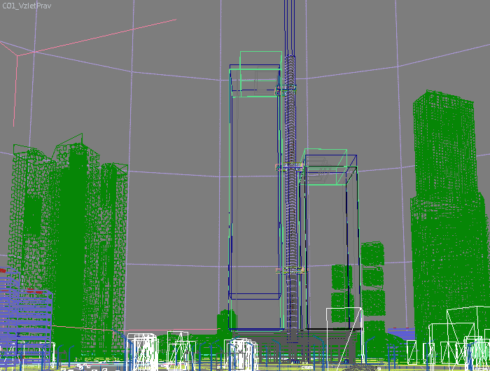
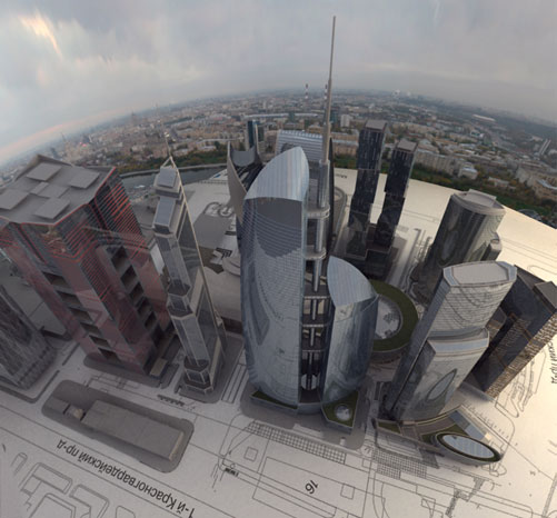
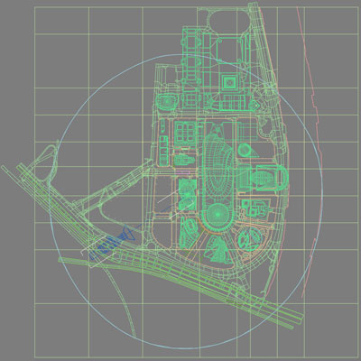
We place everything on the map:
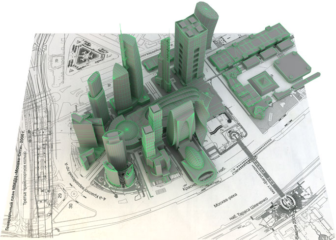
And check the heights against the magazine page spread. Apparently, it is not the best way to achieve accuracy, but well, buildings are never constructed according to 3D models.
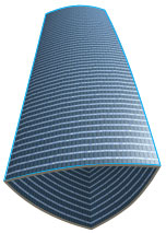
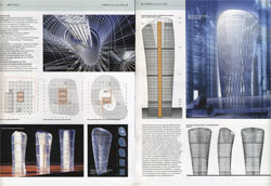
Now we need to spread the two-dimensional charts onto the surfaces. We do the unfolding:
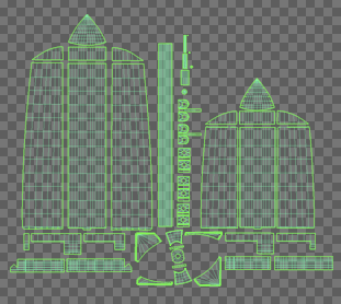
And begin drawing the charts.
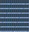
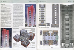
Lets study carefully a photograph taken at the construction site:
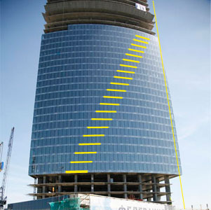
Pay heed to the pattern between the storeys and the cut of glass along the side of the tower. You can barely notice that the three glazed windows are transparent... But it’s time to recall an old architects saying: “Maps are to walk on, sections to live in and fronts to look at.” This justifies our being reluctant to add walls and furniture onto the front models.
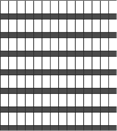
We copy down a piece of construction and have the whole surface covered with such.
|
+ |
|
+ |
|
> |
|
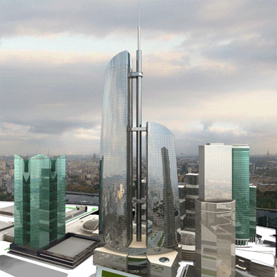
Looks good so far.
We repeat this procedure for the rest of the models.
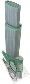
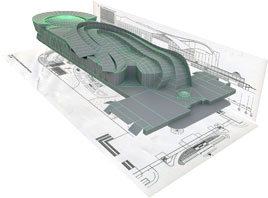
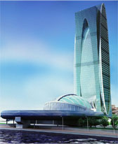
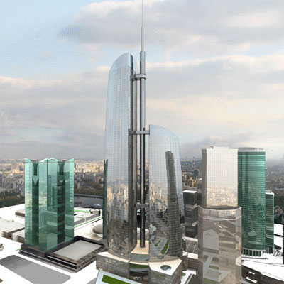
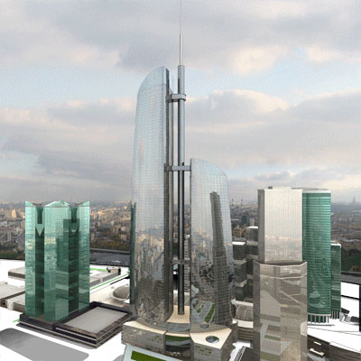
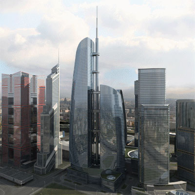
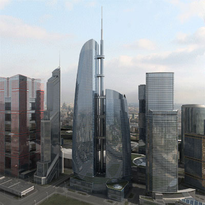
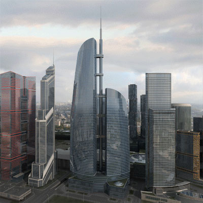
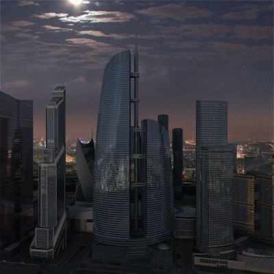
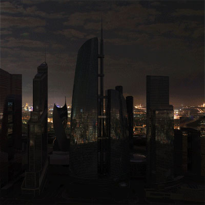
And now we add all the necessary details and adjust the lighting:
What we have as a result is a scene of 7.5 MB needless of any proxy objects.
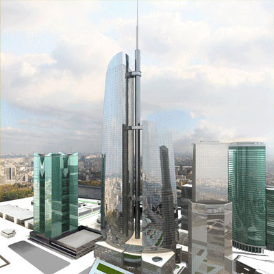
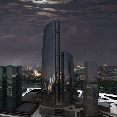
Lets compare the two.
|
First:
|
Second: 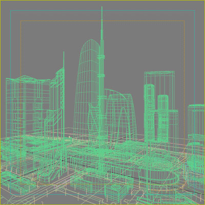
|
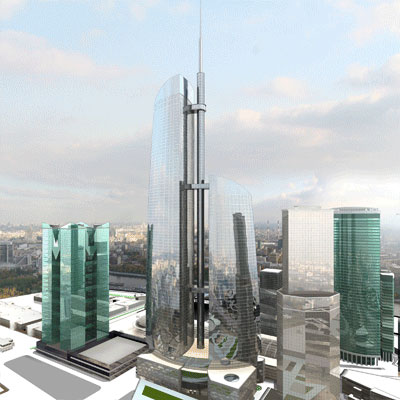
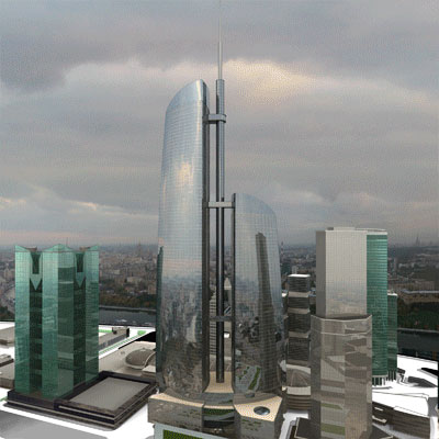
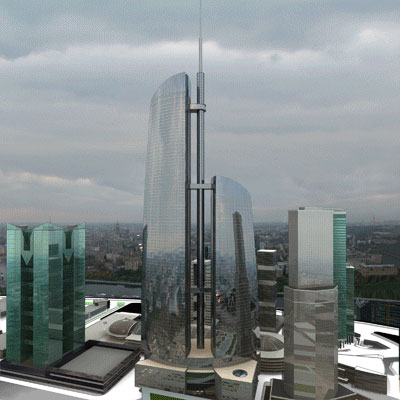
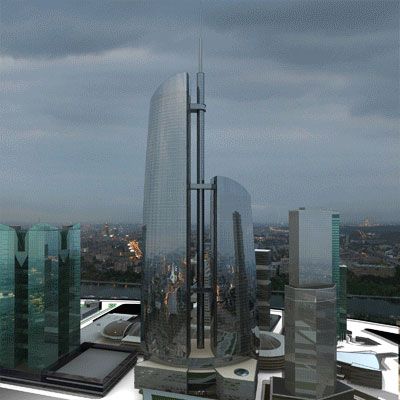
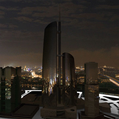
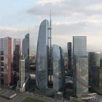
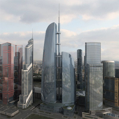
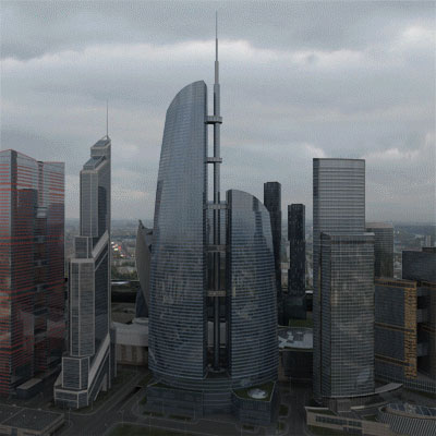
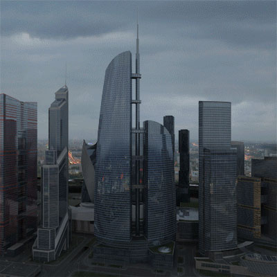
Spare me the job, if you don’t see the difference.
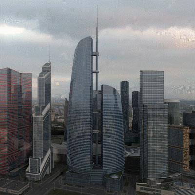
We managed to accomplish this task without a render-farm. It takes only 10-15 min to visualize each image I made (2000×2000 pixels). Next come the elements that change as we travel in time (one image for each 10-year shift). That’s the subject I’ll bring on.
In conclusion, a few words addressed to 3D amateurs.
A piece of advice for dummies
Get the kitchen stuff.
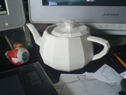
|
Utah teapot A virtual model of this teapot was first created in 1975 at some American university. It paved the way for free shape modelling. The original physical teapot now resides at the Computer History Museum in California. Download pattern (pdf)Download pattern (eps) |
Here is the way to exercise. First, you select the material’cardboard color and texture. Then, you copy the pattern down, cut it out and glue it together. You don’t visualize the ready model—it is real, you can move it in reality, put it in real-life lighting and really show to your real friends. See? It’s real good stuff! :-)

Order a design...