The making of the Museum of Soviet Arcade Machines website. Part 1
Overview Process
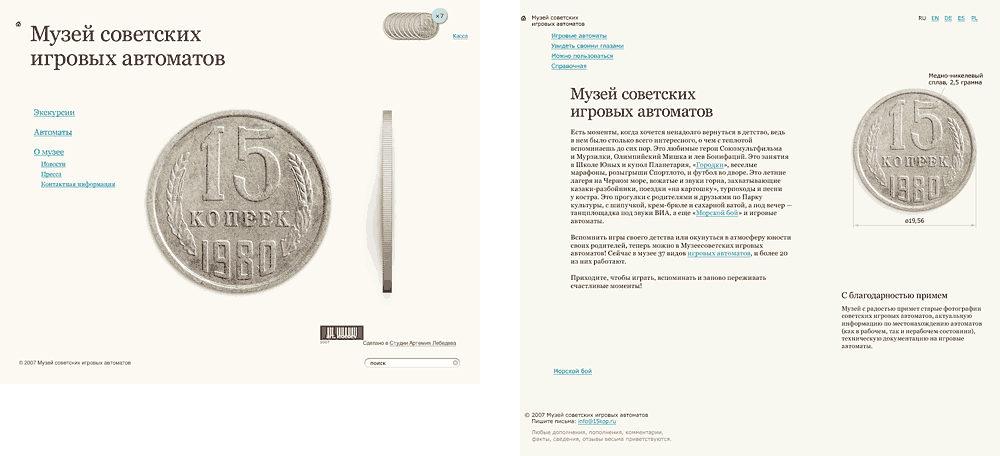
Early drafts featured a coin.
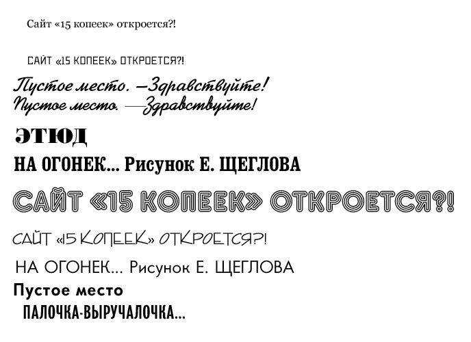
We went through a pile of old Crocodile magazines to find the right typefaces for the project.
Preparing the list of machines and a new piece announcement.
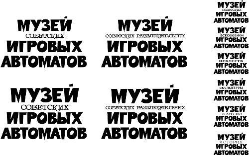
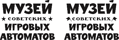
Designing the museum logo.
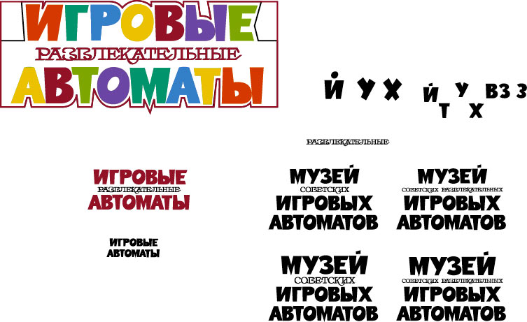
The first series of drafts—it felt right, but the small type lacked readability. We had to find the best design for the second word.
Finishing touches: stars and flags.
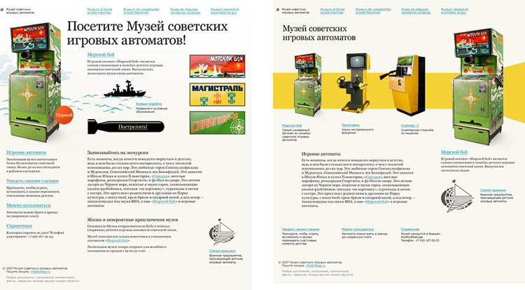
Creating the front page, we tried using photographs and banners as posters announcing the latest item.

At this point it started looking good.
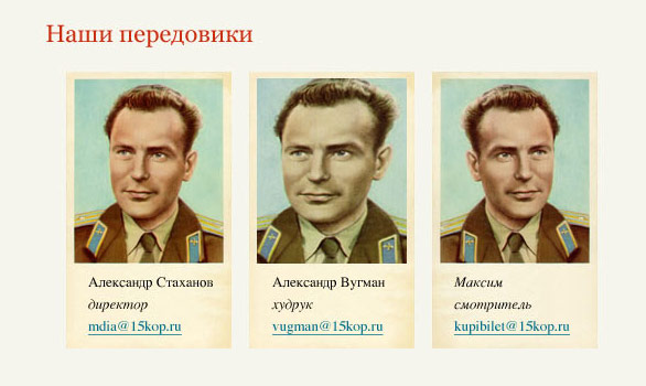
And that would be a draft for the hall of fame.
To make the website, we did several shootings outside the Studio and many more inside.
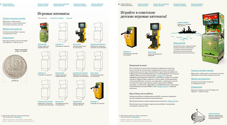
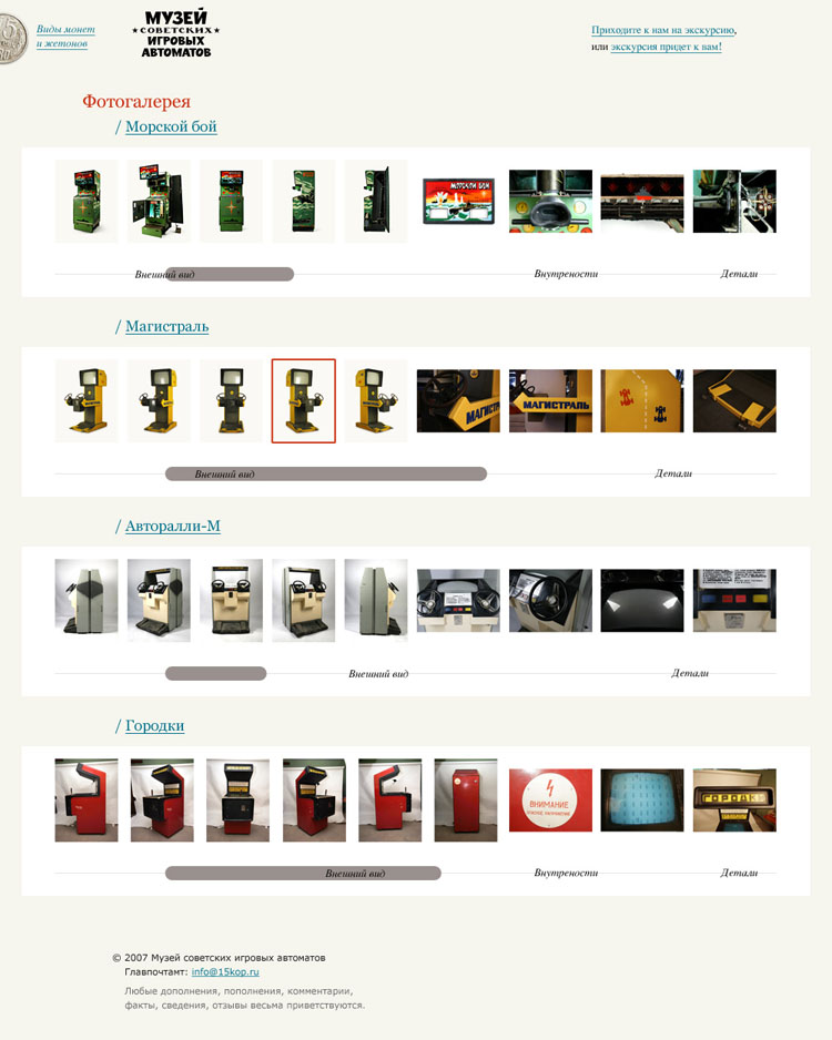
Putting together the gallery.
Draft design for the launch page.

Two versions of the site icon—one of them was more true-to-life, while the other had better legibility. Legibility proved more important.

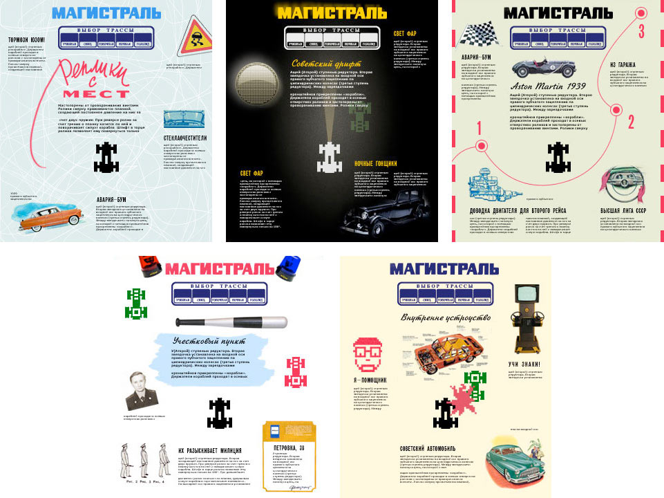
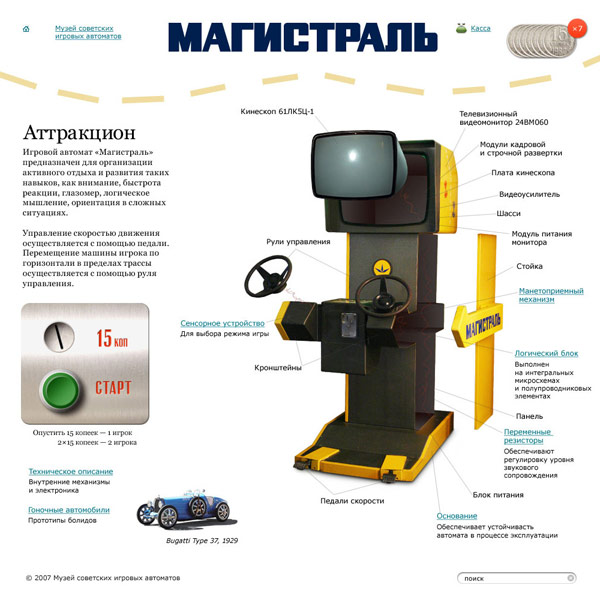
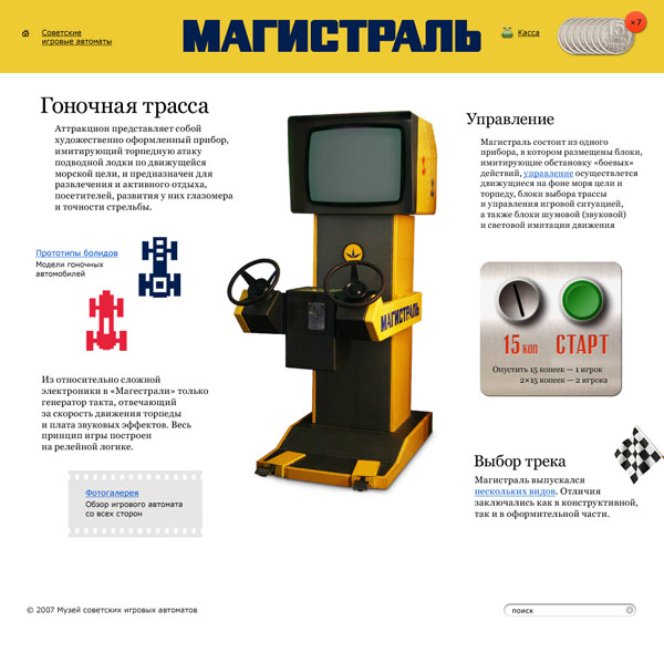
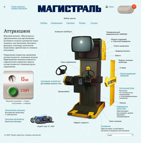
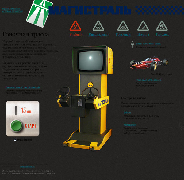
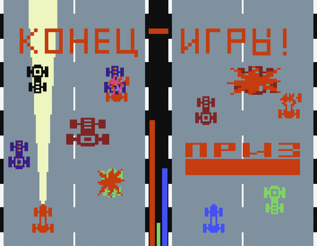
Highway
Drafts for the site. Five pages, one per each of the game modes.
Creating pages in real size. Practice Race.
Speed Race.
Icy Road.
Night Race.
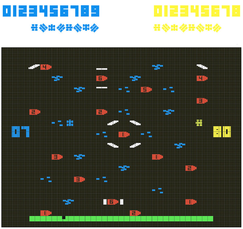
Some game components.
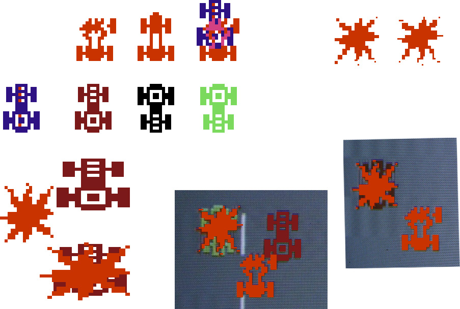
The game.
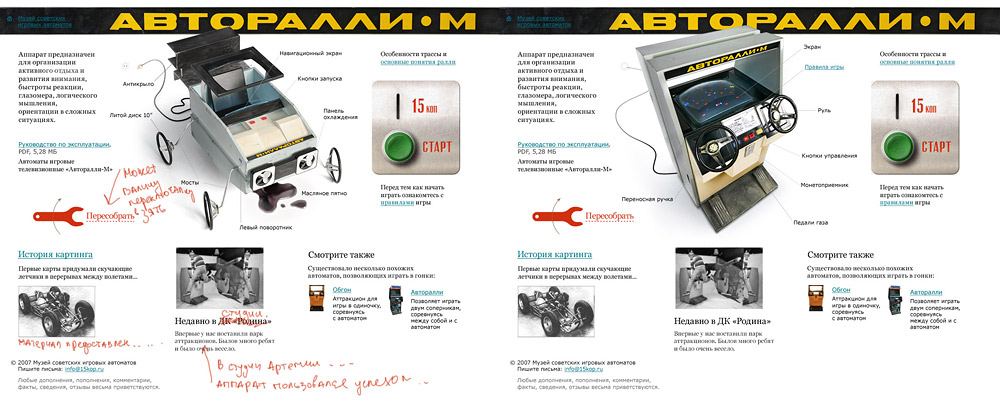
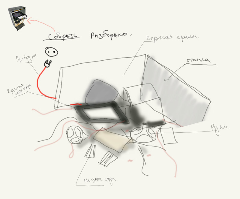
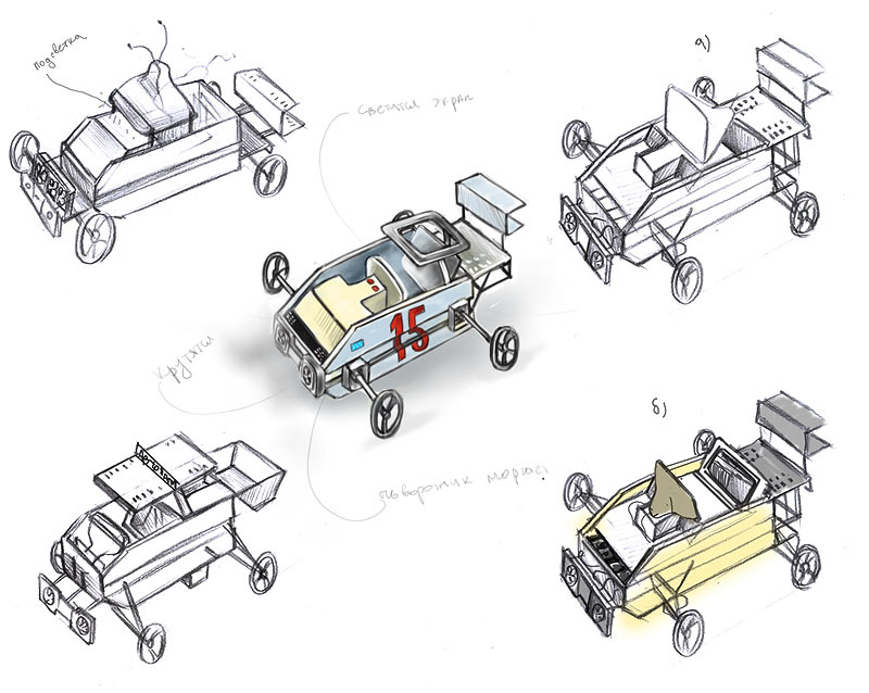
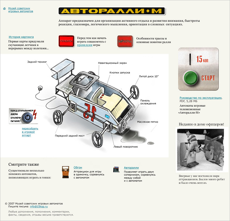
Autorally-M
Brainstorming for the main illustration.
Sketches of the machine being transformed into a cart.
Taking the first critical look at the front page.
Modelling and applying textures to the transformer.
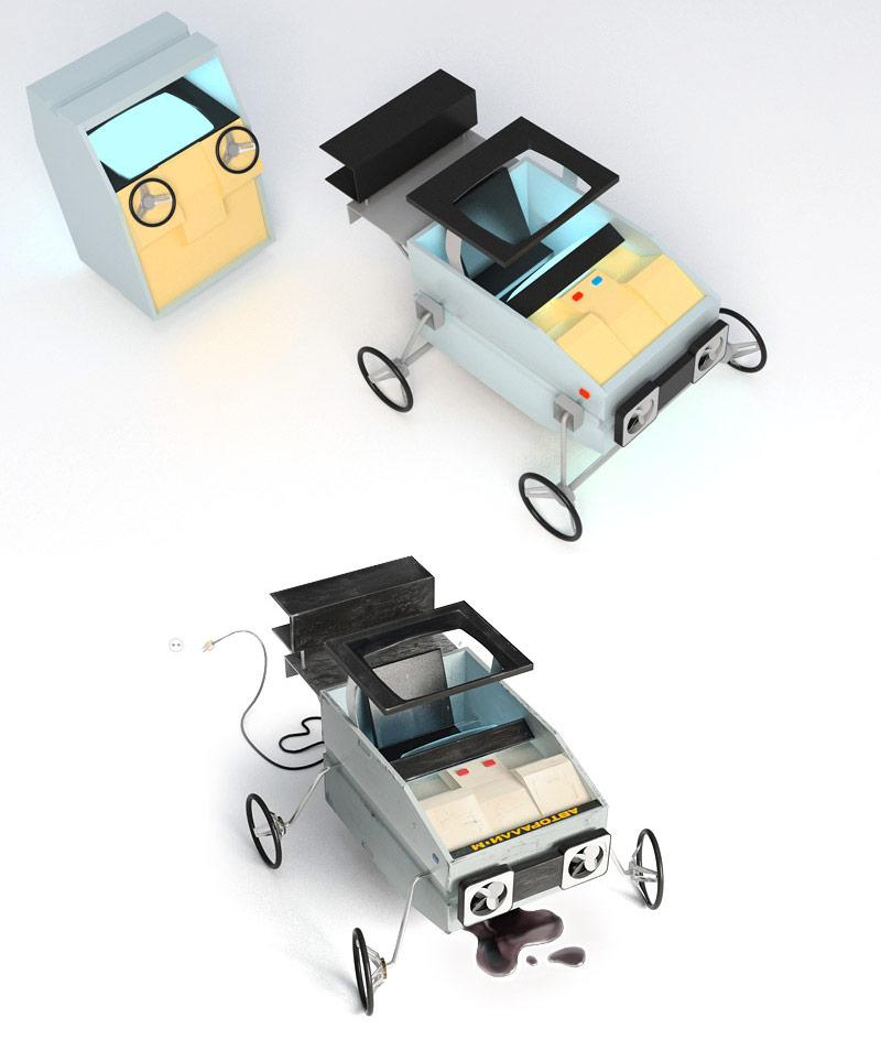
Creating the details.
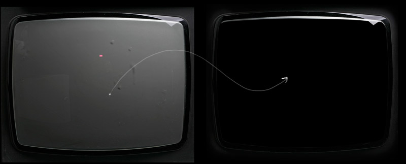
Preparing the screen, a shot of an old TV.
Bringing the components together, an early stage.
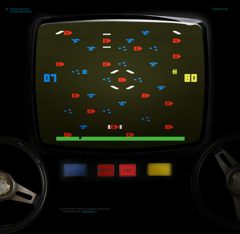
Examining the layout of the front page featuring the transforming machine, not final yet.