1.0 Corporate identity Internetbank Website for residents Website for non-residents
AB.LV corporate identity
 |
|
|
Release date: March 05 2002 Cast: art director & designer
designers
Alexey Pelevin
Oleg Paschenko Ilya Mikhaylov Roma Voronezhsky manager
Denis Shokhin
|
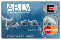
BrandWe started working on a website for Aizkraukles Banka Latvija in summer 2001. And in the beginning of March 2002 we completed our first Latvian graphic design project. Constructing the website we offered some ideas for overall corporate design concept. They were well accepted by the bank’s management who aimed to develop new services and attract more clients. The first step was modifying the brand. The new name—the abbreviation AB.LV—also became the bank’s web address. New identity centers on personality and cheerfulness. A choice of colors and backgrounds allow everyone choose the bank to his or her own liking. AB.LV is Latvia’s most promising and dynamically growing bank. |
 AB.LV corporate identity concept had some significant influence over Latvian design industry |
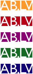
Corporate colorsAB.LV package includes six main colors with an addition of black. White is the basic one—it is used to graphically arrange spaces. Five vibrant colors are present in all advertising materials. Black is used for text and in case no other color can be applied (fax letterheads, check books, etc.). These specialty colors can be employed in document design, i.e. on letterheads, envelopes, business cards, folders. Any of the five may be chosen for two-color printing (besides black). All ads are to feature the white logo on a black or solid colored background or a colored plate. We also worked out guidelines for selecting and using corporate colors. The choice of colors and graphics depends on the purpose. The bank’s corporate design allows for frequent use of background images:   |
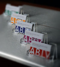 Each employee can select a color for his or her business cards |
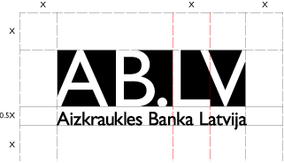
GridAB.LV advertising materials and documents are to be based on a twelve-column grid. It allows various configurations with one-, two-, or three-column layout used most often. Main sizes are calculated on the basis of the logo’s L width. Different formats are to feature different logo variations. Scale transformations are restricted.   Conventionally, paper and web documents follow different layouts. AB.LV’s online pages are created along the same lines as printed materials which makes the company more universally recognizable. |
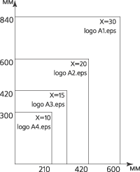 Different format logo variations were carefully designed to retain visual legibility. Small signs meant for letterheads must never be put on a billboard, and neither conversely |
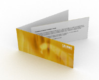
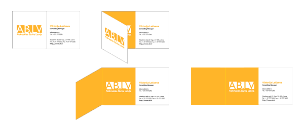 Business cardAB.LV business cards have original folding design. When folded, they are white with an addition of one of the five corporate colors. These produce a nice impression being both novel and traditionally utilitarian—it perfectly fits into a standard card holder. AB.LV staff are given an opportunity to have business cards colored according to their personal taste. GuidelinesAB.LV corporate identity package covers all possible application ways. Its components can be used on websites, ATMs, cards, letterheads, buildings, etc. We compiled a comprehensive guidebook providing detailed rules and recommendations regarding all sorts of media—from invitations to lightboxes.
Should AB.LV need to have a corporate minibus decorated, one of the guidelines will tell them how to. |
    Let different people have different, yet strongly recongizable cards |
|
We prepared two manuals. The first one is brief and outlines corporate design application standards, while the second contains full and precise information on all identity package elements enabling their re-creation. 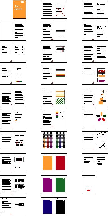
Brief guidebook
|
|

Order a design...