Agrotek is a meat processing holding with full production cycle including raising livestock, growing feed, obtaining and processing meat, producing sausages and frozen foods and providing them to the market. The company dominates the meat product market of the Kamchatka Krai and is planning to expand to the Far East and other regions of Russia. Thus, Agrotek required an updated modern logo.
Flying to Kamchatka for an introduction with the client, to see their production facilities and the existing corporate identity.
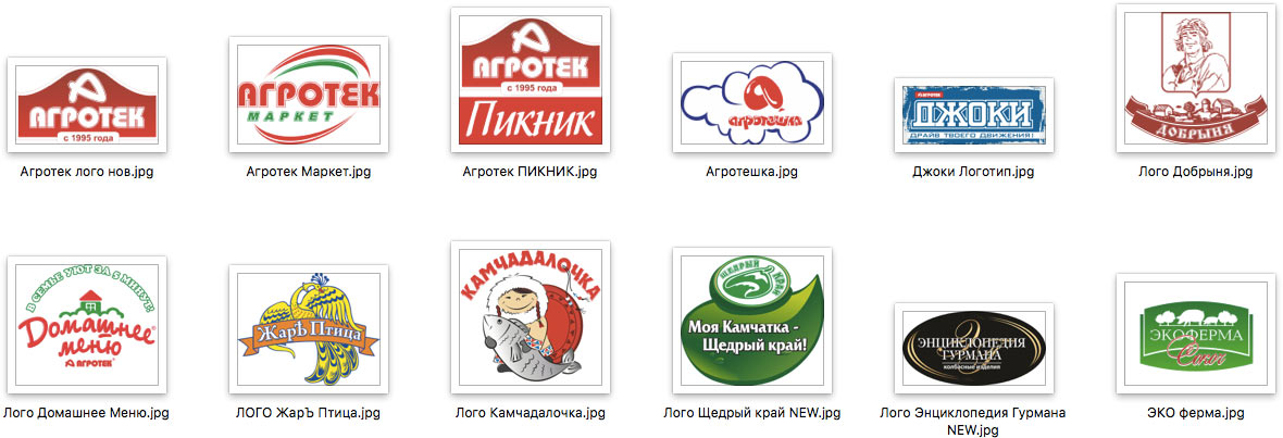
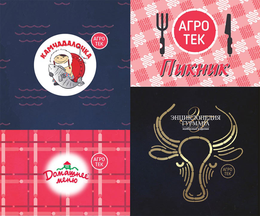
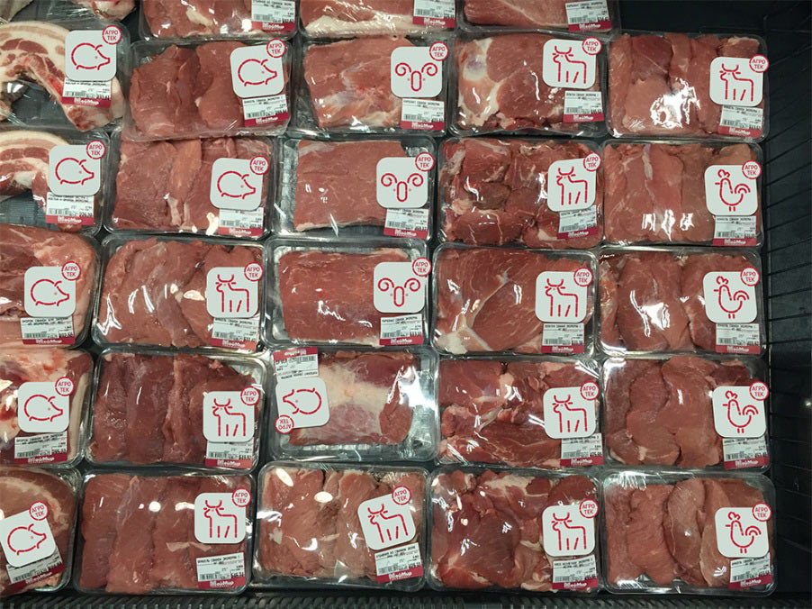
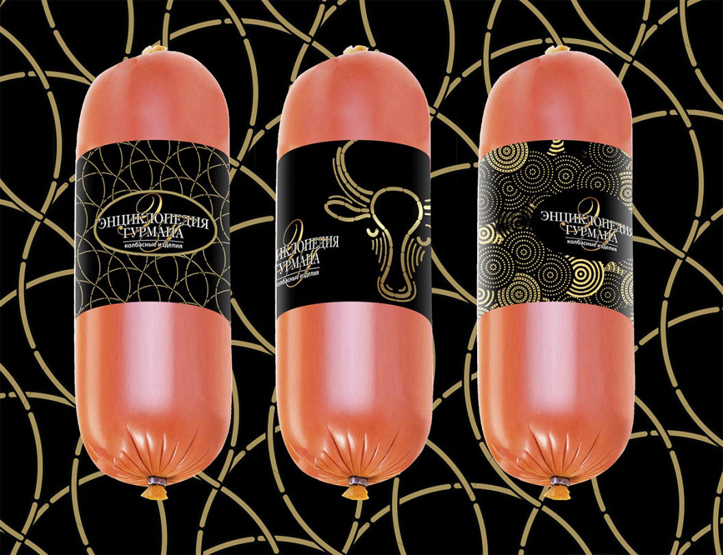
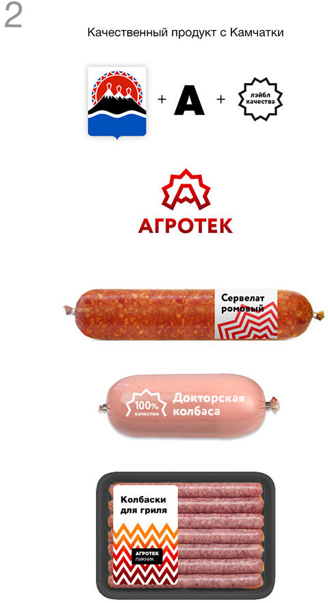
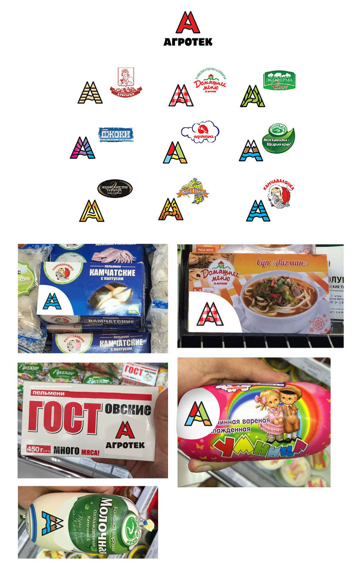
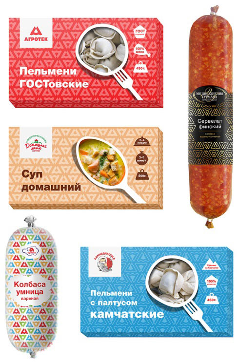
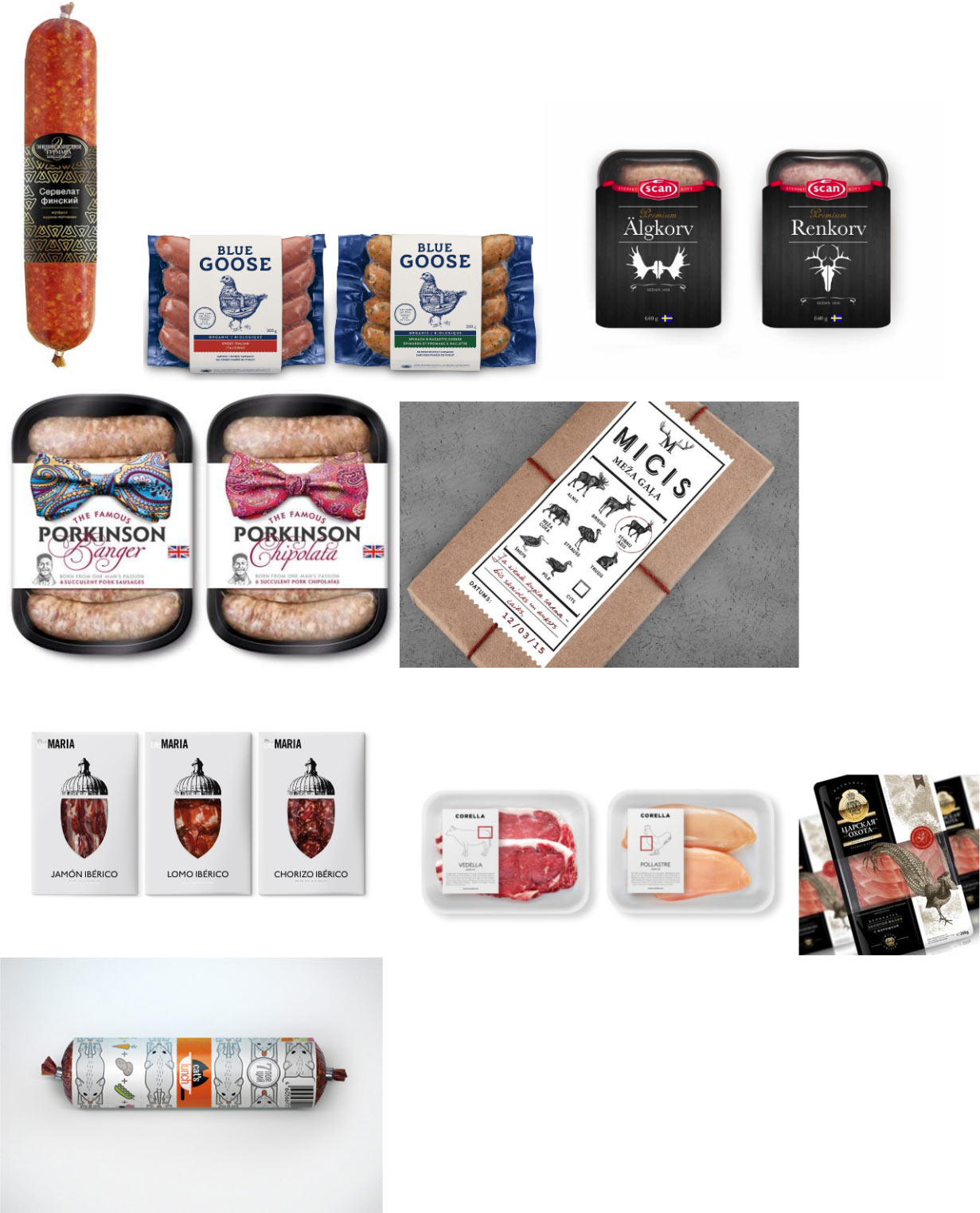
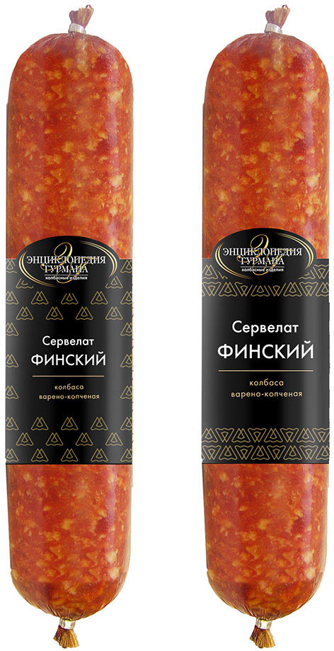
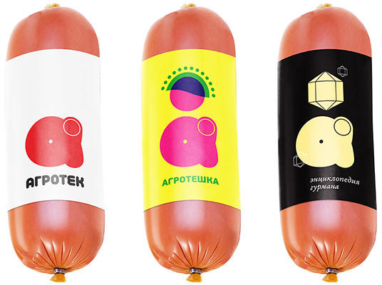
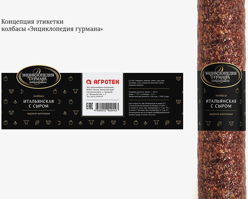
The company sells their products under Agrotek brand which includes subbrands oriented towards different market segments: Piknik, Agroteshka, Dzhokky, Dobrynia, Domashnee Menu, Zhar-Ptitsa, Kamchadalochka, Shchedriy Krai, Ekoferma and Entsiklopeida Gurmana. It is important to make sure the new logo looks good among all the subbrand logos.
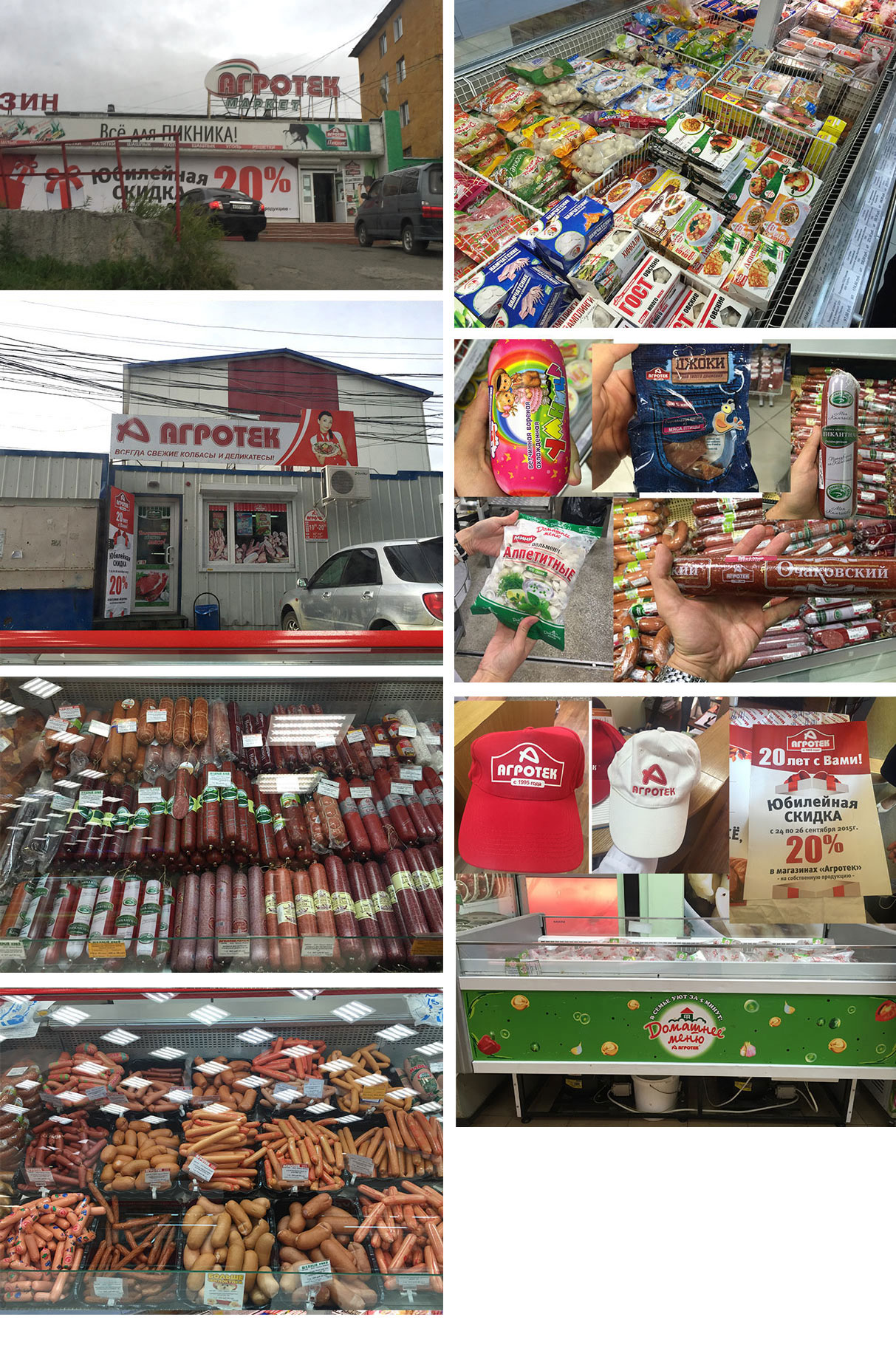
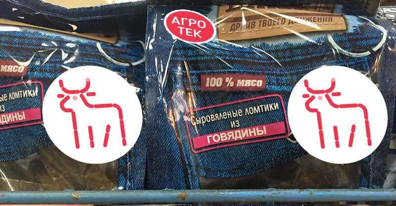
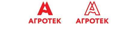
Assuring the company’s leading position on the market: the signature red color and the company’s logo can be found in almost every grocery store in the city.
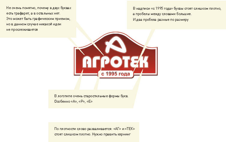
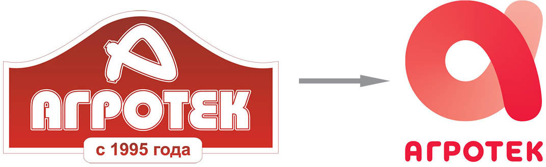
We start by going over everything that’s wrong with the old logo.
Inviting several designers to work simultaneously. Making the first approach.
Art director: Sure, but Agrotek isn’t only about sausages.
Designer: Well then.
Designer: I just saw Yukidim logo (one of Agrotek’s competitors). We’ll have to change ours.
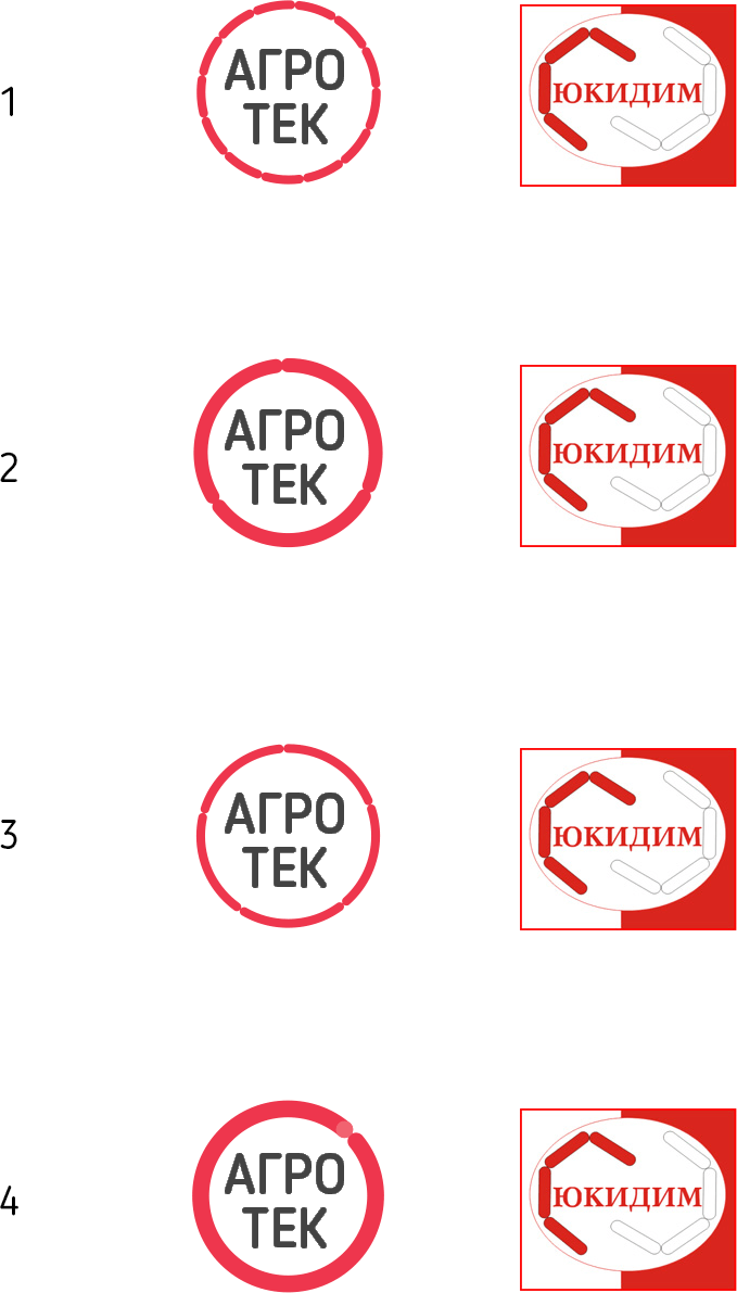
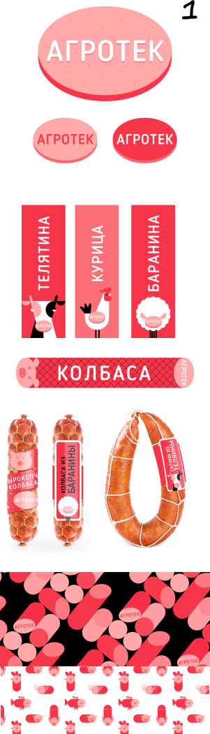
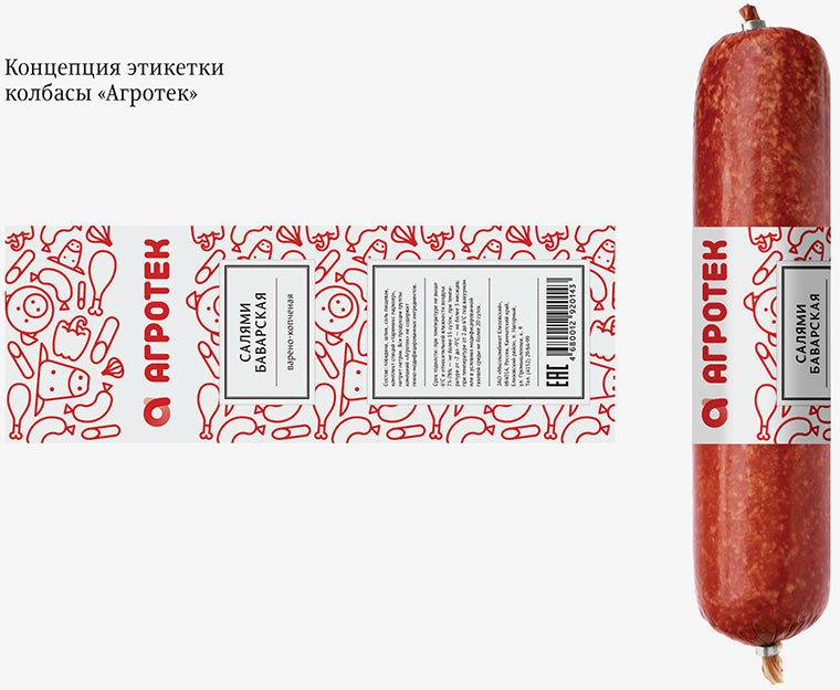
A single sausage and the patterns are exactly what we are looking for. Also, we moved away from small frankfurters towards larger sausage, which is good.
Another designer suggests his concept.
Art director: The first one can be promising, the second one is more about the industry, with all the gears. The third one would suit a confectionery company better.
Designer:
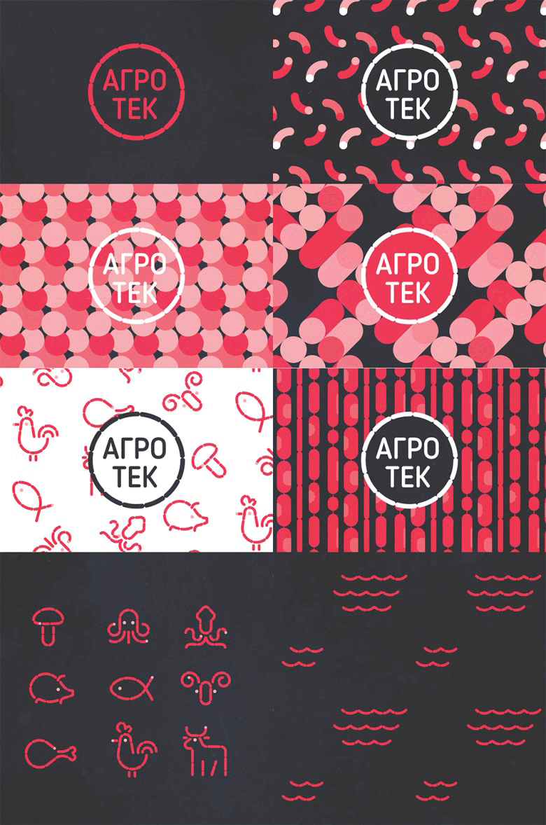
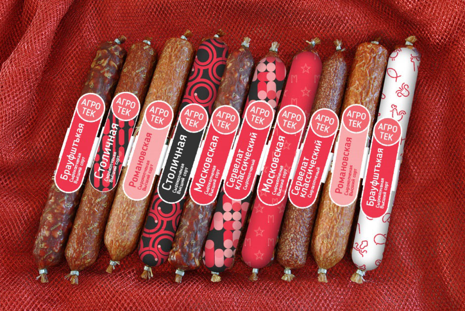
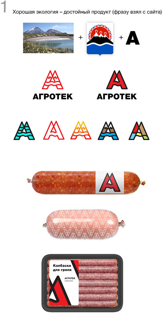
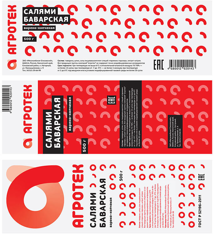
Designer: How about that: each subbrand is represented by its own letter A textured with a suitable pattern which is then printed on packages to bring them all together. Later we will make another redesign to drop subbrand logos entirely making the various letters A the only subbrand logos.
Art director: Are you sure about combining?
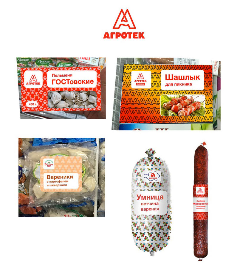
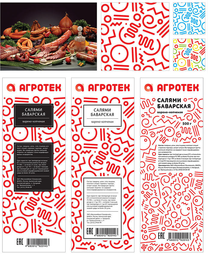
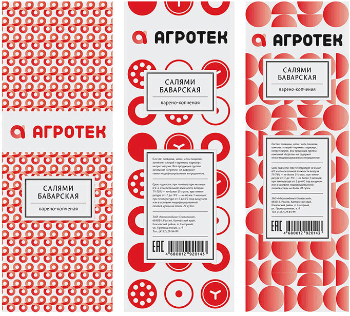
Designer: How about that: individual pattern for each subbrand based on the logo will tile the entire packaging. Text and pictures will be on top of it on white-colored bars.
Art director: What do you think looks more expensive?
Designer: Anything except for my design, I think. In this case, I offer this.
Another designer:
The art director likes it, the logo will be supported by typography on packaging.
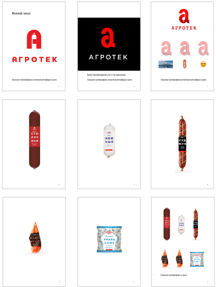
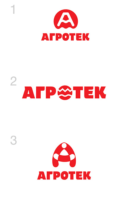
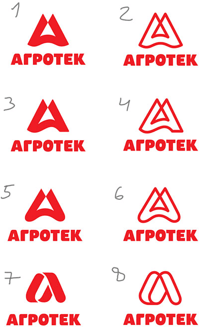
Developing the idea with the letter A and sausage.

Everybody likes the idea, but it doesn’t solve the task: the company’s range spans much further than just sausage.
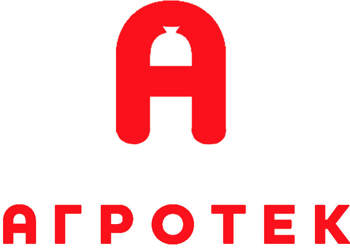
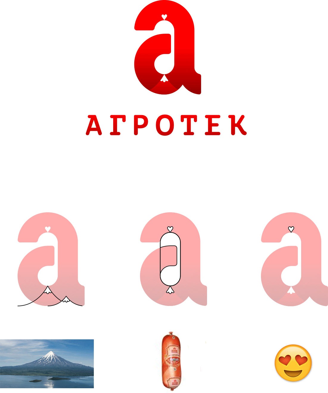
Inviting yet another designer. Cleaning up the old logo and replacing the grapheme A with α. Agrotek is Kamchatka’s primary sausage. Alpha sausage!
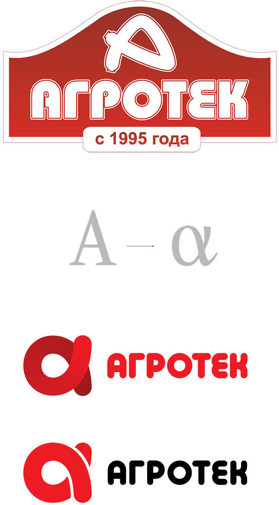
Nope, the alpha gets lost. Returning to the original shape and trying the logo on packaging. Thinking how to marry the logo of the holding with the subbrand logos.
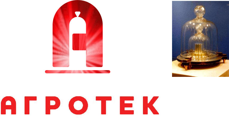
Art director: Good, but looks too much like Remit.
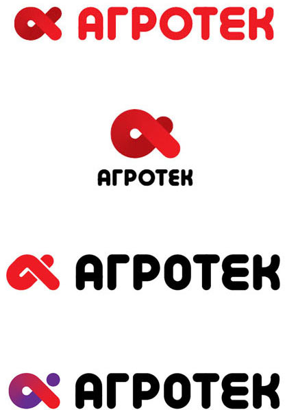
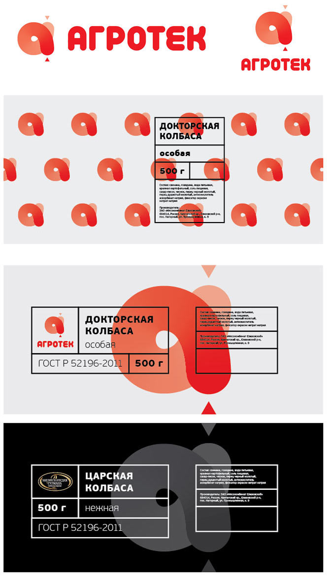
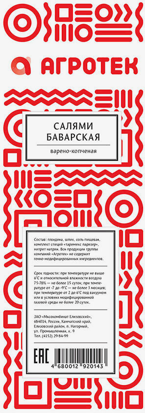
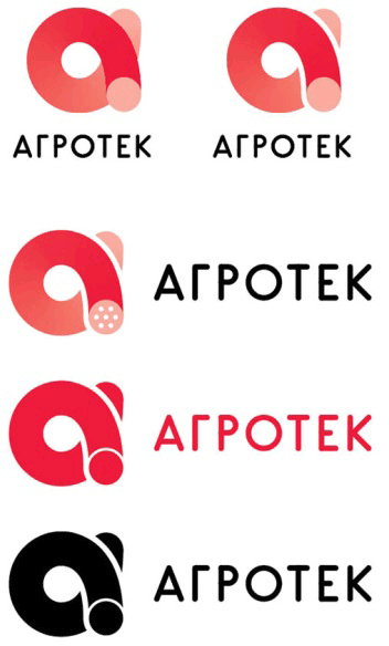
Designer: What if we used a logo-based pattern? No matter how you look at it, this label will be seen as Agrotek-branded. It can also be used on subbrand products, but on a lesser scale.
Closer, but the pattern looks like a bunch of maggots now.
And now like bacteria.
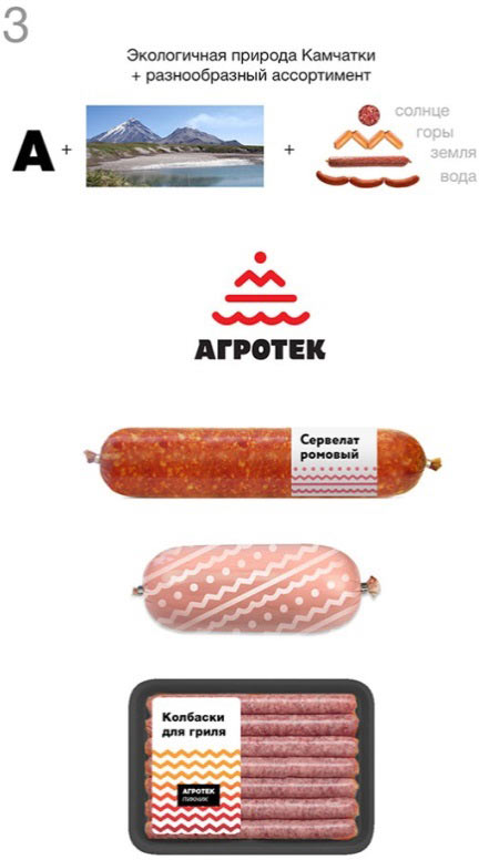
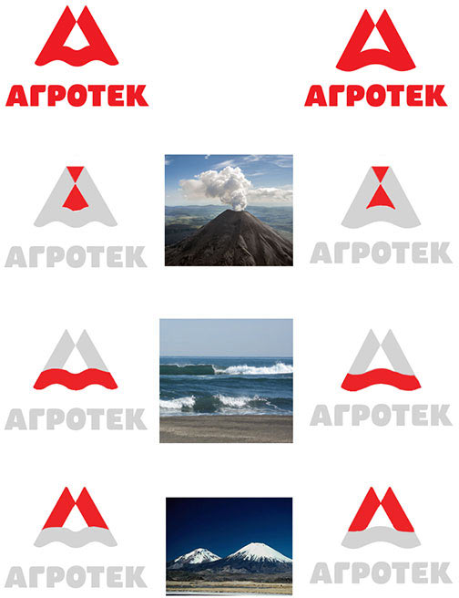
Patterns of the people of the North.
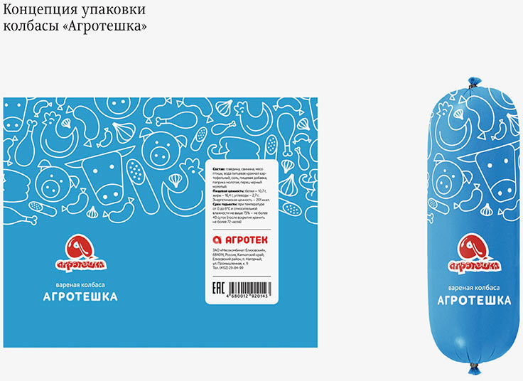
The client likes it, but asks to try to add the sausage cut from one of the previous concepts.
Trying to do so.
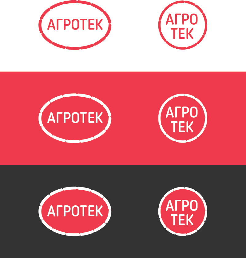
Making the sign more geometric.
Asking the type designer to help.
The client asks to emphasize the “tek” ending. Showing graphically why it shouldn’t be done.
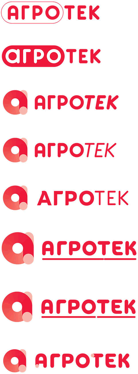
Ultimately deciding to remove the sausage cut and brining a bit more life to the symbol by making the grapheme recognizable again.
Preparing the final files.
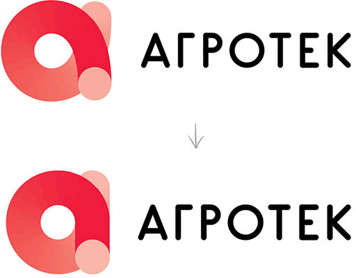
Art director: I don’t like the curves here. And don’t you think this white divider is a bit too wide?
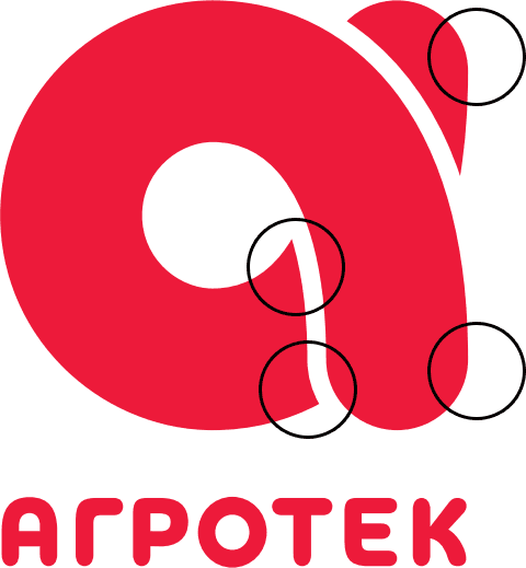
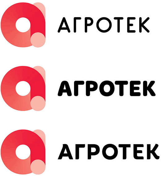
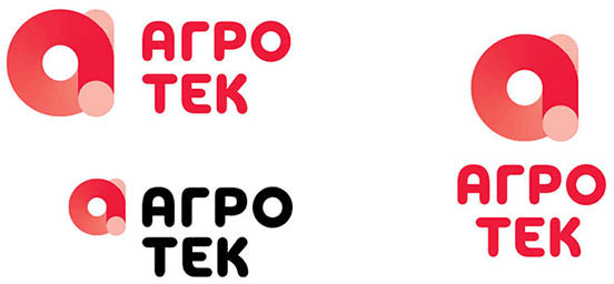
Designer: I’ve adjusted the curves in all versions. Made the white spaces slightly narrower as I really hated the free hanging part on the right. Now it looks more coherent. I haven’t touched the horizontal version though, as the space gets lost in small scale.
Art director: Still, this part looks complex. Do you think you can make it a bit more oblong to make the alpha more recognizable?

Designer: I think yes, especially since the oblong looks better, looser and less squeezed. It also seems to fix the unpleasant hanging bit.

Art director: The front end looks slightly thicker than the back one. How about some small adjustment? :) Is there any more room in adjusting the divider width? Looks like it can be made even narrower.
Also, have a look at this:
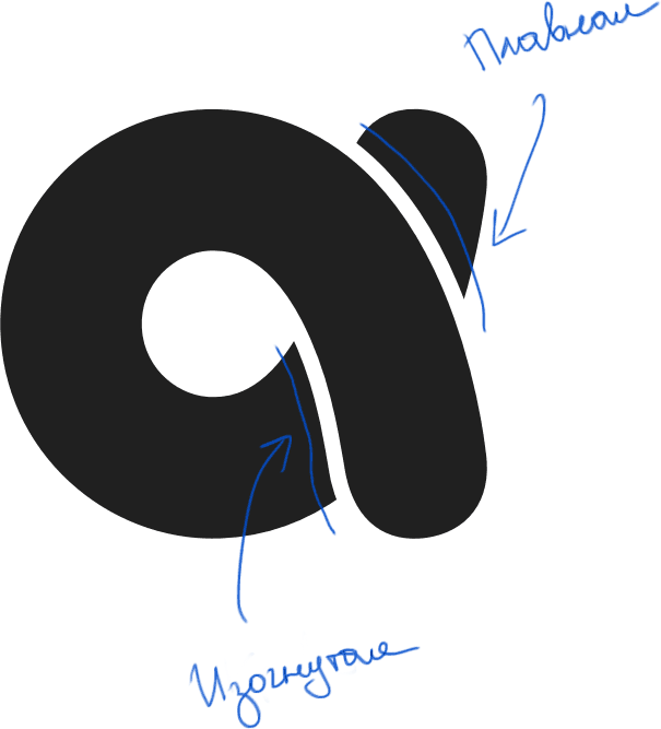
Designer: I’ve balanced the ends, smoothed the curved line and took another look at the white divider.
Art director: Almost very good. How about compensating the rounding of the sausage here? It would make the divider width equal across its entire length.

Designer: I’ve compensated by making the rear end thinner as it looked thicker visually and now looks more even. Only for monochrome versions, though.
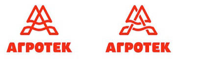
Deciding to mirror the logo vertically.
Everybody is happy.
