We need to develop packaging mock-ups for the variety of Agrotek’s products: sausages, frankfurters, soups and main courses in the Domashnee Menu range, Picnic ready made meals and other products. We need the packaging to stand out on the shelves, have special recognizable elements, be laconic and be associated with quality and environmental friendliness, the company’s main advantages.
Before we start drawing, we need to explore the current situation on the market of meat products and ready meals. Going to the stores to do the research.
Having spent enough time in stores and markets, smelled enough of smoked and boiled meat products and carefully thought over what we’ve seen, we start piling up ideas.
Showing the ideas to the art director.
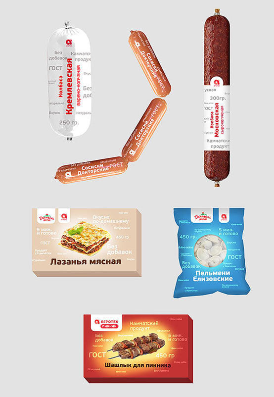
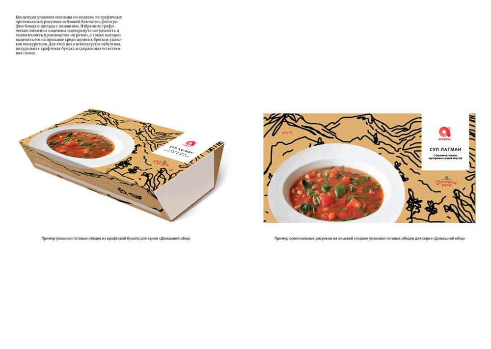
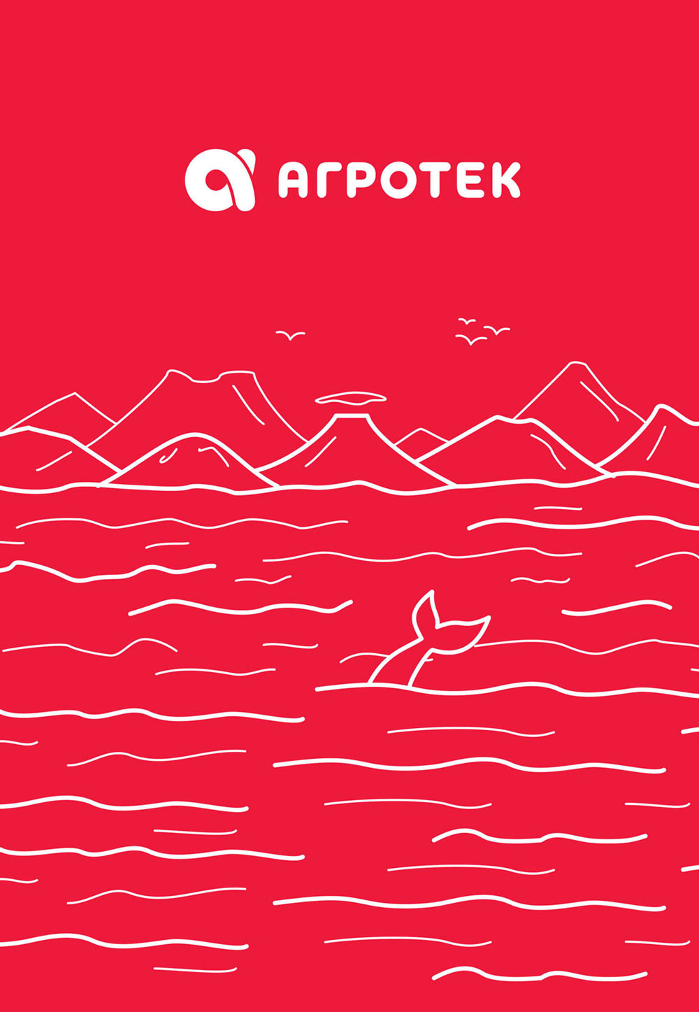
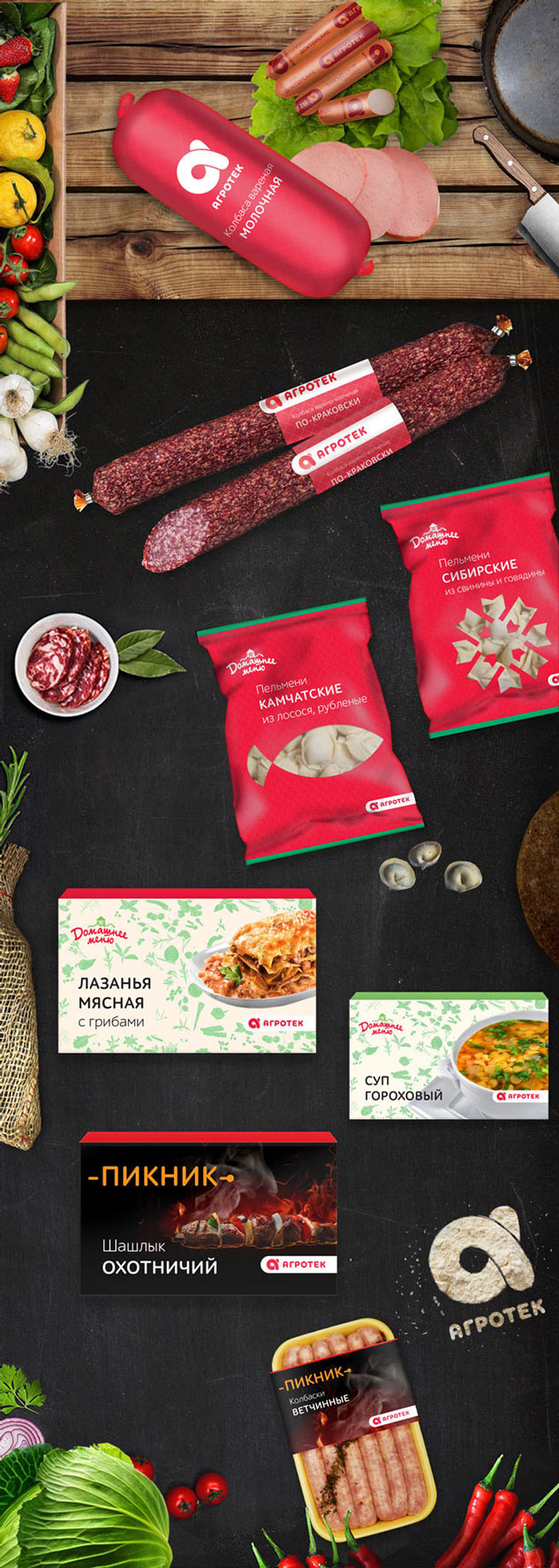
1. At the center is a photo (or a cut-out to show the product) surrounded by supporting contour graphics. A landscape for Agrotek brand products, something cozy and homely for Domashnee Menu, nature and outdoors for Picnic.
2. Again, a photo or a cut-out in the center, surrounded by tags of helpful information that describe the brand. Something generic for Agrotek and themed words and phrases for Domashnee Menu and Picnic.
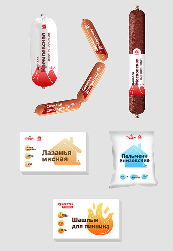
3. Large-scale typography over a large, bright, somewhat detailed icon. The icon characterizes the sub-brand. For example, it can be volcanoes for Agrotek, a house for Domashnee Menu and a fire for Picnic.
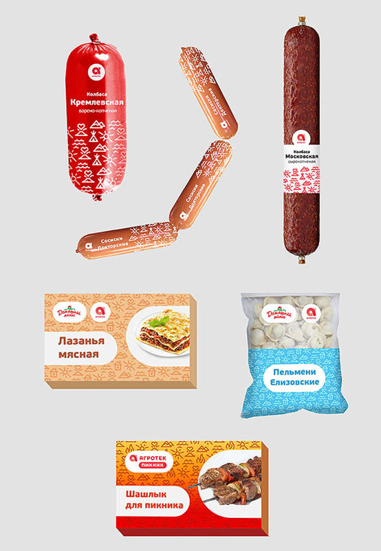
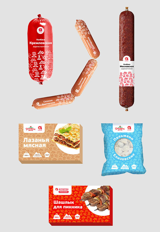
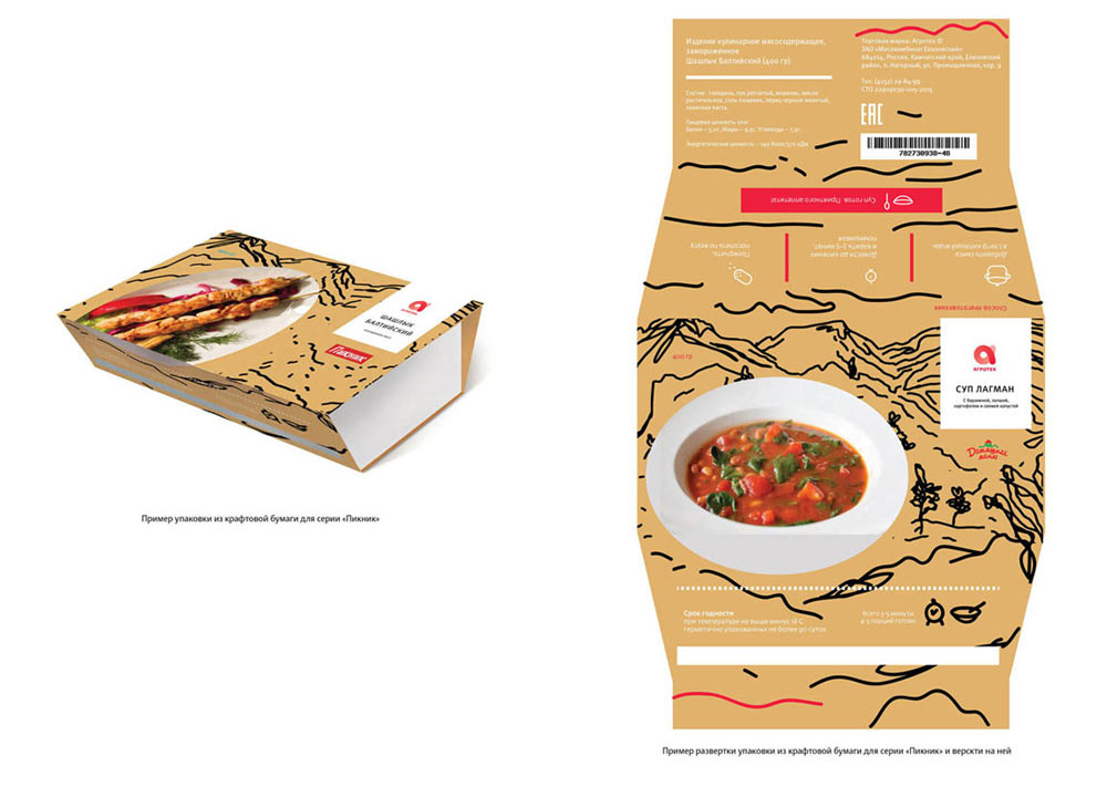
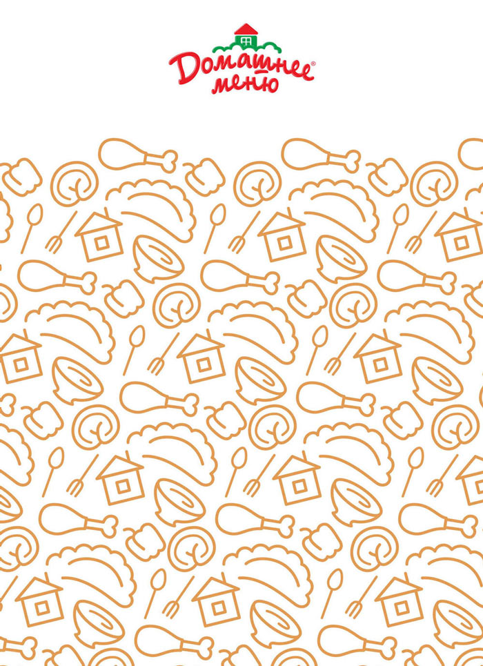
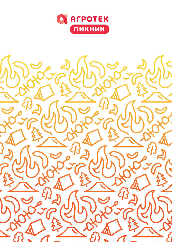
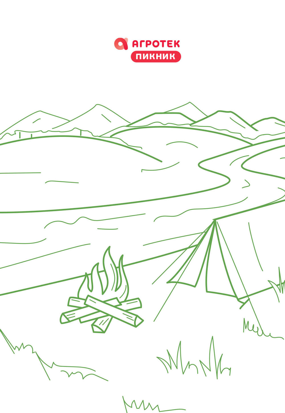
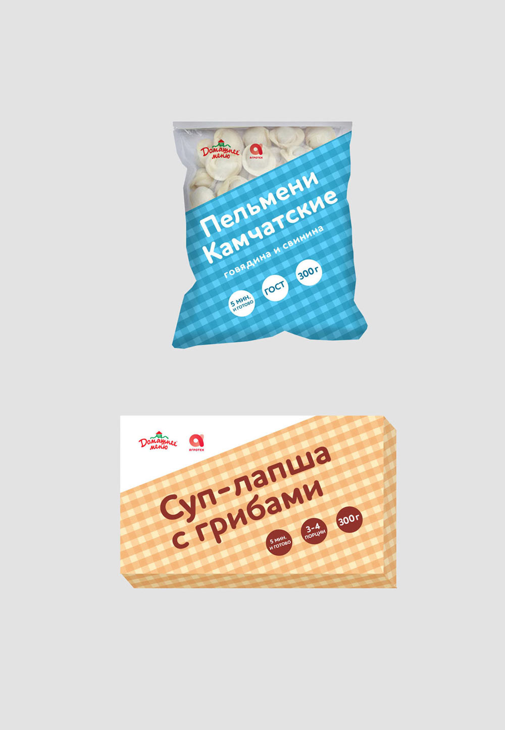
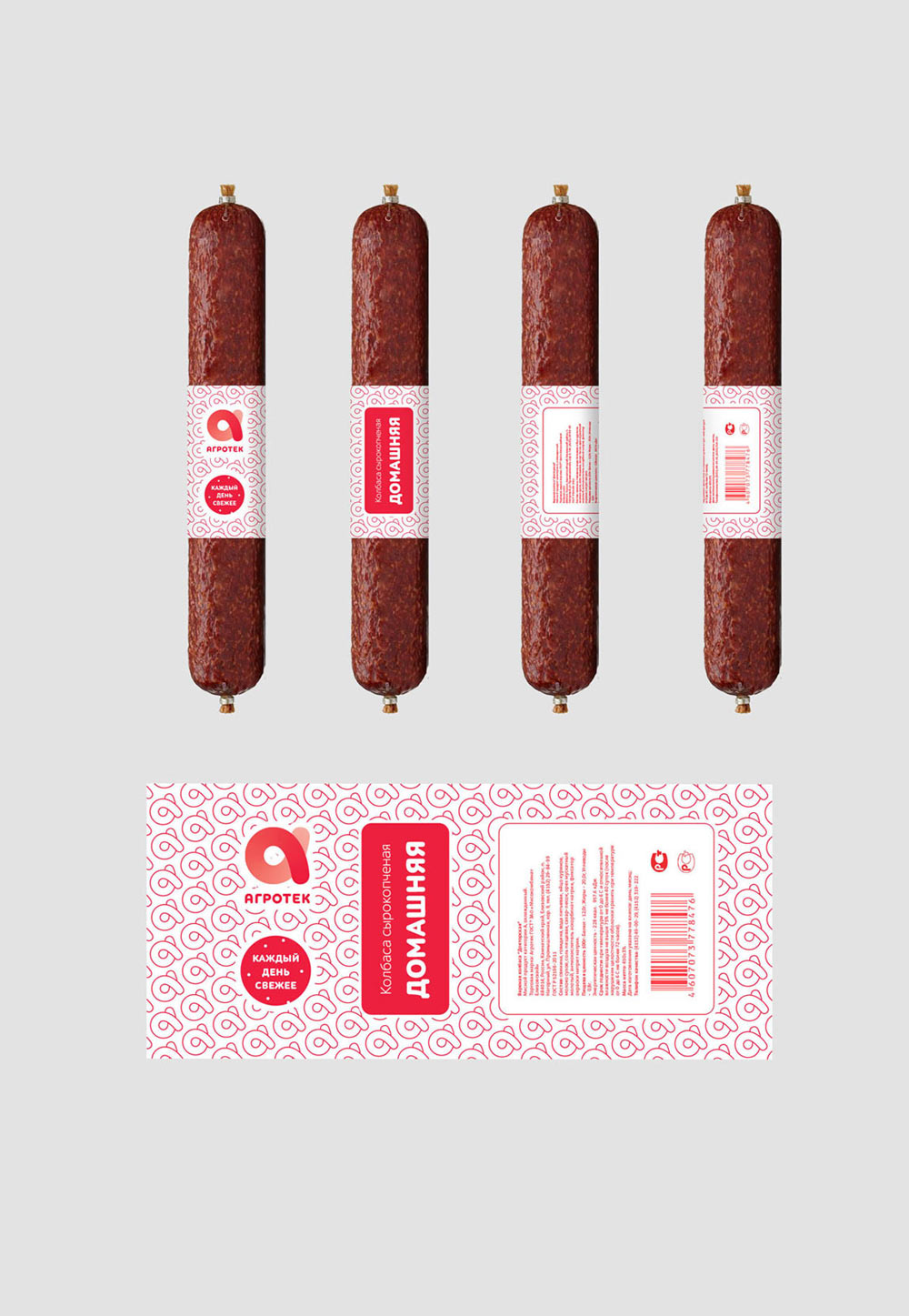
4. A pattern of Kamchatka’s natural symbols. For Domashnee Menu, the pattern is supplemented by a house, for Picnic by a fire.
Art director:
1. The first one is good, let’s develop it.
2. These tag clouds are a thing of the past.
3. It might lead to something but right now it’s too raw.
4. Let’s develop this one too, however the Picnic range looks poor compared to the others. The logos and bars behind text look artificial.
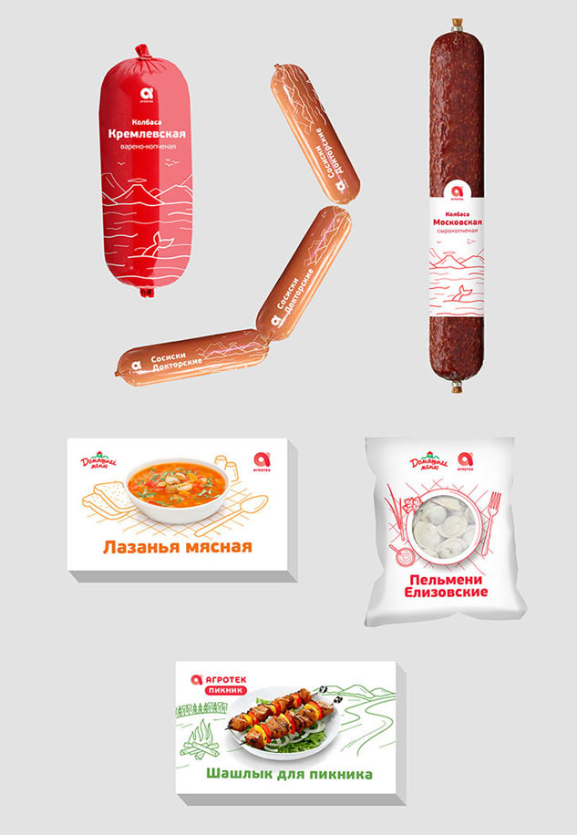
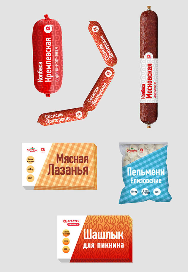
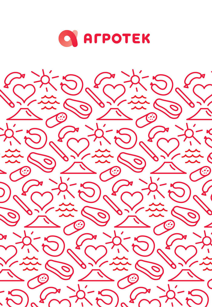
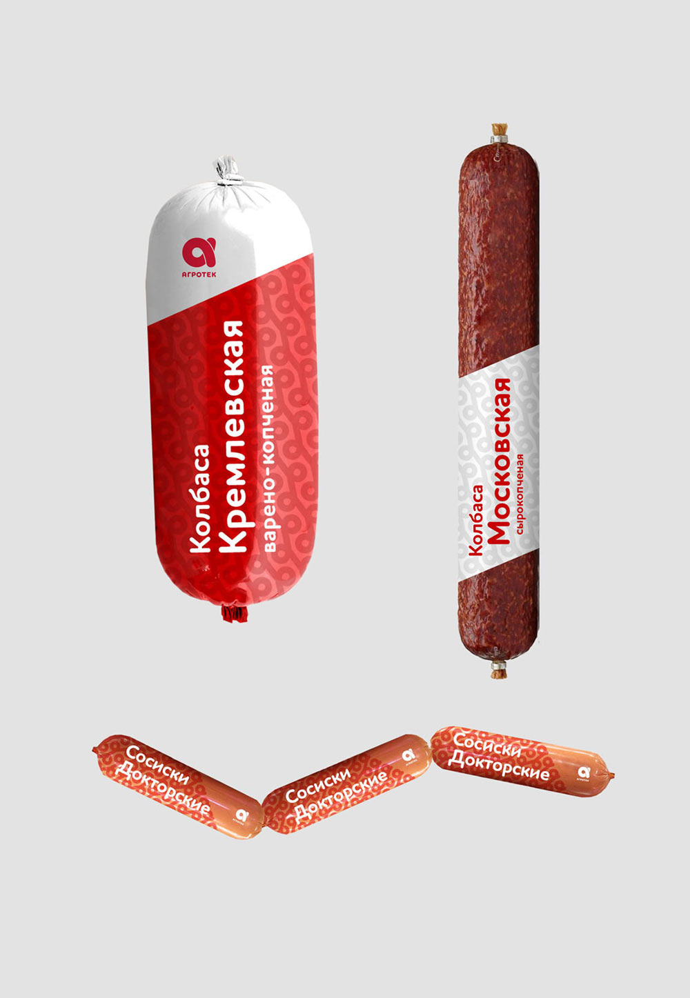
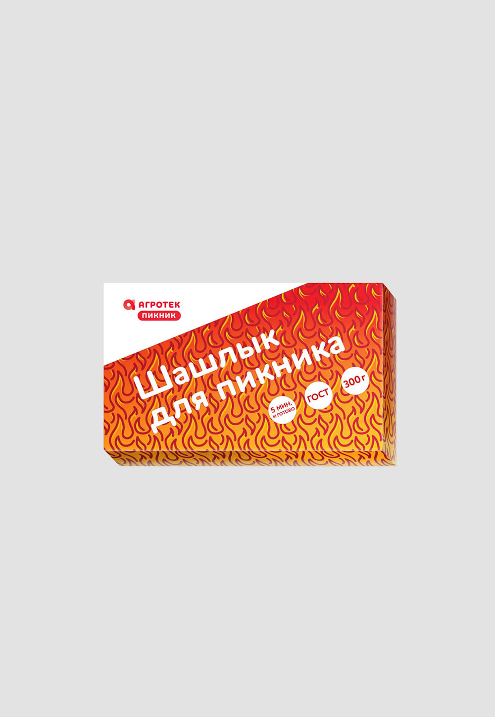
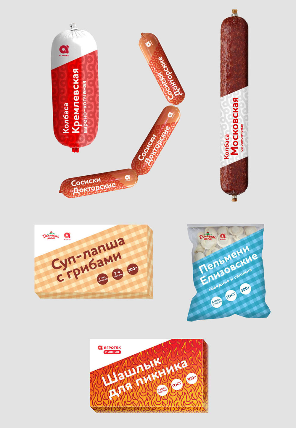
Designer: I’ve improved two of the concepts. Plus, here is another one. Large-scale typography over backgrounds made of simple patterns. For Agrotek the pattern is made of logos, for Domashnee Menu it’s something like a tablecloth, for Picnic it’s fire.
And another idea.
Continuing to think. Another designer joins in and offers his concept. Ultimately presenting five ideas.
Concept 1.

Concept 2.
Concept 3.

Concept 4.
Concept 5.
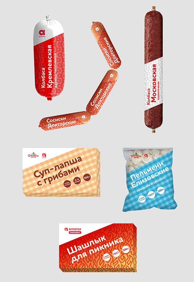
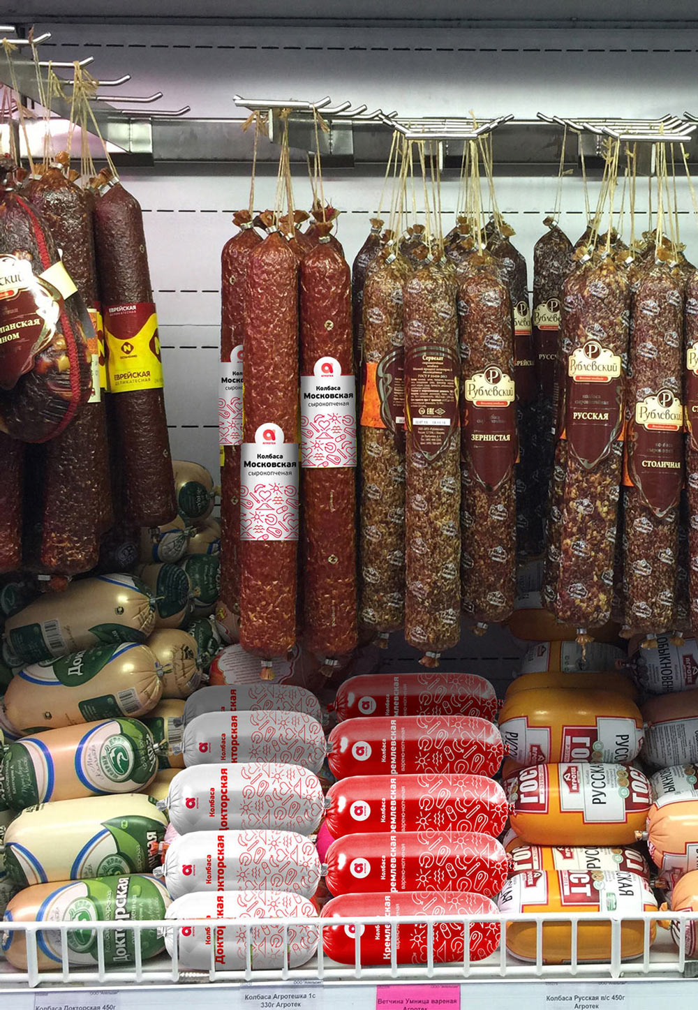
The client conducts large-scale research, considers challenges of manufacturing and chooses the concept number 2, giving some feedback:
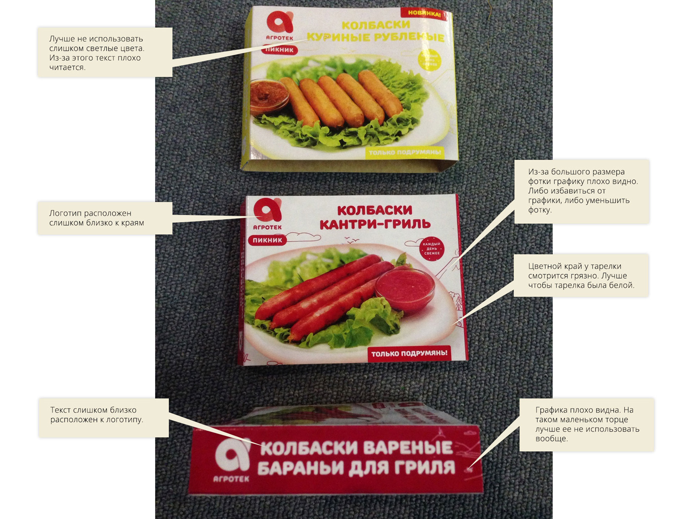
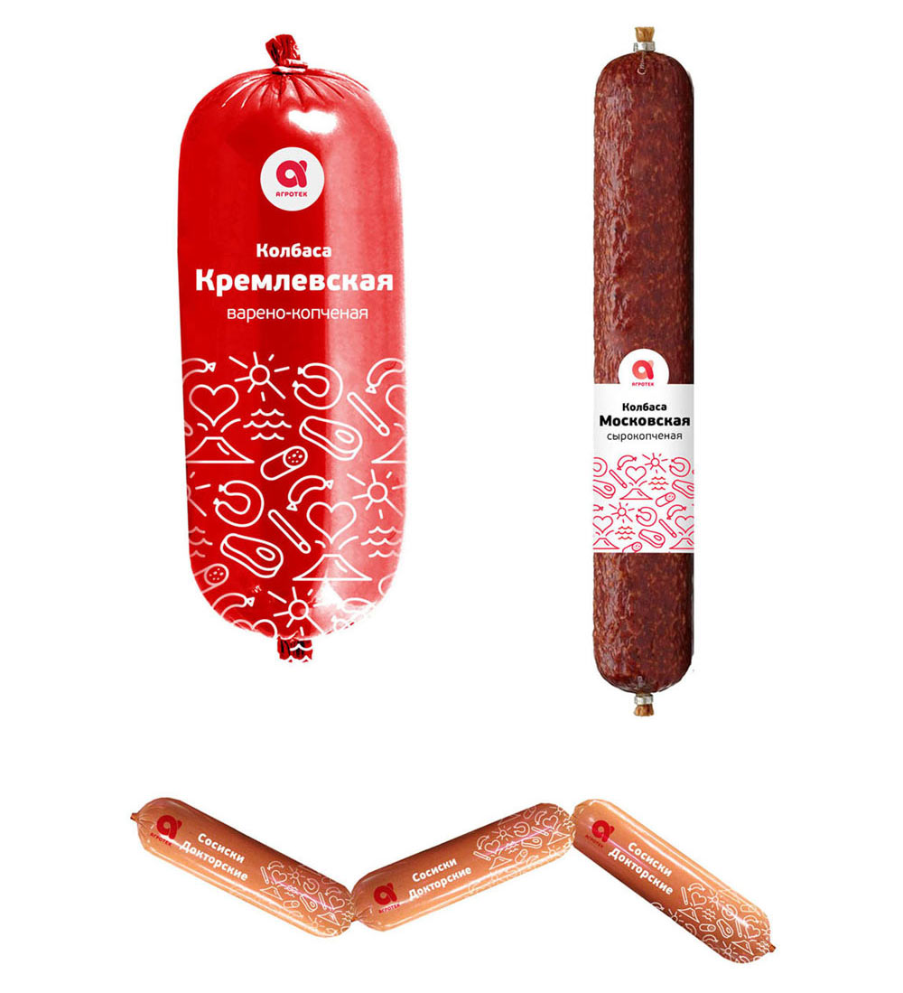
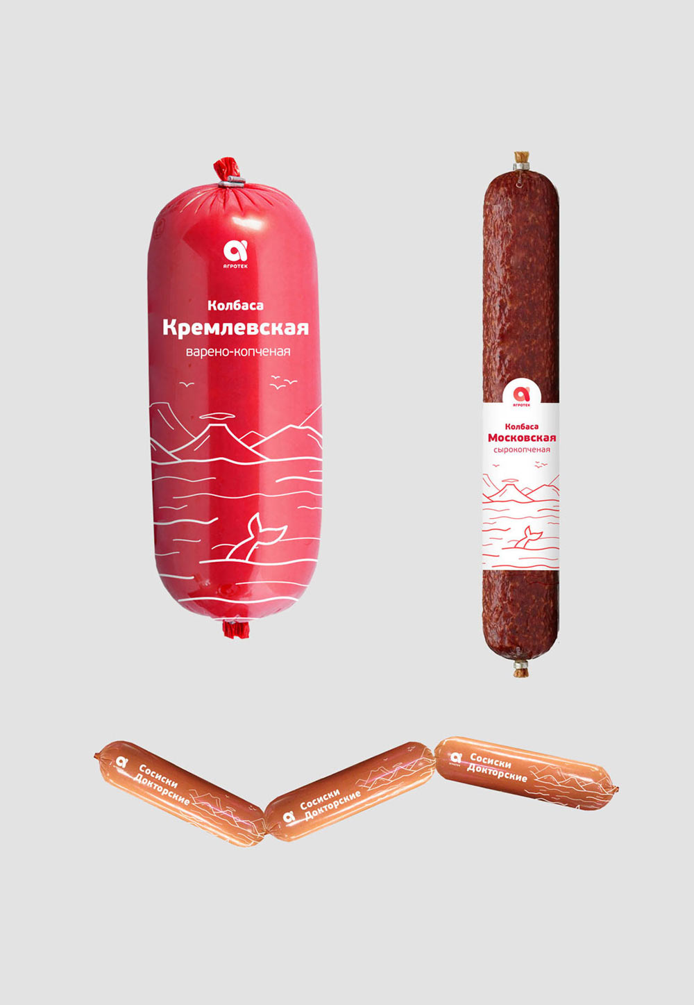
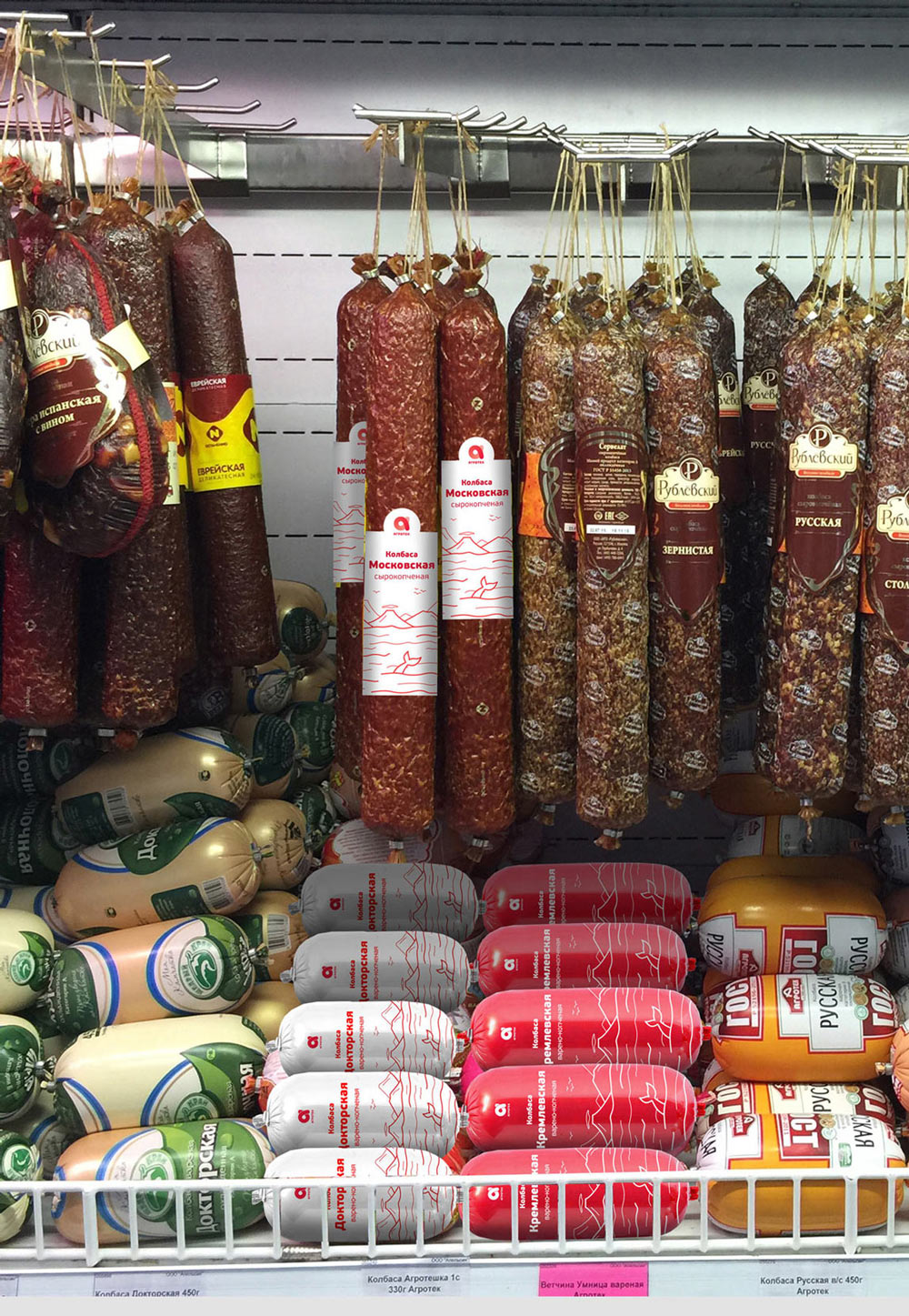
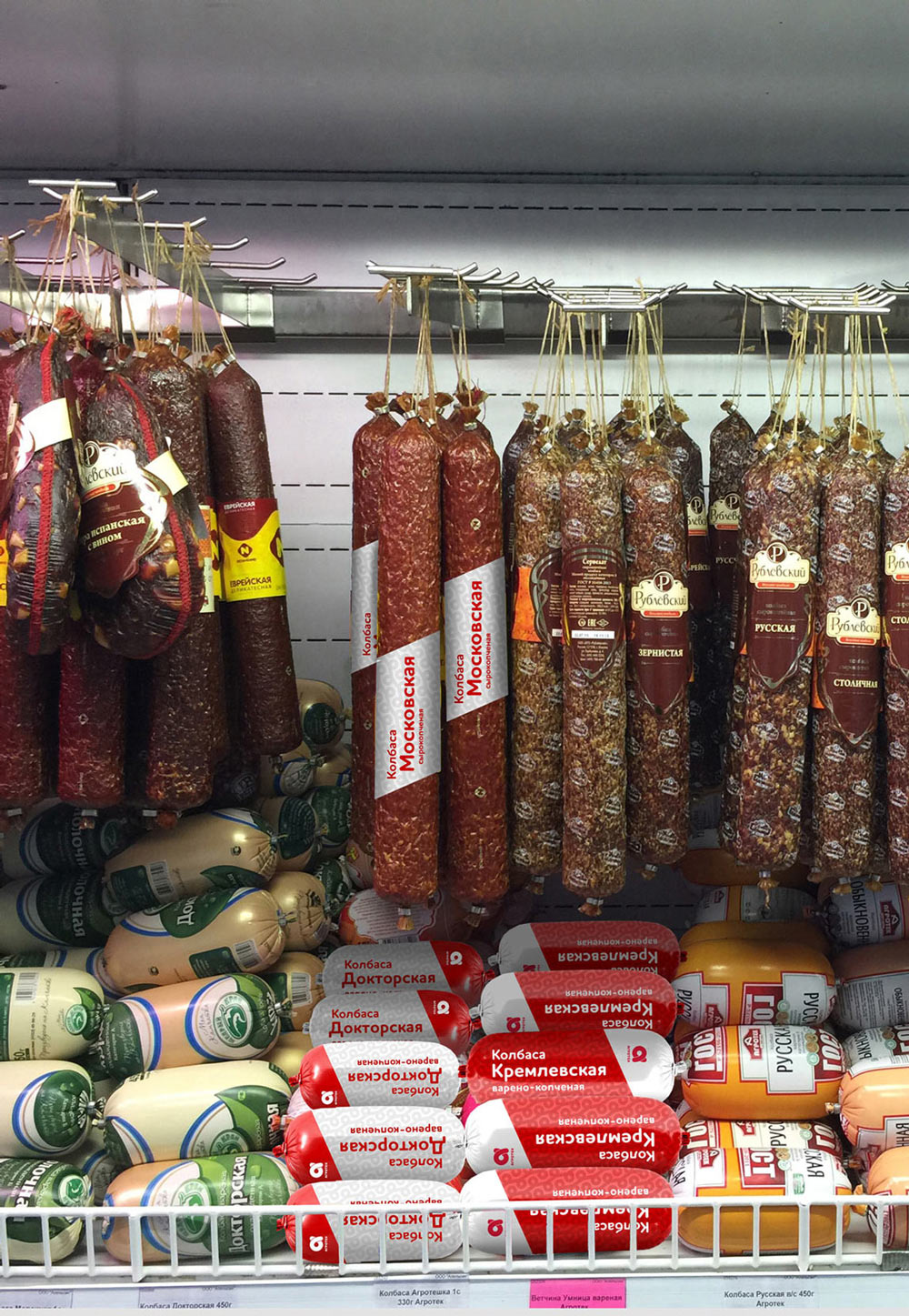
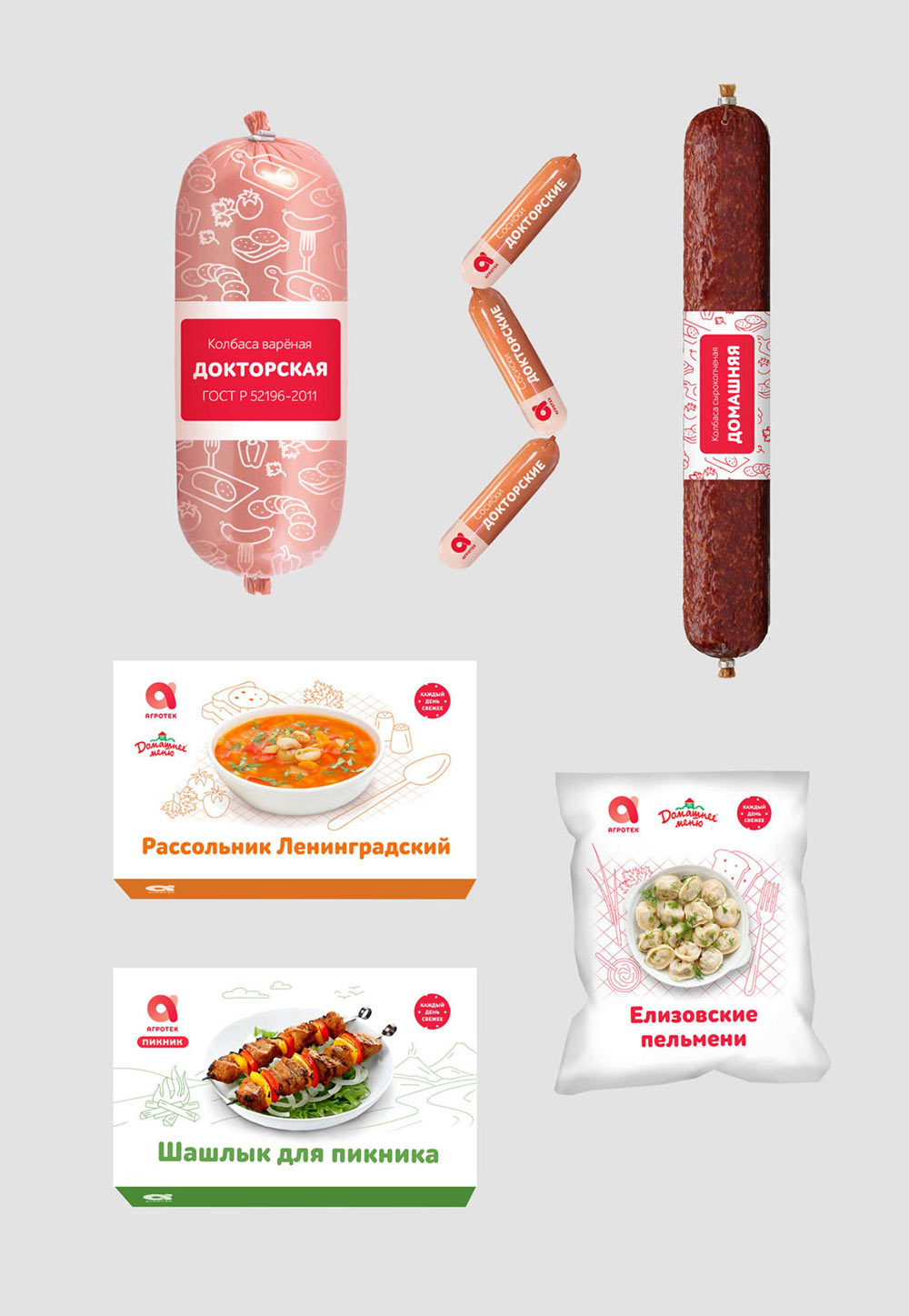
1. Graphics for ready meals and sausages differ, as if they were in different product ranges.
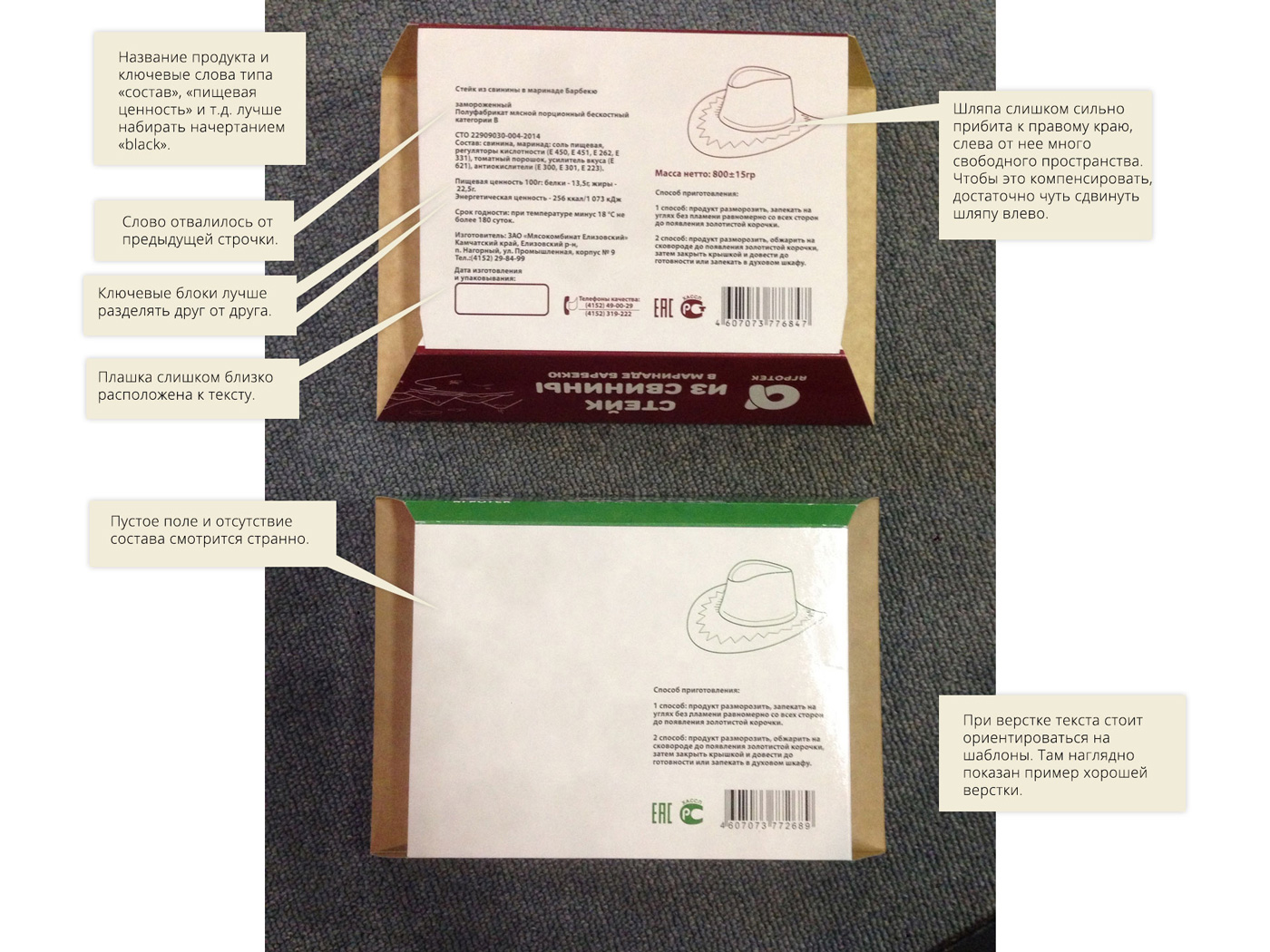
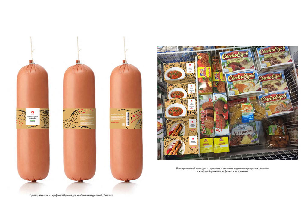
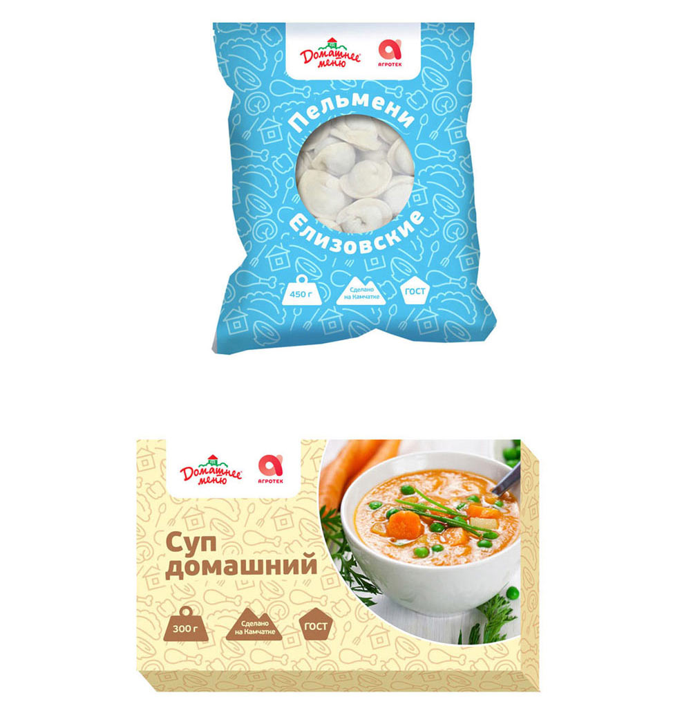
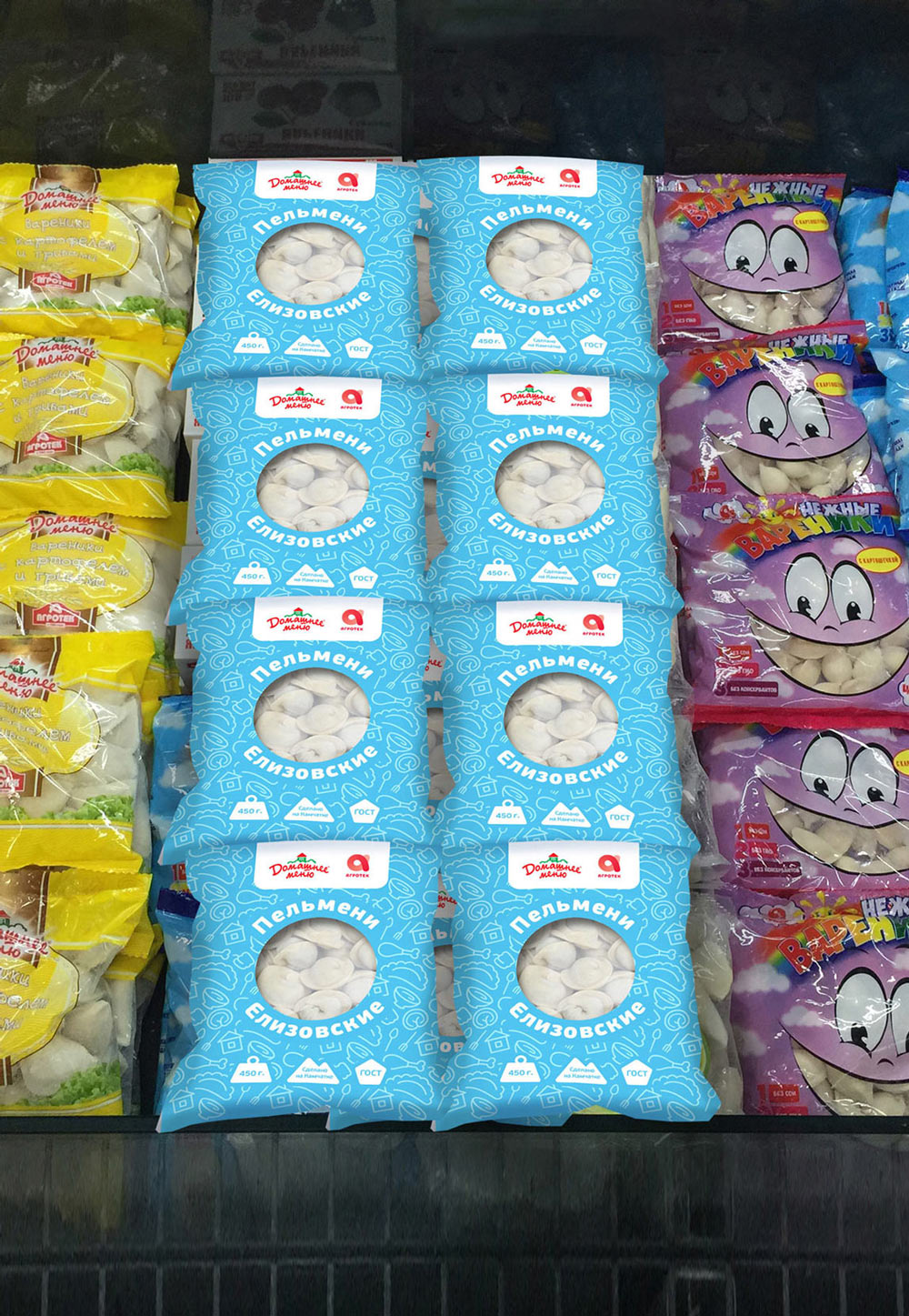
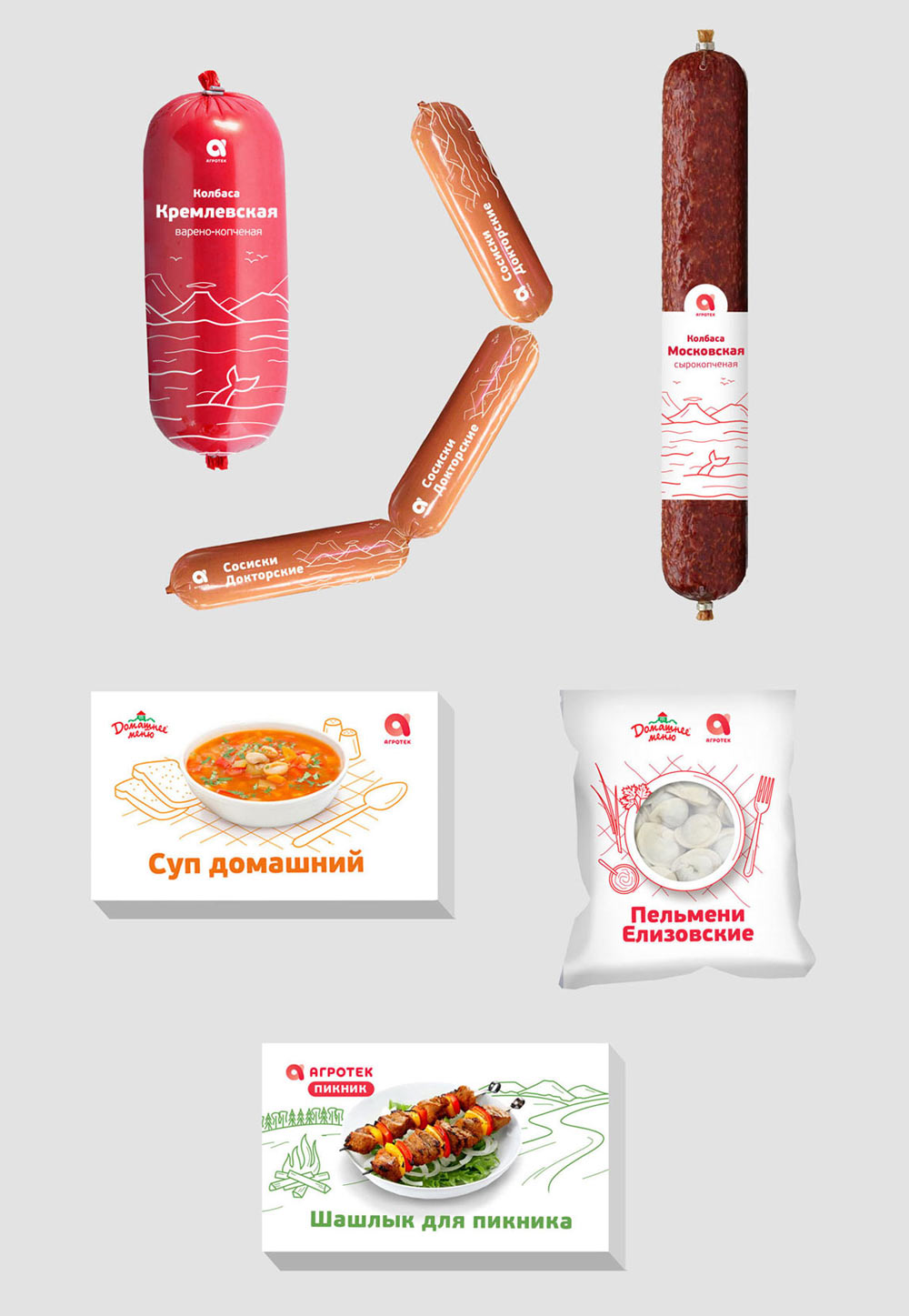
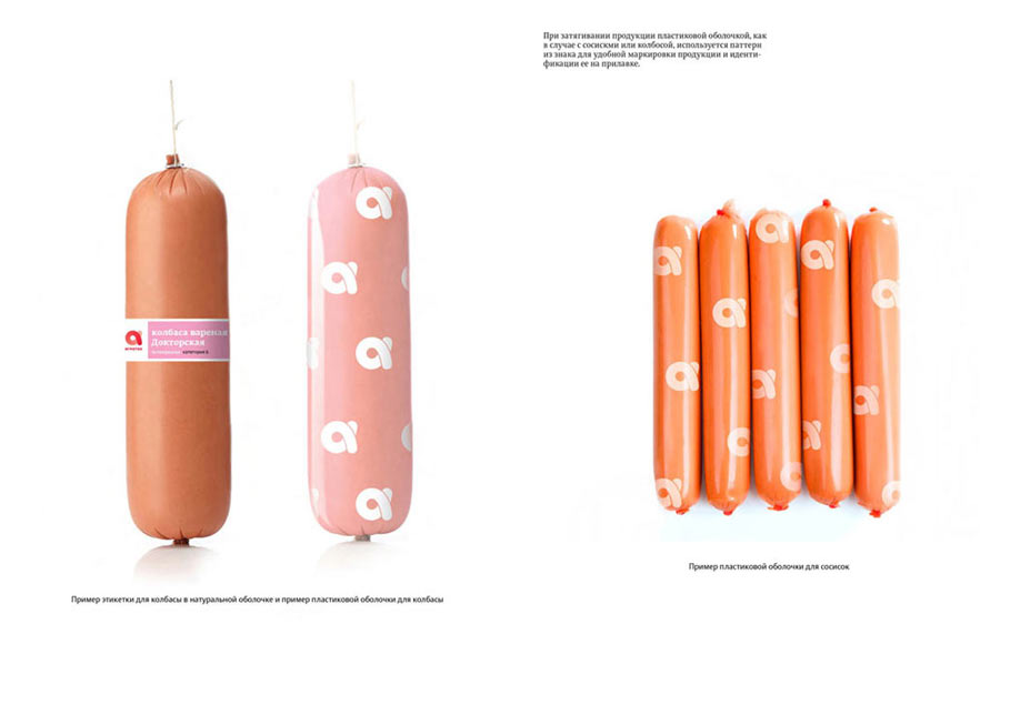
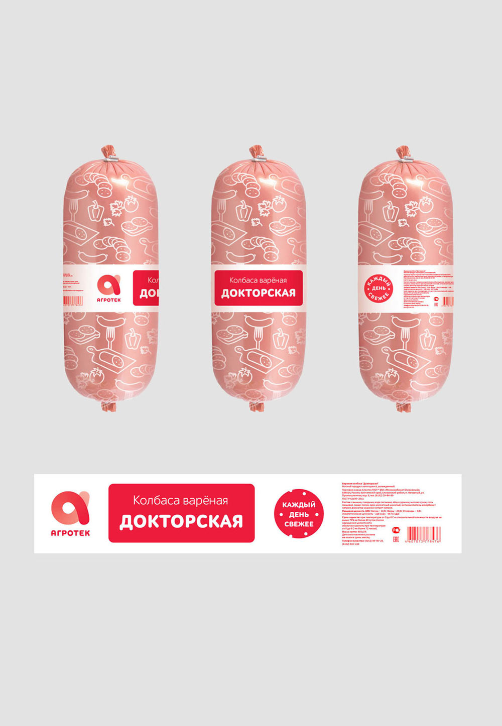
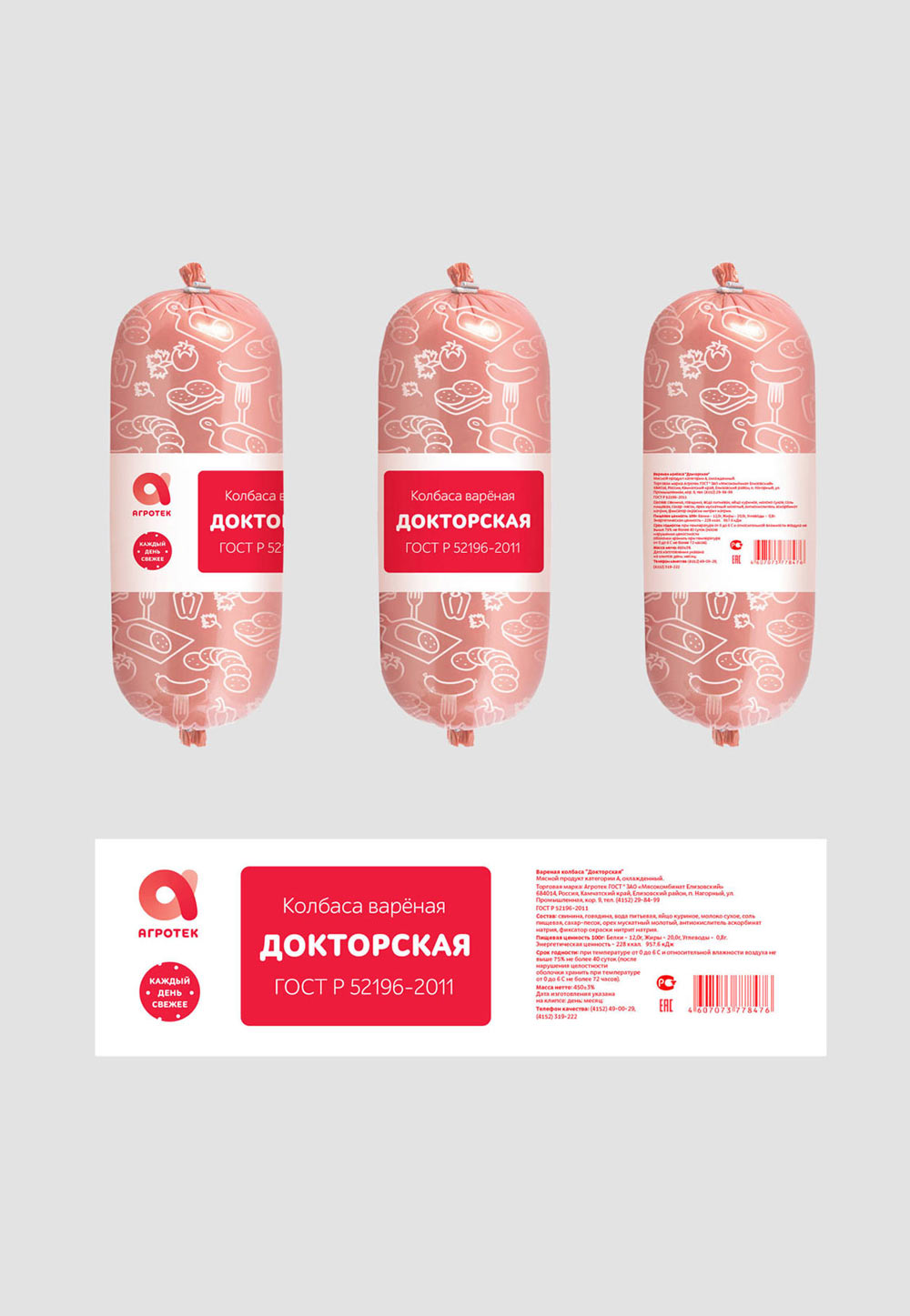
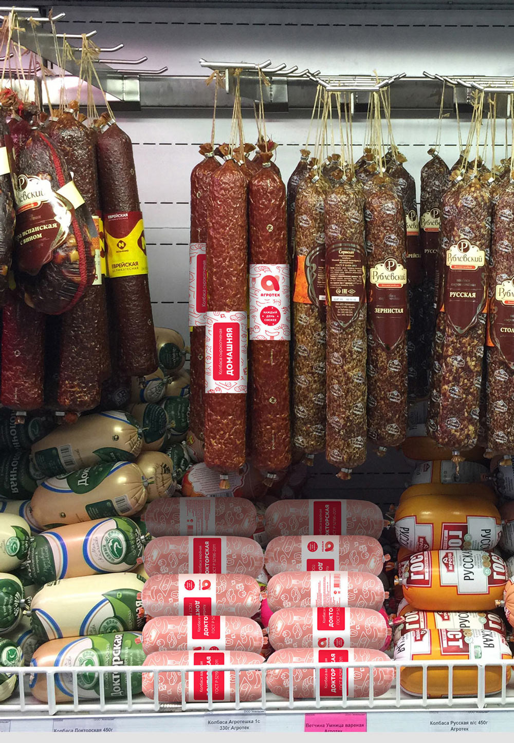
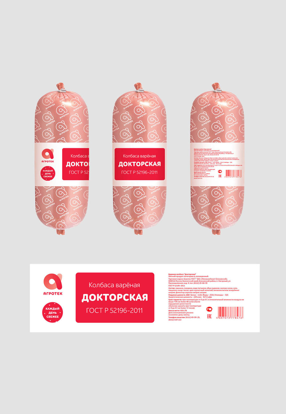
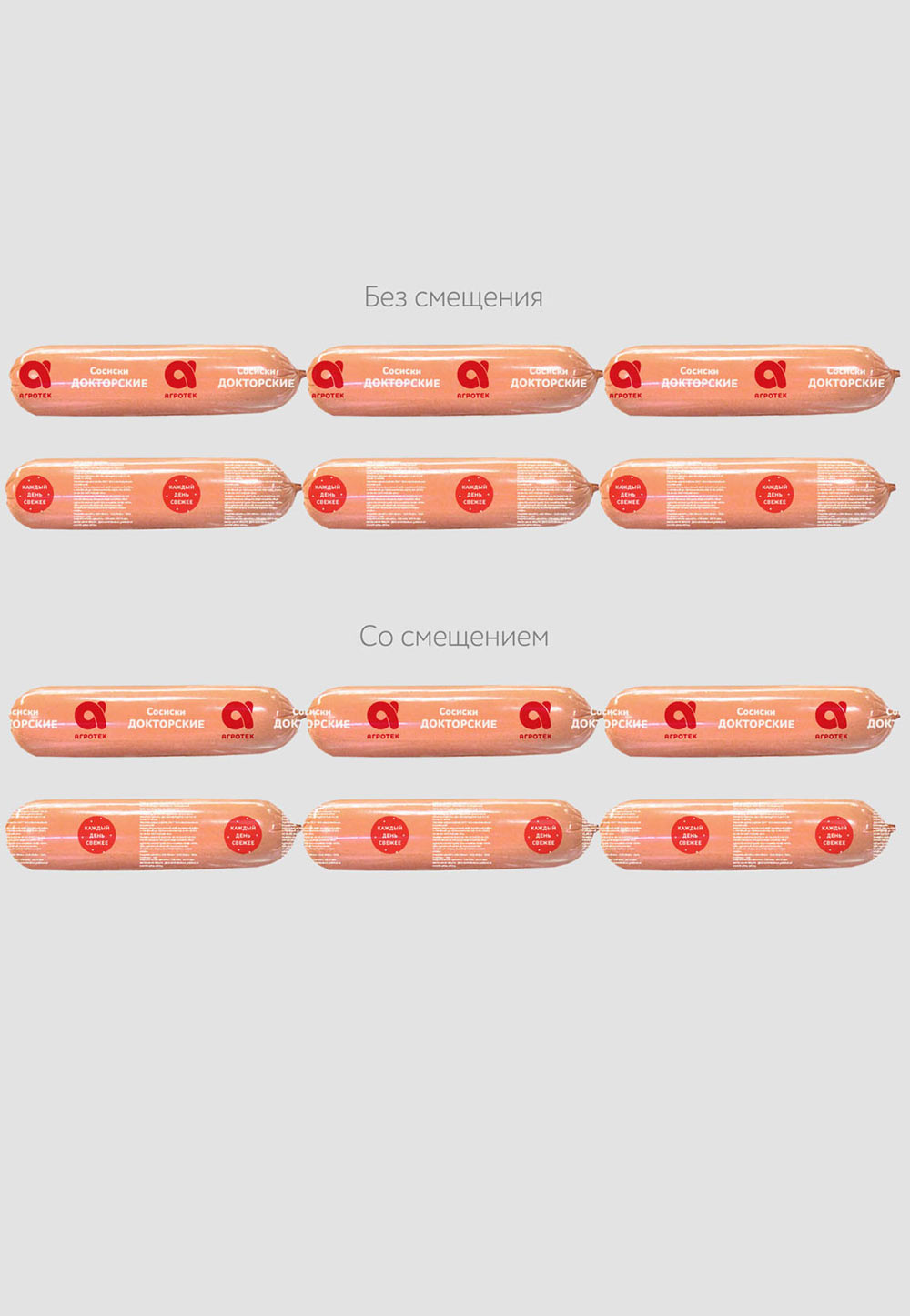
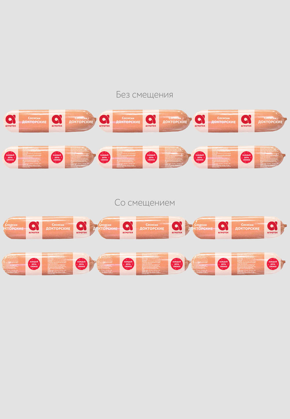
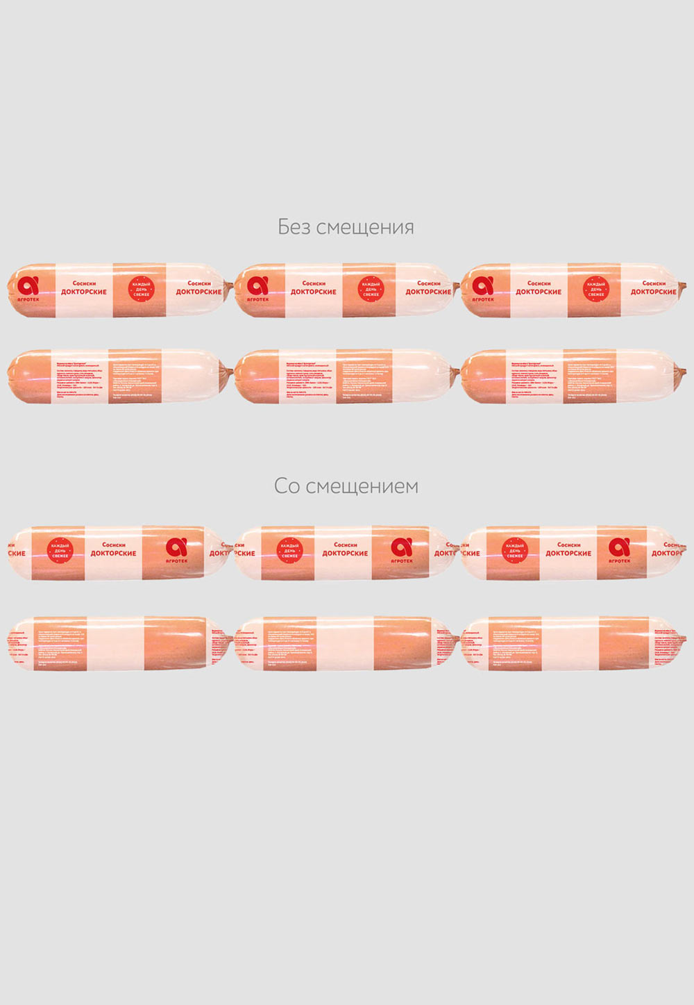
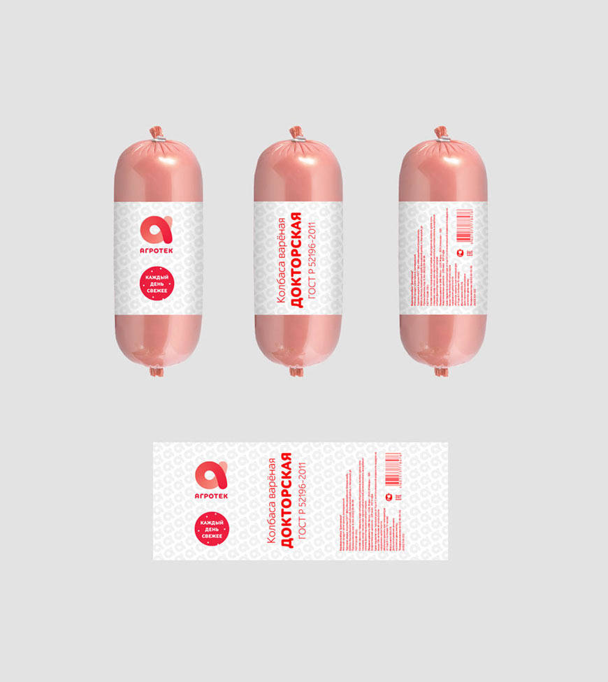
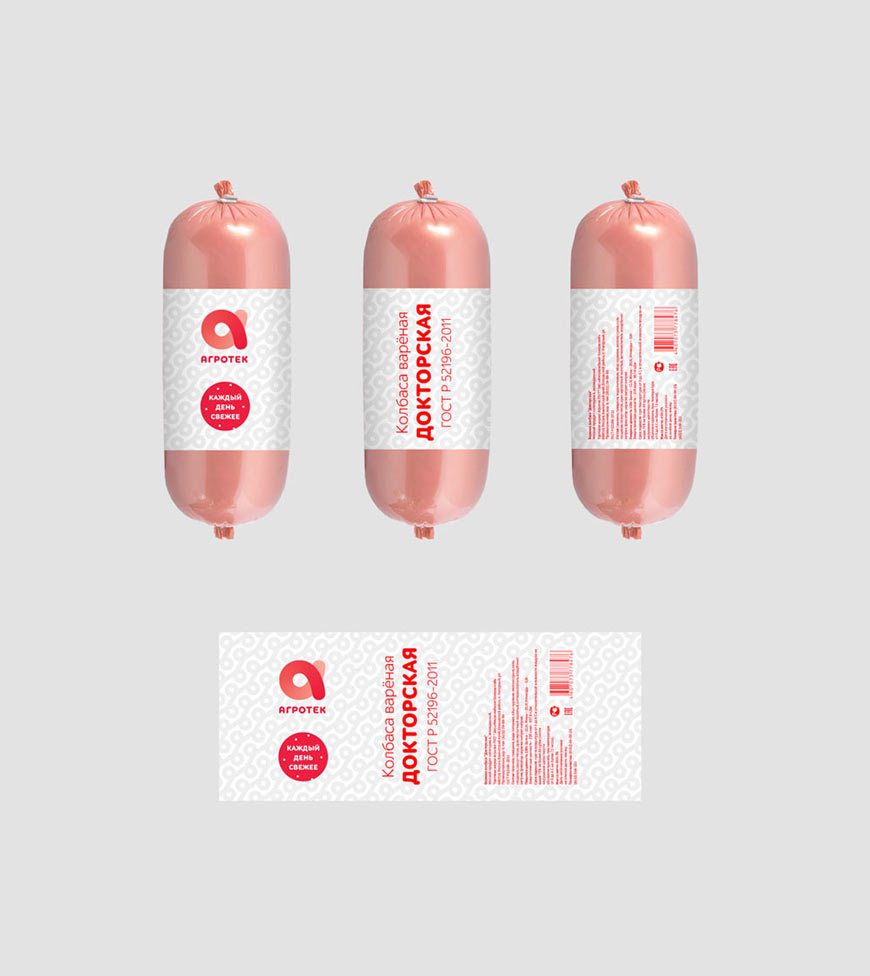
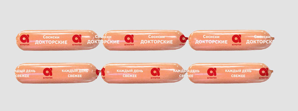
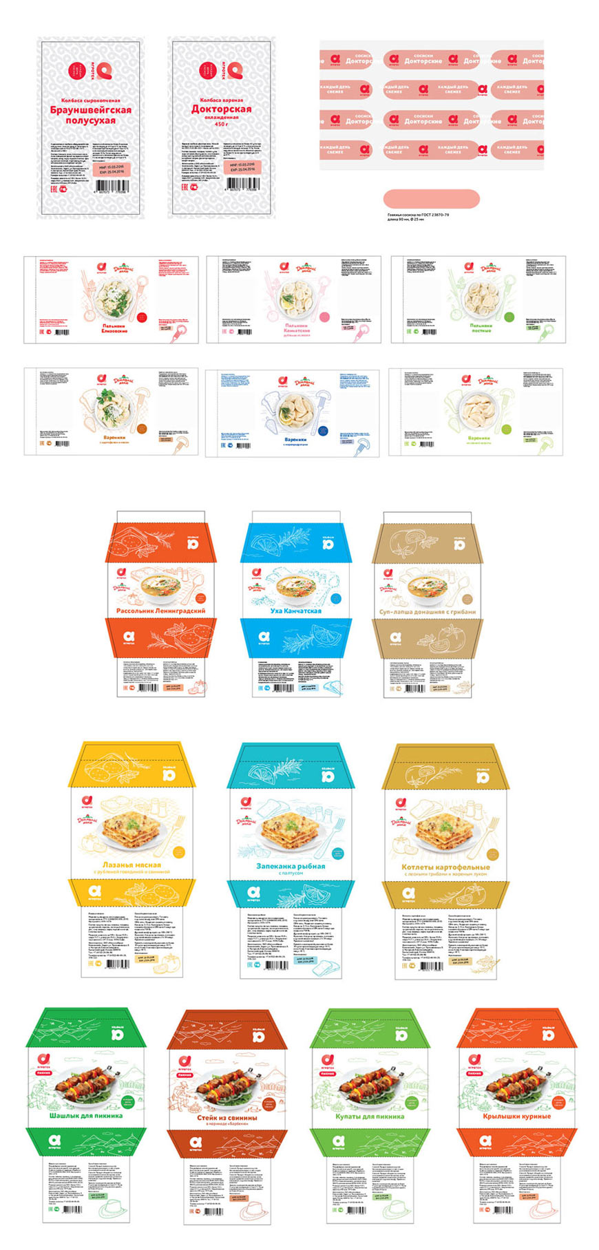
2. Boiled sausages: use transparent casings and have all the information on a label around the sausage.
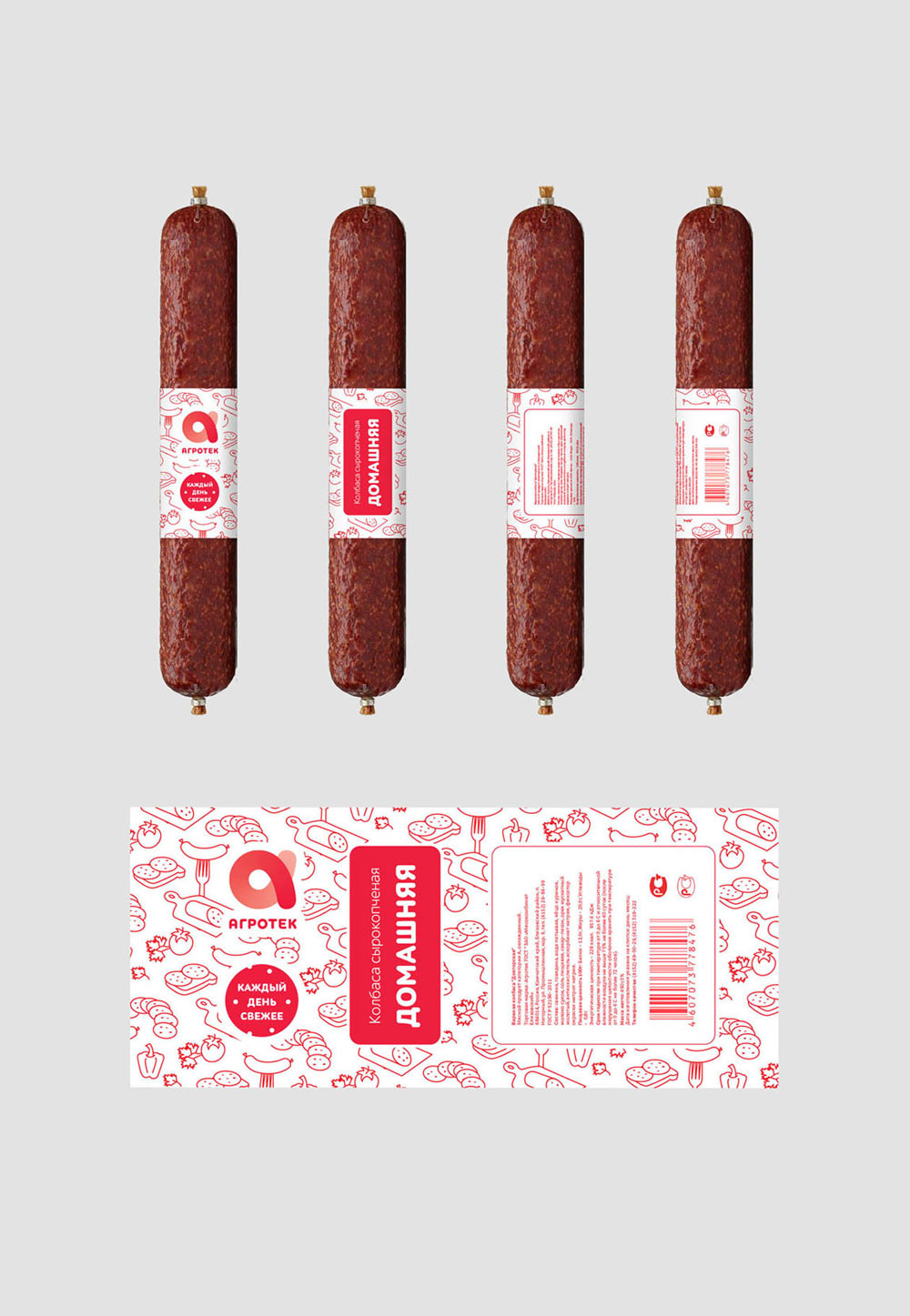
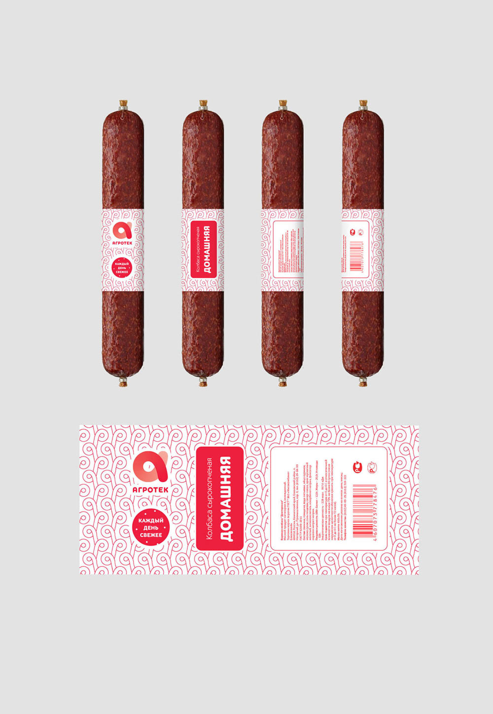
3. It’s better not to use cut-outs on labels for semi-smoked sausages as they won’t hold in place.
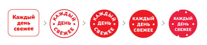
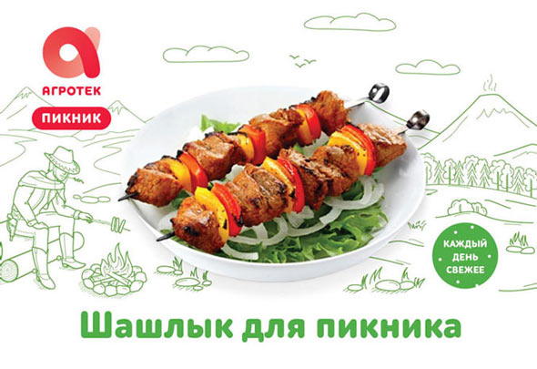
4. Add the phrase “Fresh every day” to each package.
Making changes based on the feedback. Searching for the best way to add the phrase “Fresh every day.” At the end, using a label that looks like a slice of sausage.
Showing to the client again.
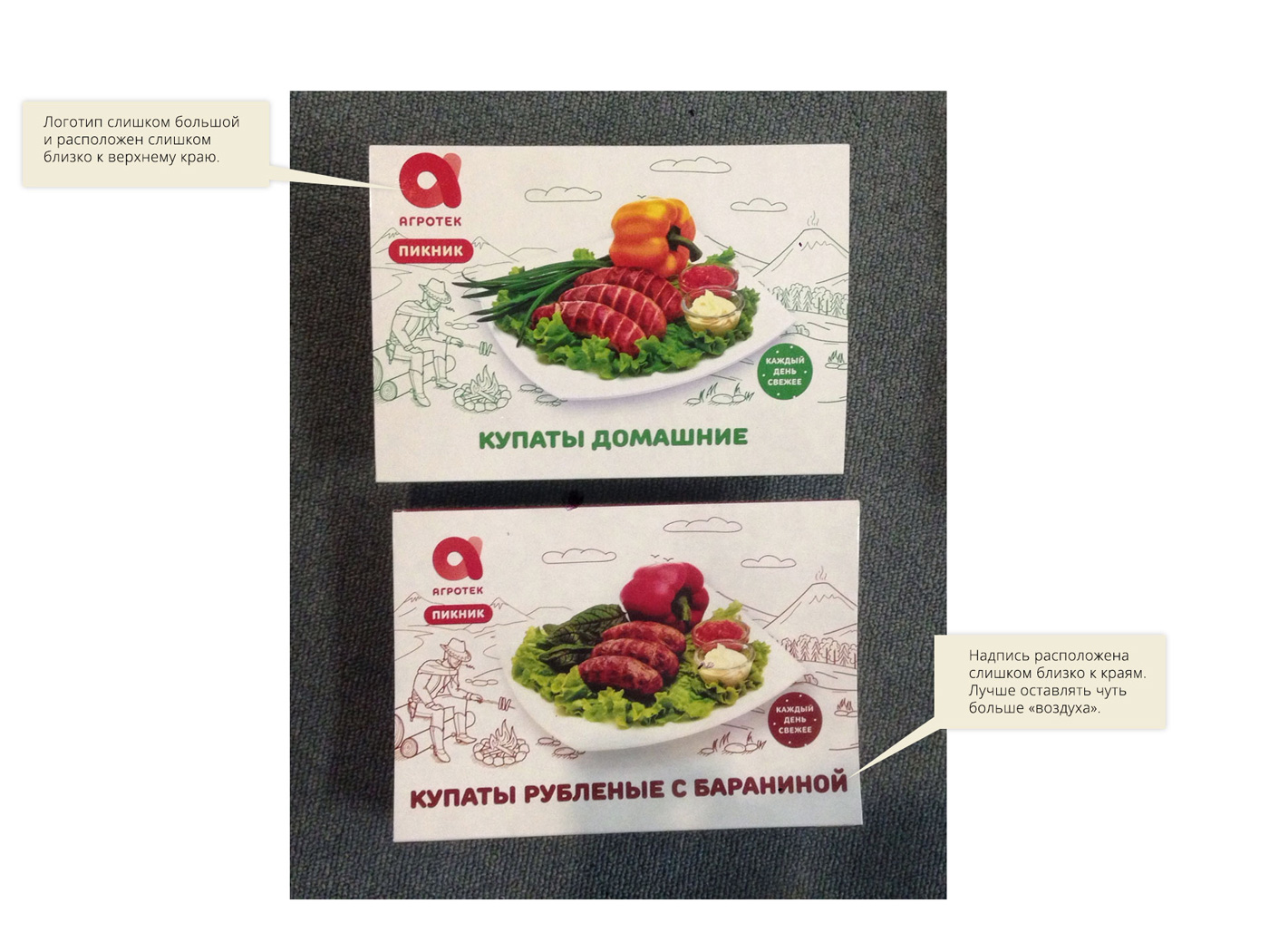
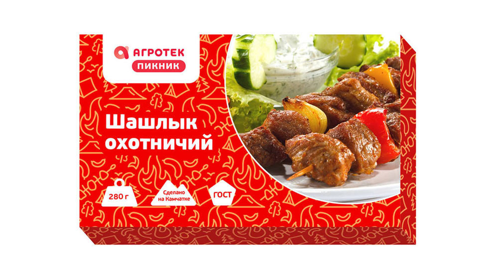
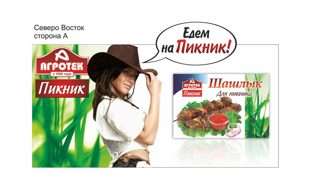
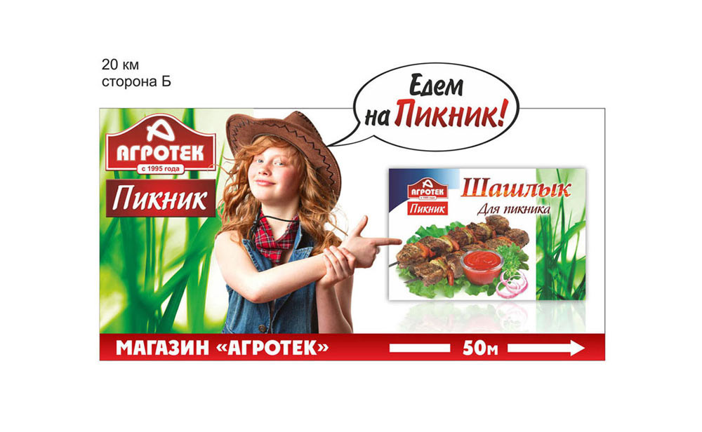
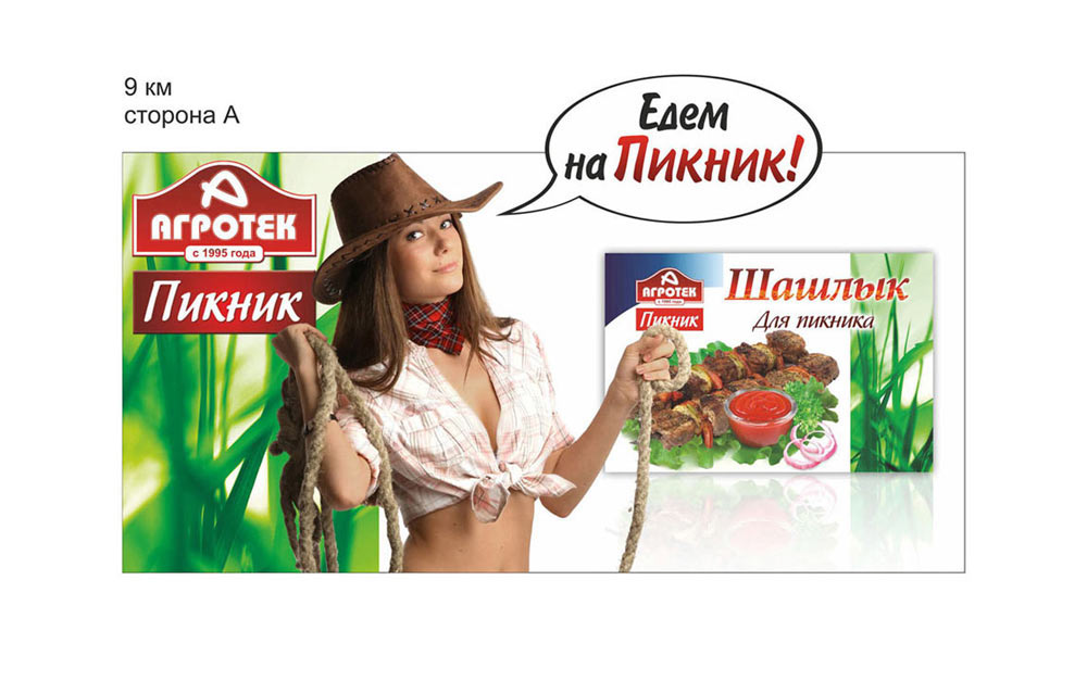
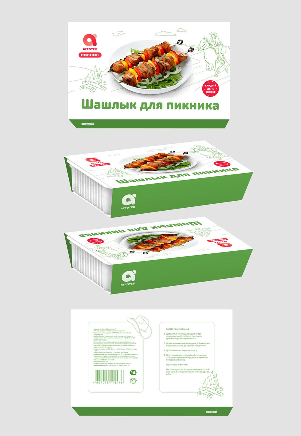
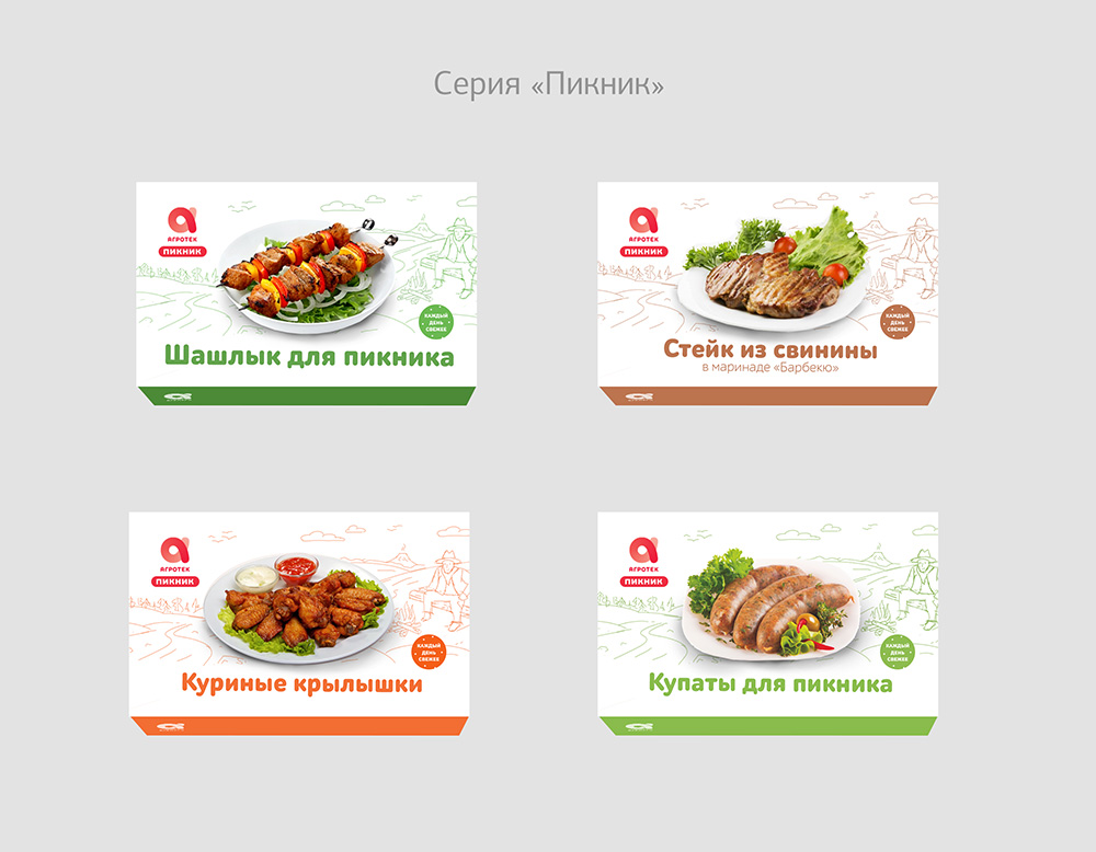
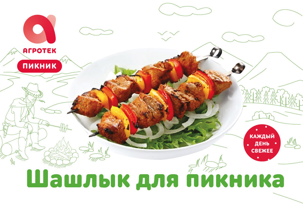
We need to maintain the cowboy style from previous packages in the Picnic range by adding a cowboy hat or a person in a cowboy hat.
Demonstrating once again.

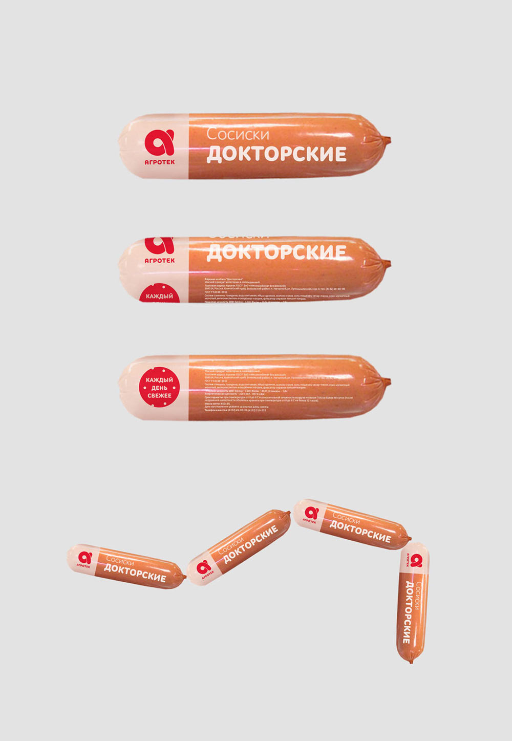
Creating sketches for frankfurters packaging taking into account the specifics of manufacturing.
Domashnee Menu and Picnic are a go. Starting to work on the final versions.
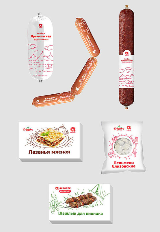
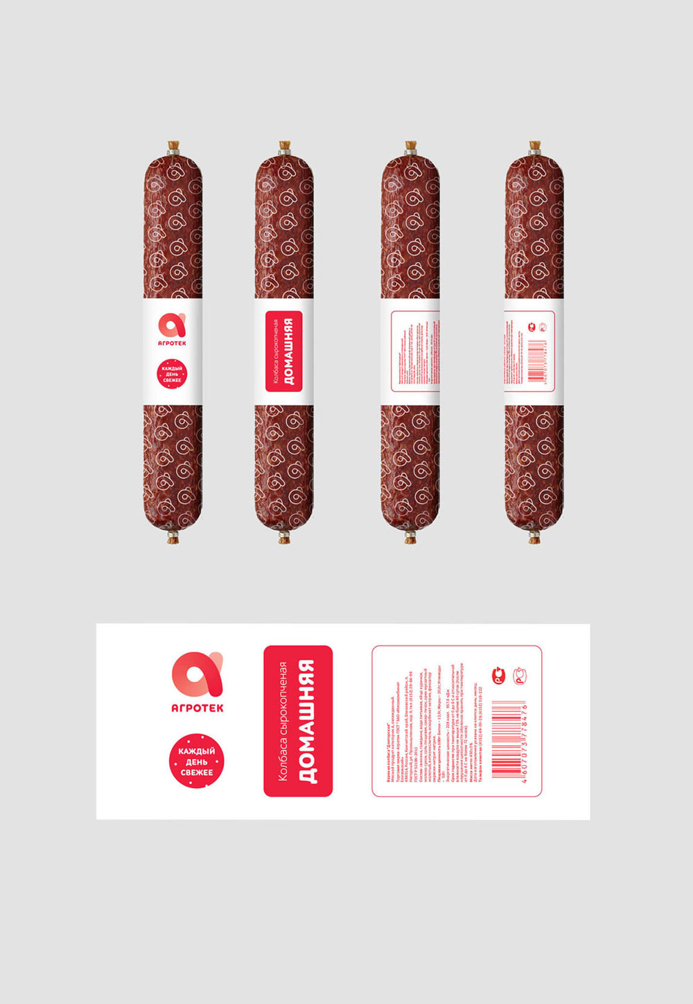
The client suggests not to bother with sausage casings and work on the label only. Creating a couple more variations for sausages: one with a logo-based pattern and another with a different pattern design.
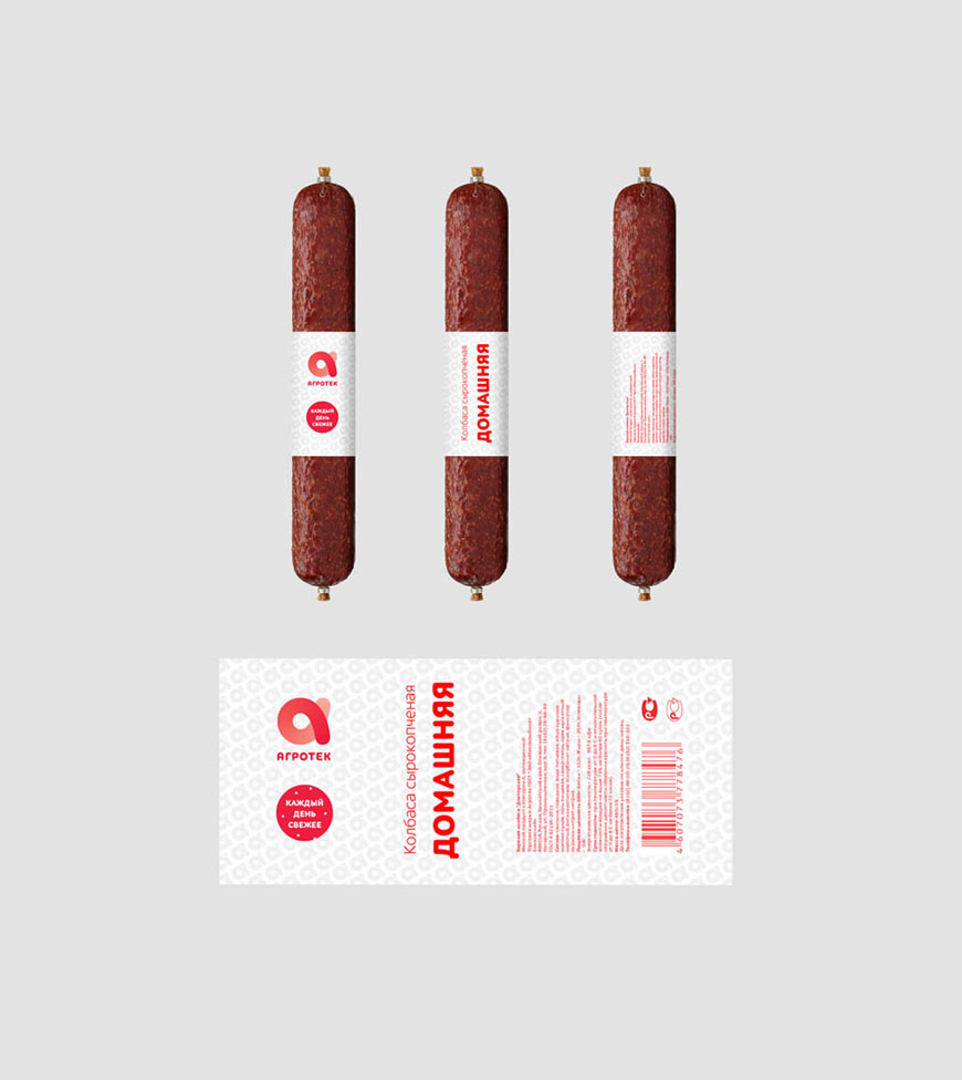
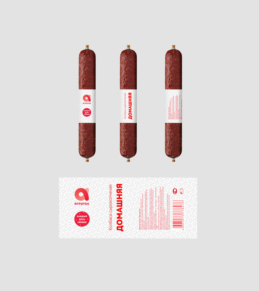
Frankfurters are OK and the design with line pattern is chosen for sausages.
Finally, the concepts for each mock-up are approved. Starting to draw the final versions.
We start with Domashnee Menu and Picnic. Before we start drawing, we need to formulate principles for use of graphics and color. Showing the ideas to the art director.
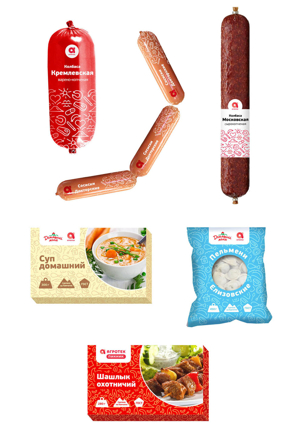
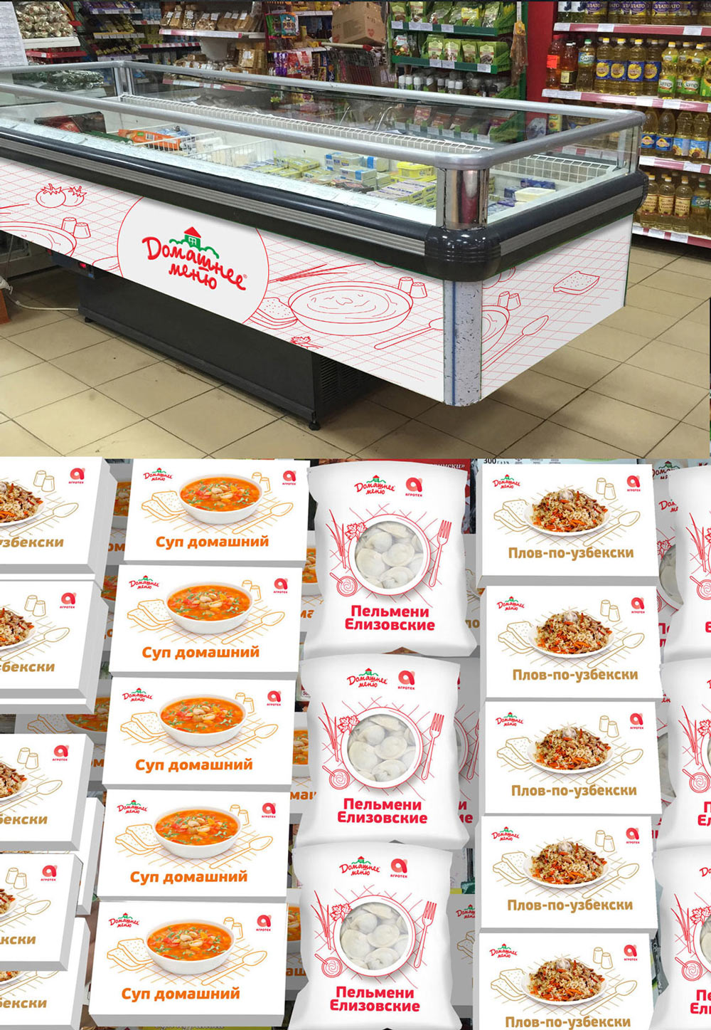
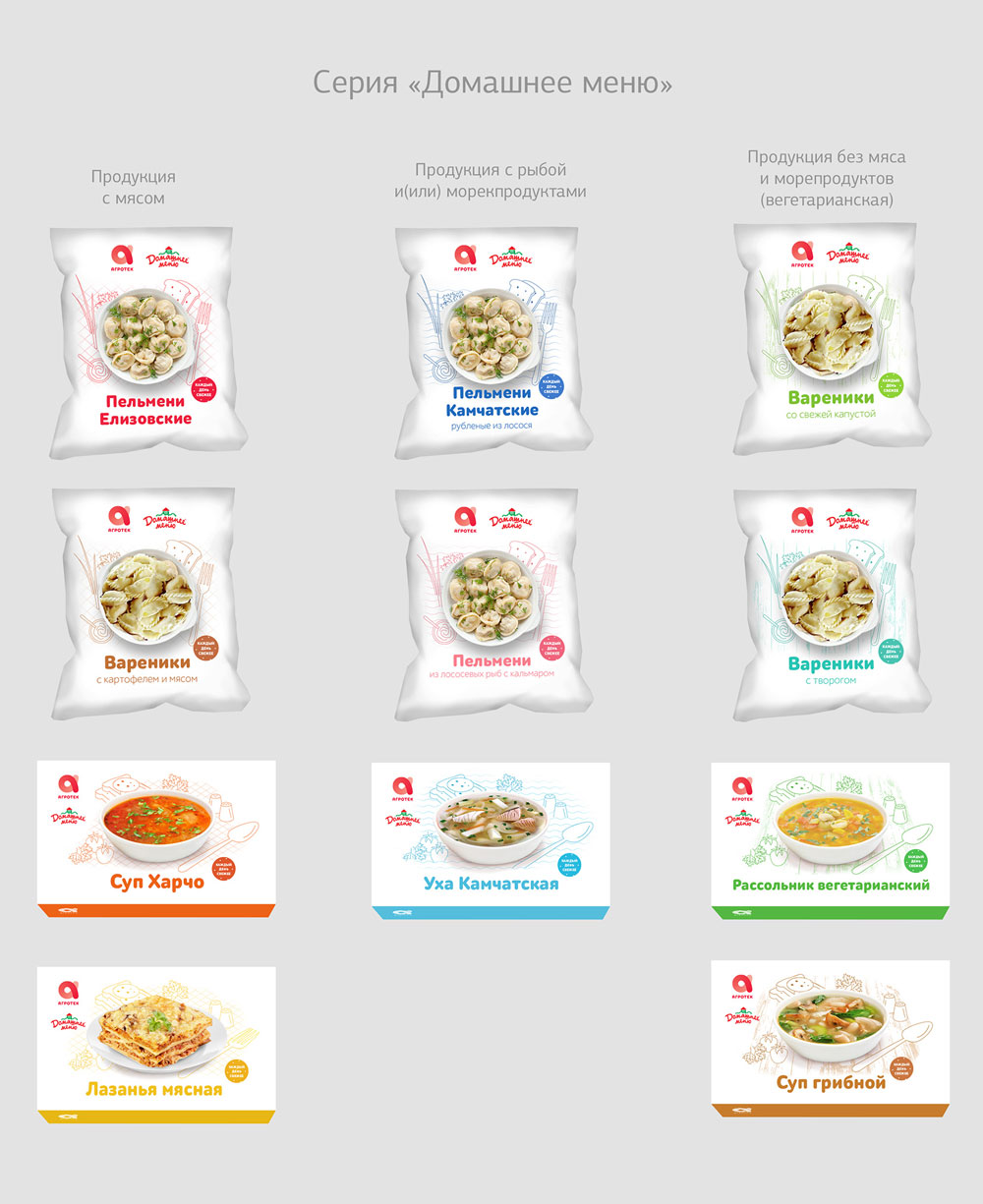
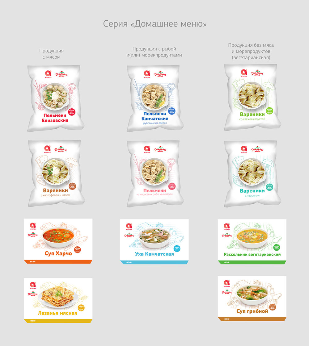
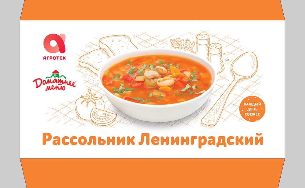
Domashnee menu:
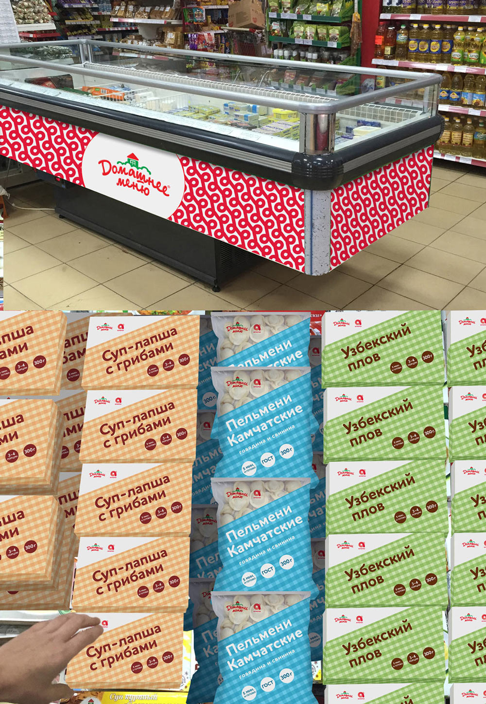
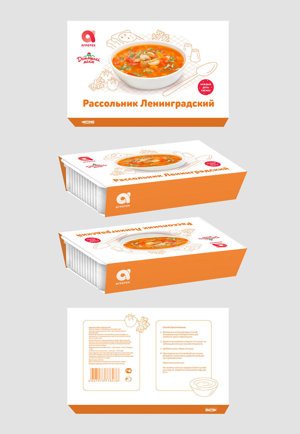
—color is chosen for each individual product (we should be careful not to repeat colors in one range);
—graphic elements depend on product type:
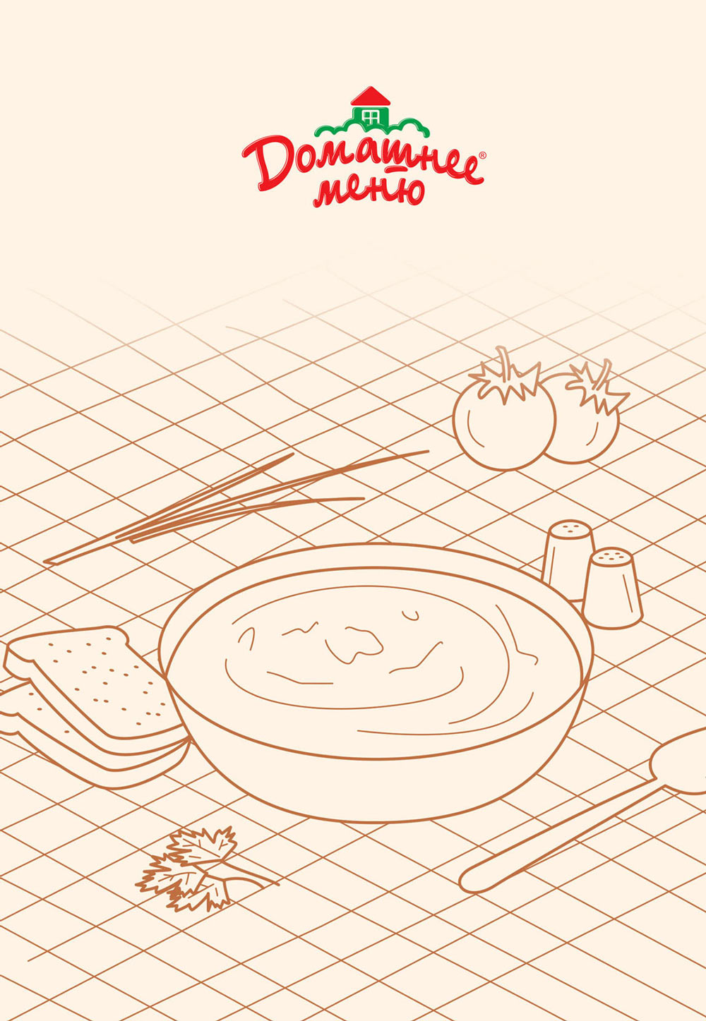
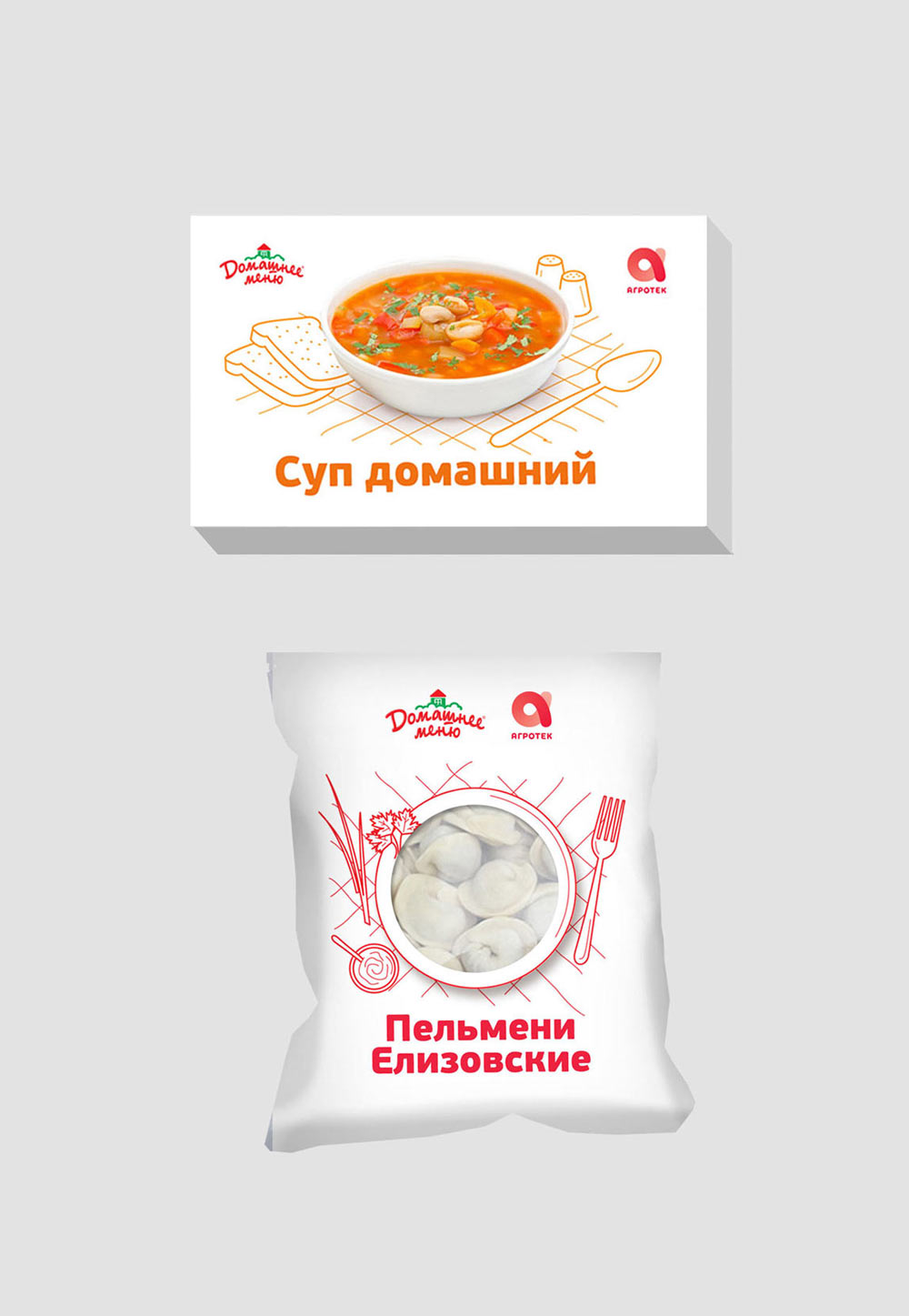
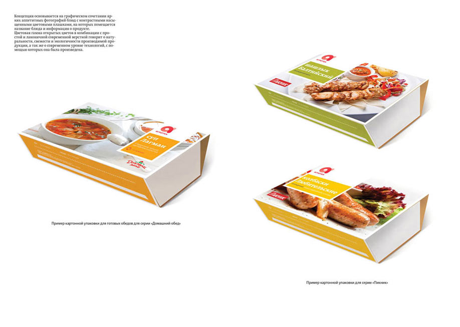
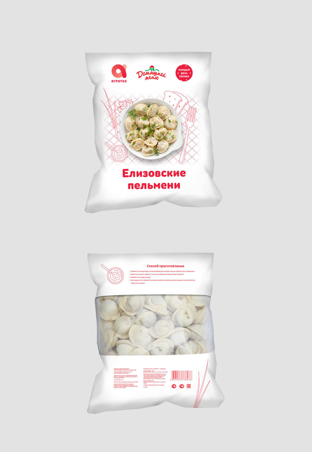
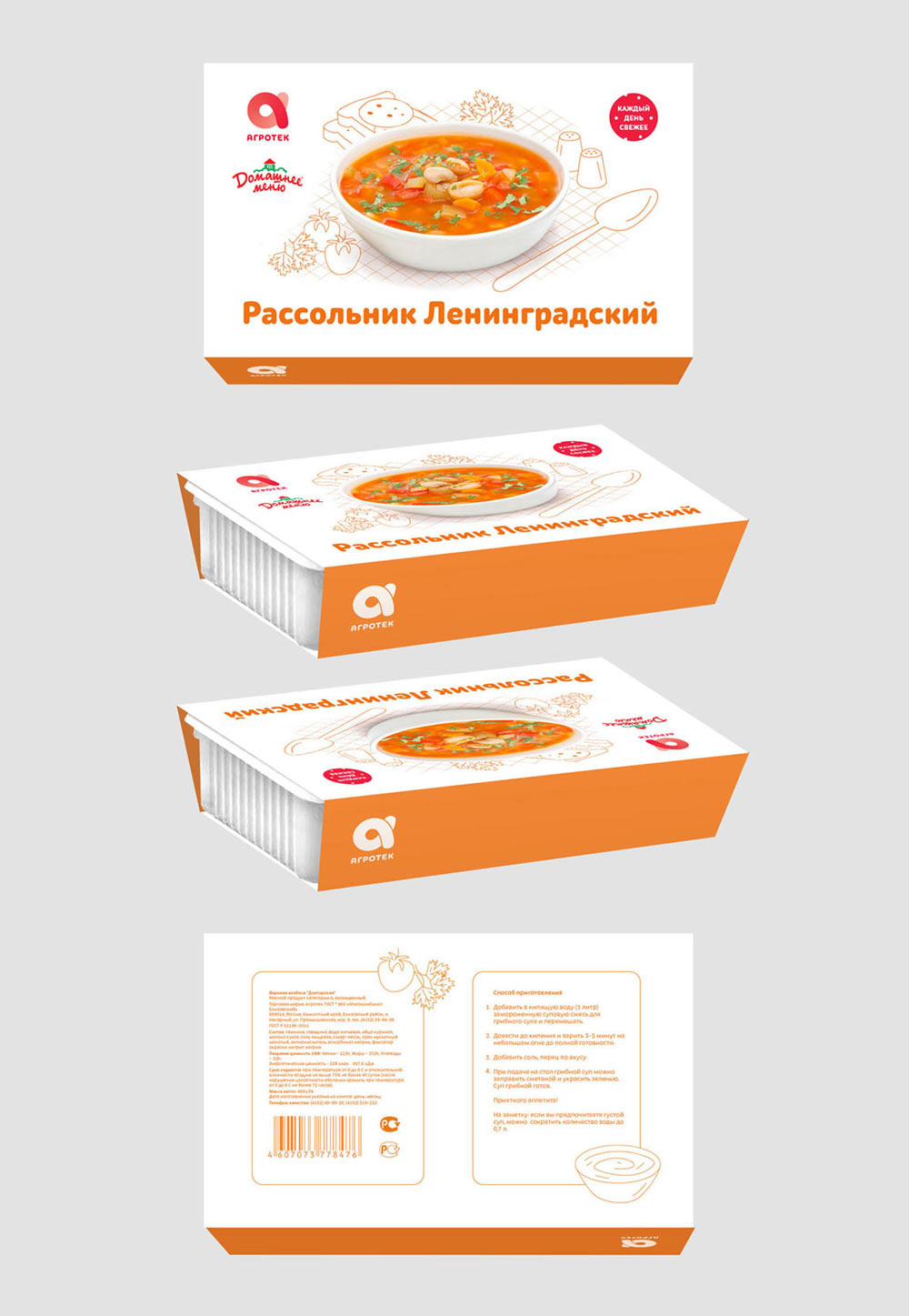
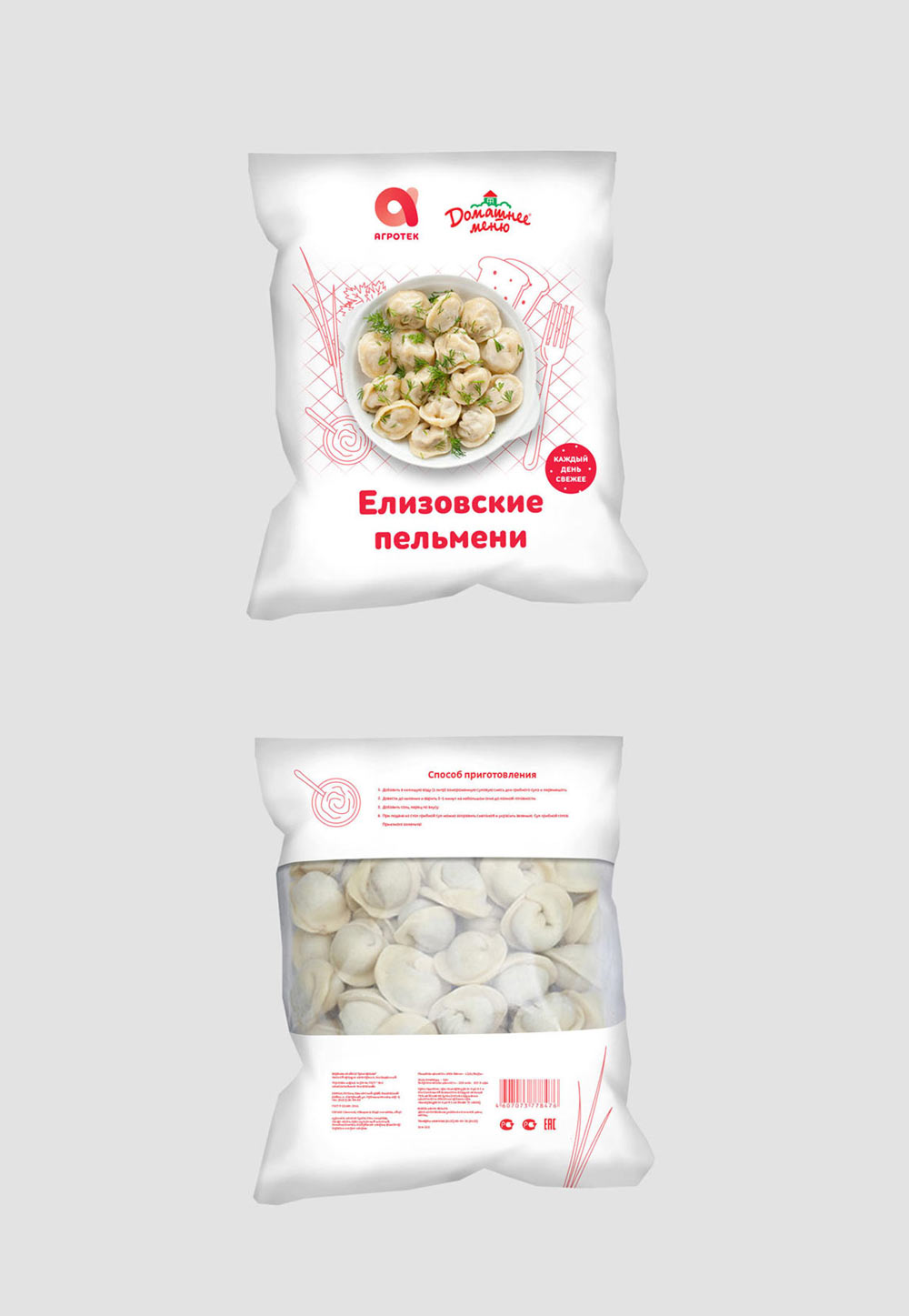
—meat products are pictured over a tablecloth (checkered pattern);
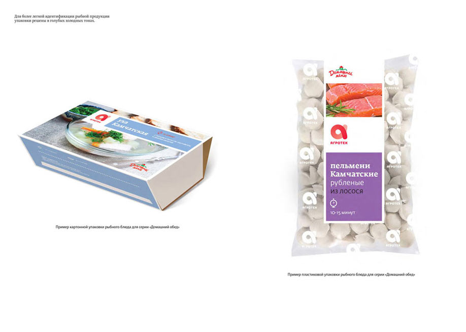
—fish and seafood products are shown over a wavy pattern (as if they’re sailing);
—vegetarian products are displayed on a wooden table (wood texture);
—products are also coded by which cutlery item is better suited to eat them, fork or spoon, while other objects are universal (bread, sauce, spices, etc.).
Let’s take Mashed Potatoes with Beef, for example:
1. The dish belongs to the Meet Products category.
2. It’s better eaten with a fork.
3. Using graphics with a tablecloth and a fork on it.
4. Choosing a unique color in the range.
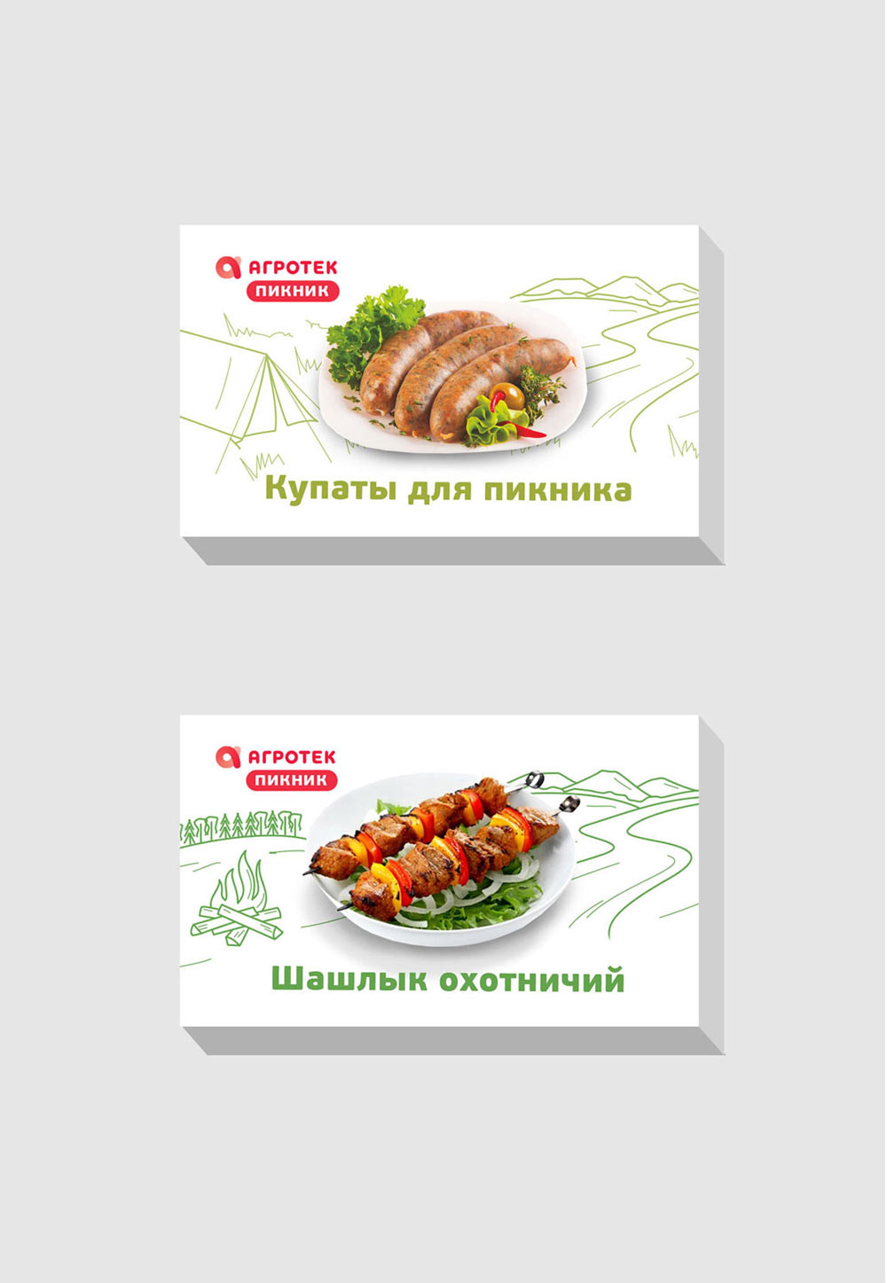
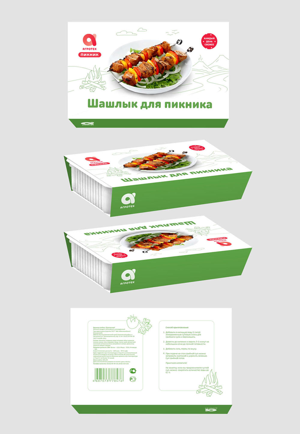
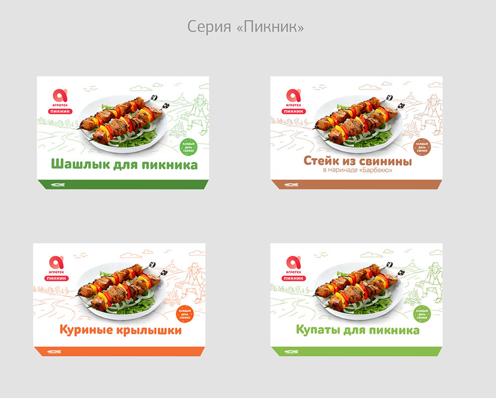
Picnic range:
—the color is also chosen for each product individually and is unique in the range;
—single graphic design for the entire range (a sketch of a cowboy by the fire).
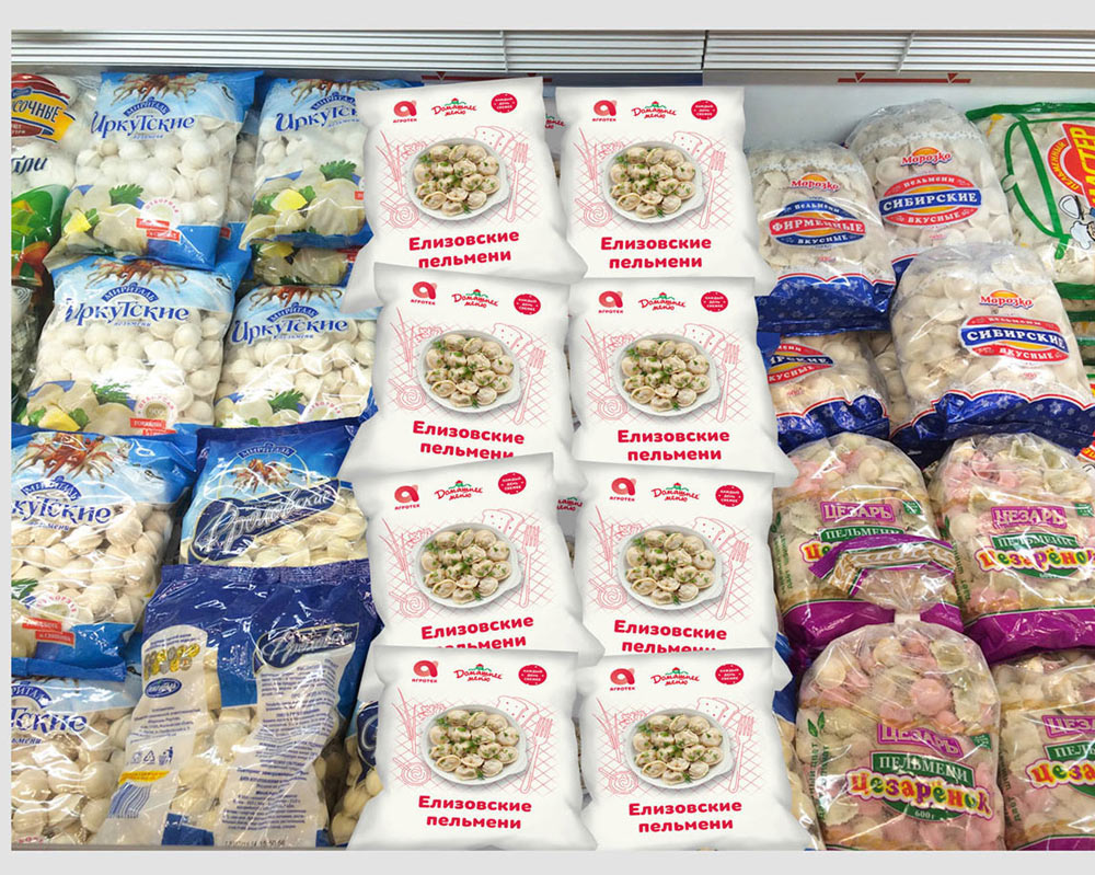
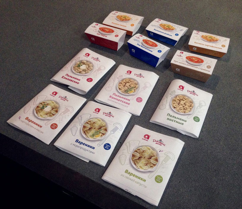
Art director: We also need the photos of ready meals to be different. Make sure a photo of pork pelmeni differs from a photo of salmon pelmeni.
Designer: Then meat pelmeni and pierogi will be shown with sour cream and parsley or dill (classic accompaniments), those with fish or seafood will have rosemary or thyme and a slice of lemon (seafood spices), vegetarian ones won’t have anything. I’ve also created separate graphics: for pelmeni—a pelmeni on the fork with spices (onions, parsley or dill) and sauce next to it; for pierogi—a pierogi on the fork with bread and a sauce next to it. I’ve removed the sausage slice on bread from the packaging for soups and main courses as I want to have consistency with vegetarian products (I don’t want to create separate graphics to avoid making production too complicated). Haven’t fixed the cowboy yet, we’ll just explain that he sits by the fire and maybe has a frankfurter on a stick.
Drawing the rest in the same style, working on illustrations for each mock-up. Asking the illustrator to draw the cowboy.
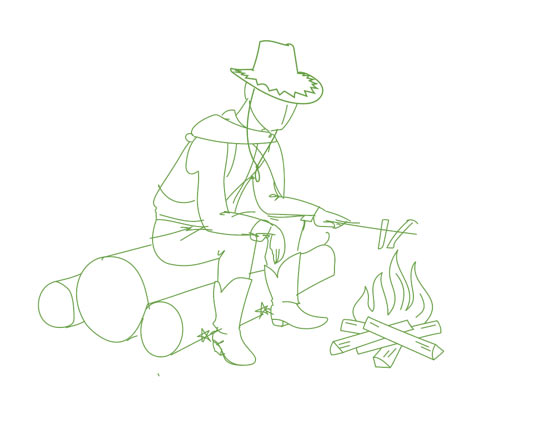
Art director: His hands look tender, he’s just like a T. Rex :)
Slightly changing the posture and transforming a younger guy into a brutal cowboy.
Printing full-size mock-ups, taking a close look. Adjusting line width in illustrations to make sure the graphics stand out from the background and yet don’t draw too much attention.
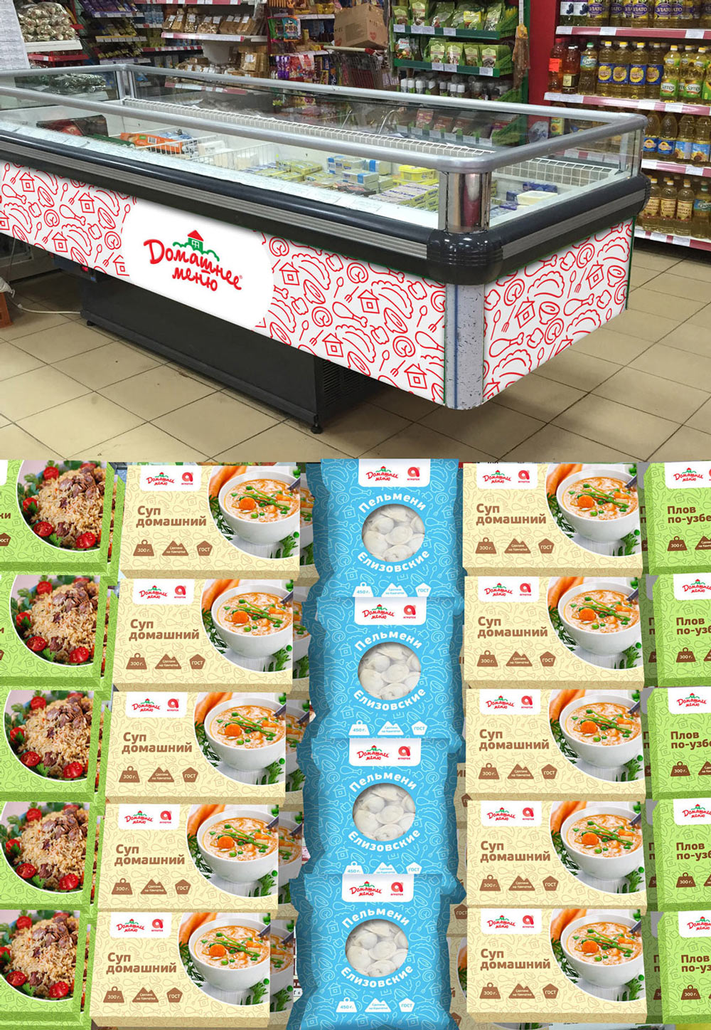
Sending the approved concepts and final illustrations to the typesetter to assemble mock-ups.
Typesetting the mock-ups and the guide.
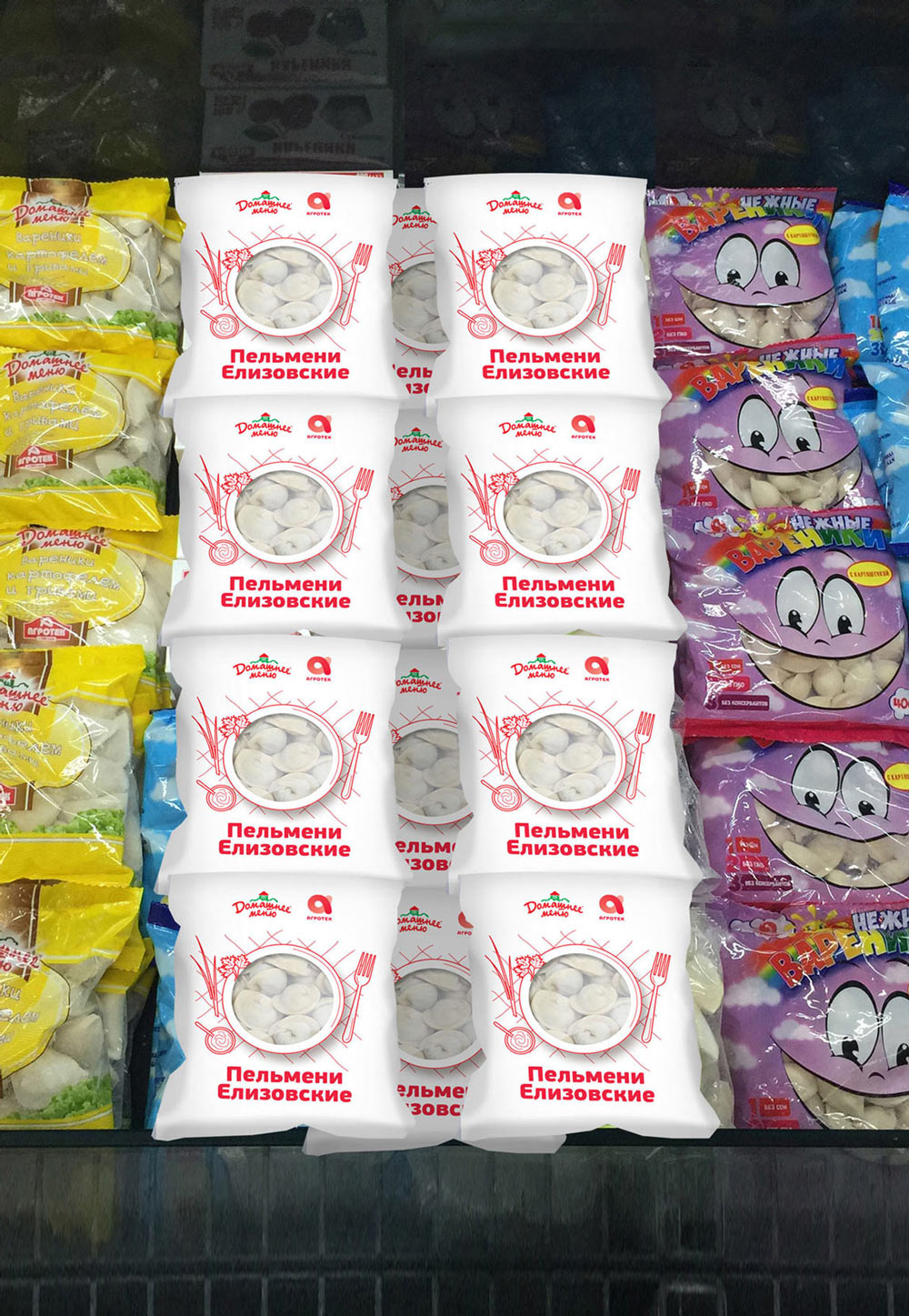
Receiving production samples and writing comments.