
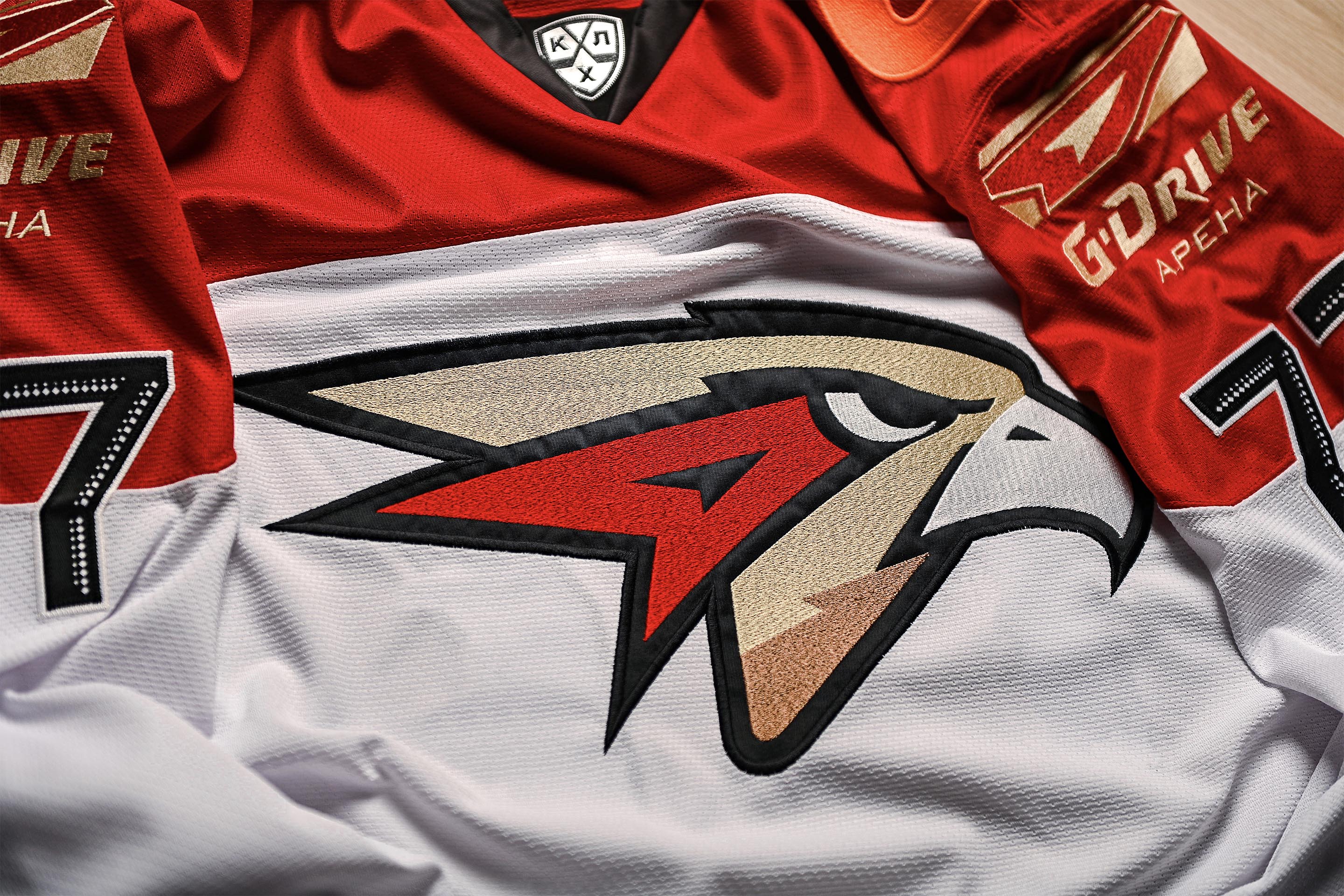
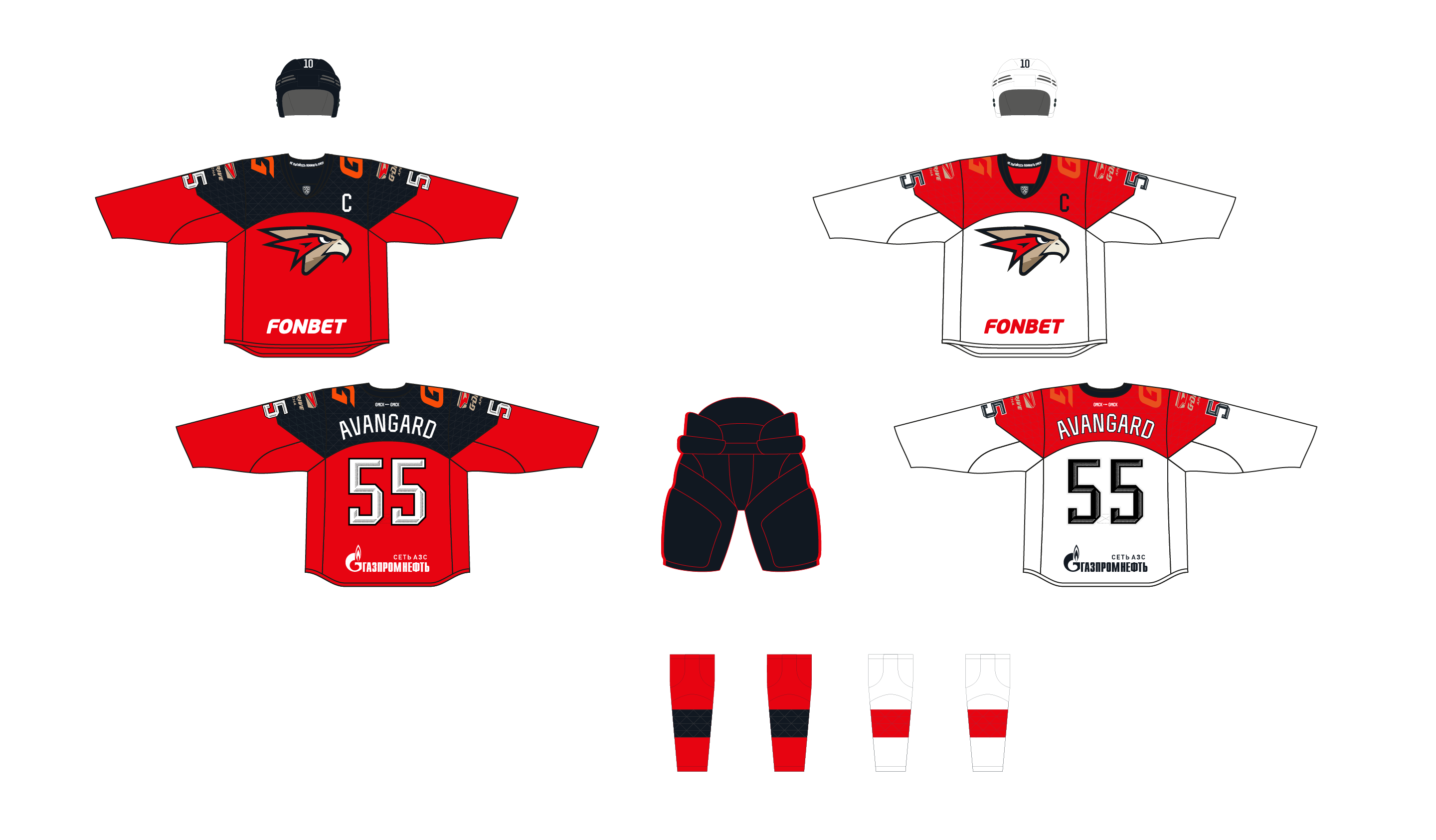
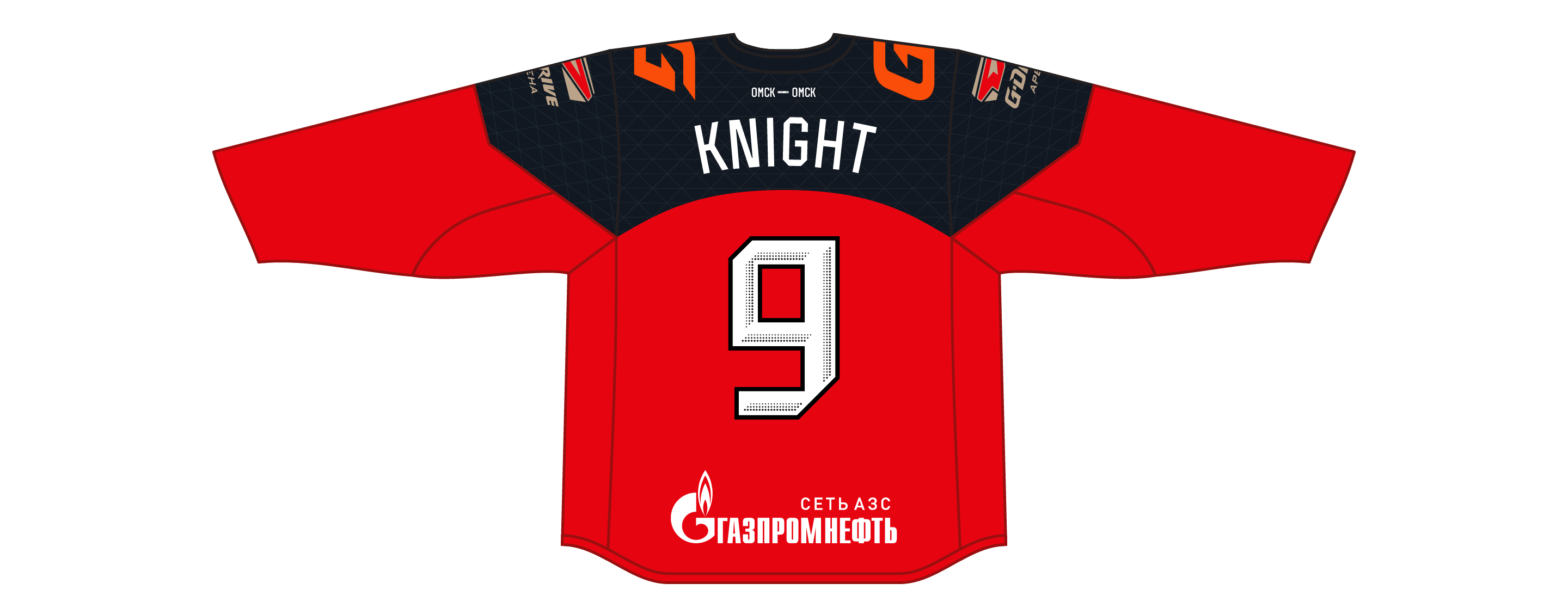
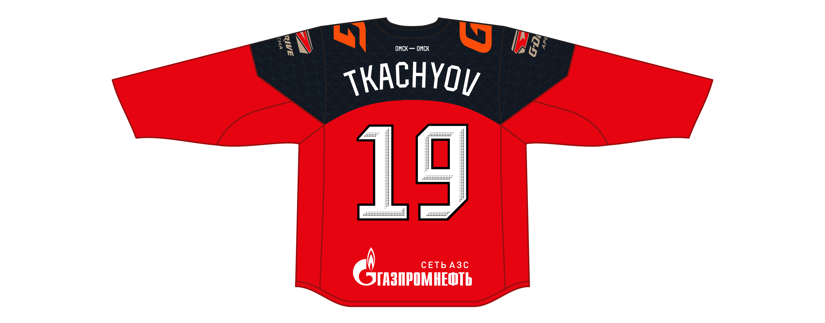
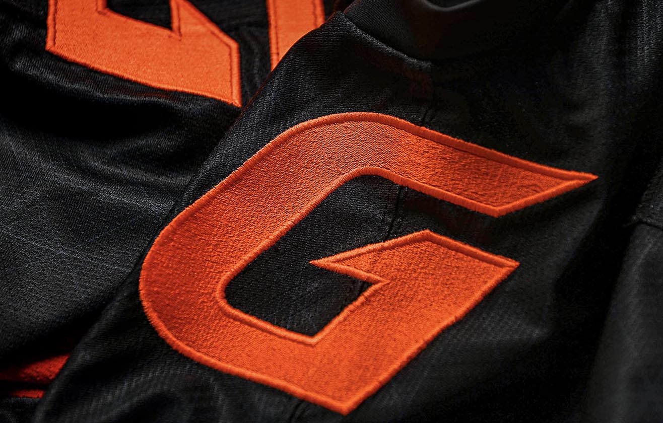
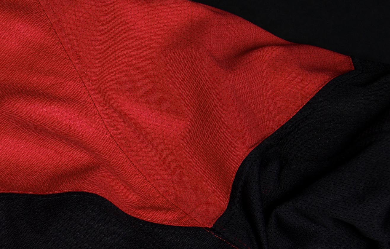
After returning to its home arena, Omsk Avangard adopted studio-designed red jerseys with a black shoulder arch as its home uniforms. The curve of the arch and the arrow-shaped elements refer to the image of the G-Drive Arena.
The away uniforms are traditionally white.


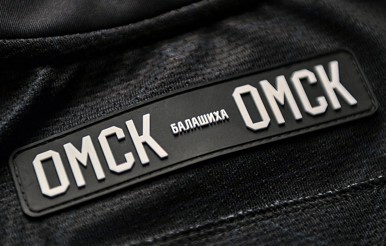
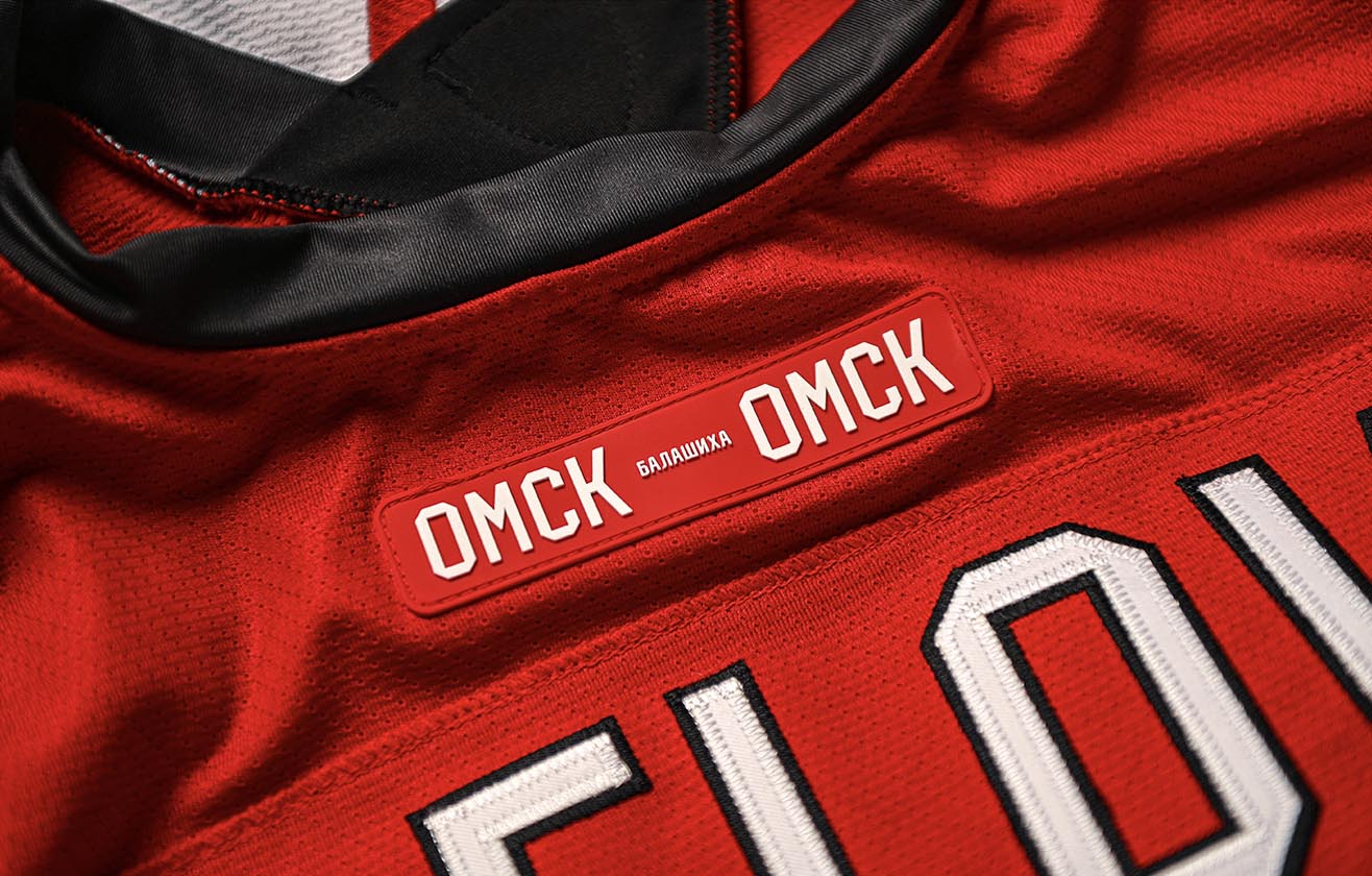
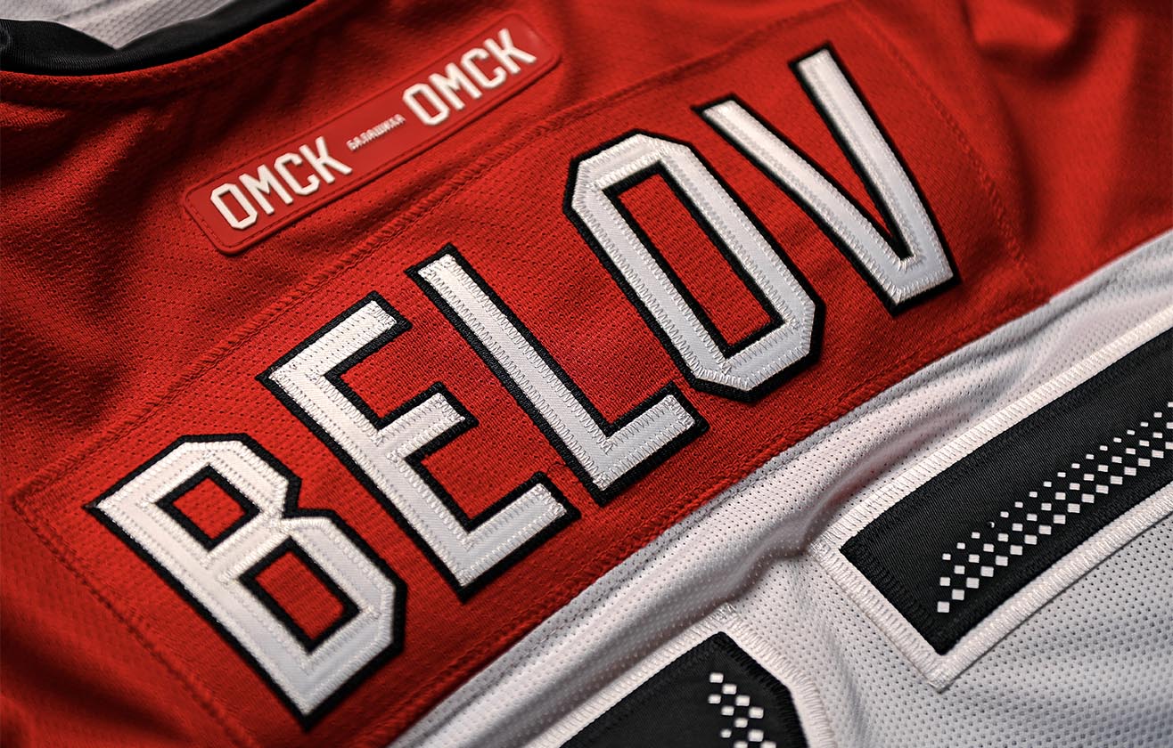
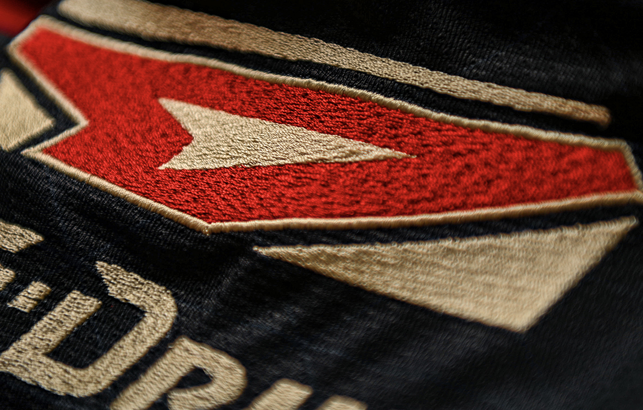
A special patch on the collar recalls the history of Avangard’s arenas: Omsk, the forced move to Balashikha and finally the long-awaited return home.
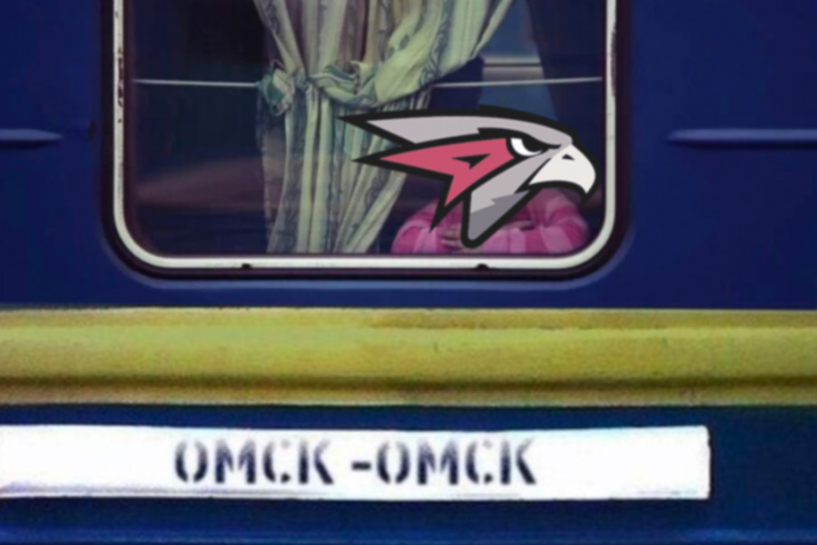
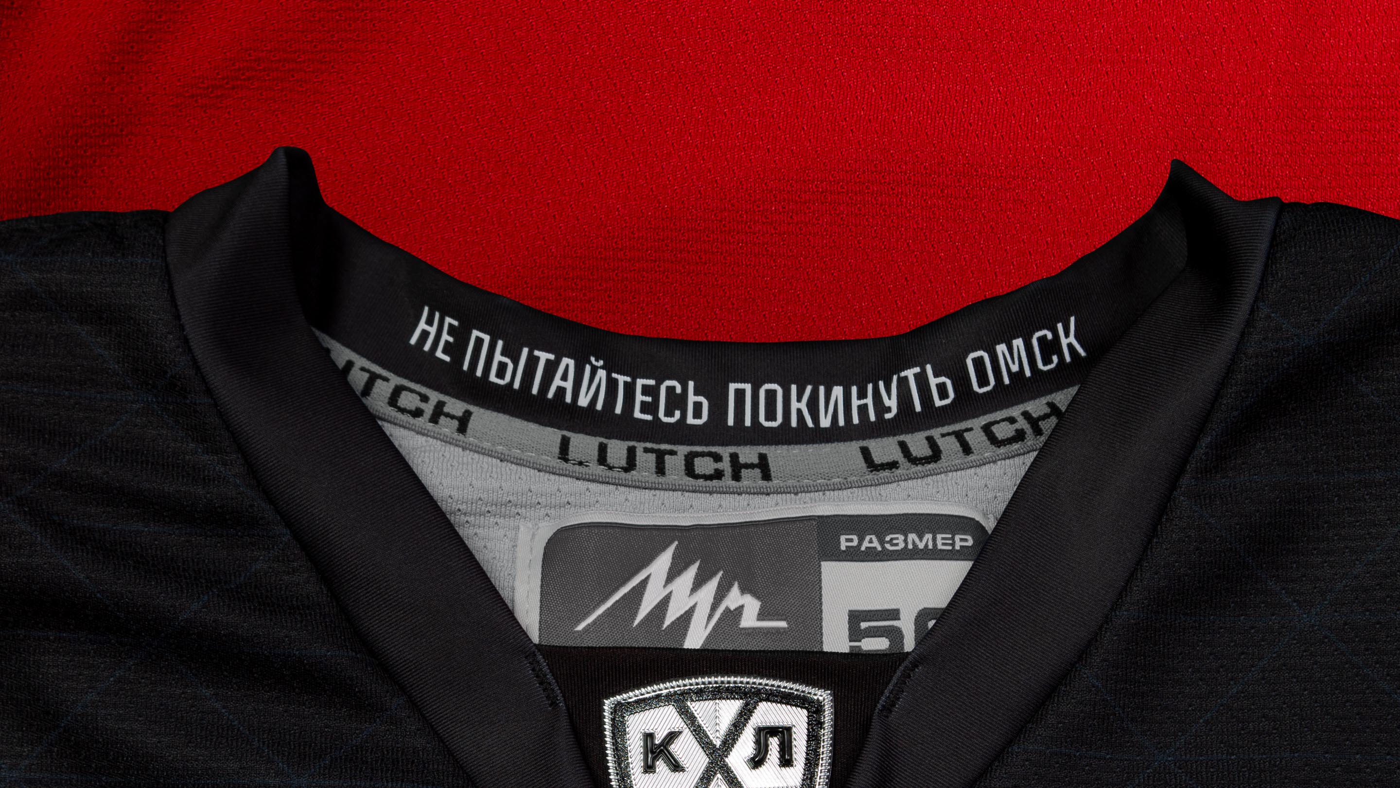
The back of the collar is embroidered with a phrase that makes it clear: no matter where the team is, sooner or later it will always return to Omsk.
Typeface
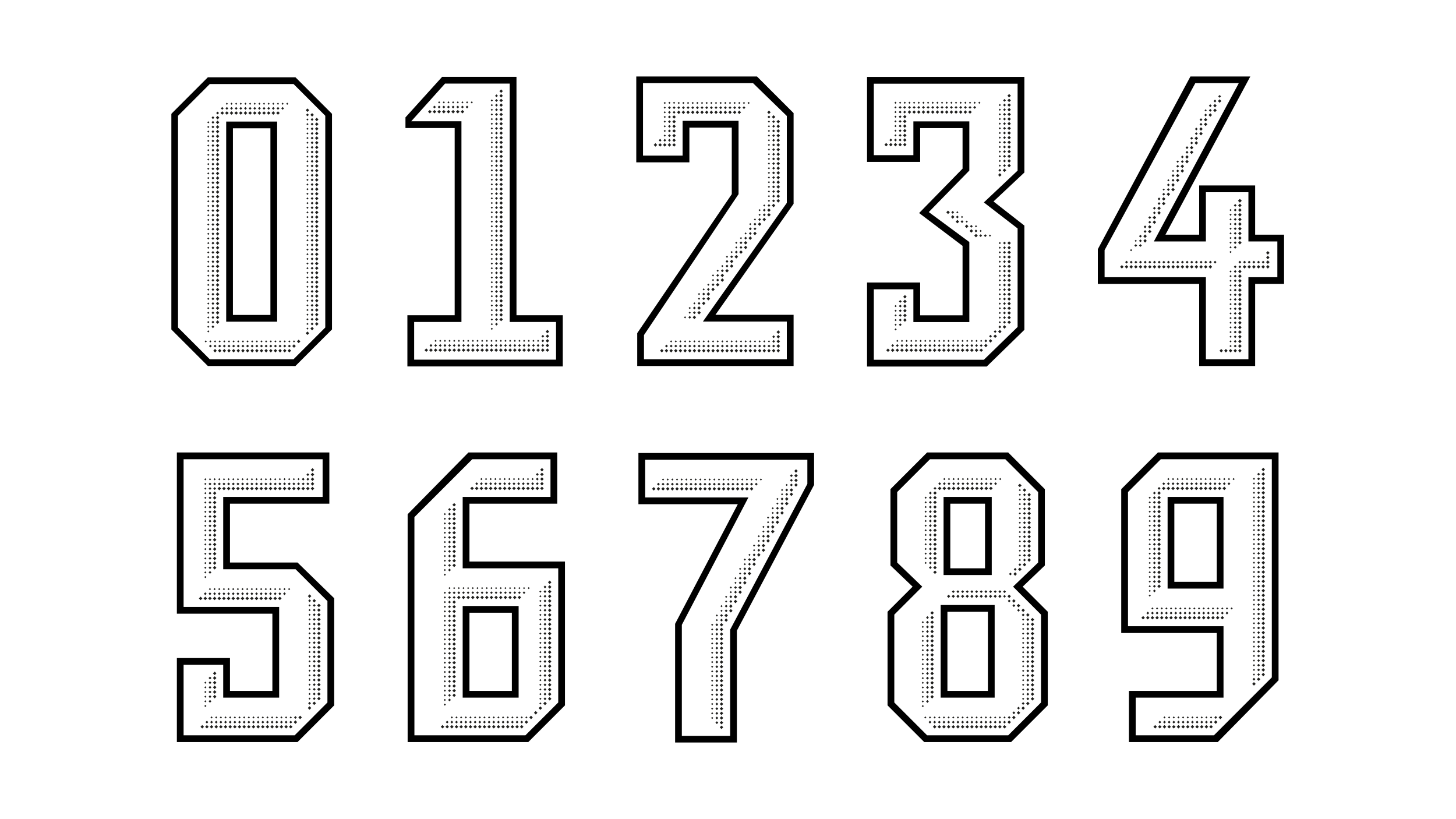
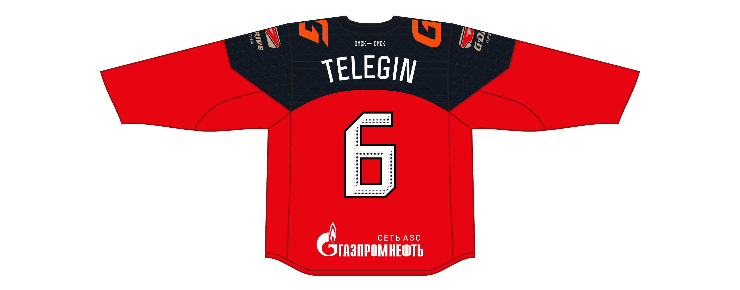
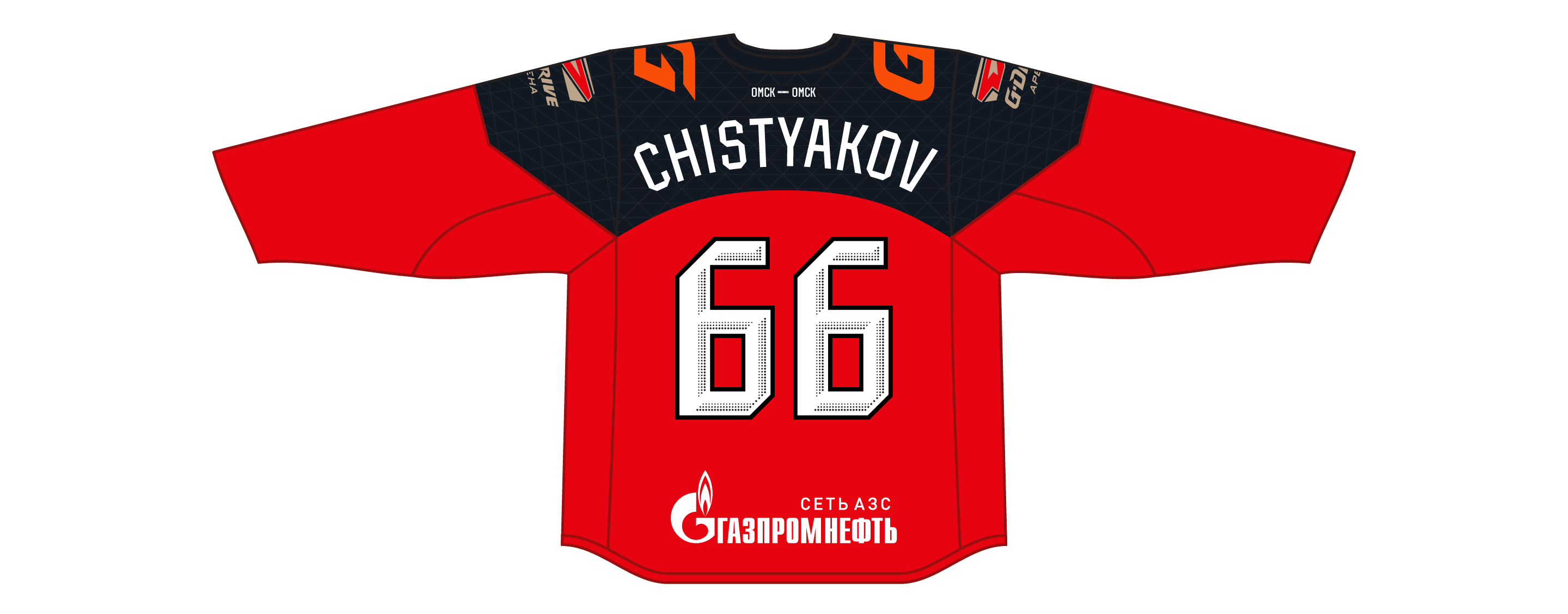
The typeface used for players’ names and numbers on the jerseys was created specially for Avangard. The slant of the letters and digits echoes the pattern on the shoulders. Names are written along the arc repeating the shape of the shoulder arch, which is both beautiful and functional, as even the longest names can fit without much distortion.
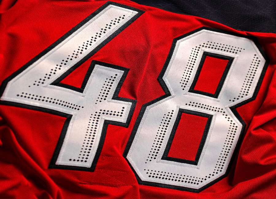
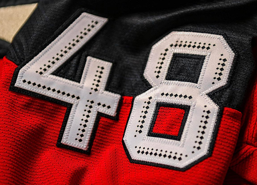
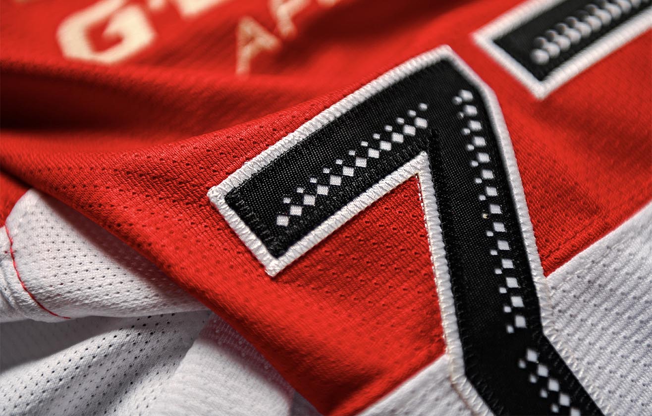
The digits are made from a two-layer material: the upper layer has a special perforation which makes the digits appear as if they have volume.

An additional style of digits was designed for placement on shoulders and helmets. It is smaller, so all elements are rendered in different, larger proportions.

On the back
On the shoulders
Depending on the number of digits in the player’s number, a narrower or wider type is used: narrower if the number has one digit and wider if it has two.


art director
designers
- Ilya Udovichenko
- Valery Tolchanov
type designers
- Taisiya Lushenko
- Alexey Malkov
