Identity of “DIA Holding”
“DIA Holding” creates residential, commercial, and social real estate. The company strives to form a comfortable and high‑quality environment for the lives of new generations. The holding’s strategic priority is the implementation of projects and development in the market of the United Arab Emirates.

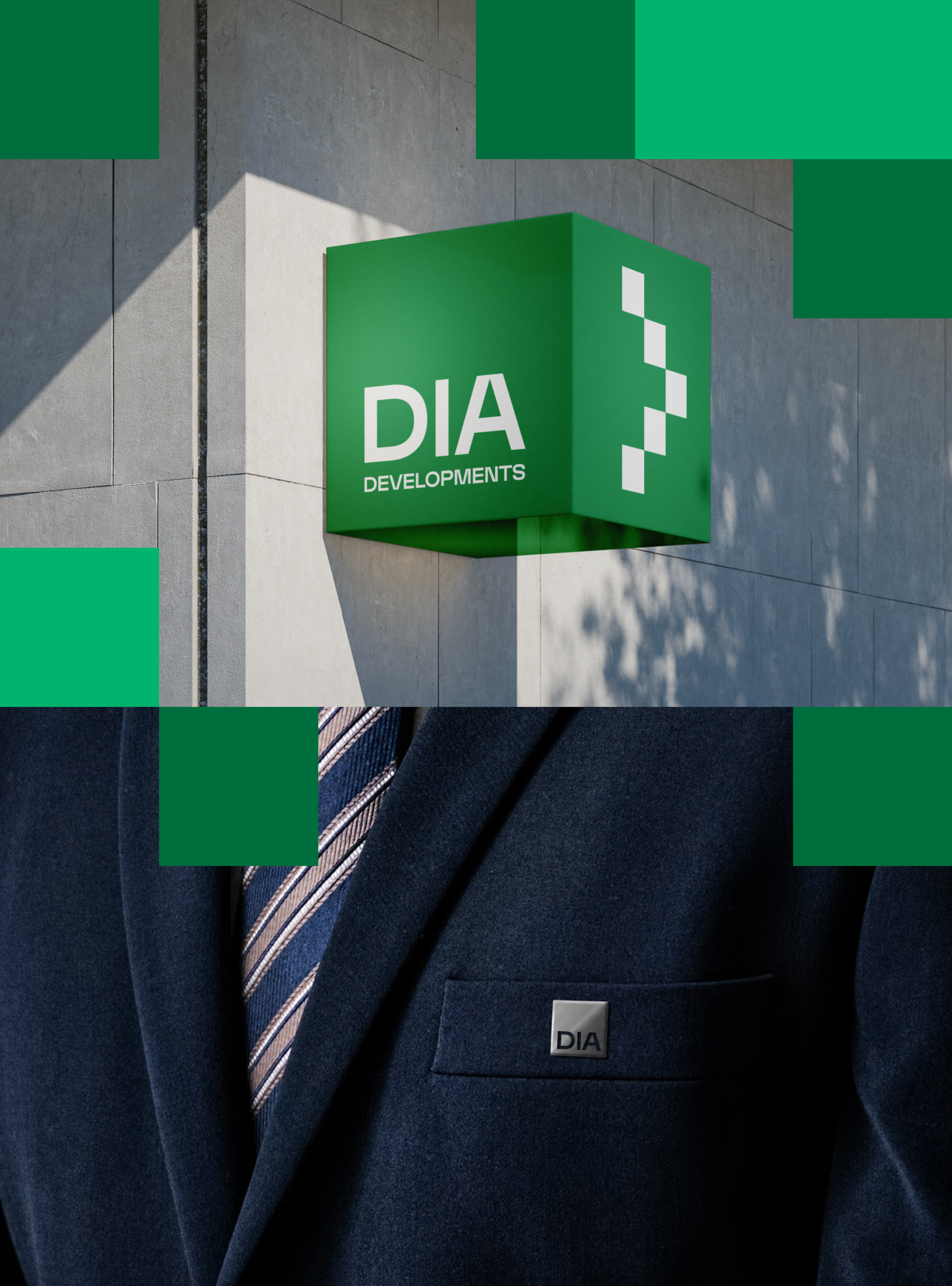
The name of the holding is a mix of the abbreviation “Dubai Island” and the Spanish word “día” (day). The studio created a fresh and modern visual image for the holding. The main element of the identity is a square, a symbol of resilience and stability. The name in the lower part is a kind of foundation, the basis of the reliable work of the entire holding.
The cool green color gives the identity a maximally invigorating mood, making the palette deeper and richer. The spirit of innovation and breakthrough power is felt immediately.
A special DIA typeface was developed for setting bold headlines.
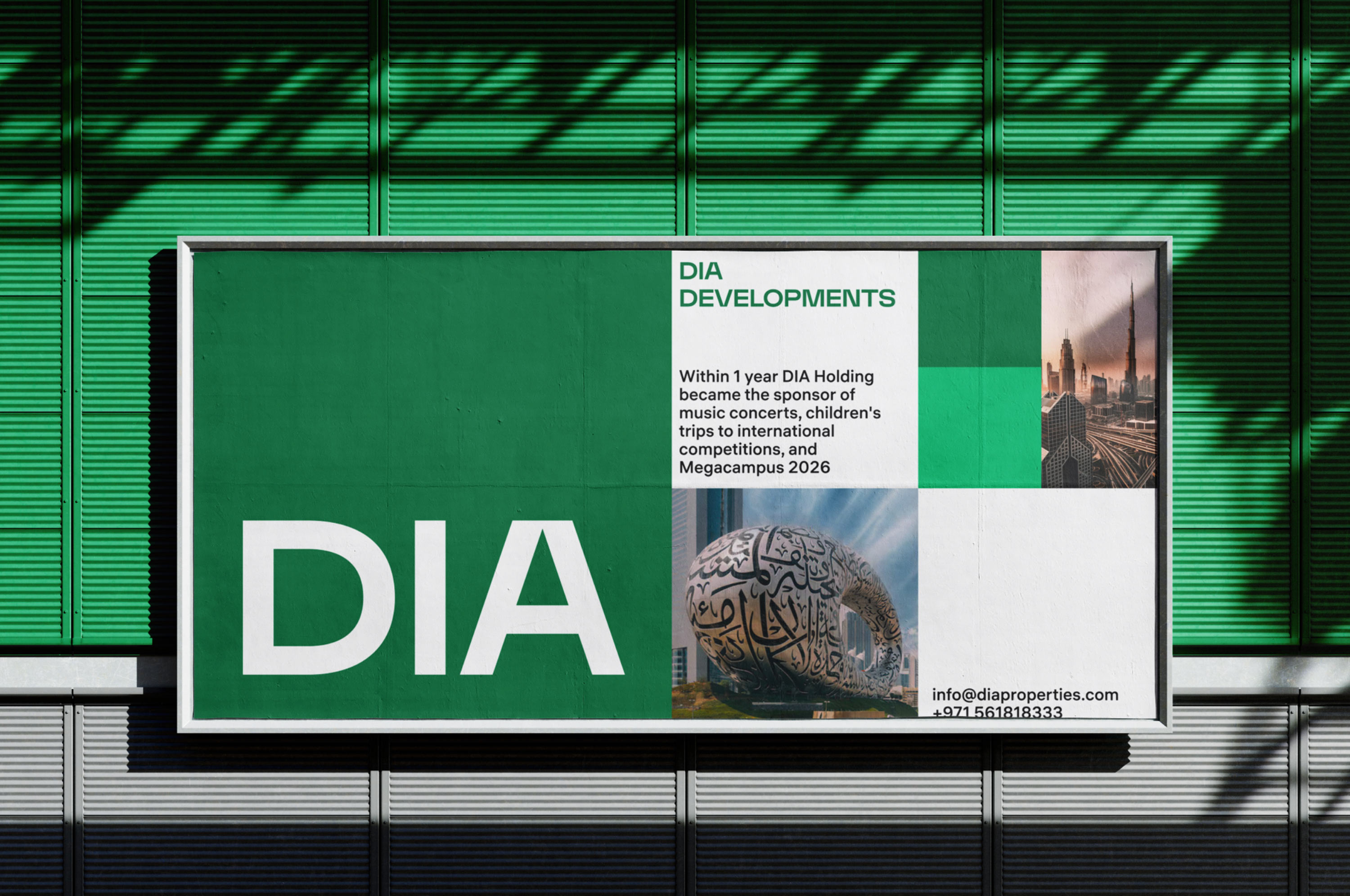
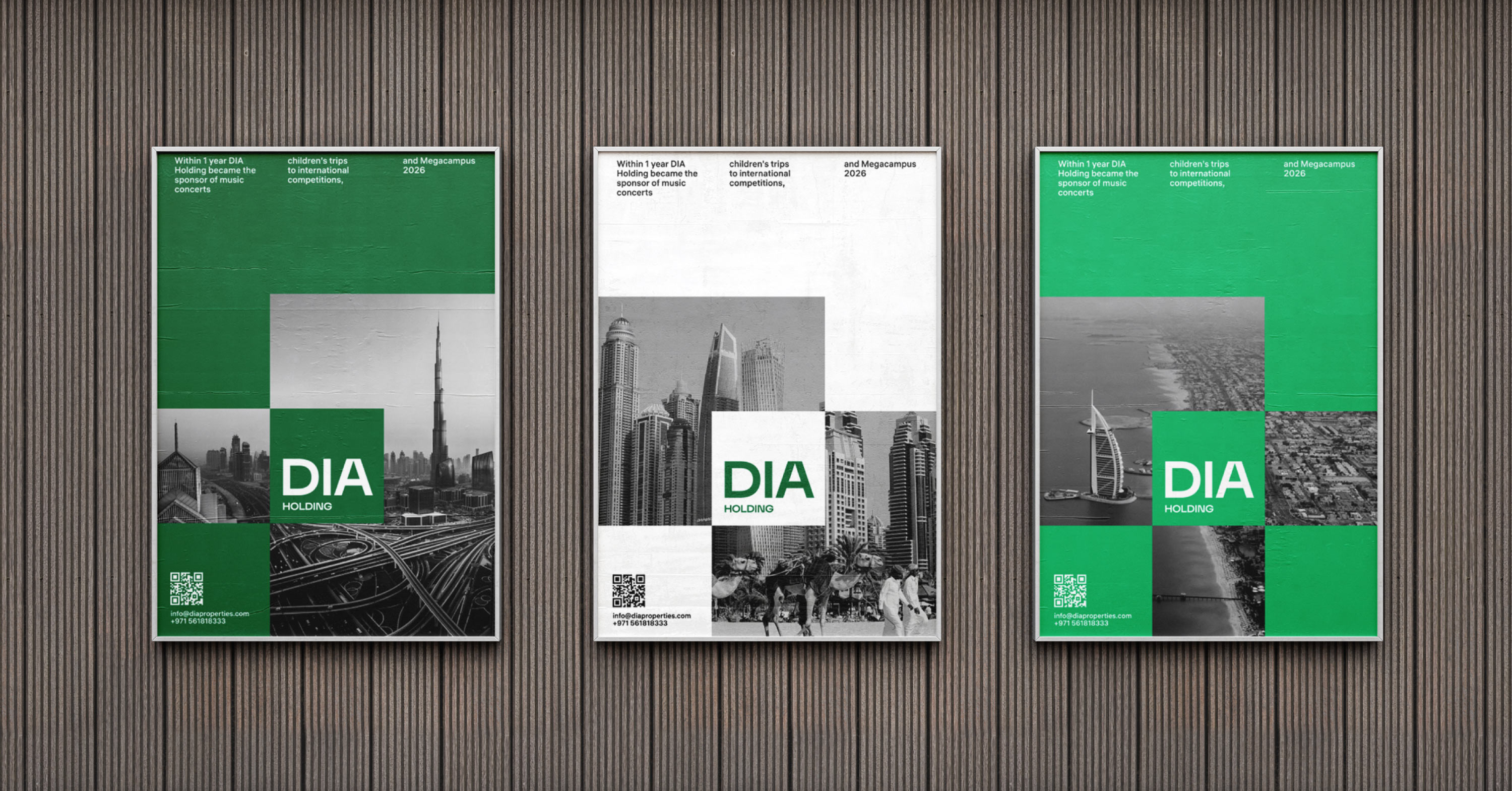
The sign becomes the basis of the corporate grid. Any material laid out according to it turns into a brand attribute. The grid also works perfectly for decorating properties.

The corporate grid becomes a framework that is filled with any thematic graphics and texts.

A detailed guide ensures correct and effective use of the flexible identity.