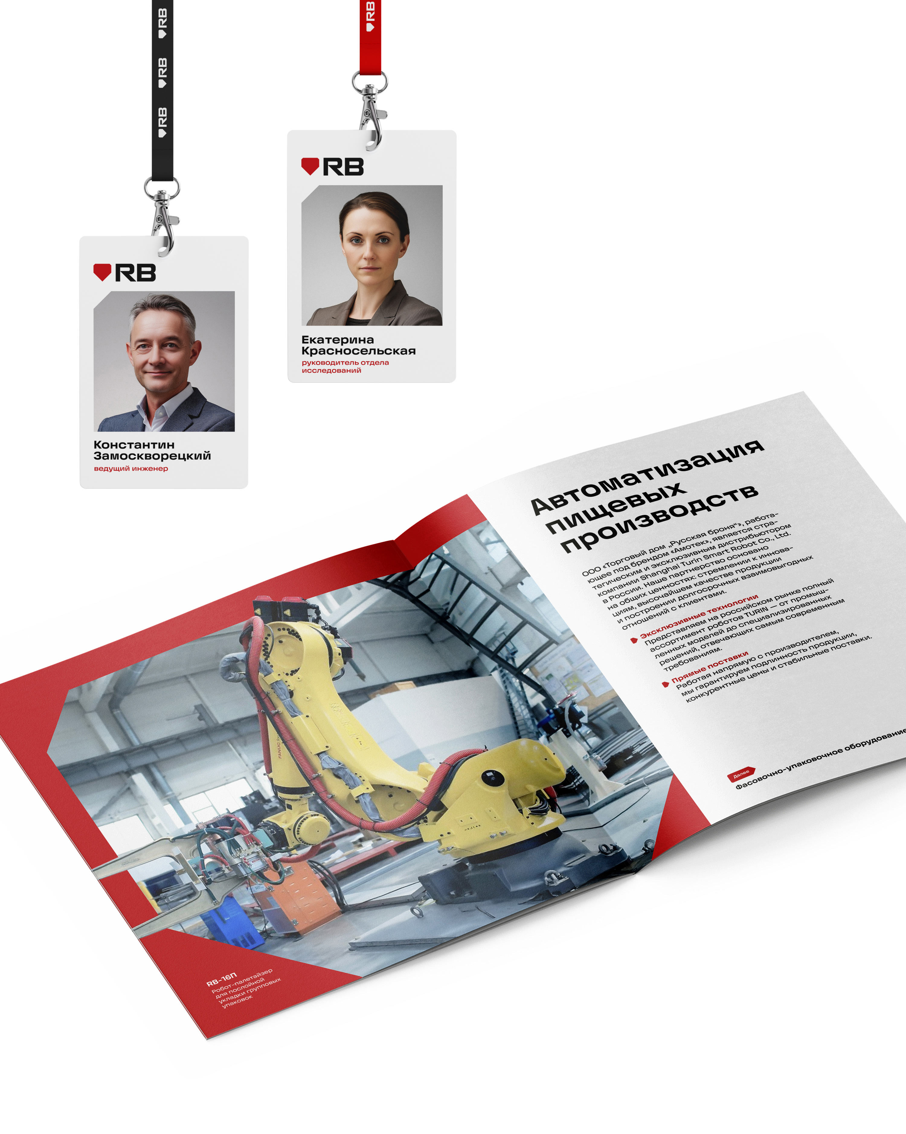
Naming and identity for RB company
“Russian Armor” is a company that started making safes and indestructible steel doors in 2001. Then it expanded its range and began producing complex automated systems under the Amotek brand. To unite the two directions under a modern brand while preserving continuity and recognizability, the studio came up with a shortened name for the company and designed a solid style that speaks to the reliability of the products manufactured.
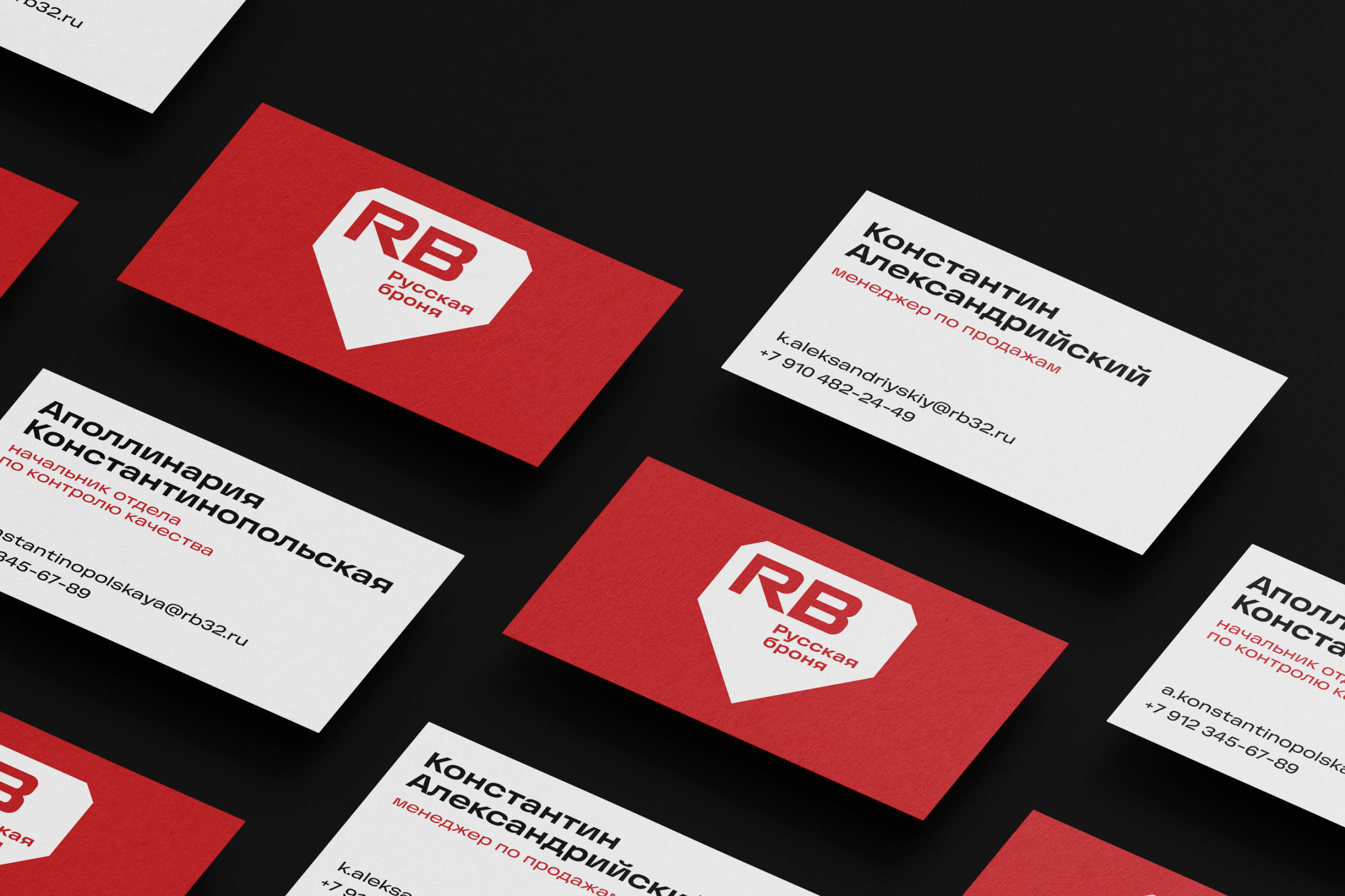
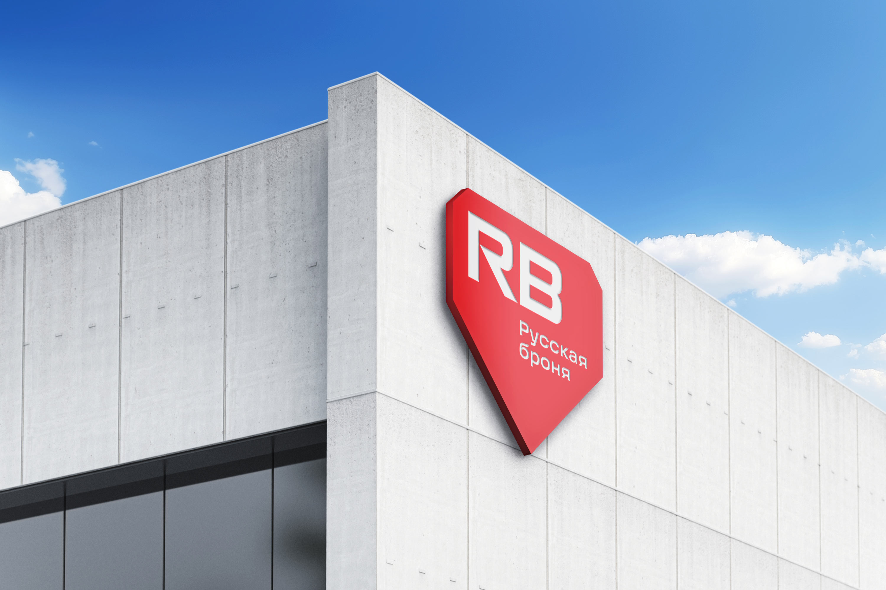
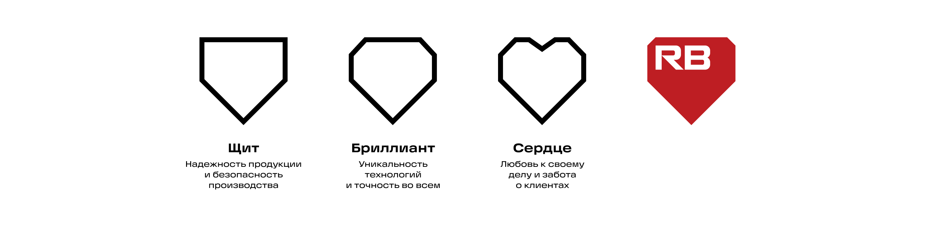
The key images for the company are combined in the logo. All of them are easily read in the geometric form of the mark.
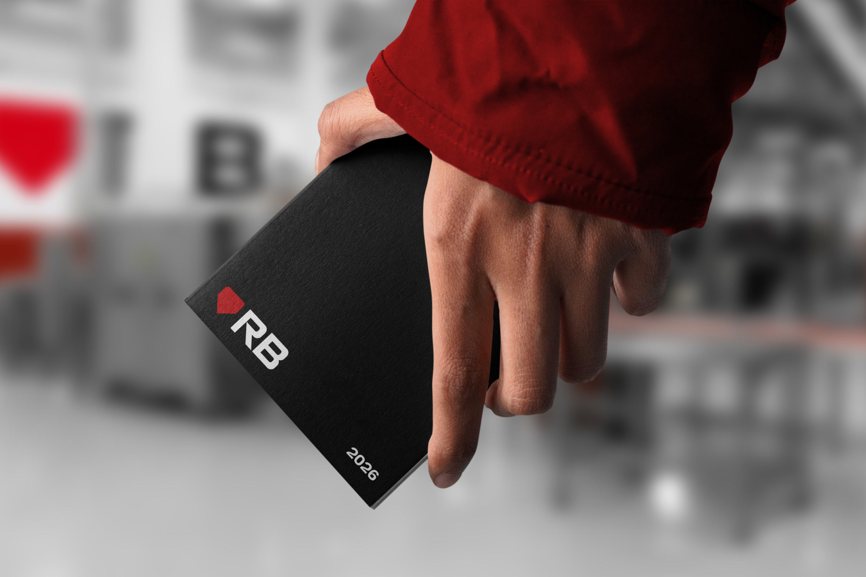
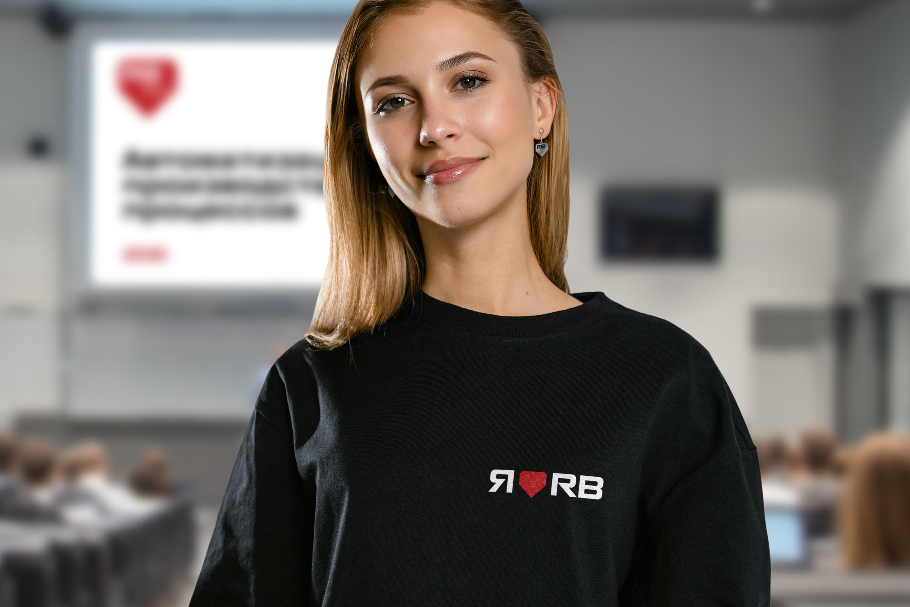
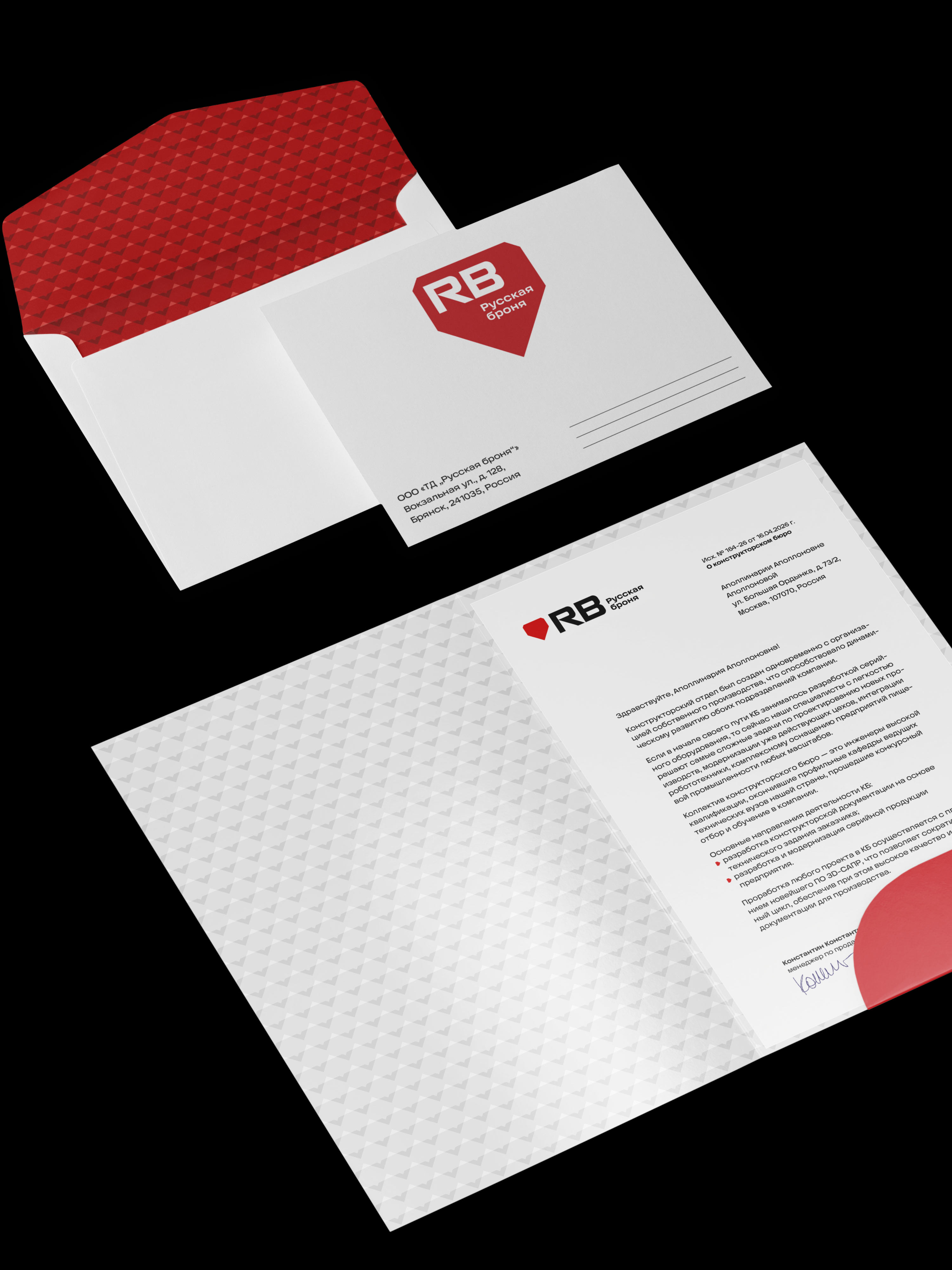
An alternative composition of elements is provided in the additional version of the logo.
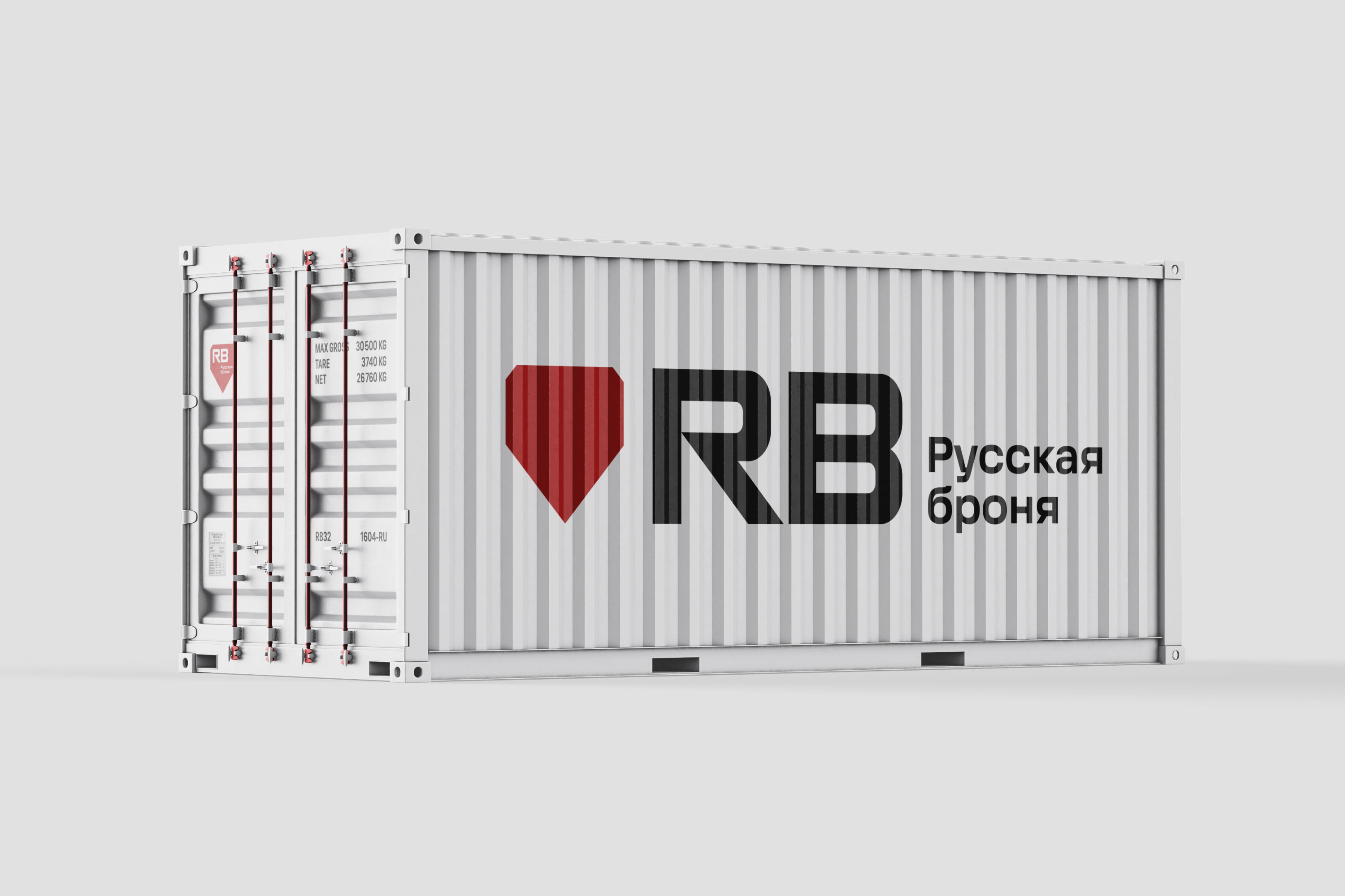
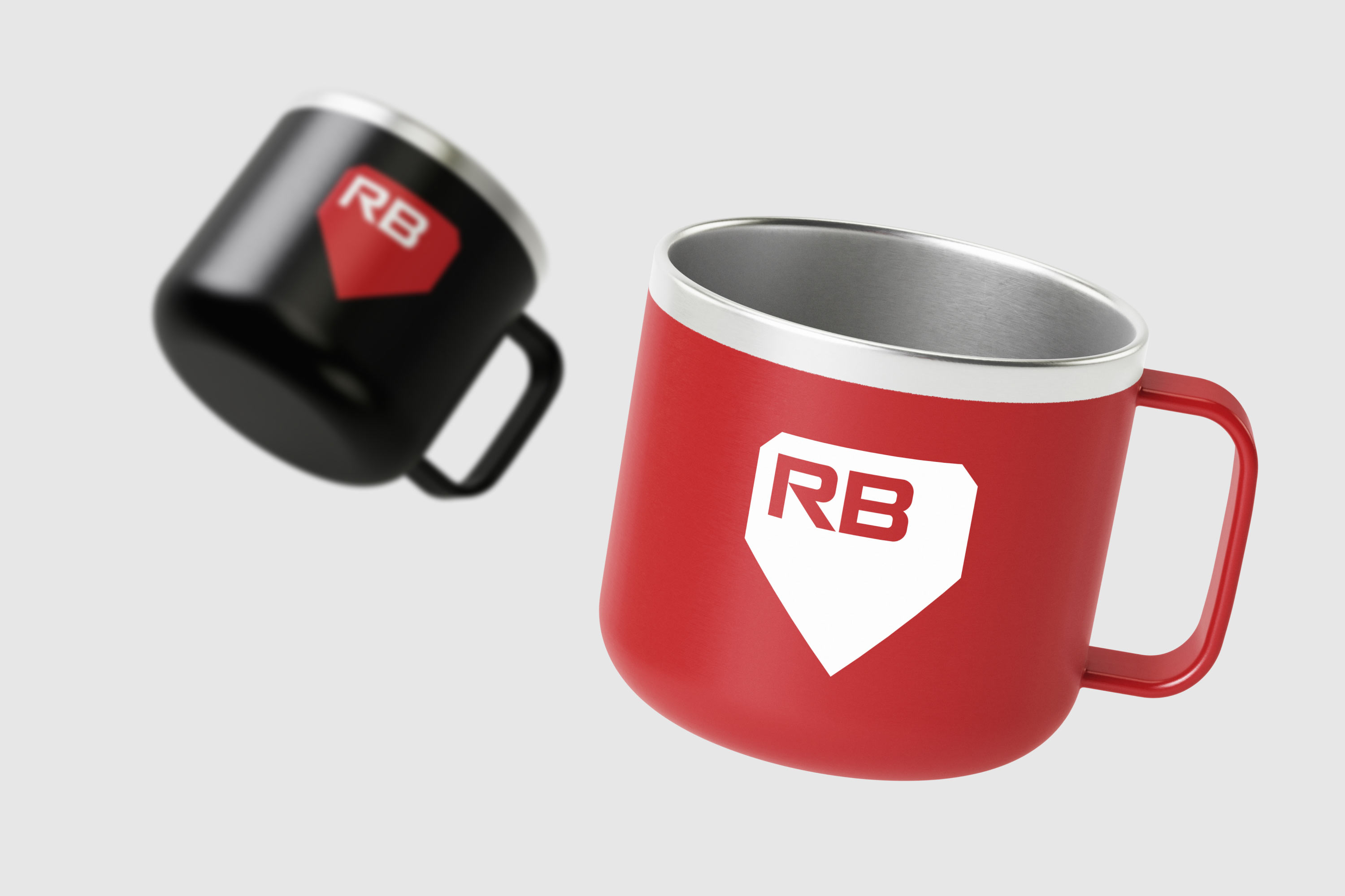
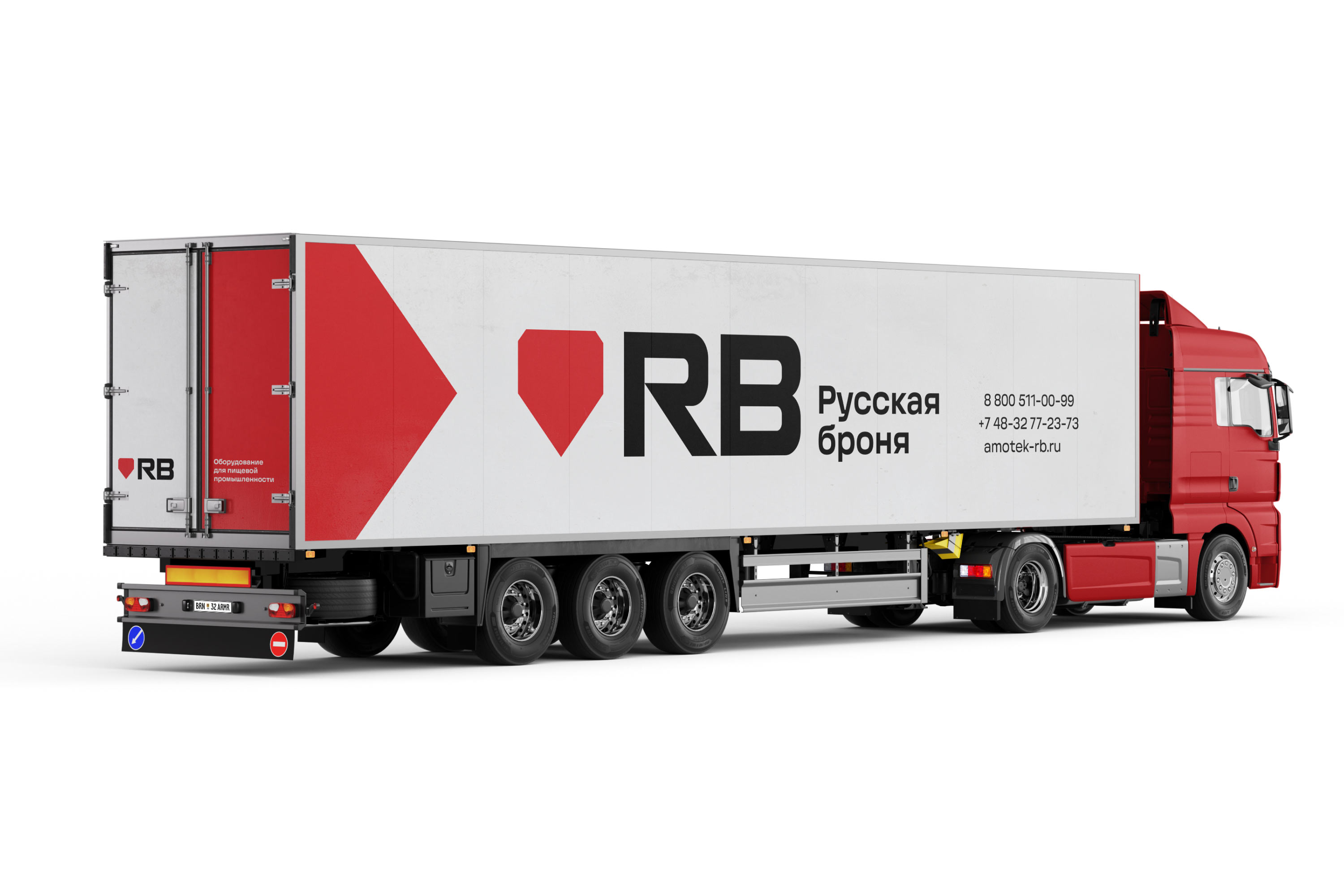
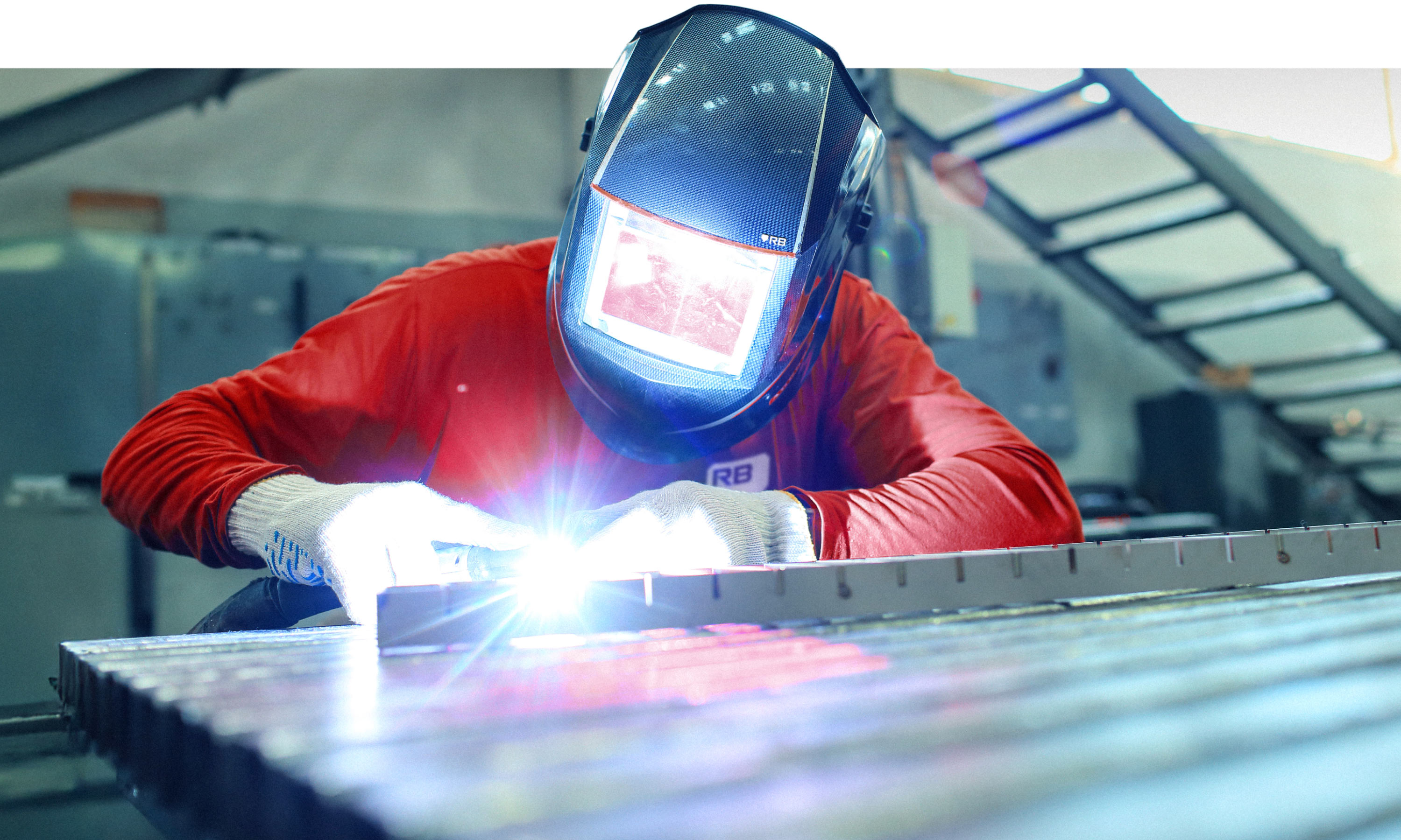
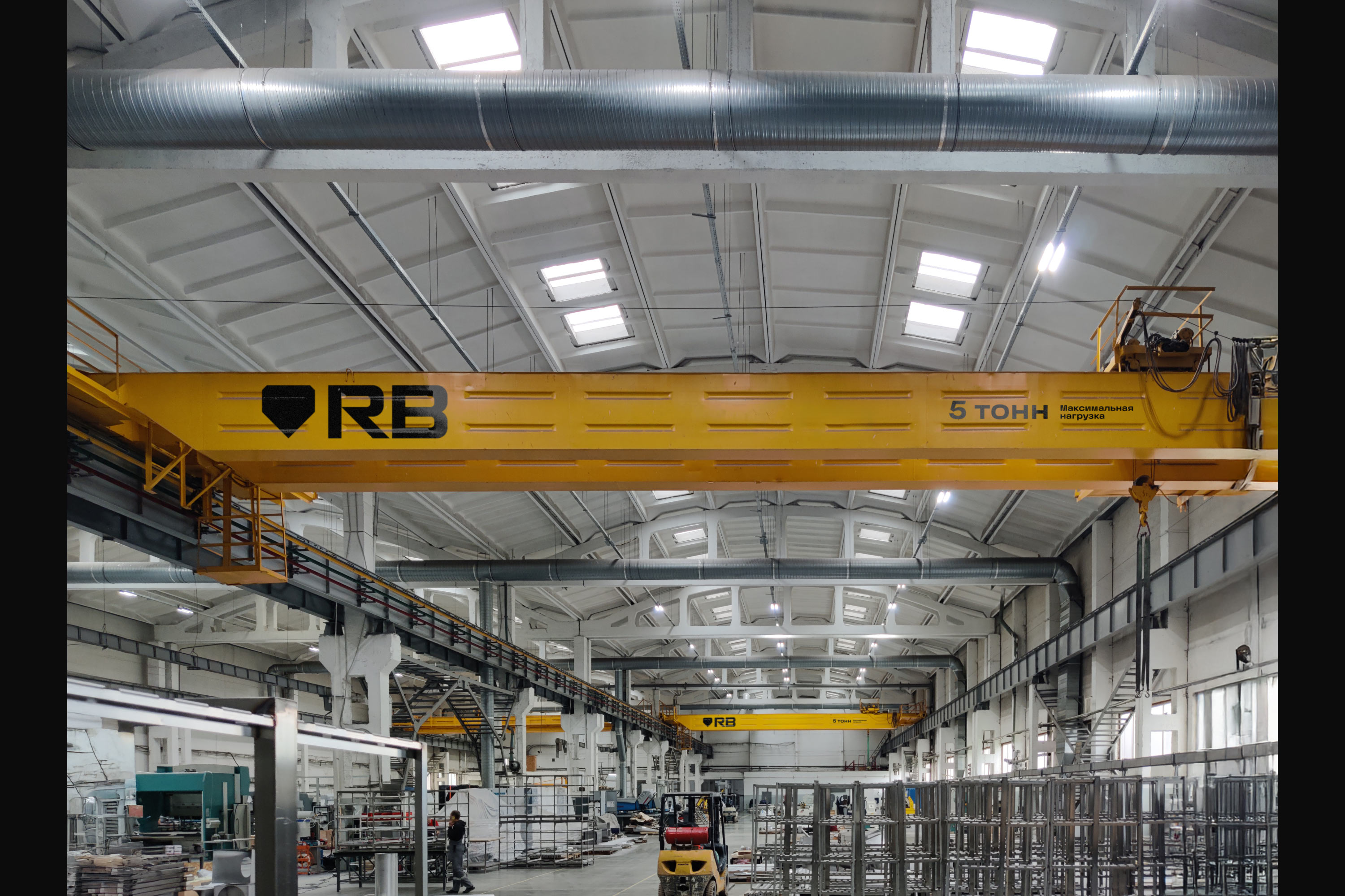
Thanks to their massiveness and angular forms, all versions of the logo look solid and fit perfectly into an industrial environment.
The Horizont typeface complements the company’s image: the wide and dense setting reinforces the feeling of strength and solidity.

Any object instantly turns into a brand attribute if it is designed with diagonal cuts that rhyme with the mark.
The pattern supports the identity: its structured design resembles chain mail.
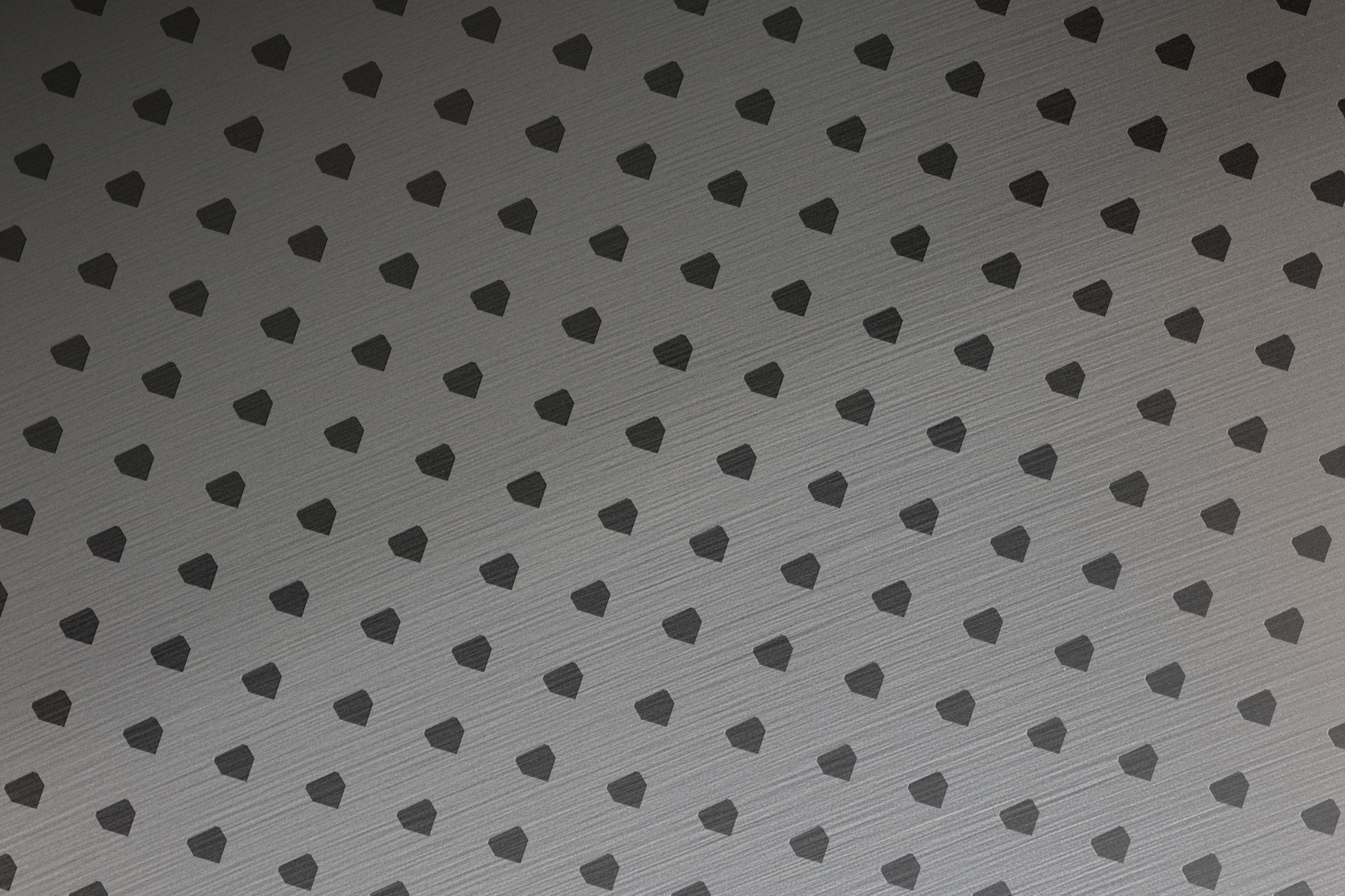
The simplified version of the ornament is intended for more delicate use. The minimalist design is applied in one color or engraved on the surface of the medium.
The rules for using the identity elements are described in detail in the guidelines.