BQB identity and naming
BQB owns a network of warehouses in different regions of Russia and is engaged in transporting, storage and delivery of goods throughout the country. In the nearest future, the company is planning to grow, enter new markets and even open its own marketplace.
To enter the international market, the company needed a new name and logo.
The new name is immediately associated with the company’s main clients, businesses or B2B. It’s short, simple and recognizable.
The name sounds international, it will work equally well in Europe and the United States. Plus, BQB is not associated with something specific, which means it always allow the company to expand in any new direction.
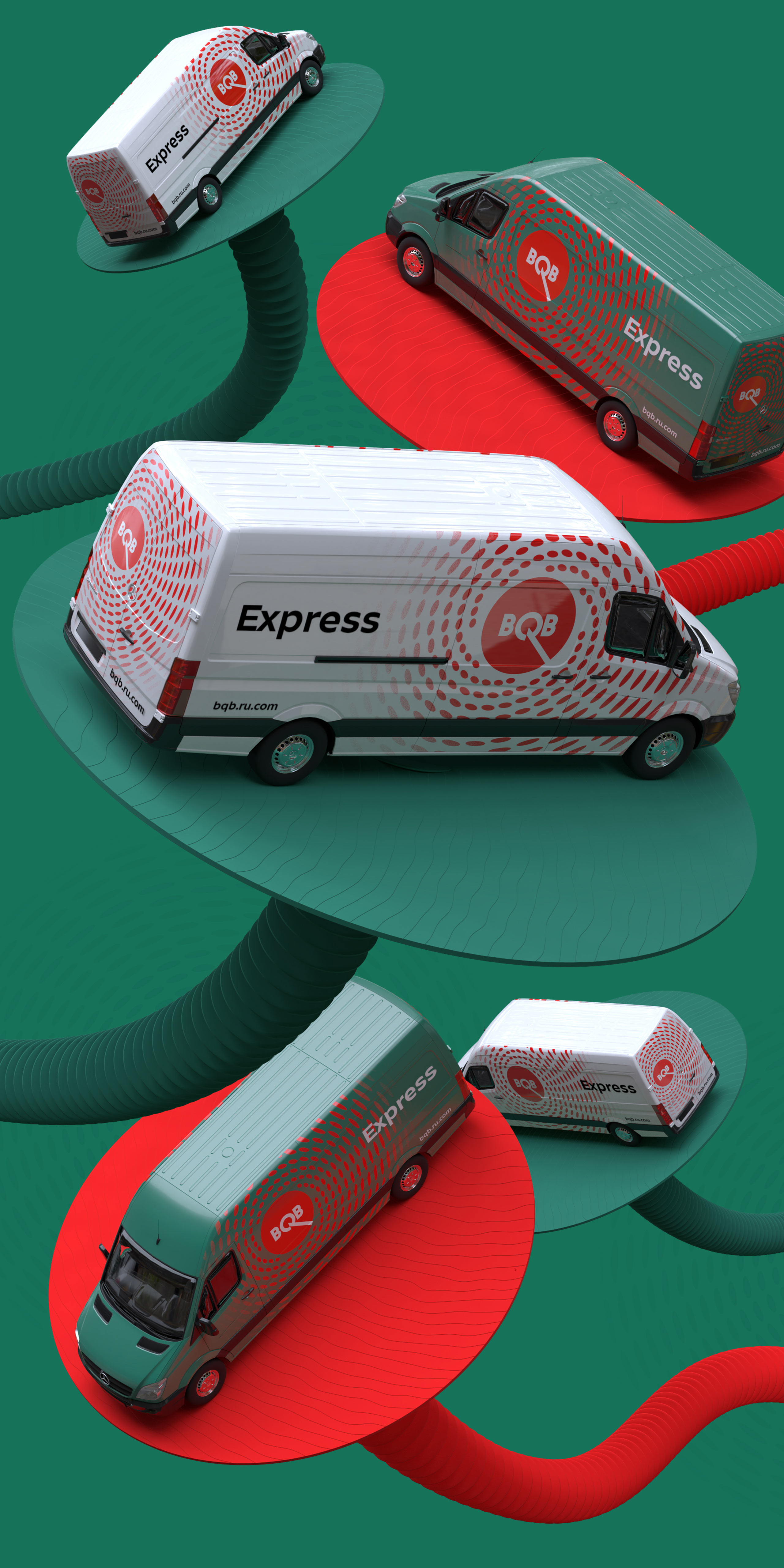
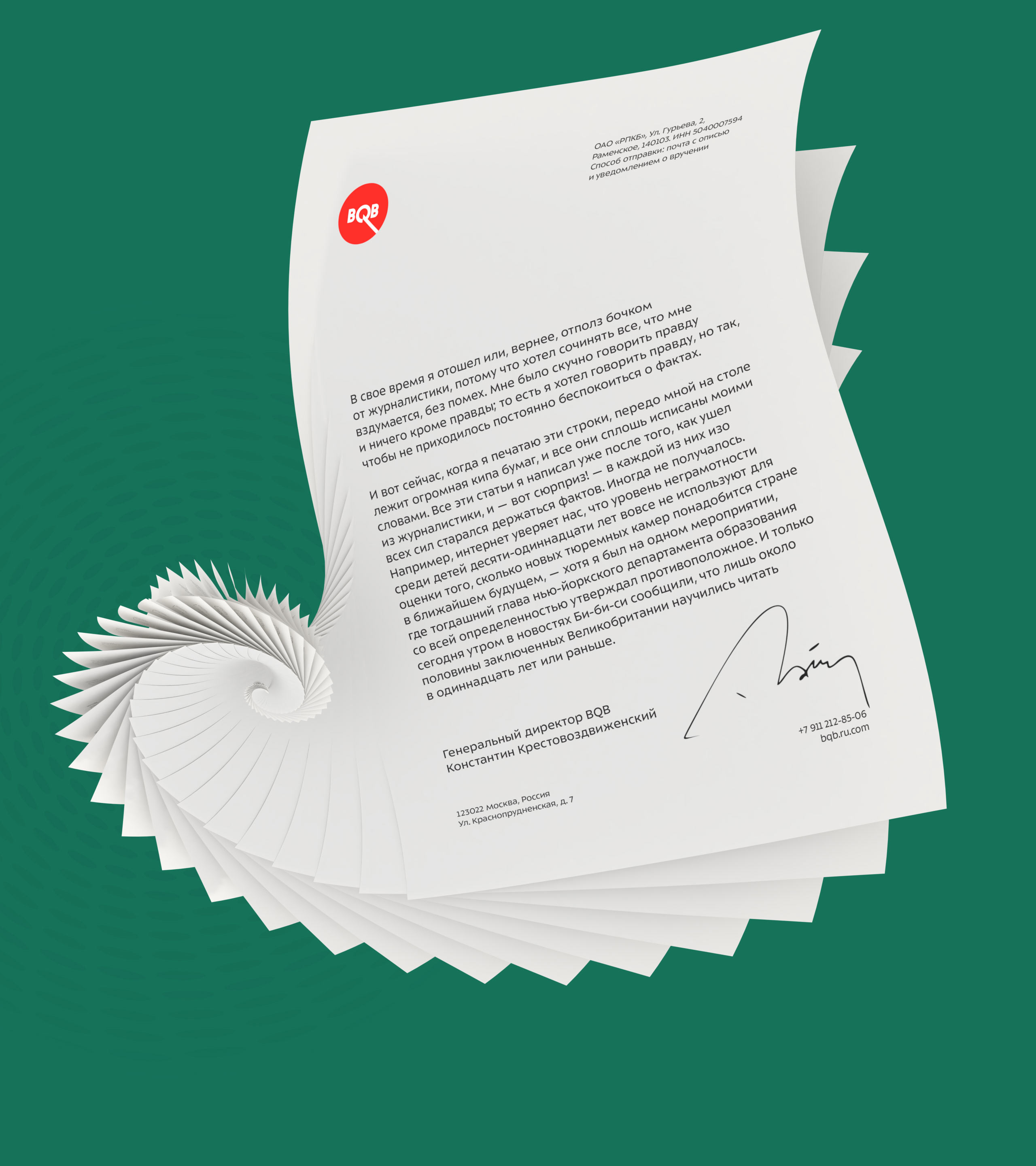
The logo is also very versatile, it looks like a speedometer and symbolizes movement and speed. Speedometer is a symbol equally suitable for both a logistics company and an online store.
The logo looks great in large format and at a distance (for instance, on passing trucks). Two colors, red and green, were chosen to contrast with each other. The red looks very bright, even brighter than if it were placed on a black background, creating an optical illusion.
Another important accent is the long leg of the letter Q. It is visible from afar and draws attention to the center of the circle, directly to the name of the company.
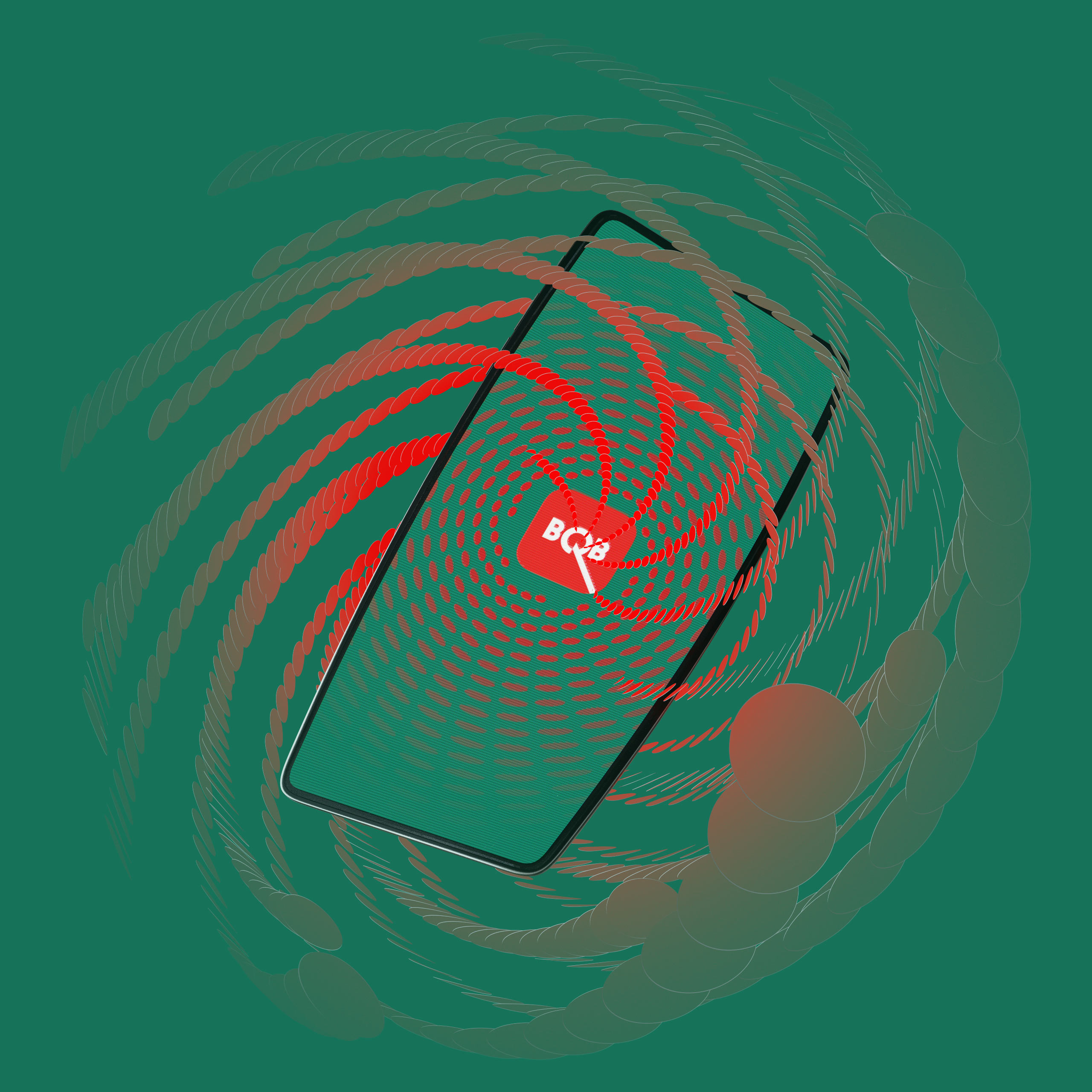
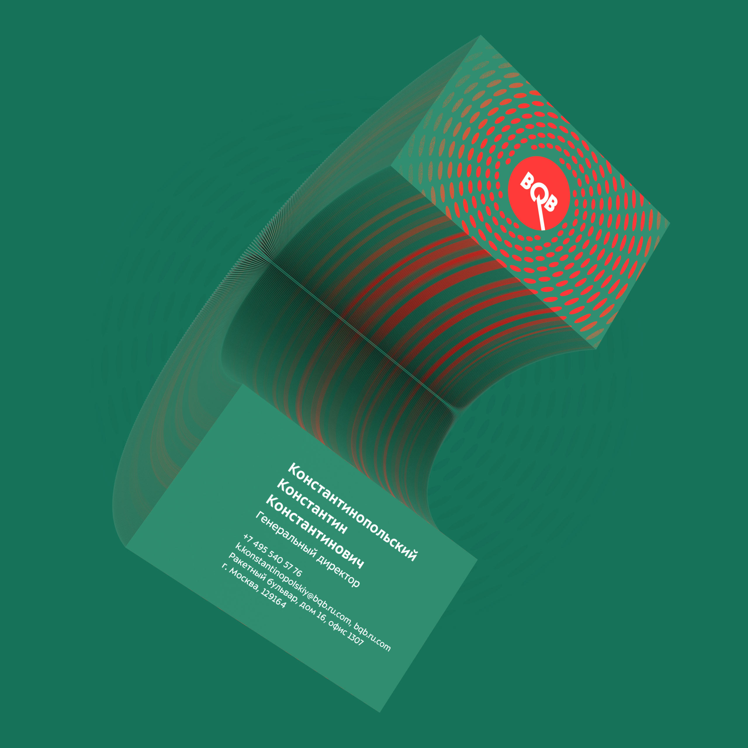
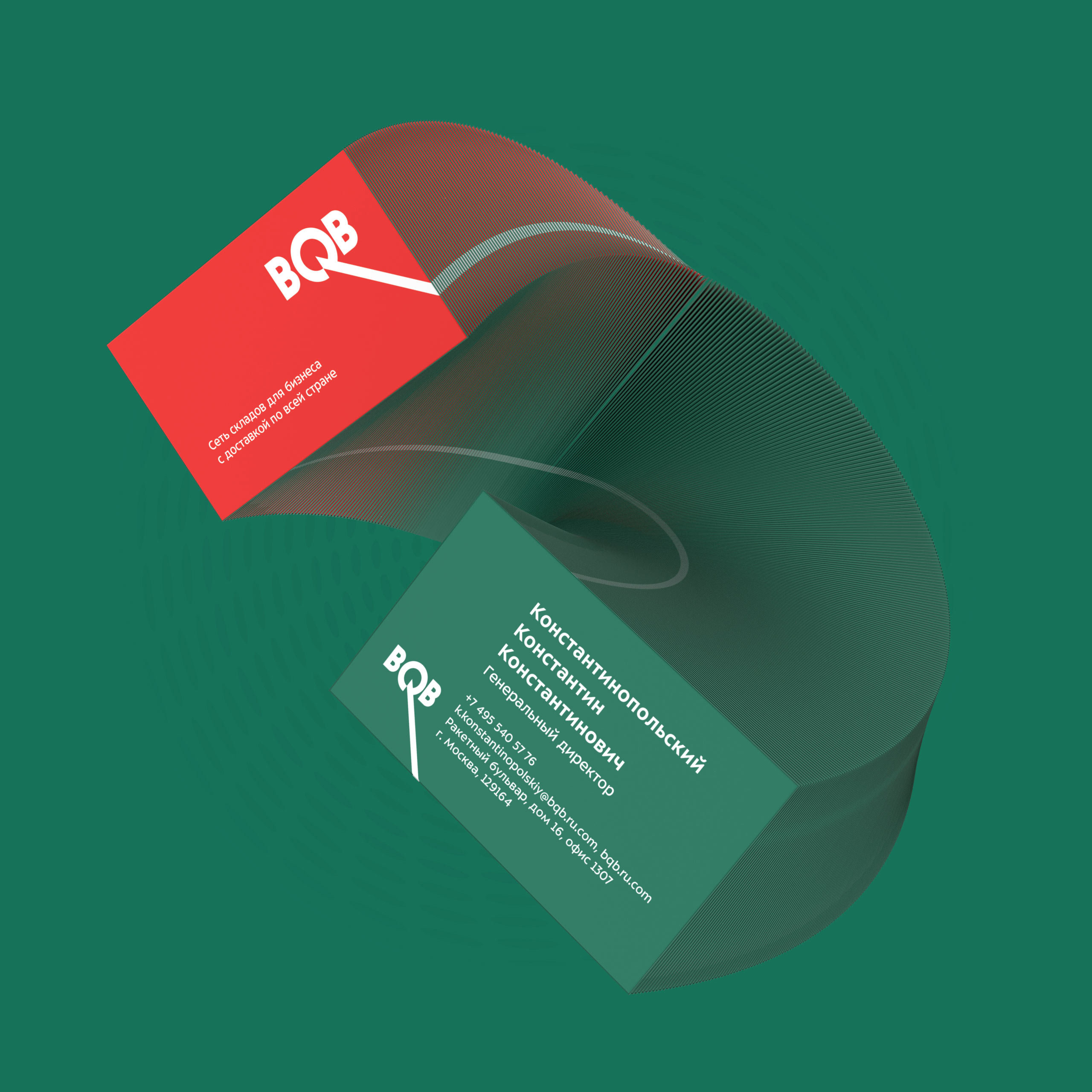
At the core of the company’s identity is a play with dots that are arranged in a spiral, scattered and spun.
With its new identity, BQB will be able to work all around the world, differ from competition and stand out on streets and on the internet, as well as explore new markets and new spheres of business.
