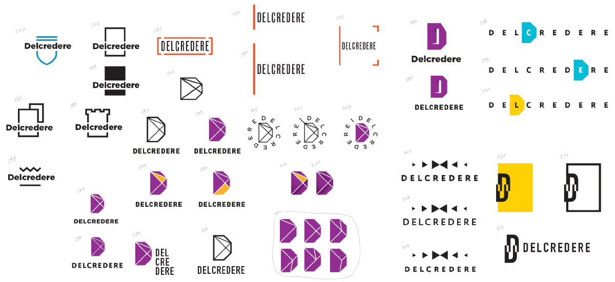
Designer: From what I understand they need a clear and easily readable symbol. European laconism and all that.
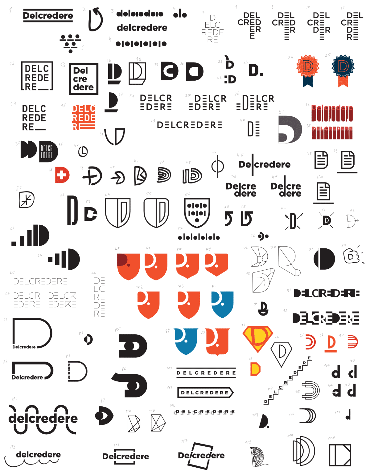
Art director: Number 8 and all the following ones are too fun. Number 12 is closer, but needs to be more strict. It makes reading more difficult however, and the word is quite complex as it is.
Number 36 has a nice typeface, I would try to work with it. Probably, coupled with Number 52 which has a nice letter (and Number 98).
For Numbers 46–47, I would think of the best way to separate the letters L and D. Number 100 is simple, yet is very close to our requirements. We just need to think ow to make it unique.
Numbers 113, 116 also call for more thought.
Numbers 114–115 aren’t an exact match to the client’s requirements, but this is just as well, we should suggest something more lively among other things.
There is definitely more than enough shields here.
Designer: OK, here’s another batch.
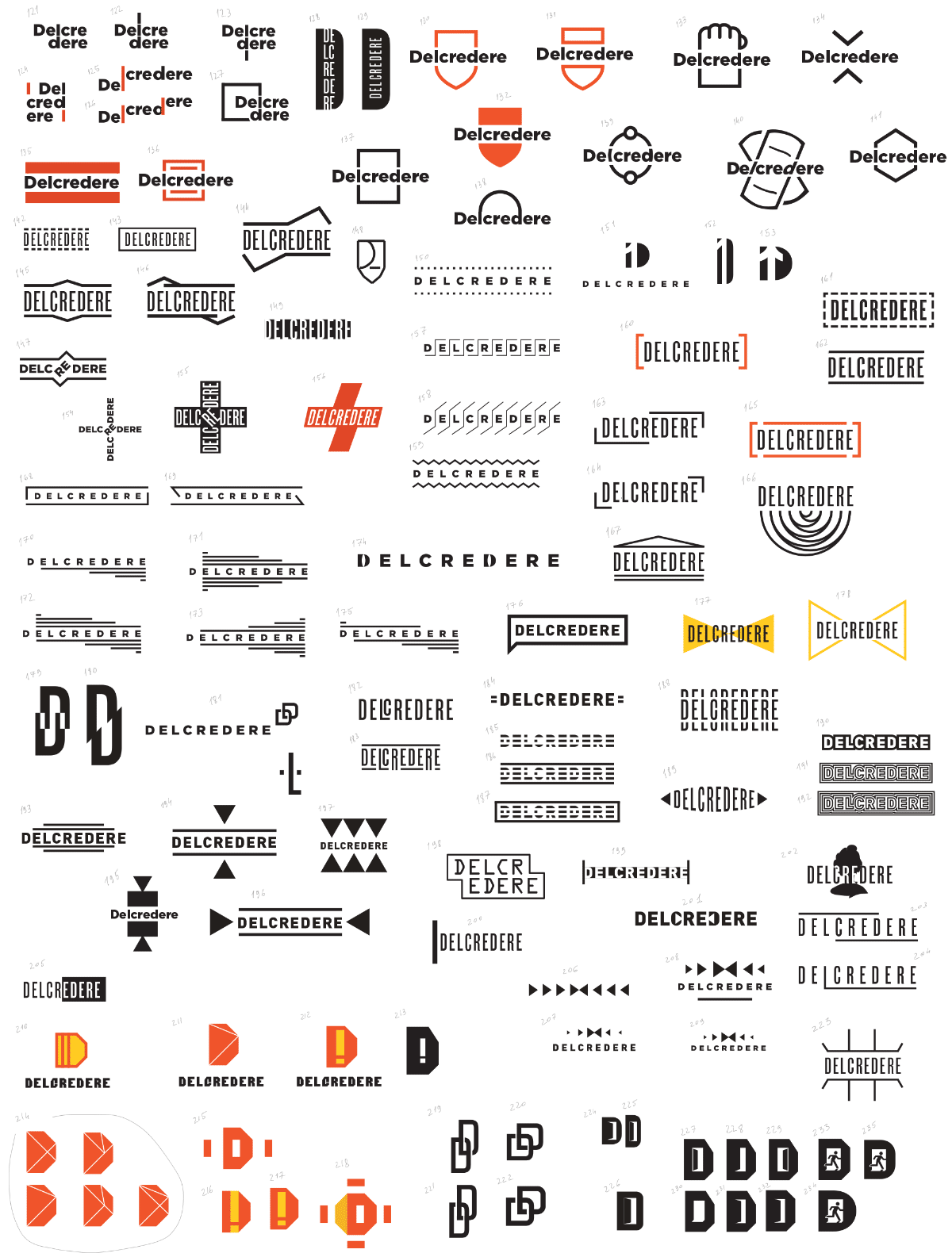
Art director: Number 124: of all the multi-line alternatives this one works much better, let’s put it aside for now.
Numbers 130, 137, 141: I understand that something like this is possible, but the rectangle looks very simple, the shield does not go in line with the requirements and the hexagon is difficult to understand. I think we need to fine-tune it: find better proportions for the rectangle (for example, make the top much larger than the bottom and bring the text down), maybe add some detail to the shield (e.g. a stripe at the top), etc.
Numbers 165, 168, 169: I would put aside some of these stamp-frames.
Number 200 matches the requirements and is otherwise nice, but are you sure it doesn’t exist already (although this applies to some of the other ones, too)? For now, let’s leave it be.
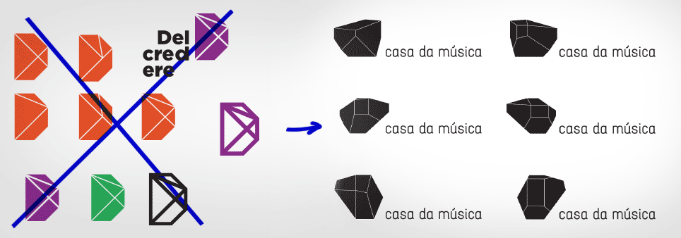
Number 207: the triangles and the butterfly made it look better than I imagined based on the verbal description. Putting aside.
Number 214: I would match a symbol like this with a more neutral typeface and change the color.
Number 228: I would make it with a gap at the top or at the bottom, but thinner. But let’s keep the letter like that. Although there may already be many logos with doors like this one.
Now let’s go over all the sketches and create a short list and try to work on it. So, let’s polish what we have rather than generate new ideas.
Oh, almost forgot, Numbers 129 and 179 are expressive and in Number 215 you should use letters instead of squares.
Designer: Well, I may still have a couple of new ones. I don’t really know what to do with the expressive ones and with the stamps. Also, not sure I understood your comment about the rightmost one.
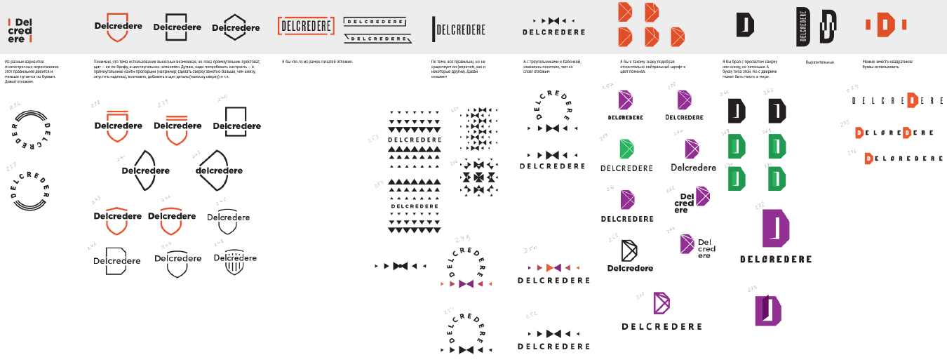
Art director: Number 239 seems OK, but I feel like I might have seen it before, maybe even in one of our projects. How about Number 240?
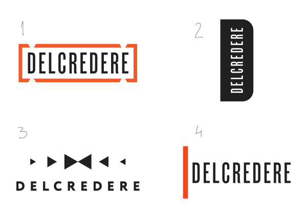
I would show it with an breaking red rectangular frame. We need to think about placement of frame gaps, maybe use them as accents?
Same goes for the vertical line, maybe it’s an idea for a new line, a new paragraph?
Number 252 is OK, triangles will form a pattern.
Numbers 260–261 or 264 are OK, although I have doubts about the typeface. I want it to be simple, but not trite.
Number 272 longs for a different typeface, clean and simple. The metaphor of exit is OK for bankruptcy proceedings. Maybe, make the top of the door a bit darker.
As for the one on the far right, it shouldn’t necessarily have the letter D inside (or any colored letter for that matter). It also calls for a clean typeface.
Also, I want to take the “expressive” one and put it on the edge, like they do on folders and documents.
Designer: Yep, there are similarities between Number 239 and www.artlebedev.com/everything/manufactura.
And another one I just remembered.
Art director: Yep, I know this project, don’t know why it didn’t come to mind. Their shape is a bit different, but the look is quite similar. We’ll have to put it aside for now.
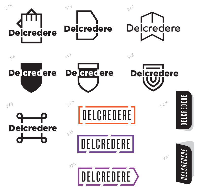
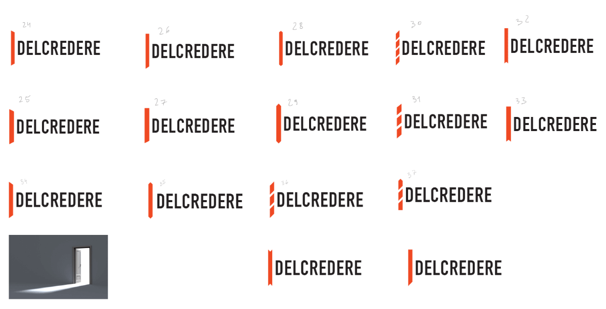
Designer: The first six probably won’t save the day, but here they are just in case.
Number 319 looks like command-key (looped square).
I still need to play a bit more with the stamp, right now the first one feels more solid.
Numbers 323–324: how should I place them on a letterhead? With bleed? It is quite narrow, so that might not work.
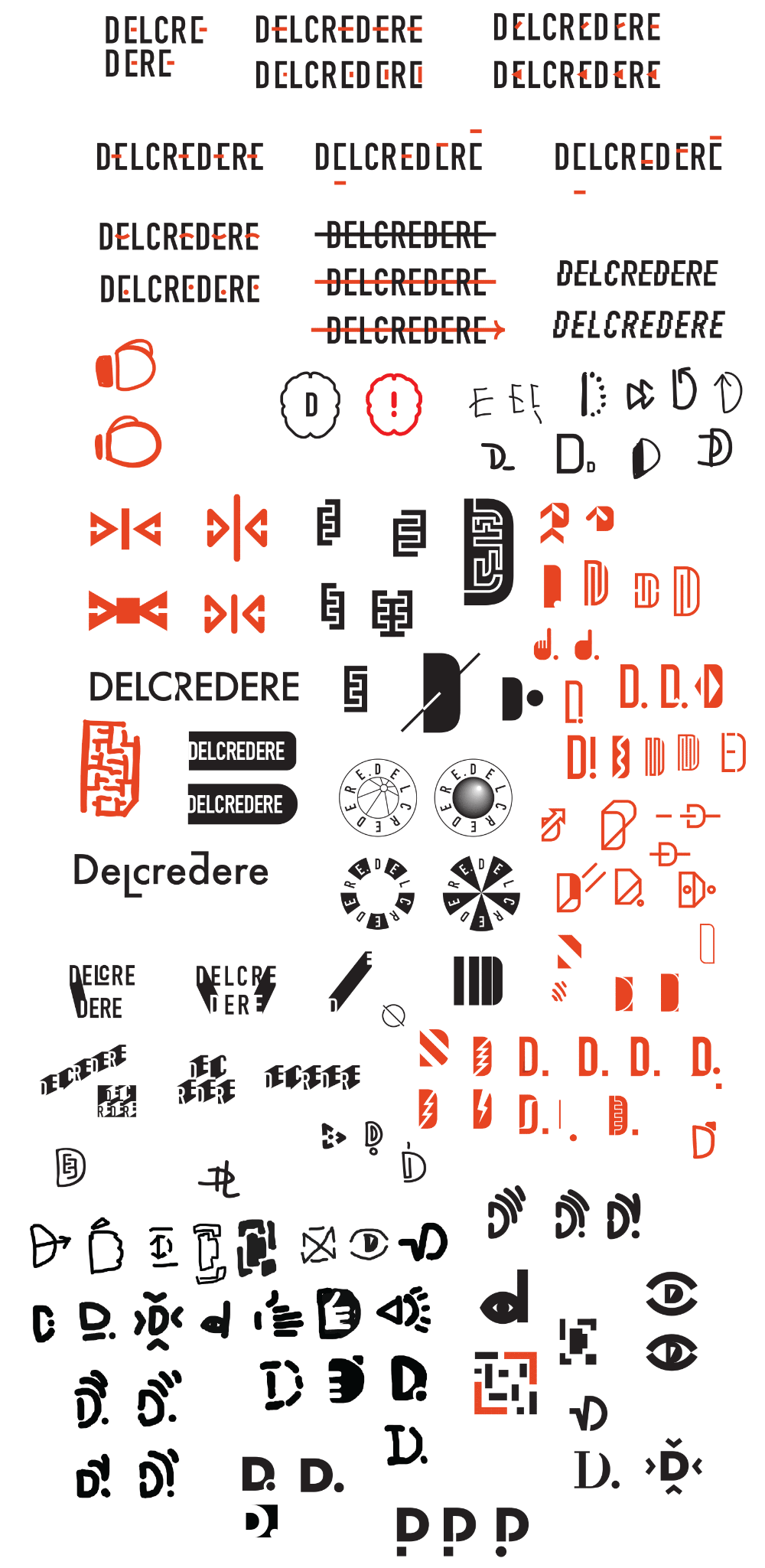
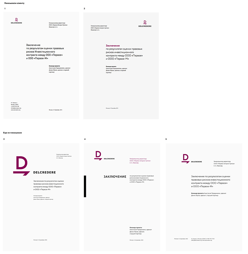
Designer: Overall, that’s what we have. I haven’t had the time to write the texts yet.
Art director: The pictures look beautiful. If you haven’t sent them to Lebedev yet, do so. Be sure to include a one-sentence description for each one, otherwise they might be difficult to understand.
Sending to the artistic director.
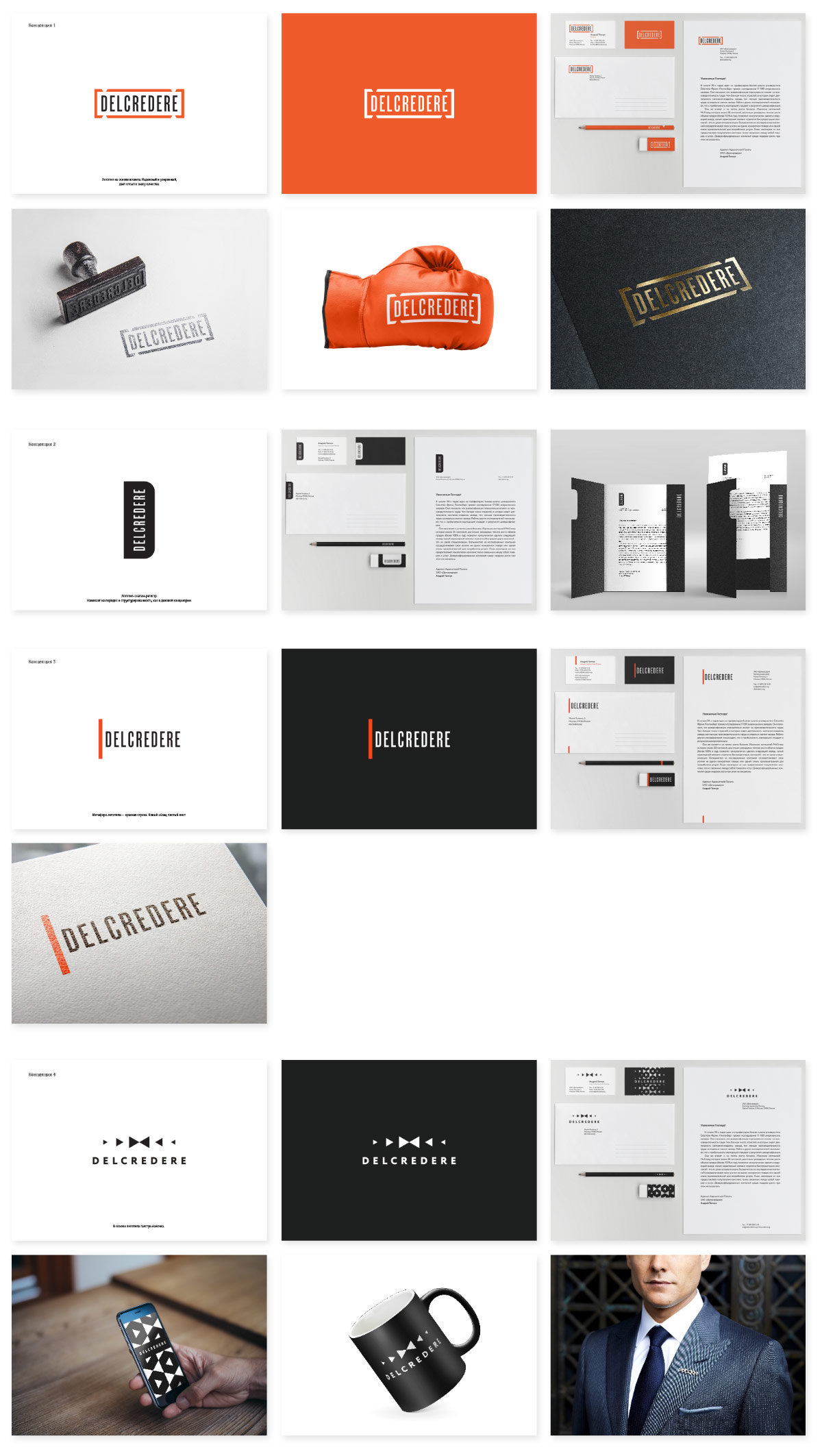
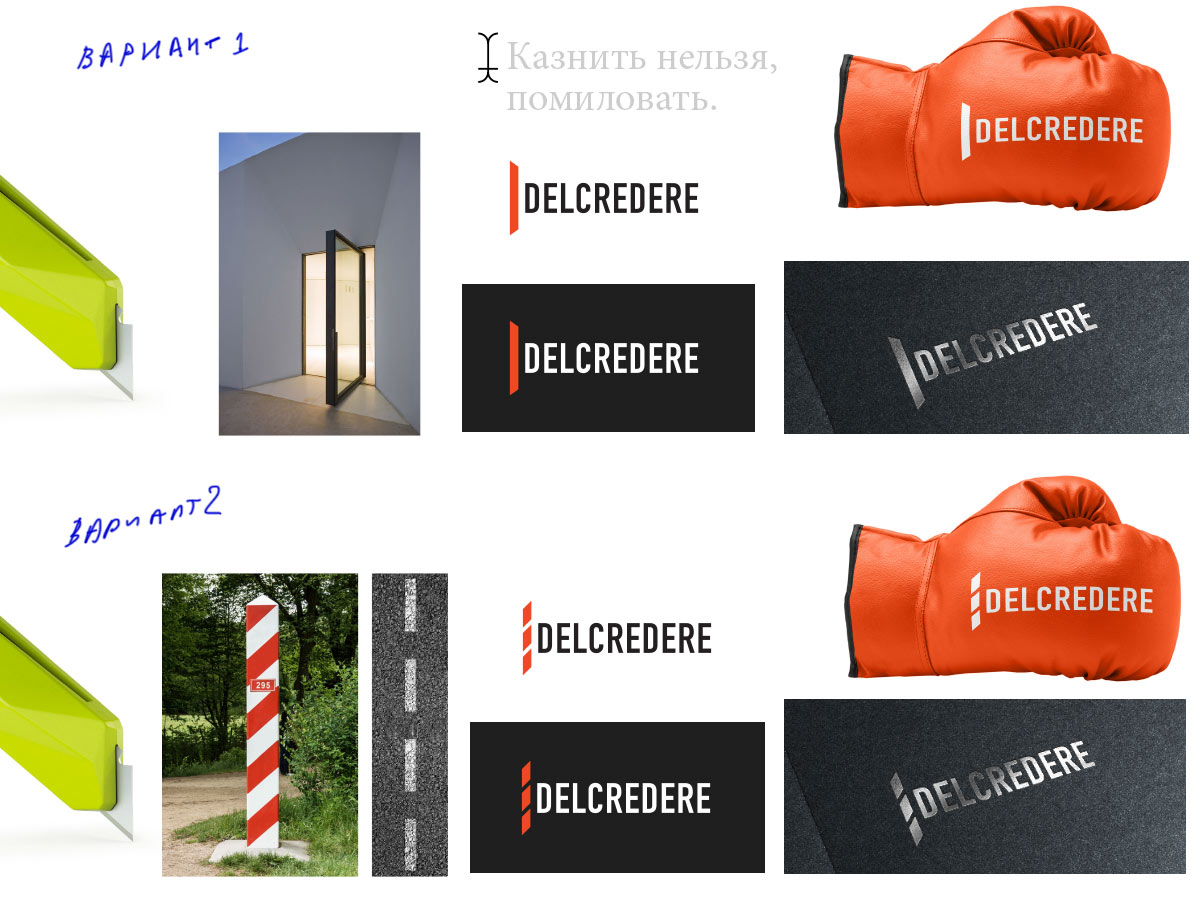
1. Stamp-based logo. A firm grip.
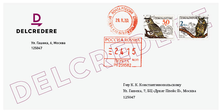
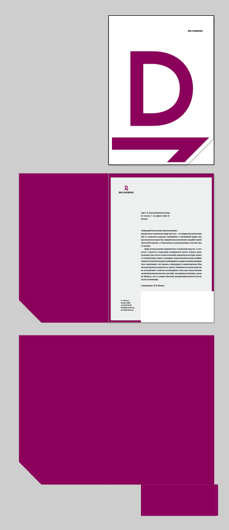
2. Folder-divider logo (order and structure, like in business documentation).
3. A clash of interests. Civilized and professional settlement of any conflicts.
4. New line, new paragraph, blank slate.
The artistic director approves.
Finding an existing design that resembles one of the ideas. Which means it has to go.
The client seems to like the new line approach, although isn’t terribly ecstatic. We need to work on it some more.
Simultaneously coming up with some new ideas.
A couple of interesting alternatives appear.
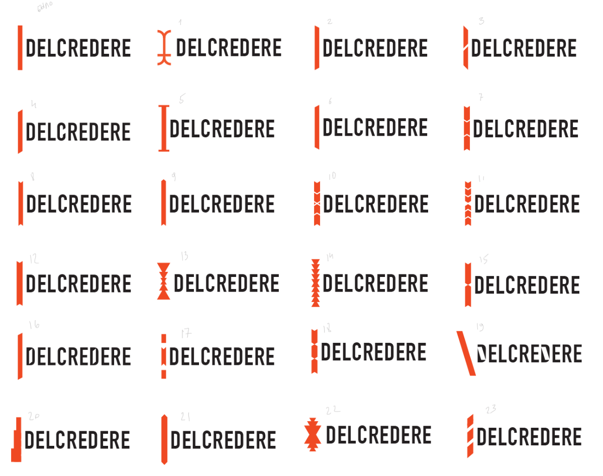
The client immediately chooses the second one.
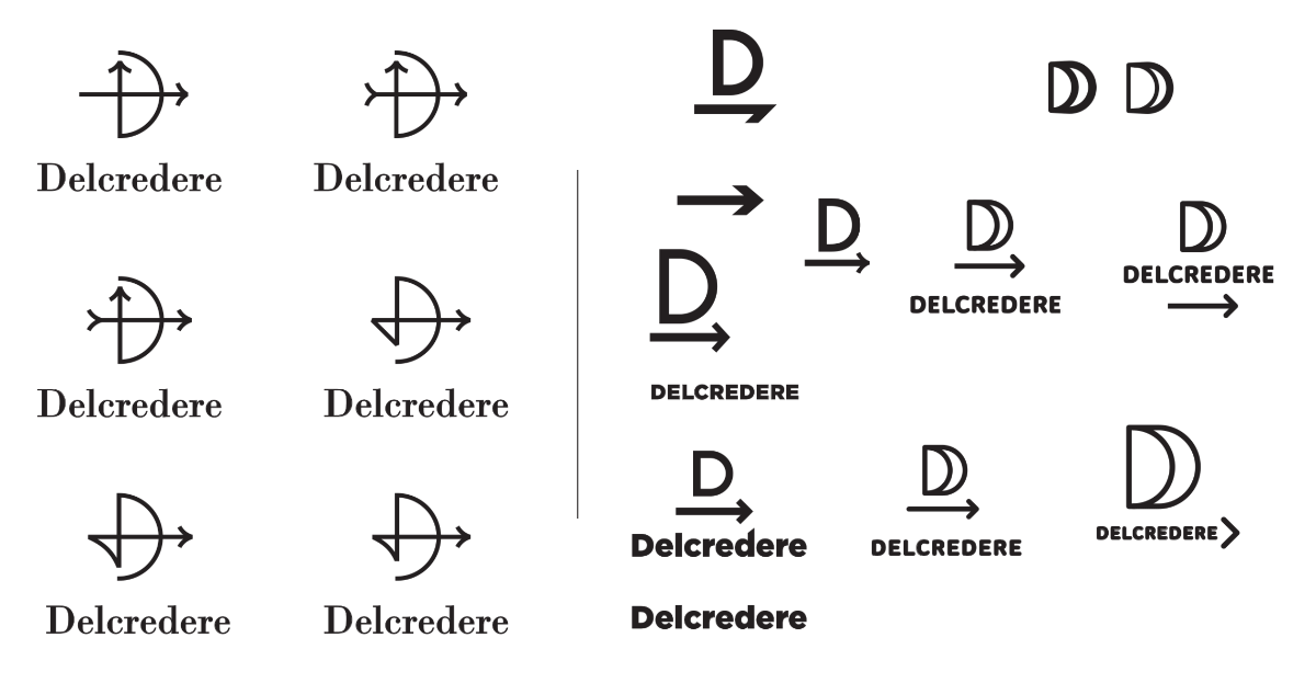
Art director: Let’s test ourselves. Go try it in different scales (it looks a bit toyish when large), with asymmetry (with the ship in the left corner), with different line weights and with different proportions of the D-sail.
The typeface in Number 1 is the most bland, I think.
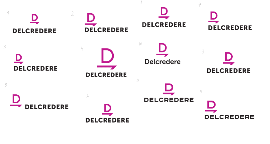
Art director: I would go with something like Number 9, although all of the Ds now seem like the arch is thinner than the stem. As for colors, I would try lilac or purple (more blue).
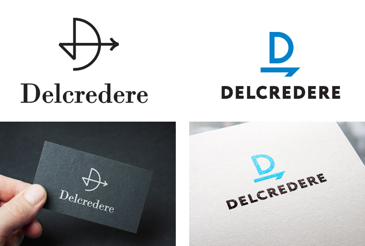
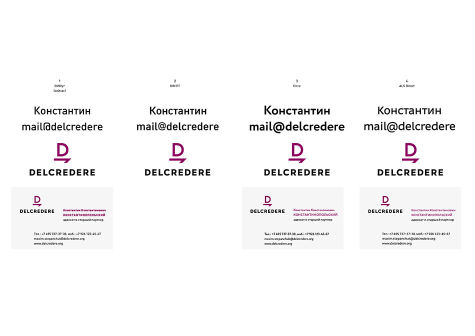
Designer: The type designer has already started drawing the letters, so we will soon have more options. What do you think of the colors?
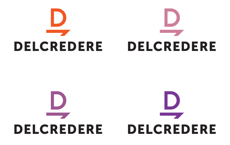
Art director: The bottom right one, which is the most enigmatic. I think we need to show two color variants, another one either in black and white or in a more active color.
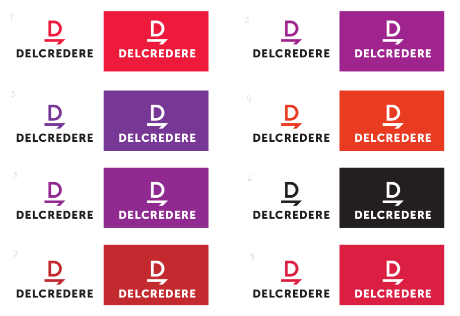
Art director: I would go with Number 5 and black and white.
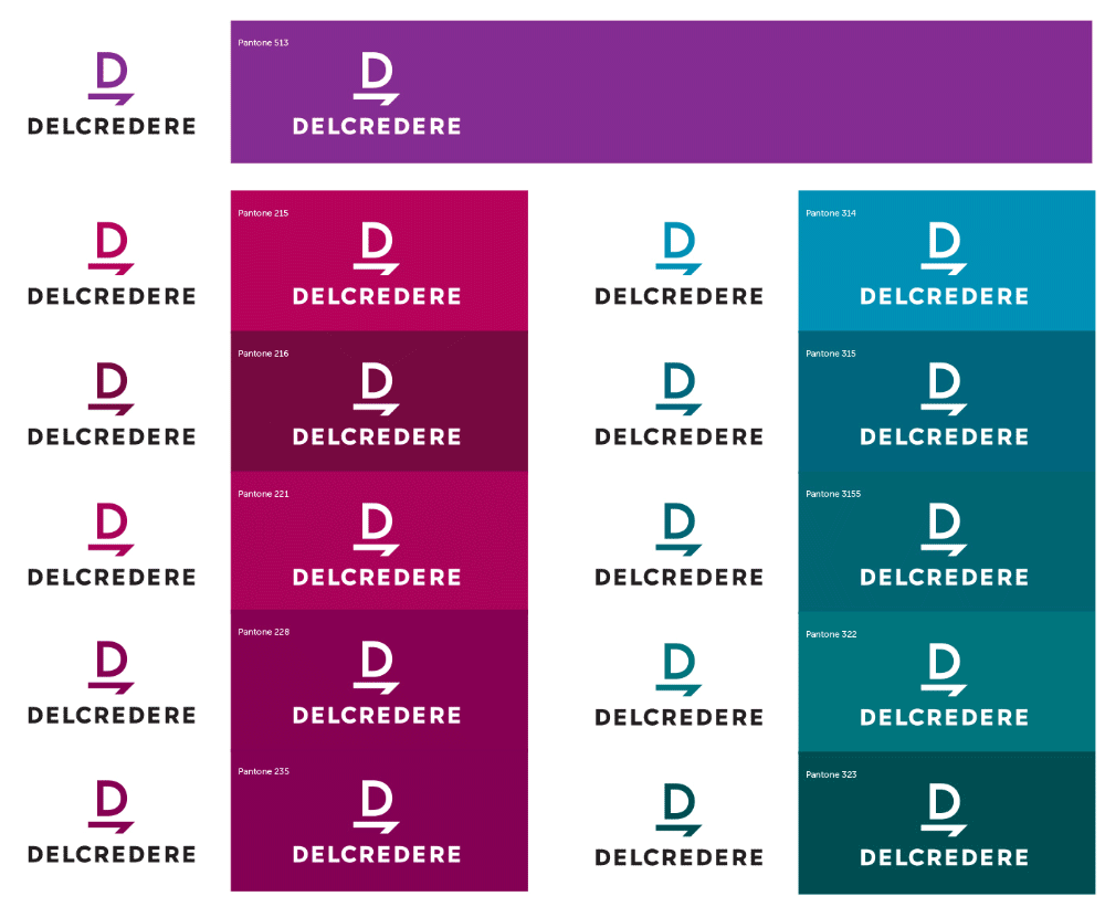
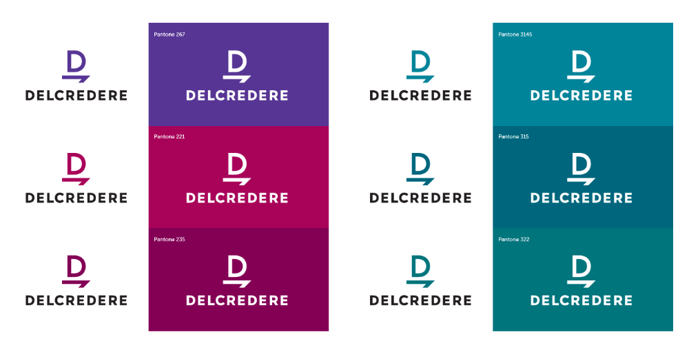
Deciding on the color.
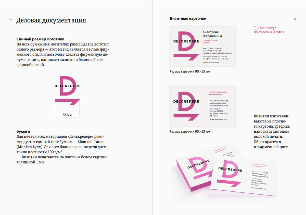
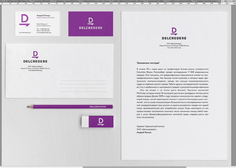
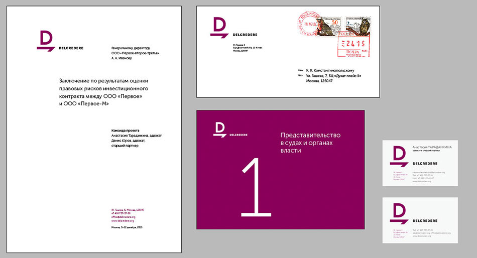
Time to work on stationery.
Studying classic examples.
Starting to typeset.
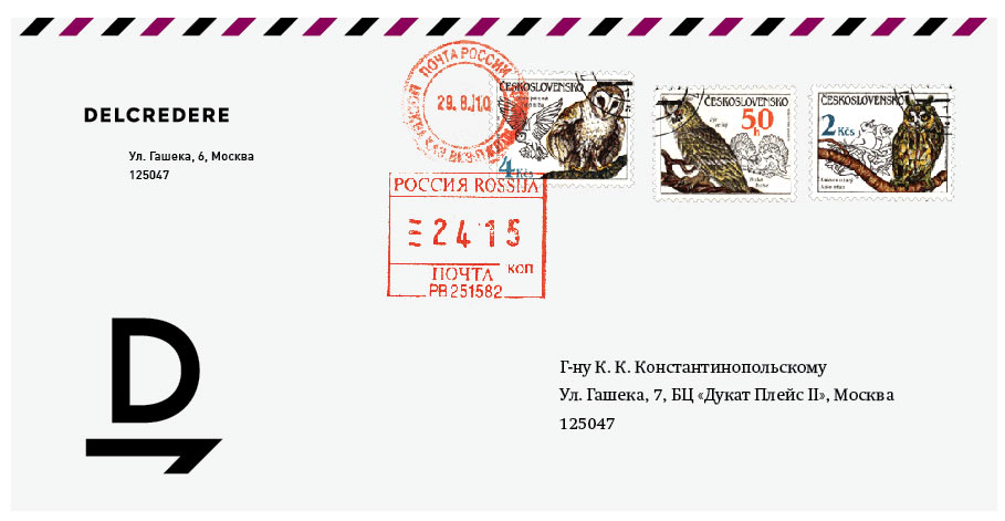
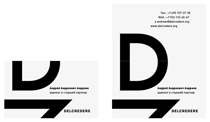
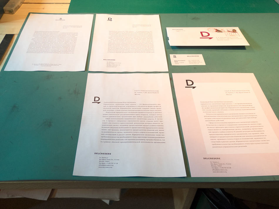
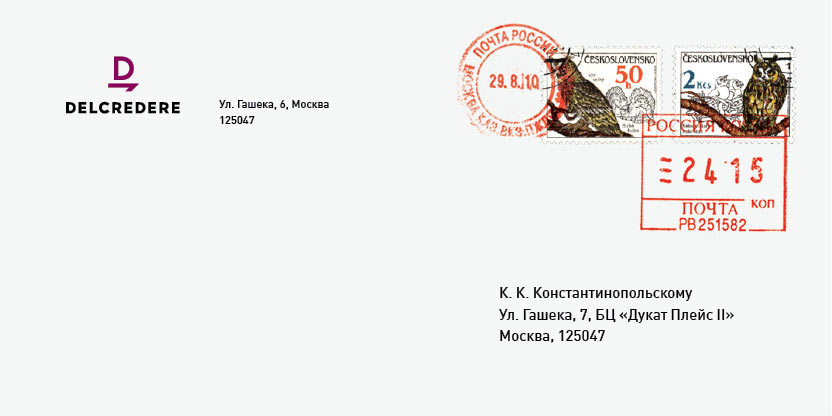
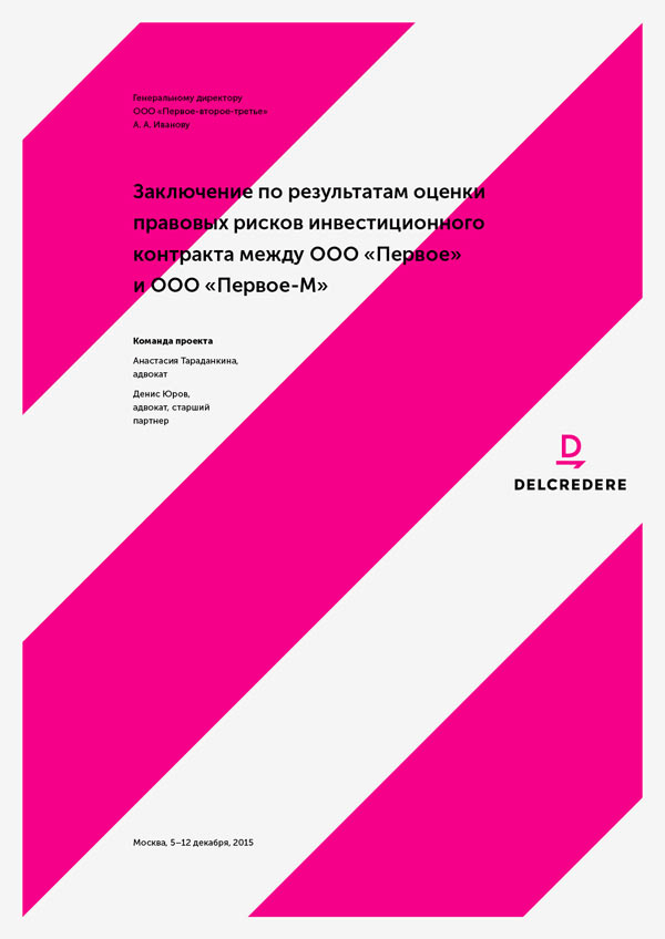
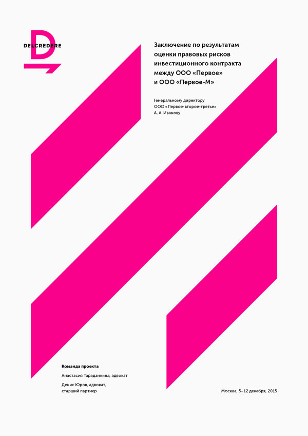
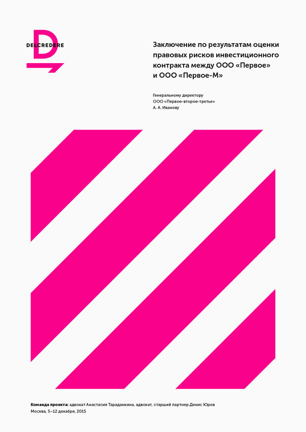
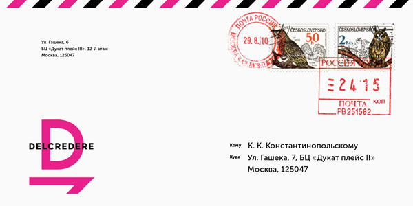
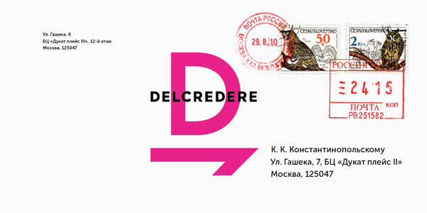
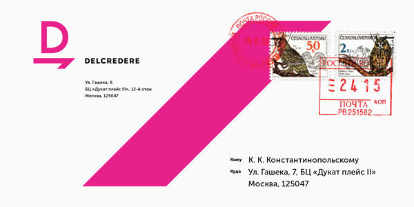
Art director: I think the logo is quite reserved, calm and strong. It would probably make sense to maintain the same image in stationery. Which is why the business cards which are interesting on their own start appear too light (and the gentle gradients probably contribute to the impression). Placement of the symbol under the logotype as done on the envelope also doesn’t help to create a strong impression, this is more about extravagance (although it might be more about proportions, not placement). I think we should use bolder ideas here, such as printing a large logo with bleed.
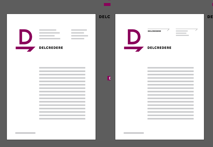
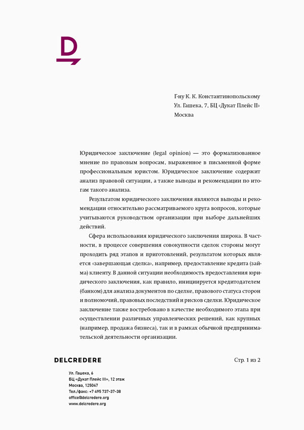
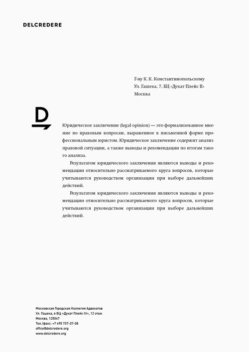
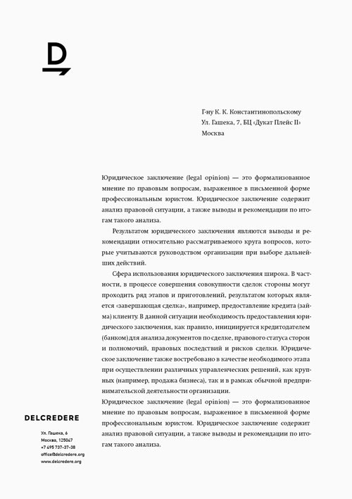
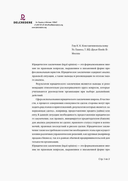
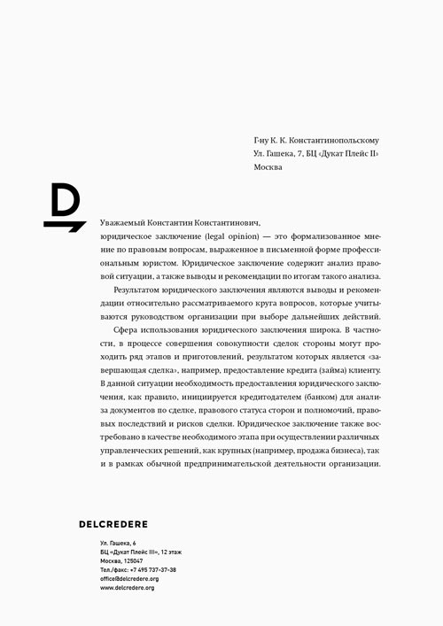
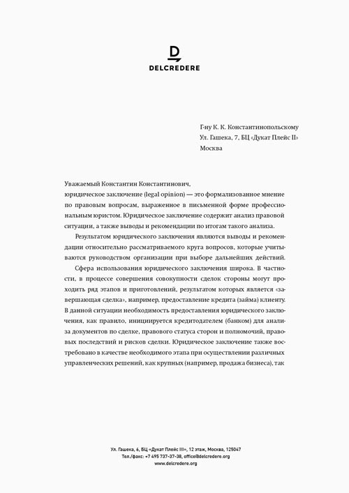
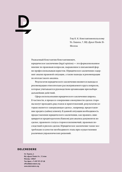
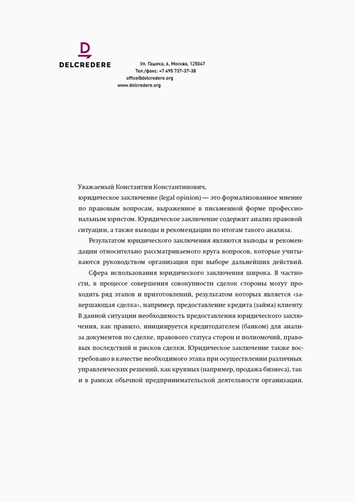
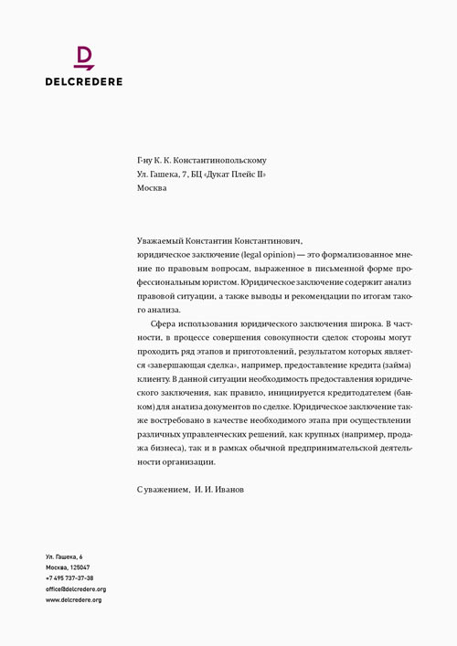
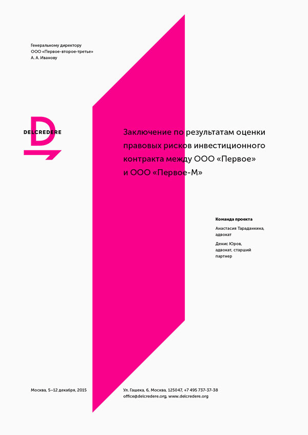
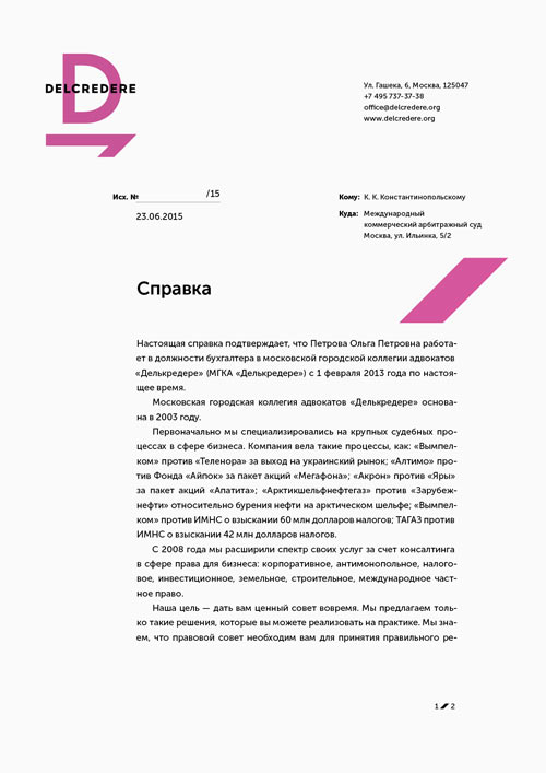
Letterhead designs.
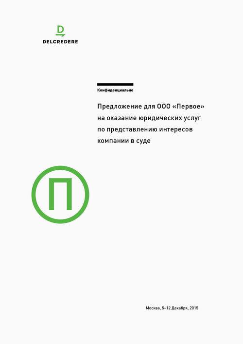
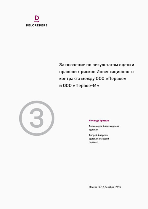
We get the idea to code business documents with large letters.
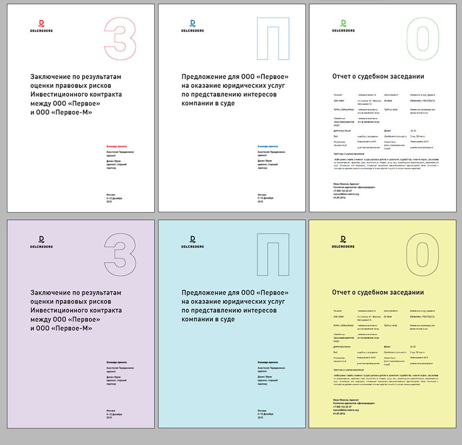
Art director: We can use coding, but what you have right now is too large and inactive, it makes the layout crumble.
Creating a folder.
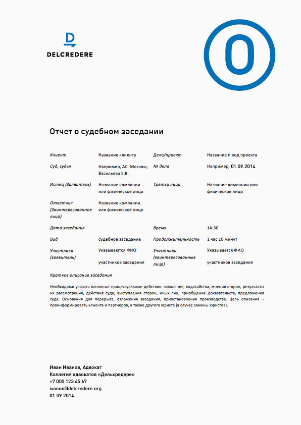
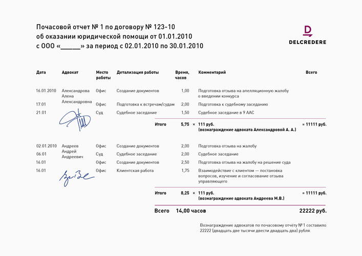
Timesheet template.
At one point showing to Lebedev. The artistic director does not approve.
Remaking.
The client points out an important detail: the @ symbol in the suggested typeface. Looking for a different one.
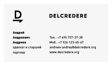
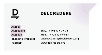
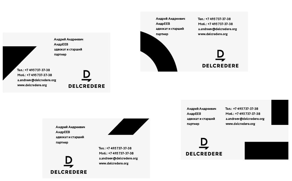
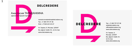
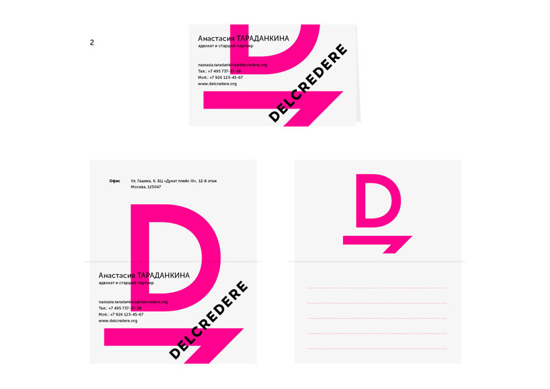
Continuing the search for the ideal layout of business cards.
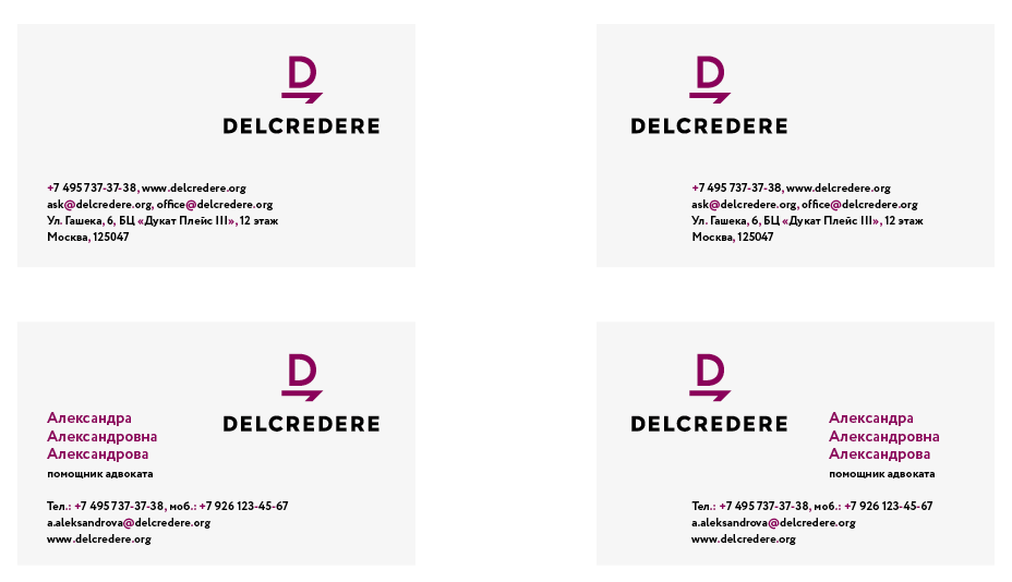
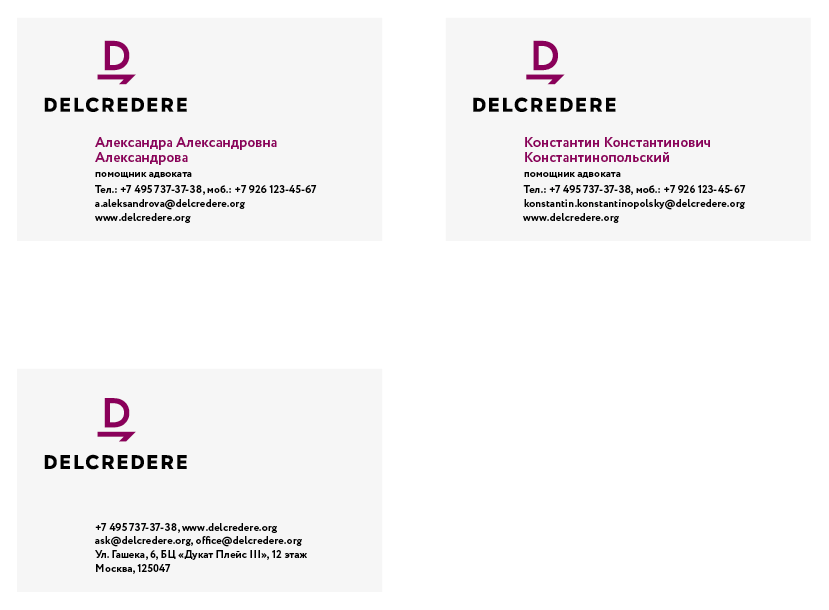
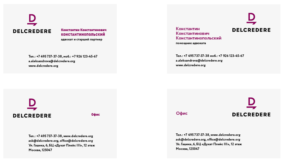
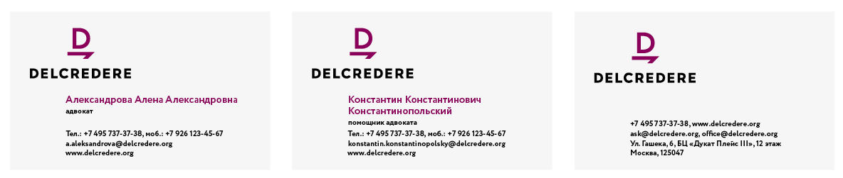
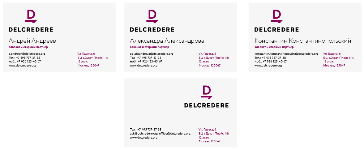
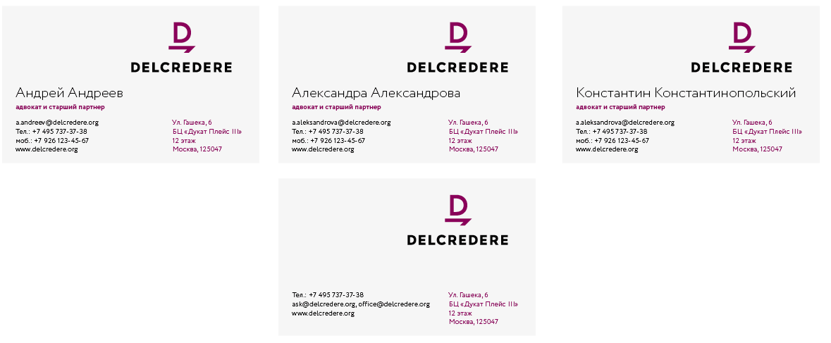
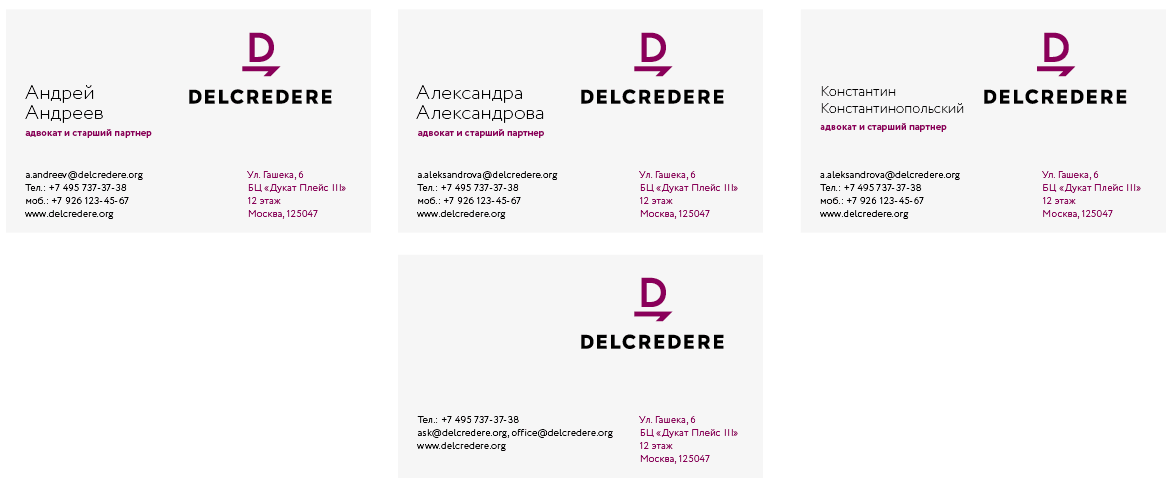
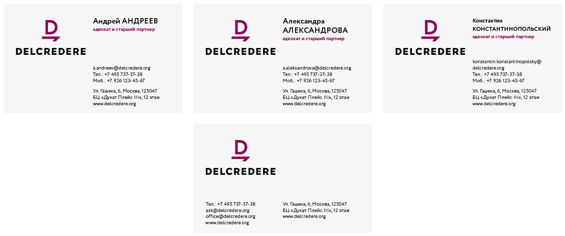
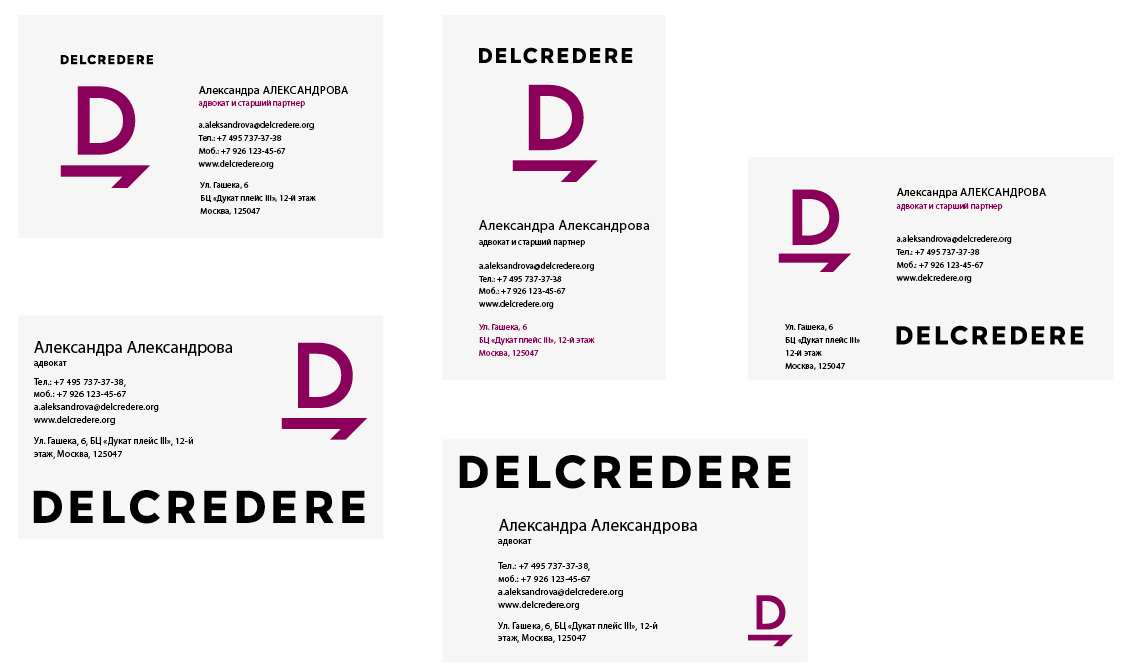
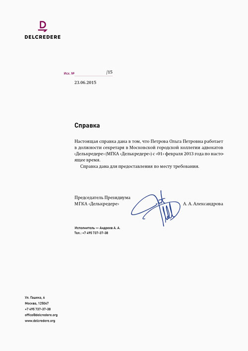
And other documents.
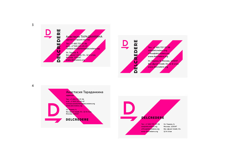
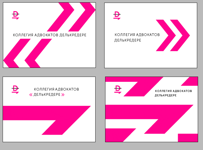
At some point losing it and making a much bolder design in five minutes.
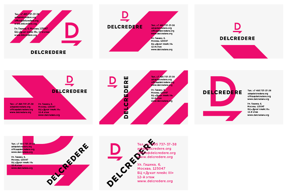
Art director: I really like it, I would show it to the client. The third in the first row and the first in the second row are no go, though.
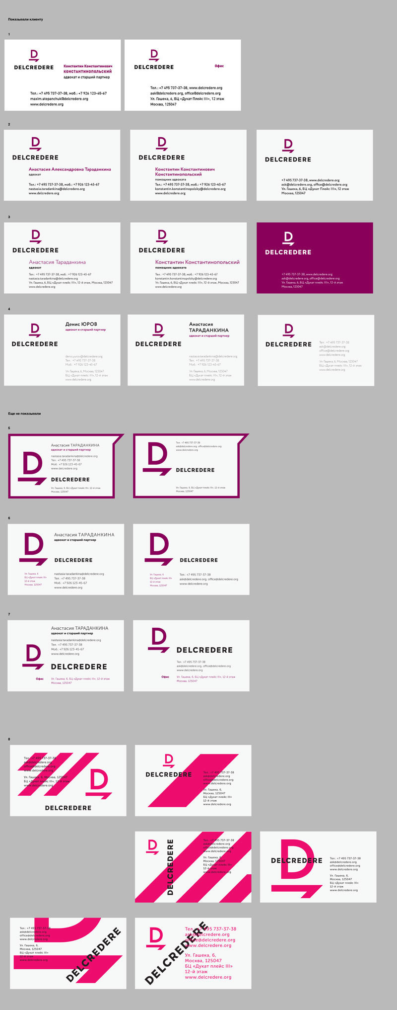
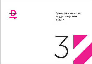
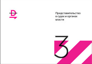
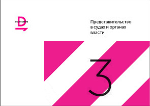
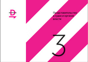
Artistic director: The only interesting ones are those with pink stripes. The rest are a horrible dead end of evolution.
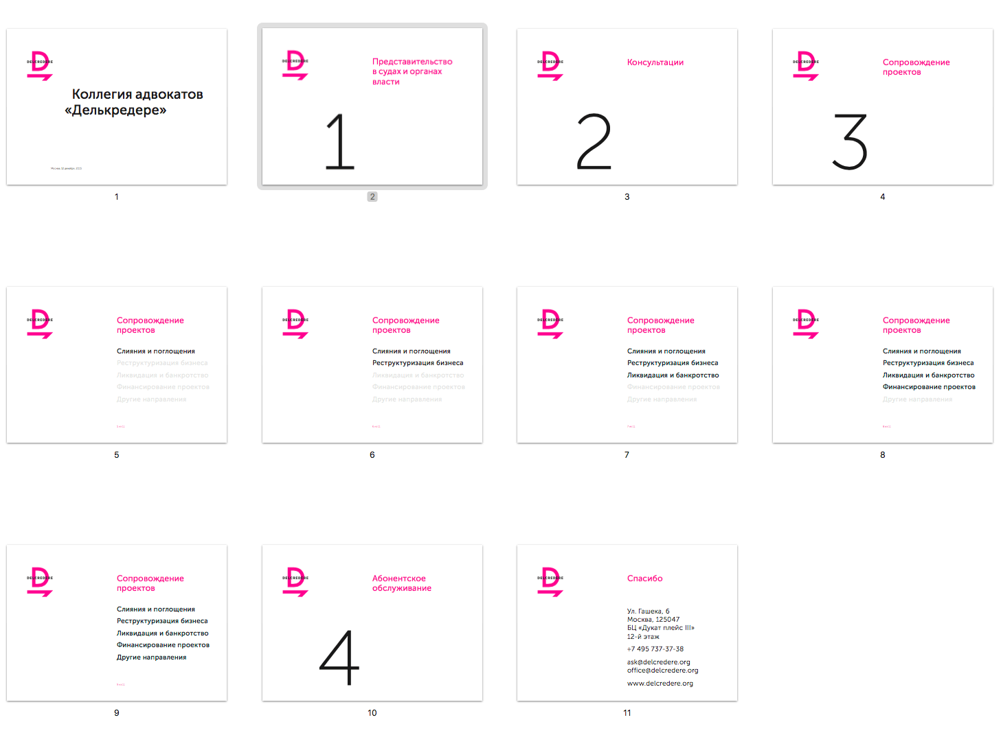
Slides for the presentation.
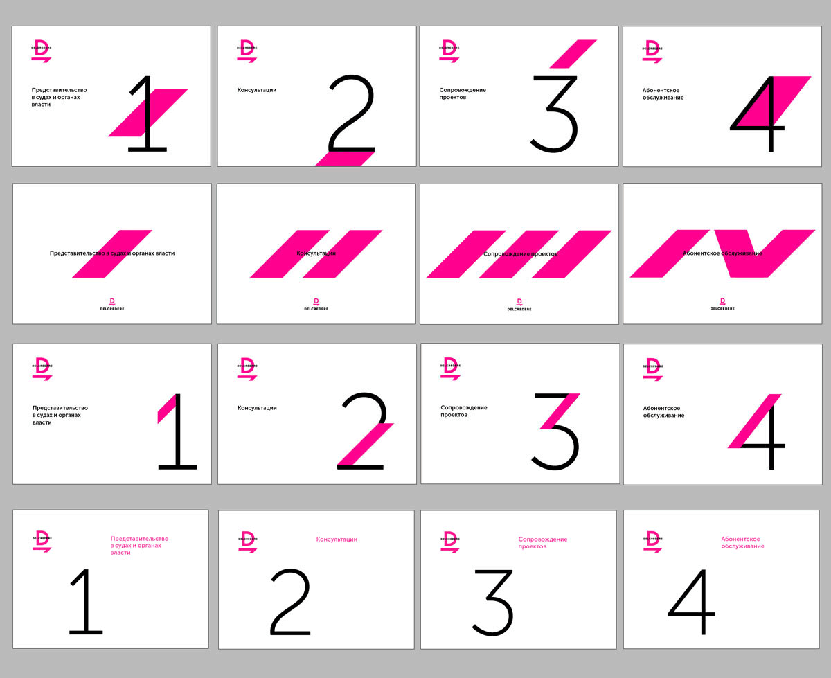
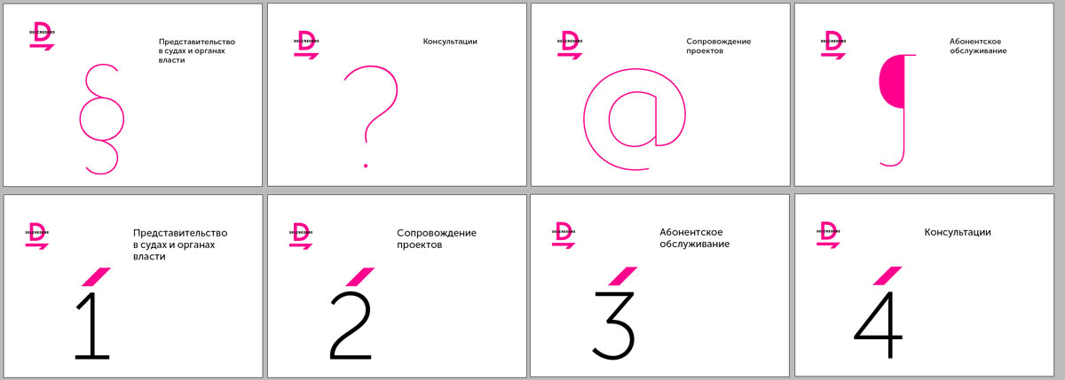
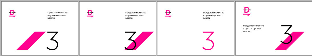
Art director: I think something in this style would work. That way you wouldn’t need to worry about drawing individual numbers.
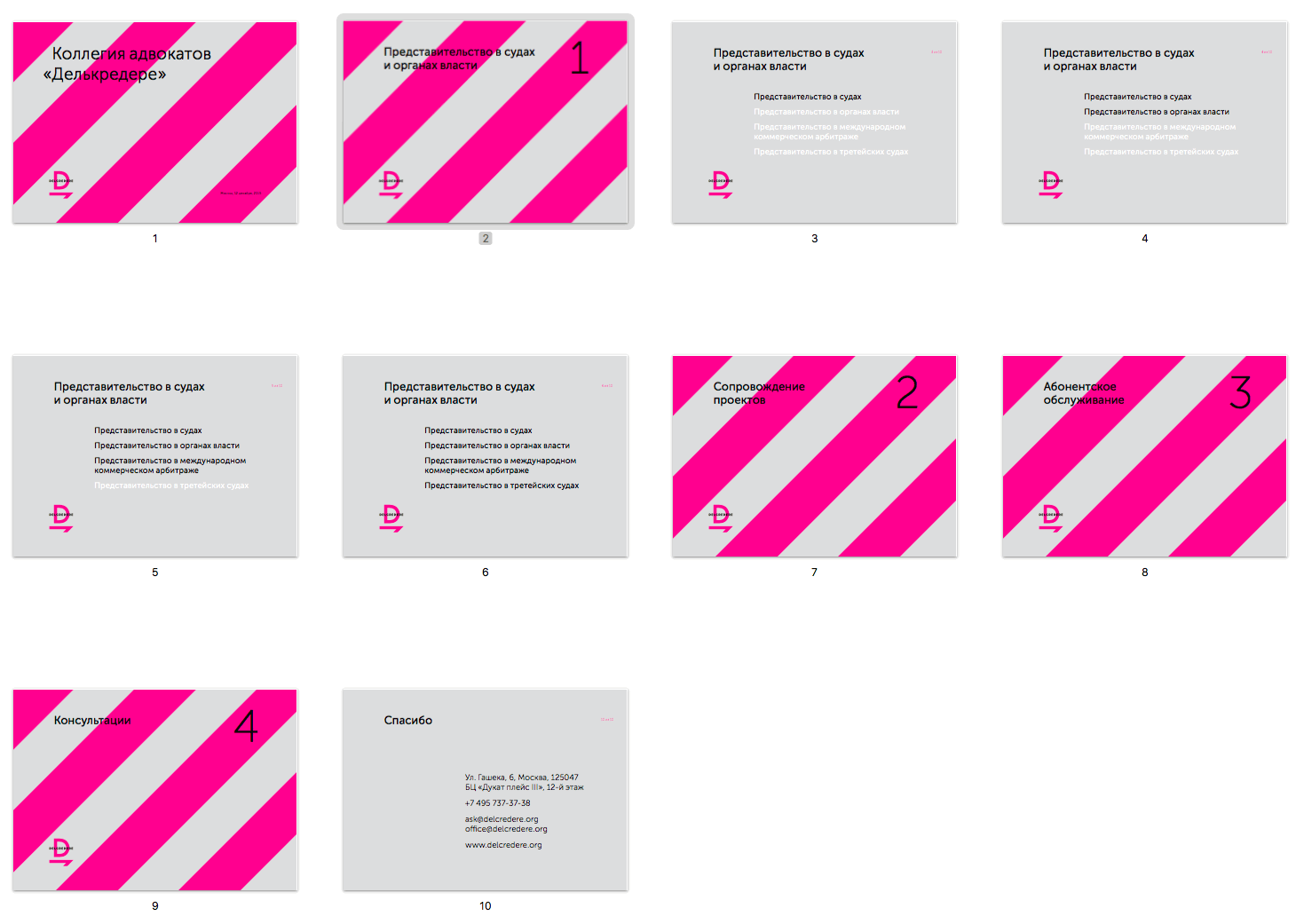
In the end, creating a simple neat layout with no stripes or large numbers.
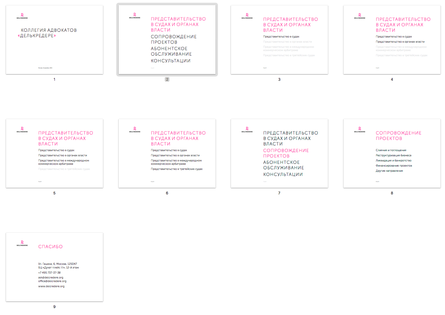
Another presentation for the client.
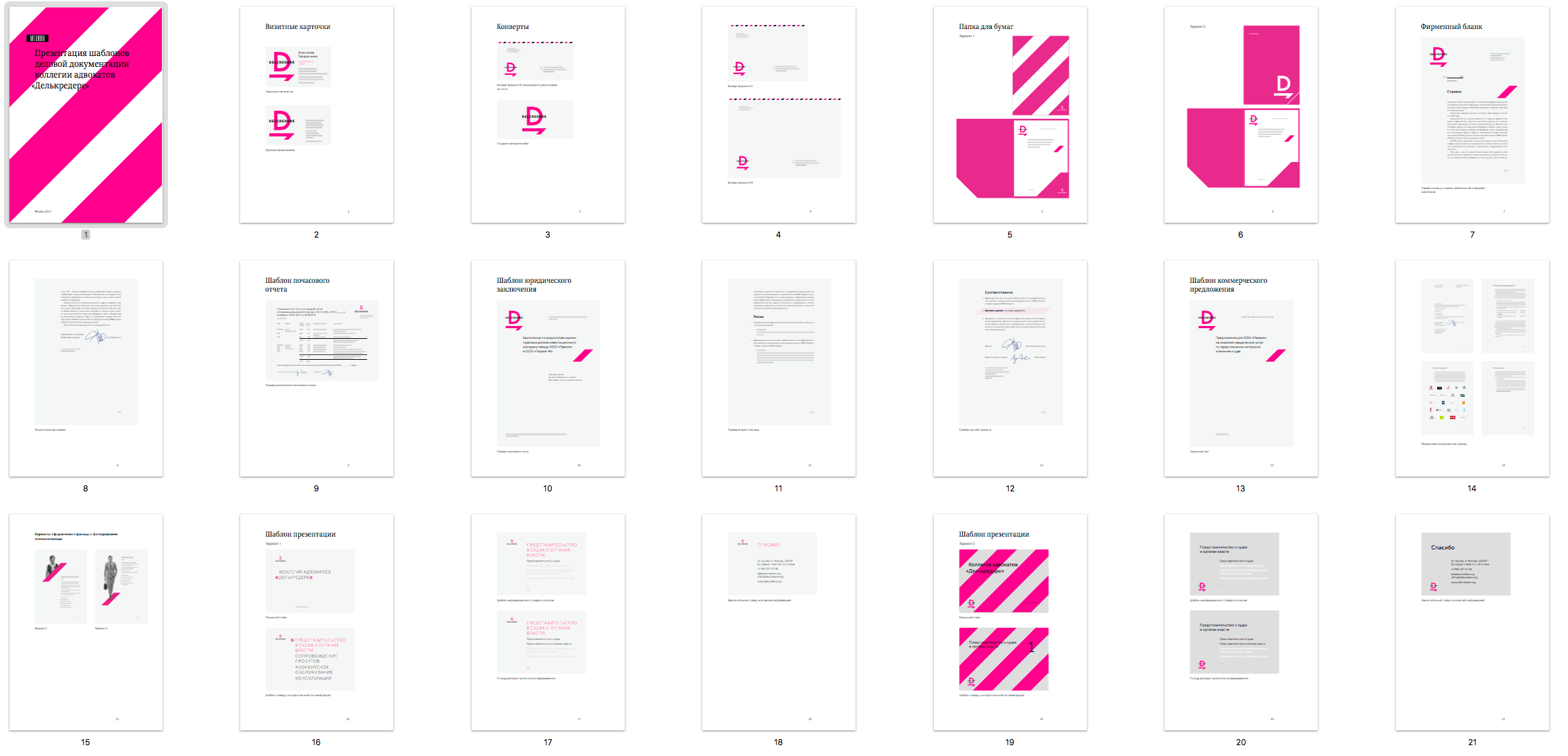
Searching for the presentation cover some more.
Describing stationery and other corporate identity elements in the style guide.