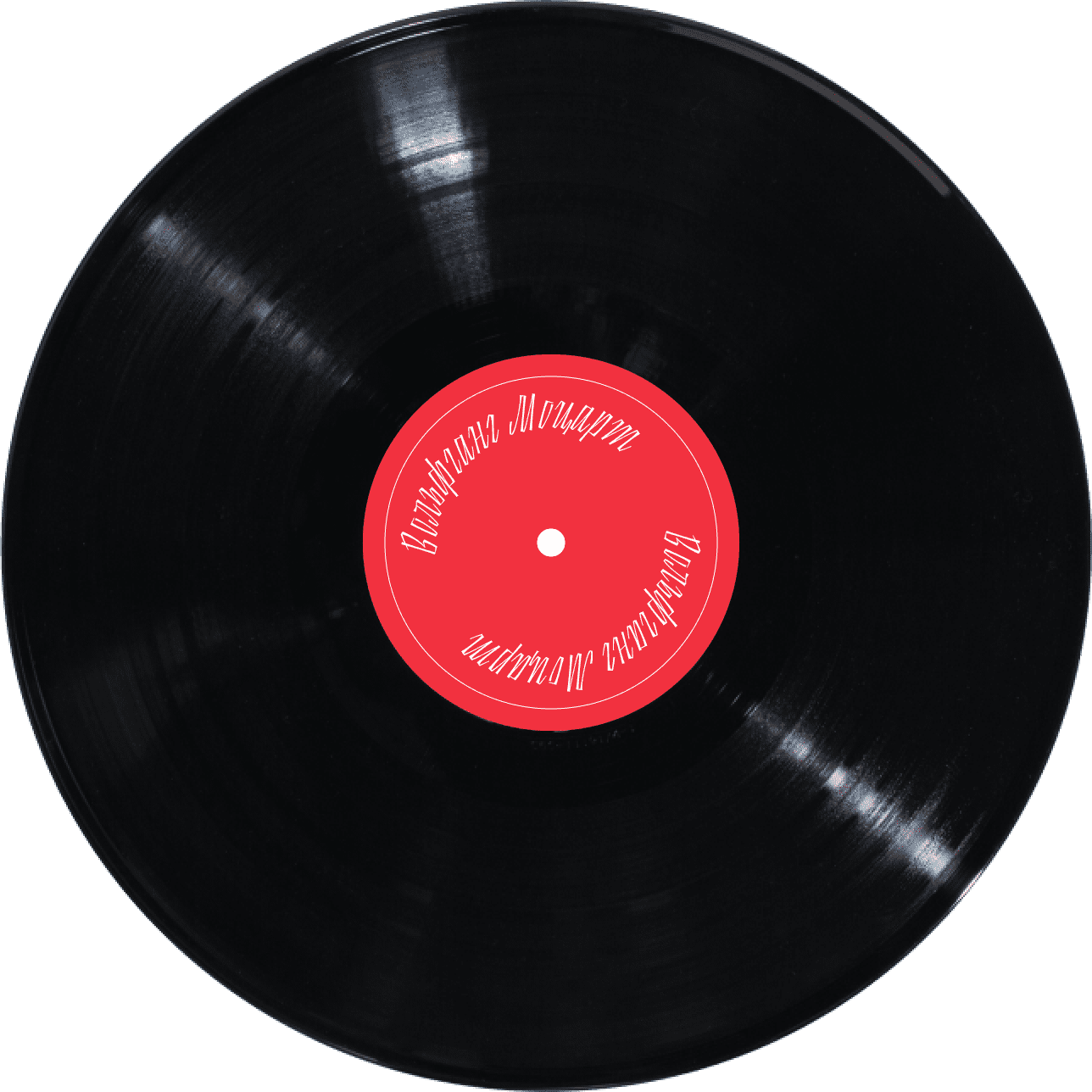
Diez typeface

Task: to design a display typeface.
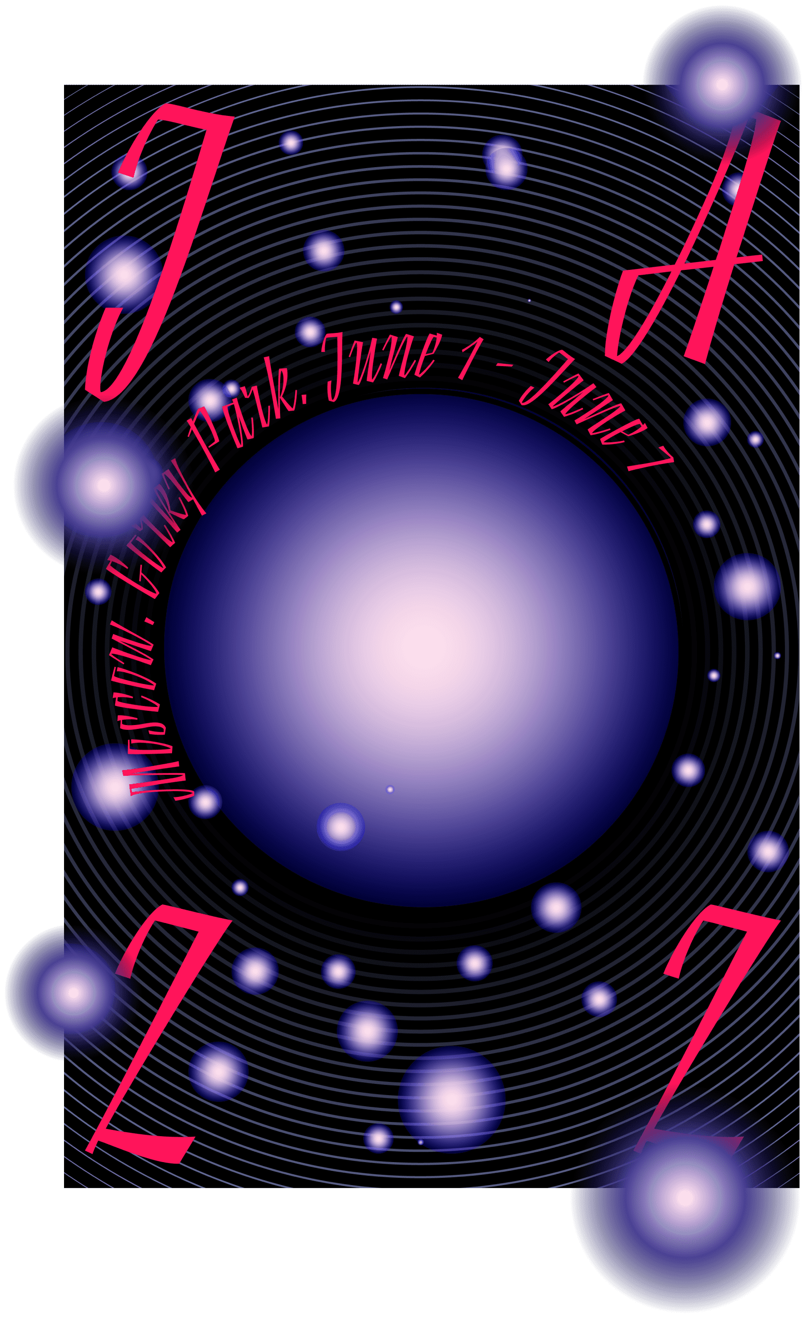
The design of short text forms such as advertisements, covers and signs requires special display typefaces. With them, the novelty of ideas is rewarded. And that’s exactly what Diez brings to the table: it’s a sharp, ringing and blistering type.
Thin
Light
Regular
a
b
c
d
e
f
g
k
l
m
n
h
i
j
r
s
o
p
q
t
u
v
w
x
y
z
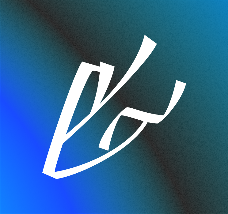
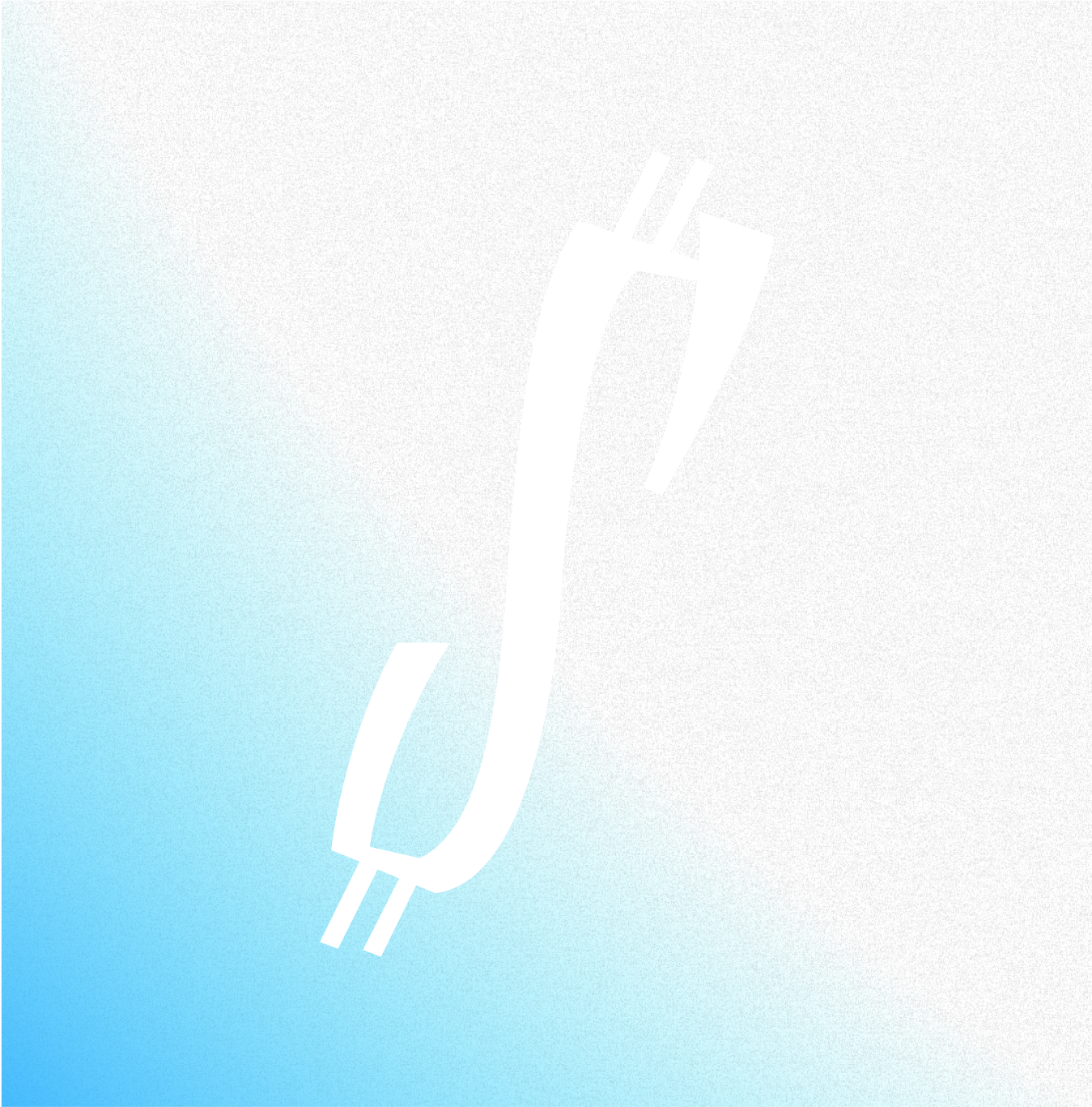
With its shapes, Diez reminds both of graffiti tags and the movement of the conductor’s baton. To make even the rounded letters look like a swing, sharp strokes were added over e, c and s while О and Д have jaunty strokes.

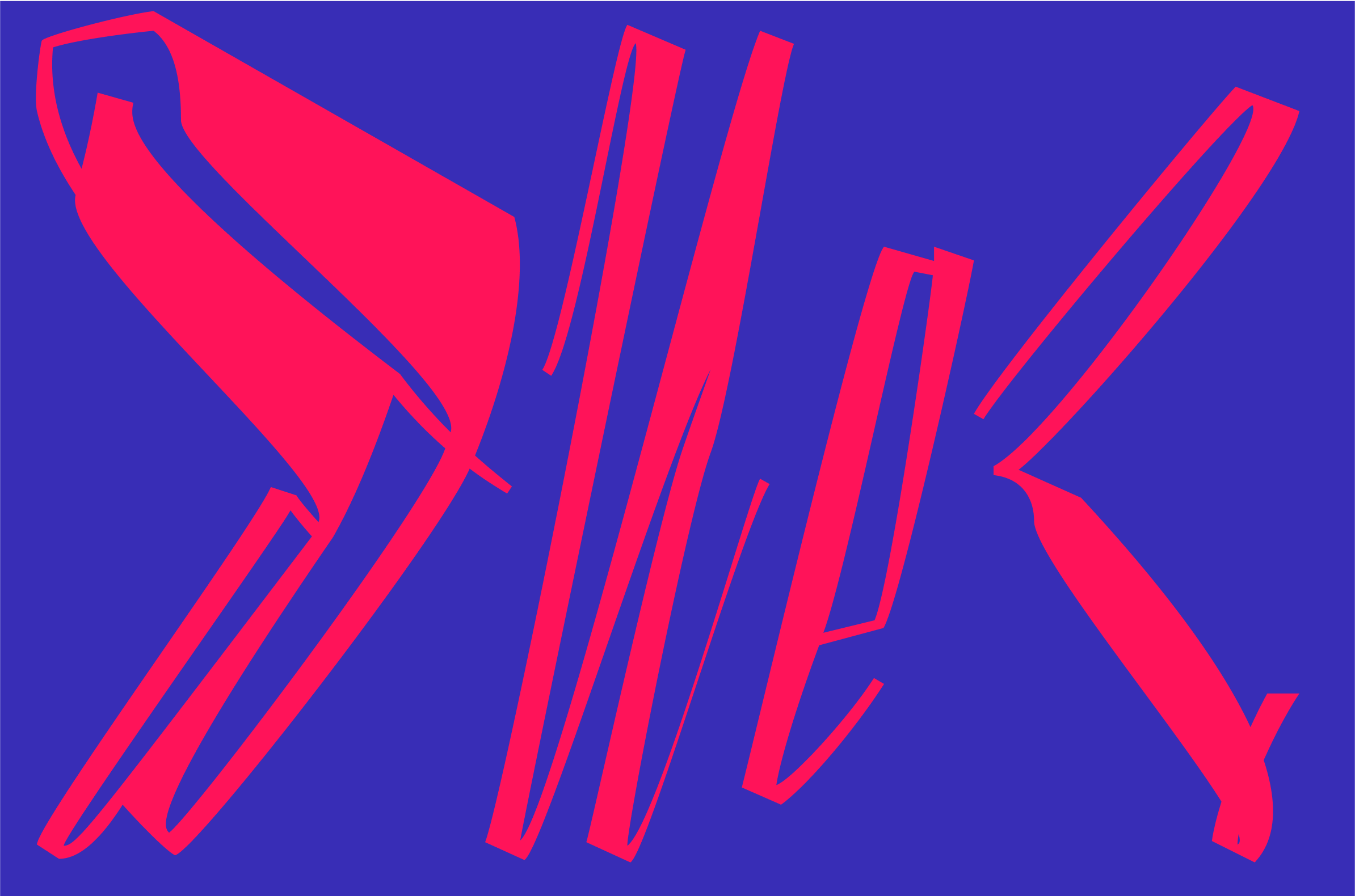
Diez doesn’t try to look inconspicuous, it’s a typeface that has character: its contrasting strokes create energy, although it still manages to look smooth in a line.


Graphemes with swells on the ends evoke associations with both Soviet lettering and ink strokes of a ruling pen.

Another characteristic property of Diez is its ability to fold into a beautiful carpet of letters, it’s enough to simply type words in columns with small line spacing.


art director
type designer
- Taisiya Lushenko
