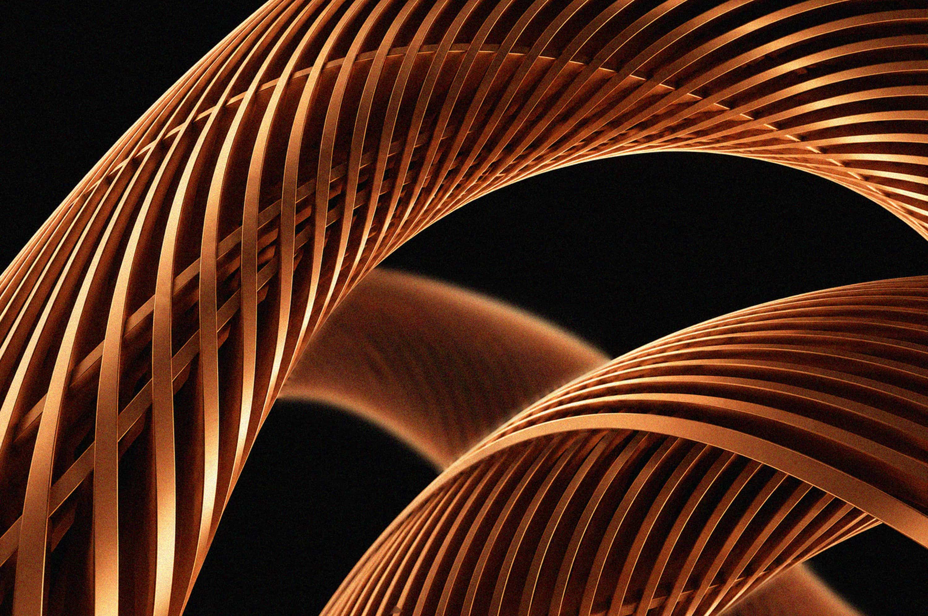

Yar Park is a premium multifunctional complex in Kazan on the right bank of the Kazanka River. It is the first space in Tatarstan that has brought together everything for a vivid and eventful life: apartments, a hotel, a business center, places for recreation and sports.
The studio developed the central idea and brand communication, and based on them — the identity.
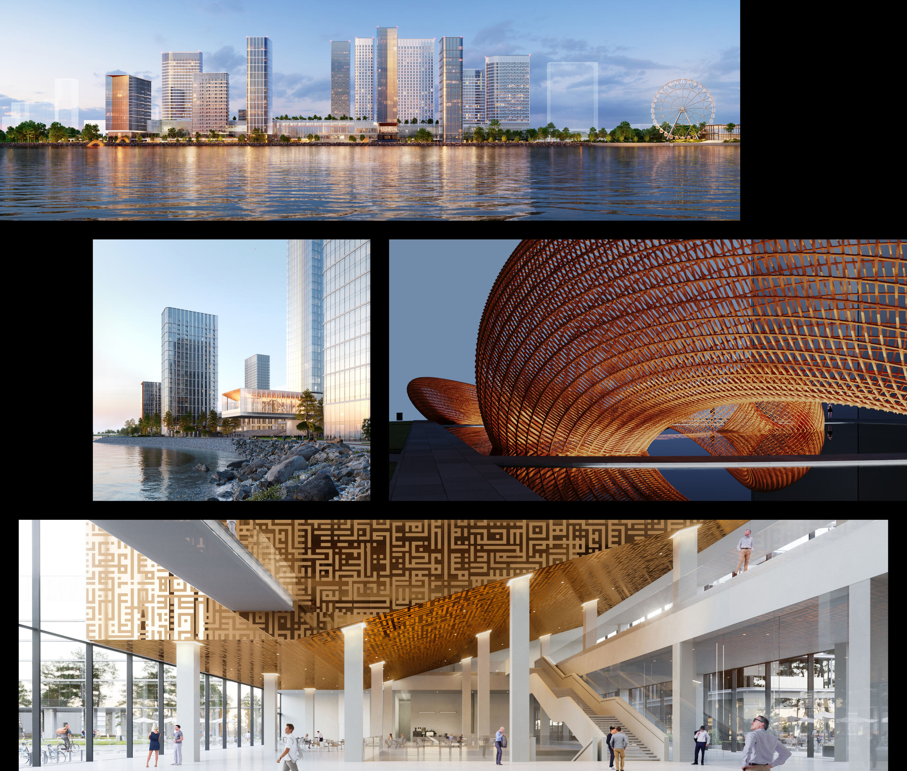
The key idea is the polarity of different human states within a single Self. In the identity it is manifested through the combination of strict geometry and soft lines — like the fusion of traditional culture and modern life. An important image of visual communication is the hero of Tatar mythology, the two-headed serpent Zilant, tying everything together: both the parts of Yar Park itself and the different facets of people’s existence in its space. Its movement, bends and dynamic silhouette shape the overall plasticity of the identity.
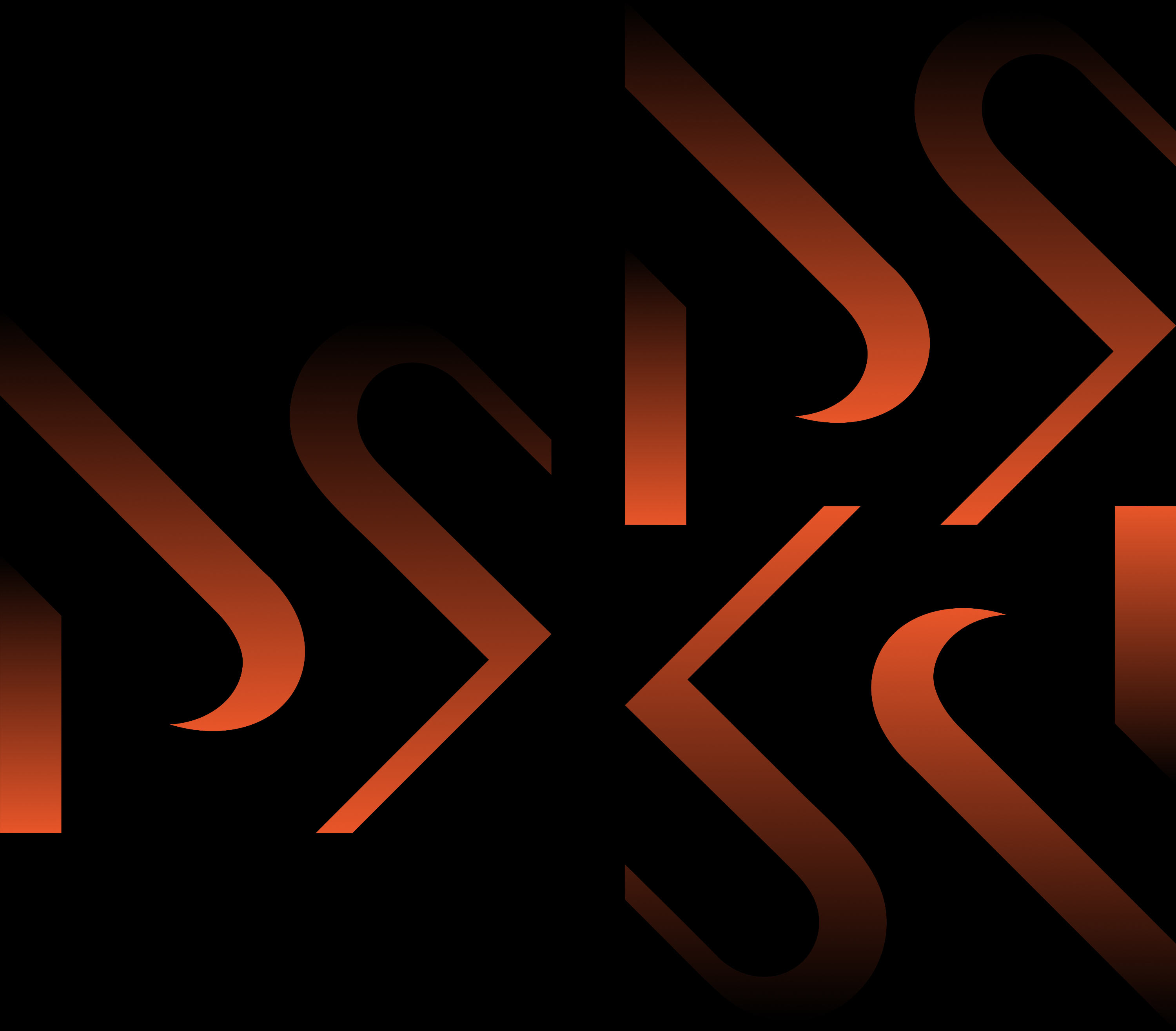
The source of inspiration for the logo is Kufic script. This is an early form of Arabic calligraphy — geometric, modular, and with an expressive rhythm.
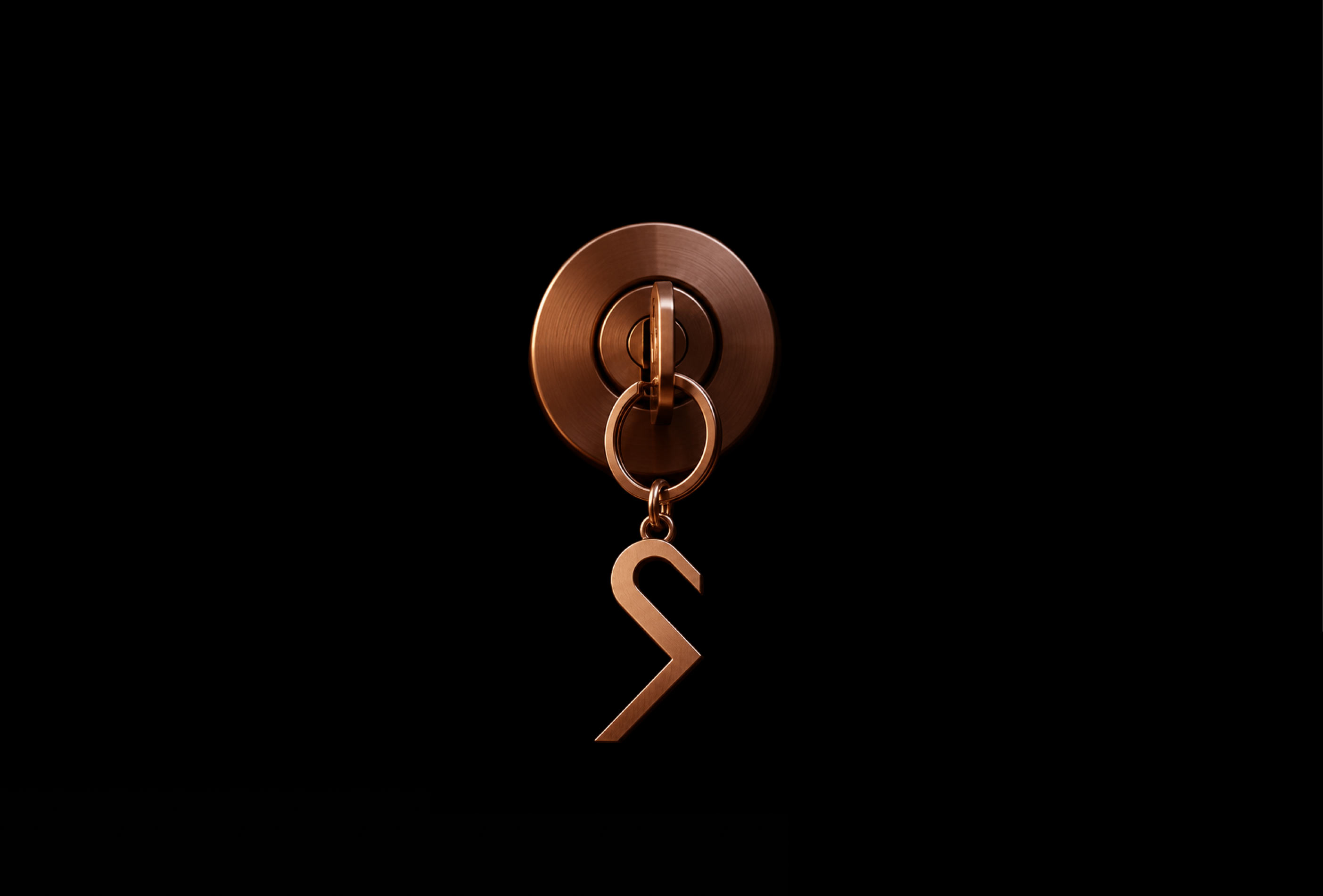
The logo is composed of several simple elements that form a cohesive graphic image. The mark does not literally depict historical symbols but works as a visual gesture — both architectural and calligraphic at the same time. In this combination, the character of the project is revealed: active urban life, rich nature, and a close connection between contemporary architecture and the history of the place.

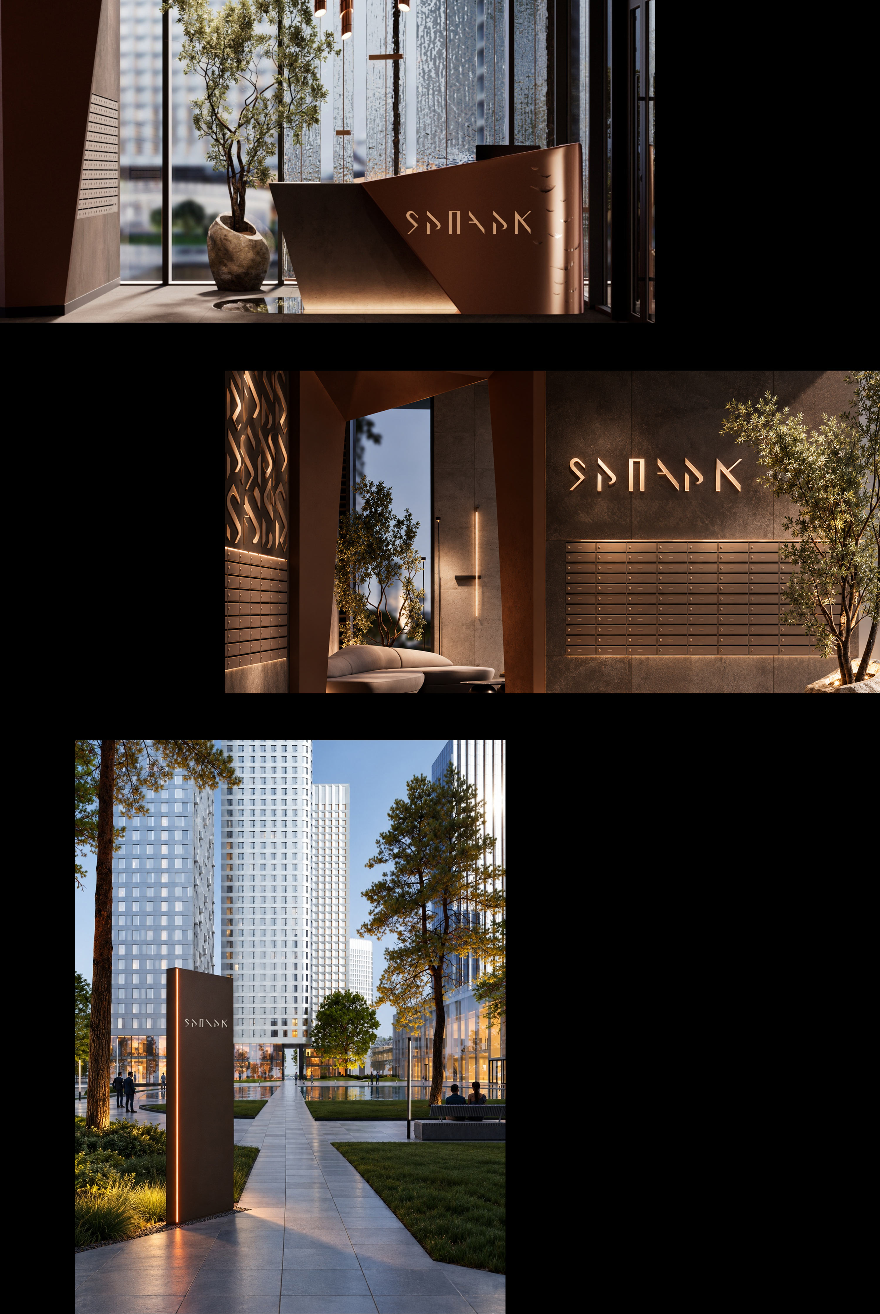
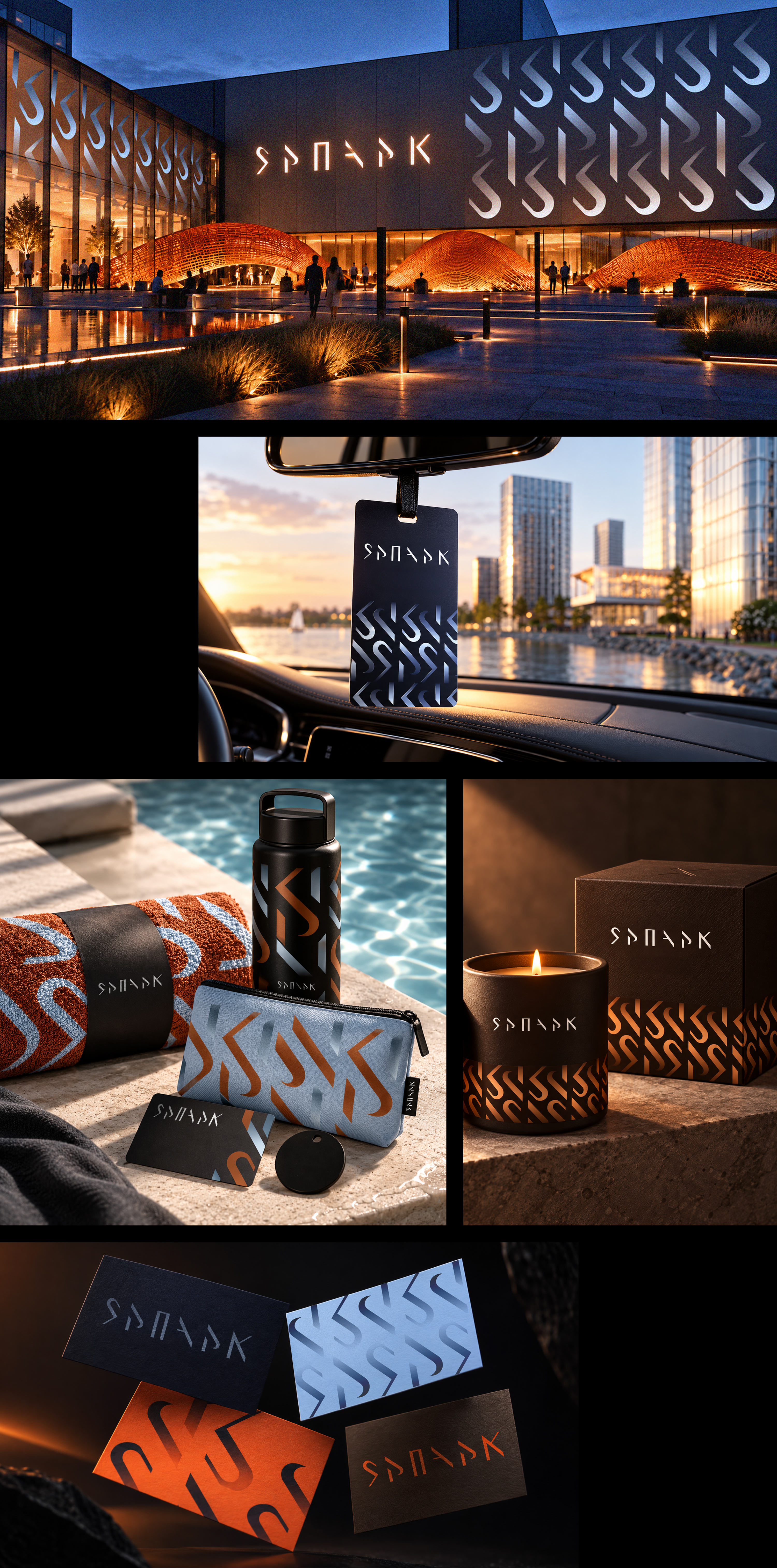
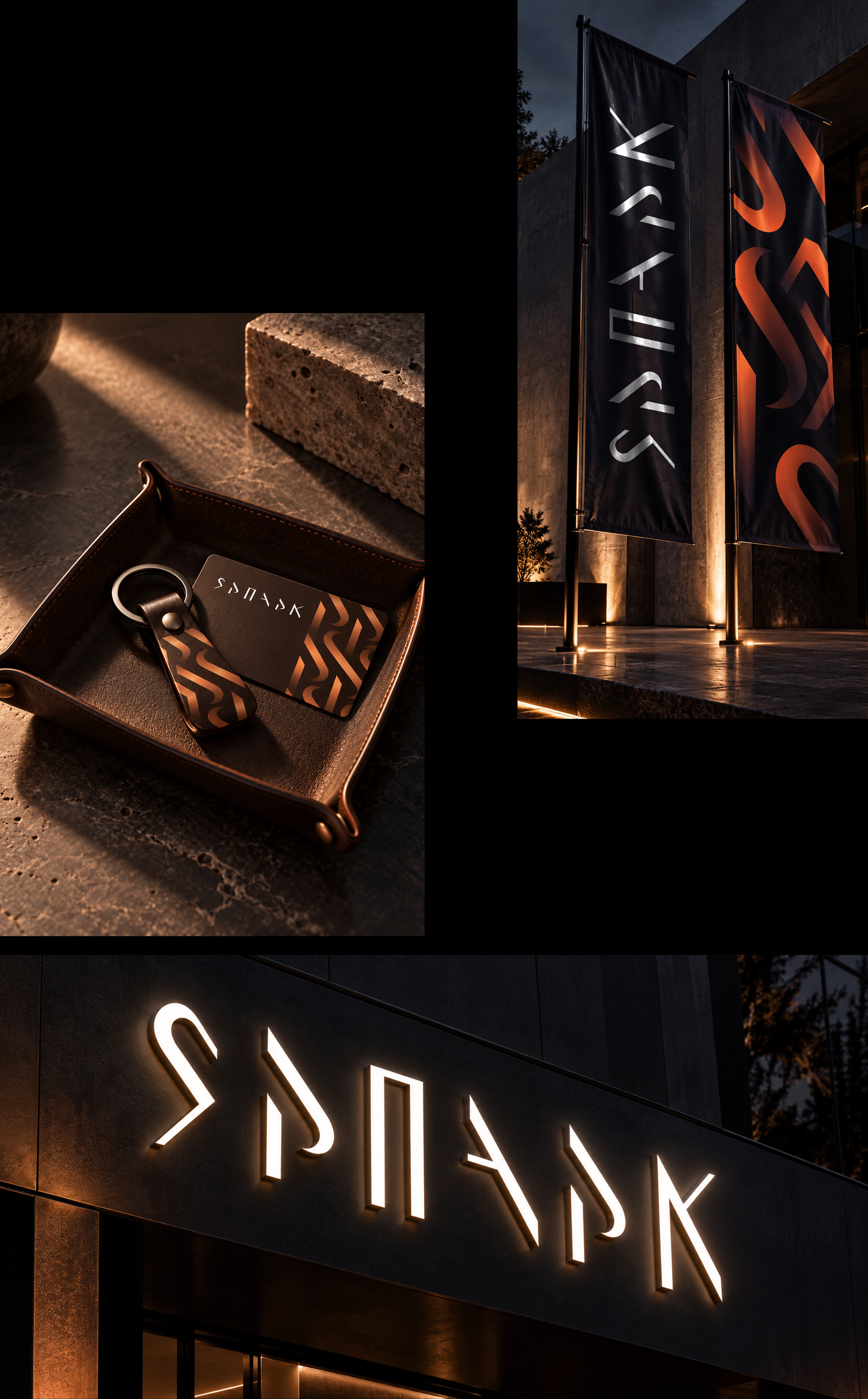
The modular structure gives the logo flexibility: individual elements live independently, and together they form a unified system. Therefore, the mark also works as part of the environment: it turns into graphics, patterns, navigational and decorative details. In this way, a multifaceted identity grows out of the logo.
The glowing effect around the lettering conveys the idea of a person’s inner spiritual light.
The deep color palette unites the natural elements and reflects the multifaceted essence of Yar Park. The sky color recalls the reflection of the sky in the river, the terracotta — the fire of Zilant and rock paintings, the dark blue — clear nights, and the brown — the earth.
art director
designers
- Ella Dovnar
