Litres identity
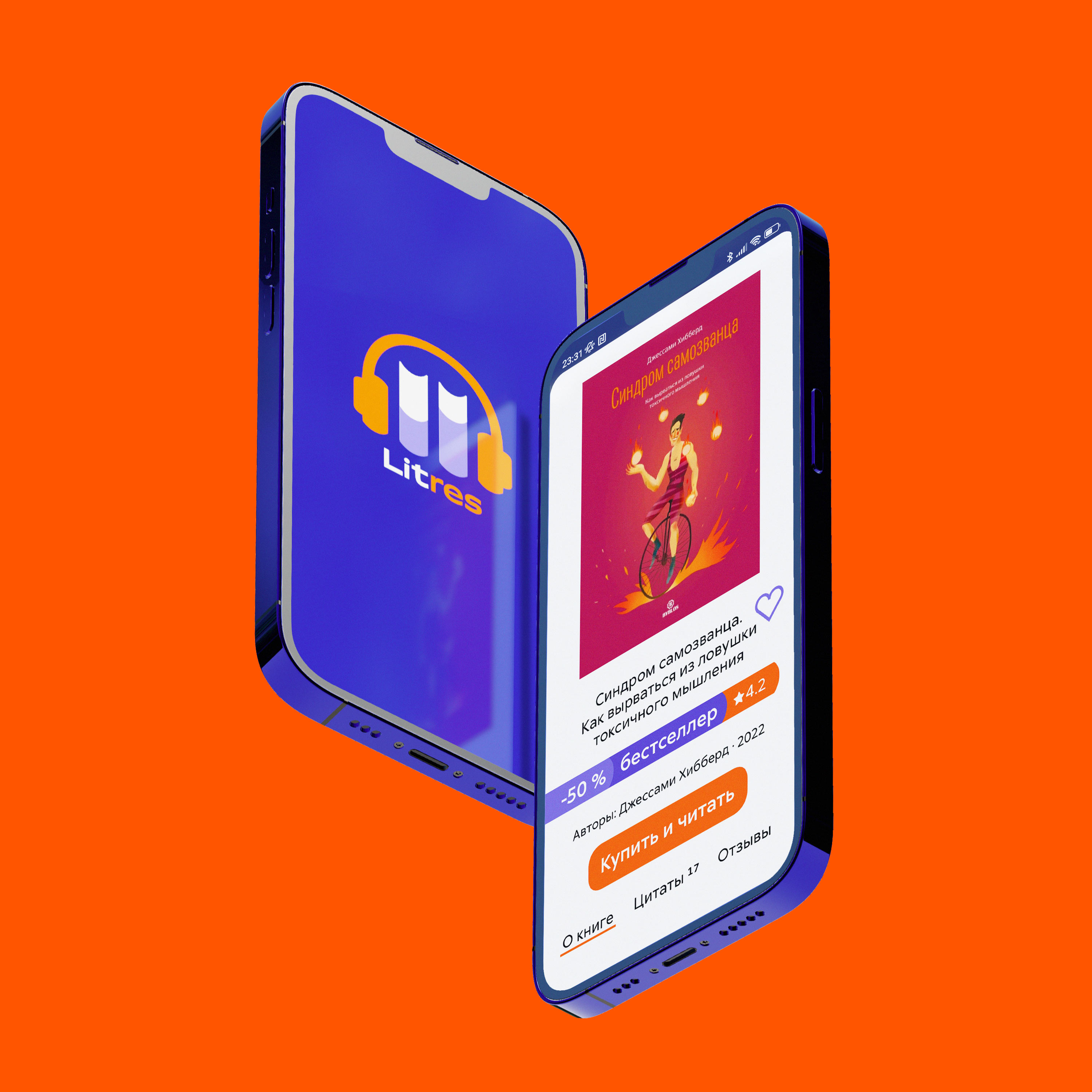
Litres has long stopped being an ordinary book resource. Now, in addition to literature it offers podcasts, lectures, audiobooks, services for authors and audiobook narrators, and the company is not planning to stop there.
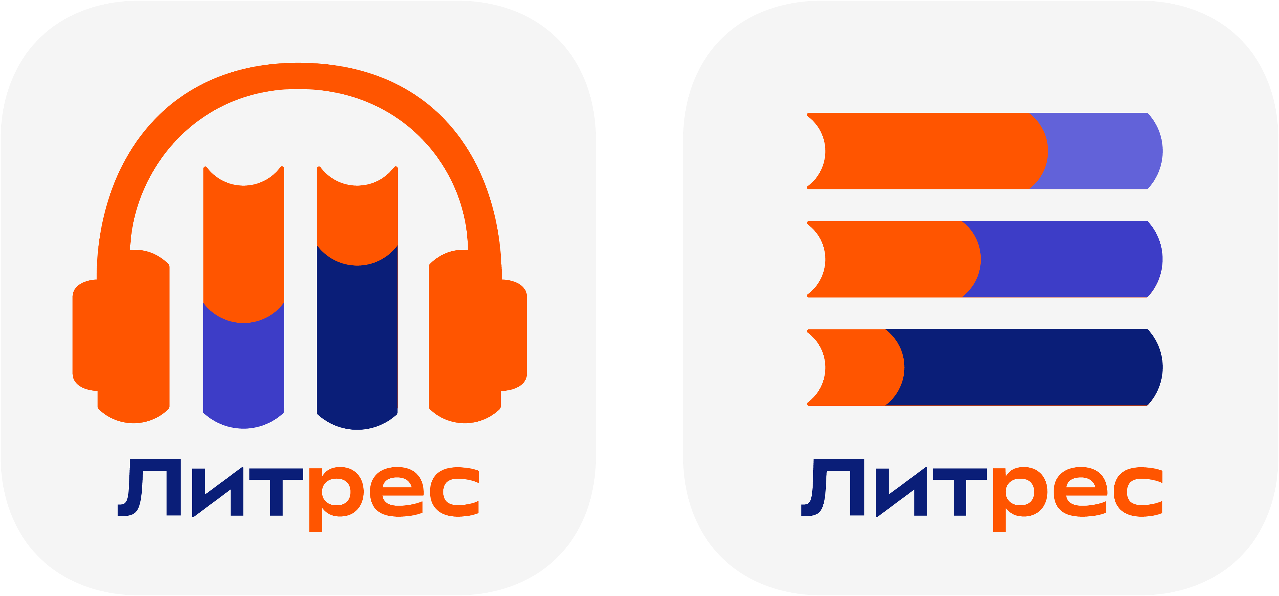
The logo designed in the studio maintains the familiar metaphor, but at the same time complements and expands it, delicately refreshing the image of the brand. The familiar three books are simplified, rotated horizontally and turned into a light and clear drop-down icon, a symbol of the diversity of intellectual entertainment offered by Litres.
The moving sliders can be seen as representing the progress bar of a player, endlessly flipping pages of e-books or settings of a mobile app. This way, the sign reflects all formats of information and the great flexibility of the platform which can be adjusted to the taste of every user.
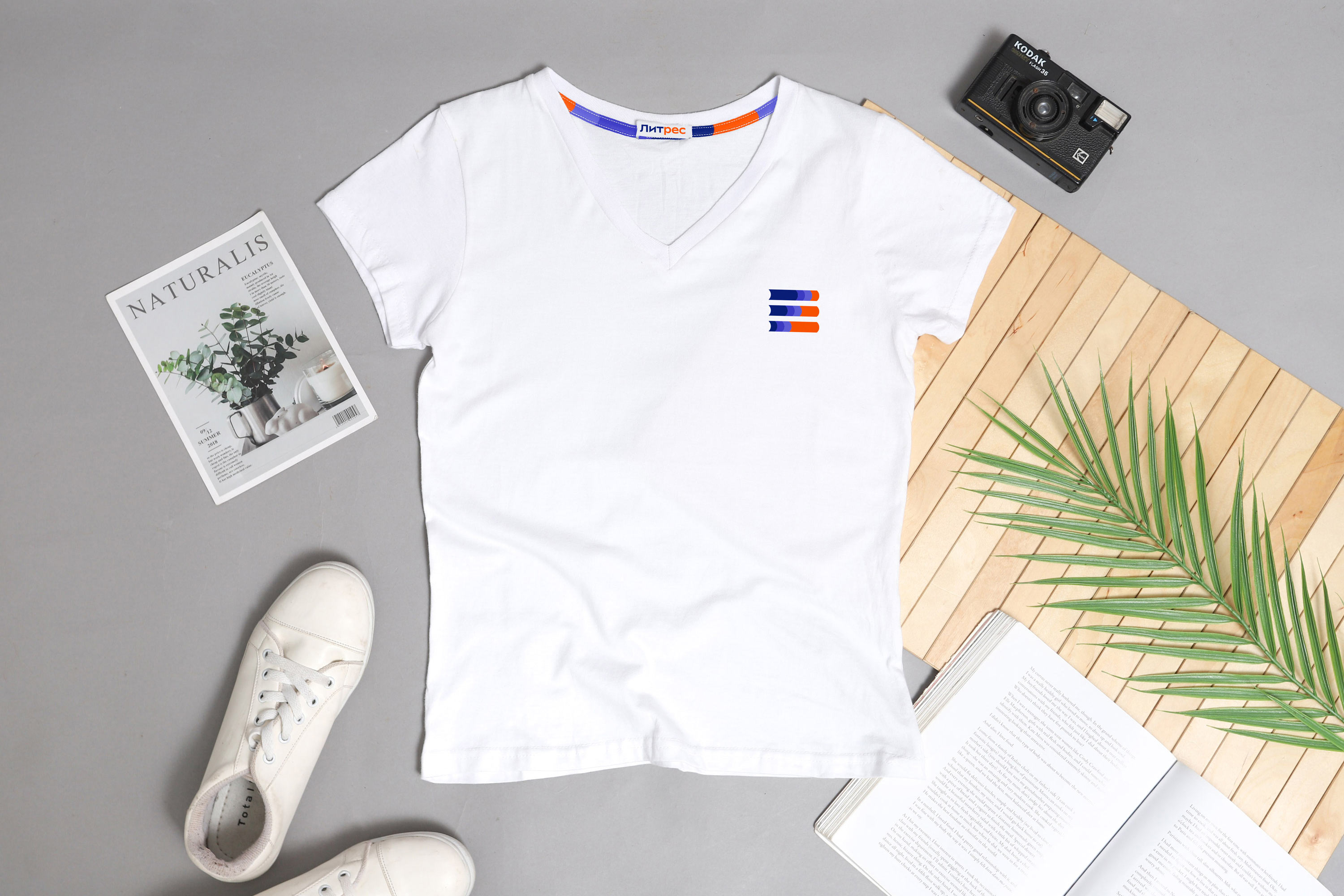

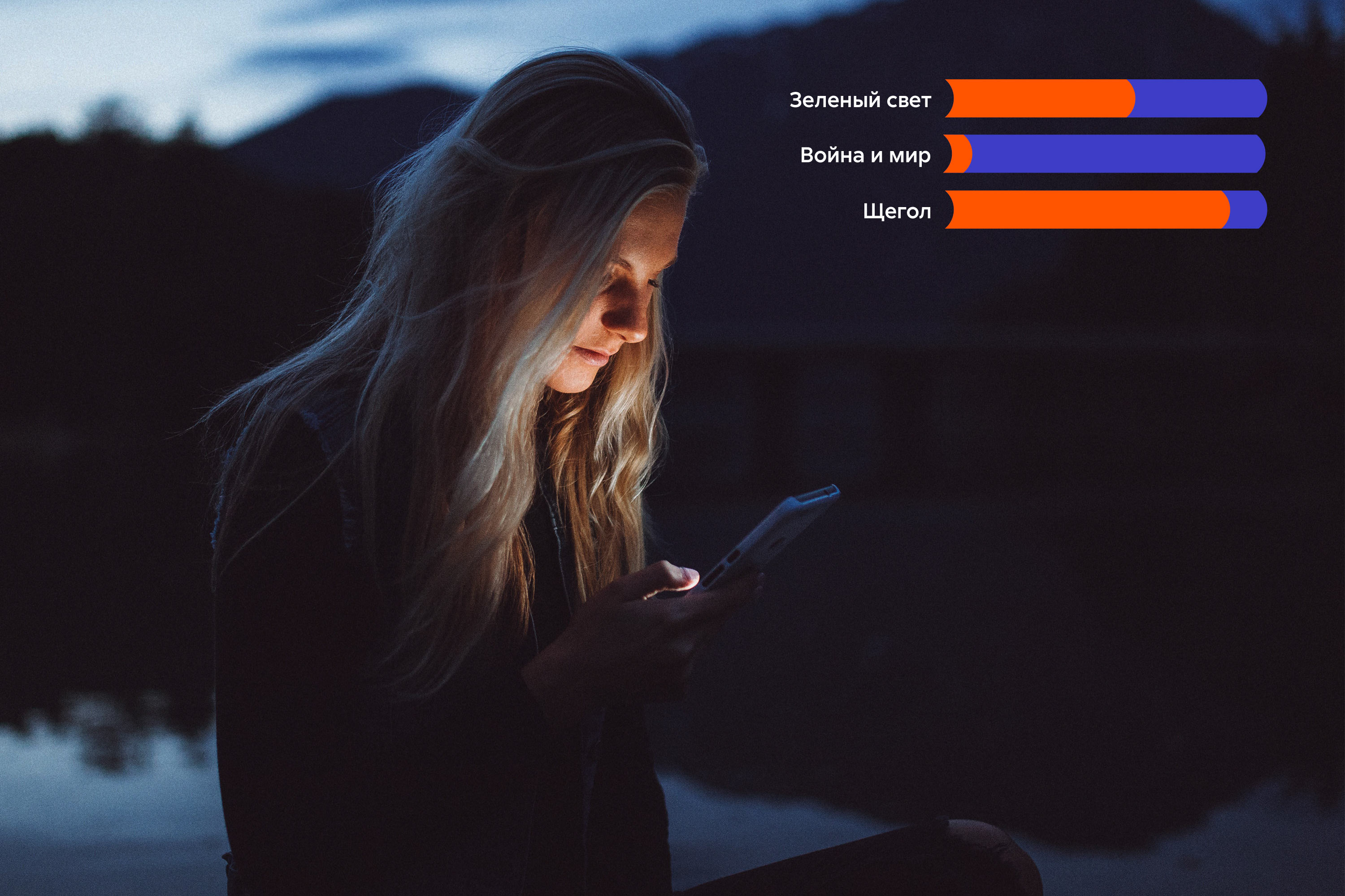

The cheerful pattern that also demonstrates the abundance and diversity of content adapts to any medium and makes branding easier.
The icons are pleasing to both old and new Litres users and can be adapted to specific products and tasks.
art director
designers
- Valery Tolchanov
- Ella Dovnar
type designer
- Taisiya Lushenko
