Luzhniki is the legendary Moscow stadium, venue of major sporting and cultural events: the Olympic Games, world championships, UEFA Champions League UEFA Europa League Finals. In 2018, Luzhniki will host matches of the FIFA World Cup.
A convenient and user-friendly navigation system for the stadium’s main arena was created at the studio.
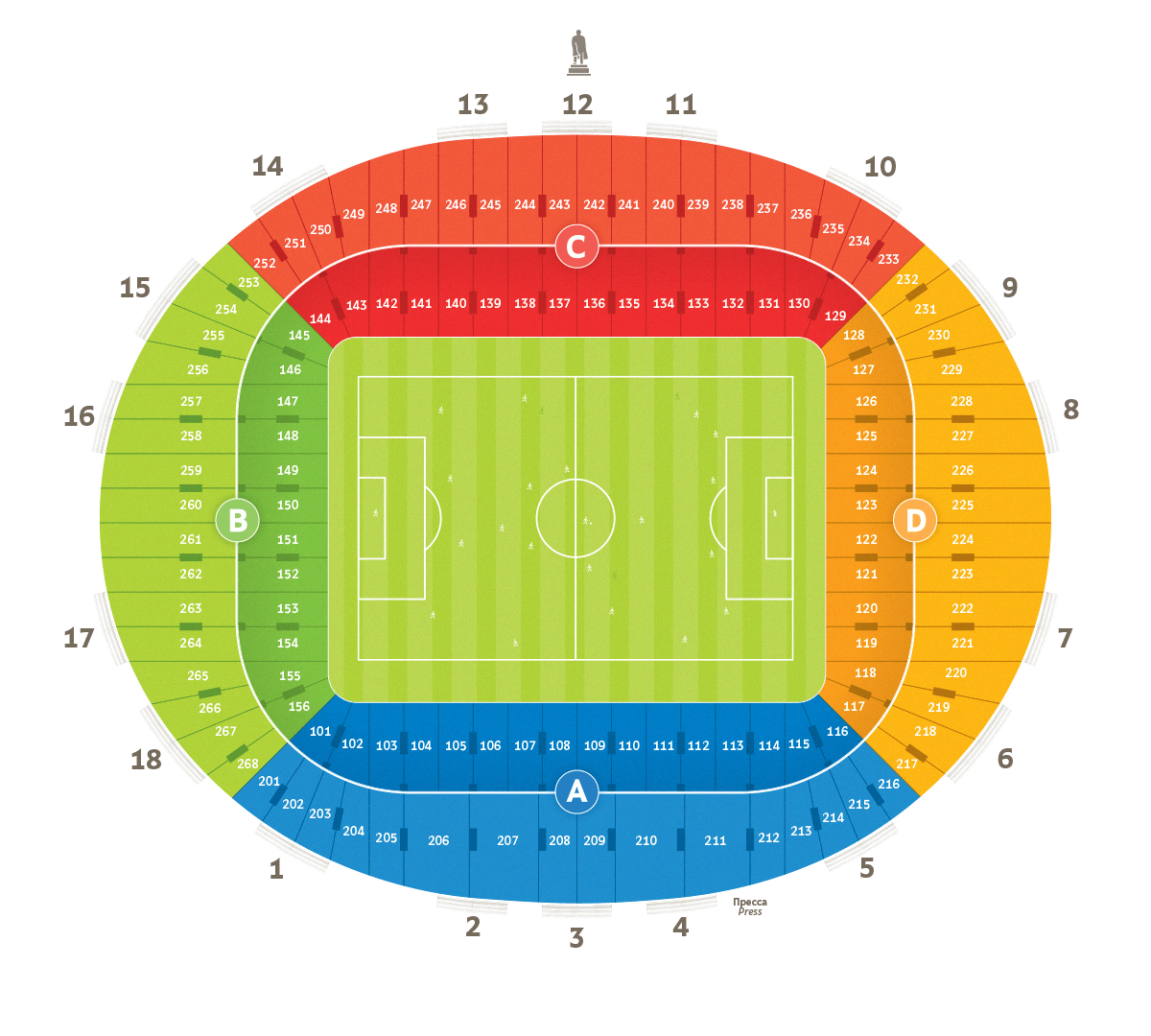
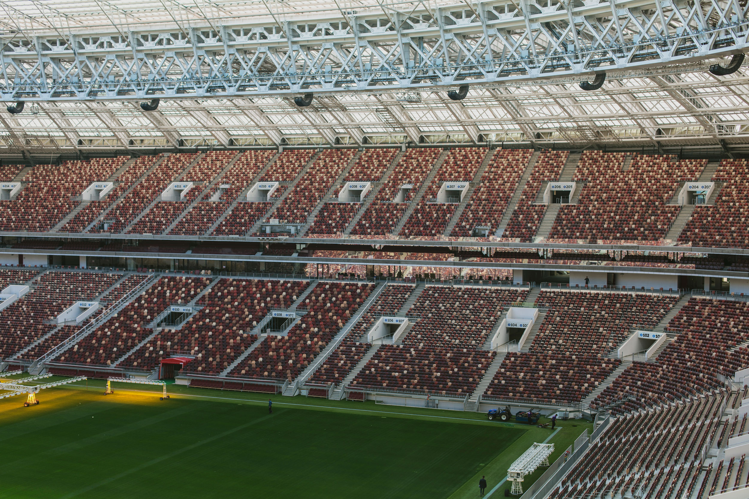
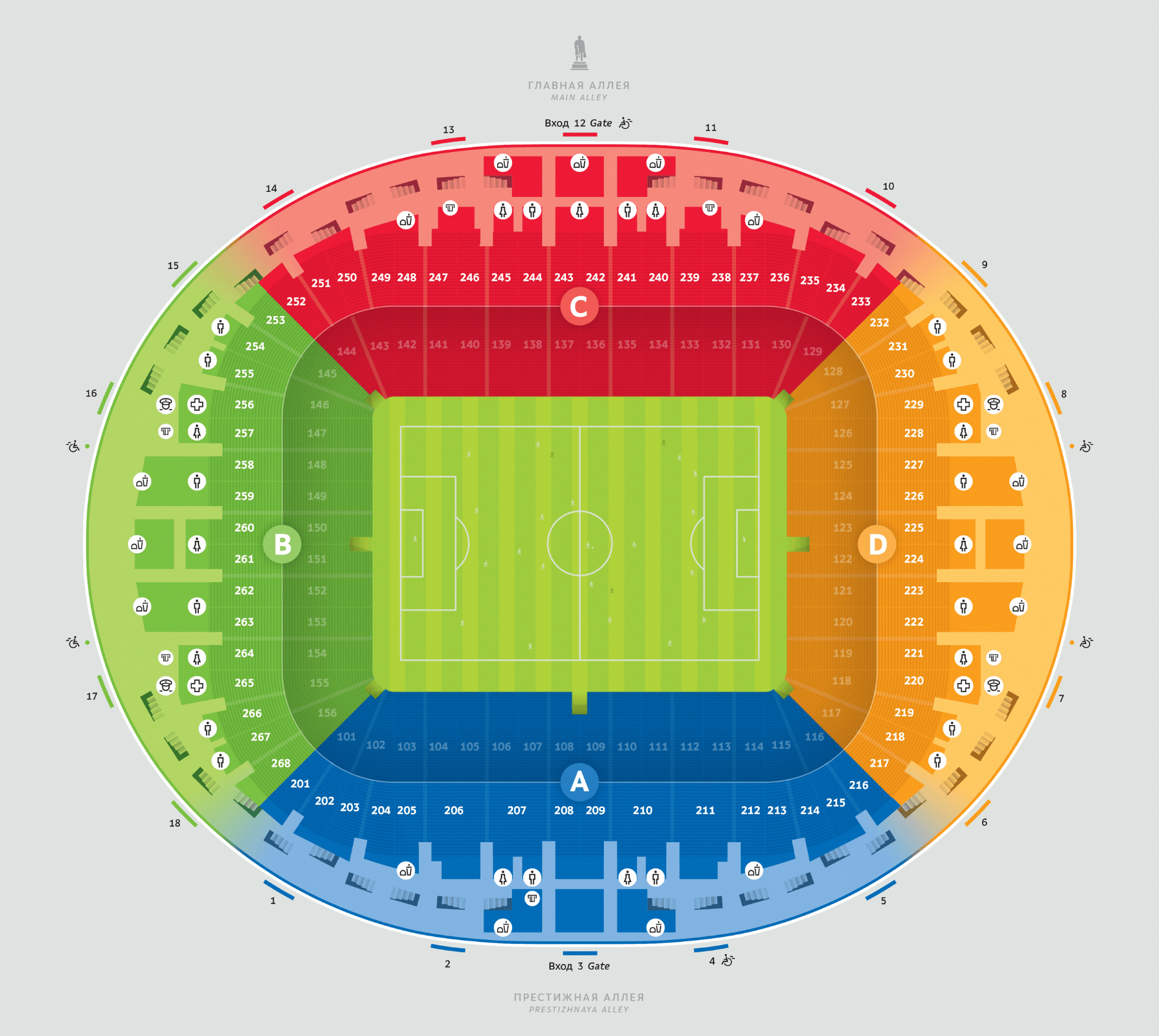
Luzhniki is the largest stadium in Russia, able to accommodate more than eighty thousand people. First of all, we had to make sure none of these people get lost while they are getting to their seat.
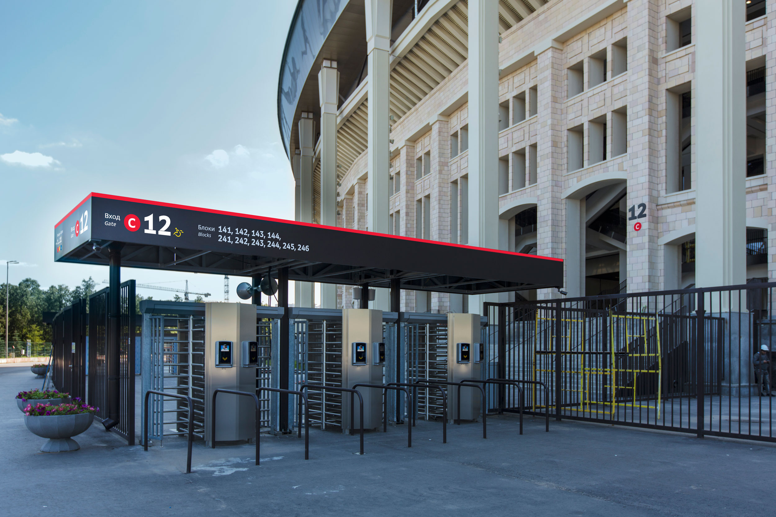
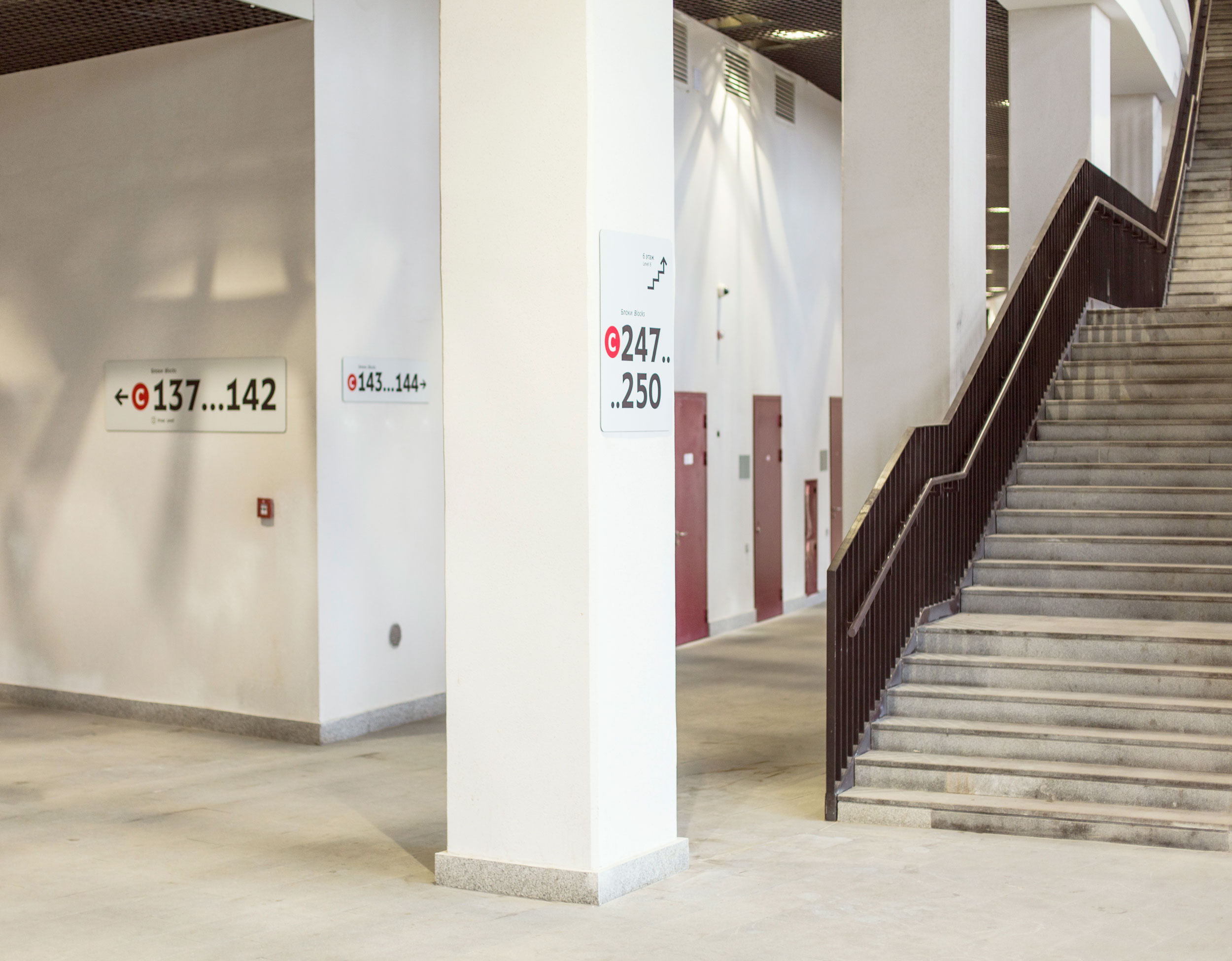
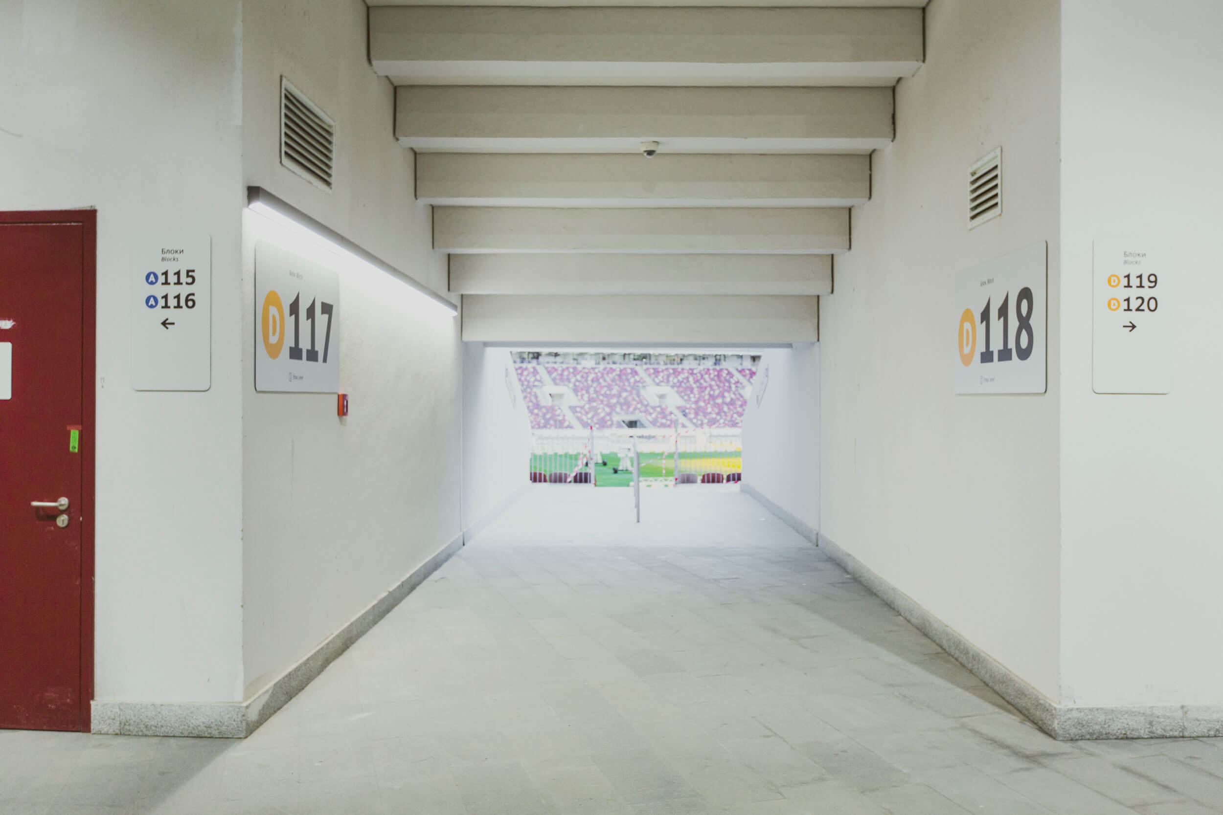
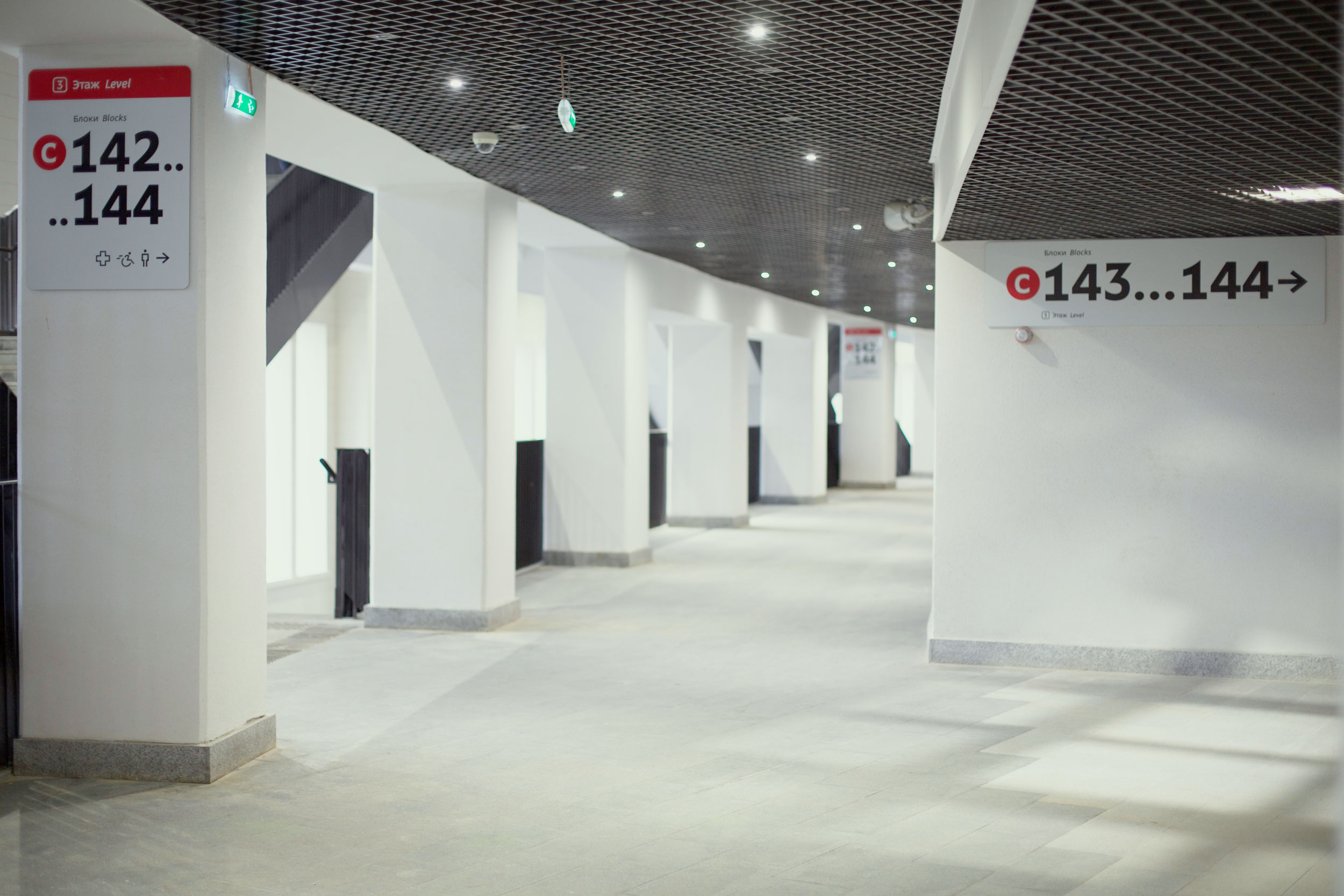
We divided the stadium into four sectors each of which is broken down into smaller blocks. Each block is connected to a corridor by a single exit, which means visitors won’t get lost searching for their seat in the wrong block.
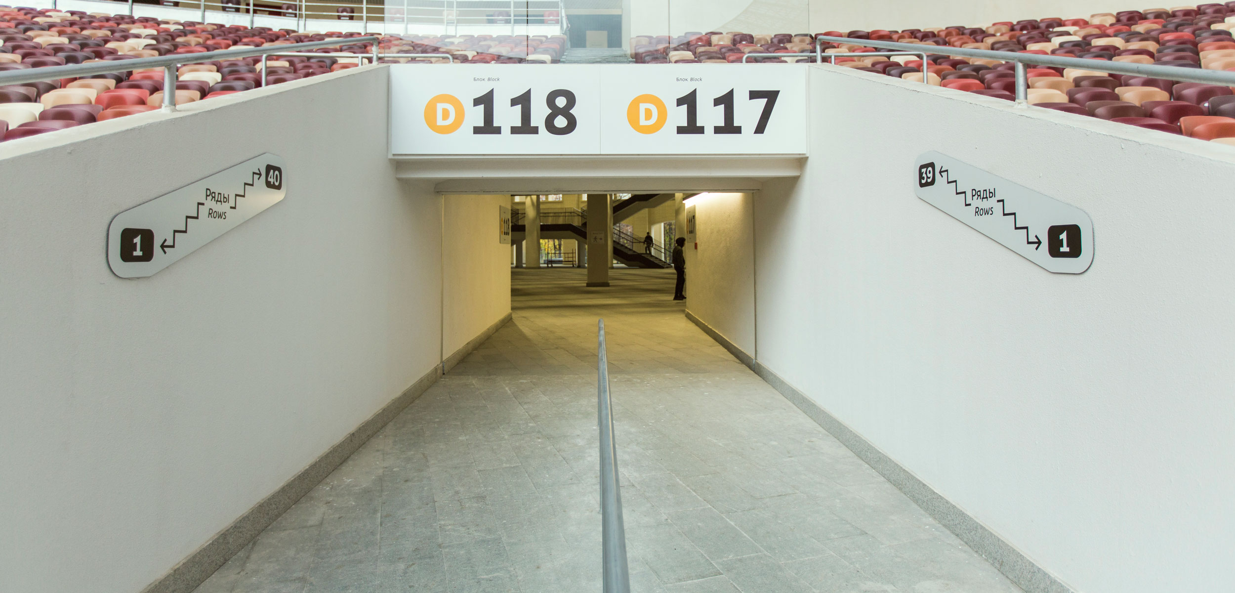
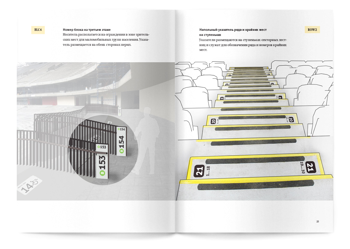
The blocks are numbered in large numbers both from the side of the corridors and the arena. Large numbers facing the arena help personnel quickly locate the right place.
—Medical emergency, send doctors to block 102!
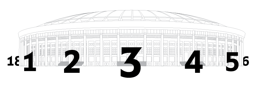
Entrances to the building and the blocks are numbered counter-clockwise, that is left to right. This was the other way around in the previous version of the navigation system and this caused much confusion to the visitors. Usually, Entrance 2 is to the right of Entrance 1, everyone is used to that. But not in Luzhniki! Often times, visitors went from Block 1 to Block 18 only to come back irritated.
The new numbering system is intuitive and significantly facilitates navigation.
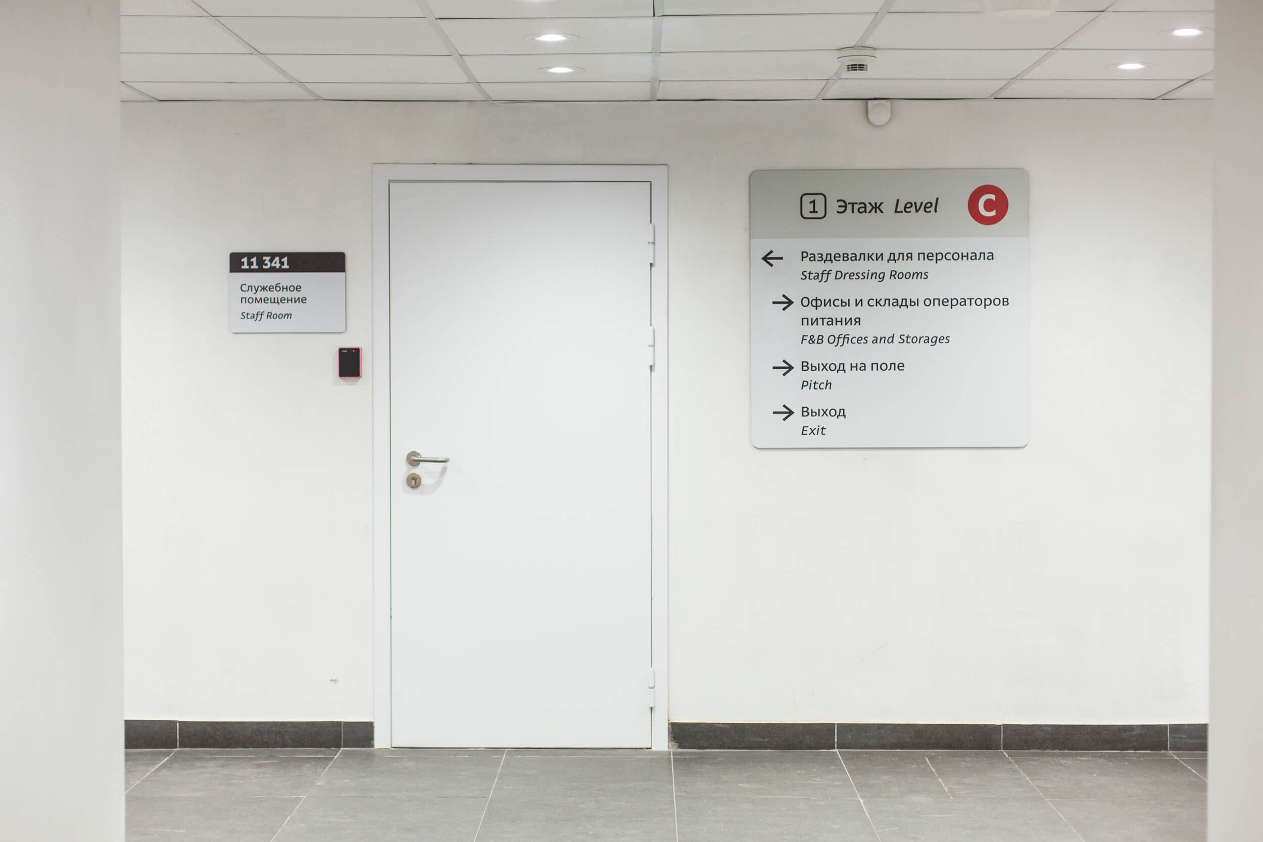
Each route has decision points, special places where a person decides where to go next. On a stadium such points include entrances, staircases and forks in the routes, that is all areas where there is a choice. Should I go right or left? Straight? What should I do? To answer these questions, there are thoughtful navigation signs at each decision point.
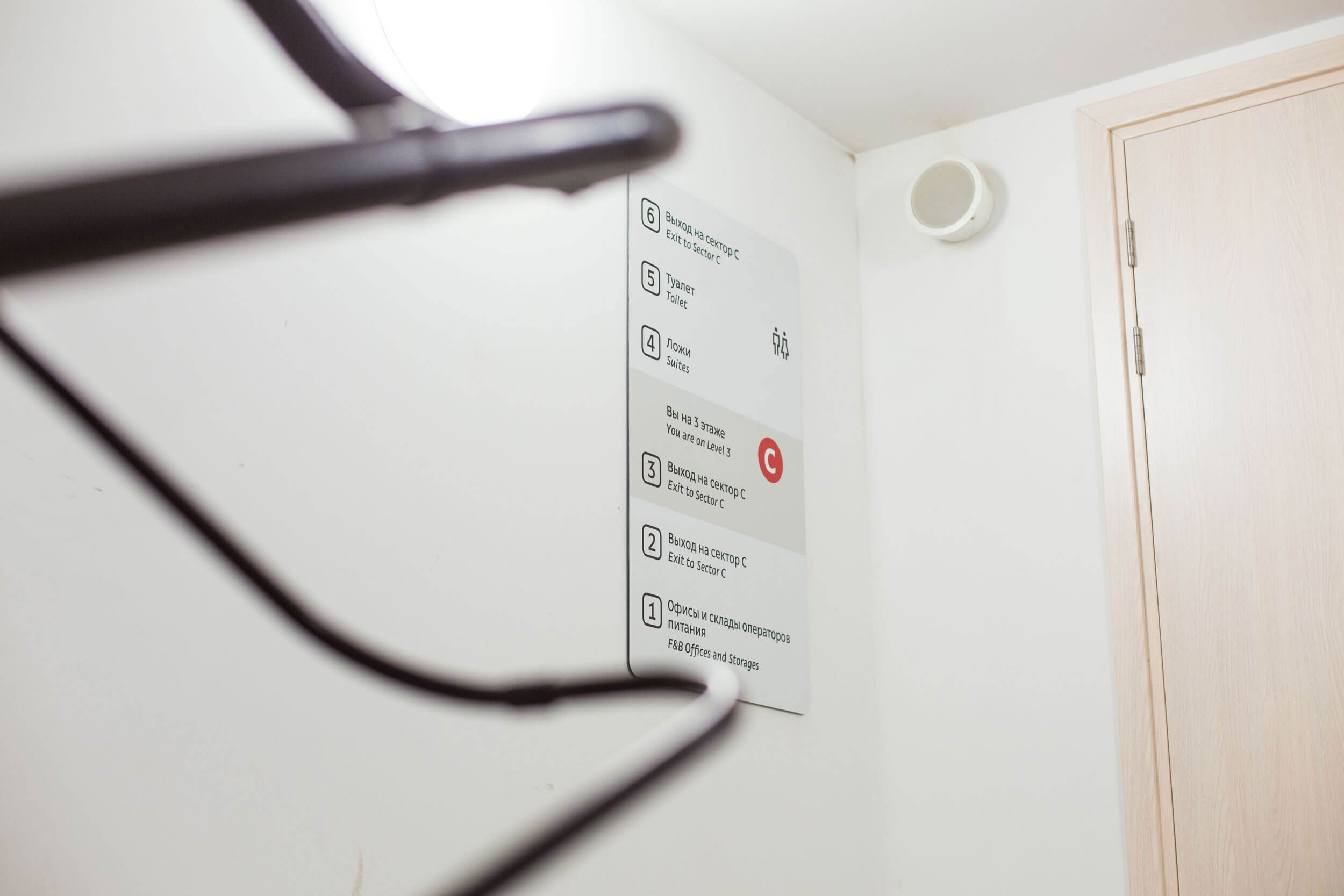
The navigation system leads visitors from their approach to the arena to their seat, pointing out the location of blocks and service facilities along the way.
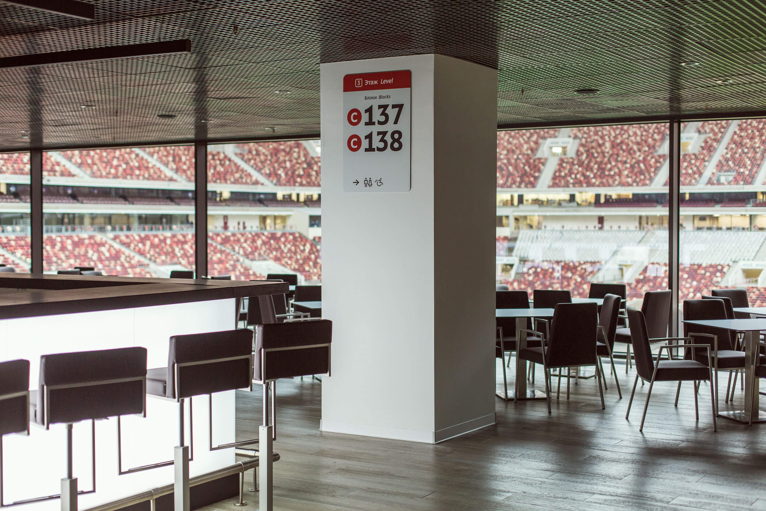
The signs are designed to emphasize the information they contain, not signs themselves. Their color accurately matches the color of the walls while the floor signs are made of the same metal that is used in the design of the stadium.
It isn’t a navigation system, it is an ode to subtlety. Signs help visitors find their way without overloading the visual space.
The system gives answers only to questions that are relevant at a particular location.
Here, a visitor approaches the stadium. What are they interested in? First of all, where the entrance is, where they need to go. Once inside, they have different concerns: “How do I get to my sector? Where is the washroom? Where can I get something to eat?”
The navigation system gives answers to questions as they come up, so the signs are not overloaded with text and are easy to read. The closer the landmark to a decision point, the larger it appears on the sign.
The signs are positioned high enough to be visible in the flow of spectators. They match the dimensions of the space they are located in: small plates in stairwells and huge signs at building entrances.
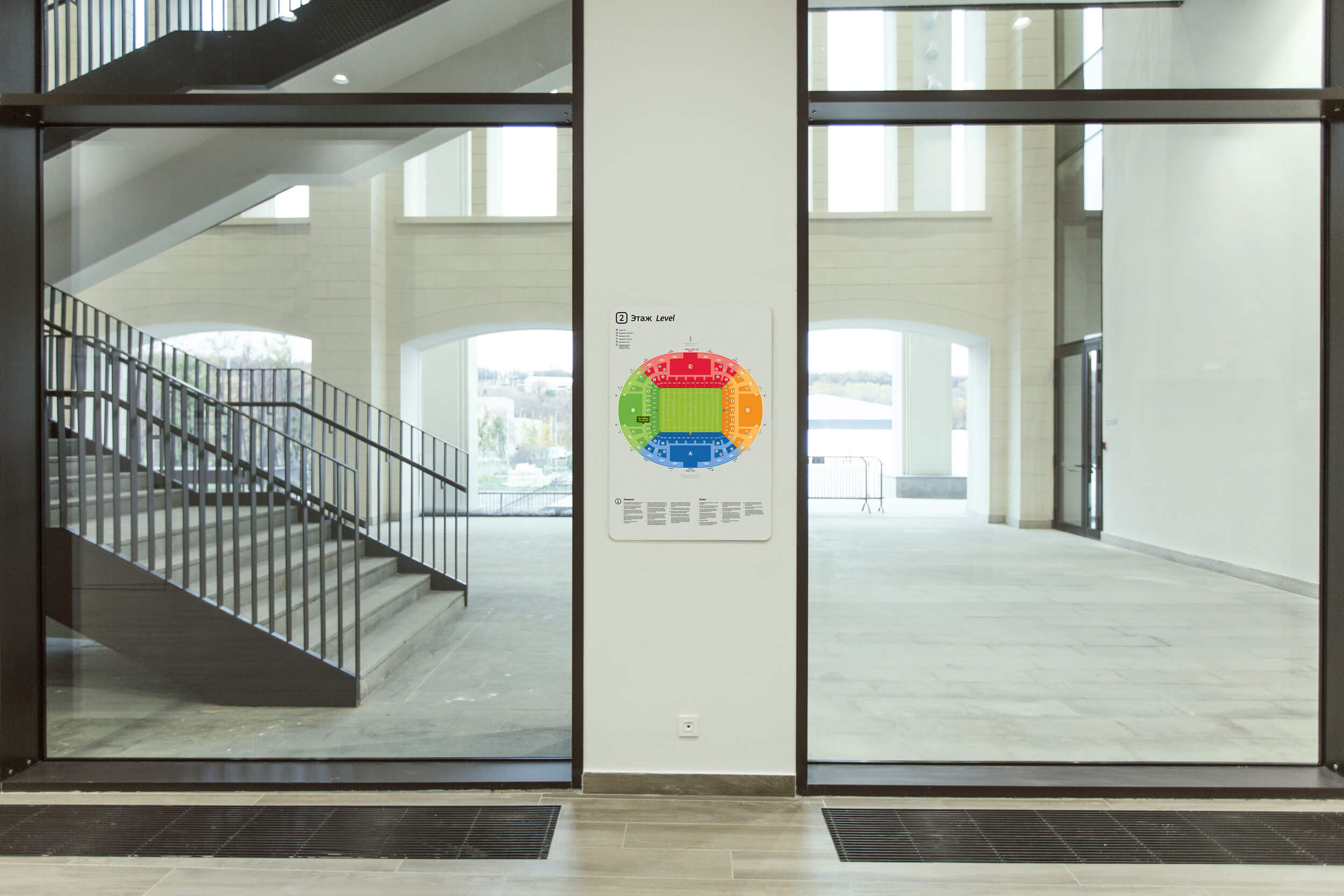
Areas remote from intense visitor flows have complete maps of the stadium allowing visitors to quietly study the layout of the arena.
Internal navigation also helps stadium employees.
To make sure visitors always know where to go, even simple signs are illustrated. For example, the direction to a row is shown with steps.

Continuity is maintained between the navigation system of the entire Olympic Complex and that of the stadium. Direct typeface and a single set of pictograms is used in both navigation systems. However, individual features of the arena are taken into account in its navigation.
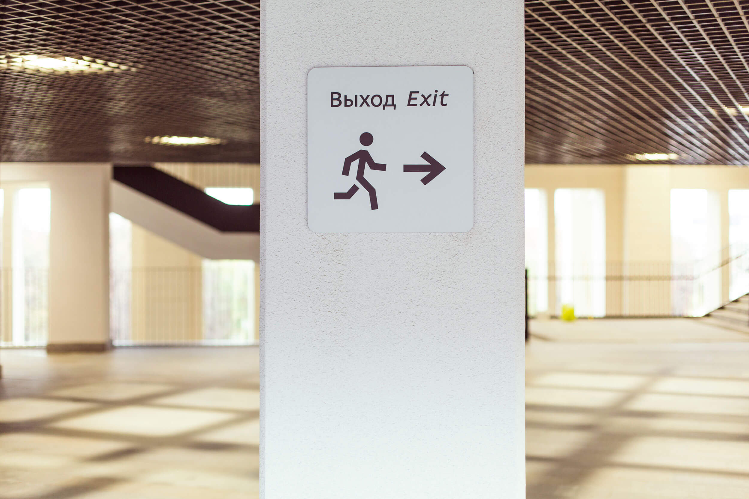
All pictograms are as friendly as possible. The policeman is affable, the wheelchair user rushes somewhere and restaurants are marked with an icon of a soda and a burger.
The guide on the use of the navigation system is presented in a separate booklet.

designers
- Sergey Steblina
- Valery Tolchanov
- Dmitry Mikhailov
- Anastasia Gorbunova
- Mark Rodionov
type designer
- Ksenia Erulevich
illustrator
- Mikhail Prosvirnin
editor
- Anna Potapkina
translator
- Tatiana Kozlova
project managers
- Yulya Milostivaya
- Alla Bryuzgina
- The studio wishes to thank Leysan Karimova and Aleksey Shubkin for their help with the project
