The making of the floor navigation in Moscow Metro stations
The story by Ludwig Bystronovsky.
At the end of 2013 Moscow government announced a contest for design, production and installation of floor navigation in the Moscow Metro. Our experts decided: we must participate. Art. Lebedev Studio entered the contest together with manufacturing contractors: we were to create the design, while our partners were to take care of production and installation of floor signs.
The work turned out to be intellectually demanding. If you happen to be in the Metro by closing time and see there a group of strangely agitated men with sheets of colored film, it must be Kostya, Mark, me, Sergey or Yegor.
Each participant has a lot to tell. Kostya can tell about how a tick-mark arrow is better than a stick arrow, about secret rooms in Metro stations and what they hide. Sergey can tell that arrows are not necessary at all. Mark can convince you that optimal size of a floor navigation sign is exactly the size of a road sign. Yegor spreads rumors that project managers promised to buy him Guinness for every day he works underground. Project managers claim it was a figment of his imagination.
I, in turn, will try to talk about the design and all the fun we had making it. Writing my story about how we created Metro maps taught me one thing: it’s important to divide the text into paragraphs or you won’t find anything later. Thus, here begins the first paragraph.
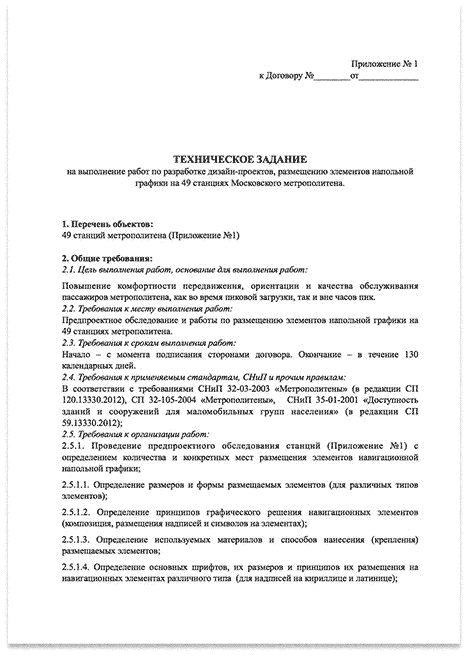
Floor navigation design started with the contest task:
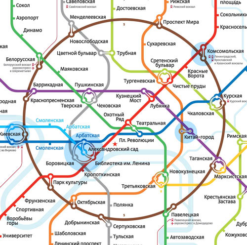
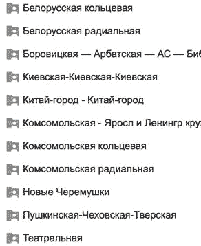
“The contest application must include the concept of design projects for installation of floor graphic elements (in the form of drafts and preliminary installation maps) in the following stations: Aleksandrovsky Sad, Arbatskaya (Arbatsko-Pokrovskaya line), Biblioteka Imeni Lenina, Borovitskaya, Kiyevskaya (Arbatsko-Pokrovskaya line), Kiyevskaya (Filevskaya line), Kiyevskaya (Circle line), Kitay-Gorod (Tagansko-Krasnopresnenskaya line), Kitay-Gorod (Kalujsko-Rijskaya line), Komsomolskaya (Circle line), Komsomolskaya (Sokolnicheskaya line).”
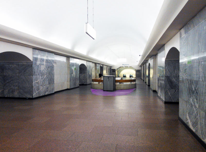
All the stations listed in the task have their own features. There are three railway stations at the Komsomolskaya hub, each of them requires a separate sign.
Kitay-Gorod is a hub with a symmetrical cross-platform transfer (which is bad for passengers since they have no points of reference) with three exits from each of the platforms. Both stations look very much alike to an untrained eye.
Biblioteka Imeni Lenina is a four-station transfer hub, with some of the stations providing through passage to others. There is Aleksandrovsky Sad with a branching line (some trains go to Mejdunarodnaya, while others proceed to Kuntsevskaya).
Stations of the Kiyevskaya hub have a highly complex system of corridors, they all share the same name and one of the lines branches off.
The drafts had to be submitted in three weeks (including the best weeks of the Russian year before and after the New Year). We decided to start right after the holidays, on January 5th, and wrap it up swiftly in 9 work days. Especially since the project mainly requires us to sit and think.
All in all, before January 5 we only got around to calling designer Kostya Konovalov to join our team and buying a laser rangefinder.
We met the morning of January 5 to have coffee near Pushkinskaya station and read the statement of work. Of course, we could have made the sketches irrespective of it, but we decided that the concept in our application must fit all contest requirements.
The statement of work (click to enlarge).
Here are the stations where floor navigation is to appear:
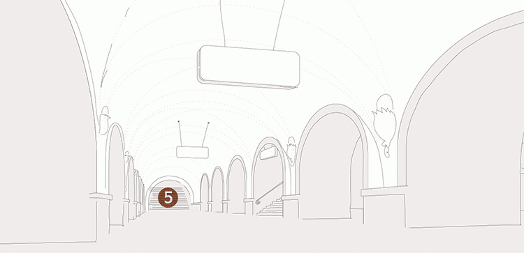
The legend: the diamond hub at Pushkinskaya station is where floor navigation is already in place (installed as part of the pilot project of the Department of Transport in 2013), the purple circles are stations that are Moscow historic landmarks. All alterations in such stations must be approved by the Department of Cultural Heritage. This means delays, and delays are unacceptable since it’s a government contract, we can’t miss a deadline here.
Approximate blueprints of the stations are available on the internet—download and print whatever you like. We need to take them underground and mark where hanging navigation signs are installed.
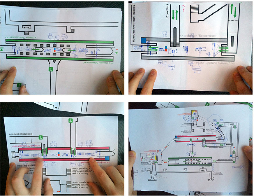
Kostya marks which text on hanging signs is visible from which side.
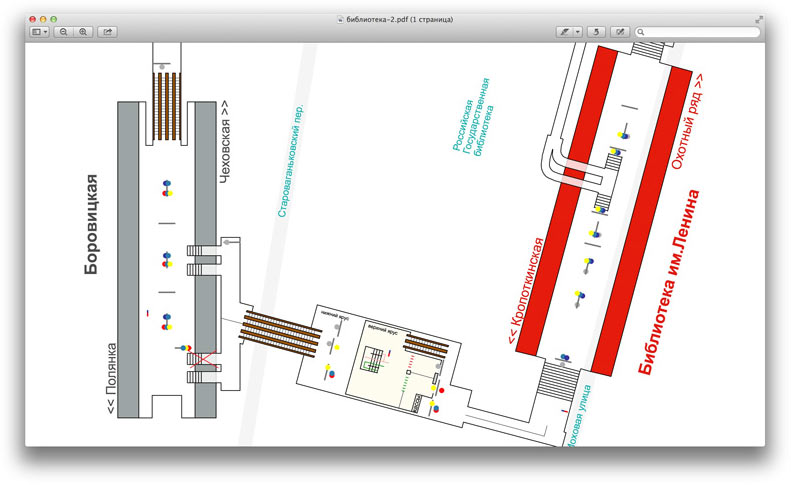
It turned out that, naturally, all blueprints on the internet are inaccurate—definitely, no laser rangefinder was used to create them. Most likely, they were drawn at home from memory. From the memory of some guys who described what the stations looked like. What they looked like before World War II when all the blueprints were destroyed in the fear of the Germans invading Moscow. For example, one of the Kiyevskaya stations is shorter by five cars on the internet blueprint. Five cars is about half the train, mind you.
It became evident that there is no other option but to make our own maps. It’s not our top priority at this stage though, as contest application drafts do not require exceptional precision.
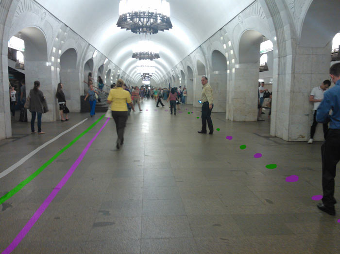
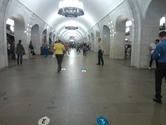
We made a bunch of pictures of all the stations (only a small part here).
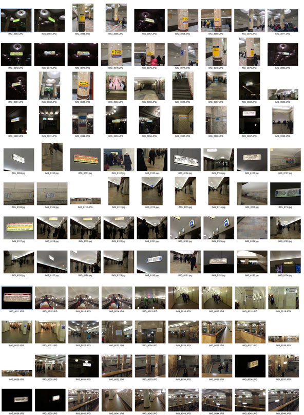
We tried to photograph everything that could help us. Zhgun, for example, took a picture of one of the passengers so that she appears four times in one frame.
Created folders for all the pictures.
Went through the studio Brain Storage to look what ideas other designers might have had.
The first idea right off the top of the head is a sticker with a station map. It’s an effort to show where the trains go from this platform. If you go down the stairs and walk straight, you’ll get on a train to city center. If you walk backwards, you’ll travel away from the center.
Every day that same girl goes down to the platform and the designer draws a new picture with her. A funny 6 vs 9 problem in one of the circles.
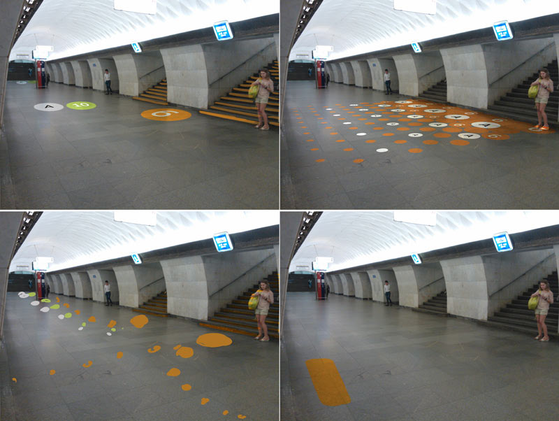
Showing where the escalator will take us, making it visible from a distance.
Lines and circles on the floor. It’s cool that they make no sense without direction arrows: you can follow the green line both ways.
Arrow-circles. Proponents of this idea will have their time to drink our blood later in the project:
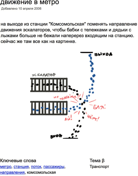
And another suggestion that has been in store since 2006:
And a more recent one:
And of course, the reason it all was started in the first place:
The studio Brain Storage has more than 300 ideas on the subject of varying degree of craziness. It’s important not to get stuck exploring them all and move on.
The task also has important limitations. Let’s outline them.
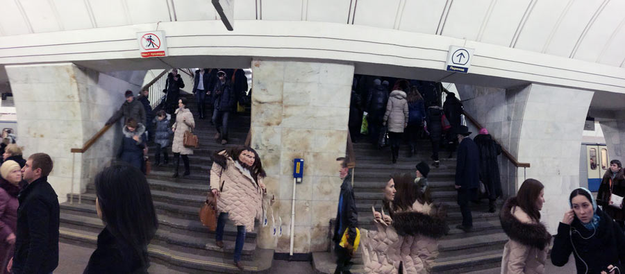
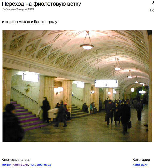
Of course, we shouldn’t ruin the architecture. There are a lot of examples in the world where chaotic navigation made metro stations look overloaded. In fact, the main challenge of the project for the designers is to make sure that there are just enough of signs to make navigation comfortable without turning the most beautiful metro in the world into a flee market. Who else will care for our cultural heritage?
So, before we pick up an angle grinder and start cutting the granite floor left and right, we need to sit down and think. Hey what? Angle grinder?
About the grinder
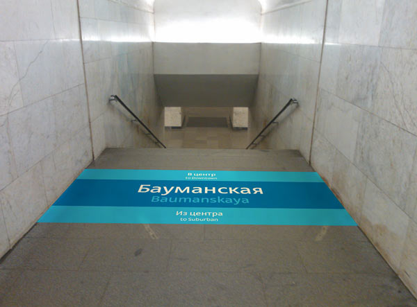
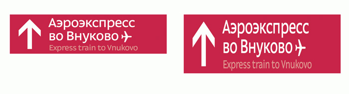
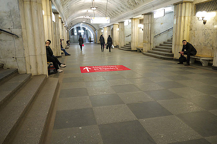
Floor navigation will not be made with stickers, oh no. This idea has already failed spectacularly at the Chekhovskaya–Pushkinskaya–Tverskaya hub: the picture on the left shows what they look like a couple of months after installation—a pitiful sight. The Department of Transport wants the signs to look like on the right picture after the same couple of months, and without putting up new stickers.
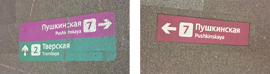
Since 2013 the Pushkinskaya hub has had various signs on the floor made from different materials. One of them exhibits a remarkable durability. It doesn’t fade, the color remains bright.
All because it’s not a sticker, the sign is made of concrete colored in the mass, and each letter is a separate shape. From what I could understand, each letter is made from a separate piece of concrete, then all of the pieces are glued to the base and the rest is filled with concrete matching the color of the background. It comes out as a heavy slab, a hole is cut out in the floor, the granite is removed and the slab inserted. The slab blends with granite that surrounds it and in time they both wear down equally.
We entered the contest together with a manufacturing partner, which means we need to get ready to use this technology. Meaning we can’t count on cutting out holes in the floor right and left, there must not be too many signs. To change a sign would mean to use an angle grinder to cut out the old one, cast a new one and install it. There will be a technical layer of putty around the slab. We need to keep in mind specific jointing edges of specific slabs—we will need to know the precise location of the future sign and granite must not chip off. Maybe, we will have to be present during the installation. All in all, a lot of pain in the ass.
We’ll get back to the restrictions later, the project has lots.
It’s important to understand why we need floor navigation at all. We have a feeling that a thoughtfully designed hanging navigation can almost eliminate the need for the floor one. The main question here is what plan the Department of Transport has in mind for the hanging sings. Obviously, we can’t ask anyone during the January holidays and it’s not a priority now anyway.
For the time being we will work with the fact that the hanging navigation will remain as it is now—a chaotic hybrid of several systems, complex and confusing. We’ll get back to this issue later (it cost us two days of heated discussions already) and right now we turn on our idea generator and start generating.
A lyrical digression on the power of art
What is the main thing about an idea? The main thing is to estimate its viability and then present it nicely.
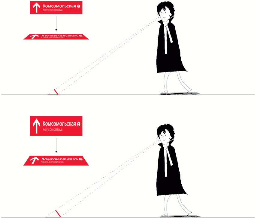
For example, we have the idea that all the signs have to have perspective distortion—that way they look better from the walking height. From a distance the sign on the right will be much more legible than the sign on the left (as car drivers will know).
I invite the reader to compare the presentation of this idea in different Universes.
Here is the Universe of Design—the first one we visit, the world of poor JPEG imitation.
Here is how a normal sign looks from a distance:

And here is the distorted version. The effect is especially noticeable with smaller angles, that is from a distance of more than 10 meters or 30 feet.
And here is the Universe of Model Prototyping, the world of printouts, trying-outs and makeshift mock-ups.
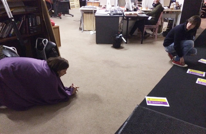
Yegor is not praying to Converse shoes as you might think. He emulates the view at a giant sign from a distance—our plotter broke down.
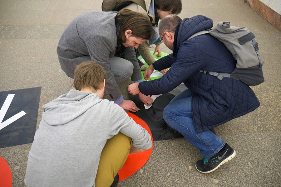
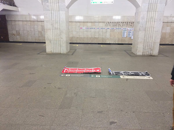
Now we come to the Universe of Real Prototyping—the world where the plotter is still broken (it’s holidays) but we have scotch tape.
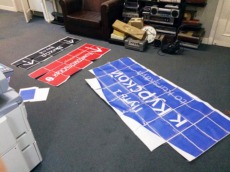
Also the Universe of Real Prototyping has policemen who are also very much real and who chase you off the station leaving you just a couple of minutes to check out your ideas. You run, you put the mock-up down, you take a couple of photos, pack it up and run again. (On average, it takes the station attendants two minutes to notice the odd commotion on the platform and call the authorities).
Here we are standing close to the signs. The further we are, the stronger the effect—the red sign is much more legible.
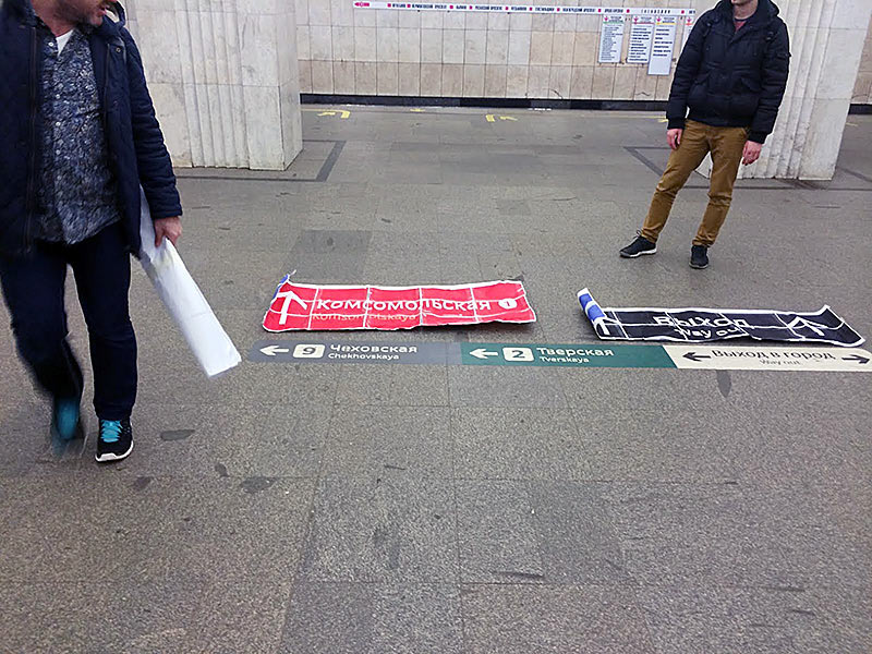
Maybe it’s because its large and red? (Not really.)
And finally, tired from all the running, we move on to the Universe of Illustration, a world where anything is possible. Here Yegor’s rendition of Benedict Cumberbatch explains the angles, catheti and all that.
All in all, photographs and real-life trials are the way to go, of course, but pictures and comics are cool too, and no danger of being caught by the police.
Here ends the digression and the first part.
In the following parts we will try to understand the role of floor navigation in this cold unwelcoming world, witness an unexpected pivot of the design task as well as scumbag decorators, partial passengers, heaps of printouts and scotch tape. And a bear.