The making of the floor navigation in Moscow Metro stations
The story by Ludwig Bystronovsky.
It started
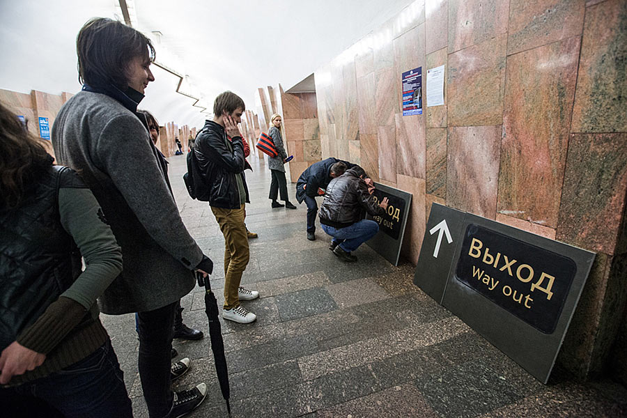
While I’m travelling the US, the guys push the project forward. One sunny day in California (or a night in Moscow) the first floor navigation sign was installed in Barrikadnaya station. Finally, the press got something to write about.
At the first glance the video is quite funny: 15 people came to manage two workers. In fact, there are so many people there that all nearby stores ran out of orange vests.
Search result for the query “How many people does it take to install two slabs?”
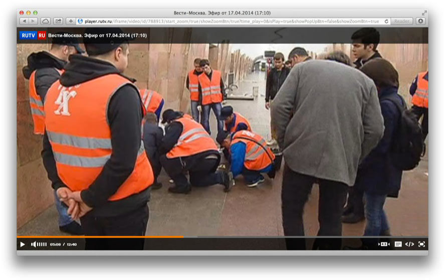
(Actually, it’s not just for fun of course, but to see how the first sign will look: everyone who’s related to the project is extremely interested. I think the workers were assembled to have a look too, so they could understand what’s it all about. I see here people from the Department of Transport, the Metro administration, the studio, the contractor. I think it’s safe to assume that there will be less people installing signs at the rest of the stations. I can also see by Mark’s jacket and Yegor’s umbrella that spring has finally come to Moscow).
The camera couldn’t capture everybody in one shot.
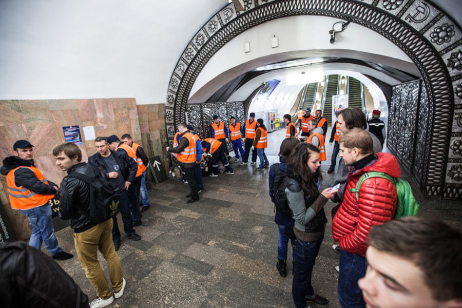
It’s a sort of a tradition at the Metro that any event assembles quite a crowd. Here, for example, an ordinary incident: taking a pissed man off the tracks and onto the platform. Done the proper way, of course, with cutting off electricity to the tracks, with police and paramedics: four people work, the rest rubberneck.
In our case people group into several teams, it’s faster this way.
In general, there are a lot of people at night in the Metro, sometimes a couple dozen. There’s always something to do here: wash the floor, wipe the dust, fasten a bolt, drive a pile, replace a rail.
Start from the third minute here:
Still, the sign presented to the audience is just a small visible tip of a giant design iceberg. If we were to take the signs that were submitted for proofreading today and write beside them some of the issues we faced, it would come out something like this:
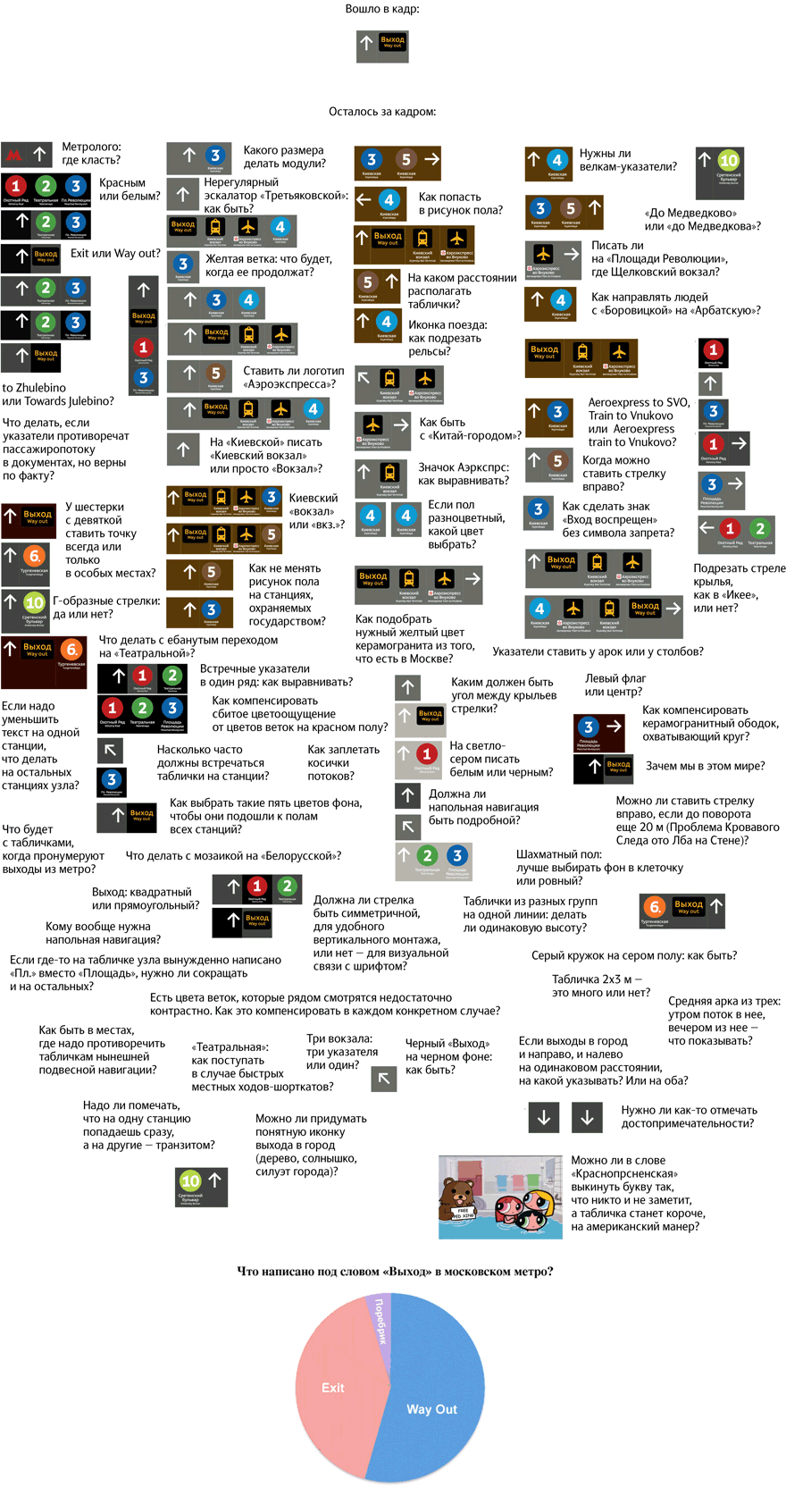
I’m not trying to be humble when I say that these are only the issues that I can remember: if I were to sit down and go through my mail properly, the picture would be twice as large.
* * *
When we were only starting out, we couldn’t even understand what there was to do for two designers on this job. Now there are nine designers and technical designers, a couple of art directors, and all of them are busy as bees.
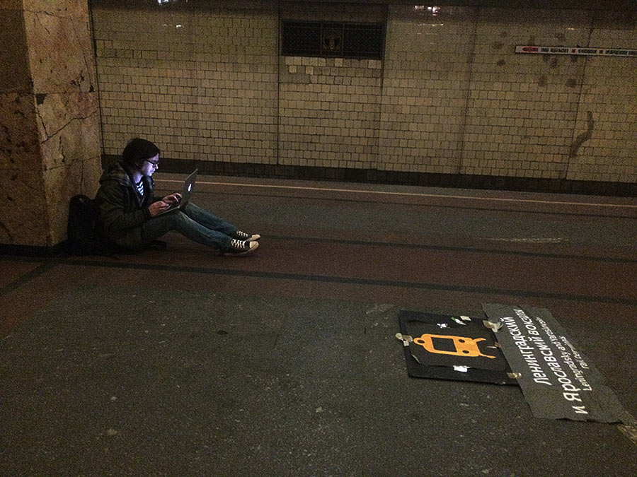
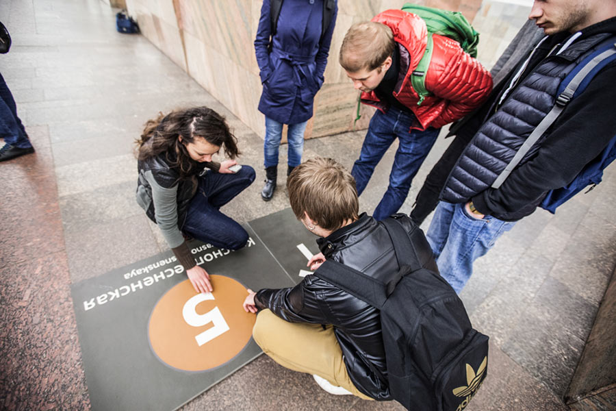
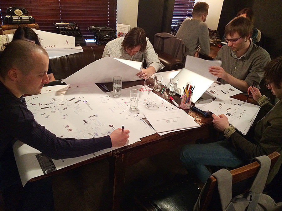
It would have been much easier if we could just create the navigation right at our desks, but as I said before, there are no reliable maps of the stations and those that are available lack benches, booths and fences which severely influence the passenger flow. Which means we have to go to every station, lay out our set of signs and create a map complete with passenger flows and a specification list. Towards the end of it all we started working on the plans right at the stations (it’s dark since they turned off almost all the lights at Komsomolskaya that night).
Quite another story is unifying maps, sending them to the Department of Transport for review, defending unobvious navigation solutions and getting a separate approval for historic landmark stations.
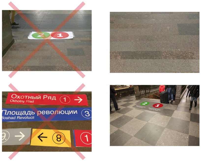
By the way, about them: the floor on these stations is also a part of the cultural heritage which means we can’t break the tile pattern and to get an approval we need to provide tile layout schemes for every single sign, like this:
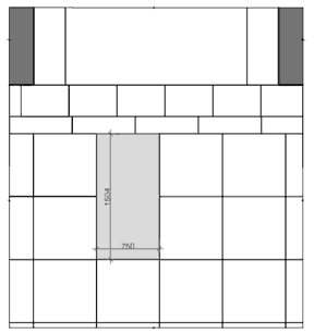
Of course, no one can give us such schemes, we have to measure it all ourselves. We resort to tracing paper and a soft pencil, scanning, taking photographs and using other devices familiar to architects.
* * *
Here are two of my favorite stories about our Nerd Inc.: about rail terminals on Teatralnaya and about the choice of size and color.
About Teatralnaya and rail terminals: overdose
When we came to Teatralnaya to work, we spoke to one of the station attendants. We asked her what were the most acute problems of her passengers. She told us, “Every single day the passengers want to know how to get to Schyolkovsky bus terminal. They ask and ask and ask. Help them, please.”
So we go, “Yeah, sure! Let’s put a direction sign for the bus terminal right near the sign for Ploschad Revolyutsii, what a splendid idea!”
We think it over for two days, then sit down to estimate the location of the signs and suddenly see—it’s an overdose.
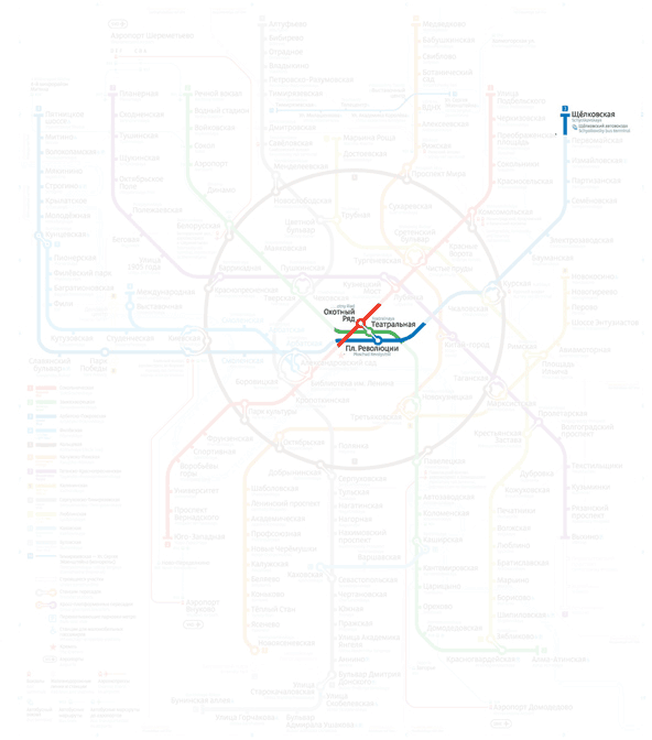
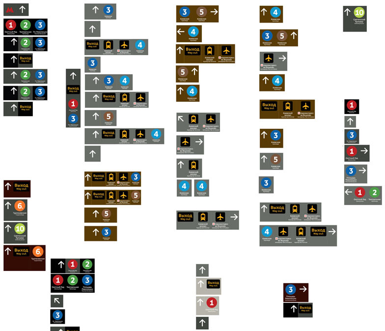
The thing is that people going to Shchelkovsky bus terminal are not the only ones who come to Teatralnaya. If we were to mark all possible destinations of passengers at that station, we were to have something like this:
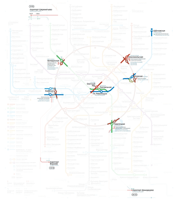
So, besides the Okhotny Riad and Ploschad Revolyutsii signs we will also have to write “to Kiyevsky rail terminal, Vnukovo airport, Paveletsky rail terminal, Domodedovo airport, Kursky rail terminal, Leningradsky, Yaroslavsky, Kazansky rail terminals, Belorussky rail terminal, Sheremtyevo airport.” Oh, and “to Shchelkovsky bus terminal,” of course. Everything, except for Savyolovsky and Rijsky rail terminals.
A sign in the corridor leading to the station would look really nice:

The next step would have been to install such a sign in every Metro station, because from each one you can ultimately get to any destination you want. And numbers 1 through 12, since people transfer between the lines, too.
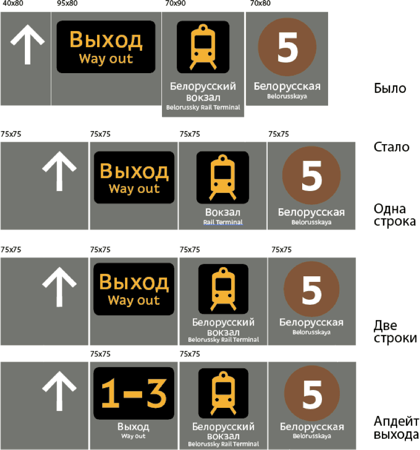
In the end we decided to calm down and abandon this idea: rail terminals will be marked in the hanging navigation. The floor navigation has a task of its own: to confirm that you’re going the right way with a fast glimpse. If you need to stand and think where to go, there will ultimately be large signs with detailed maps and a lists of rail terminals, you just have to wait and hope.
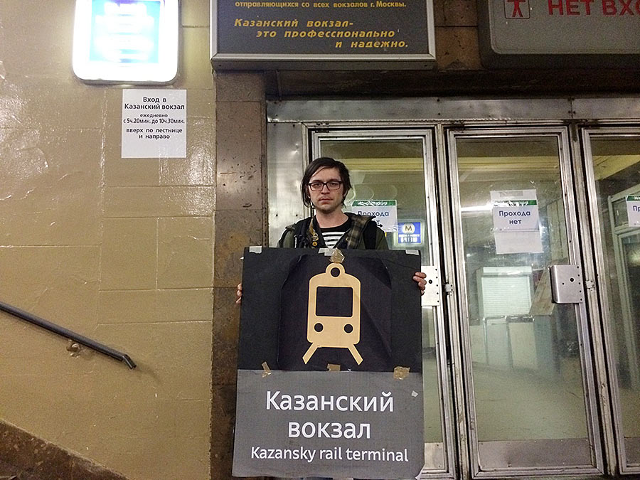
Then of course, we can always use a sandwich board. Here Sergey demonstrates how it might look. By the way, Kazansky rail terminal is professional and reliable (that’s what it says on the sign).
The other story was about the size and color of the signs.
About the color
When the idea to make all signs in color finally died, we decided to use black background for all of them. Or white, or gray—any achromatic one, in short. We made a bunch of mock-ups before we realized that there will always be a station where the chosen color (even if it isn’t a bright one) will look like shit.
There is no doubt that signs with a contrast background are easier to see, but they literally kill the architecture. Light-floored Kitay-Gorod will not tolerate black signs, and on the checkered floor of Teatralnaya a light plate will visually burn out the space around it. At this point Lebedev tells us that the solution is simple: all we have to do is match the color of the floor. The Moscow Metro is a unique object, cultural monument of world importance, surely we can show some respect and pick an individual color for each sign.
It resembles the moment in House, M.D. when House is hit by a brilliant idea and it’s evident right there and then that the case is solved. This “That’s it!” moment is the most important moment in every design process.
Of course, when we subscribed to the artistic director’s idea, we sort of realized the magnitude of the problem we were creating for ourselves, but as it turns out we weren’t even close. (By the way, it later turned out that it would have never worked any other way: we can’t break the floor pattern in historic landmark stations. It was as if Lebedev knew this beforehand. I love moments like that :-)
All right, so what do we have on our hands? First we had to go around all stations to define a few basic colors.
The problem is that it surely sounds nice: “Each sign should have its own background,” but it doesn’t mean much in terms of technology. The contractor asked us to make do with only five colors for the background. It was high time to decide on them, the deadline for placing the order was approaching.
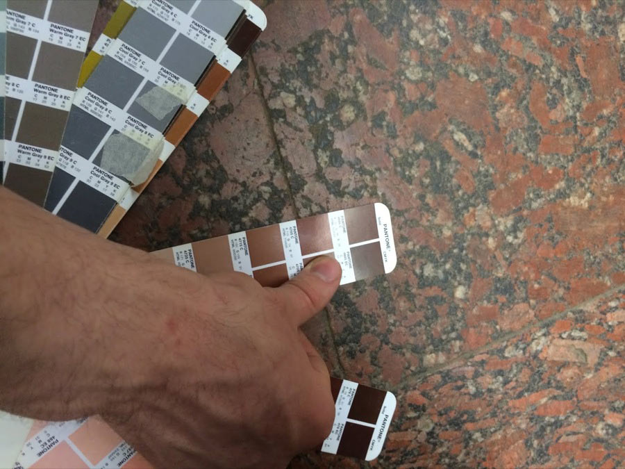
The problem is that up until the very end there was no way of knowing the exact location of each sign—the approval stage could bring in some changes. If we were to strive for ideal color matching, we should have measured all the colors over again after all the changes, and only then place the order for the colors, but we couldn’t wait a year. At this point we were greatly helped by the fact that there are many varied floors on stations within the Circle line. The vast majority of them are checkered or patchwork tiles. Stations always have tiles of different color, meaning we don’t have to match the color exactly: it’s enough to match one of the dominant shades and the sign will look just like another element in the pattern which is exactly what we need. In brief, we were visiting all the stations and trying color sheets on the floors (we had to print them all ourselves, it’s not quite easy to get an exact RAL color in Moscow).
First we used small sheets.
Then the larger ones.
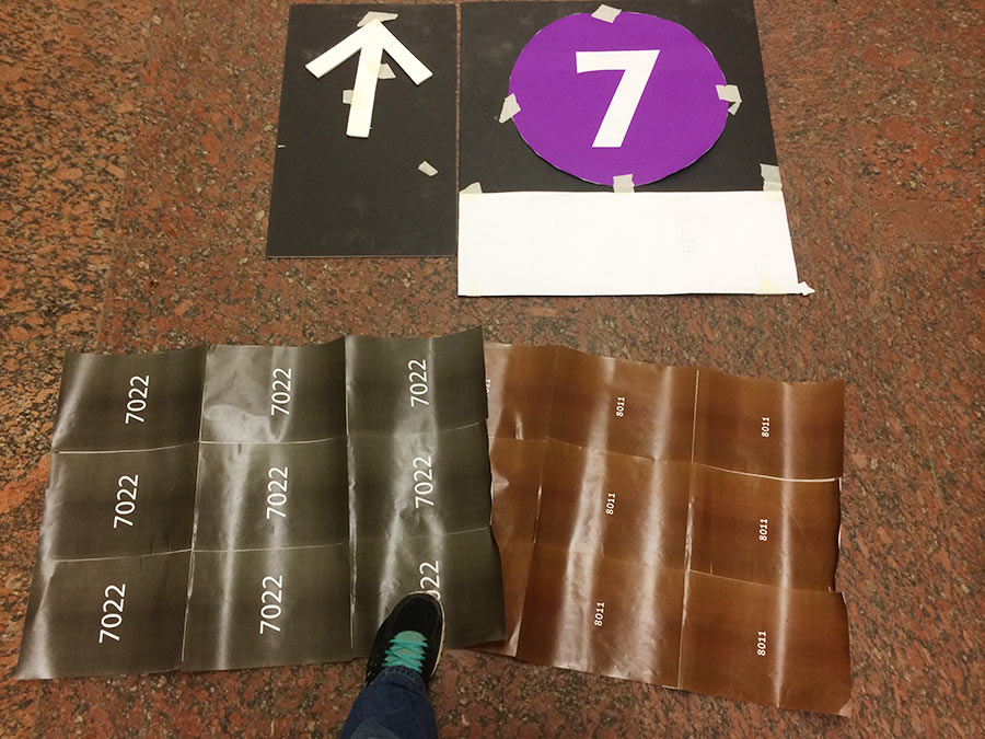
We picked a light one along the lines of Kitay-Gorod, a brown one to match red granite and three of different shades of gray.
Now every sign has its own background perfectly matching the floor of the station where it’s going to be located.
* * *
It’s great when calculations match the reality.
Let’s hear an eyewitness of the tests at Barrikadnaya.

“The signs are uber cool, that’s true. I couldn’t even believe they would match the floor so well, it’s like incredibly awesome. The only better thing to do would have been to etch the letters right in granite with some sort of acid, so it’s like totally fucking awesome, seriously.”
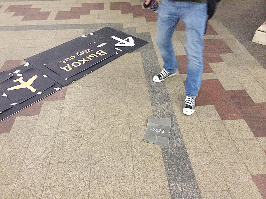
(The picture is made before installation started: the concrete is still fresh, though we count on it to blend in better with the floor after it’s been there for a while. Though the ceramic granite letters will remain bright white, their color doesn’t fade as much as that of concrete. The ring around the brown circle is also of ceramic granite, it’s a technical requirement).
When we saw the signs at the station, everyone (first of all Mark) exclaimed, “How come they’re big as fuck?” Mark even had to measure them with a ruler—they look humongous against a wall, but are quite normal when installed in the floor.
Overall, the color of the background sort of blends in with the floor, so all that’s remaining is a clean circle and clean letters and the whole beauty of it.
Enough on the color, let’s talk about the size.
About the size
At the start of the project we thought that the slabs could easily go into their neighbors since it’s very nice and technologically advanced to design modules of equal size, the contractor makes the slabs of equal size and the orange-vested men then cut out equal-sized holes in stations.
So we created the plans, decided on the common navigation principles, printed out papers for all the stations and sat down to put it all in order (we were visiting the stations in two groups and some of the smaller things were done by the groups in different ways, so we had to synchronize).
The synchronization in the studio’s Big Café (counterclockwise from left): Mart Abramzon and Sergey Steblina are reading plans made by Yegor, Mark and Oleg Mayhopar (I have almost no photos of Oleg: first of all, he’s still too young to become famous, second, he was in the other group). Mark and Yegor are reading the plans of the other group made by Sergey, Mart and me.
(If Mark and Mart happen to work together, everybody else seem to gradually develop a habit of articulating the endings of their names. Of course, we tried to call them Mart-Anatoly and Mark-Konstantin, but that didn’t work).
So, that’s us reading all the plans. Errors, misprints, arrows pointing the wrong way:
Sergey looks at how Mark enjoys the checkered floor.
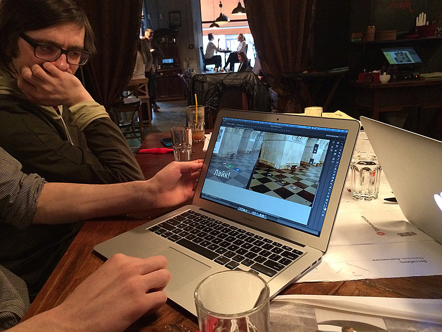
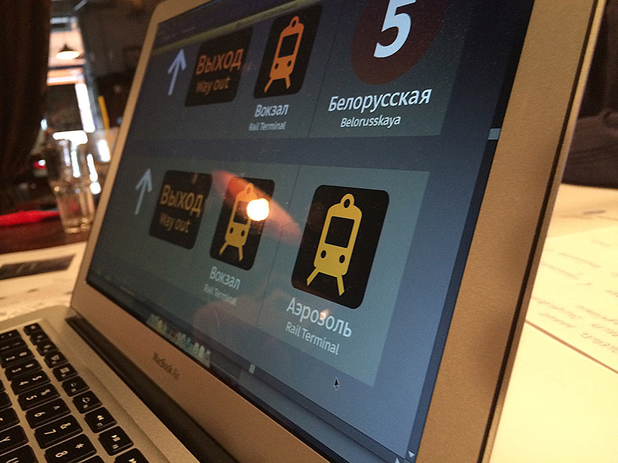
If you don’t have an Aeroexpress sign at hand and nobody’s looking, use an image of an aerosol can.
It was then, March 30, after we decided on the navigation principles, submitted the first plans of listed stations for government approval and got back the comments, that Mark made his rant about matching the tiles.
About matching the tiles
I have to remind you that before this letter the signs on all the stations were of equal size and we were happy not having to worry about modules of different sizes.
The letter:
“The new instructions from Nasledie force us to cut the floor strictly along the tile seams. Right now we’re talking only about station halls, not touching vestibules and corridors. It’s evident that the requirements are much more strict for halls than for corridors.
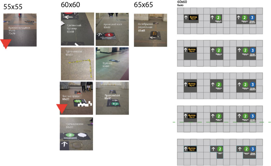
If I am not mistaken, there are 26 historic landmark stations. On 18 of them the tiles form a square or check pattern. In total, out of 49 stations: with check pattern: 30, with oblong stripes of tiles of varied length: 9, with random chaos: 5, with a fucking beautiful floor: 3.
Why I’m saying all this. We need to find a typical solution for the 30 stations with square tiles. Using the photographs from our visits to the stations we can estimate the width with an error of 3–5 cm (1,2–2”).
Here they are with the sizes:
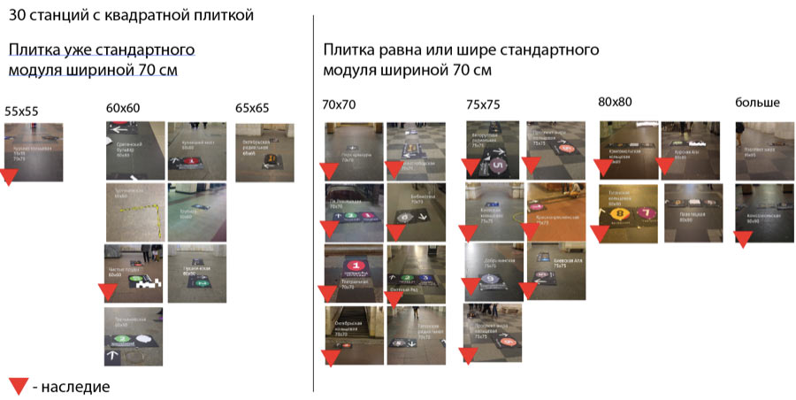
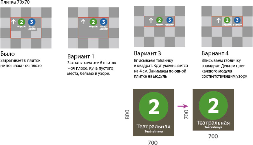
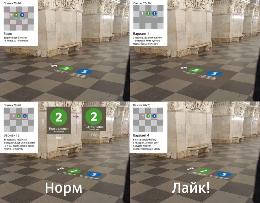
Let’s start with the 70 cm (27,5″) wide tile. Look at the check pattern floor, there is a lot of it after the 70 cm of the tile and it has to be treated carefully.
Let’s insert the modules into the geometric pattern. As soon as we do it we’ll solve the entire issue with large tiles.
The same options on photographs:
Moreover: the larger the tiles, the more changes there will be to their sizes. I believe that the change in sizes across the stations will be barely noticeable. After all, nobody saw that the check pattern floors on all stations had a slightly different size, so 5–10 cm (2–4″) of a difference is nothing.
Moreover: what happens with modules, exits and rail terminals. I think the exit sign should fit into the exact same module, so as not to break the pattern on the floor.
Now about placing the signs on checkered floors.
Sometimes we need to place a sign near the stairs, but there is an even number of tiles.
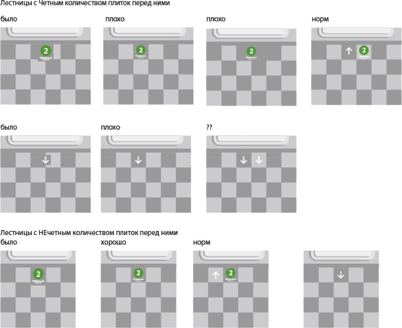
Placing between the arches.
Here is what I propose we do with large square tiles.
About the 60×60 tiles. It’s evident that it’s useless to inscribe a sign into such a small tile. There is no check pattern either.
So it comes out less neat. I don’t know which option is better right now. Then again, there are almost no historic landmark stations in this category.
The issue with chaotic tiles and oblong stripes is unclear, too. We’ll need to work more to make it look nice.
But square tiles make up 31 stations, and that’s something.
Overall, what I’m trying to say is that we need to match the tiles in all station halls except for those with chaotic tiles, and in vestibules. We shouldn’t worry about corridors, it’s usually total trash there anyway.
End of the letter.
The gist for those who weren’t attentive: he suggests to match not only the color, but also the size of tiles on all the stations. It means the signs will look much neater and nicer, but we will have to sacrifice the equal size of the modules.
This moment reminds the moment in House, M.D. when House is once again struck by an idea and the viewers realize that the case is almost closed. “That’s it!” is the second main moment in every design project.
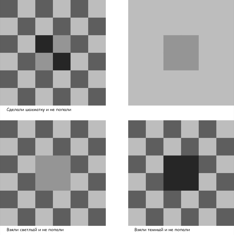
There was also the issue of making the signs with check pattern background. We grieved for a while that the color of concrete will not exactly match the color of the floor.
Now I give the floor to Yegor
“Here we’ll have to precisely match the tile background, and we have problems with that.”
I’ll explain why I support Mark.
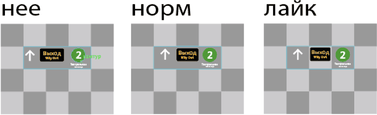
Of course we need to try and match the background as precisely as we can, but if we miss it—because the granite has it’s own color, because it looks different when dirty, because the printer will screw up the colors, because someone will pick a wrong RAL color, etc.—even if we miss the exact color, the check pattern will still look a hundred times “neater,” “more logical,” and “more inconspicuous” at least because it will have the same rhythm of dark tile—light tile. The brain will be easily tricked into believing that everything looks just like it should, and once it becomes dirty it will look like it has always been there. So, if at least we are successful in making the light tiles appear lighter than the dark ones (and I hope we can do that much), it will be a total success.
This moment reminds the moment in House, M.D. when House is struck for the last time and the viewers realize that now it’s definitely coming to the end. “That’s it!”
* * *
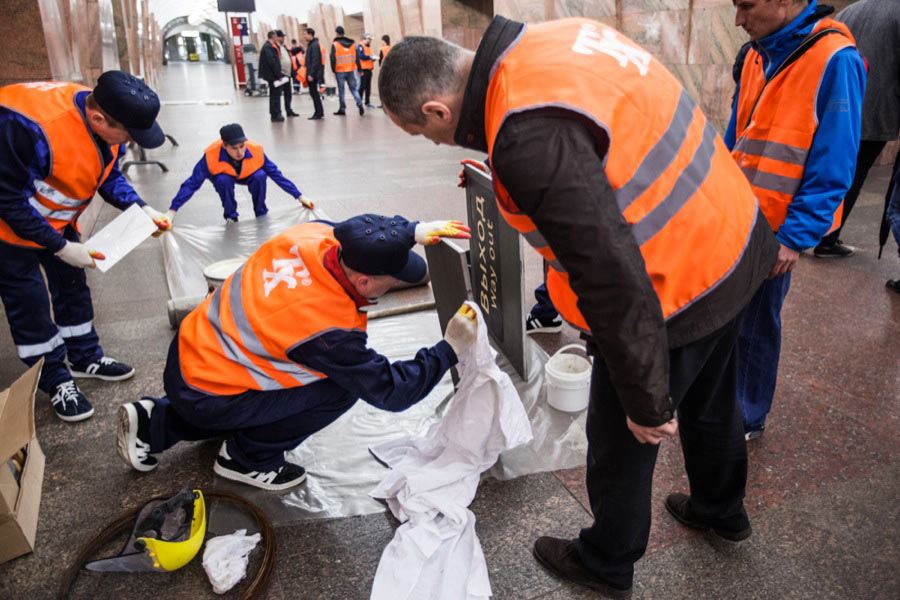
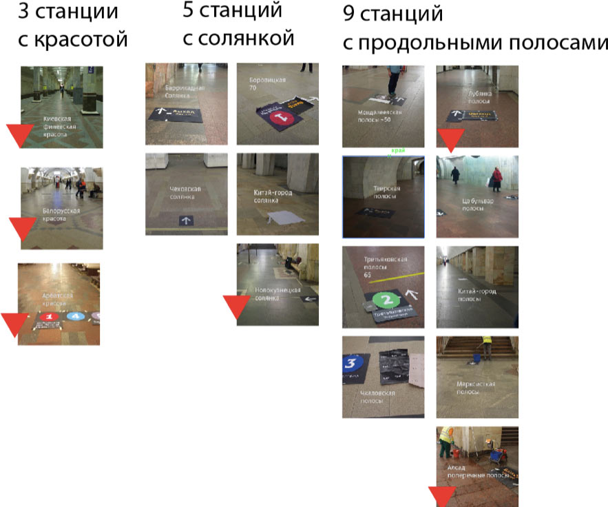
18 days passed since then. We managed to measure, fit to original floor sizes and approve the signs on 20 stations, the production has started; come to Barrikadnaya to have a look, and soon to other stations as well. We will start implementing the navigation on government-protected stations right after we are done with those protected by no one except for policemen and station attendants.
I’ll tell you about the difference between “towards,” “to,” and “way out” some other time, I’ve already overstayed my welcome at this coworking space.
