The making of the floor navigation in Moscow Metro stations
The story by Ludwig Bystronovsky.
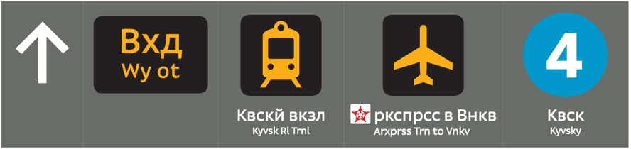
No entrance
In the Moscow Metro there are a lot one-way escalators and passageways.
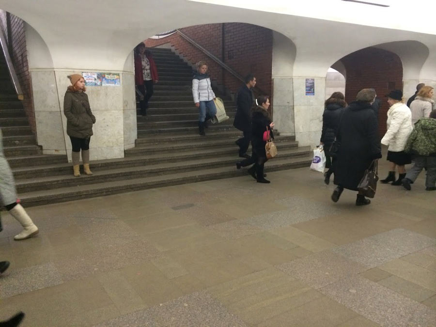
Experienced passengers usually dive there first, paving the way for amateur passengers who tend to follow the crowd (people usually see other people’s actions as a permissive signal).
Prohibition signs are placed high overhead and are hard to notice, making passengers walk against the red light that they don’t see.
Our first idea was to drop the crossed passenger sign at the entrance to the passageway (under the feet of the woman with a beige purse). The problem is that people going down the stairs (for example, the girl in a white puffer) will also see the restrictive sign and get nervous.
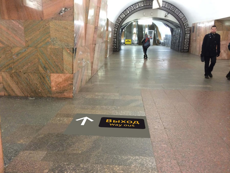
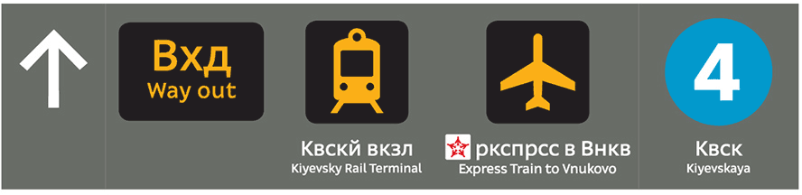
So we opted for another solution within the scope of the available tools—an arrow indicating the direction.
Here is a photoshoped picture: go into the nearest two passageways, don’t go into the far one.
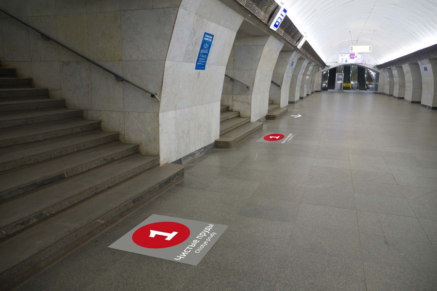
The escalator only goes up.
We witnessed the effect in practice—regular passengers don’t rush to the escalator that has such a sign (experienced passengers who want to take a short cut don’t pay attention to it). But it works for directing passengers who tend to involuntarily follow the crowd.
Where the turn is right behind the arch, the arrow is placed diagonally at a 45-degree angle.
We must also keep in mind that floor navigation (as opposed to regular signs) is seen by passengers going both ways. I think it is a gentle solution that won’t confuse people going in the opposite direction.
If all else fails, we can always place a sandwich guy or a security guard with a shocker at the entrance to a one-way passage.
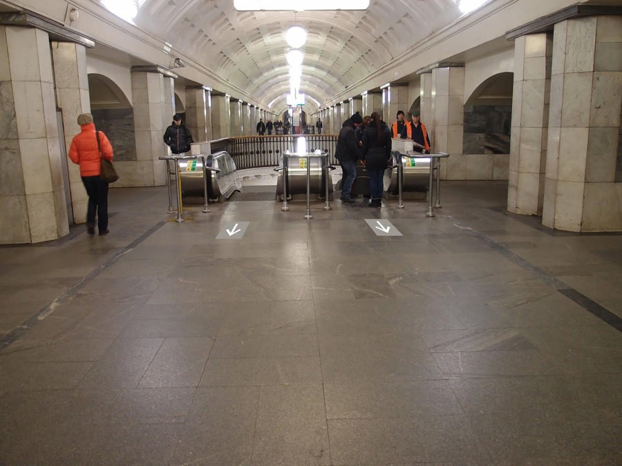
Column or arch?
Sometimes we face a choice whether to place the sign next to an arch or a column.
Sure we choose the arch wherever possible—so that the passengers who exit the train can see the sign in advance (in the picture, it applies to the passengers who will arrive from the left).
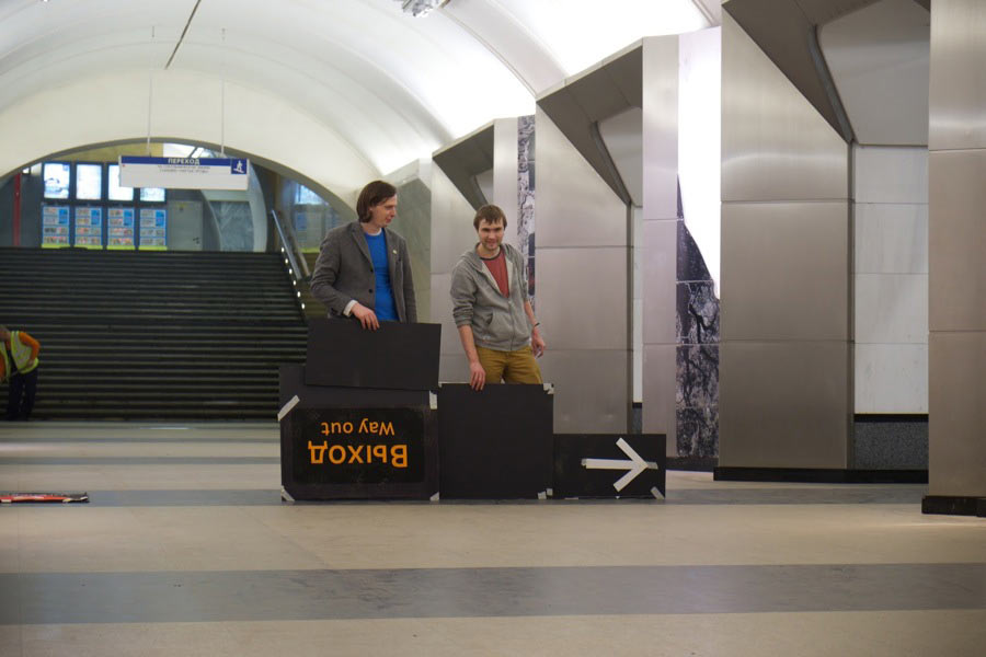
Vokzal
Floor navigation signs are usually made up of several plates. Sure there are detached arrows as well, but most of the signs are combinations of two or three plates.
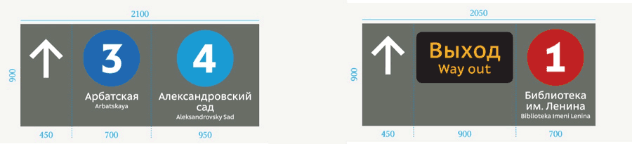
The text under the circle can be arranged in two (as on Arbatskaya sign) or three lines (as on Aleksandrovsky Sad and Biblioteka Imeni Lenina signs).
When the signs have been placed and the dimensions have been established, it’s time to make the signs look the same. Sometimes we have to shorten the three-line text so that the neighboring plates didn’t have extra space at the bottom.
Discussing the abbreviation problem:
“For ’square,’ I suggest using Pl. instead of Ploschad everywhere on a station.”
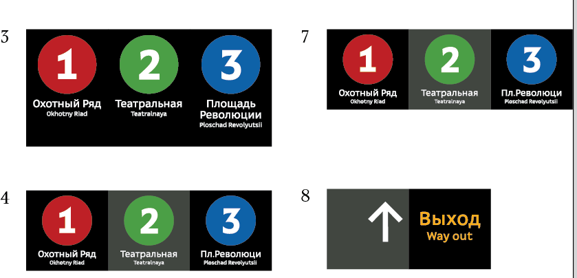
“I’m not sure about this. I think we should go with Ploschad where it fits. So it will be Pl. on platform signs and Ploschad in vestibules.
“The same with type sizes: in one location (on platforms or in a vestibule) we must use the same type size, but it’s hard to keep to it throughout the station. And I think we should write Pl. instead of Ploschad and Ul. instead of Ulitsa everywhere where it allows us to enlarge the type size.”
“I agree. After seeing Pkwy used on US signs instead of Parkway and PED XING instead of Pedestrian Crossing, you understand the power of abbreviations. RXR means Railroad Crossing.”
“Then maybe Vkz instead of Vokzal (’rail terminal’). We’ve done so on the Metro map.”

“Then also Arxprs instead of Aeroexpress. Or even Aeoee.”
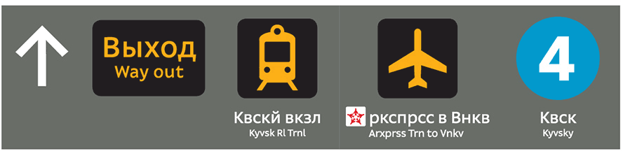
“I like the second one. Only put the letter Ы back into Выход.”
