Launching the process of designing the LED maps simultaneously with the line maps. These maps should be the “little sisters” of the big map and follow the same design principles.
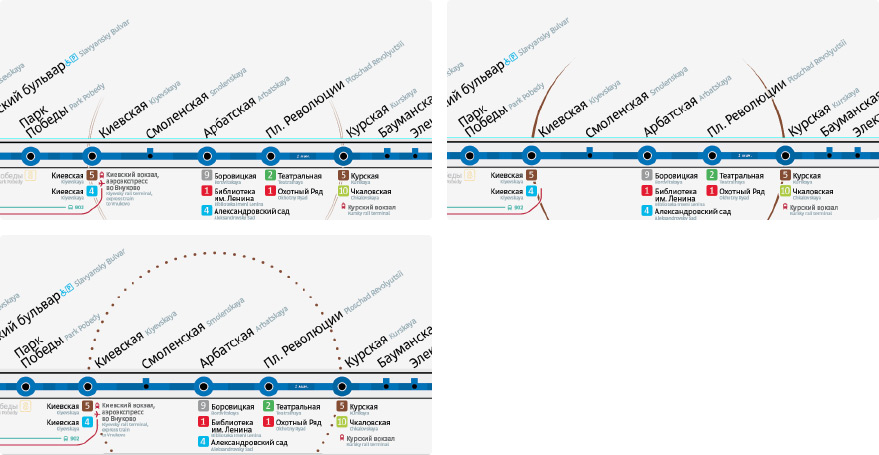
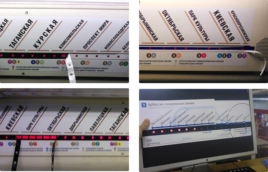
One of the most inconvenient things about the LED display is that some stations are represented by three LEDs. Moscow residents mostly have already gotten used to it, but tourists and visitors often have a hard time understanding what it means.
Taking an idea of a studio’s designer that was created as a warm up and a response to a job posting: covering the LED strip with film that would have only one hole for each station.
Testing the idea in Metro, putting together line mock-ups and creating a mock-up of the LED strip out of spare parts.
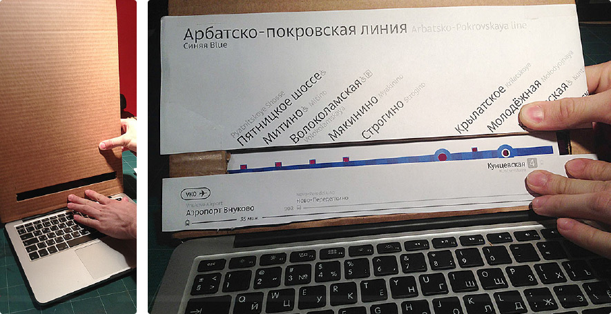

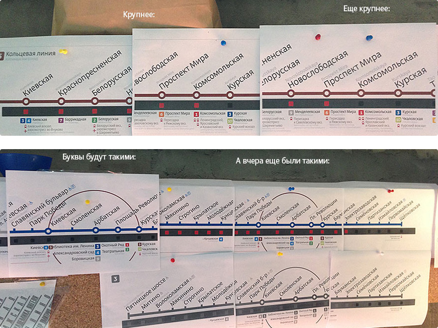
Great, it works. The holes shouldn’t be too small. Circles and squares have little visible difference, so we decide to mark all stations with circles. The holes should be as large as possible. Typesetting the longest lines into their respectable formats.
Showing to the art director.
Getting the answer.

Deciphering: “The English text looks like shit, let’s put it on a new line, not right after Russian. Round holes look odd next to square station stubs. The circle line strongly compresses the space inside it. Make another attempt.”
Making another approach to the style of the circle line.
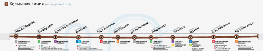
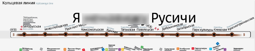
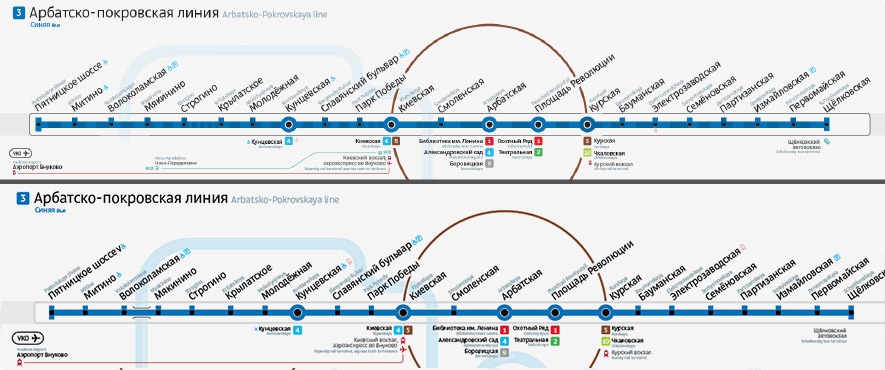
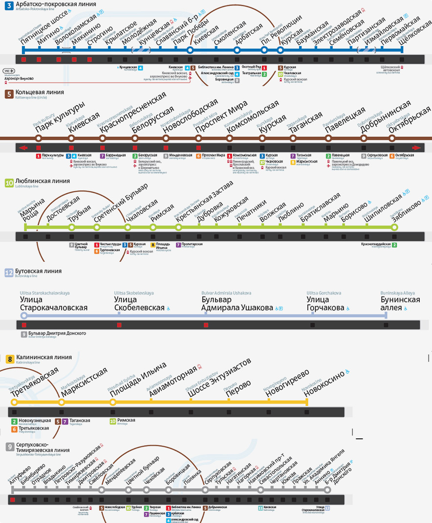
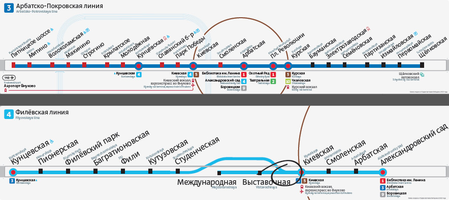
Wow, look at these cute dots. But no, we need to leave everything as it is. Starting to work on the Circle line map. We need to show that it’s looped and make sure the map includes all transfer stations and railway terminals.
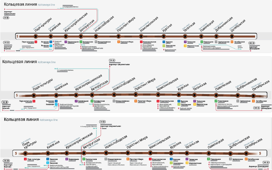
The airports need to go.
Dense at the bottom, empty at the top. What if we switch it around?
Small, tight and illegible. Everything’s broken.
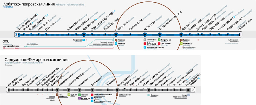
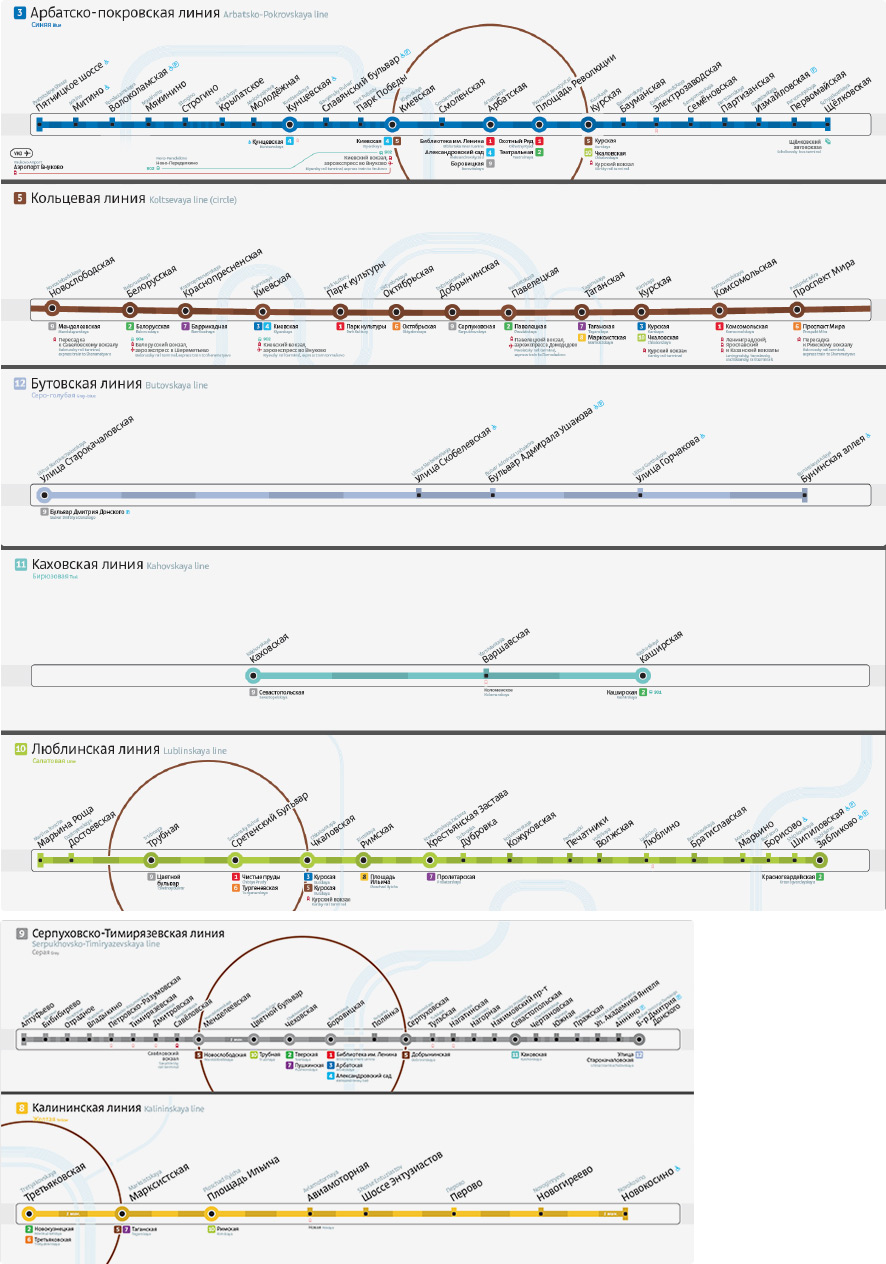
Keeping the design with the bent line. Assembling the full package.
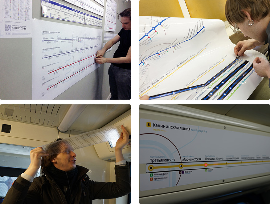
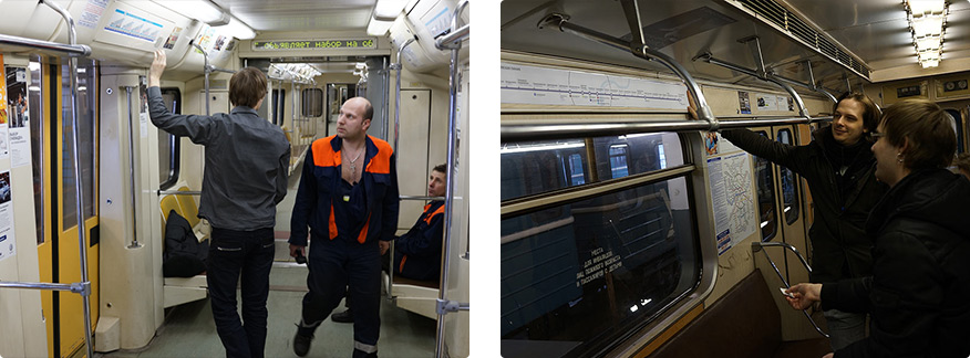
Going to a Metro rail yard to test the sticker idea and look at the maps in their natural environment.
Listening to the comments.
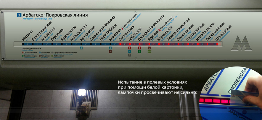
The main question which is whether we can we put film over the LED strip, is solved: we can. Time to search for dimensions, colors and hole shapes.
It turns out, the LEDs have a certain operating life during which they gradually dim to the point where they can’t be seen through stickers with white background.
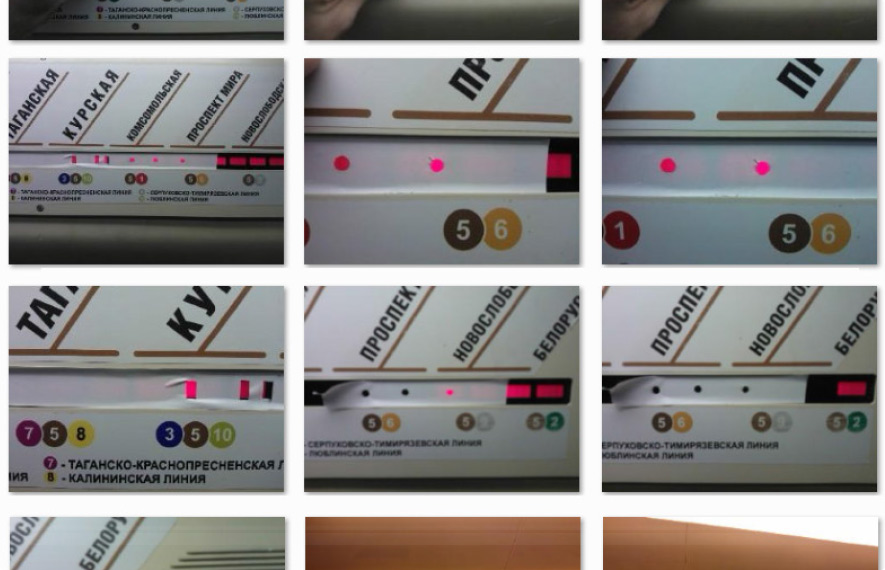
Experimenting with different backgrounds and hole sizes.
The black background definitely wins. Increasing the typeface and the holes as much as we can.
Assembling everything together again.
The artistic director is against the black background. Going back to white and turning station stubs into holes for the LEDs to make sure we uncover the maximum possible area.
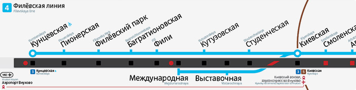
Searching for a solution for the Filyovskaya line. We want it to be clear to a person who has just boarded a train which direction it will be going.
The first idea is to show routes.
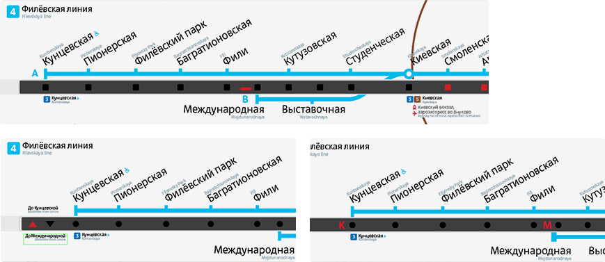
Or maybe even connect the lines. That’s a good solution.
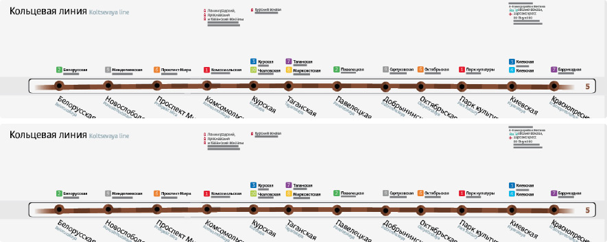
Going back to the white background. The search continues.
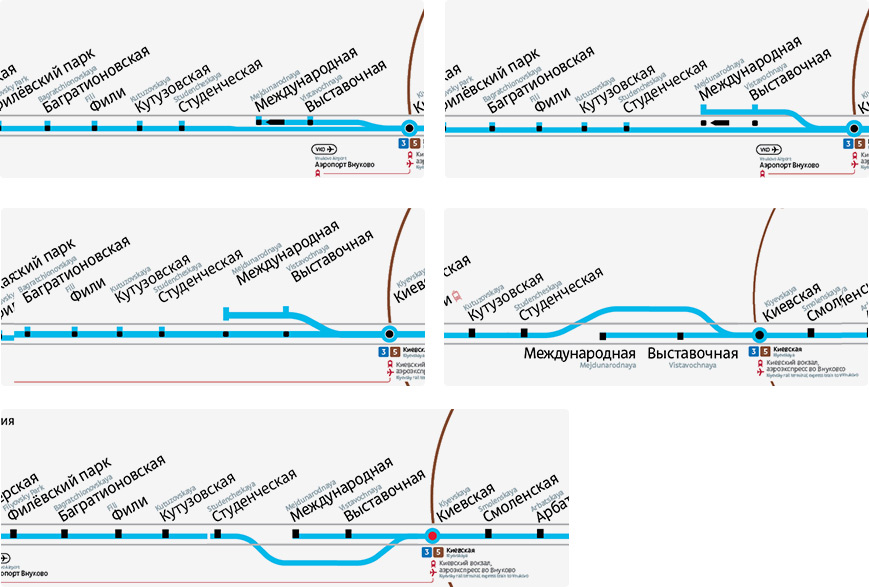
The last idea is the best.
The final question that remains: can the LED strip be reprogrammed? Collecting all ideas and requests, sending to the client and getting a preliminary response: reprogramming is indeed possible.
The maps go through a series of color proofs and the process of choosing materials and ways to print the stickers (cutting out holes is expensive and makes the maps prone to tearing during application; we try to sandwich in a transparent film instead).
After a meeting with technical experts, the client gives the final answer: the LED strip can’t be reprogrammed.
The LED maps are put on the shelf to wait for their time which probably won’t come soon.
