Well, we’ll have to live with the fact we can’t reprogram the strip. Dusting off the mock-ups and continuing.
The train automatically distributes the number of LEDs per station based on the total number of stations on the line.
Studying a reference table from the LED strip documentation.
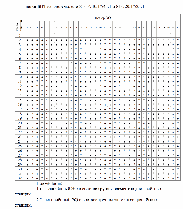
Approximating the map layout based on automatic LED distribution and realizing that to our surprise it leads to almost no changes in density. Only on the blue line the stations with larger gap were slightly moved out of the circle. As for the stations inside the circle, they always had wide gaps due to longer labels at the bottom anyway.
Adjusting the uniformity by moving the holes relative to centers of the LEDs.
Another pause in the project.
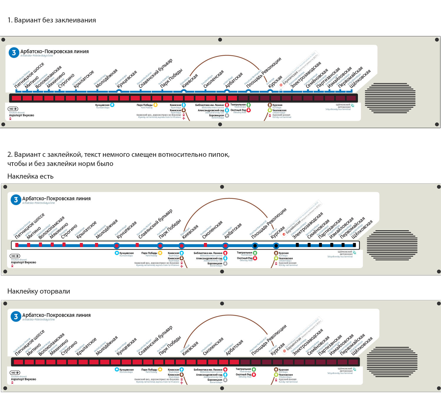
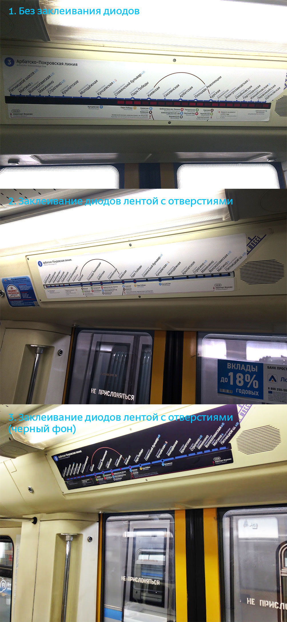
Suddenly, Baumanskaya gets closed and the idea of LED line maps becomes relevant once again after handmade stickers are used to change the maps. Deciding to test the map in the trains of the navy line.
Remembering about the problem with dim LEDs and trying to come up with fresh ideas to solve it.
If we don’t cover the LEDs at all, we will loose the battle for making the map logical. If we keep everything white, we will sacrifice functionality. As for the white map with a black LED line, we tried that already, it kills the aesthetics.
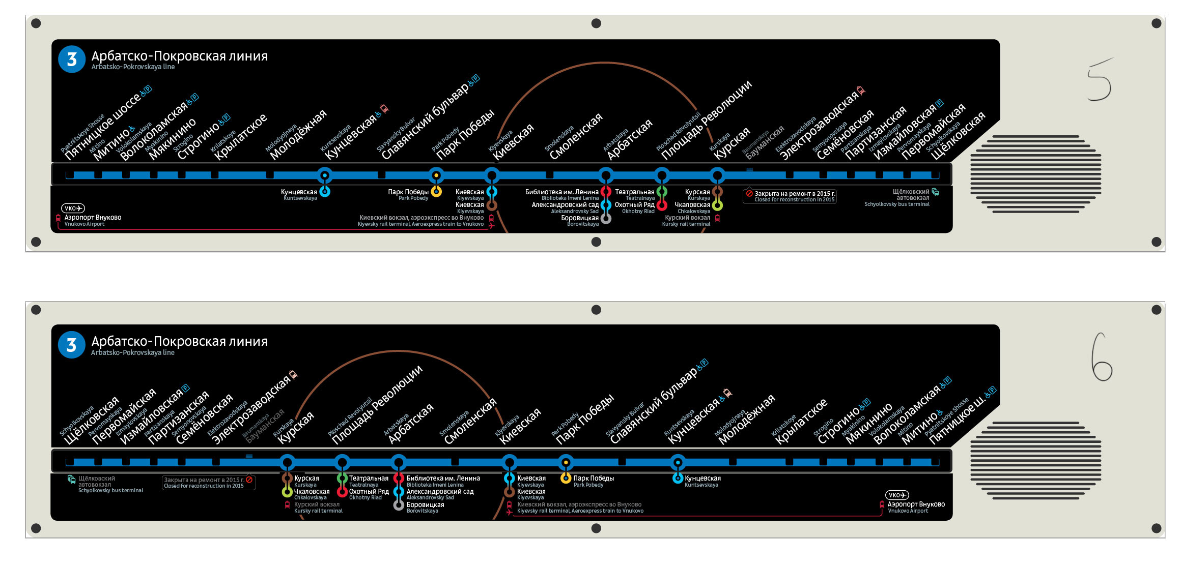
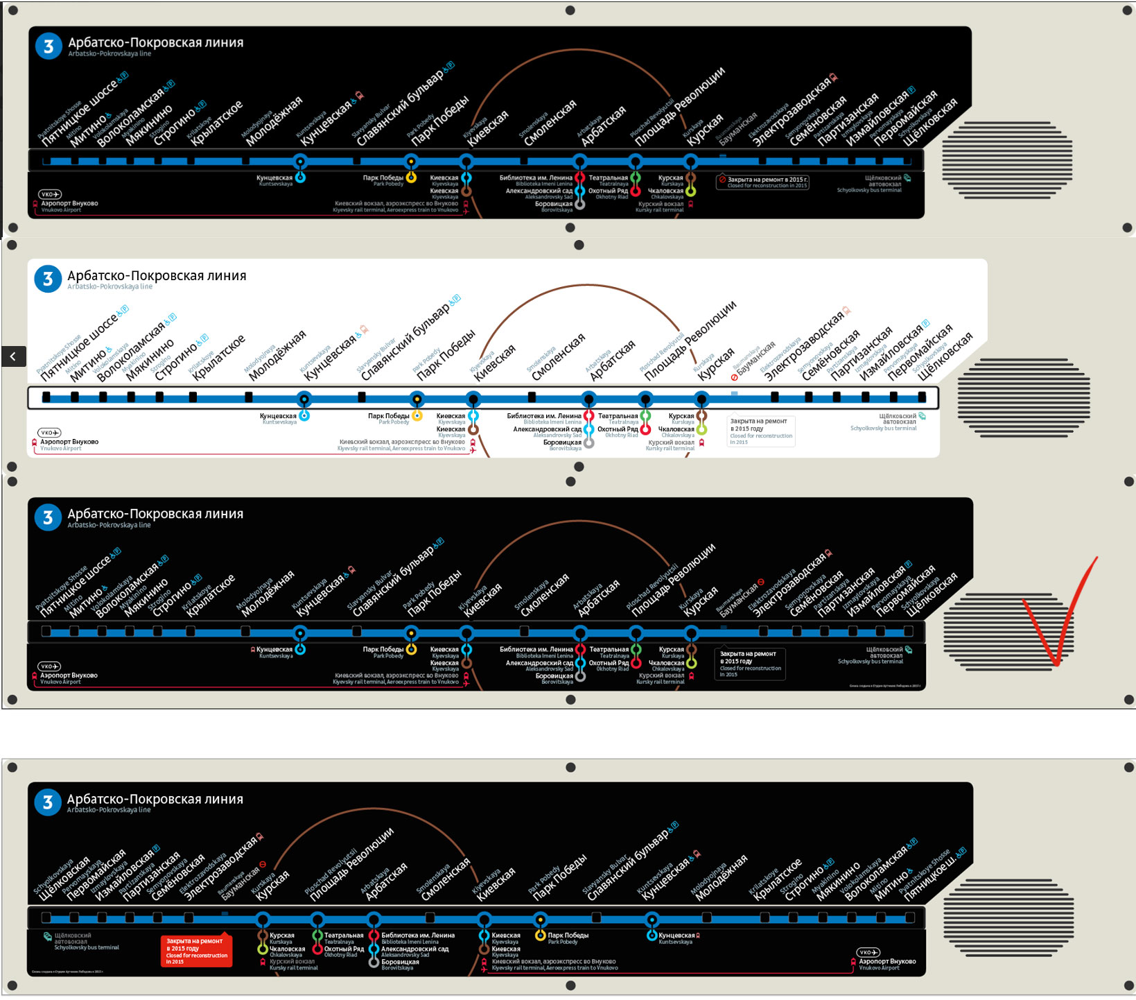
Everything looks bad. Suddenly we have a revelation: the entire map should be black. Victory on all fronts: color, cohesiveness and clarity.
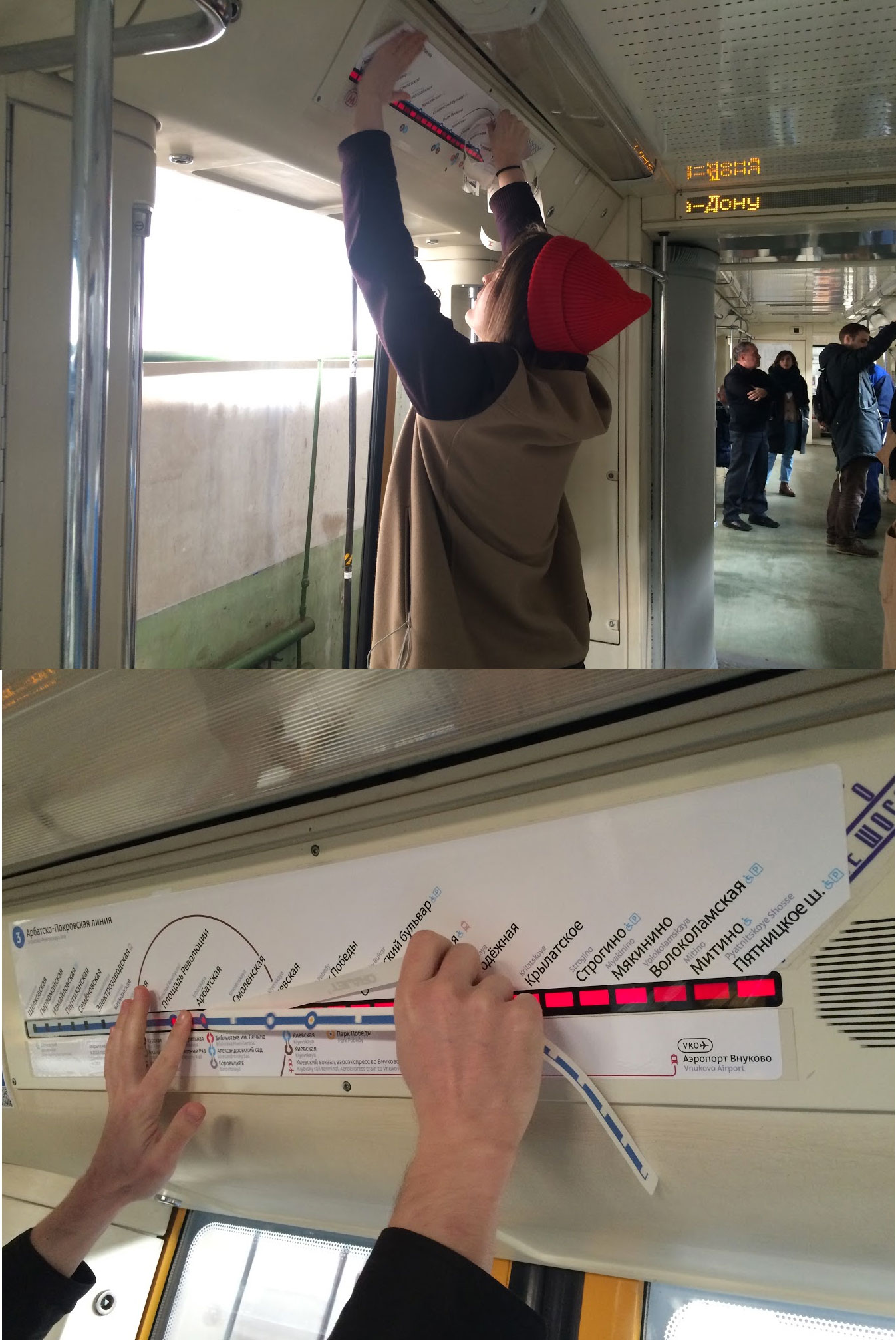
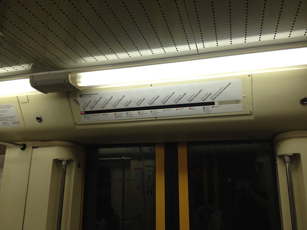
Printing out and rushing to a train to test it in a real car.
Trying different approaches.
Creating a short list of ideas, the black map clearly wins.
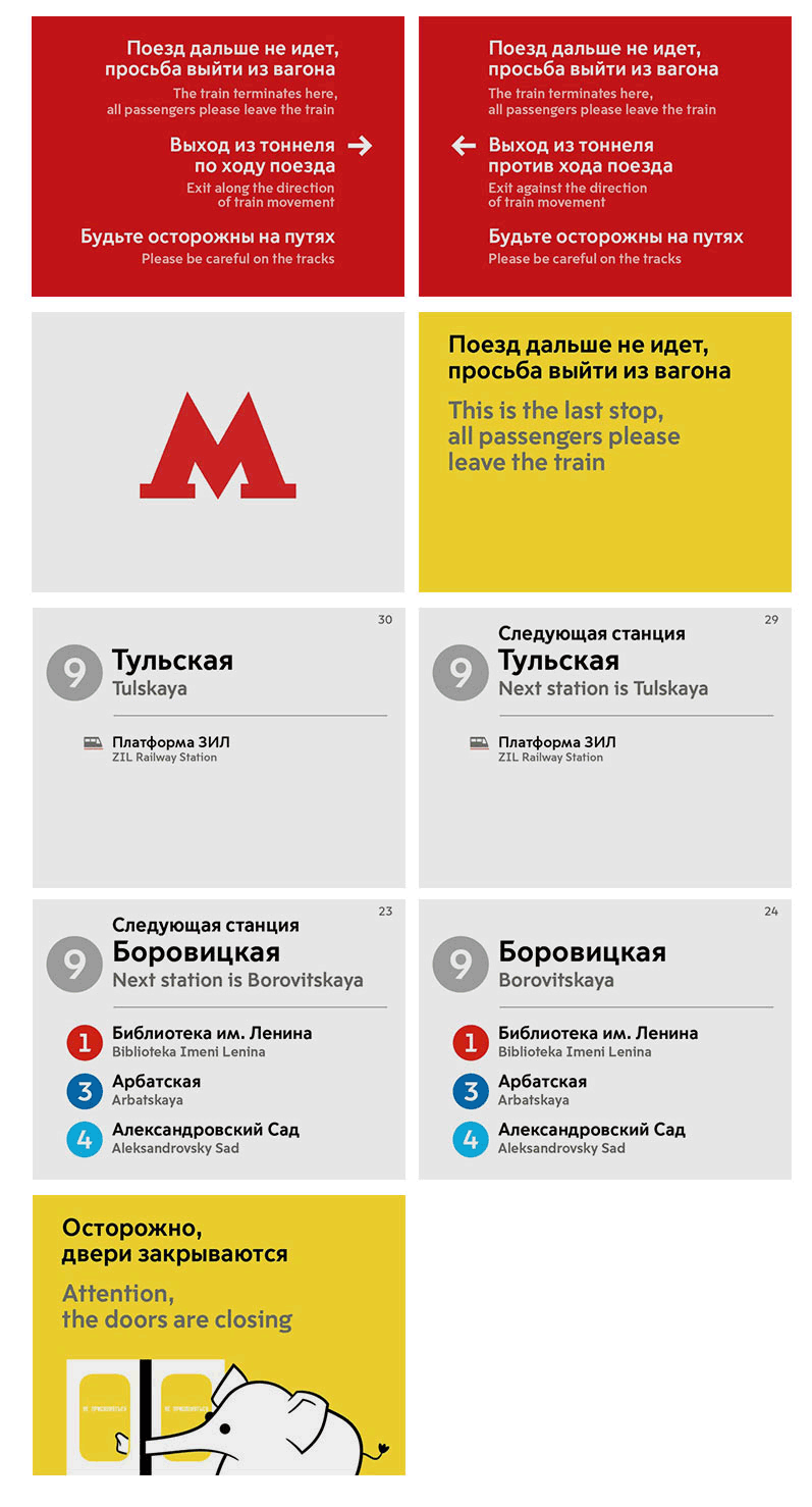
Choosing the least intrusive way to show that Baumanskaya is closed.
Done.
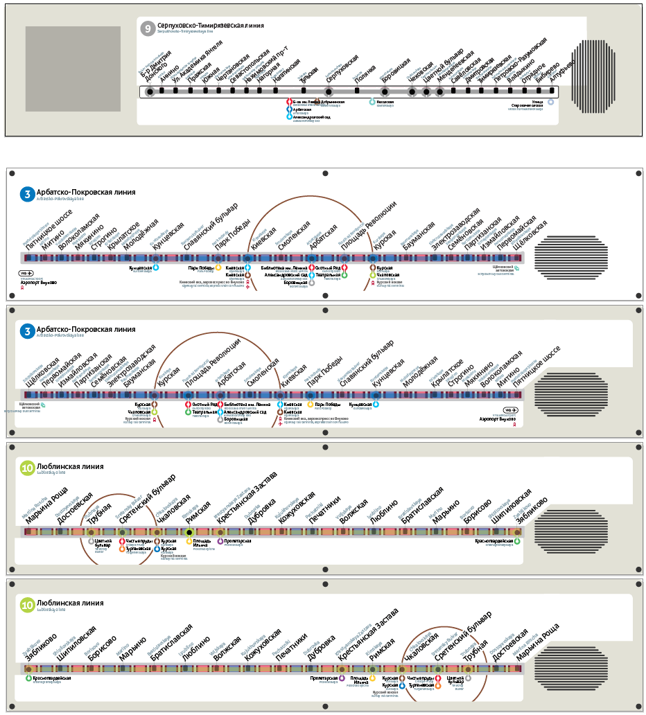
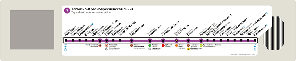
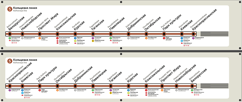
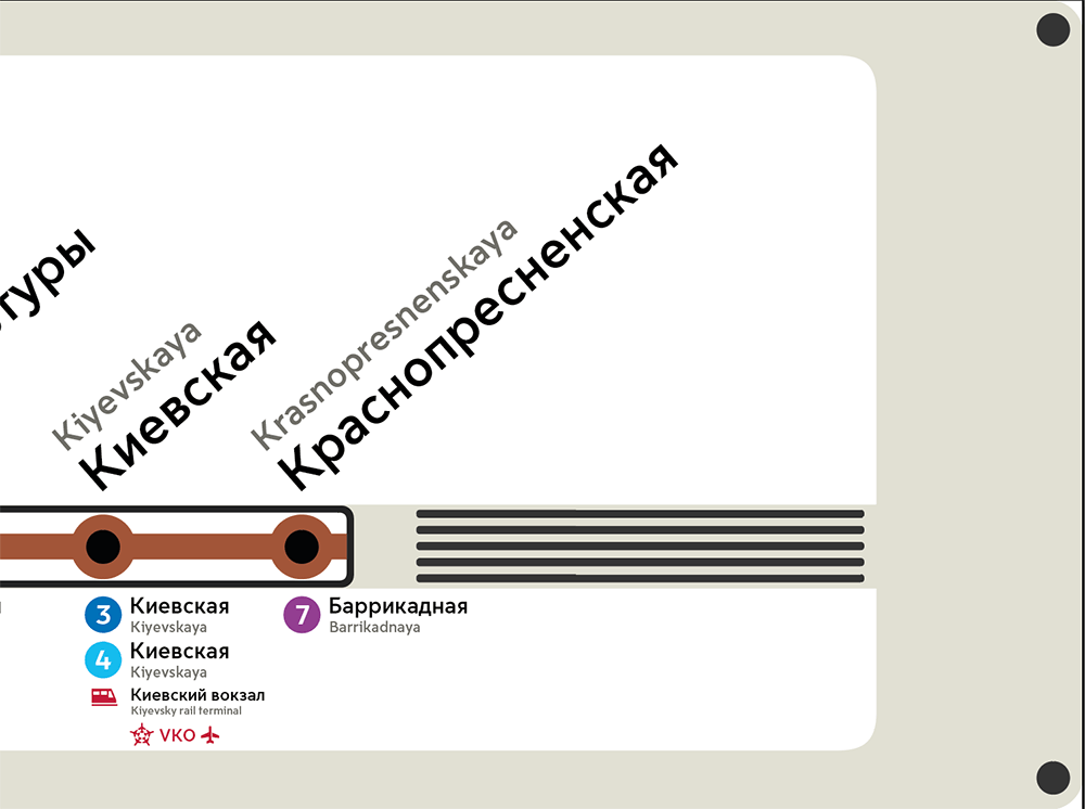
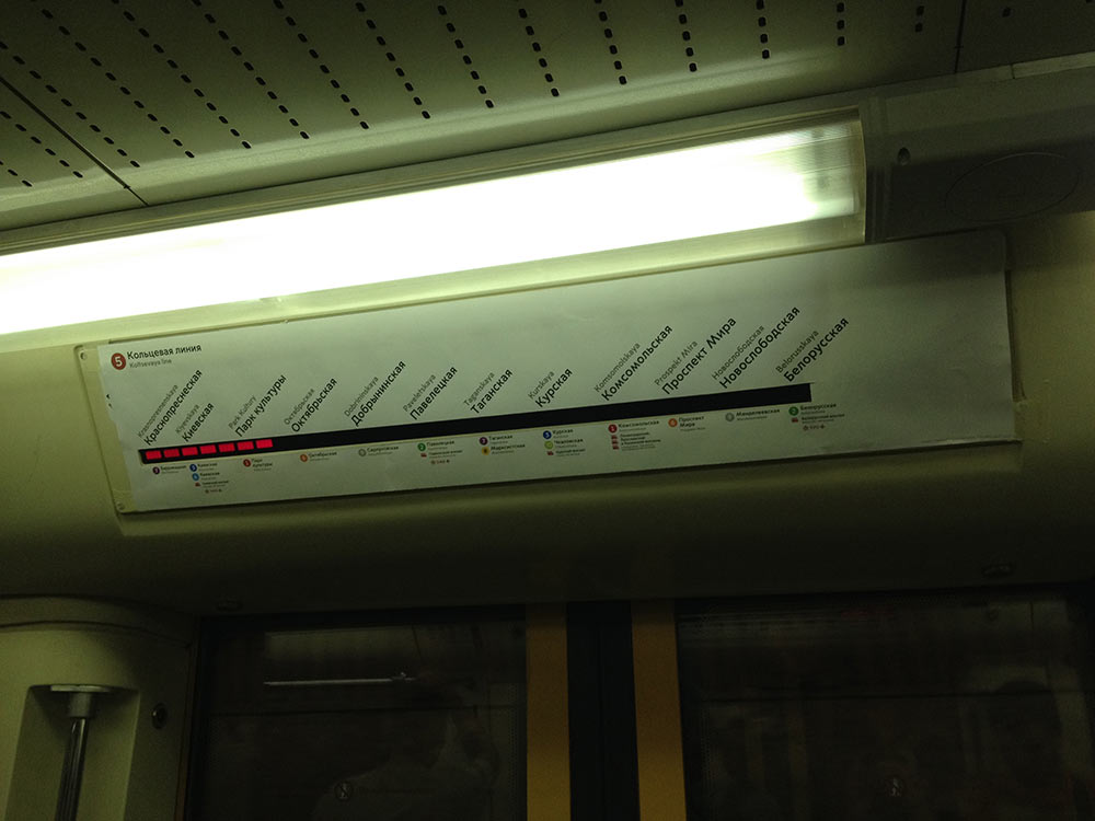
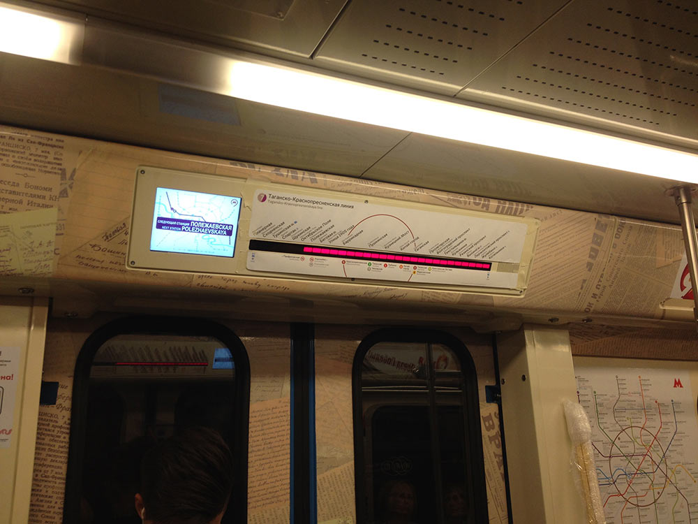
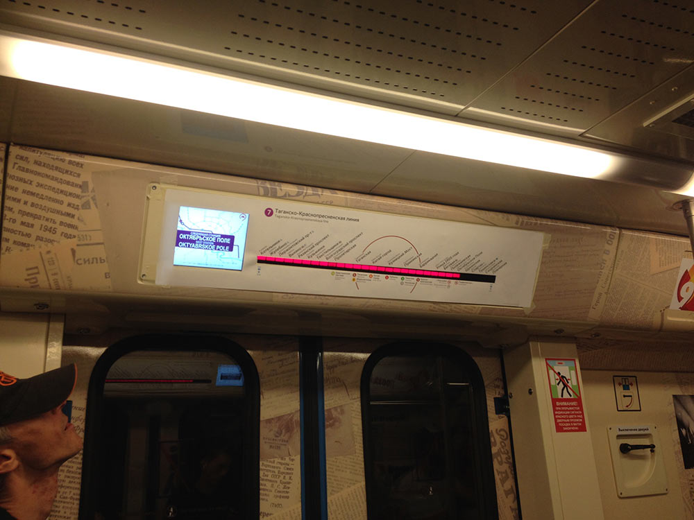
Deciding whether to make the maps black or white. We already know that black maps look good. But they do not fit well into the existing system: they would be the only ones to use black background. Which is why we need to test white maps as well. Comparing black and white maps in a train car. The white ones look good, we will be using them. Starting to typeset the rest of the maps. Simultaneously updating the typeface, icons, transfers, etc. Overall there will be two types of maps: for strips of 30 LEDs with an information screen and for strips of 32 LEDs with no screen. Deciding to typeset a map for each of these cases and then generate the rest of the maps based on that example. Preparing maps for the third and the seventh lines.
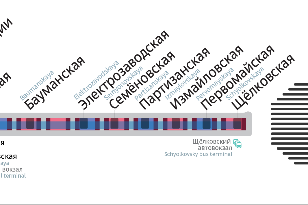
Noticing ways to make graphic elements simpler. Most of the changes will apply to the Aeroexpress route. It used to be quite massive.
Turning it into four icons. Now it just marks a station that a passenger could previously locate on the big Metro map.
The simplification is too radical: it doesn’t work well without the name of the railway terminal. When you see railway terminals both to the right and left of the Circle line, it’s difficult to understand which one is which. Now the labels and massive elements are gone, while it is still easy enough to understand which railway terminal the Aeroexpress departs from.
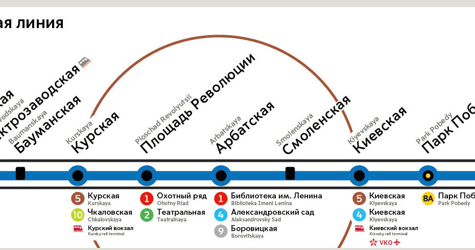
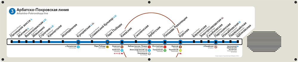
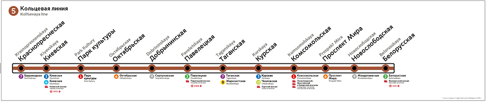
All right, we have identified the style, now we can typeset the rest of the maps. We thought the Circle line would be difficult due to the number of transfer stations, but so far we’re making good progress.
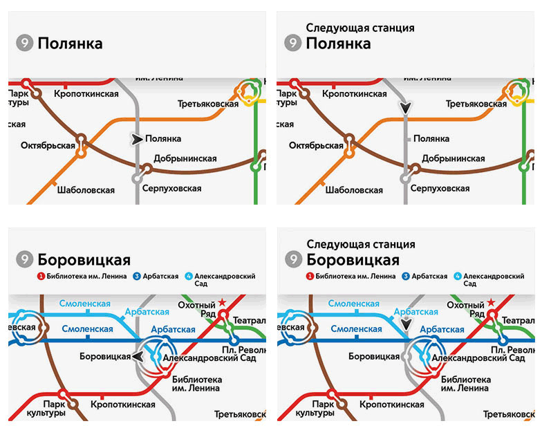
The rest of the maps are equally simple, except for the ninth line. We don’t know how to label the transfers and the railway station in the eastern part of the map.
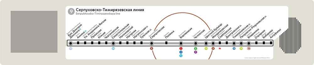
Moving the railway station up towards the station name, spreading station labels as much as the LEDs would allow and labeling all the transfers.
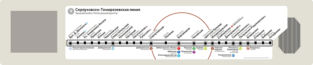
The art director says that the area near Novoslobodskaya, Timiryazevskaya and Petrovsko-Razumovskaya doesn’t look good and suggests to label a couple of transfers inside the circle and center-align their names. Also we need to decrease the typeface size for station names, right now they all look lumped together.
Moving transfer labels some more and everything starts to look better.

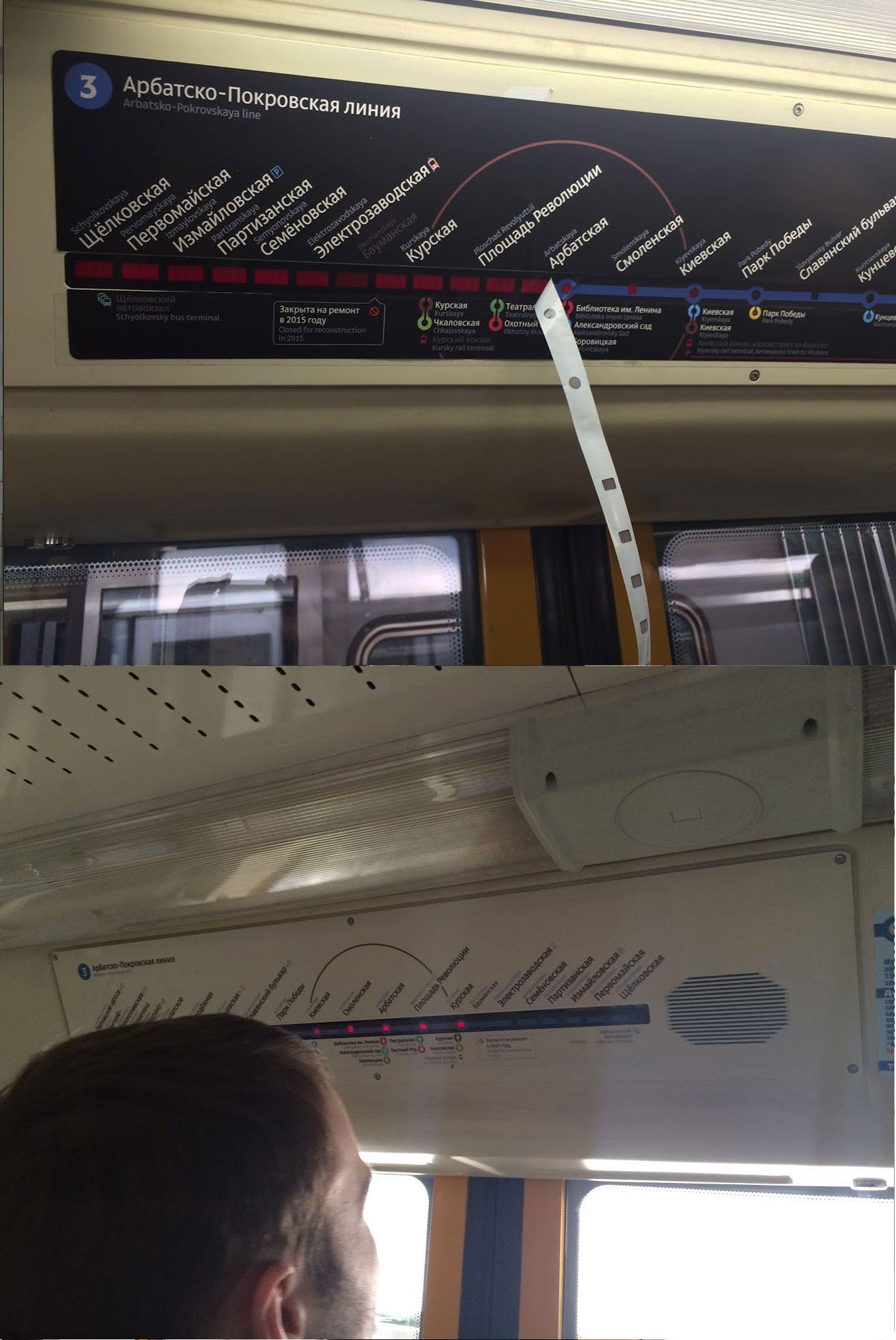
It’s not exactly nice that some of the maps encroach on the speaker.
But what if we expand them even further to make everything look even better?
Or cover the panel entirely.
Looks promising, but we need to check it first. Going to the real cars for a test.
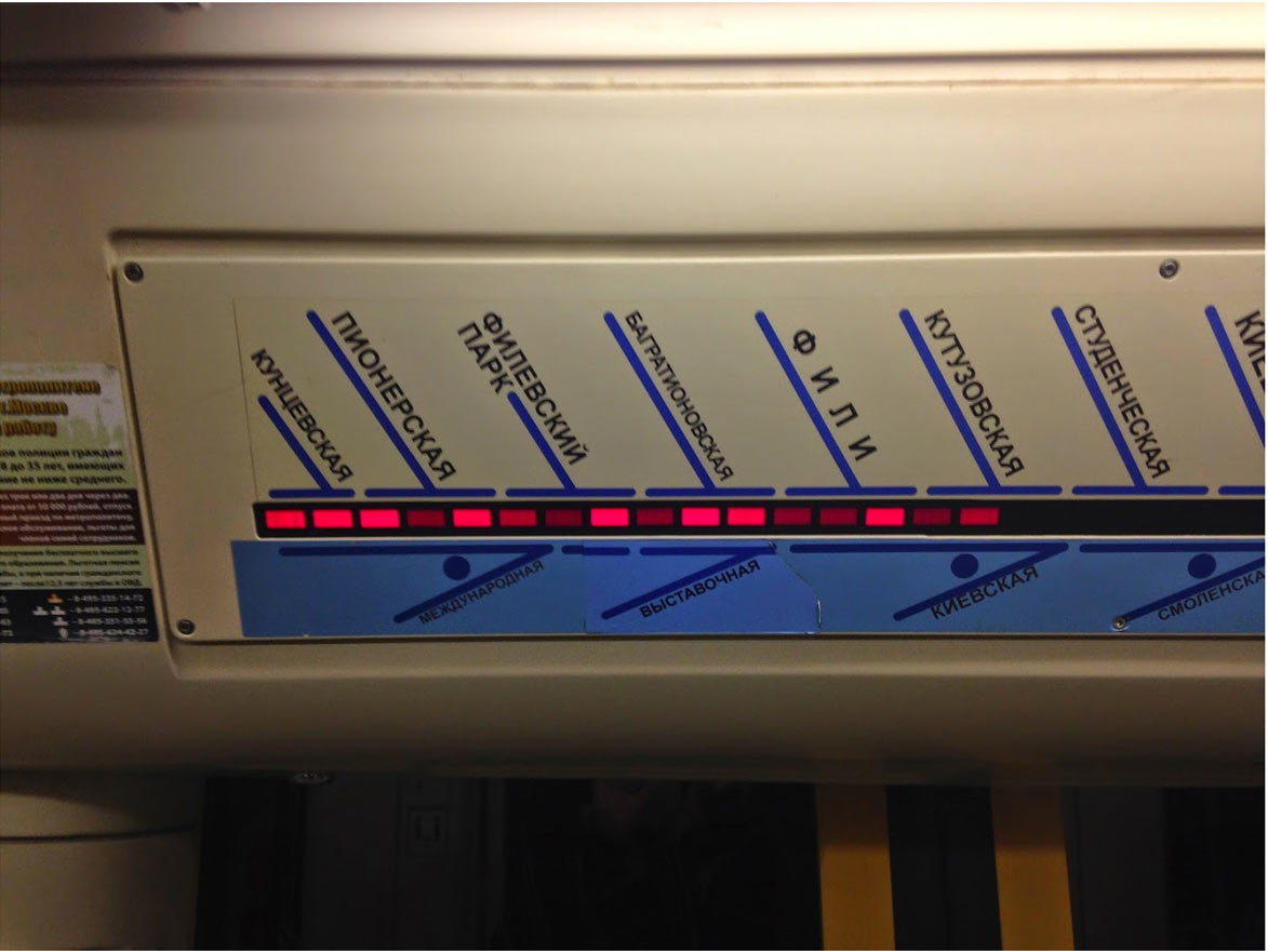
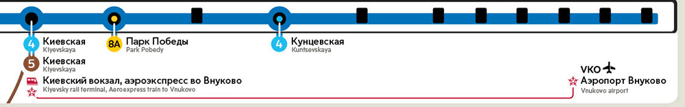
Super! The next day we get the news that we can’t cover the speaker at all due to safety regulations. All right then. Retypesetting the maps so they don’t cover the speaker. All that’s left is to finish the Filyovskaya line map. There are two different routes a train can take after Aleksandrovsky Sad. If the train goes to Kuntsevskaya, each station is represented by three LEDs on average, but if it goes to Mejdunarodnaya—by five. There are two routes but only one LED strip to show them both. We need to come up with a way to show the current route. Trying to match stumps and circles on the same map. What if they just happen to align nicely?
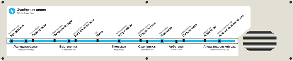
Indeed, they aligned, but that didn’t make the map any more legible, plus it looks awful.
Drawing two lines.

Better, but still hardly user-friendly. Discarding the LED cover entirely and drawing lines on outside stickers.
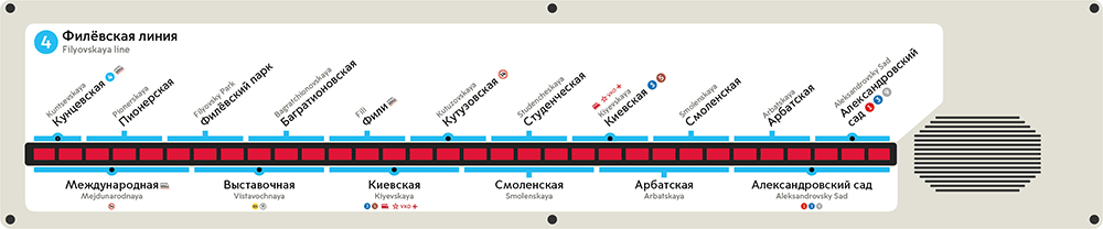
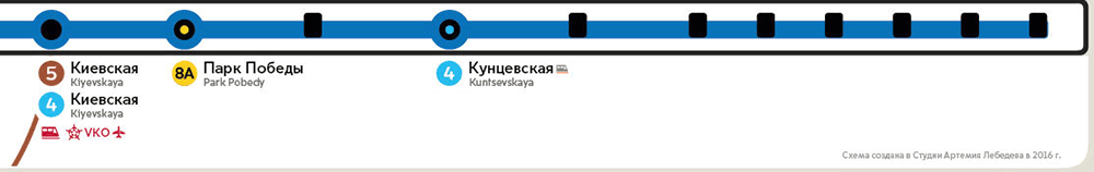
Hinting at two possible routes by introducing branching at Aleksandrovsky Sad.
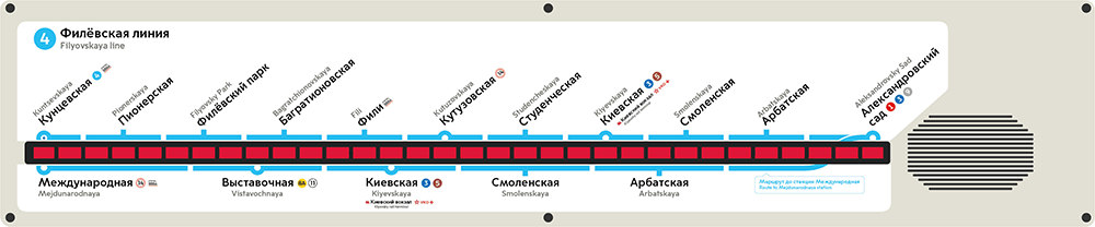
Per the artistic director’s request, bringing back tunnels at transfer stations, fixing small things, making changes based on editor’s comments, preparing files for printing.
Done. Breathing out.
Starting to work on screens. The first approach.
Trying to add a list of stations and a Metro map.
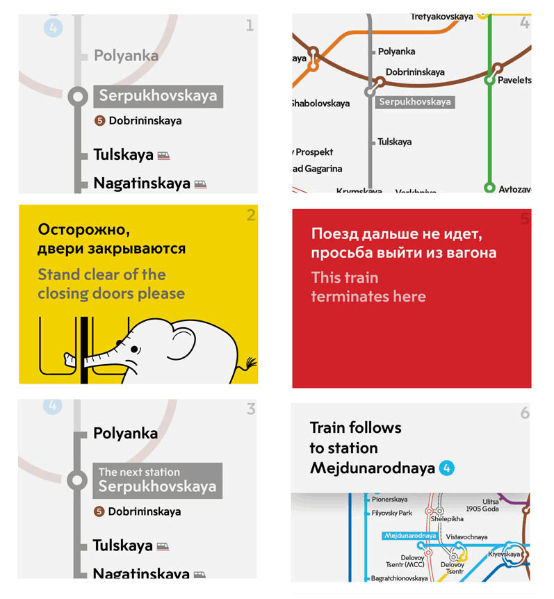
Looks complicated, we can try to use a simple map with the name of the current station.
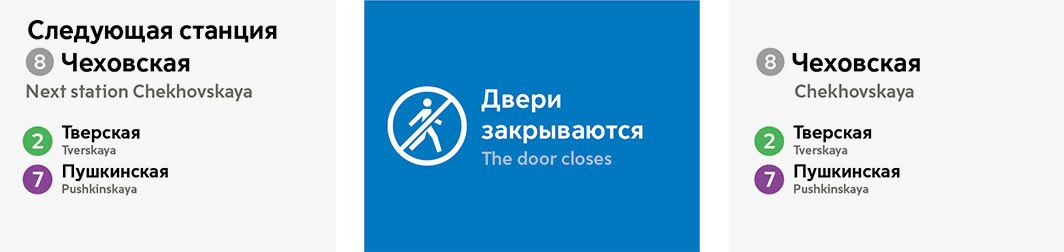
Asking the artistic director for advice. Due to technical limitations removing the Metro map and all the animation. Replacing them with simple messages in Russian and English.
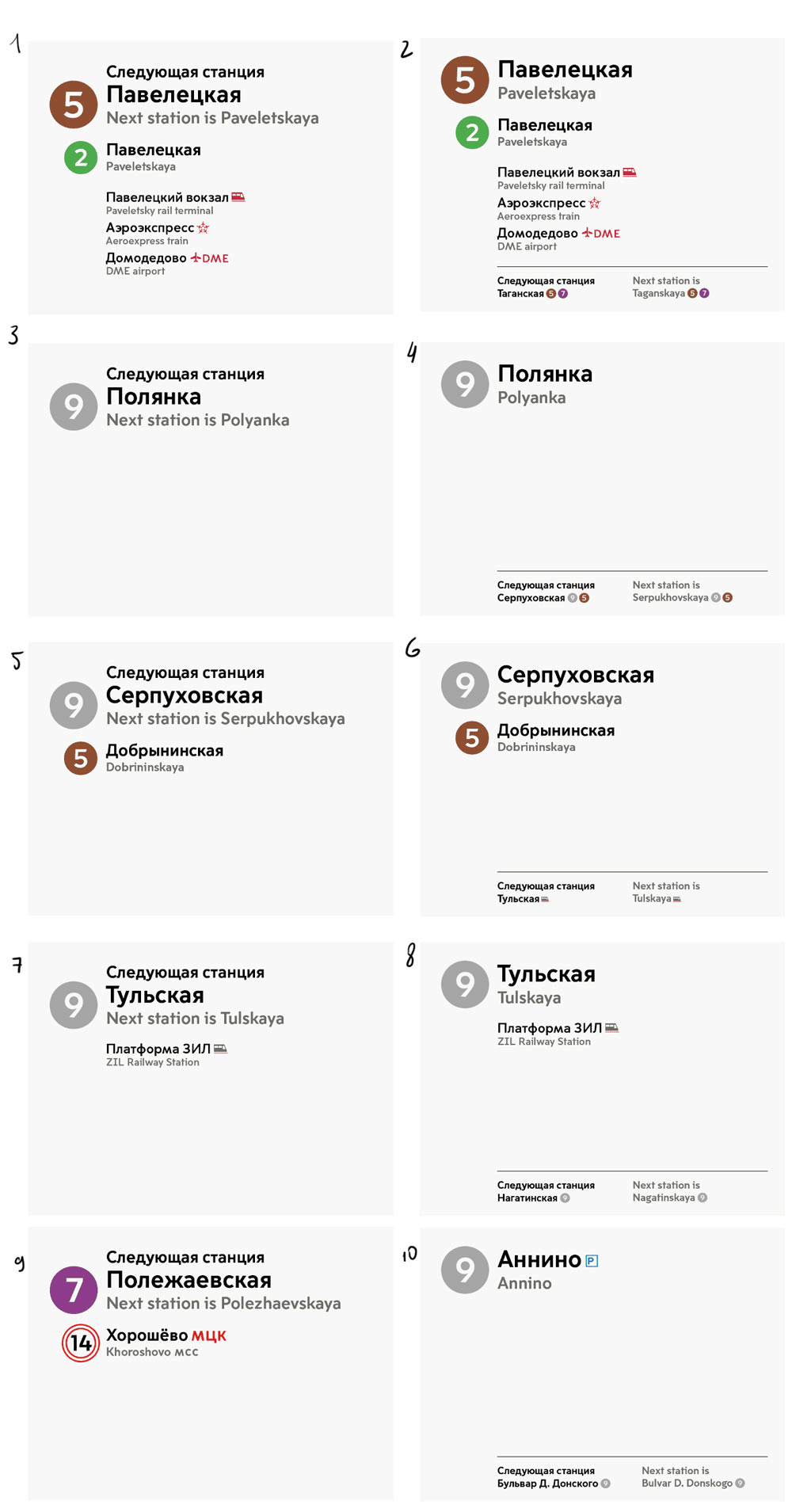
Artistic director: Does that mean everything’s going to jump around every time the train approaches a station?
Fixing.
Per the artistic director’s request, connecting line numbers with gradients.
Typesetting, checking and sending files to the client.
