Studying what at first appears to be a contradictory statement of work. The logo needs to be modern but with Old Slavic motifs in the text. Reflecting historical values—architectural, cultural, recreational—but not too airtight (so that foreign tourists could also understand it). Featuring the unique selling propositions of the city (the spa resort, the old churches and the atmosphere of a small Russian town) but with room for growth. All in all, we need a logo with a soul but without all that Gypsy bullshit.
Reading historical documents, studying the panoramas, architectural motifs, modern and historic city maps, photographs. Truly beautiful places.
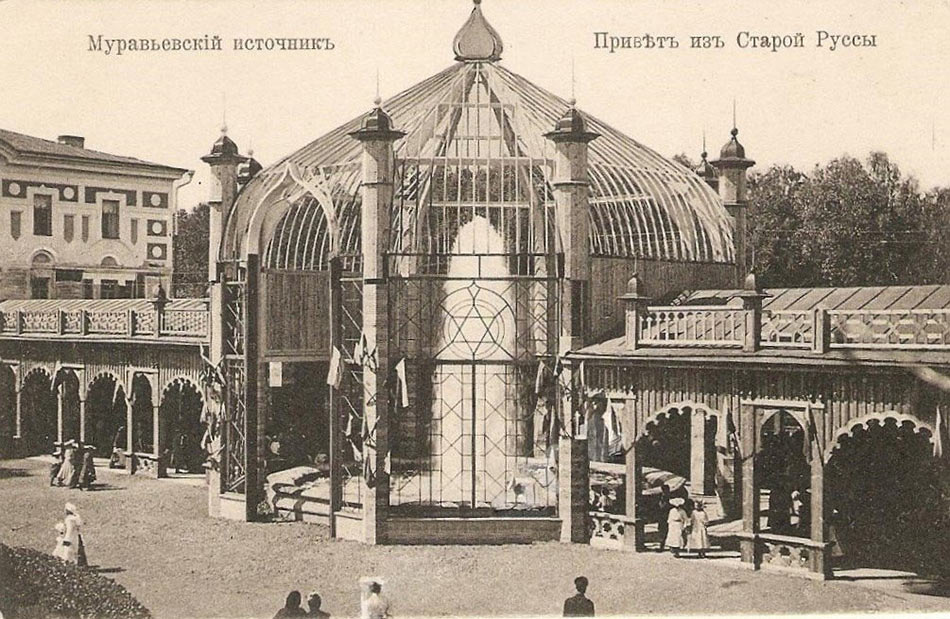
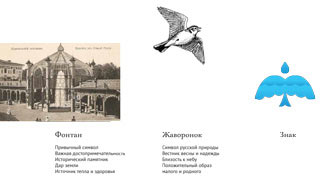
For the past several hundred years the life of the city has been revolving around the mineral springs and the salt works. Salt production at Staraya Russa stopped a long time ago, but the spa industry has been going on uninterrupted since long before the revolution. Previously though, the symbol of Russian Baden-Baden, the tall mineral fountain, was decorated much more intricately, enclosed in a delicate glass pavilion.
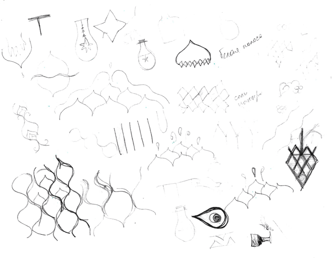
Making some doodles based on all the inspiration we gathered.
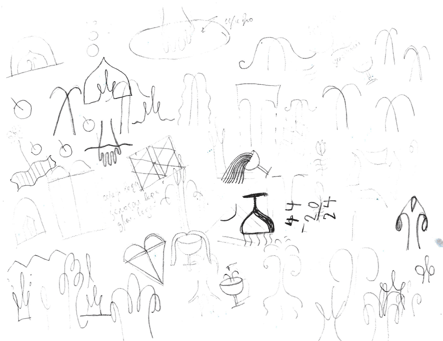
Turning the doodles into sketches. C + P, salt and steam, healing water, dome-fountain-kokoshnik.
Art director: Right now, neither.
A city on a river, minerals, bread and salt.
Art director: That’s not the kind of salt they have.
Spa-huts.
Art director: No.
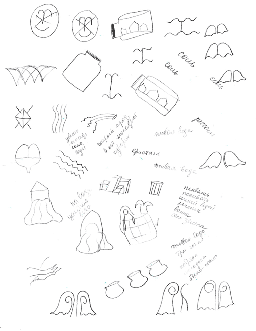
Digressing from the fountain, salt and water. Architecture? Examining the details of churches, windows of wooden houses, window frames of the Dostoevsky House Museum. Drawing mermaids, scarlet flowers, living and dead water.
How about this image, will it work?
Art director: Nope.
Right, we can’t use any of the fairy tale motifs. Discarding the mermaids altogether.
Studying the Novgorod ceramics. Reading the diary of an archaeologist documenting excavations at Staraya Russa. Examining the findings. Getting the strong desire to forget everything and move to the banks of the Polist River (local geographical names are so beautiful). But it’s time to return to commerce and tourism. From what we can tell, the current city souvenirs, both official and homemade, often employ the image of the fountain. Which means we have to go back and find a pleasant, gentle Russian metaphor.
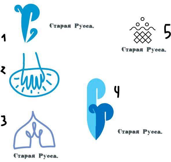
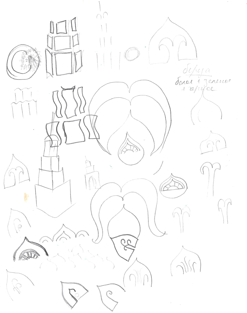
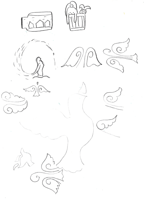
Searching for ideas in the outline of the fountain. Domes, hands, petals. Wings! Sure: a fountain-bird.
Art director: Maybe.
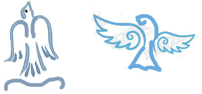
And also the flag as the symbol of the city, merged with the fountain. And the letter Р.
Art director: There may be something here.
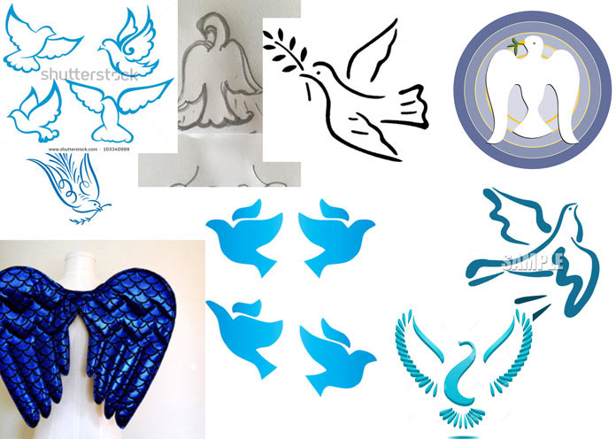
Let’s work on the bird. What kind of bird can it be? A swan? No, too posh. A dove? Too religious. Russian fairy tales often mentioned a turtle-dove. Sounds nice, although probably no one ever saw it in person and can hardly distinguish it from a regular dove. There is also the lark. Sounds cool. It’s small, flies up, sings beautifully. Russian field. Homeland. Spring.
We’ll leave the logo neutral for now, we can always find the style later if it gets approved. What can we show here?
Art director: Number 2 is good.
Assembling a micro presentation.
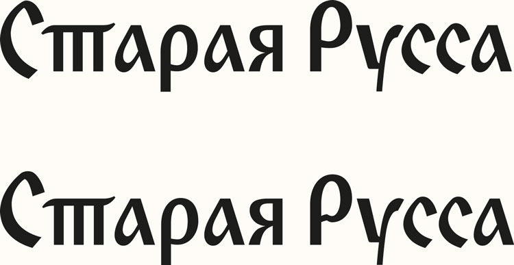
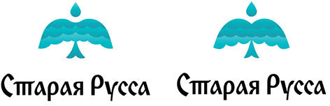
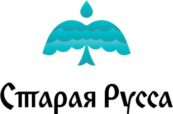
Approved! The logo is sent for elaborating while the text designer starts working on writing the text in an ornamental script as per the client’s request.
Preparing first drafts of the text using Old Russian cursive as inspiration.
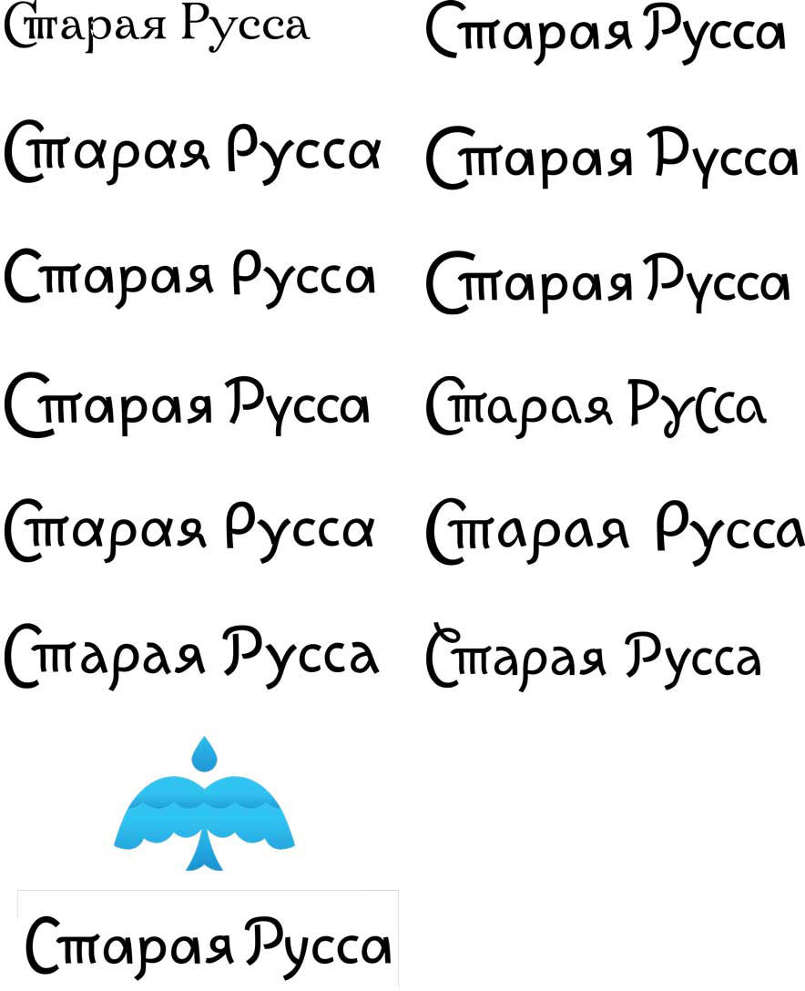
Art director: I want it to look more solid. You can keep the birch-bark motif, but remove the handwritten lightness by adding the feeling of the text being typeset.
Creating more options, geometrical and simplified.
Art director: Nope. Not good. We need to get rid of that childishness. And make sure not to make the word Русса look like Pussy.
Since the cursive is too light, making sketches in the uncial style.
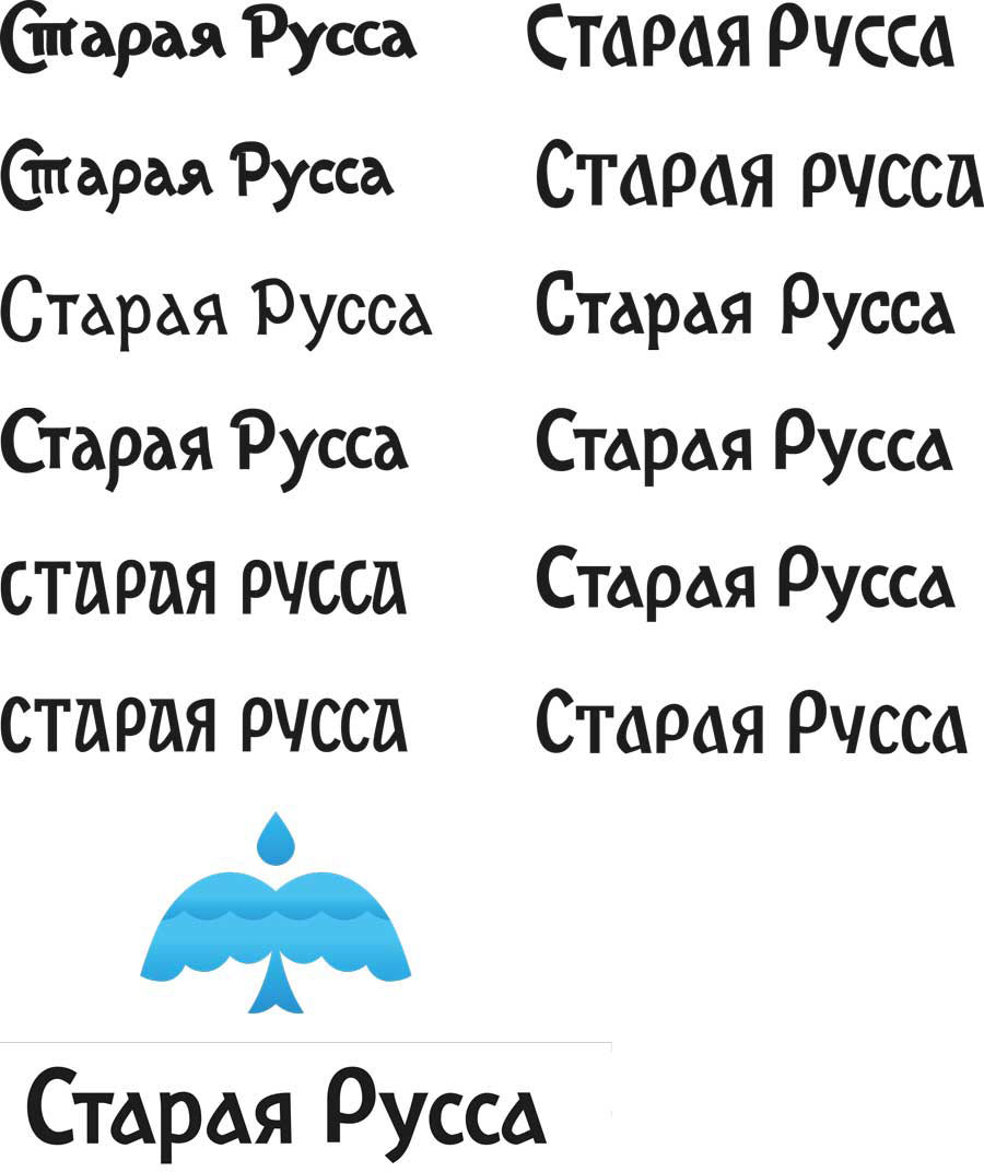
Art director: That’s better but not exactly super yet.
Preparing new alternatives and reworking the old ones. Asking the art director which one is closer to his vision and is any of them worth elaborating.
The art director chooses the last design.
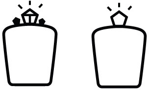
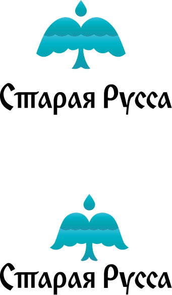
Getting the client’s request to change the logo color to aquamarine.
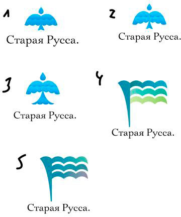
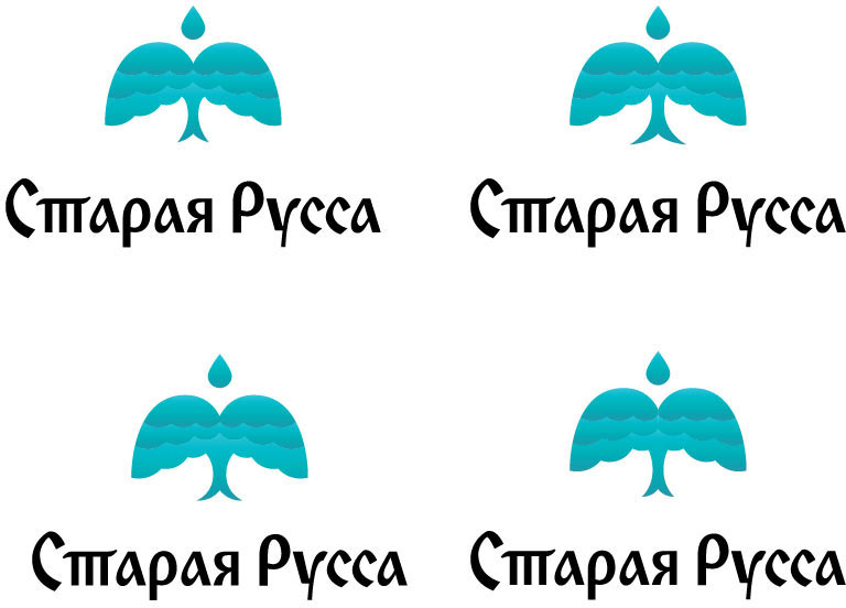
Designer: Am I moving in the right direction?
Art director: The top one is OK. On the bottom one the fountain’s sides are too big.
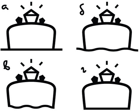
Designer: I think Number 3 is the closest.
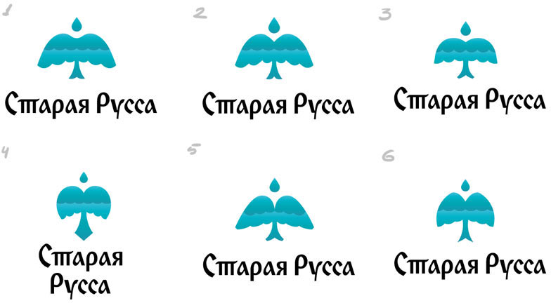
Art director: It looks too much like an umbrella. Number 2 is better. You need to add another line of waves inside, one is not enough.
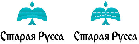
Art director: The gap between the waves should vary in width, wide at the edges, narrow towards the center. Imagine that the tail is a spring spouting out of the ground. And look at the umbrella’s dome. Water’s trajectory should match, and right now the top does not go in line with the bottom.
Art director: The right bottom one is best. Let’s change the rhythm of the waves to place the middle of the wave, not its peak, at the center of the ass. Also, the tail is now too fat and fish-like.
Art director: Now it looks like lungs or a toadstool.
Art director: No, it seems more and more like an ass to me.
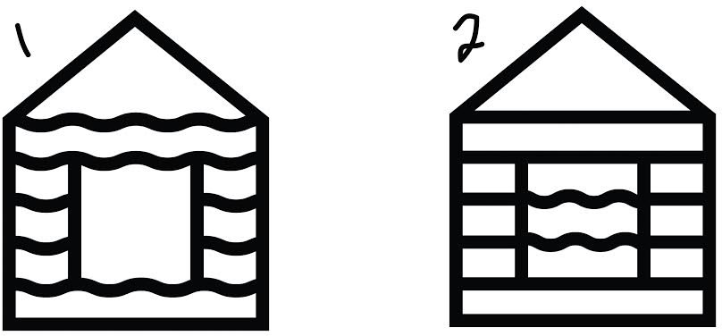
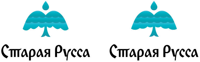
Getting back to the initial design and working on it.
Art director: The second one is better. Let’s flatten the ass slightly and expand the waves inside, like in the previous version.
Art director: OK.
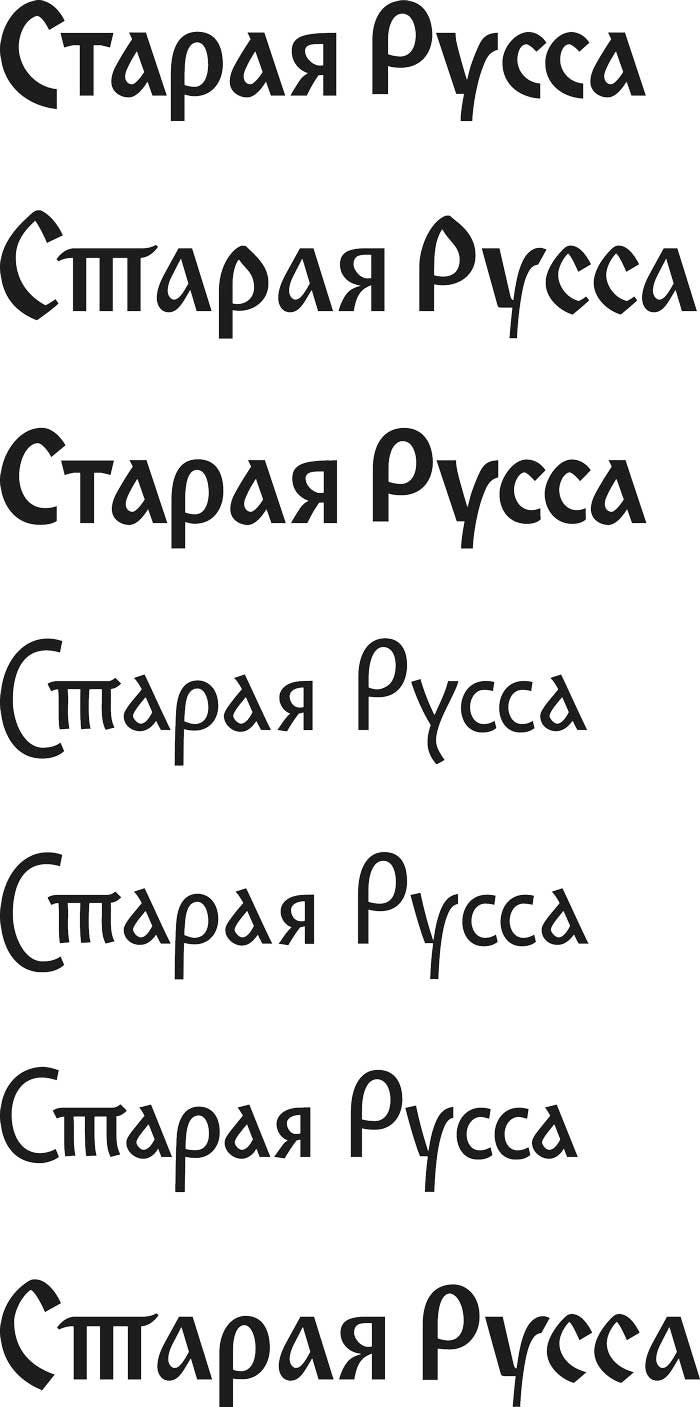
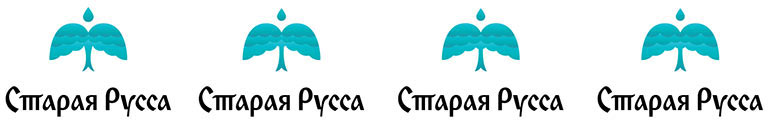
The type designer is not entirely satisfied with the approved design and creates new alternatives.
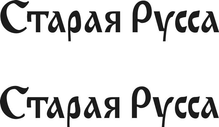
Art director: That’s bad. The Т lost its character and the С looks like it came from the Hebrew alphabet. By the way, the С you had before is really widespread in Yugoslavia. And the О made of two halves, too.
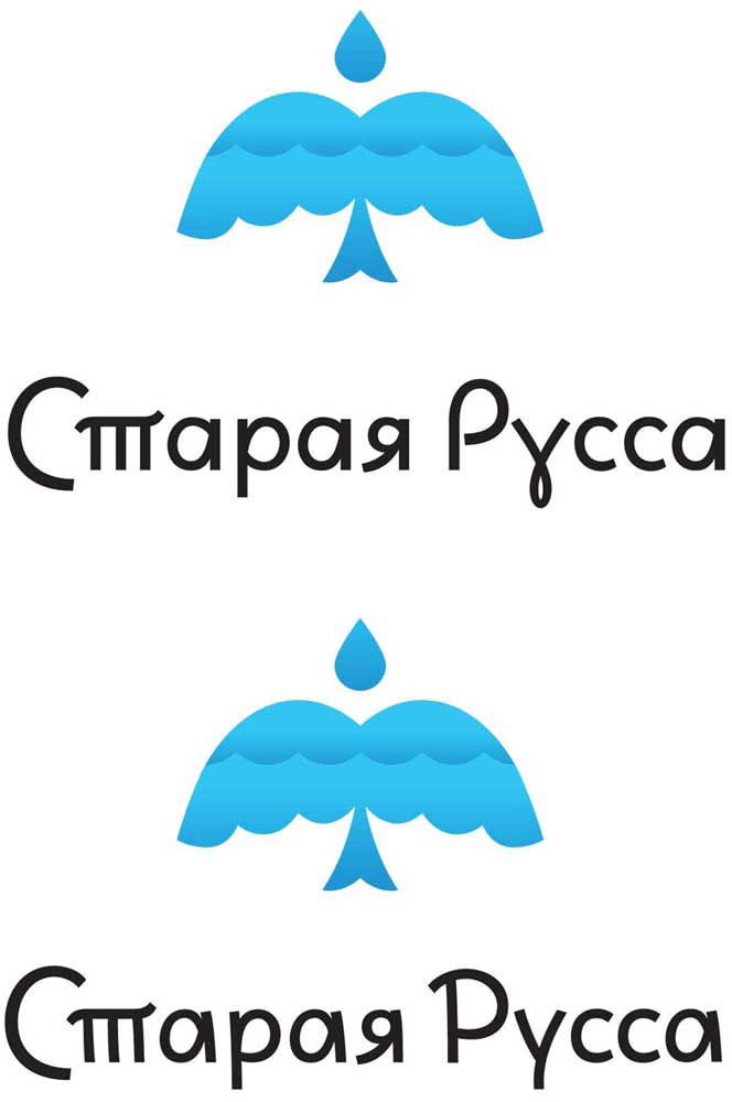
Going back to the previous design and finalizing it.