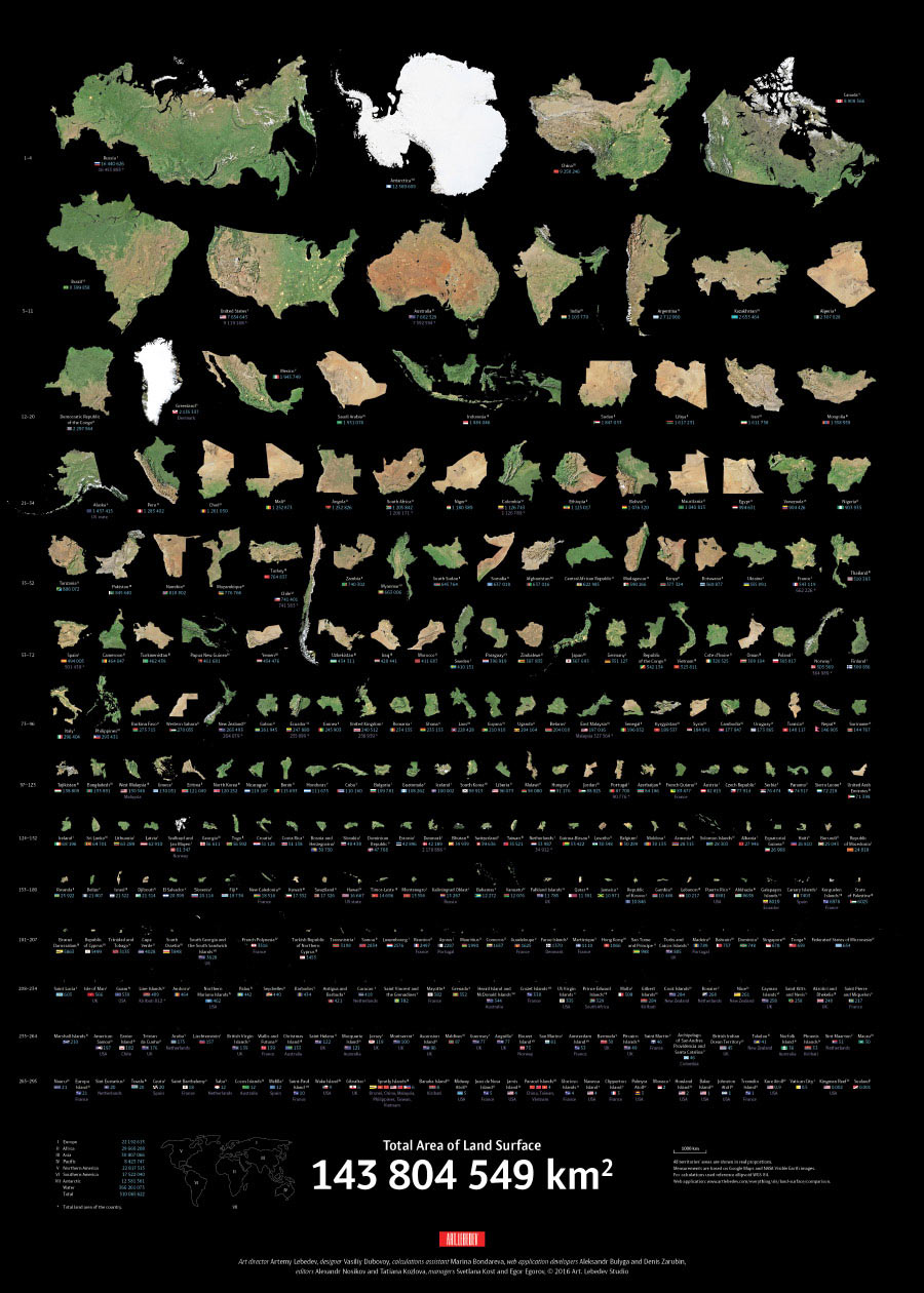
Task:
to create infographics capable of changing our perception of the world.

All world maps rely on projecting the Earth’s spherical surface onto a plane which makes it hard to compare relative sizes of territories. Globes are equally difficult to use for this purpose. This means that people perceive territory sizes incorrectly.

susha real
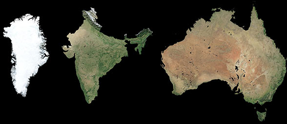
Greenland, India and Australia’s real proportions


susha fake
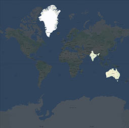
Same countries on a traditional map

The infographics created at the studio shows real proportions of all land masses revealing actual areas of countries, territories and major islands without any distortions. Important economic indicators serve as a useful addition to the diagram and enhance the overall picture of the world.


Source data used in analysis: Google Maps (2016); NASA’s Earth Observatory topographic maps (Reto Stockli, 2004); Population list (CIA, 2016); Population Statistics for Countries, Administrative Areas, Cities and Agglomerations «City Population» (2016); GDP by Purchasing Power Parity list (CIA, 2016); Human Development Index and its components (United Nations Development Programme, 2015); Wikipeida

Poster

Countries on the poster are arranged by descending size, are shown without external or dependent territories and are distributed by continents according to the United Nations geoscheme. The poster encourages close examination full of pleasure and awe.

susha poster en
susha poster
English and Russian versions of the poster are available


art director

designer

calculations assistant

Studio projects  Graphic design  Posters