Story by Vasily Dubovoy
It so happens that today’s standard for navigation and cartography services is the Mercator projection. At first, it seems that this projection distorts proportions but if you look at it from a mathematical standpoint, it turns out to be the Holy Grail of all projections. There is no doubt that it is more gentle, reliable, better and original in handling and storing information than other projections.
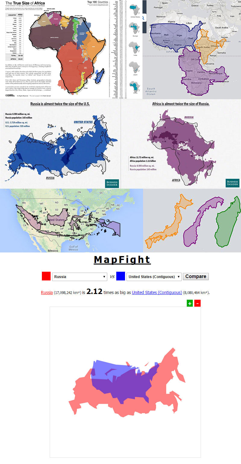
Every day, hundreds of millions of people use the Mercator projection without even realizing that they see the world through a mathematical equation. Some of them know that the Mercator projection distorts proportions, although imagining this would require some enviable imagination skills. Others might have a hunch that something isn’t right, while others yet don’t even suspect that proportions and dimensions of countries are entirely different in real life. In the end, we have an entire mankind with a very modern yet distorted picture of the world.
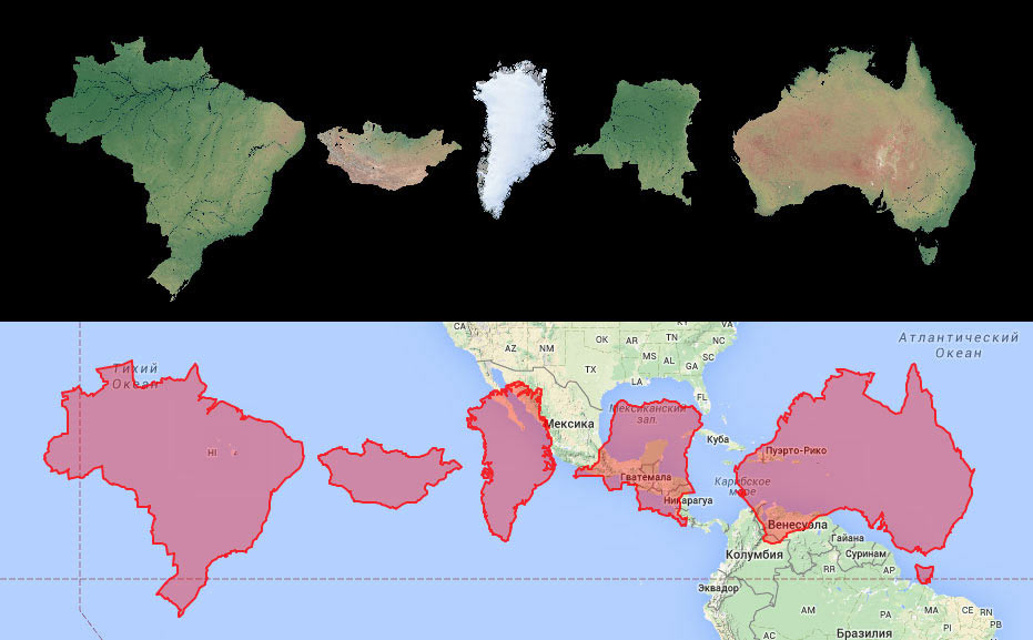
Of course, developers are trying to solve this perception problem. Google, for example, renders satellite maps on a volumetric sphere. This is a step towards causing less confusion. But the globe is still the globe even if it’s electronic: it still makes it hard to compare territory sizes and there is no way to look at two countries in different parts of the world at the same time. thetruesize.com perfectly demonstrates how territory shapes and sizes are distorted in the Mercator projection and on Google Maps.
Actually, the efforts to fix the scale perception problem have begun only recently.
In reality, sizes of territories is just one of the facets of the scale perception problem.
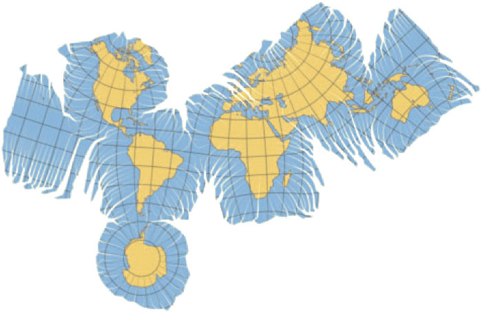
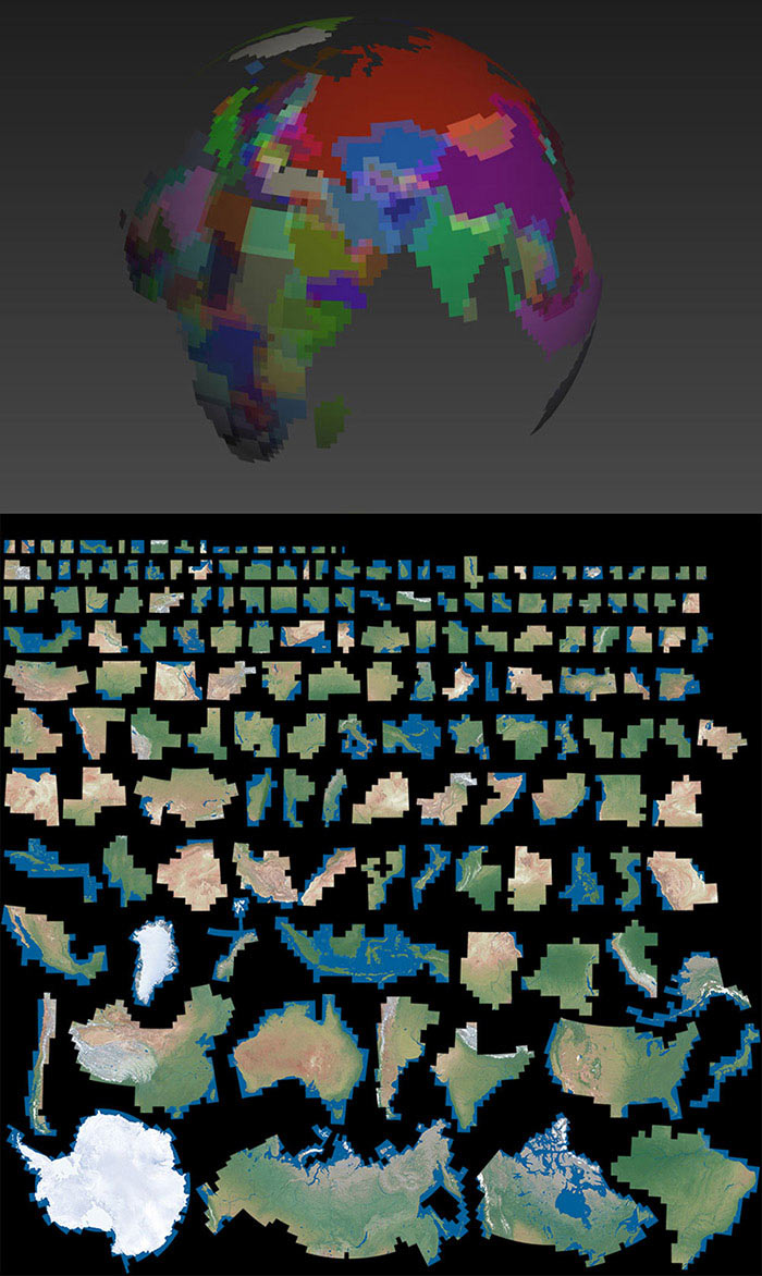
One day after reading Artemy Lebedev’s Real Picture of the World post, I came across the article Unfolding the Earth: Myriahedral Projections by Jarke J. van Wijk.
The article gives a number of ways to unfold a spherical surface available to anyone who is familiar with any 3D modeling application.
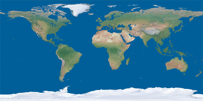
Unfolding Tom Patterson’s Natural Earth III texture.
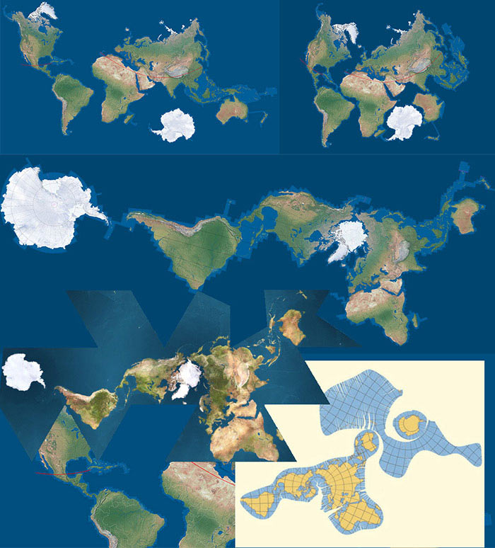
After I had some fun with arranging continents, it became clear that the result does not look like a map, but rather like a collage. In addition, it’s really hard to tell where the north, south, west and east are. But this gives us an interesting idea: to choose polygons of each territory on the sphere separately and rotate the unfolded clusters so that they are facing north.
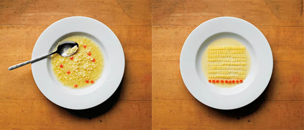
The result looks like Ursus Wehrli’s photos.


The result is also not entirely a map, but is closer to a collage of maps of all currently existing territories. All territories rendered in a single scale are facing north and scale distortions are brought down to a minimum.
Comparing to the Mercator Puzzle.
Adding territory captions and sorting by size based on information from Wikipedia.
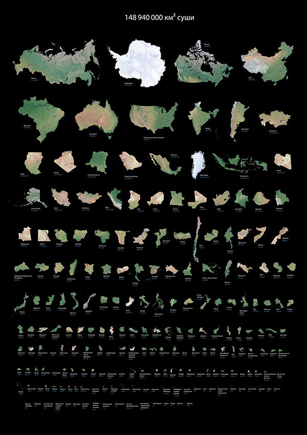
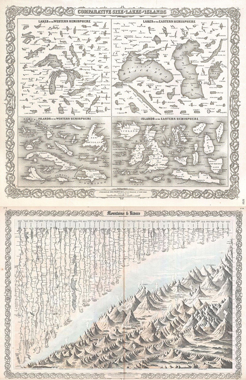
The result looks like vintage 1850s infographics by J.H. Colton.
This has the makings of a good informational poster. Adding the idea to the studio’s Brain Storage.
