Oceania shopping center
Visiting the shopping center and taking pictures.
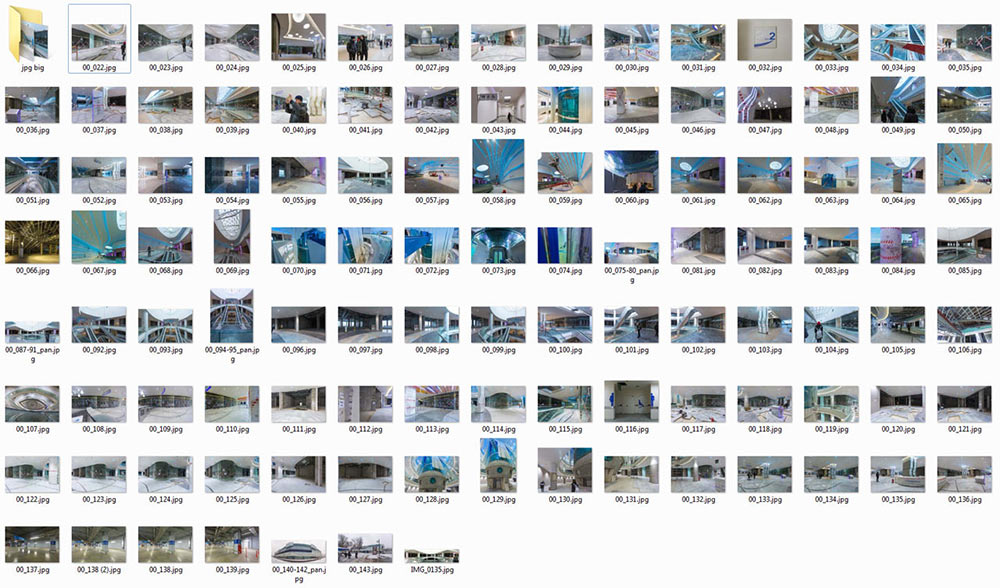
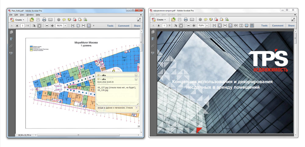
Receiving information from the client.
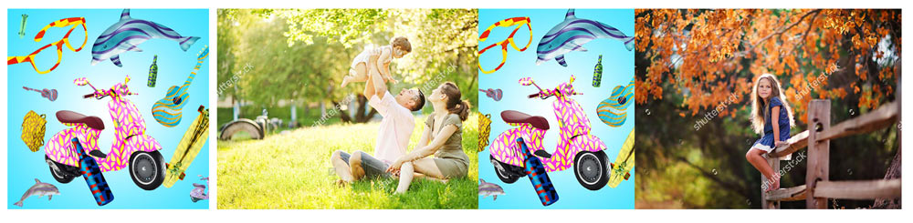
The client asks to explore the idea of showing the interior of future stores with customers inside.
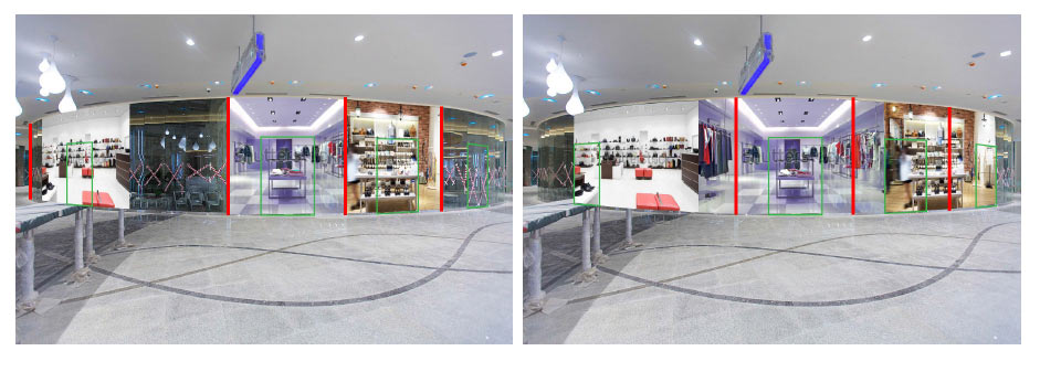
The illusion only works if each picture is viewed directly from the front. Given the dimensions of the surfaces we need to cover we realize we won’t be able to make the effect believable.
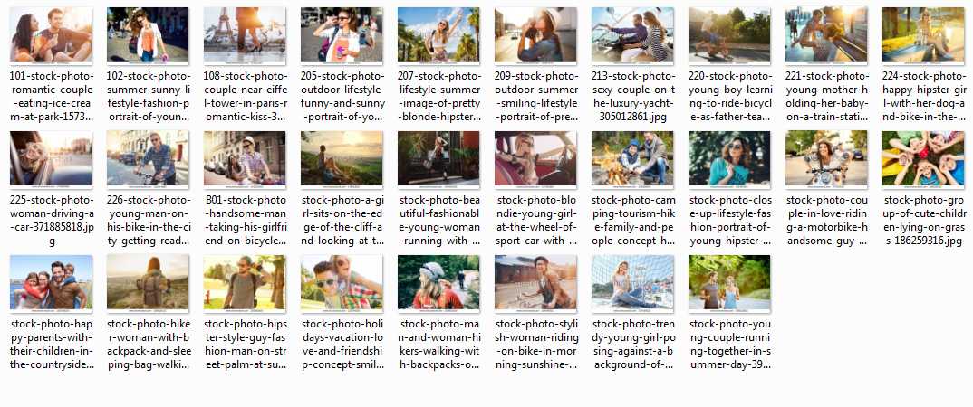
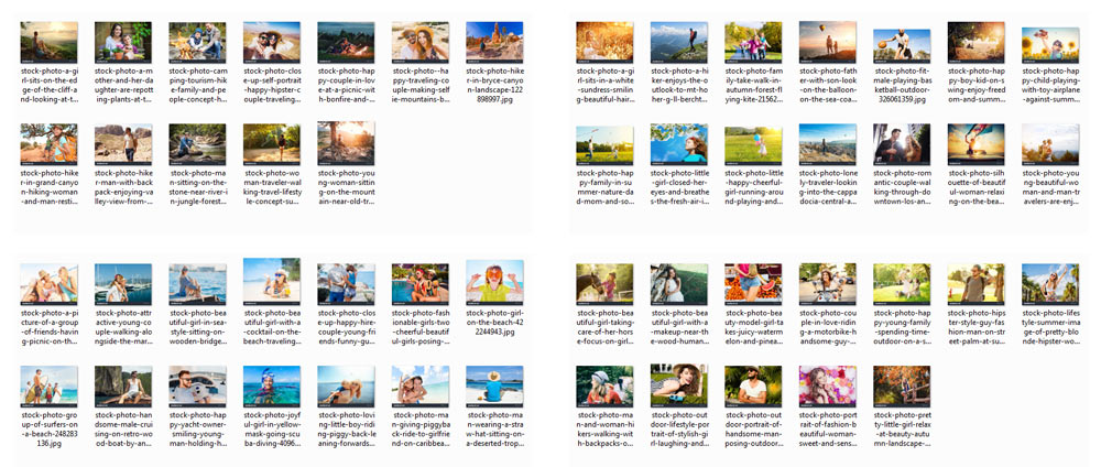
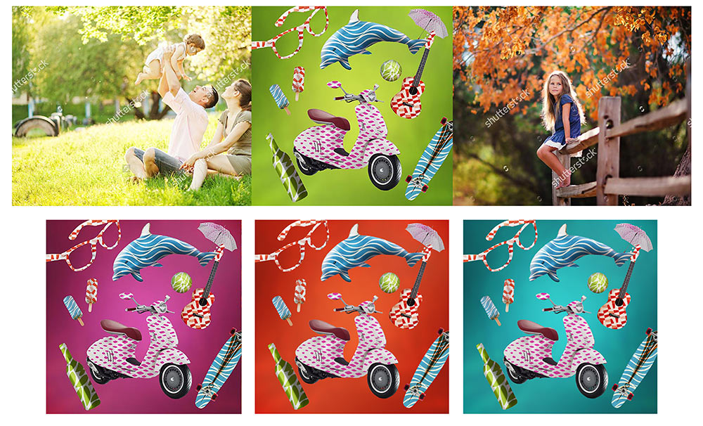
Trying on photos of people.
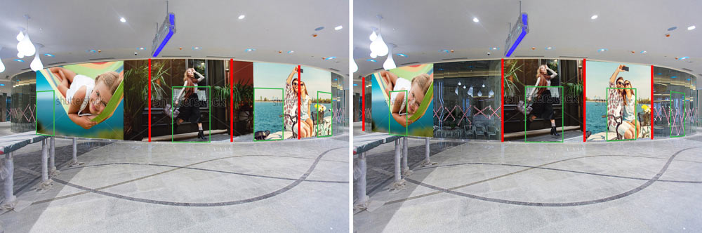
Searching for more natural shots.
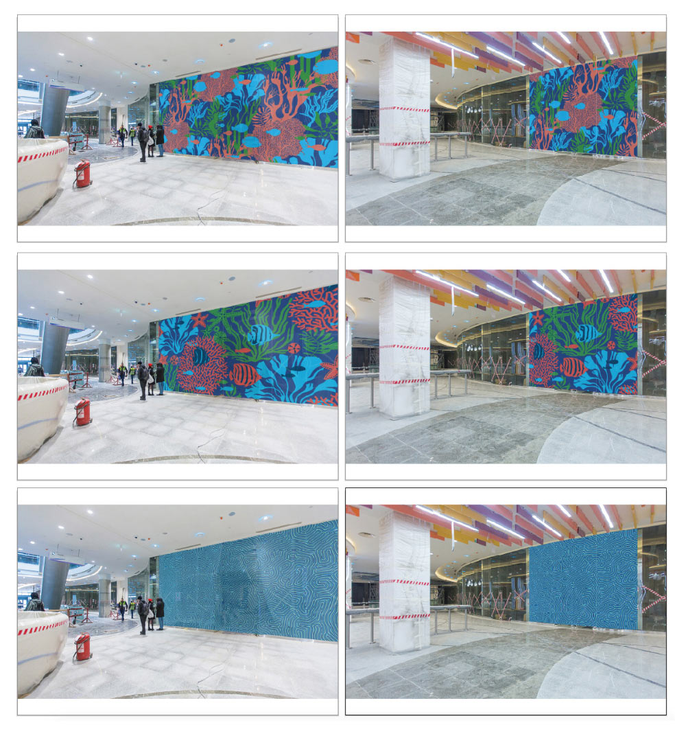
We need to ensure the space inside the shopping center is diverse. Deciding to supplement the photos by covering some of the storefronts with a sea-inspired pattern.
Starting to work.
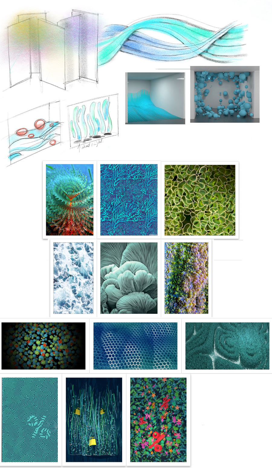
Drawing out the chosen directions.
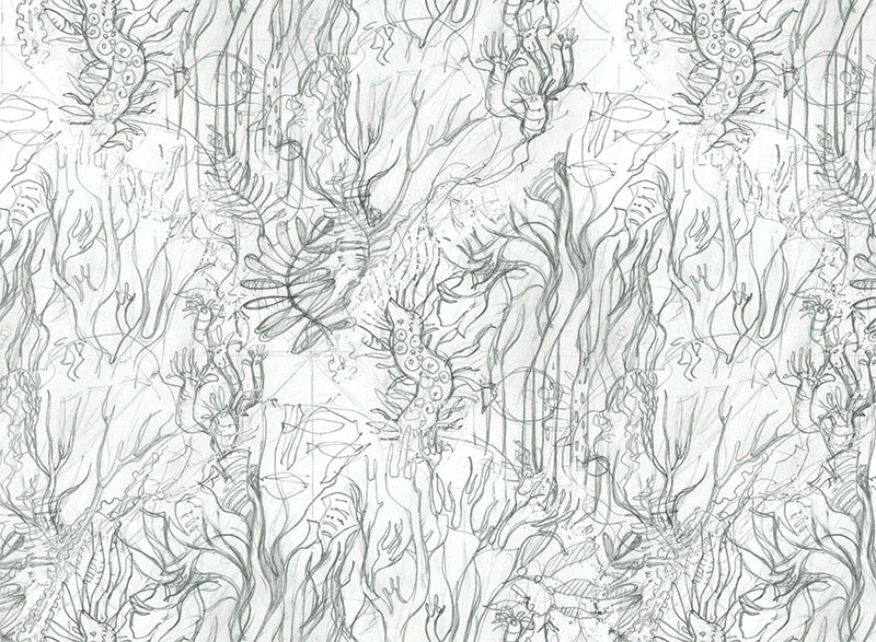
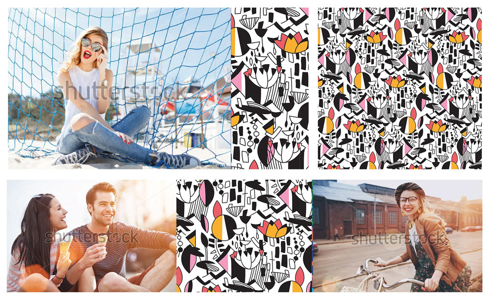
The illustrator wants to create a pattern with seaweed: it has beautiful dynamics in water and is very diverse.
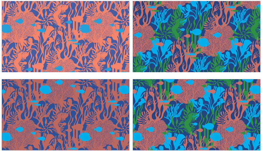
Replacing complex colors with the shopping center’s signature ones.
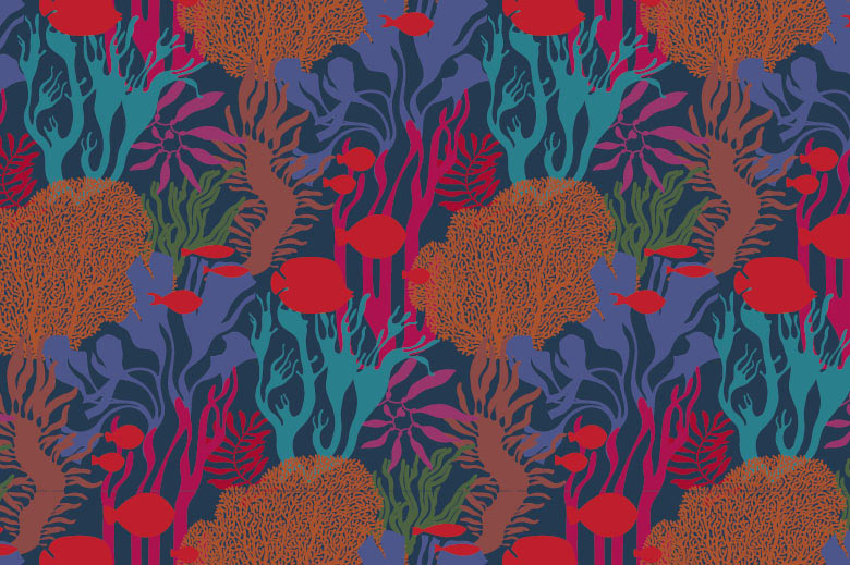
To make it more interesting, drawing a second pattern with fish in the foreground.
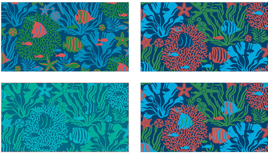
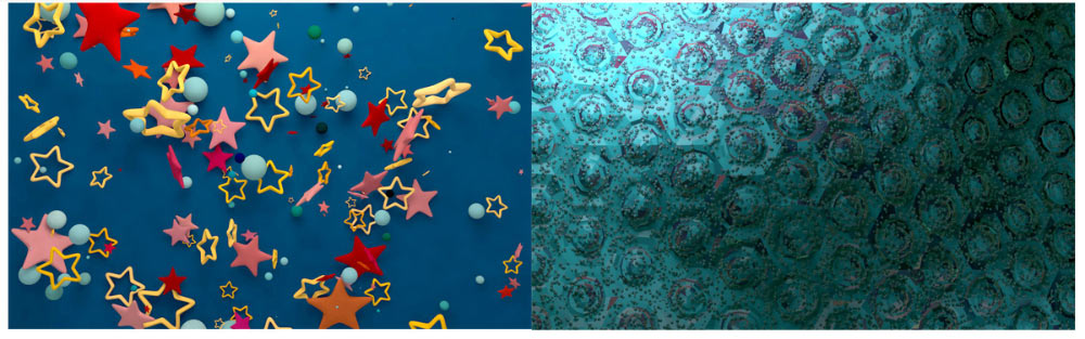
Trying both on storefronts.
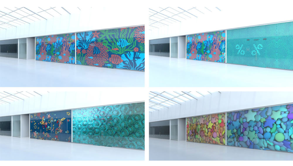
Showing to the client.
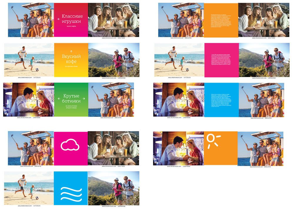
Designing bright banners with interesting facts about brands and products, navigation elements and minimalist graphics.
The art director approves the navigation elements.
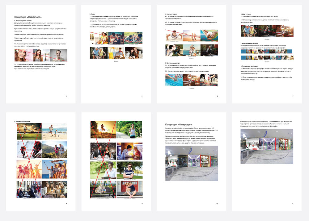
Putting everything together to create a presentation. Adding a guideline on selecting and placing stock photos. Describing recommended subjects as well as technical and composition nuances. Providing examples.
Showing to the client. The design is approved. Retypesetting the navigation, choosing arrows, location of text and the tenant logo. Searching for suitable colors.
Everything looks good. Preparing files for printing.
Khorosho! shopping center
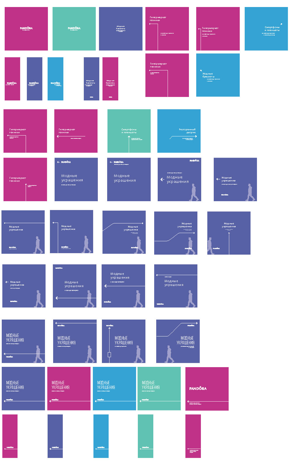
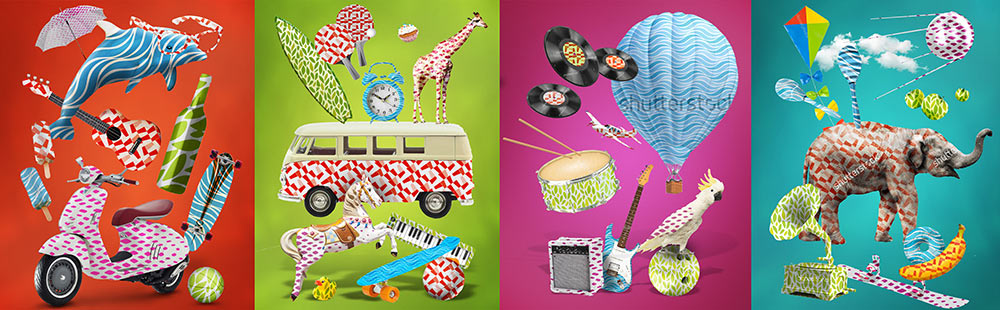
Adapting Oceania concept for a shopping center where each level is divided into zones representing the four elements.
Choosing photos of people in relevant environments.
Coming up with banners to add variety.
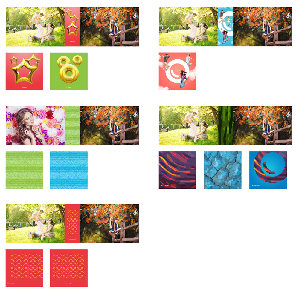
No, we need something more interesting than that. Drawing a pattern that can be used in all four zones. Using subtle details to show the elements.
The pattern is a go. The art director suggests to assemble a composition out of the objects. Using patterns created by the architects of the shopping center.
The result looks interesting. Finalizing the illustration. Adding navigation elements colored in the center’s signature colors to the presentation and demonstrating to the client.
The client rejects the pattern but approves the illustration. Reassembling the composition from scratch, creating a separate illustration for each of the four zones.
Realizing that there are too many elements and that the designs have to be more simple. Reassembling again. Retouching.


Preparing files for printing.
