Mio typeface
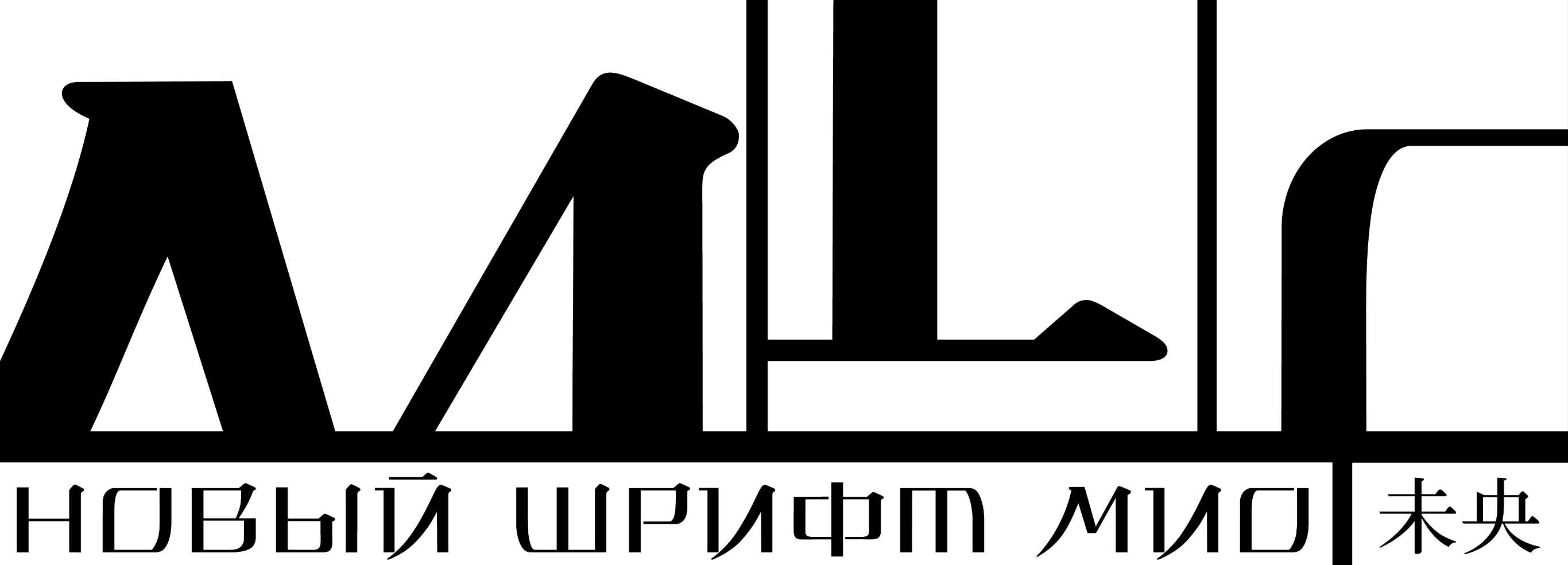
Mio is a display typeface with a clear Japanese character.
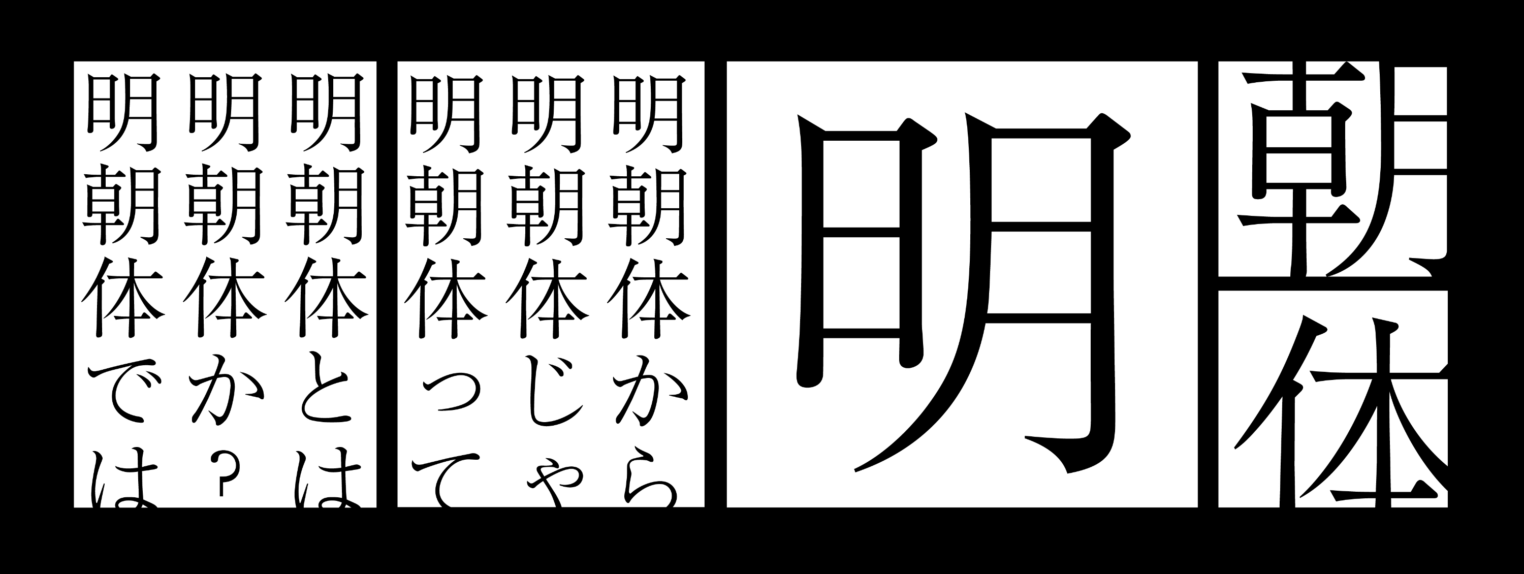
Mio is based on Minchō, a system of strokes that is used to create Japanese hieroglyphs.
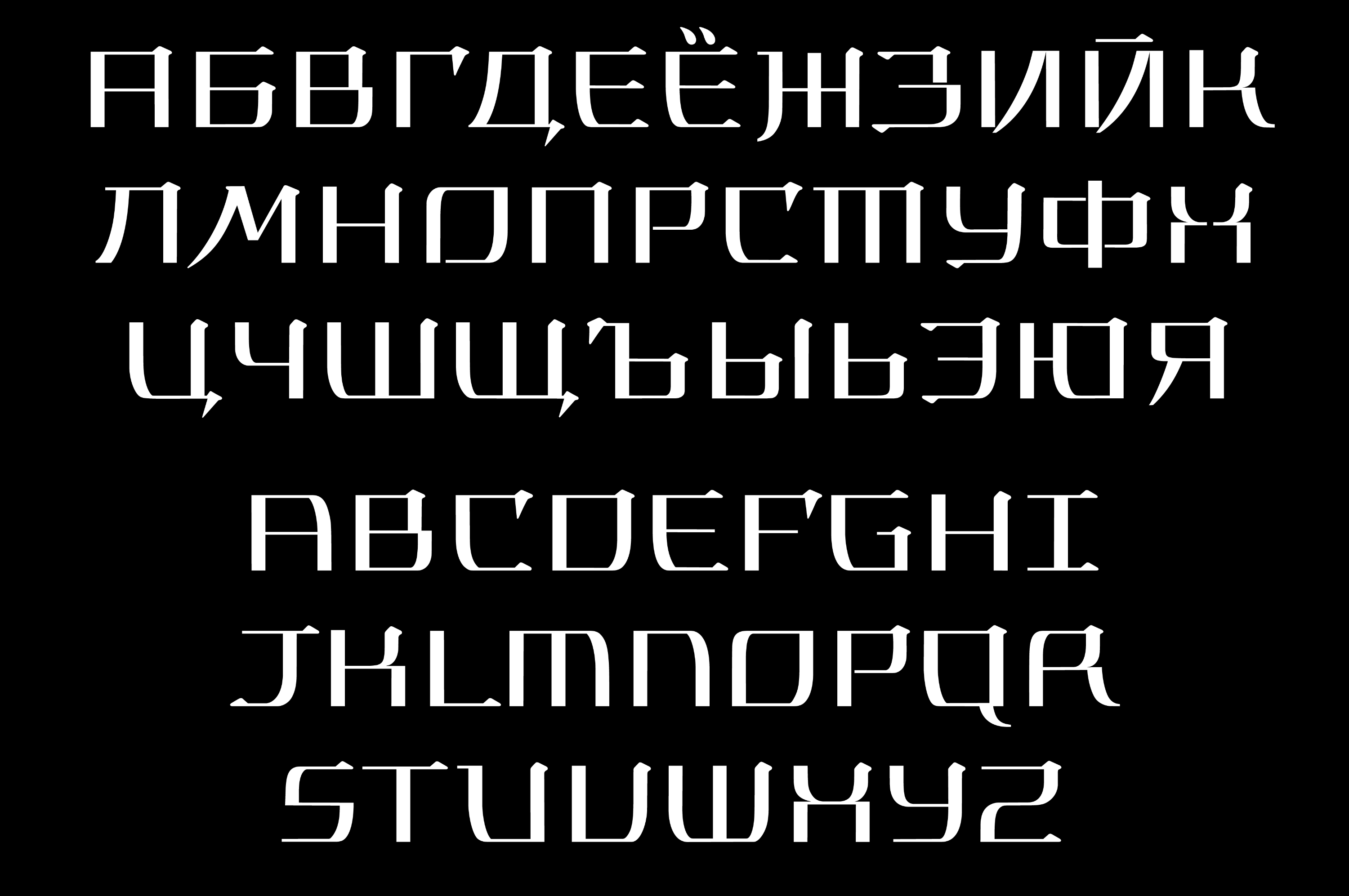
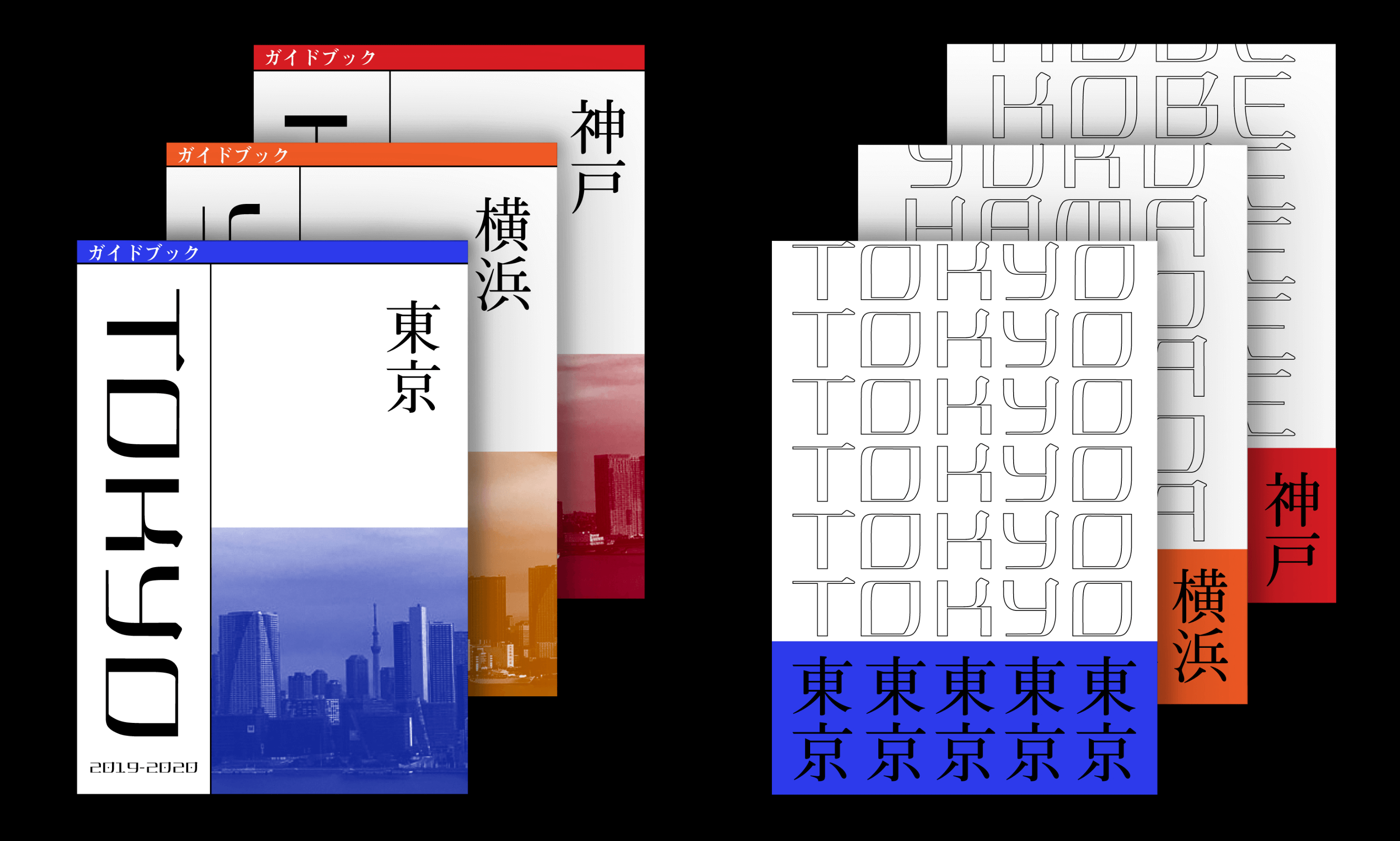
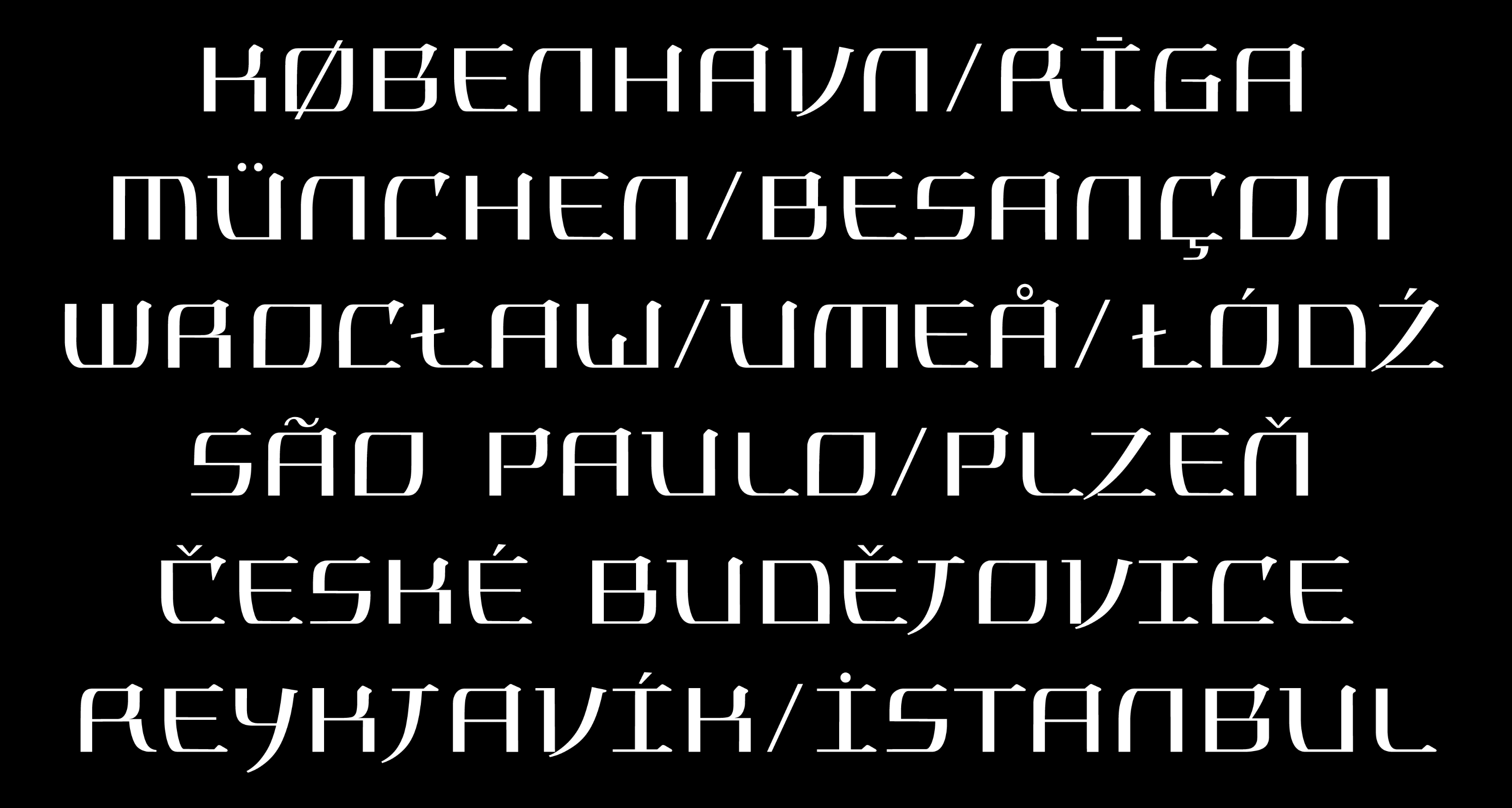
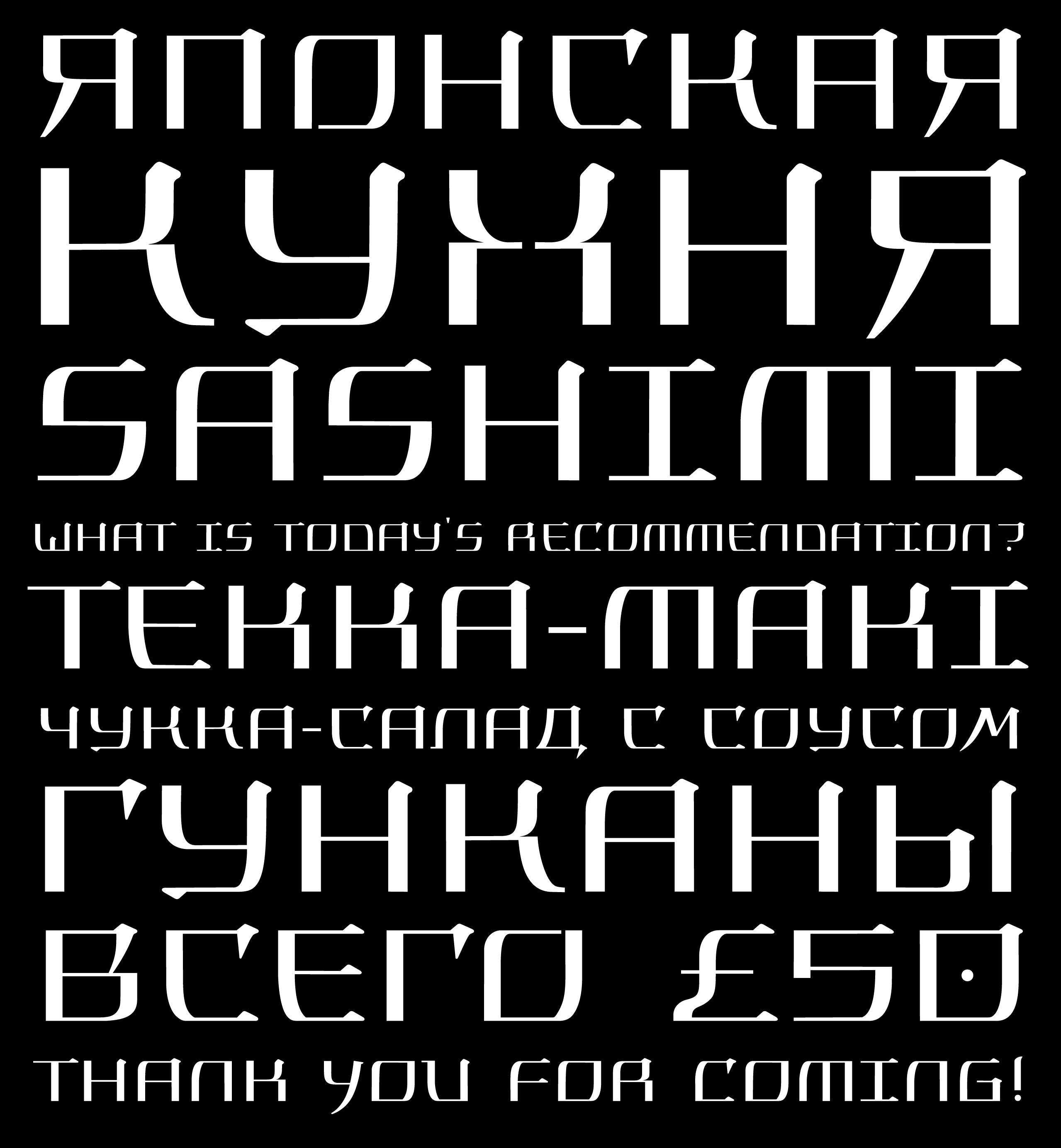
In Mio, elements of the traditional Japanese writing are used to construct Latin and Cyrillic characters.
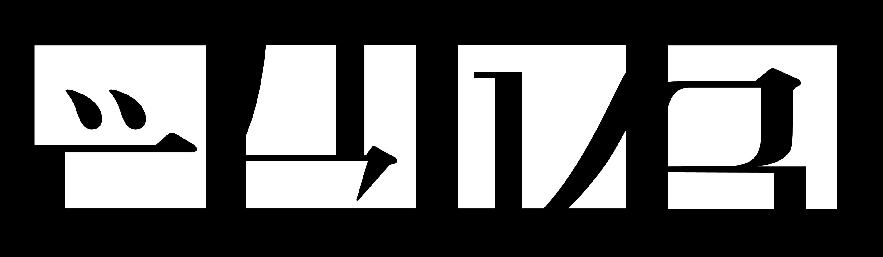
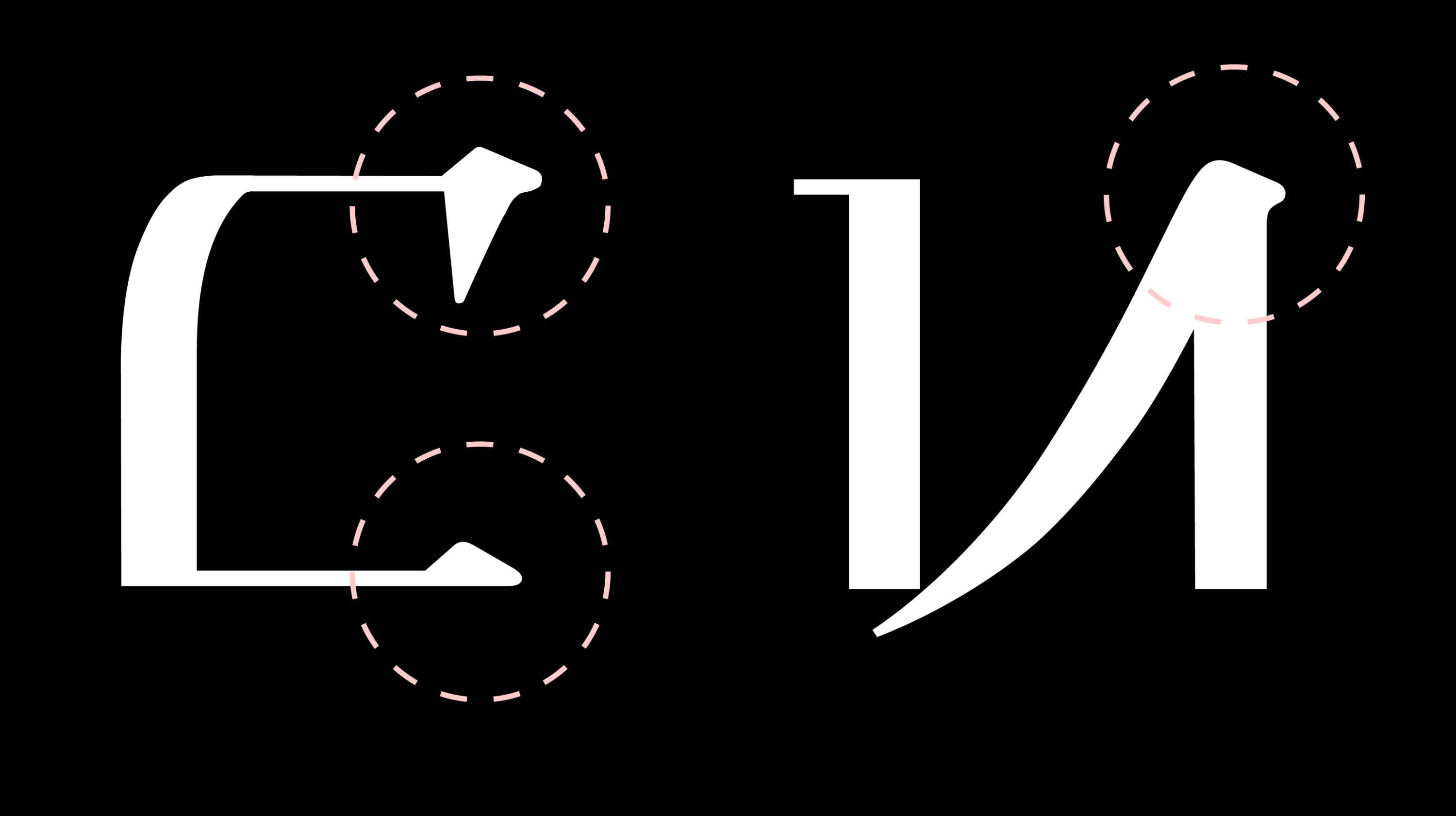
Graphemes in Mio do not follow the traditional logic: the usual rhymes of elements in letters are absent, their place is taken by other, unexpected, pairings. The typeface has an excessive set of elements so that different ones can play the same role. An example of this is the letter C that employs both triangle and nail serifs. The blade-like diagonal element used in the letter И is especially characteristic.
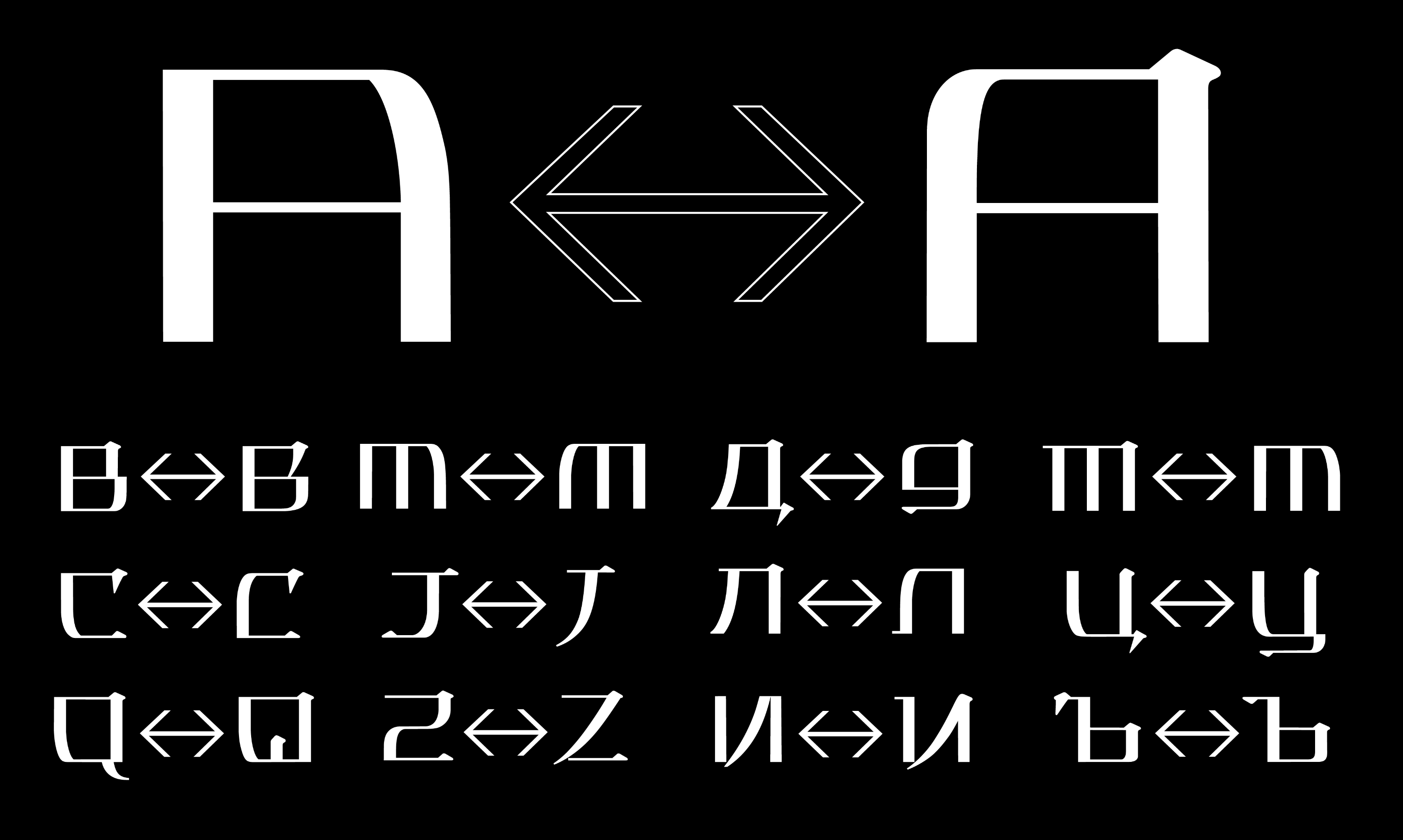
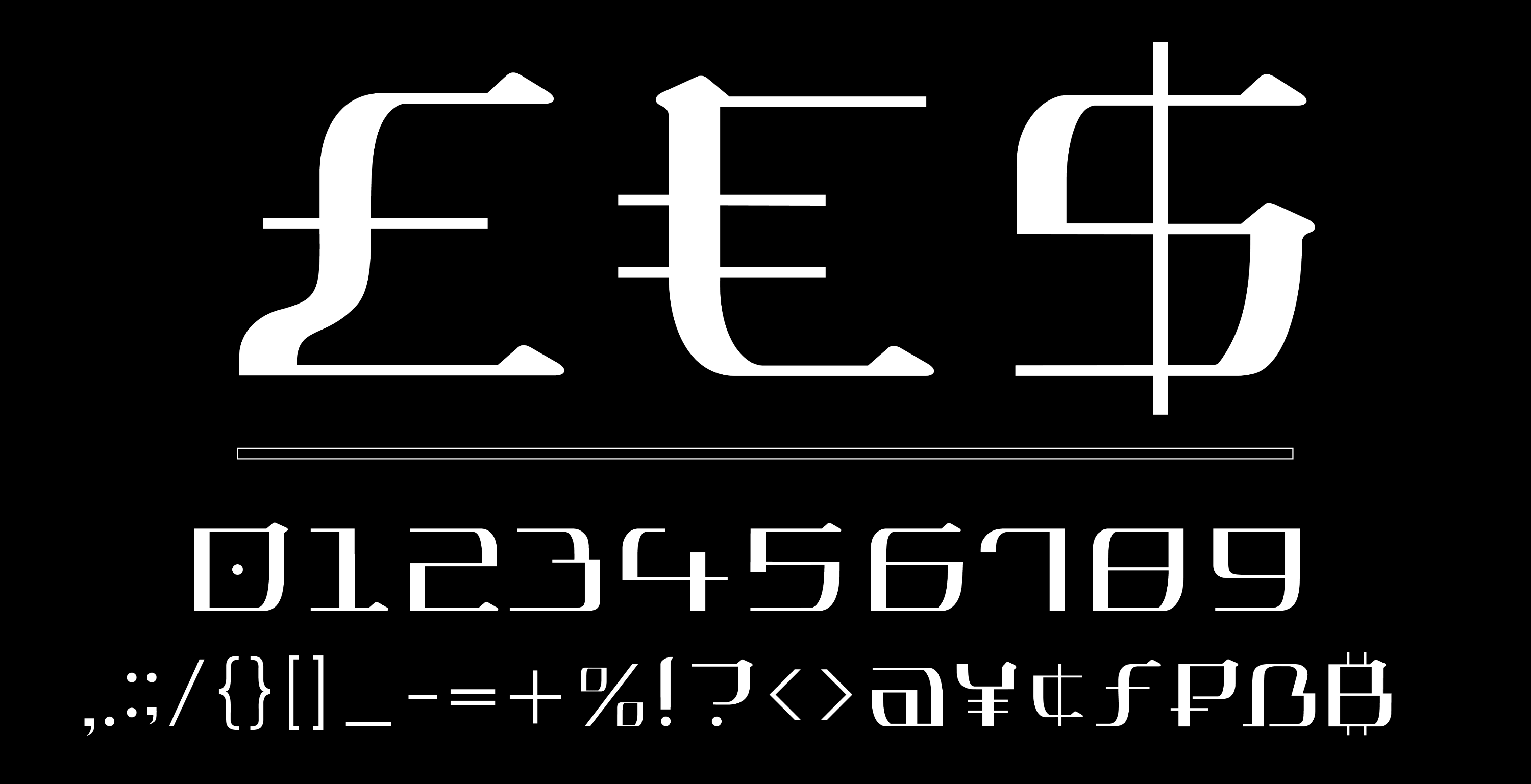
Instead of lowercase letters, Mio has another set of uppercase characters with a different style.
Mio blends together European and Asian traditions. In the minimalist Japanese writing few elements are used to create an endless variety of hieroglyphs. In Mio, a variety of elements is used to create a small set of letters making them ornamental and complex, as is often the case in Latin and Cyrillic scripts.
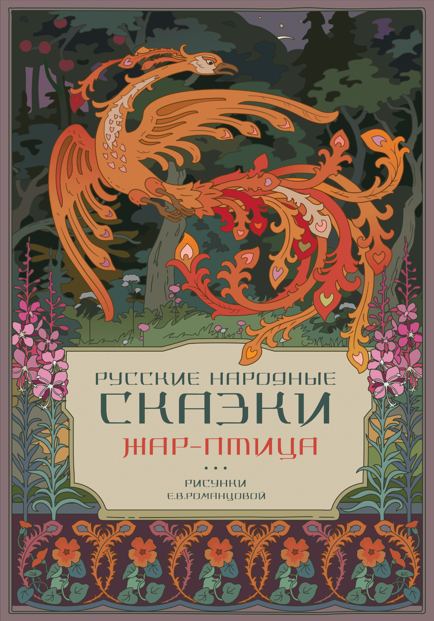
The bright character and shape of the symbols make the typeface suitable for various design purposes and allow to easily combine it with Art Nouveau illustrations.
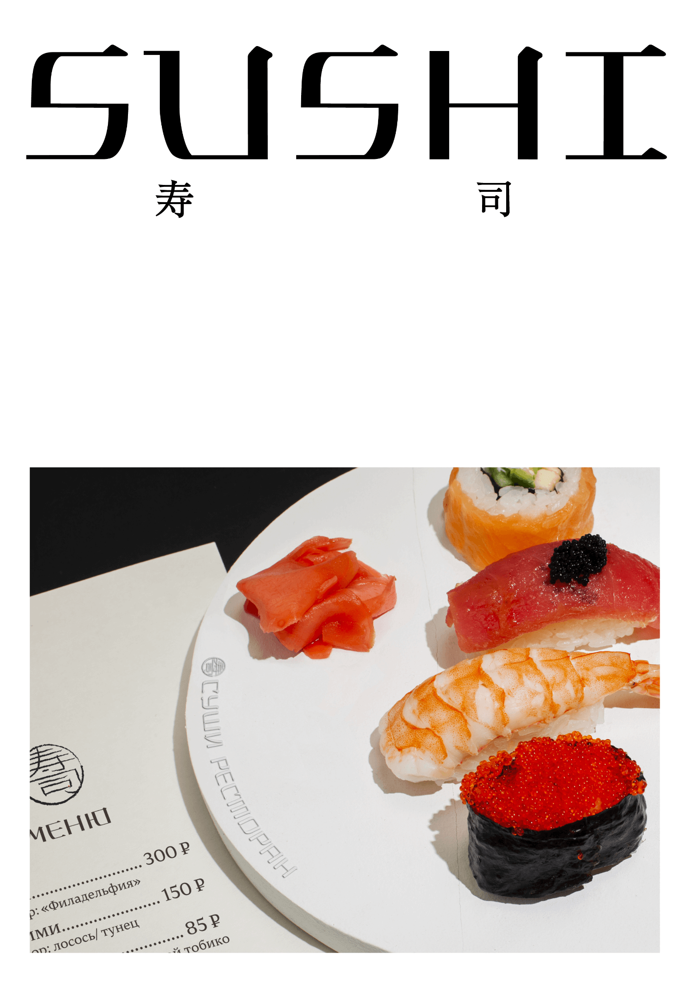
And of course, Mio feels right at home in menus of Japanese restaurants.
art director
secret advisor
- Taisiya Lushenko
