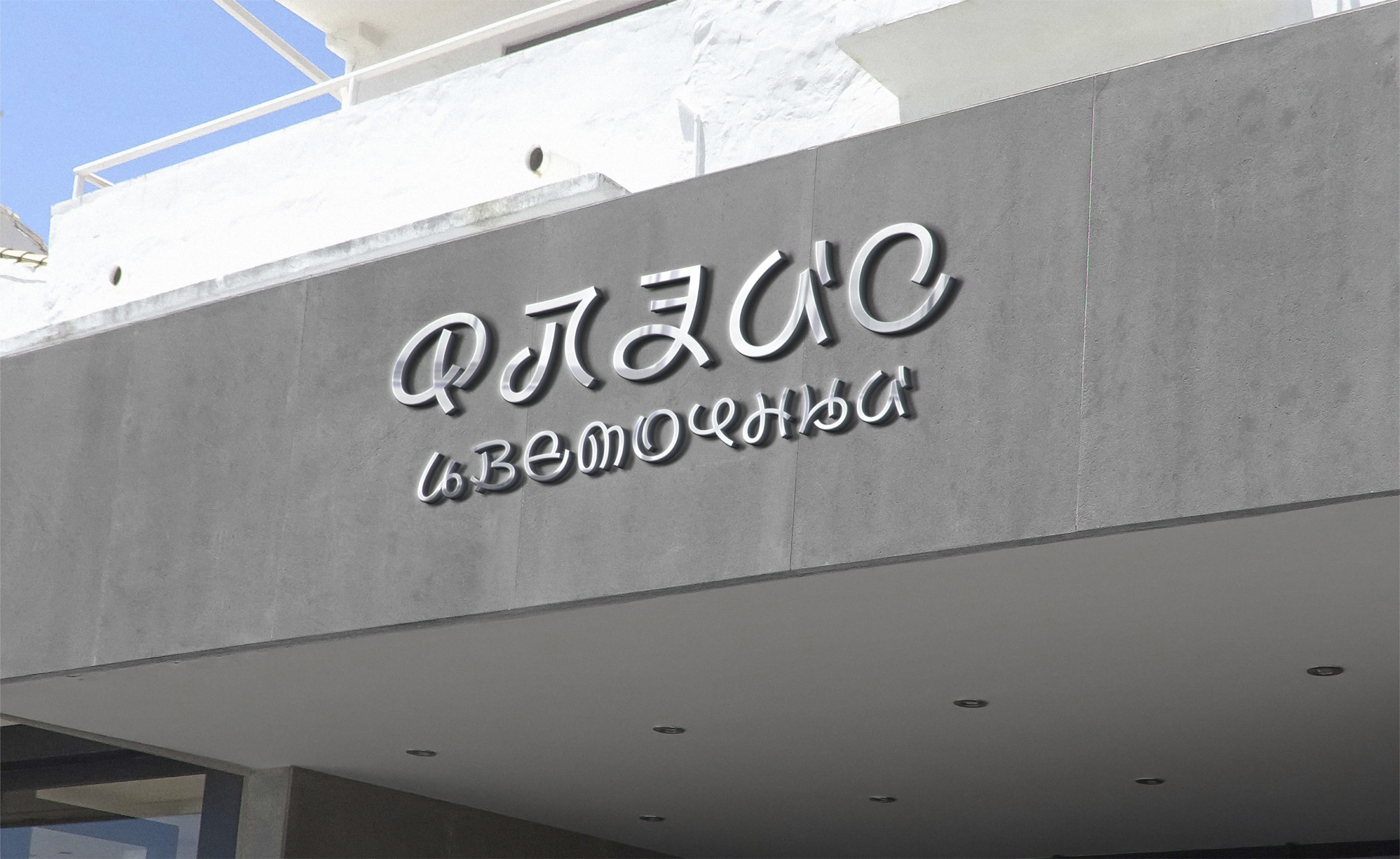
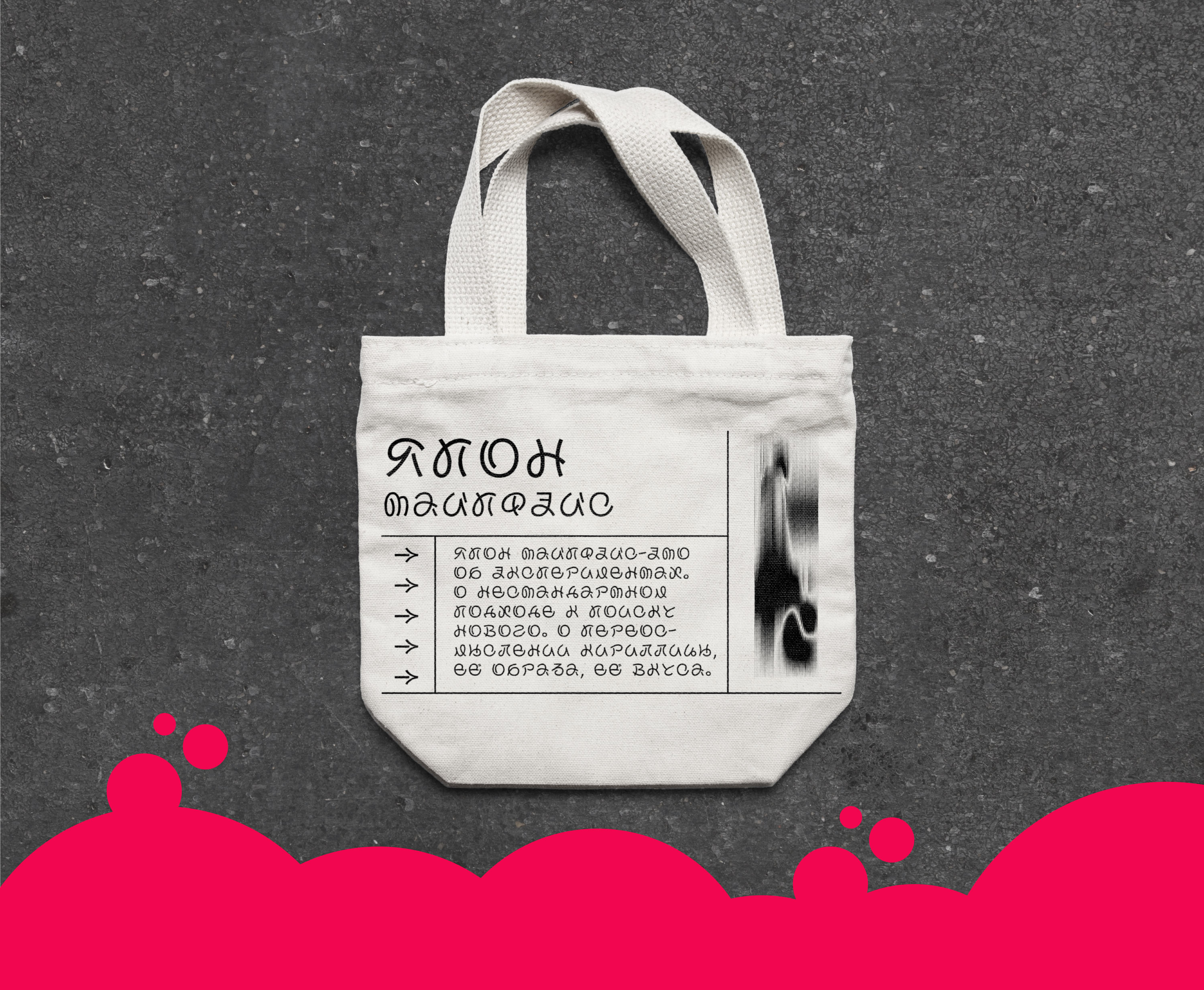
Yapon typeface

The elegant and lightweight Yapon is based on the graphics of the Japanese alphabet, hiragana. Instead of imitating Japanese characters, it elegantly develops them in Cyrillic and Latin letters.

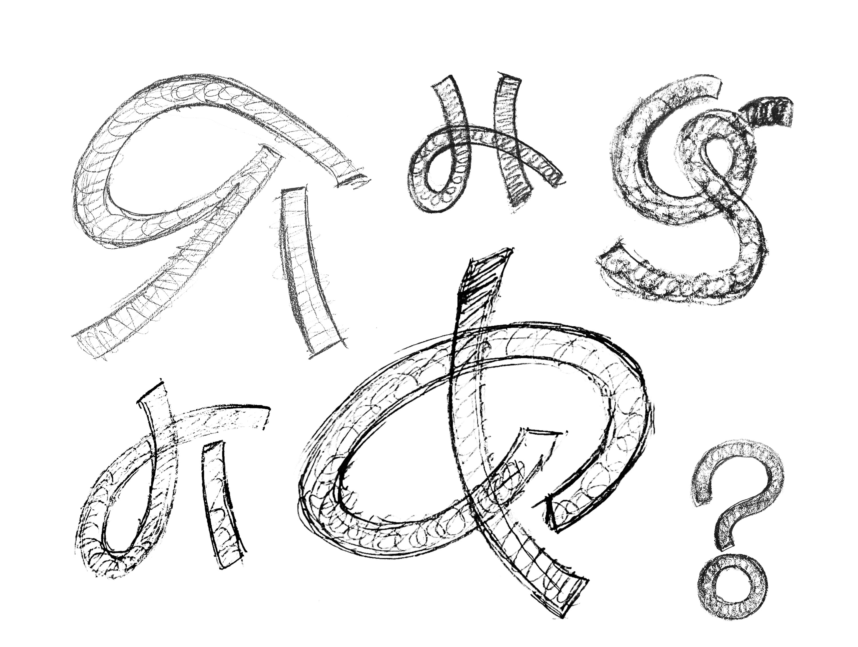
The shape and dynamics of each letter were painstakingly developed by hand.


The upper and lower case have the same height and width, but thanks to the thoughtful drawing of elements they are easily distinguished from each other.

The typeface conveys the refined image of Japanese characters while retaining the recognizable nature of Cyrillic and Latin letters.


All shapes have been preserved, making the letters easy to read

The glyphs are inscribed in a square, just like Japanese characters

Hiragana is embedded into the skeleton of the letters, allowing them to approach the source of inspiration as close as possible without mimicking it


The oriental mood is enhanced by the identical em-square and equal sidebearing, a deliberate move that matches the rhythm of Cyrillic and Latin scripts with hiragana.