The logo needs restyling. The old one combines a volleyball, a net and the colors of the Russian flag. Deciding to keep these components and play with the style.
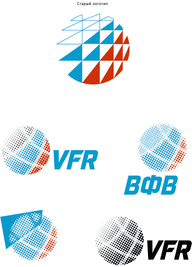
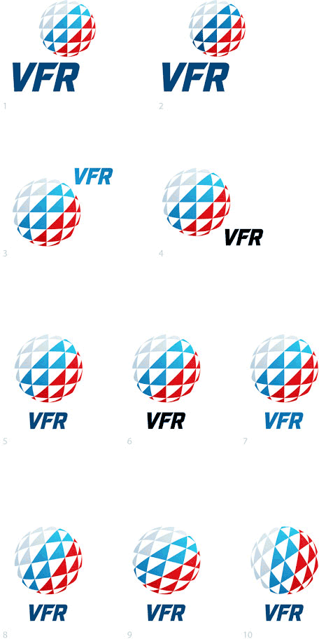
Simultaneously working with the text part of the logo. We need to make the letters more modern without changing their character. The new typeface has distinct expressive features: the slanted connections of main and secondary lines in the characters that work well with the logo.
Making the drafts. The art director chooses one of the variants.
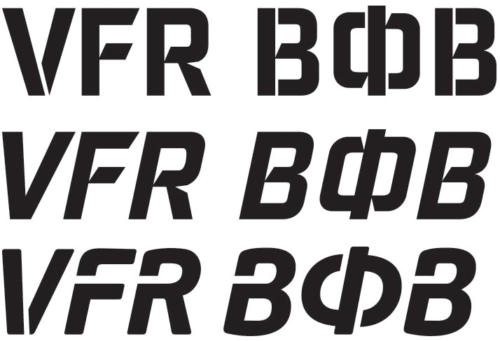
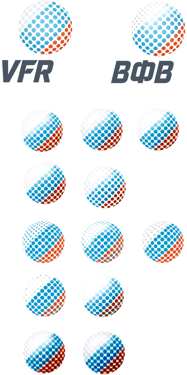
Now we need to make the letters bolder.
Starting to work on the documents. The first attempt.
Giving the task to another designer. The second attempt.
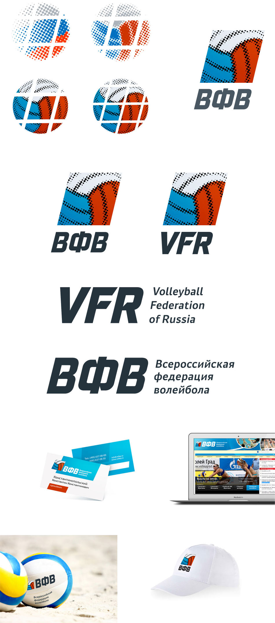
The client doesn’t like the result, thinking some more.
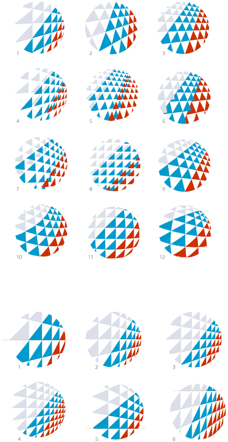
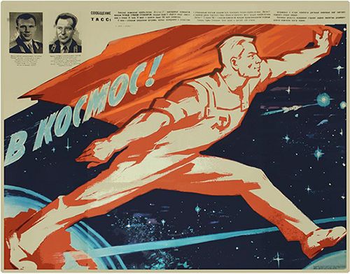
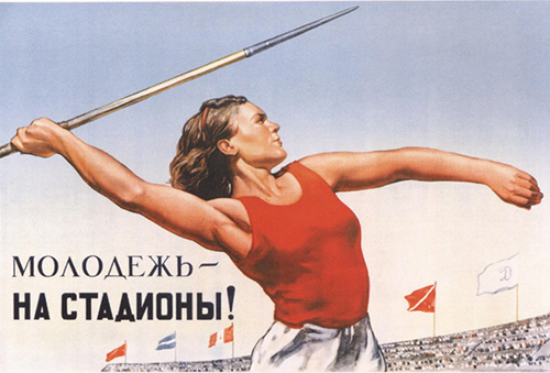
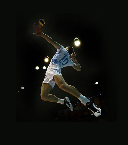
Designer: In the style I want to express the spirit of striving for victory, the dynamics of an athletic body. Soviet poster art has been very successful in doing this, which allowed me to use it for inspiration.
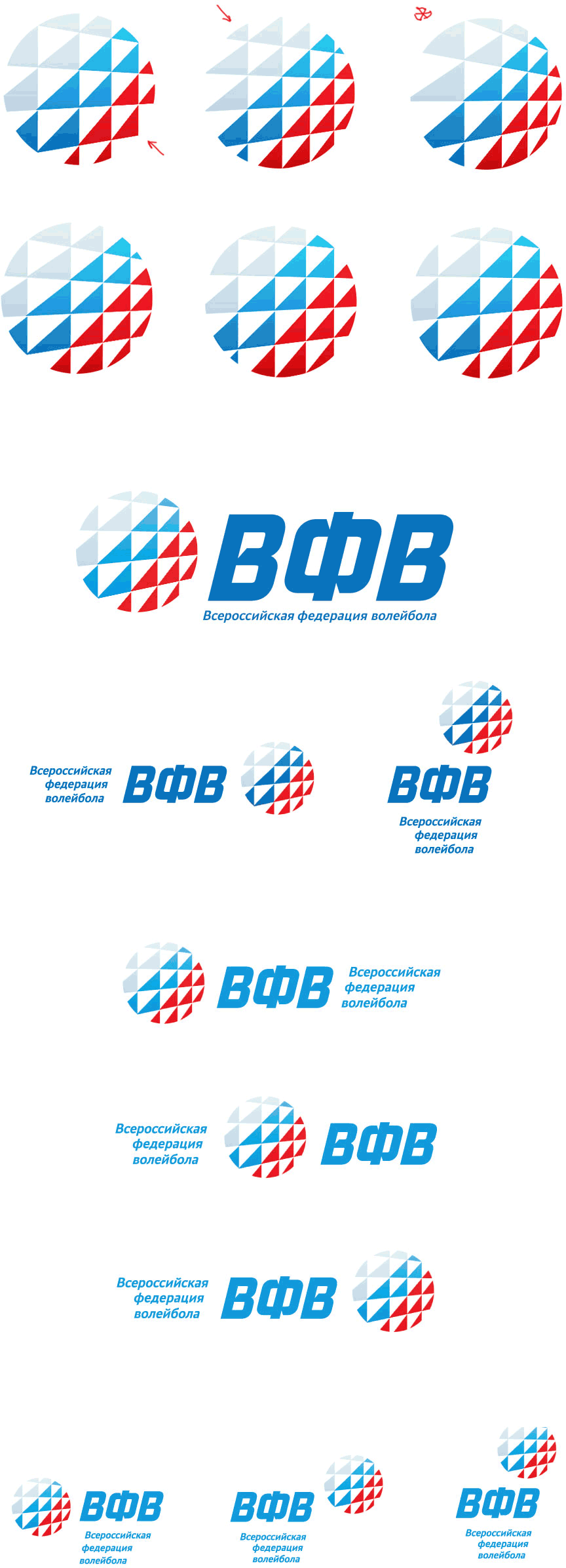
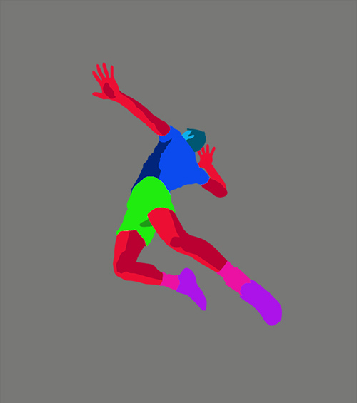
At the same time, we want to underline the contemporary outlook by drawing it in the trendy low-poly style.
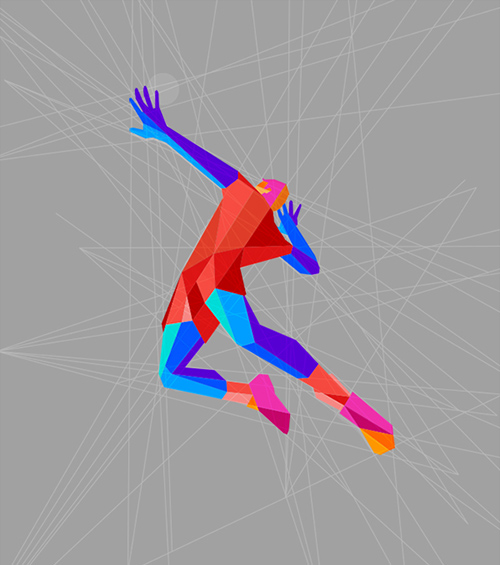
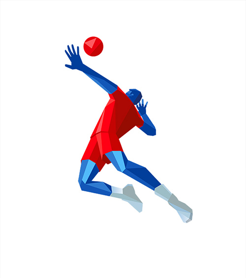
Showing to the art director with a note “It’s not Krishna, it’s the Russian flag.”
Art director: OK.
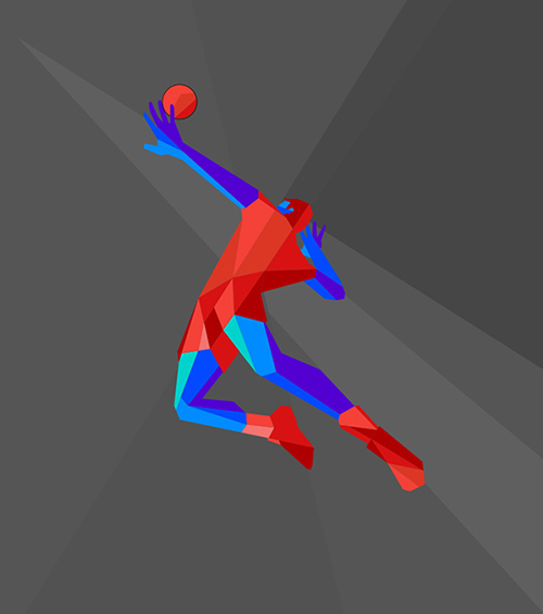
Drawing the second figure in the same technique. Using the famous volleyball player Yekaterina Gamova-Mukasey as a model.

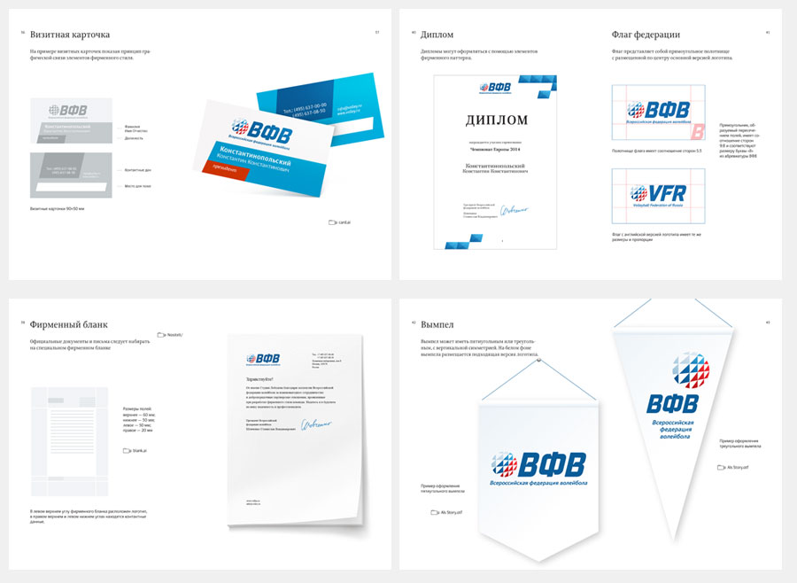
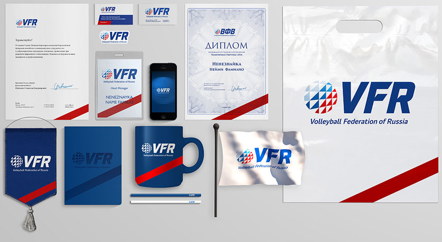
Including the new elements into the corporate identity.
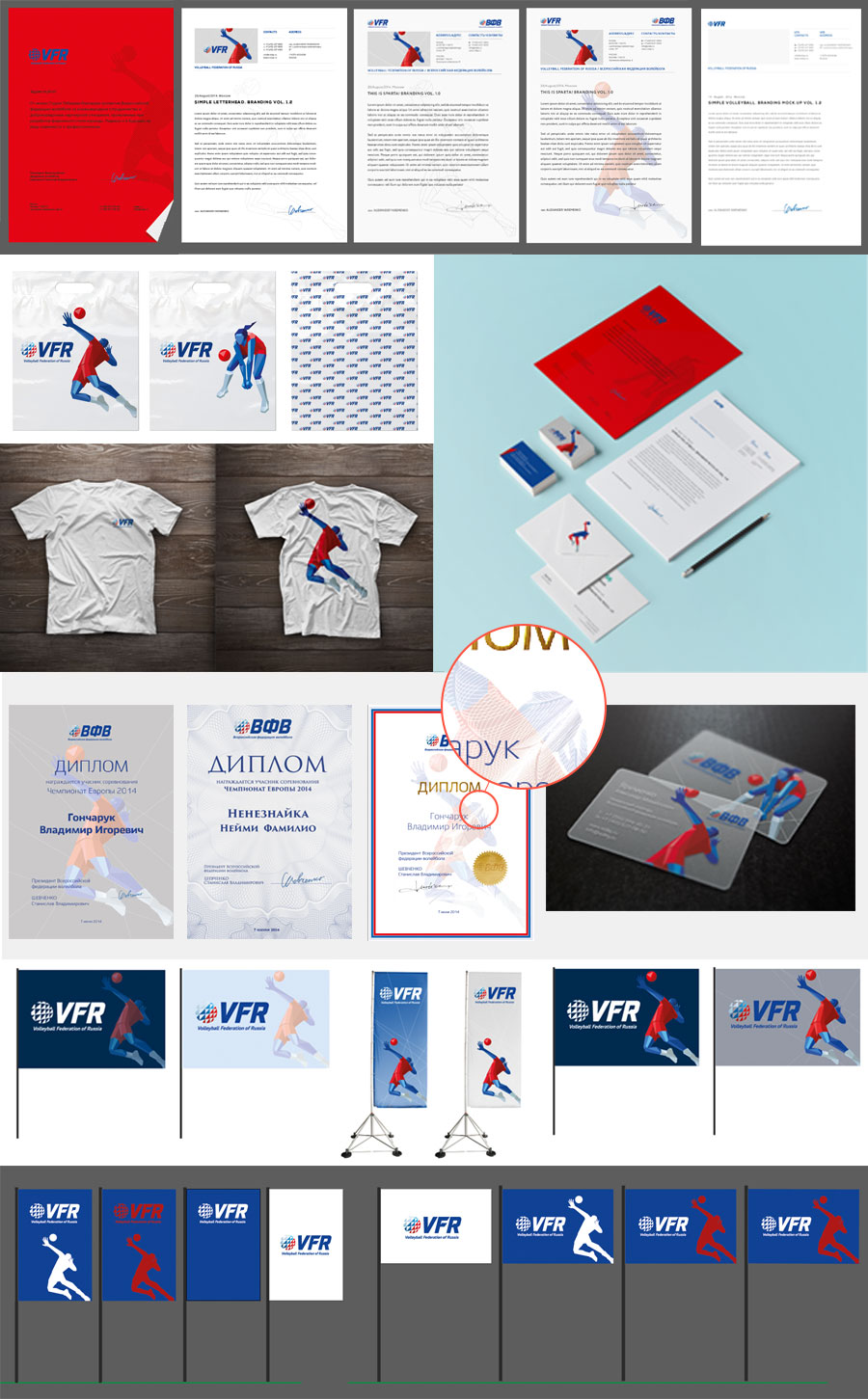
Art director: OK.
Client: OK.
Finalizing the business cards source files to allow printing on plastic, assembling the brand book.
