Identity   Cars   Packaging  

Yakitoriya logo and corporate identity

Overview   Process   Real Life   Awards  

Task: to develop a logo and a corporate identity for a network of Japanese cuisine restaurants.

Yakitoriya is a network of Japanese cuisine restaurants that is part of Vesta Center International, Russia’s largest restaurant holding. The first restaurant opened in Russia in 1999 and the corporate style remained unchanged since then. To mark the fifteenth anniversary of the company, a graphic logo and a lively corporate identity were developed at the studio.
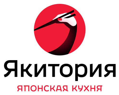

yakitoriya logo ru
yakitoriya logo en
Russian and English logos

The sign combines three expressive symbols: a hand holding chopsticks, a Japanese crane and the rising sun.

Release date: September 11 2014

Cast:

artistic director
art director
designer
type designer
typesetter
editor
project manager
yakitoriya logo parts

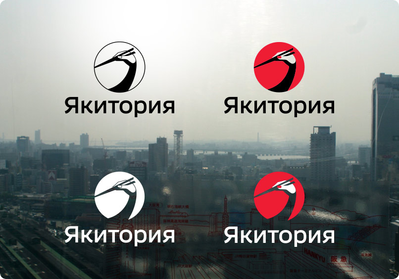
A number of alternative designs are provided for use in different situations.

yakitoriya logo transparent
Monochrome and color logos, including versions with transparent segments

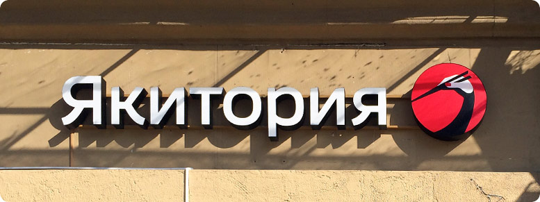
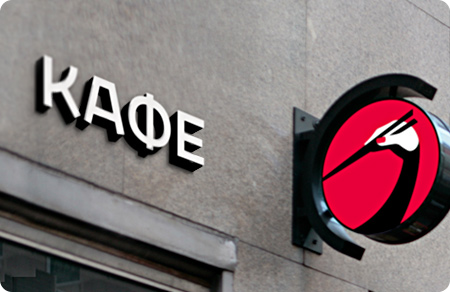
There is also a horizontal version of the logo that looks especially well on the sign which adheres to the strict rules of the Moscow city design code.

yakitoriya logo facade
Refreshed design
yakitoriya logo facades old
Previous signs exceeded the regulated height of 50 cm (20″)

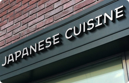
Additionally, text signs for decorating façades of the restaurants in Russia and in English-speaking countries were also developed.

yakitoriya logo sign 01
 
yakitoriya logo sign 02
yakitoriya logo sign 03

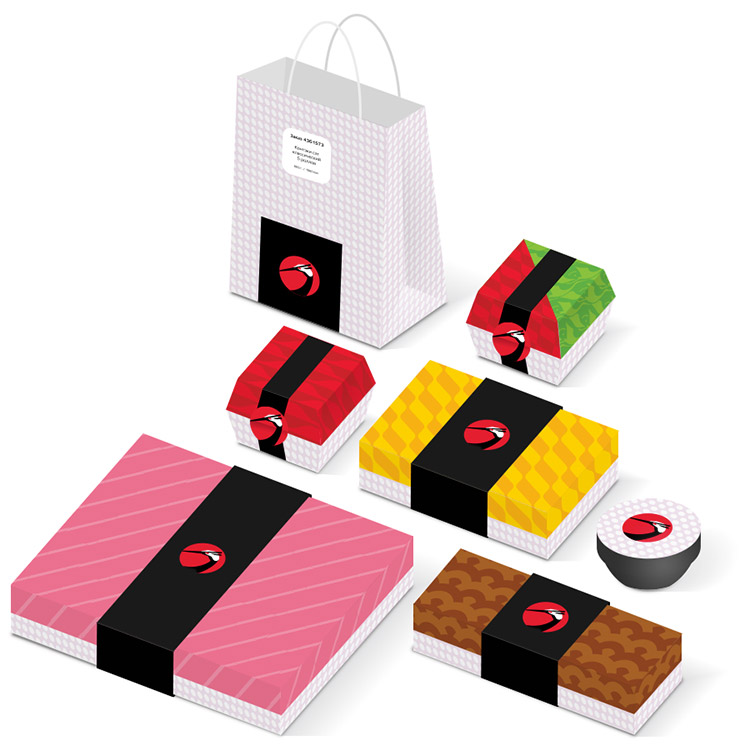
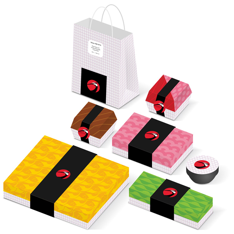
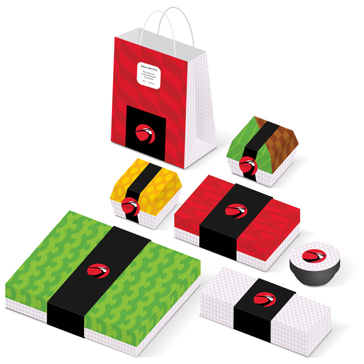
Simple and bright geometric patterns were created for various purposes.


Example of packaging design


yakitoriya logo sticks
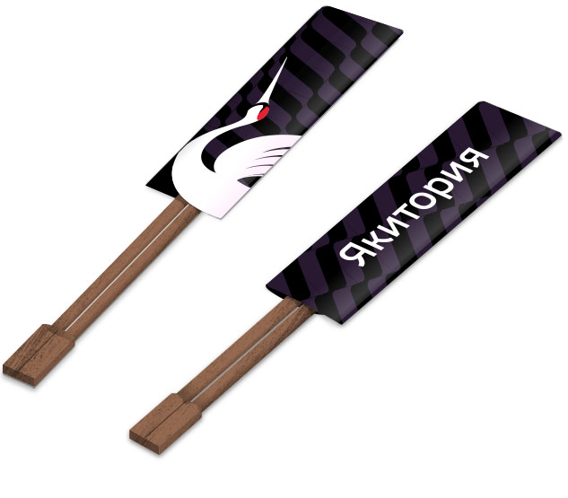
Chopstick envelopes

Wrapping paper

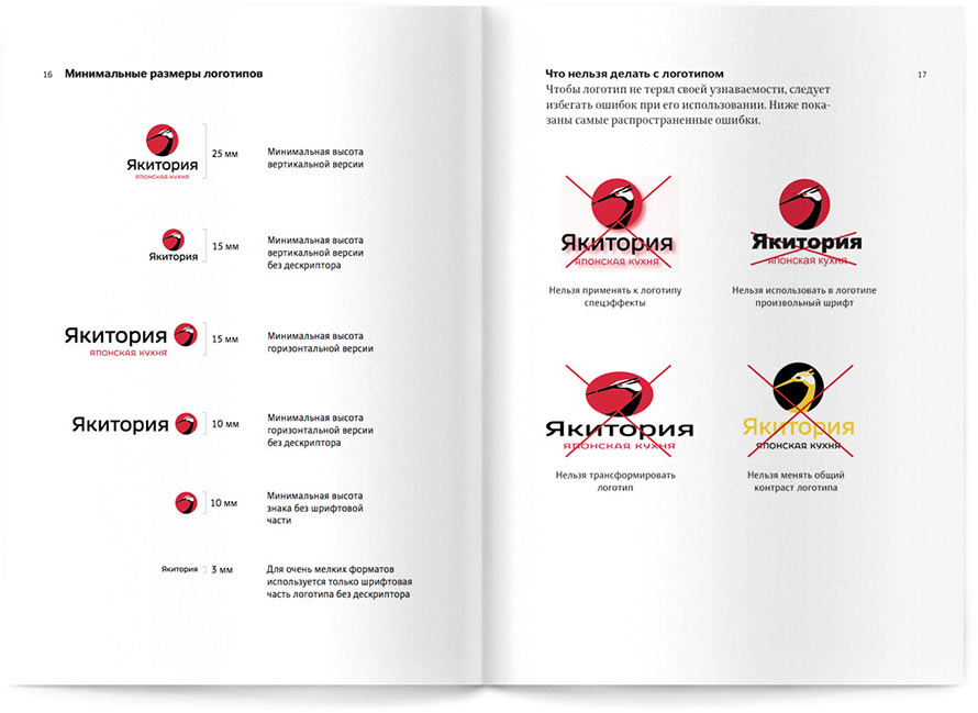
Rules for using the logo and the elements of the corporate identity are given in a brief guide.

yakitoriya logo bb sizes
Opening on the minimal sizes and unacceptable use of the logo
yakitoriya logo bb prints
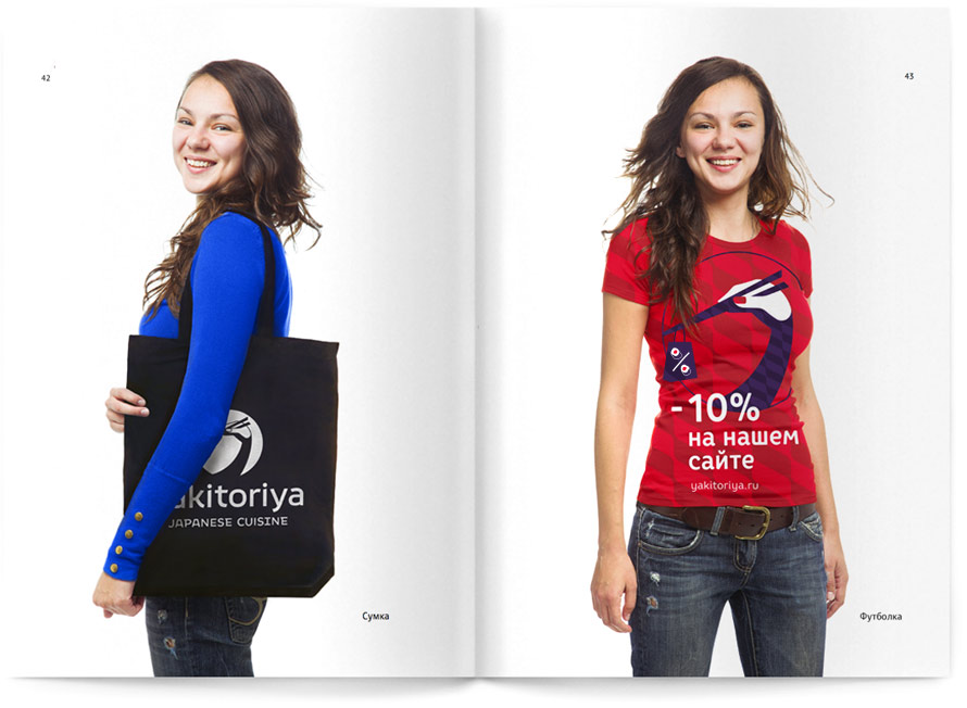
Opening on corporate souvenirs

Order a design...