Identity Advertising
The making of the logo and corporate identity for the Year of Culture in Russia
Overview Process
We want to make something simple, modern, cool and communicative. Simply letter K, a flag, a window, openness, happiness, light—all that.
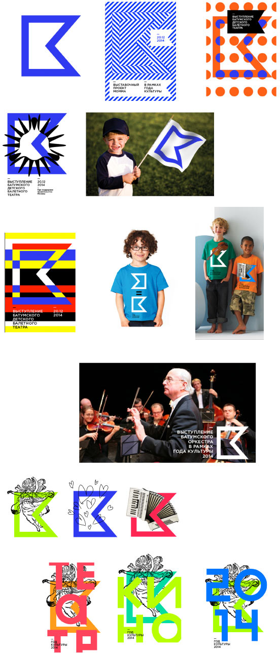
The art director says we have too much of letters K and flags already. We need something else.
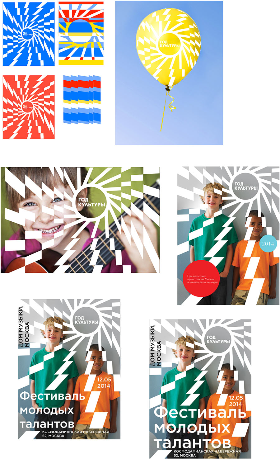
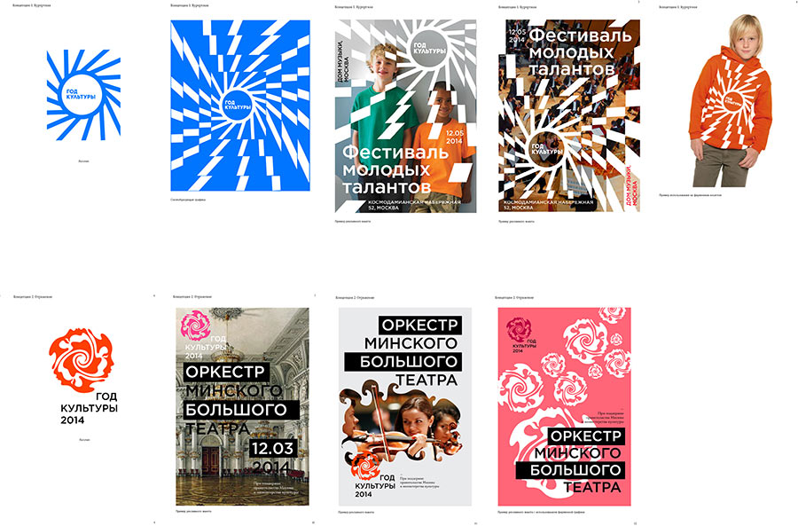
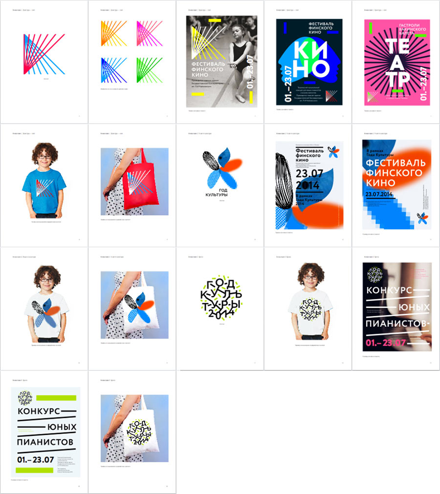
Thinking further we get the idea that culture is light. Sun beams, happiness, Monday—library, Thursday—theater, Saturday—museum, Sunday—walks around the city.
Coming up with a logo.
The art director offers his own vision.
Developing it into a style.
Assembling presentations.
Client: Neither of the concepts were approved by our management. One is too daring and aggressive, the other one is too soft and vague. Meaning, both of them are at the extremes. Maybe you could try finding the golden mean? Work with the idea of “reconsidering the role of culture in everyday life?” That is, how culture is transformed, how more and more we can use culture to transform something, etc.
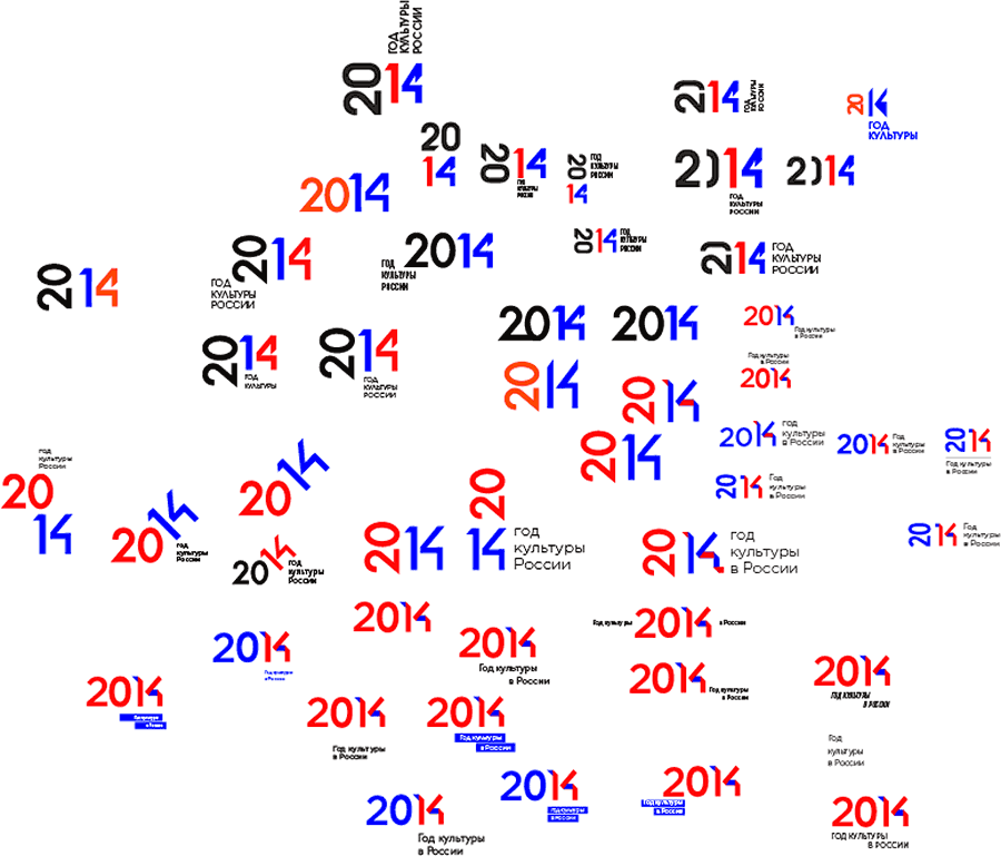
We get the idea of a typographic solution.
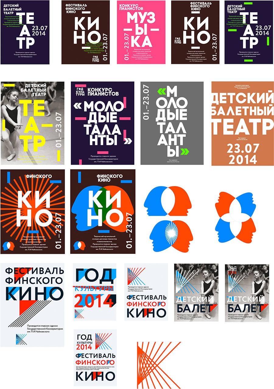
Or here is a sign: letter K made of beams. Let’s lay it aside for a while.
Another option with a tree crown.
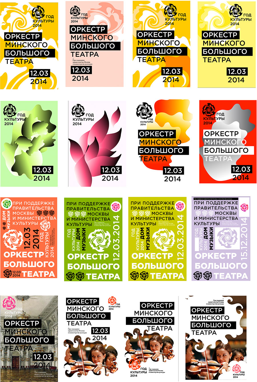
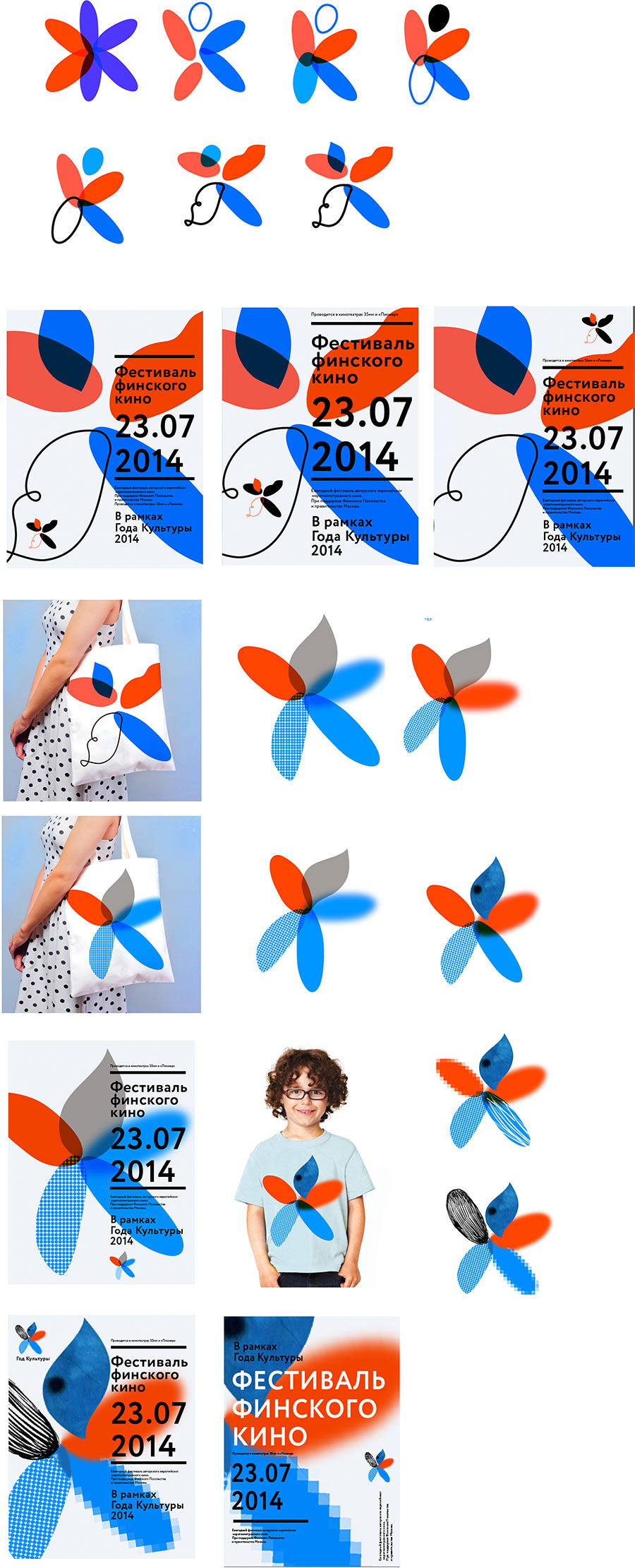
And another more abstract alternative—a flower made of different kinds of culture and art.
Assembling a presentation.
The client changes the direction of thought. This time, national identity becomes the priority. The humanitarian approach fades into the background.
Client: First of all, the logo has to be stately, it has to promote the Year of Culture both in Russia and abroad. And all your ideas will better suit some festival. We need to see the colors of the Russian flag, we need it to be evident that the state cares about the culture of its citizens.
Well, no means no. Back to the drawing board.
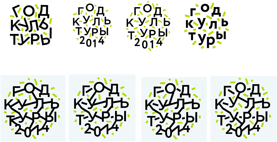
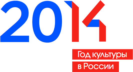
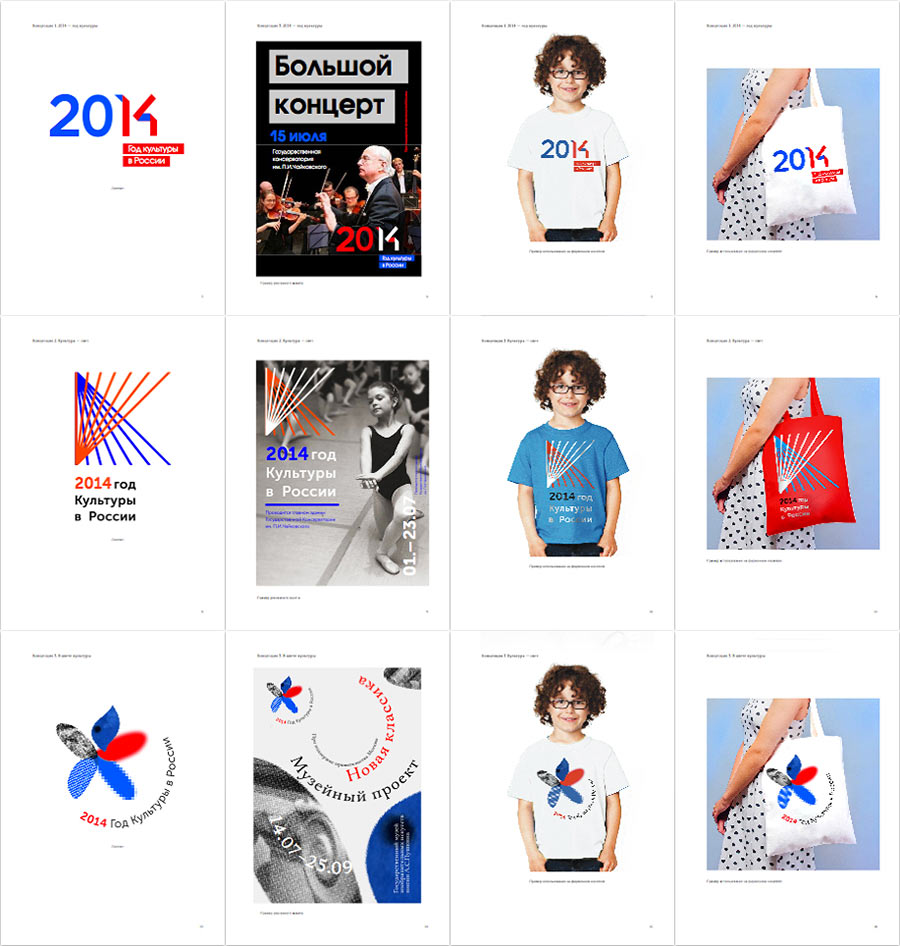
Suddenly, it all clicks together. It comes out really cool, to say the least. It’s all here: the year 2014, the letter K, the ribbons, the sign, the red-white-blue. And we even like it ourselves.
Polishing the flower and the letter.
Happily assembling it all together and presenting to the client.
Client: The logo has to be very universal, simple, modern and popular, understandable both by a grandma and a student. What you have is too hip.
Trying again, this time taking the flag colors and using the constructivist approach.
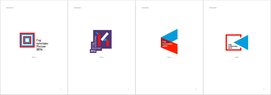
Client: Not enough statehood. We don’t like it.
We don’t give up that easily—bringing in the best designers.
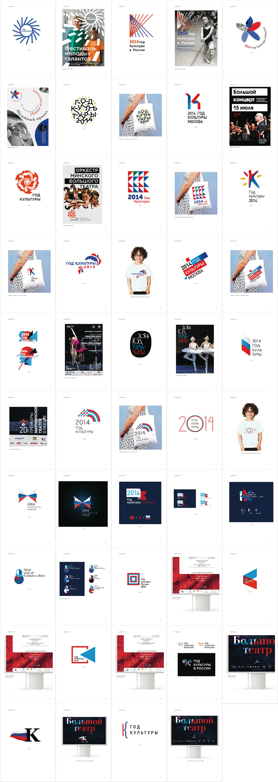
The client picks the one with the bars.
Trying out the style elements and typesetting the style guide.
Culture makes life exciting!
