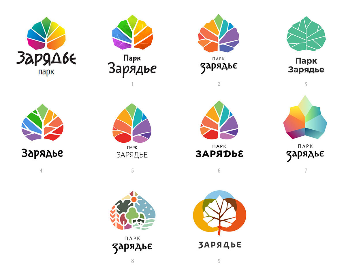
Learning that a contest for a logo for a mega park will start soon. Inviting several designers, sketching ideas.
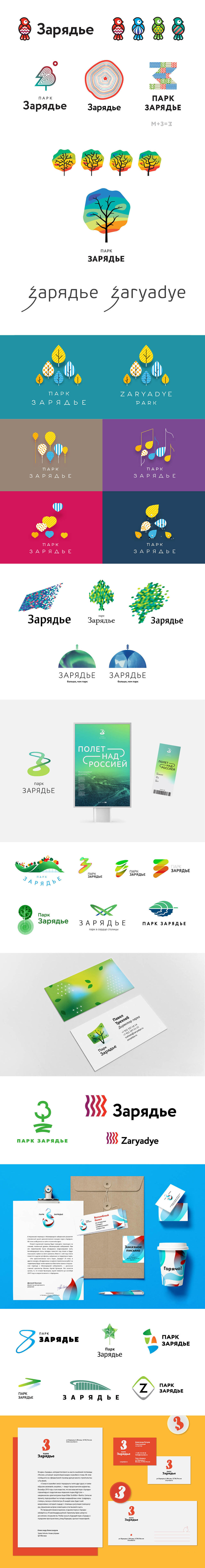
Fifteen versions get sent to the contest of which one gets shortlisted.
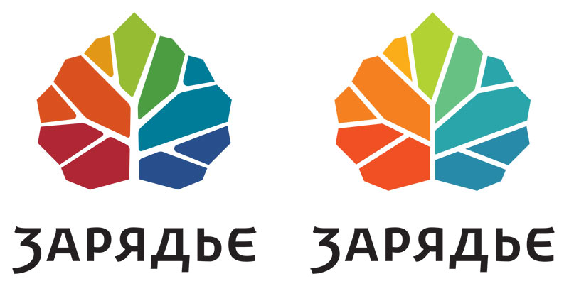
The open voting sees the multi-colored leaf win with a hefty margin. Not letting this disappoint us and joining the fight for the development of the corporate identity.
We start by trying to make the shape of the leaf simpler.
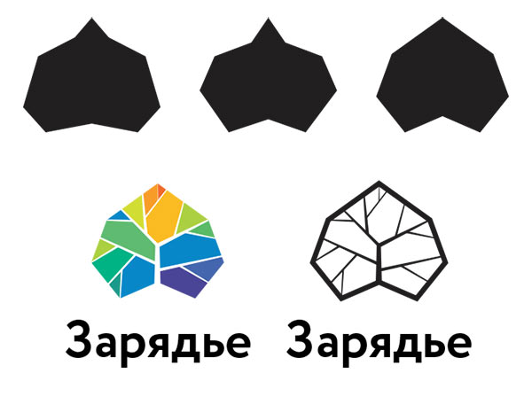
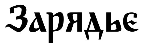
No, doesn’t work. Using a birch or a linden leaf with an uneven edge as the basis. Immediately creating a draft version of the text with a hint of the traditional Russian writing style.
Smoothing out sharp corners, adding several alternative shapes of the logo for use in patterns and souvenir products.
Artistic director: The leaf now looks like an acorn. Plus, the classic Russian flavor in the text can be stronger.
Getting rid of the acorn and coming up with various color sets.
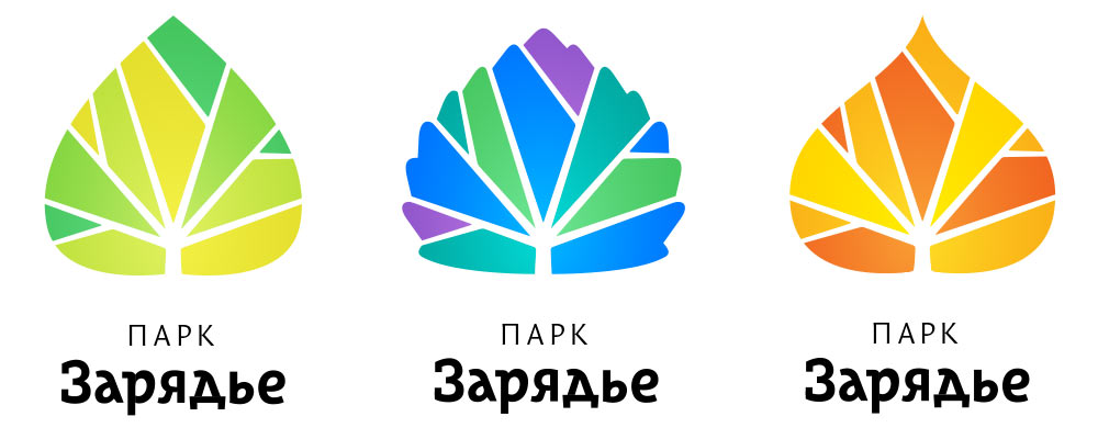
Artistic director: Now it’s a maple leaf. The logo that won the contest was rainbow-colored, don’t try to change it beyond recognition. We just need to make it look good.
Oook. Putting the herbarium away and thinking what to do with the logo.
Too shy.
And this is too much. Sending all sketches to the type designer and continuing to struggle with the logo. Searching for proportions and a more life-like irregular positioning of the branches.
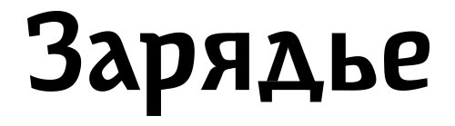
Meanwhile the type designer responds with two versions of the text.
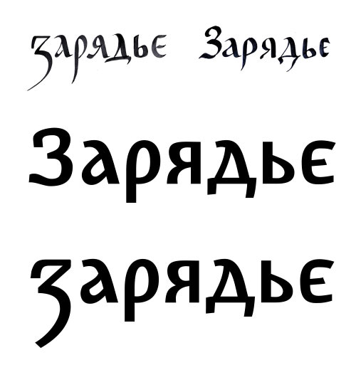
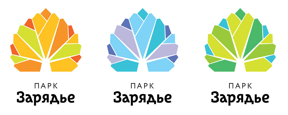
Choosing the design with a more interesting З toning down the excessively open colors in the logo, making the color scheme more complex by introducing new colors, assembling a presentation.
Another designer offers his vision.
Sending both designs to the contest and winning it. Meeting with the client to discuss different ways to improve the logo.
The client chooses the second logo with the text from number 9. Making the leaf outline simpler, cleaning up the branches and toning the colors down even more.
The type designer sends back a more modern version of the text.
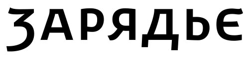
Everything looks OK but the Е looks too much like an Э. Making the top flat.
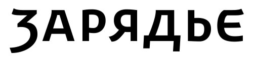
Considering the English version of the logo. The Z needs some interesting feature, too.
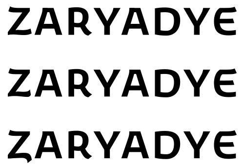
The second design is better but the bend of the tail in Z needs to be stronger.
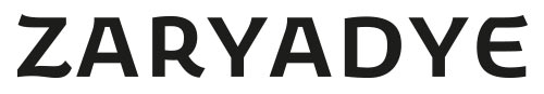
Perfect.
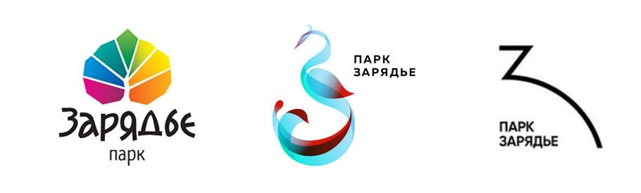
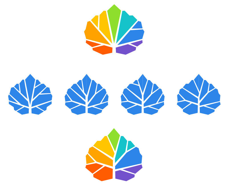
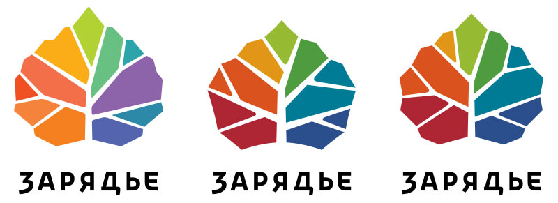
At the end, getting two similar logos that give birth to two concepts.
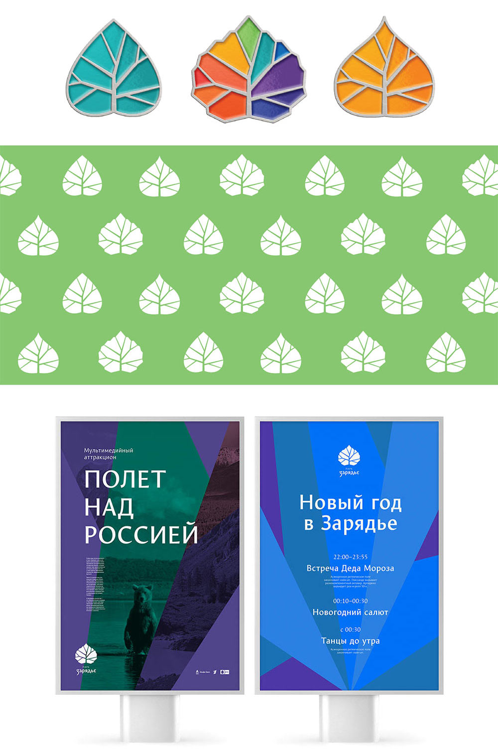
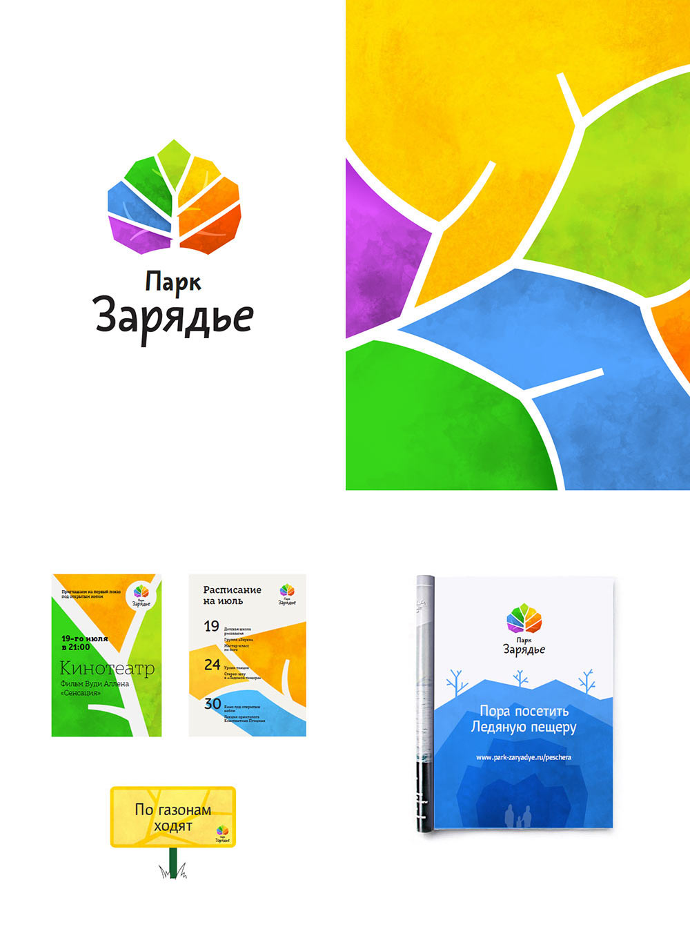
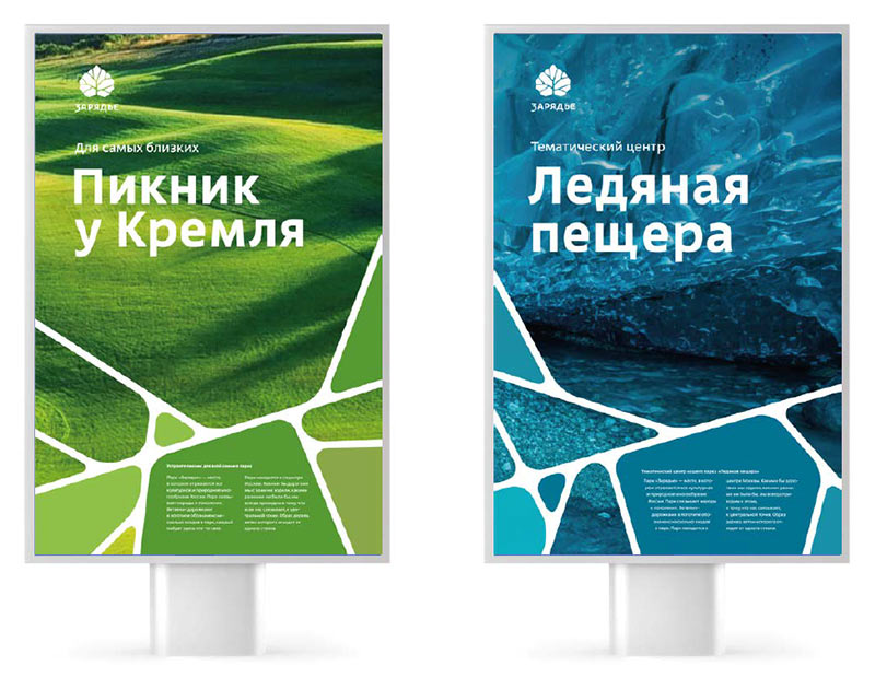
The design with a rounded outline that hints at a silhouette of a hovering bridge develops the theme of park paths. Using it to create patterns that break up every media into zones, similar to the park.
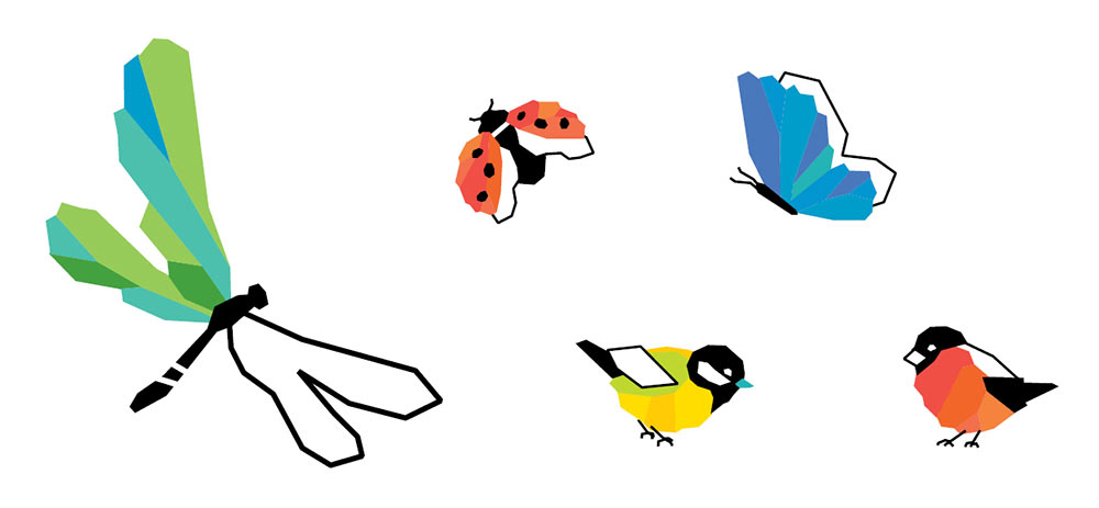
Suggesting to use the birds that appeared earlier as the park’s signature characters.
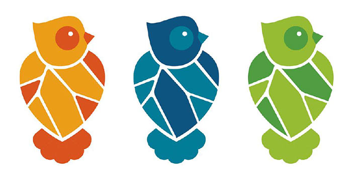
For the second, more geometric design the illustrator draws bold birds and insects.
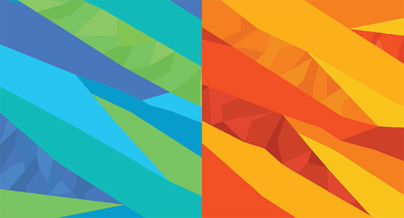
Inspired by them, suggesting polygonal patterns and textures exploring the idea of the park’s multi-faceted future.
The client talks to the authors of the park’s architectural project. The authors say that at the core of the park’s concept is openness and “pathlessness” which means the design with strict paths surely won’t work. The client chooses the second concept but asks to remove the paths from the sign on it too.
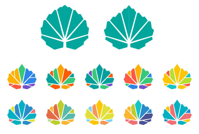
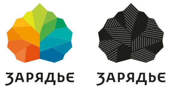
The devil hides in the monochrome version: it’s best not to use veins to distinguish the logo’s elements. The design with multidirectional hatching creates an interesting impression of volume, we need to develop it further.
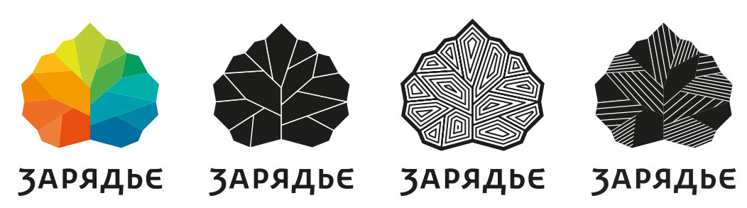
Art director: I doubt we need to use two types of hatching. To avoid creating angles and triangles with the strokes it’s enough to simply place some gaps between them.
Artistic director: Let’s break the leaf’s vertical axis.
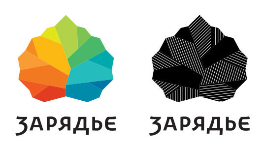
Art director and artistic director: OK.
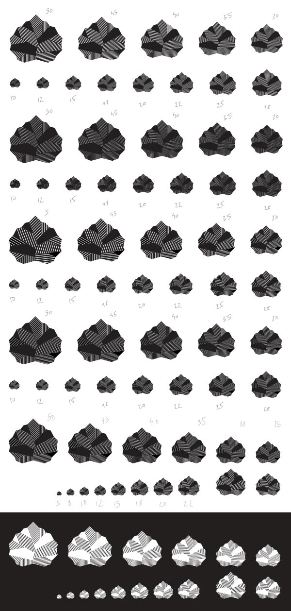
Checking the frequency and width of the strokes several dozen times more, defining minimal sizes for the logos.
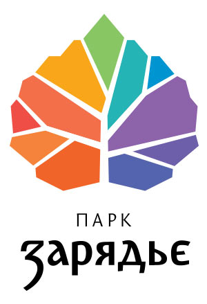
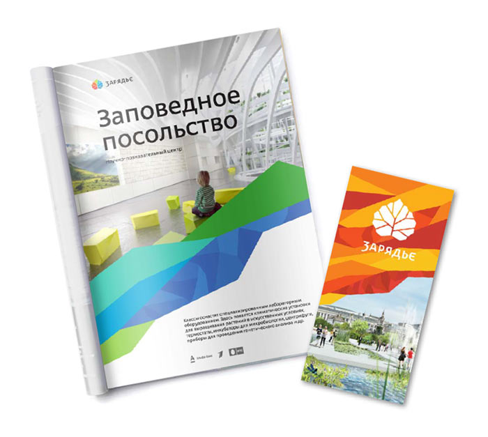
The logo is approved, starting to work on branded media.
