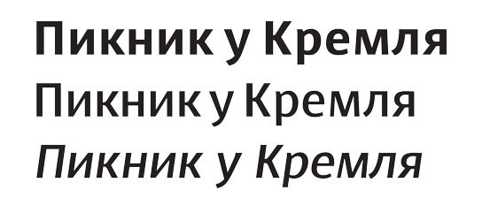
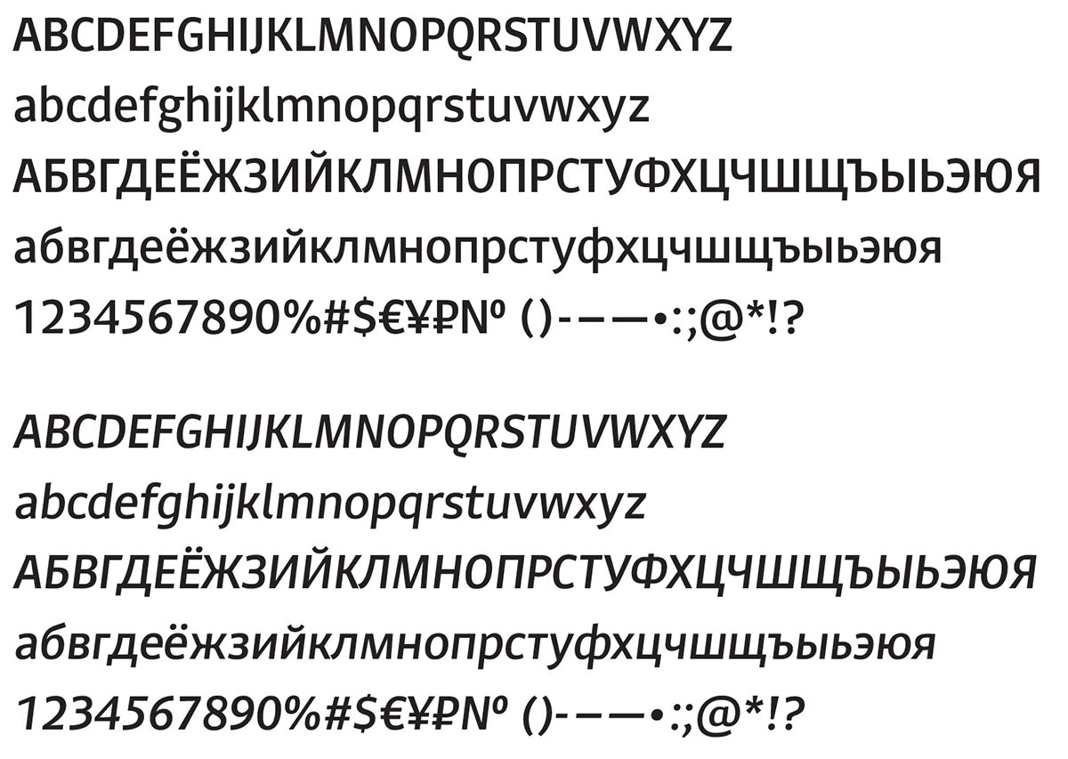
In a very short timeframe we need to create a corporate typeface in three styles: normal, bold and italic. The typeface will be used on booklets, posters and documents. It has to have character yet not attract too much attention.
Making the first sketch to understand what is possible. Starting with the bold style as it is the primary one. It will be used on posters and in headings.

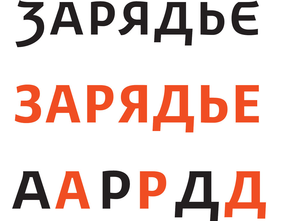
Borrowing some of the special letter features from the logo: descenders of uneven length in Д and д, a small corner in А. The semi-ovals in the letters acquire humanistic grotesque traits.
Later we have to “dry down” the letters to make sure they come out even when typed. Often, what is possible in a logo doesn’t work for a movable type. The letters become more compact and calm.

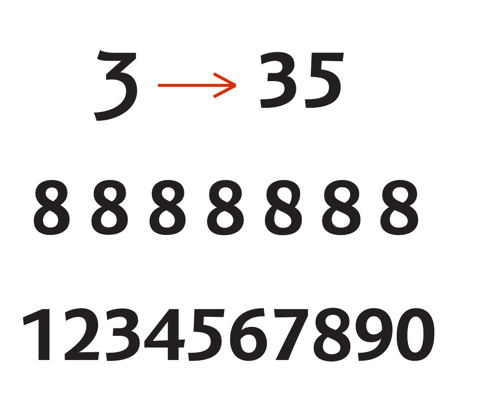
Starting to work on digits. Drawing the digits 5 and 3 by looking at the letter З in the logo. The 8 is most difficult. First of all, it’s hard to balance the top and the bottom, secondly it always looks smaller in height than other digits.


Drawing the two remaining styles.
