Two students walk out of a toilet. One of them says to the other, “At Harvard we were taught to wash our hands after taking a leak.” The other retorts, “At the Moscow University they taught us not to piss on our hands.”
Anekdot.ru
In the days when book printing was still in its infancy, the choice of the binding was the matter resolved by the book owner. A person given a stack of printed leaves would go to his favorite binder and order the material of the binding depending on aesthetic or financial considerations. As a rule, the binding was chosen to match the color of bookshelves or the overall style of the library.
Today’s reader will probably find it hard to believe that the spine was originally viewed as the book’s backside, so books were put on a shelf with the spine facing the wall, and pages facing the room. The title and the author’s name were not embossed on the spine until the 16th century. The text was placed horizontally, while slim books were not personalized with any lettering at all.
As time passed, books would get ever cheaper to produce and thus larger in number. There finally were so many of them that a blank spine would make it hard to find the required book. Their number grew so dramatically that print shops themselves began to bind books. So plenty of them were out that even slim books would get inscribed spines.
That was the point in time when the division into Big-endians and Small-endians germinated. One of the traditions held that the spine should be inscribed top-to-bottom, the other adhered to the opposite. Each of the traditions has a rational basis behind them.
The tradition to write on the spine top-to-bottom is older; its roots can be traced back to the time when books were few. The reasoning was that if a book is lying on the table (or in a small stack) face-up, reading its title should be easy.
The tradition to write on the spine bottom-to-top is younger; it’s more concerned with how easy it is for the bookshelf owner to handle the book. Reading bottom-to-top is easier, because this direction is more in keeping with the European left-to-right writing tradition, which is especially apparent when there are several lines of text on the spine (an urge to read the lines left-to-right is only natural).
The Western Europe and the US opted for the more venerable tradition, while the Eastern Europe and Russia aligned themselves with the more modern one. What the reader should remember is that both traditions are centuries old.
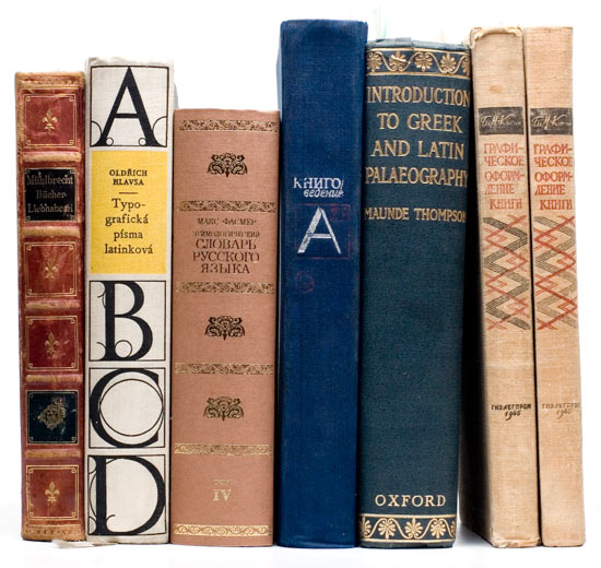
On the left: Russian books; on the right: foreign books.
The reader is advised to pay closer attention to multiple-line titles
On June 5, 2002 the Intergovernmental Council for Standardization, Metrology, and Certification (which includes all former Soviet republics except Baltic states) adopted the intergovernmental standard GOST 7.84–2002 “Print Editions, Covers, and Bindings. General Requirements and Design Rules”. In Russia this standard has been effective since January 1, 2003.
The text of the standard contains the clause 6.2 that reads in flagrant defiance of the Russian book printing tradition: “the data on the cover ought to be printed […] top-to-bottom”. The thin silver lining here is that the silliness of the provision is redeemed by one’s discretion to disregard it.
In the end everyone will stick to their guns: folks in the West will cling to the belief that the title on the spine should be readable when the book is lying face-up; local folks will remain committed to the belief that when the book is lying face-up, its spine is of little value, because you can read all you want on the cover.