Bleximo is a Berkley-based startup that builds stable quantum computers. Unlike industry giants that develop universal quantum processors, Bleximo creates computers that solve specific customer problems.
An identity designed to help the company move to the new stage and make a name for itself was developed in the studio.

The Sakai spinning top in the logo symbolizes the advances in physics that are at the core of the new industry, a qubit in superposition and the finite lifespan of a quantum computer.

The history of quantum computers, just like that of the first monochrome screens a long time ago, is just beginning. That’s why the basic colors of the identity are black and white.
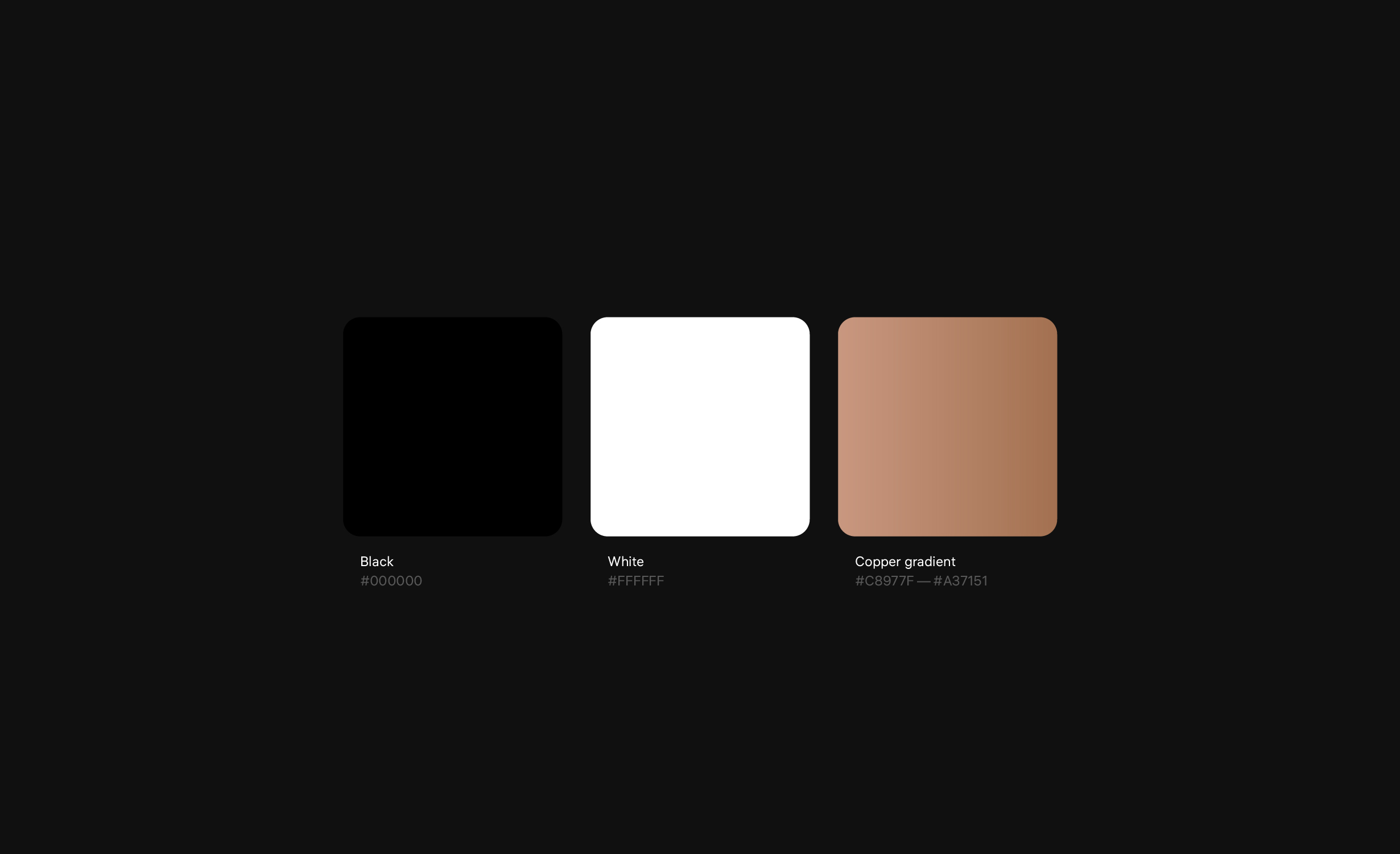
The additional copper accent color refers to the material from which parts of quantum computers are made.
Moreover, copper is used to make souvenirs that emphasize the company’s uniqueness and ambition.

Pixelization is one of the main graphic techniques used in the identity. It also alludes to the first computers with low resolution and tiny memory. Even the mug is pixellated.

The lower part of the corporate t-shirt has a branded pattern. The height of the “levels” is a multiple of two, but the higher the “level,” the more voids there are in the pattern. This is a visualization of a fundamental problem of modern quantum processors: as the number of qubits grows, so does the number of errors in calculation, and the stability of the whole system decreases.