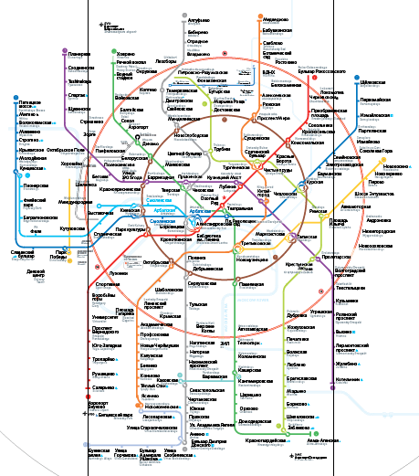
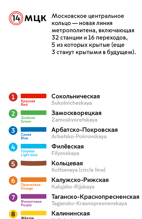
The new version
After the previous map was sent to the client, we started working on the new version which will be used in September after the Second Circle line is opened. We need to produce all formats: maps for cars, information stands and round pillars by the stations.
Previously we had separate maps for round signs as the round version of the map had different proportions compared to the version for cars.


However, maintaining two different maps is difficult, which is why this time we decide to create a single version for all media.
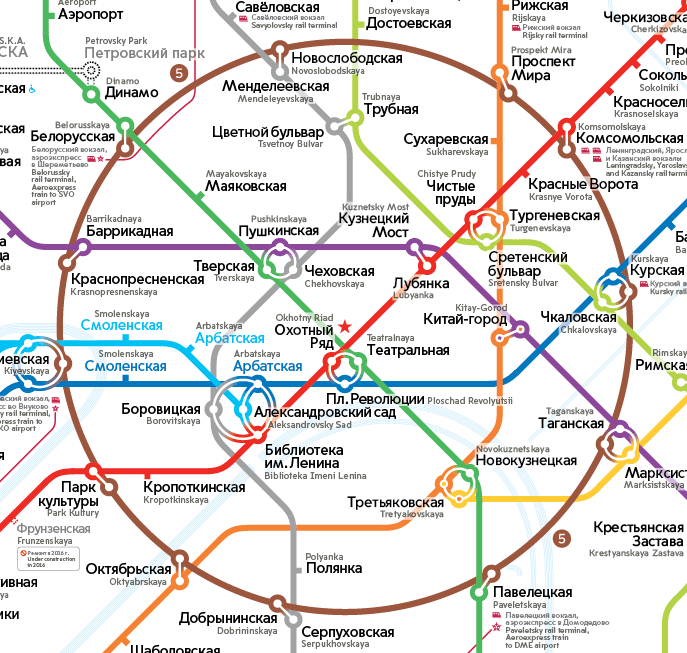
The round format is more demanding to the map, we can’t change dimensions of the media (the pillars are already being manufactured), proportions of the legend and the index are difficult to change. Which is why we choose this version as the base for the future map.
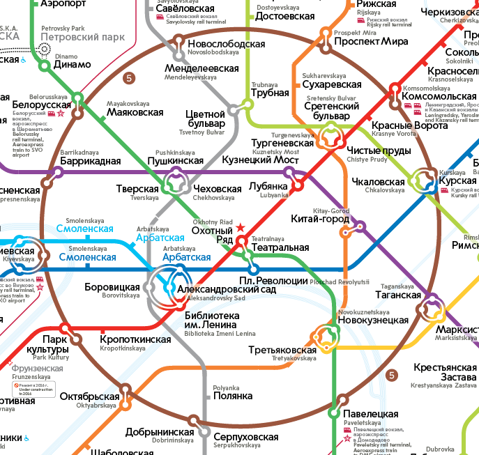
First we need to see the differences of the round map from the car map to see what would be easier: to add the new circle line to the round map or to adapt the existing one. Overlaying maps to see the differences.

The main differences between the maps are in width and it’s easier to adapt the existing map. Looking at the results after the first attempt.
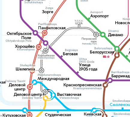
As we are hard at work, we get the news that we need to add the Oktyabrskoe Pole—Panfilovskaya transfer. It means that the intersection of the seventh line and the Second Circle line will become very crowded. Going over several options, deciding to go with the “good for now” one.
At the start of the design process we decreased typeface size to fit all stations for preliminary testing. Time to go back to the original size.
This leads to increased density in the center.
If we were to use this typeface, the Circle line should be larger. Expanding the circle and stretching the map so that it becomes almost square.

The square map doesn’t look well on a round sign. The legend is now too far to the right (red area) whereas it needs to be closer to the center (green area).

Changing the grid slightly. Before it looked like this: the purple line is aligned with the navy line and the red line is positioned between the purple and green lines. To get rid of the hole in the south east (where the Moskva River label used to be) and the unpleasant bend of the gray line, deciding to narrow the grid down somewhat. Now the red and purple lines are positioned exactly in the middle between the top lines.
To evaluate the density of the map, we mirror and blur it. This allows us to see the whole picture without concentrating on the details.

It’s clear we need to readjust density. The weight of the stations make the map’s left side heavy, we need to do something about it. Moving the top lines to the right. This results in several oddities (left flag by the navy line and an extra bend of the red line near Komsomolskaya) but that’s OK for the first effort.


The mirrored blur shows uniformity nicely.

Thirty degrees
The map has another issue: too much air at the bottom between the Circle and the Second Circle lines. As a possible solution we reassemble the map using the 30-degree grid. This angle will make the map more narrow and will possibly compact the empty space.

As a result, the empty space remained almost the same but the top of the map became very dense. The area limited by the gray line became narrow and all stations stuck together. There is now a strong difference in density between the top and the bottom of the map.

This contrast isn’t as visible on the 45-degree map, which is why the 30-degree grid will remain an interesting experiment and we will go back to the good old 45.
Reinventing the grid
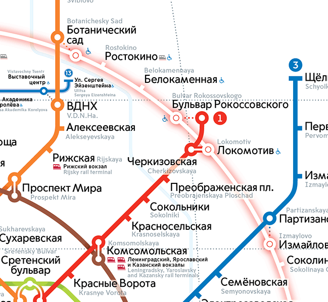
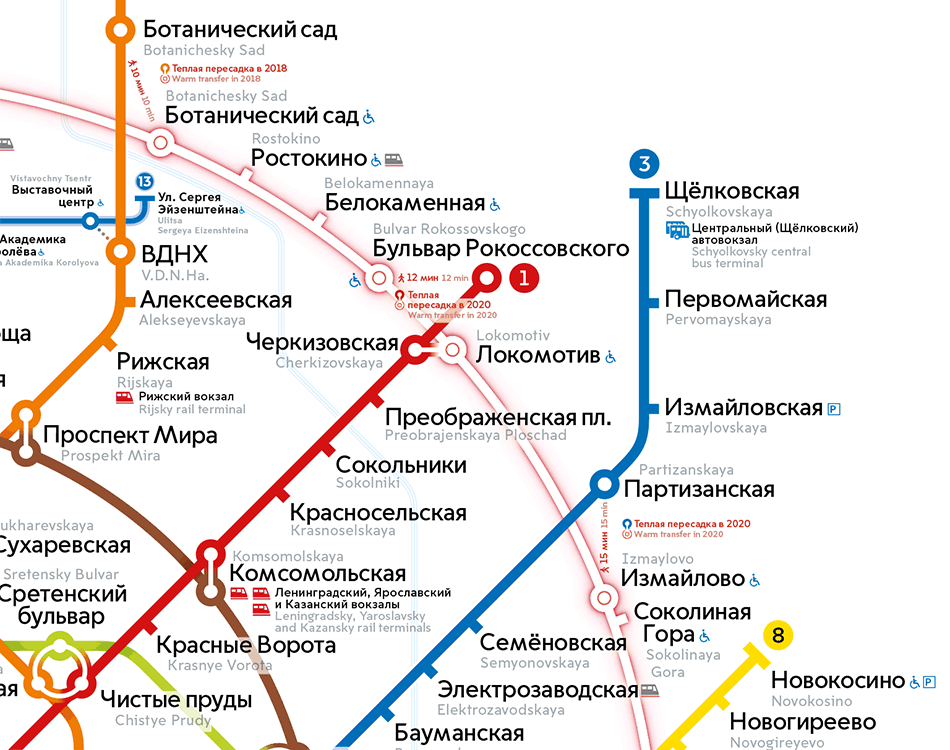
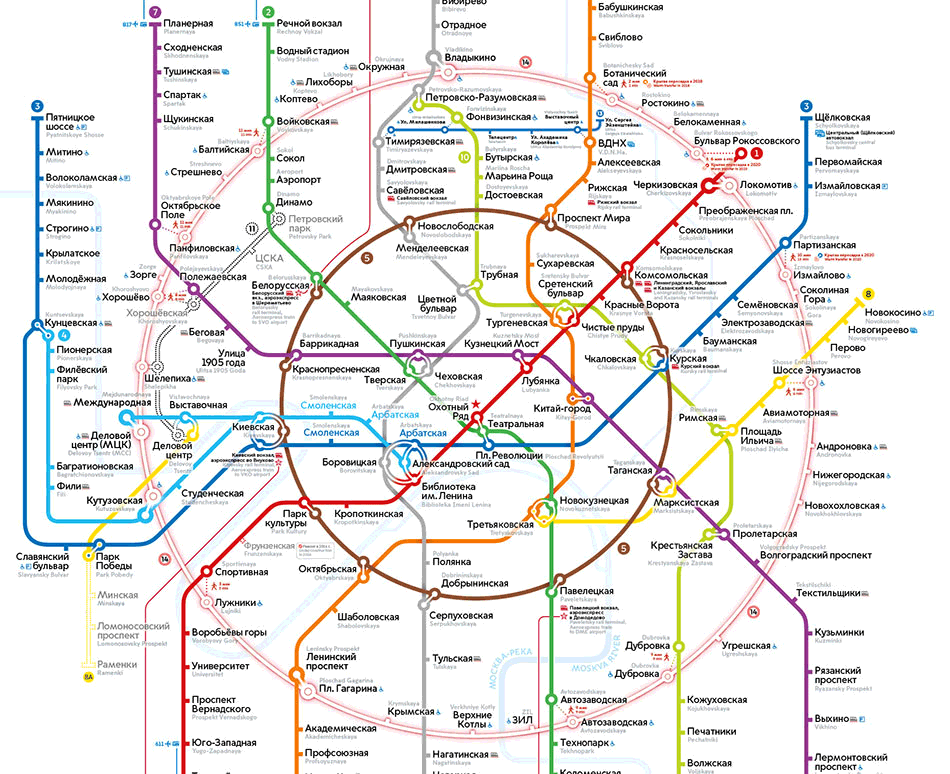
Now it’s time to sit down and think about the new stations of the Second Circle line. When the previous version of the map was printed, they were closed and their names were typeset in a smaller typeface. Now they have opened and in certain areas (for example, between Botanichesky Sad and Bulvar Rokossovskogo they feel really crowded). The problem is difficult to solve if we are to adhere to the old grid. So we ask ourselves: “What would we do if we were starting designing the map right now, when all these stations already exist?”
Most likely we wouldn’t try to squeeze them in. Changing the vertical step of the grid. The base remains the same, but the step is now smaller. This made some of the Metro lines move by one grid step to the left or to the right compared to their previous location.

Tidying up the map and showing to the art director.

The art director approves the new approach.
Transfers and the traffic light
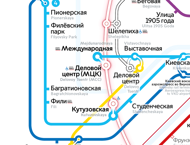
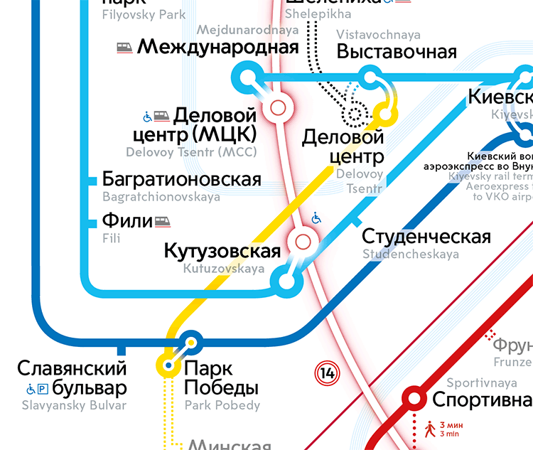
Each station of the Second Circle line is accessible for people with disabilities, adding icons to reflect this.
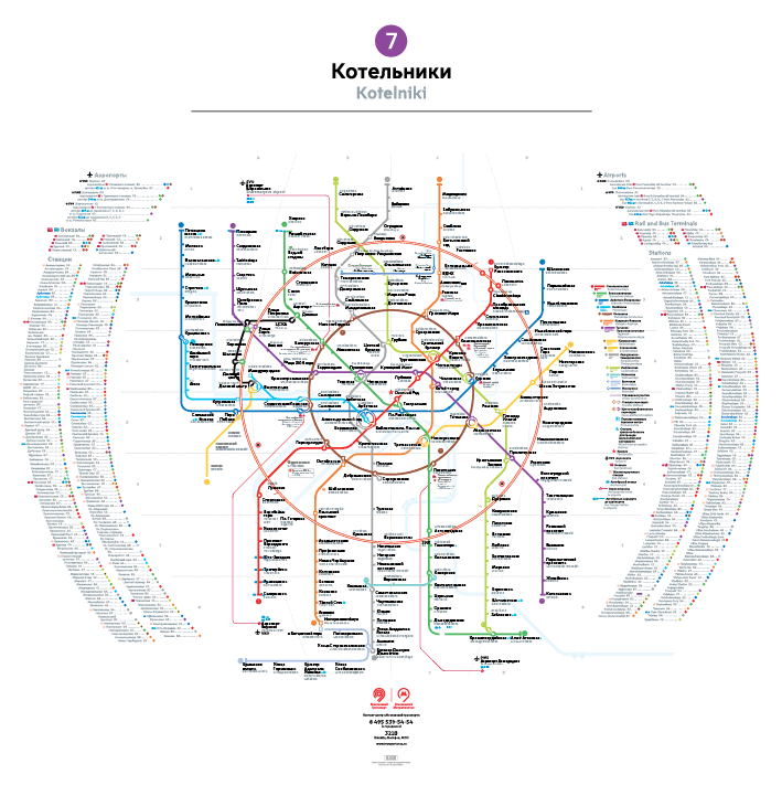
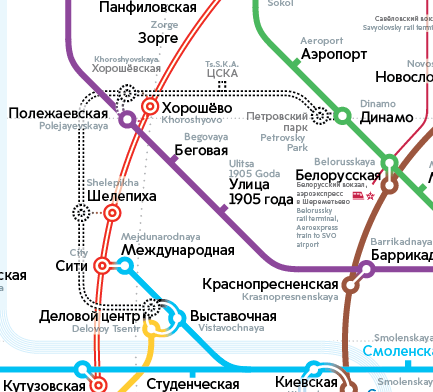
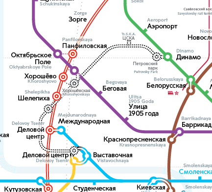
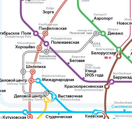
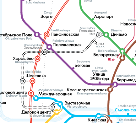
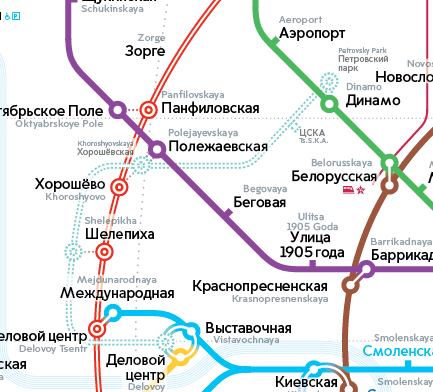
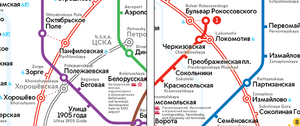
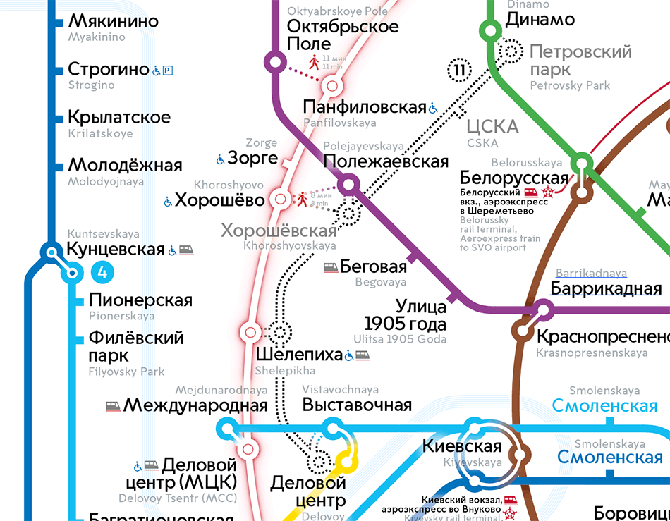
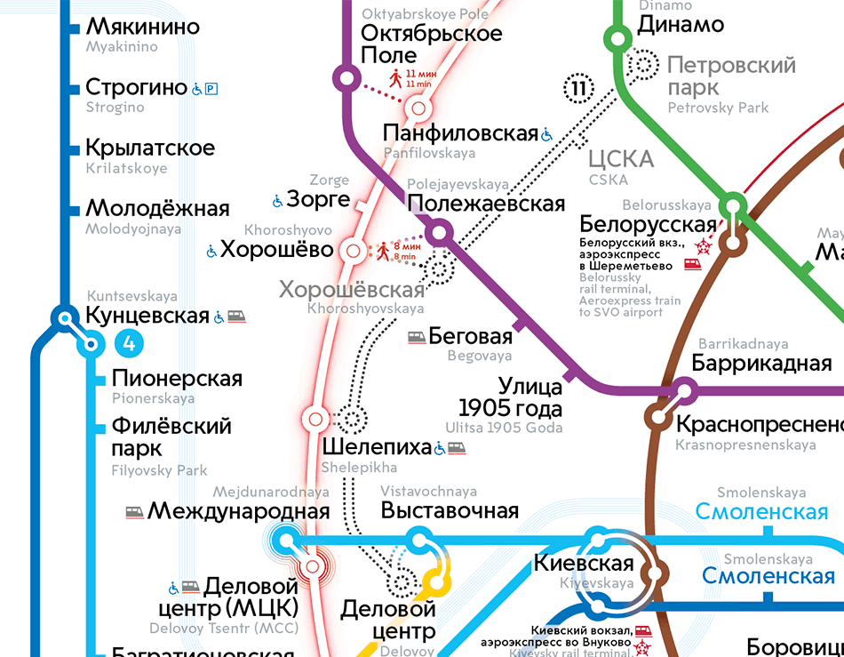
We learn that once the Second Circle is opened, some of the stations will change their names. When the Oktyabrskoe Pole—Panfilovskaya (previously Khodynka) appeared, we failed to realize that Zorge comes before Panfilovskaya and needs to be moved below the purple line.
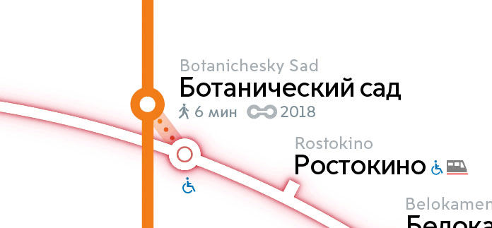
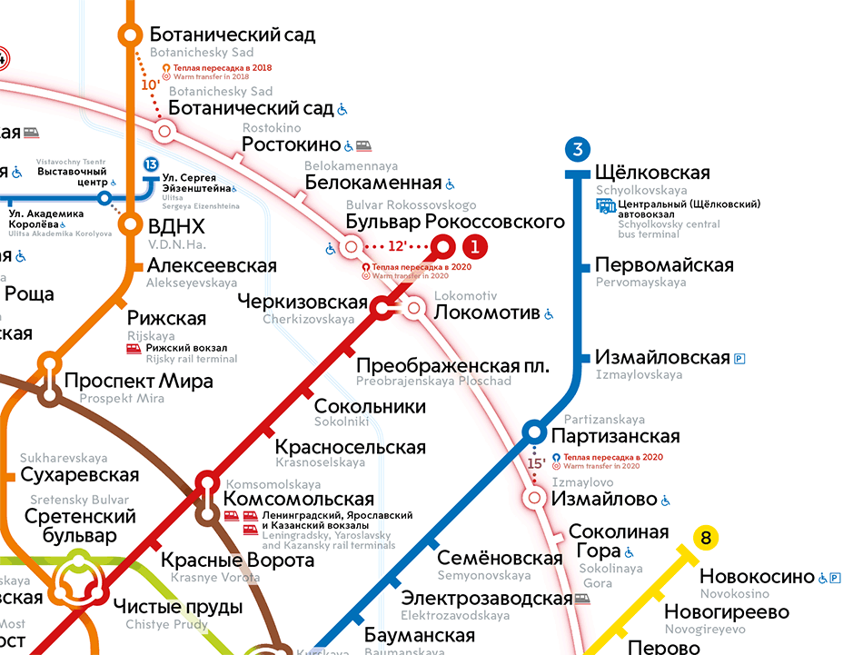
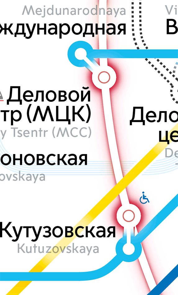
Trying to solve this by introducing a circle transfer to make room for new text. At this point the art director comes by to say that we need to show longer transfers visually. For example, there’s a distance of 700 meters (0.4 miles) between Oktyabrskoe Pole and Panfilovskaya. The map has to show it’s a bit of a walk.
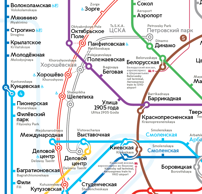
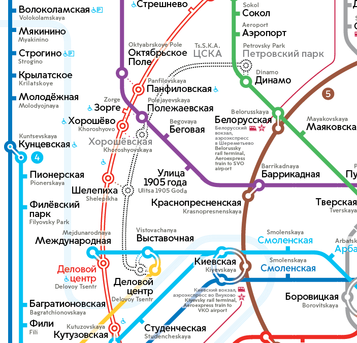

Also, by the request of the art director we remove the circle transfer in the center, bringing back the traffic light and reassembling the center of the map while we’re at it.
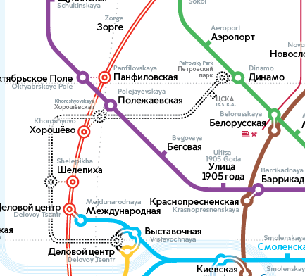
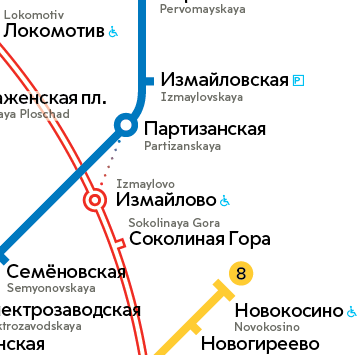
We spend some time finding the solution for longer transfers. For example, right now it looks like Sokolinaya Gora is closer to Izmaylovo than Partizanskaya.
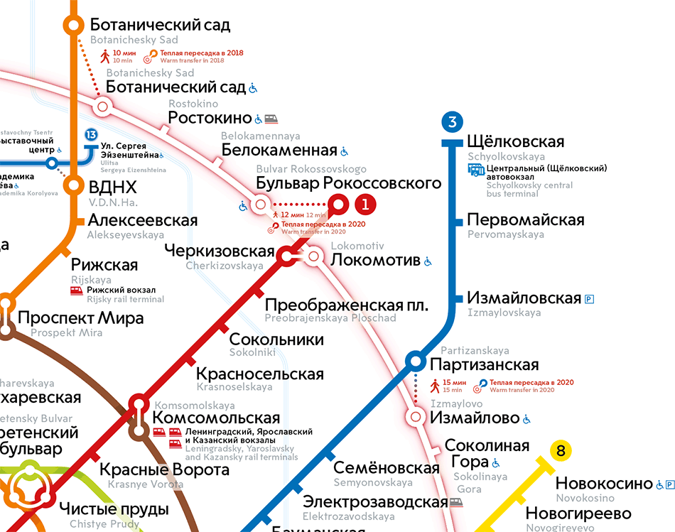
Introducing ranging of walking transfers. Anything less than 400 meters (0.25 miles) we will show as short transfers and anything longer will look longer on the map, too.
Also remembering that the transfer at Shelepikha will be indoors.

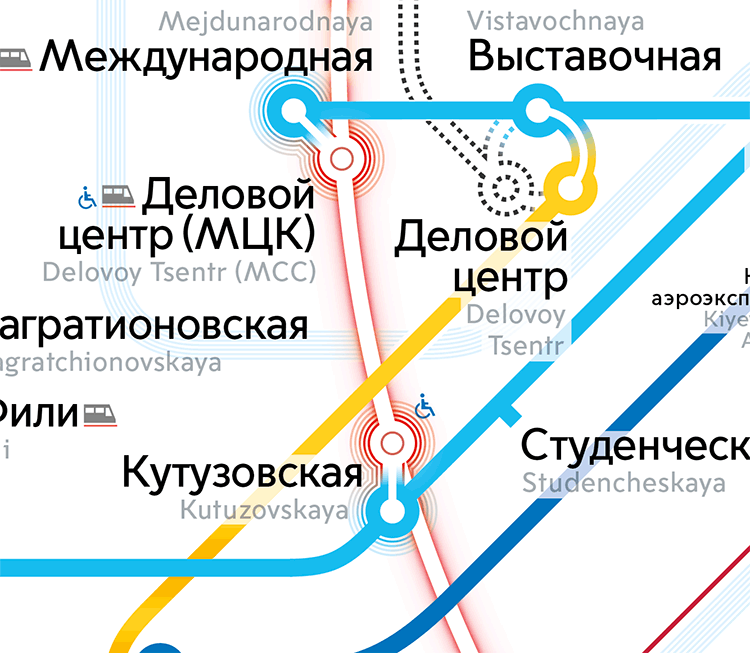
Lighting up the circle
A whole new line is being introduced to the Moscow Metro, not just a couple of new stations. We need to make viewers aware of this fact. The art director suggests to add some glow to the new line.

To choose the best glow style, generating ideas, printing, hanging the results up on the wall and asking the art director to have a look.
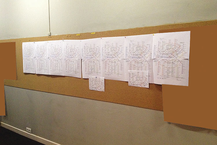
The art director points at the best solution. Next we create the same number of color options and send files to the print shop to get color proofs.
We learn that the Second Circle line is now Moscow Central Circle. Changing the legend accordingly.
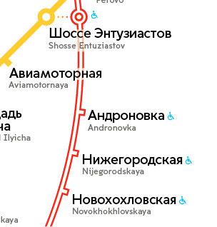
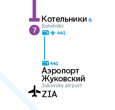
Time to add the new Zhukovsky airport to the map.
Advertising Moscow Central Circle transfers
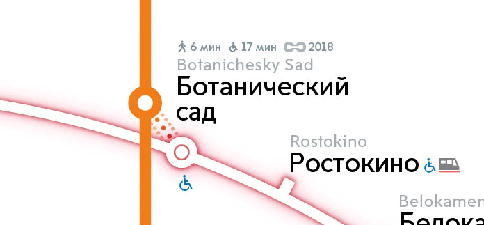
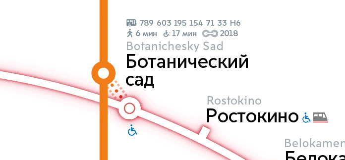
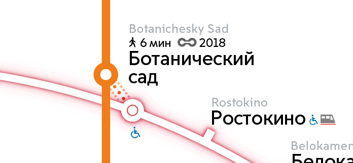
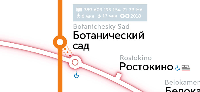
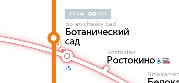
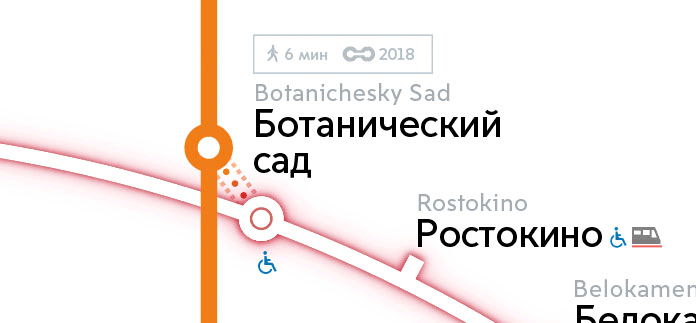
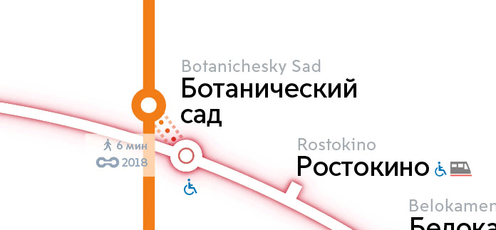
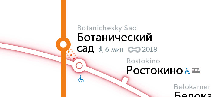
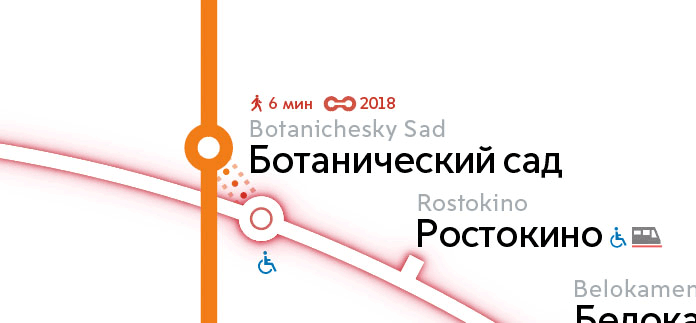
We need to tell people about transfers at the Moscow Central Circle: what the distance between stations is, how long they would need to walk and when (and if) an indoor transfer will be constructed. With the introduction of the Moscow Central Circle, first transfers denoted by dots start to appear. However, they only show that this is some sort of an unusual transfer, which means we need to add more useful information.
While the primary designer is on vacation, the second designer picks up the work.
Deciding to abandon the idea to show the exact distance as it isn’t exactly very userful information. 400 meters, is that a lot? Who knows? But everyone knows how long five minutes is.
Showing outdoor transfers
Sketching ideas to show transfers.
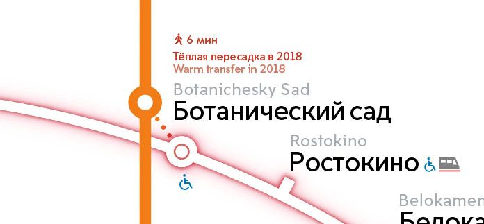
Making attempts to show visually that an indoor transfer will be constructed later.


But all of the ideas turn the transfer into a very vague entity. Deciding that it would be better to simply write it in text.
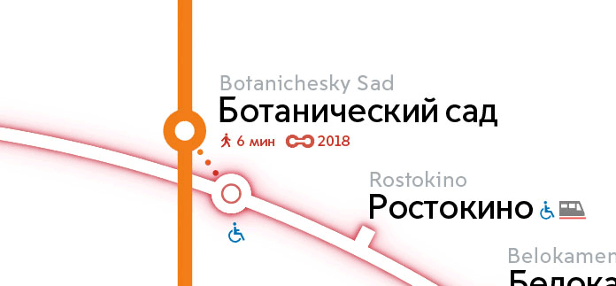
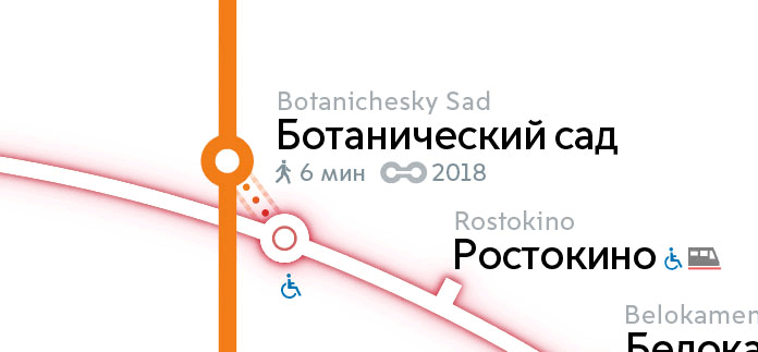
Information with red text and the guy
Developing the idea with red labels near the transfer.
1.
2.
3.
The first design is horrible, the second one is laconic but unclear. Deciding to go with the third one, trying it on the entire map. Cool, it didn’t even require a global change.

Highlighting indoor transfers
Now that we have introduced outdoor transfers where people need to walk across the street to change to the Moscow Central Circle, the client wants us to highlight indoor transfers too. These ones work exactly as regular Metro transfers.
Simply make them bold?
What if we also increase their size?
Unfortunately, this isn’t enough.
Taking some time to think and suggesting a different idea: an advertising block above the map legend.
The client approves the block but says that indoor transfers still need to be highlighted.
Looks like pimples.
What if we put it in a circle?
Yep, looks good. Showing to the client.
The client says that highlighting is too weak. Keeping it as a backup option and searching for other solutions.
The problem with the glow is that it attracts too much attention and blurs edges of the stations’ circles. Using stripes instead of blur for highlighting.
Removing the icon notifying that indoor transfer is under construction.
Sending the map for approval.
Art director: OK. The client: OK.
Polishing the details
Now that all the major tasks have been completed and we still have some time before the map is printed, we start working on all the small issues.
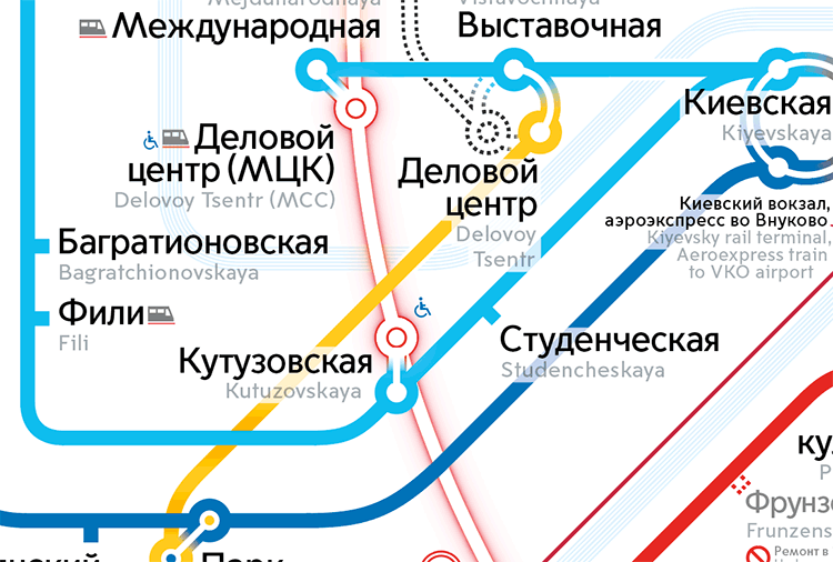
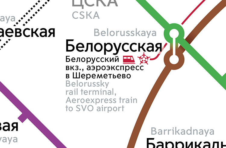
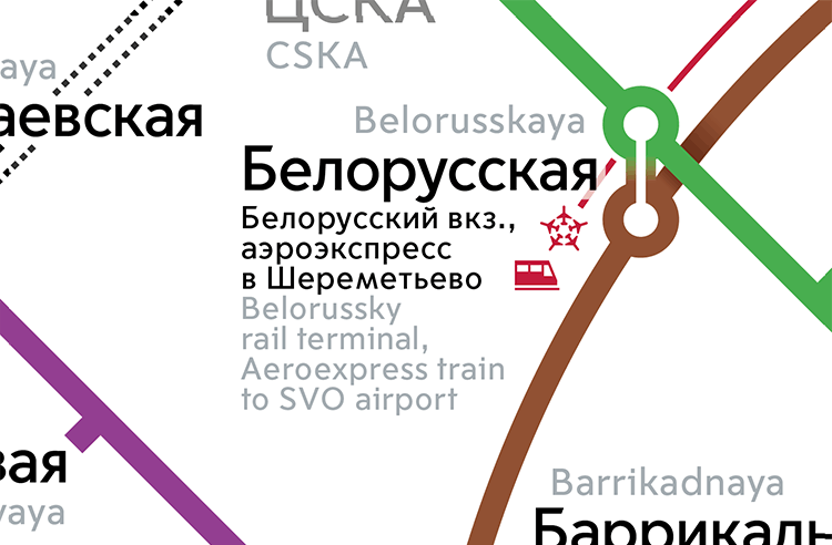
Rearranging icons by Belorussky rail terminal.
Rounding the Third Transfer Contour.
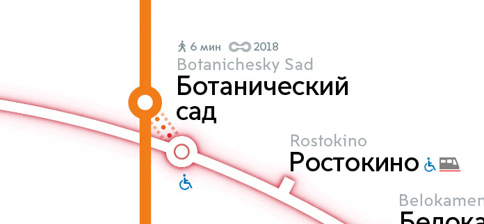
Reworking the segment from Botanichesky Sad to Bulvar Rokossovskogo.
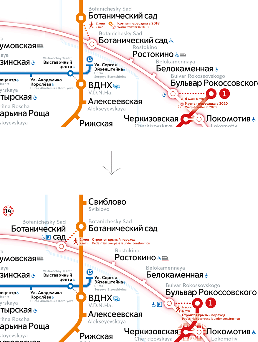
Equalizing the distances from circles to labels, rounding the river above Kievskaya, aligning white bars behind text with lowercase letters, adjusting distances between outdoor transfer dots, slightly moving labels in the center, removing the Moscow Central Circle advertising block per the client’s request and fixing a bunch of other microscopic issues.
Done.
