Transparent map
Story by Ludwig Bystronovsky
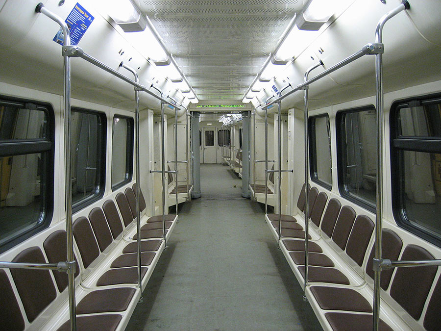
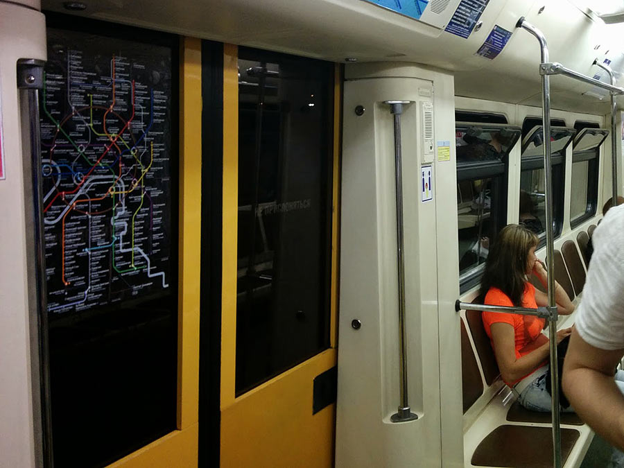
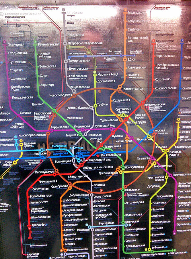
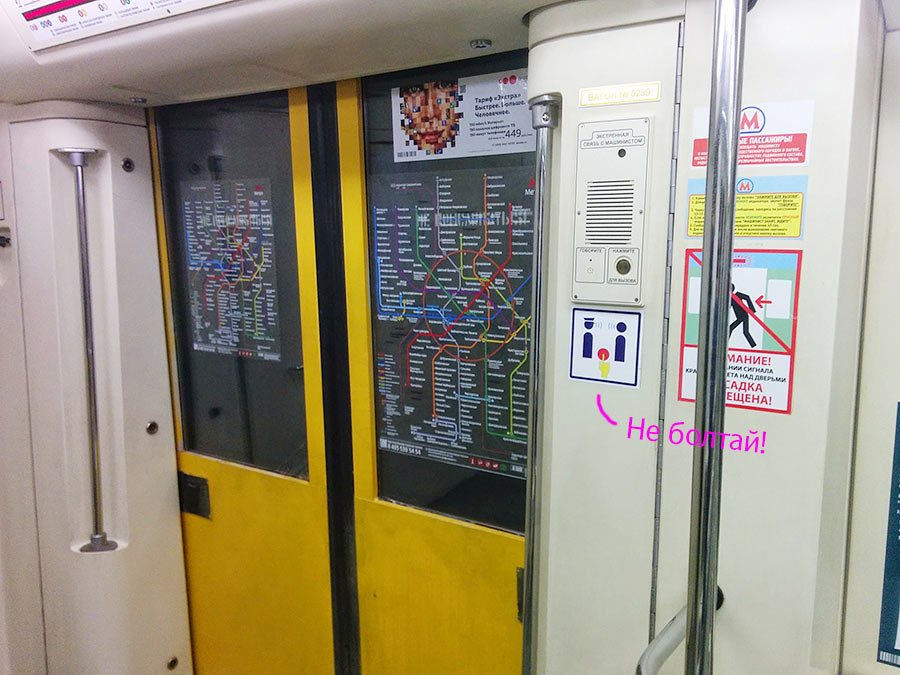
Here is a Rusich type train car. It has a lot of large windows, no wide walls and has very little space for a paper map. All it can fit is a small vertical map by the doors and a small horizontal map above the windows.
But we don’t have enough paper maps. Two last havens of hope for people obsessed with the idea that We Need More Maps are the bellows in the middle of the car and the windows.
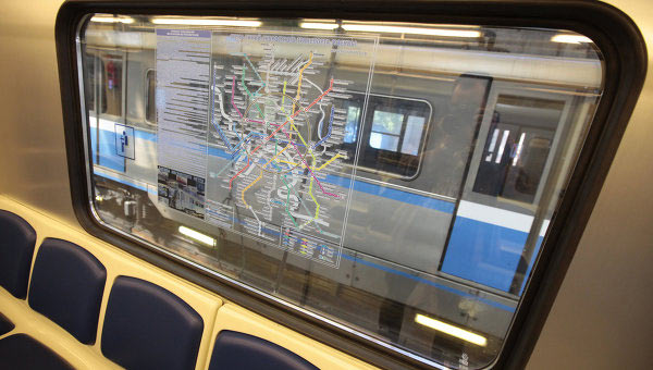
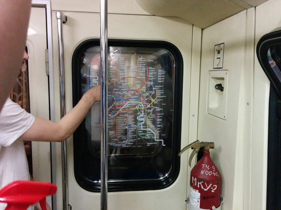
One of the specific features of the window map is that passengers can’t step up close to it and trace their route with a finger, plus the view outside the window can be dark or bright and the map has to be readable on any background. Of course, we can’t just fill the map sheet with a color and be done with it: windows in cars are needed for crowds inside and outside of the car to see each other and prepare for the Battle of Boarding. Overall, we have a complex design task on our hands, no laughing matter for sure.
Here is a sample from 2010:
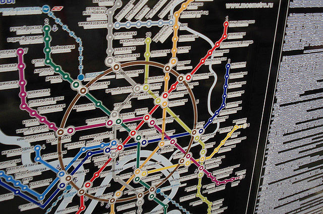
The problem of this design effort is that traced letters make the text very difficult to read: the map will help if a person forgot the name of that station on the red line they need, but it isn’t going to be of much use if that person doesn’t know the Metro well and wants to find Merzlyakovo station, for example (any person not familiar with Moscow is likely to damage their eyes in the process).
Photos from the first tests. Back then the Rusich car we ordered hasn’t yet been delivered to the studio so we had to go to the Metro to do our tests. We didn’t create a special format for this map but instead chose one of the existing ones just to see what it’s going to look like.
The technology is simple, you spray some water and place the map.
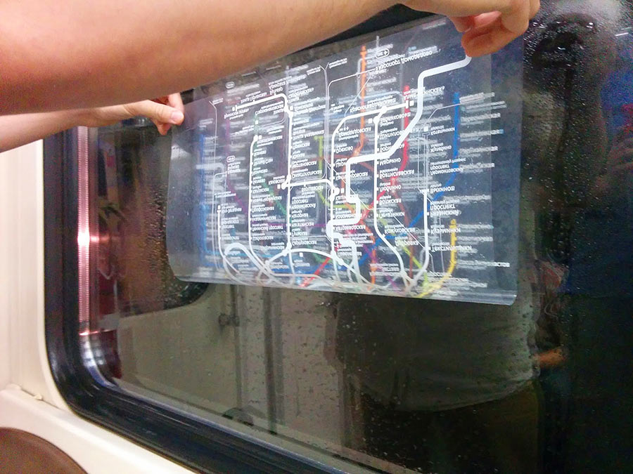
By the way, this picture shows the back of the map: the white layer is applied to transparent base first, then it’s covered with colored paint.
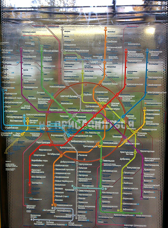
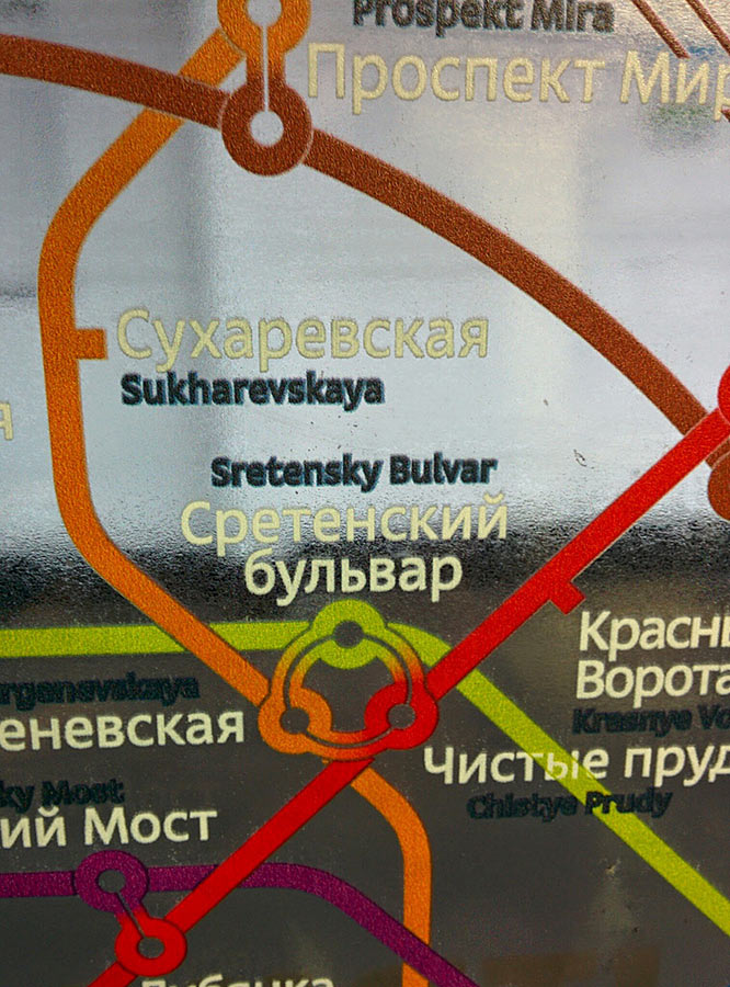
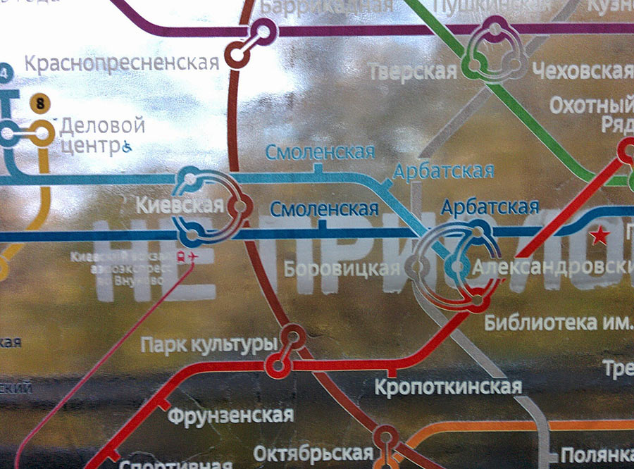
The most noticeable element of this map is the river: it dominates over Metro lines and station names so much that passengers can’t bear looking at it. The river can only be rivaled by the white interchange circles.
Both Egor’s water bottle and Mark’s finger are telling us: look at the white filled circles at the interchanges.
Looking and drawing conclusions.
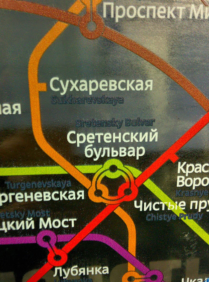
While the next file with the map for windows is being prepared, we reassemble the primary map file without white technical objects (the blue bar is to illustrate transparency).
Holding additional tests to verify various hypotheses.
1. Version with all the information:
2. Version with Russian station names only and without the rest of the information:
3. This one is noteworthy because of the transparent river:
4.
5. This one is interesting for the white outlines of the lines. The color layer here is the same as the white one:
6. Here the color layer in the file is wider than the white one, the result is that color covers the white base entirely. This works well for the lines but not the text. Which is why we’ll use this effect for lines only.
7.
8.
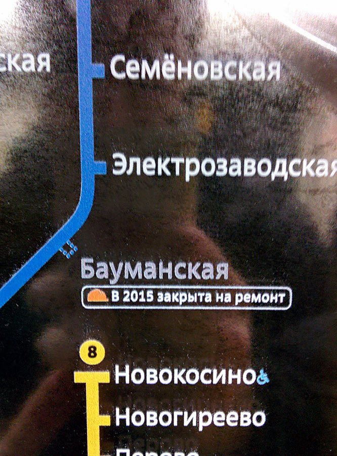
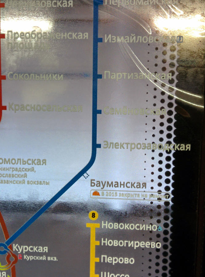
9. The gray text of Baumanskaya is better visible when looking at the map during overground stretches and looks equally good in the tunnel. We get the idea to make all white letters slightly gray as the white color is barely discernible against houses, trees and concrete in the background.
10.
11.
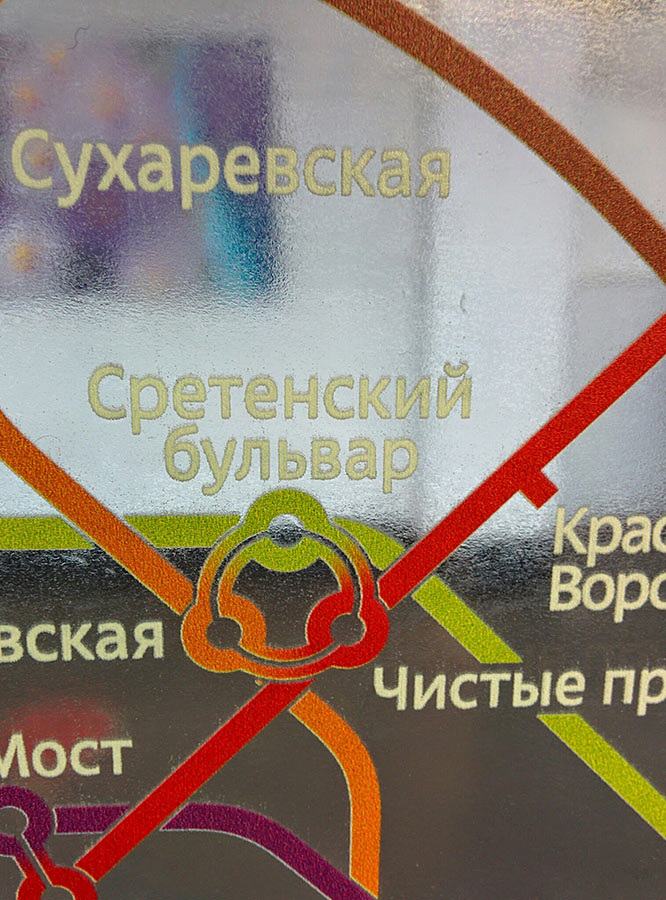
12. The circles are now hollow to prevent them from causing glare in when backlit:
13. Again with the river:
14. More of the river:
The results: overall, it’s all good. We get the idea to make all white letters slightly gray as the white color is barely discernible against houses, trees and concrete in the background.
Making some changes to the file and checking it at the rail yard again (we need to make sure there are no bubbles or streaks). Deciding to remove English names entirely, the map is barely readable as it is. The same goes for information about railway and bus routes. The transparent river looks cool, we’ll keep it, though it can only be seen at stations and during overground stretches.
But how are we going to make stickers for the map for when new stations open?
We’ve got a couple of ideas for that:
1. The most obvious one: remove parts of the map with paint thinner and put stickers on top. The result will probably look like shit.
2. Another option is to not draw the stations under construction on the map at all, but reserve the space so we can add them later. The only problem here is with stubs at terminal stations.
3. Cut out a part of the old map and glue in a new one in its place.
Right now we like option number two the best.
Also discussed at the studio was the idea of placing the film right on passengers, but ultimately it was dropped. Though we still need to explore the option of human billboards more closely.
From the problem we now move on to trying out solutions. This time testing the map against the darkness of a tunnel.
Dividing the next testing session into two parts, as we don’t really want to do it in crowded trains during work hours: we have four color proofs and need a lot of space and less unsolicited advice (when people don’t agree with our choice of the typeface or line colors on the map they tend to call the police). Going to ride the Circle line at night as it has cars with the same doors as the ones we design the map for; during the day we can test the map using windows at the studio, although later we will go to the Metro to test the map in daylight, too.
Testing a couple of things.
* * *
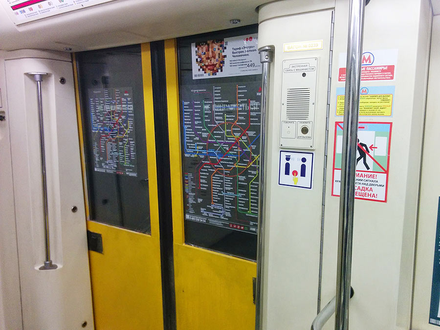
First of all, the format.
Sometimes doors will have advertising and we can make sure the width of the map matches the width of the ad banner (it makes the map smaller but neater):
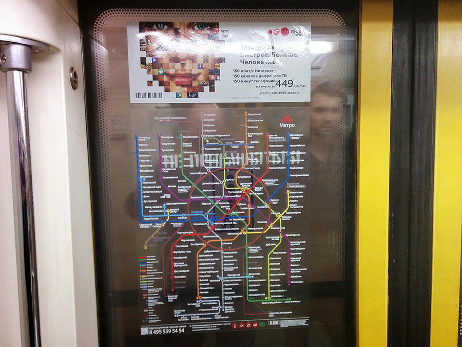
We can choose not to pay attention to advertising and make the map as large as possible (but there is a chance it won’t look nice):
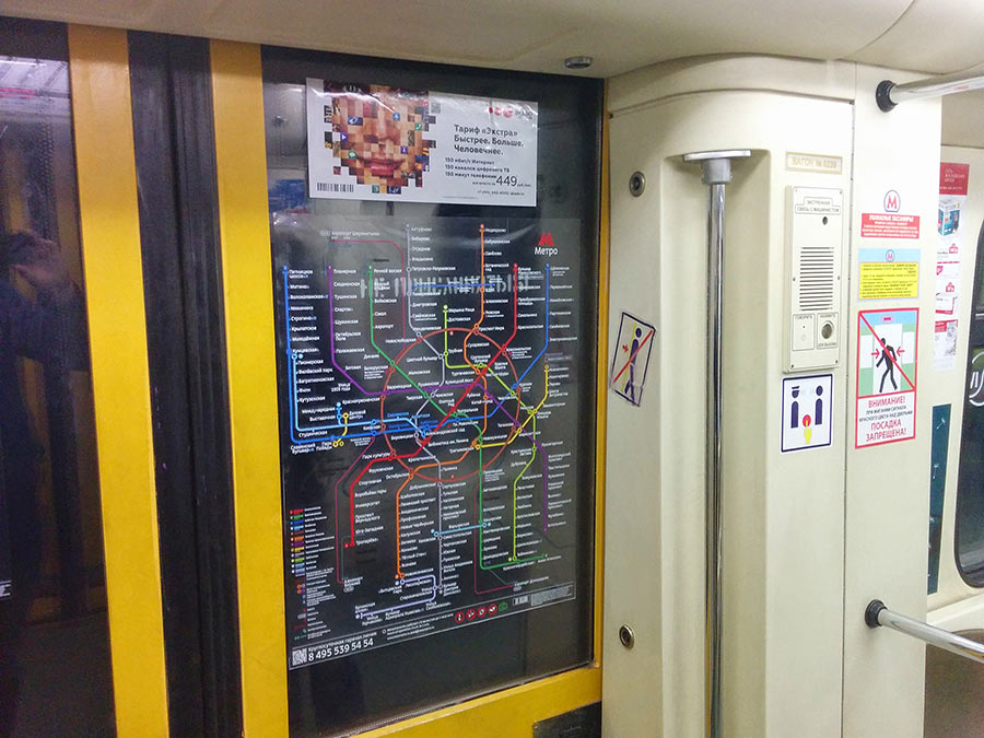
It turns out, we can easily forget about the ads, the large map looks a hundred times better in real life.
Although we need to decrease the size a bit to make it easier to mount.
It’s interesting to note that on screen the smaller map looked much better than the larger one. In real life the opposite proved to be true the moment as we started testing:
The same photo but with a captioned Silence All Passengers icon:
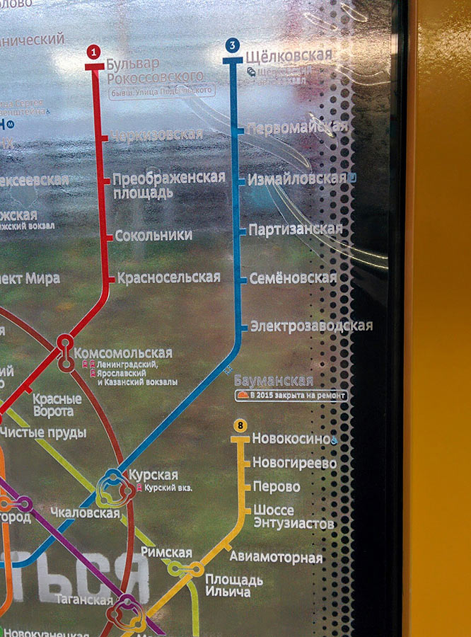
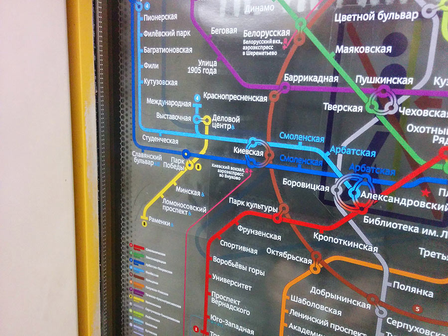
In addition to the format, we’re testing the future stations. We showed lines under construction in two ways: in transparent dotted lines without a base layer (the same way as the river):
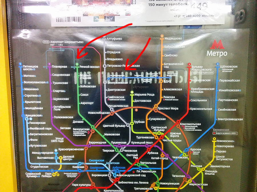
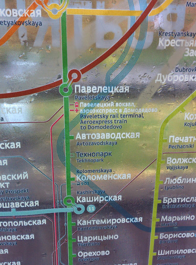
Readers are invited to find Park Pobedy on the yellow line (currently line 8 but soon to be line 8A) and the barely visible dotted line below it. It is barely visible because it also has no base layer, as opposed to the rest of the lines.
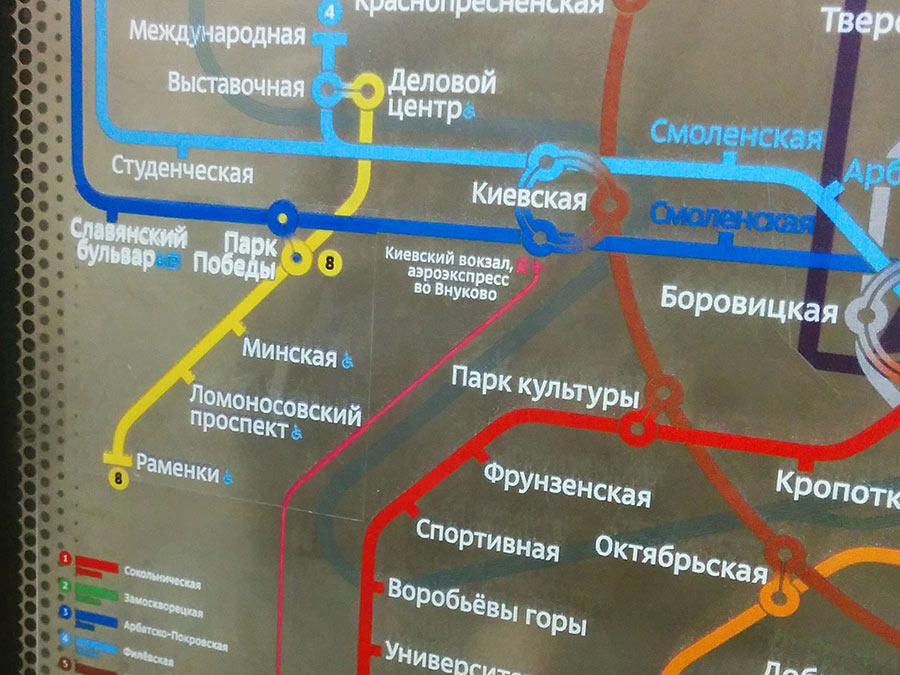
Here is a variant with dotted lines with a white base layer under them. Readers can try to find the same line for comparison:
The opaque version with white base layer wins. Not just because lines are better visible, but also because they can be covered easier.
* * *
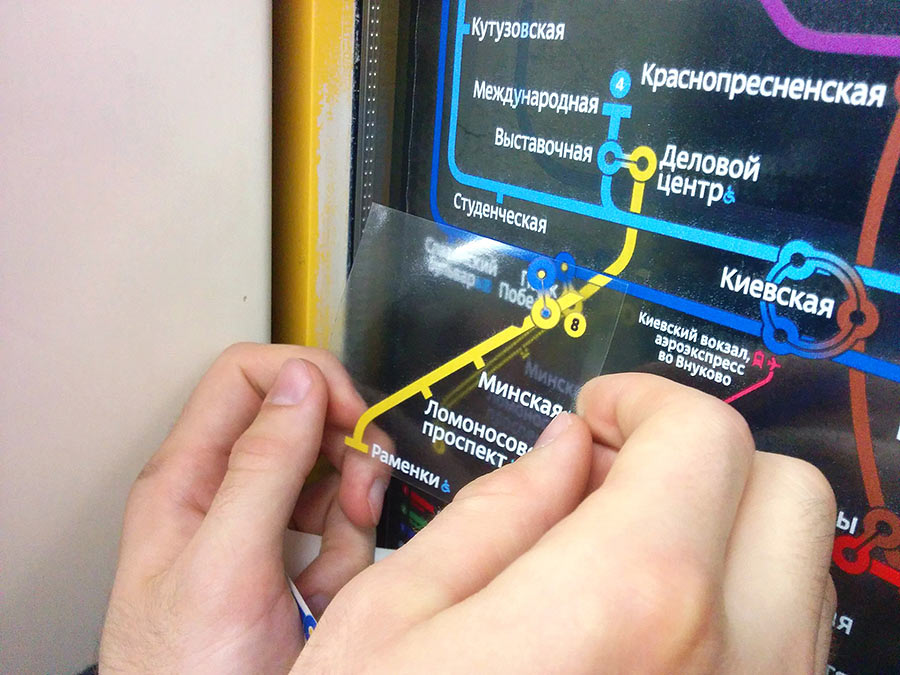
The second thing we test are the stickers.
The stickers look great. We don’t attach them properly on purpose, to make sure we can remove them later, which is why the edges stand out so much. If we were to attach them properly, the difference would be barely visible.
The bottom at the top:
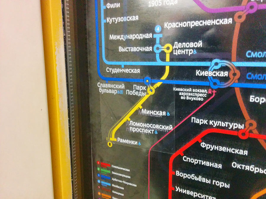
This is what we call a fuck up due to the line number and the stub at the previously terminal station Troparevo. Solving it by using the same idea as on Ramenki on the yellow line on the same picture: the line number moves to the last station under construction. Most likely we are going to use a regular stub at the last completed station of the line that is about to be expanded.
The sticker on the yellow line at the bottom (here we attach the top of the sticker properly and it almost blends in with the map but later we spend several minutes trying to remove it):
The reason we need to remove it is to test different ways for printing letters.
Here is a sticker which doesn’t repeat the name Park Pobedy, instead it uses the name from the main map. Of note is the gray caption for Minskaya which is later covered by white caption on the sticker:
And here is a variant where the name Park Pobedy is printed both on the main map and the sticker. We won’t be doing that:
And here Mark is trying to pass an exam for Junior Map Sticker by putting the sticker in the worst way possible. He passes with flying colors:
Even such tremendous carelessness does not lead to horrible consequences.
* * *
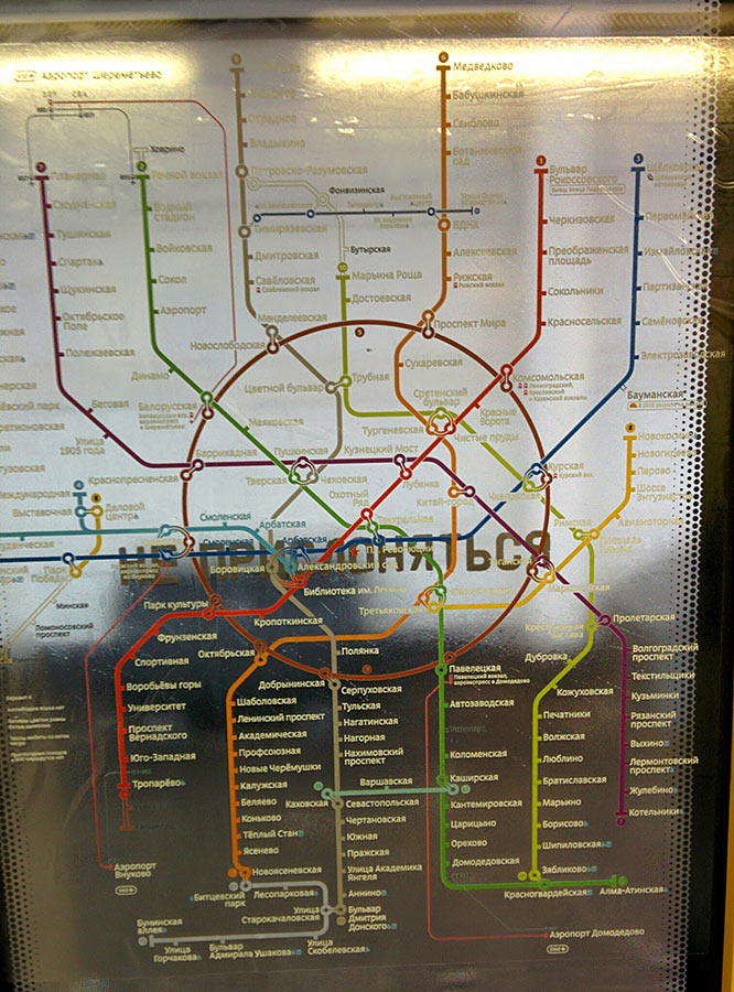
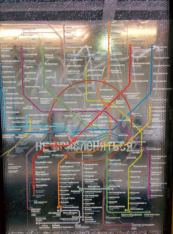
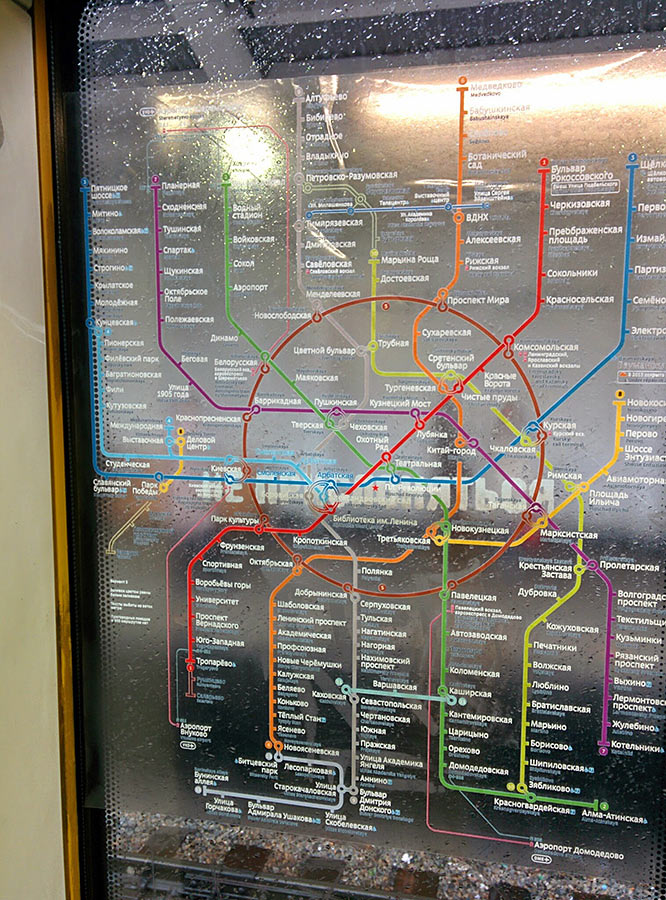
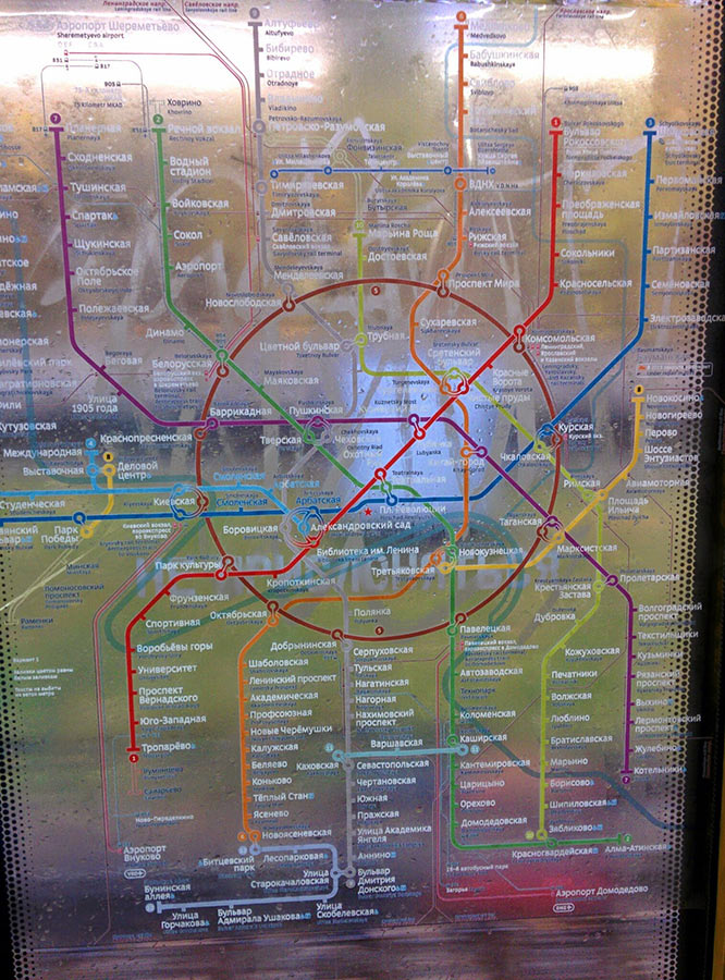
When the map 3.0 with the Moscow Central Circle is approved, it’s time to prepare the transparent map. First, the map is colored white (except for the river).

No semi-transparency: all shadows, bars behind the text and transfer stations are made with cutouts. Applying the next layer with colors on top:
The color layer is slightly wider than the white one. Otherwise, white will bleed at the edges when printed.

Sending to the editor for proofreading and then printing.
