Trying to find inspiration in a cross, a network-globe and even snakes (as symbols of medicine).
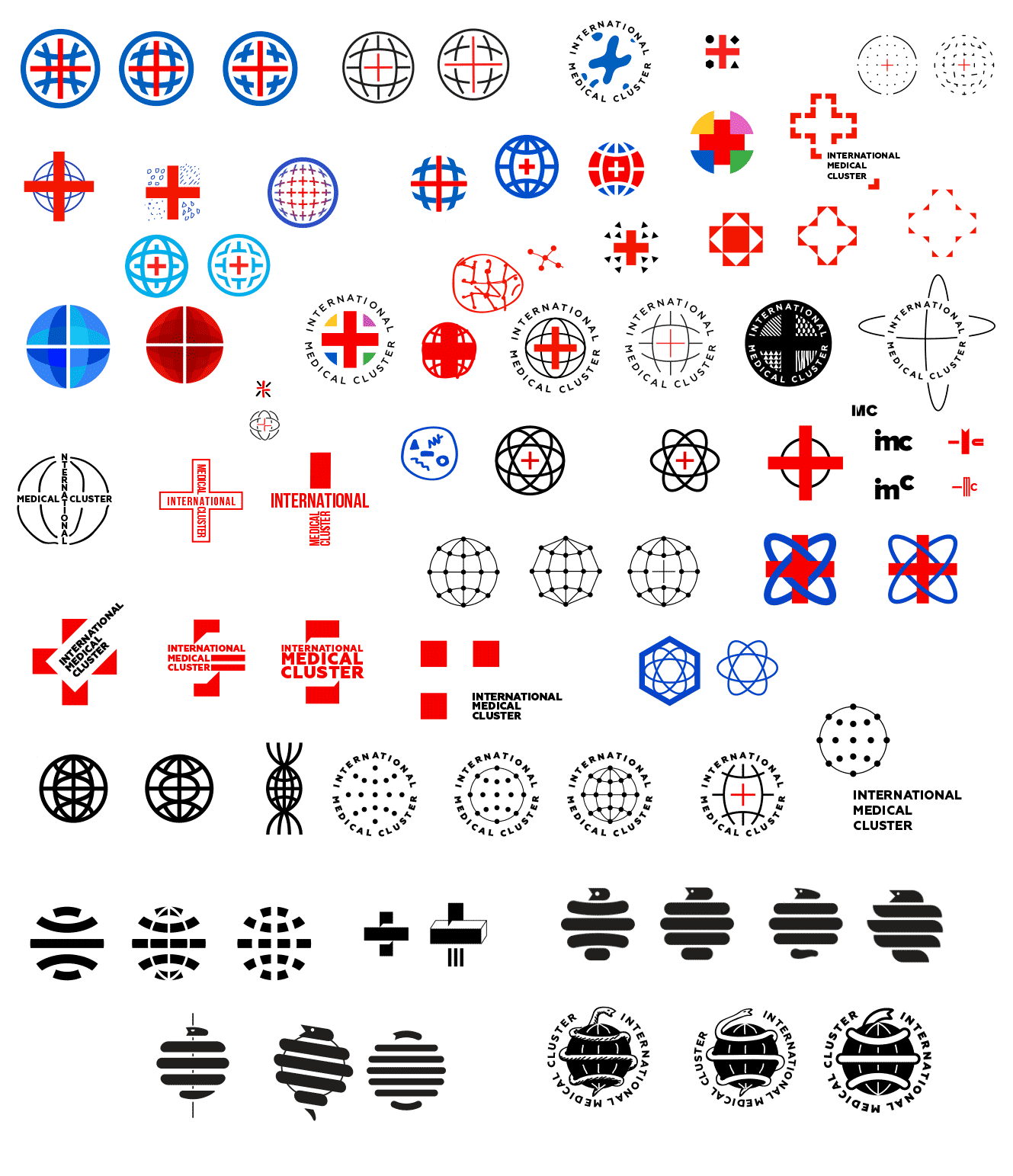
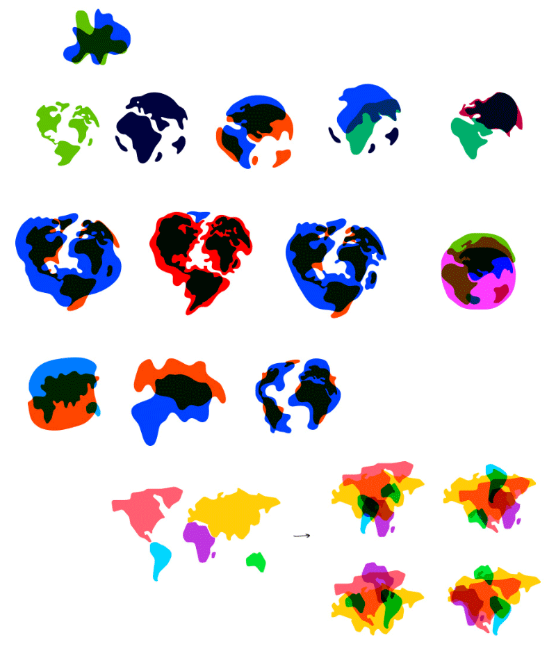
The topic of connections is also interesting. We also get an idea of a certain bionic device, like an organism. Or continents that can remind of human organs (lungs, stomach, etc.).
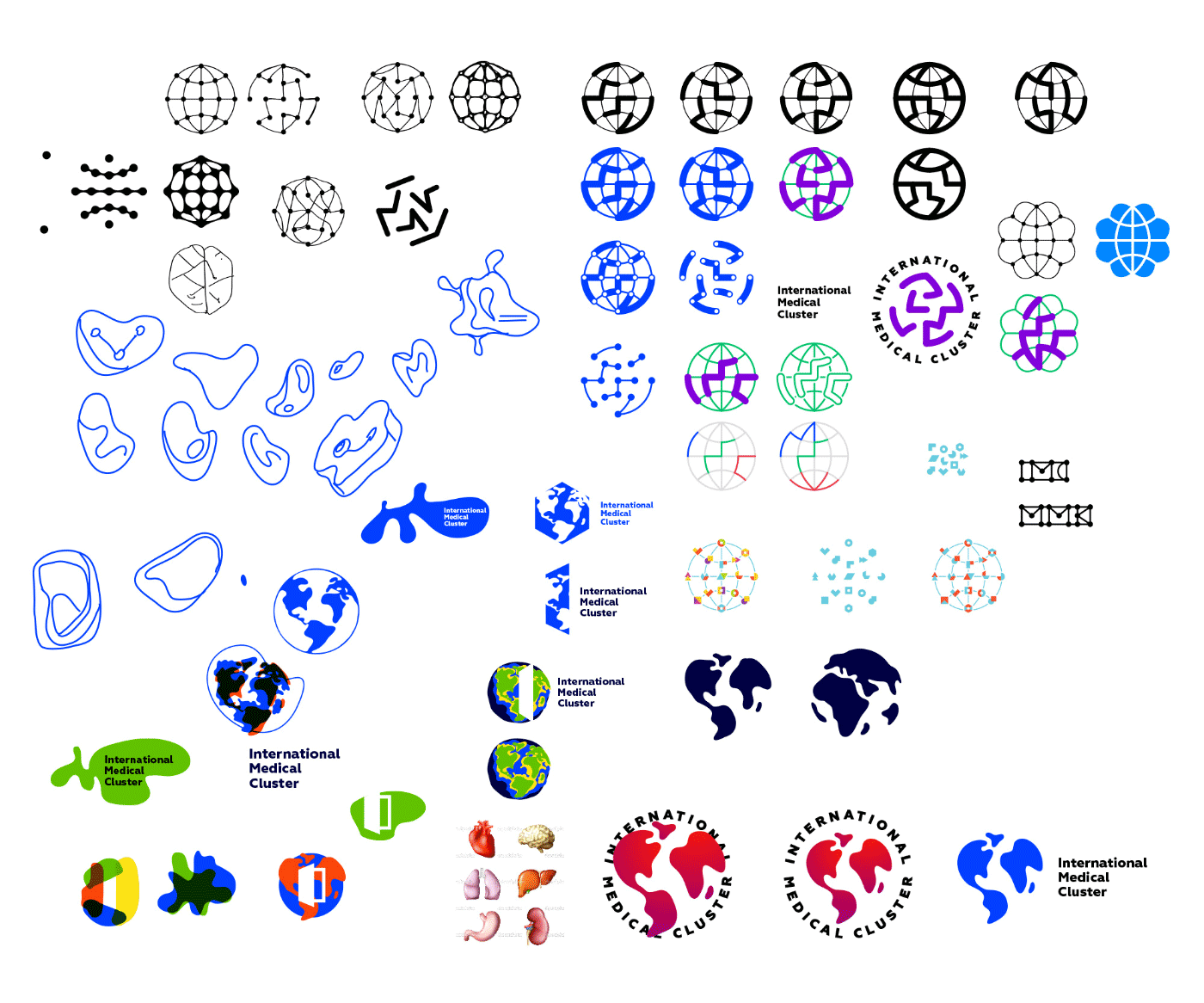
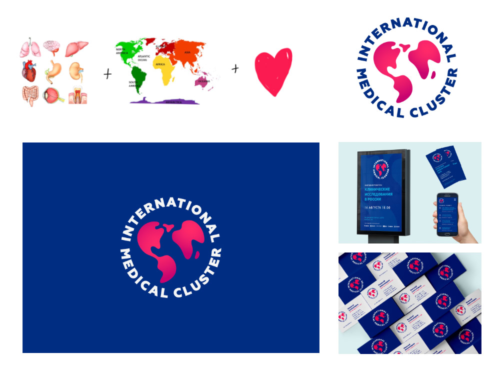
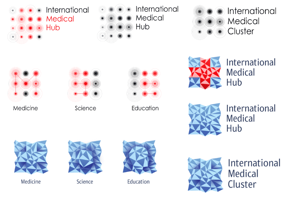
Continent metamorphoses.
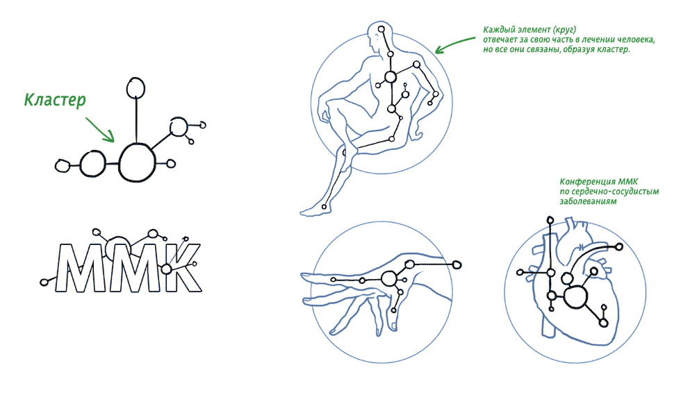
Another idea: cluster cells projected on a man.
Something bionic, a combination of several things in one, enlargement, as in a lens.
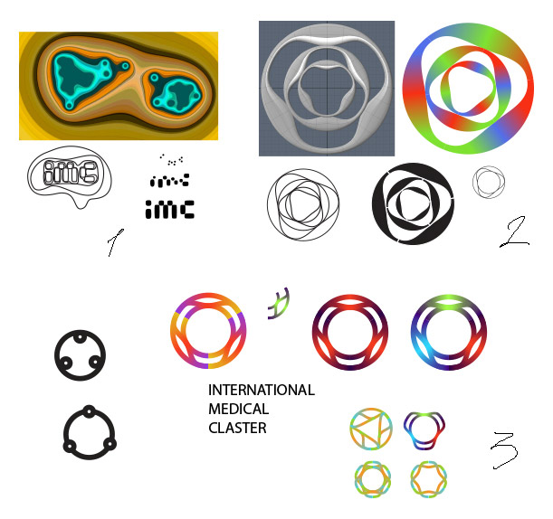
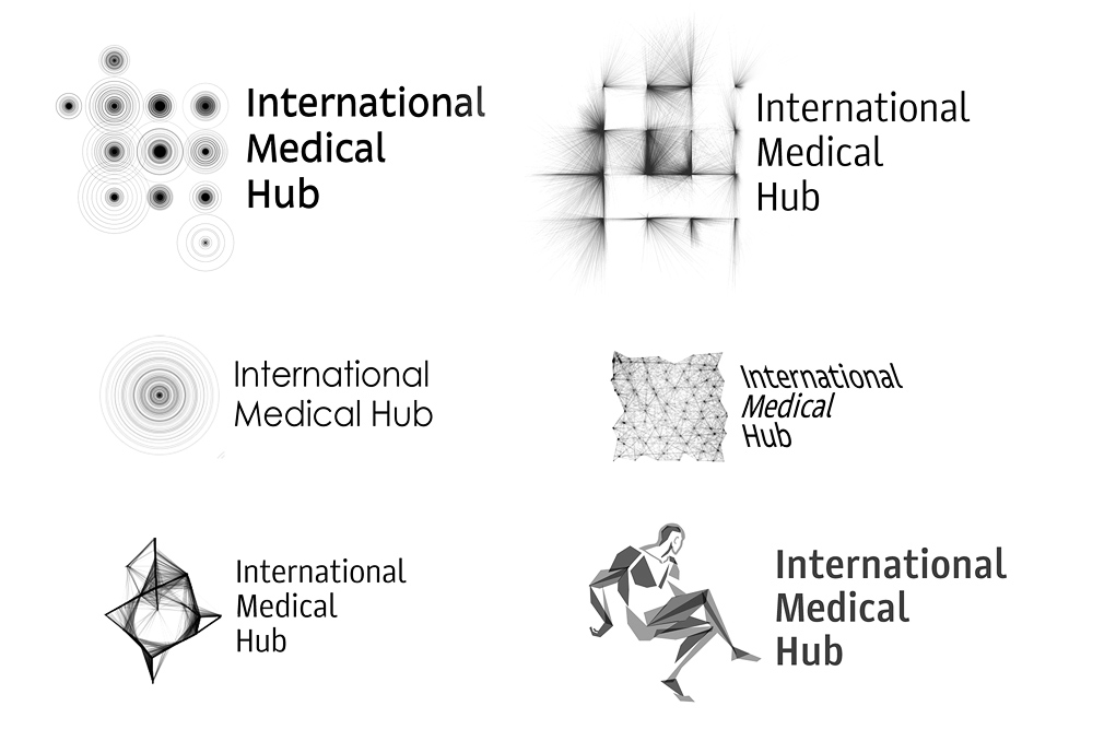
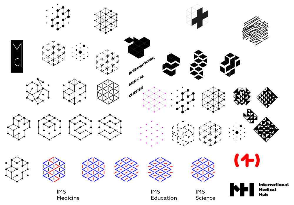
More sketches.
Choosing ideas and presenting to the client.
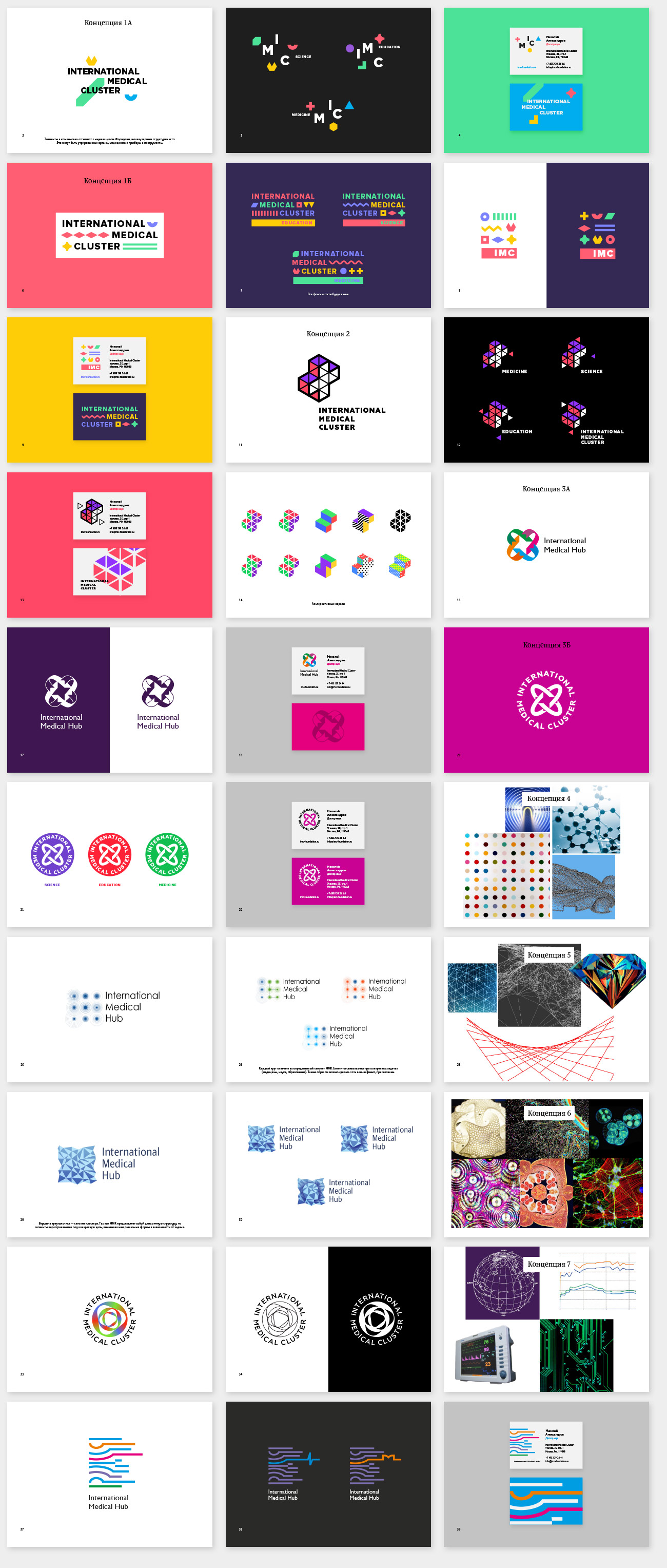
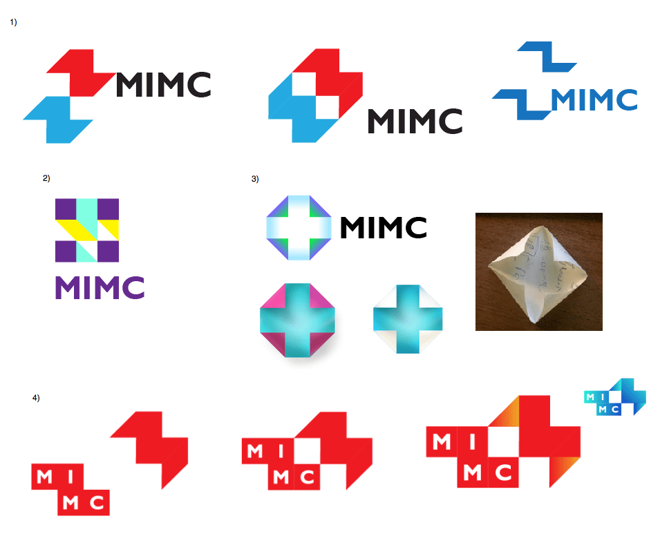
Of all the proposed ideas, the client likes the second one best, but it needs to be elaborated: the sign needs to be less rough and heavy, more dynamic, it needs to be easily adapted for any of the cluster’s focus areas or subbrands.
Taking it further.
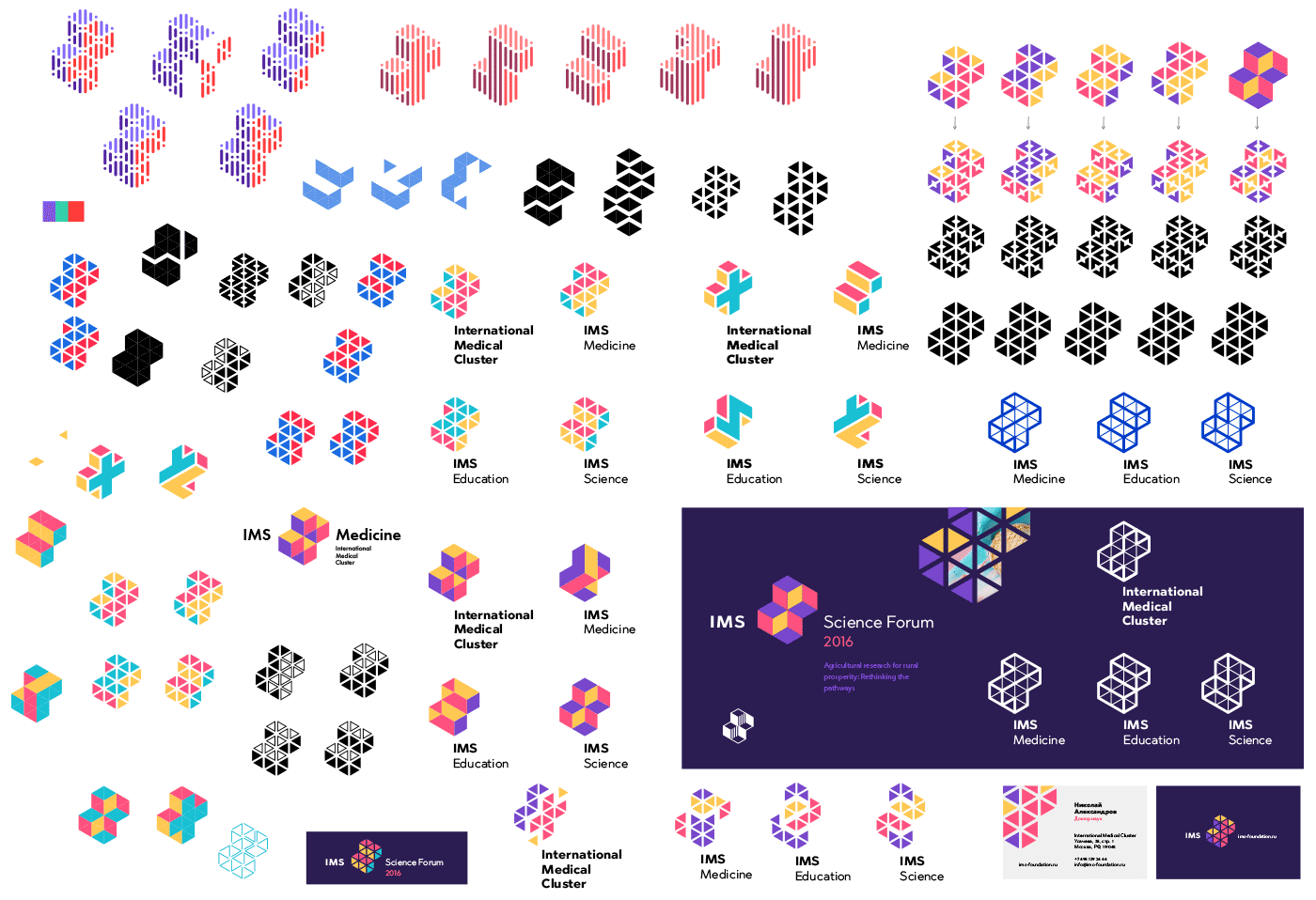
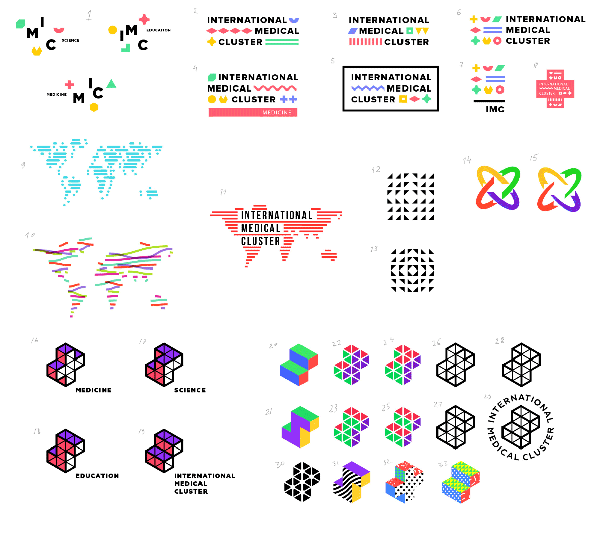
Trying to go back to simplicity. Designs 6, 22 and 34 are potentially interesting.
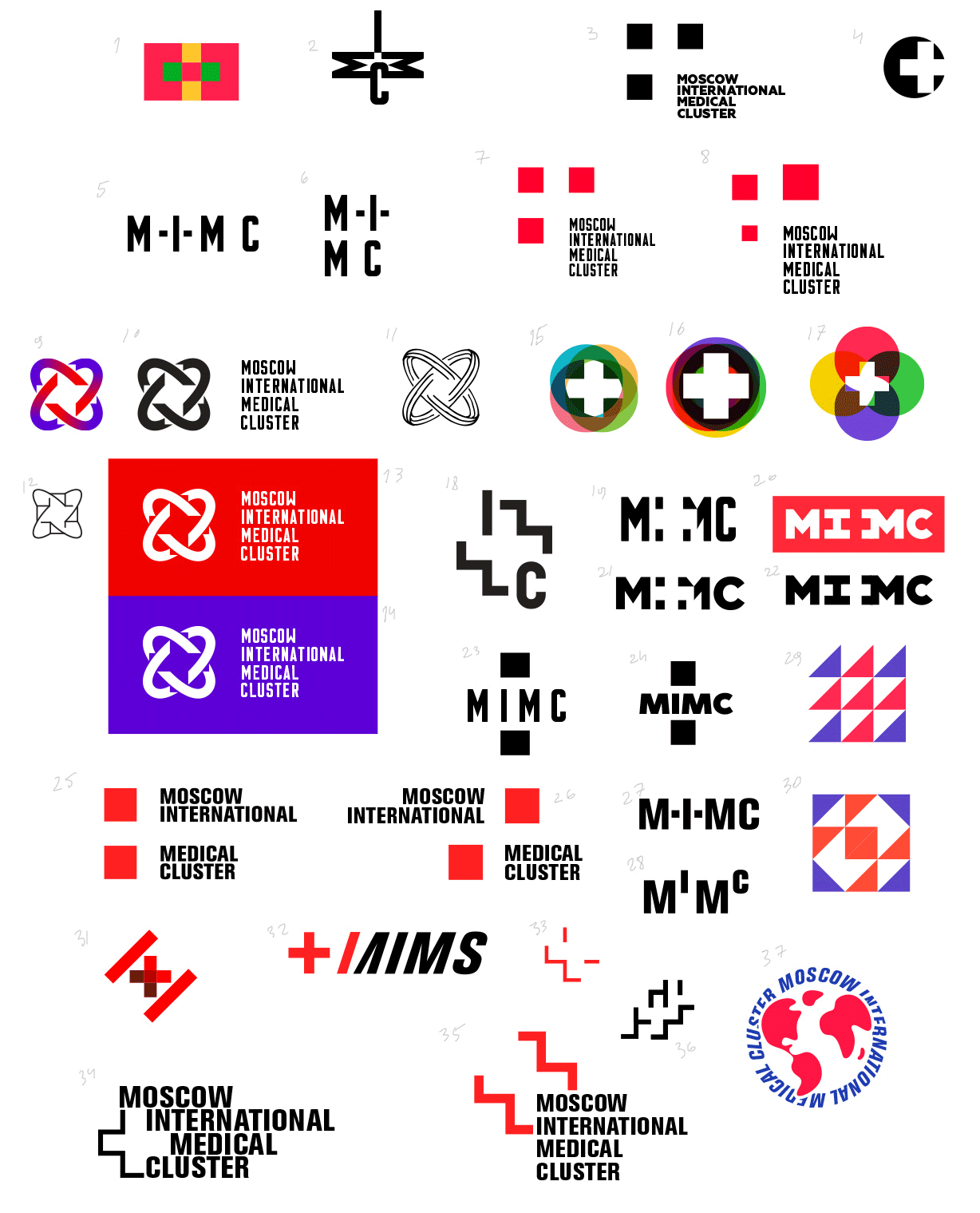
Developing.
More ideas.
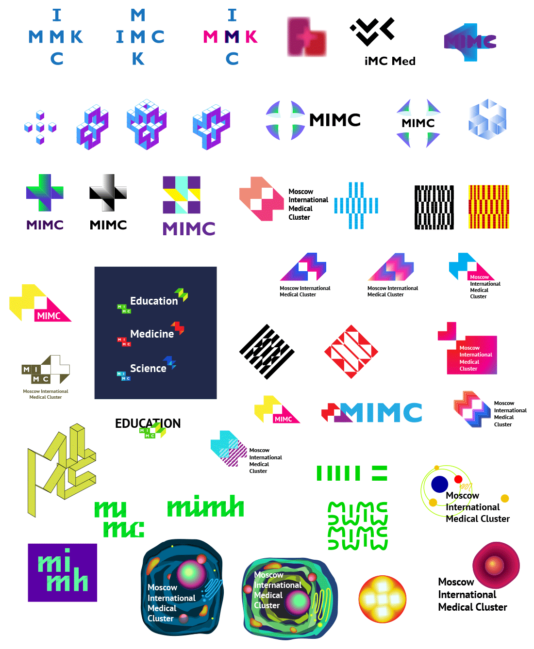
Sending the new batch to the client.
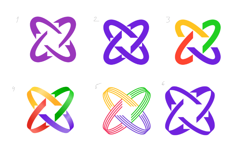
Great news: the client liked all designs, but most of all the one with the cross.
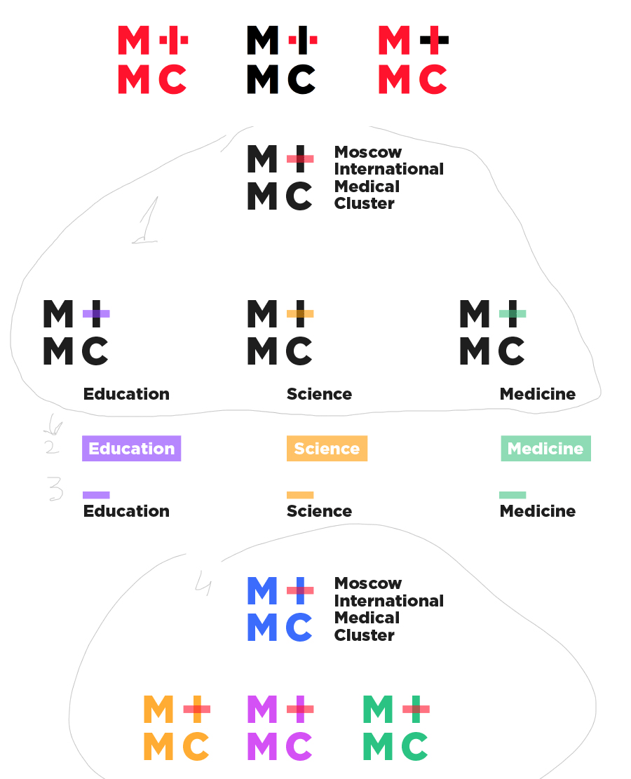
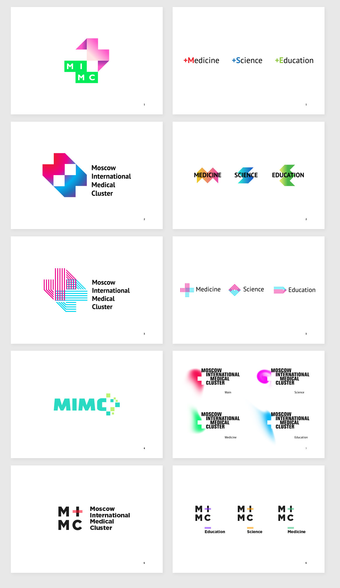
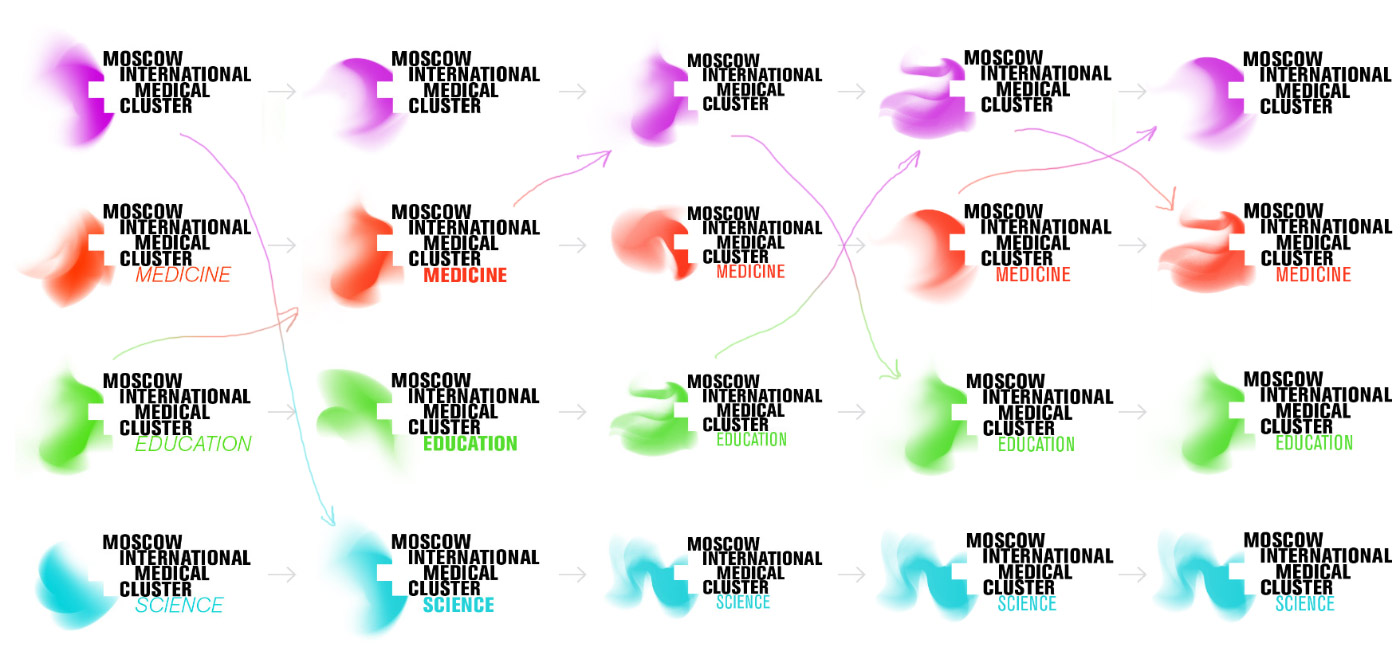
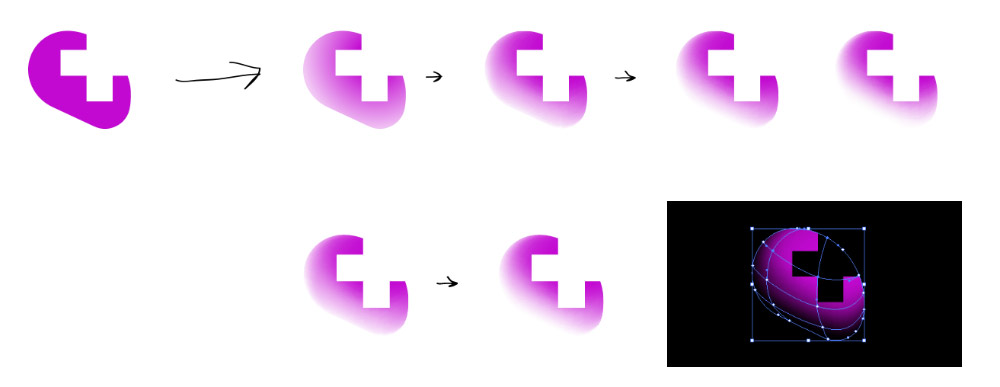
Generating various shapes of the blob.
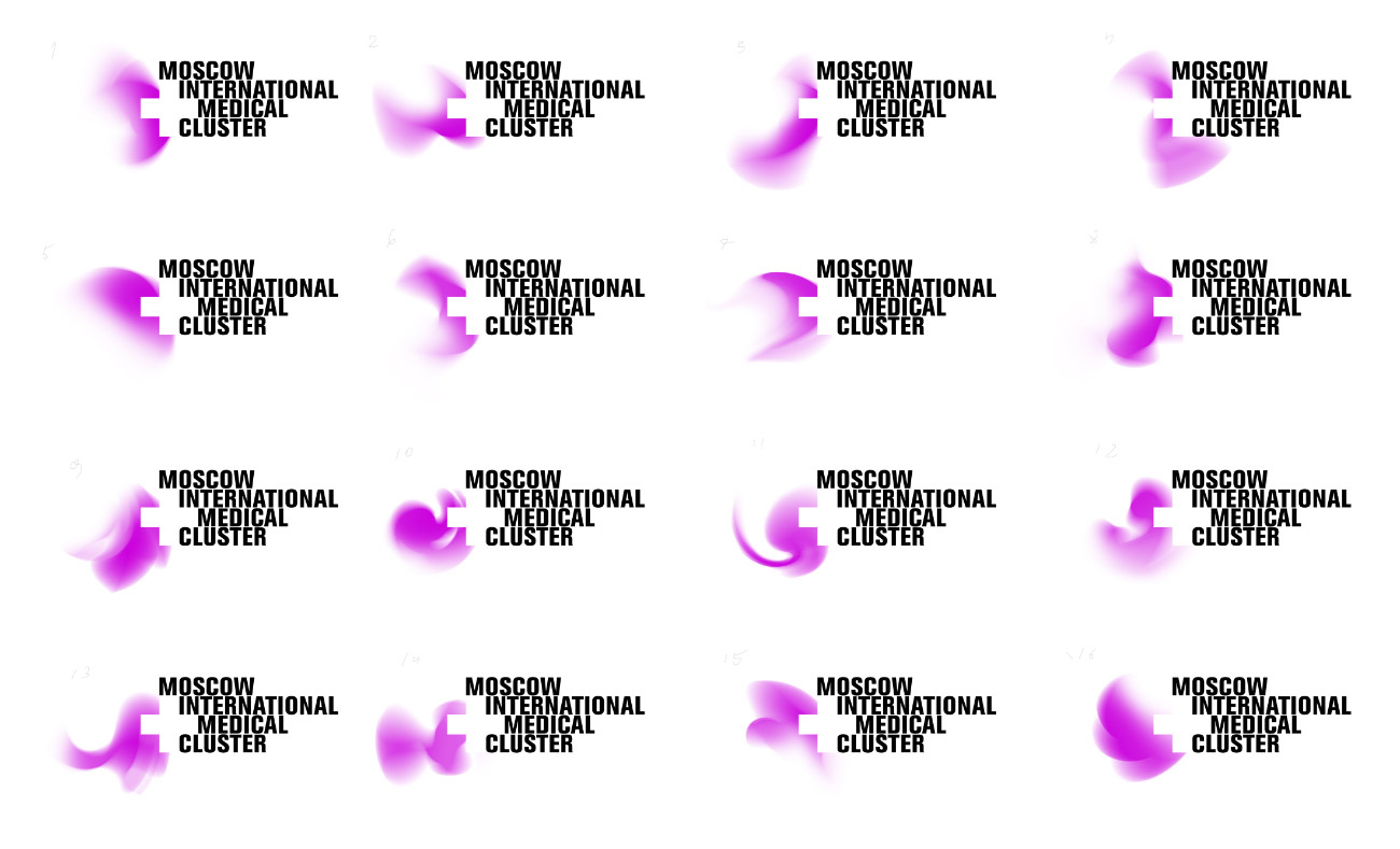
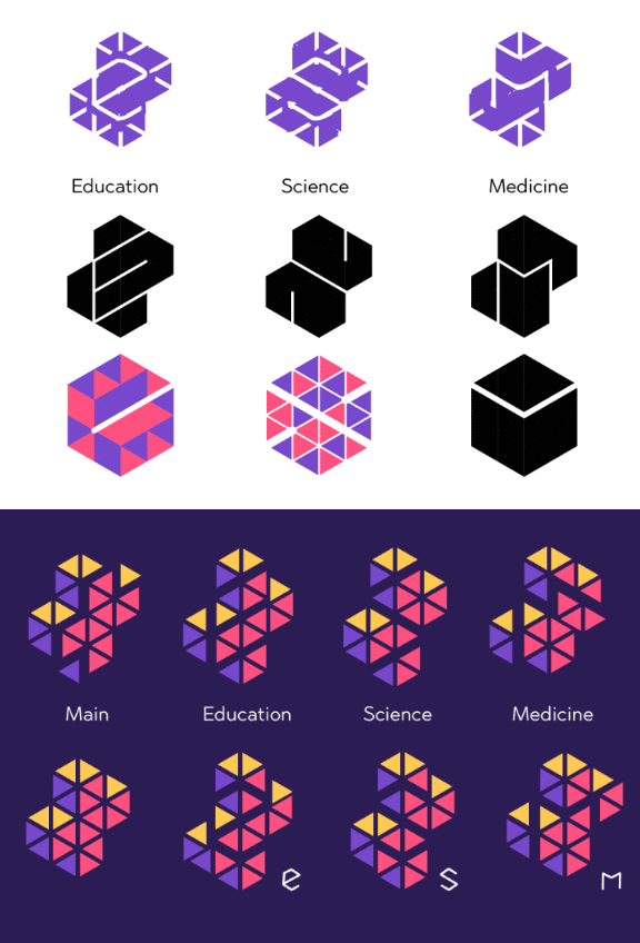
Segmenting them by focus areas. Initially, we wanted it to be a truly generative approach with blobs of free shapes. But the client insisted on a constant primary logo for the project launch. All games with blob shapes can still come later.

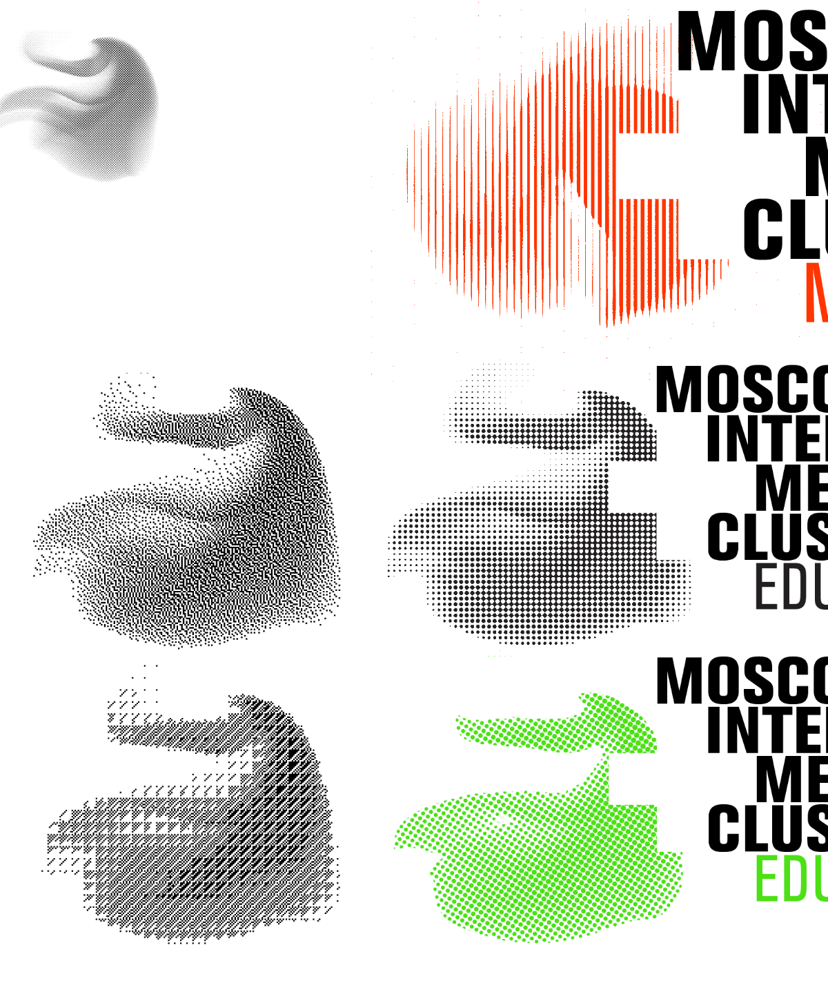
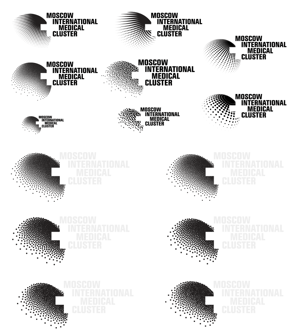
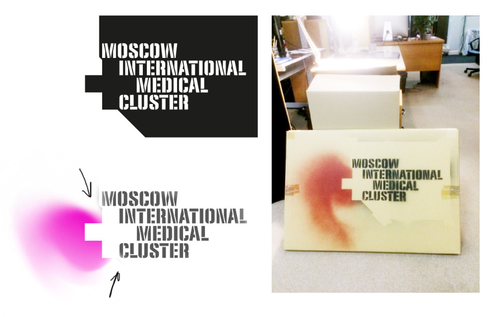
Thinking how it can be rendered in a single color for printing.
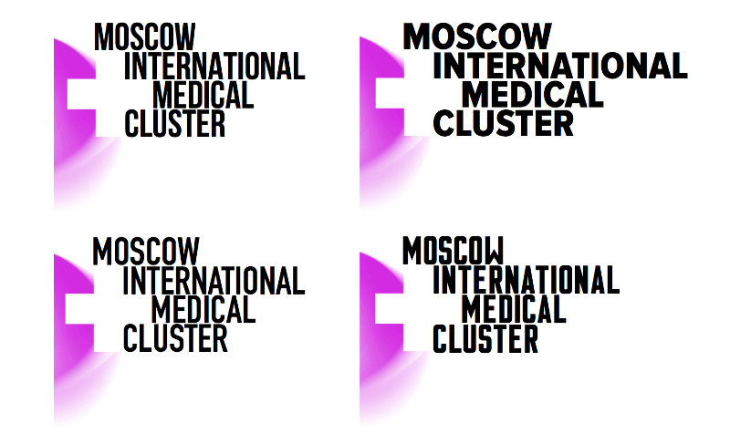
Typeface variations.
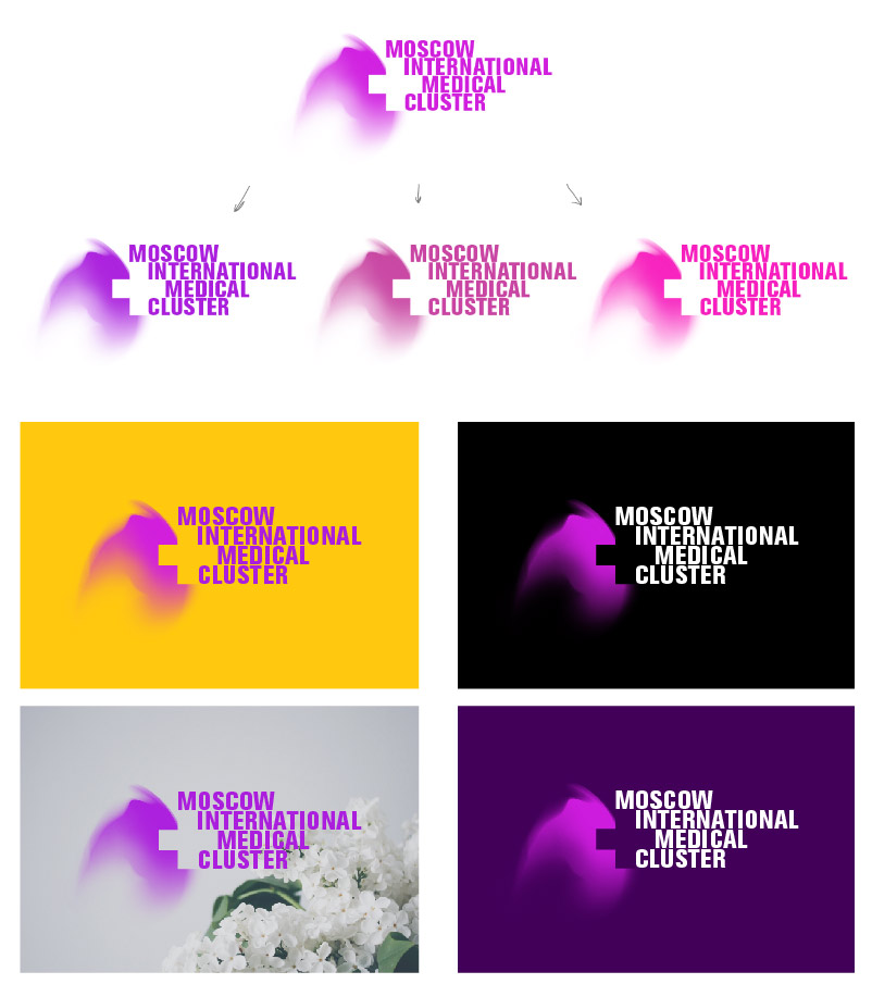
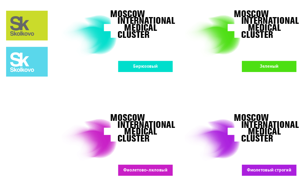
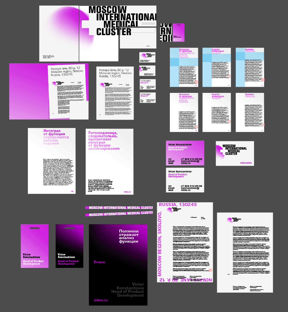
Choosing the color of the main logo.
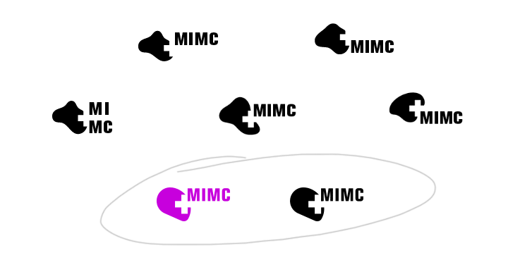
By the client’s request, generating a minimalist version.
The client chooses the sphere-based shape (as if hinting at the globe) for the main logo.
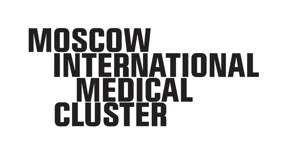
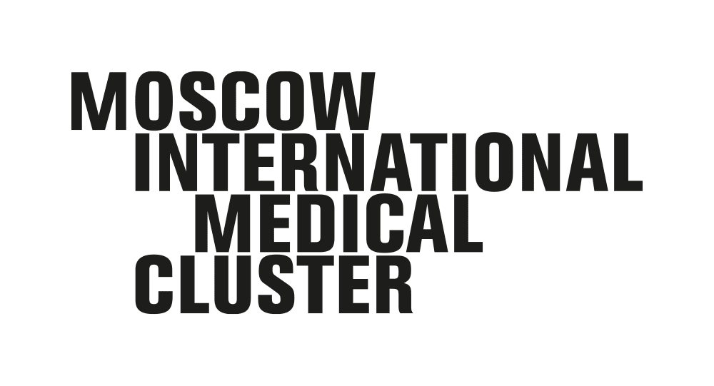
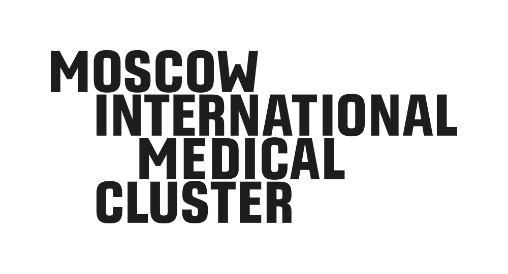
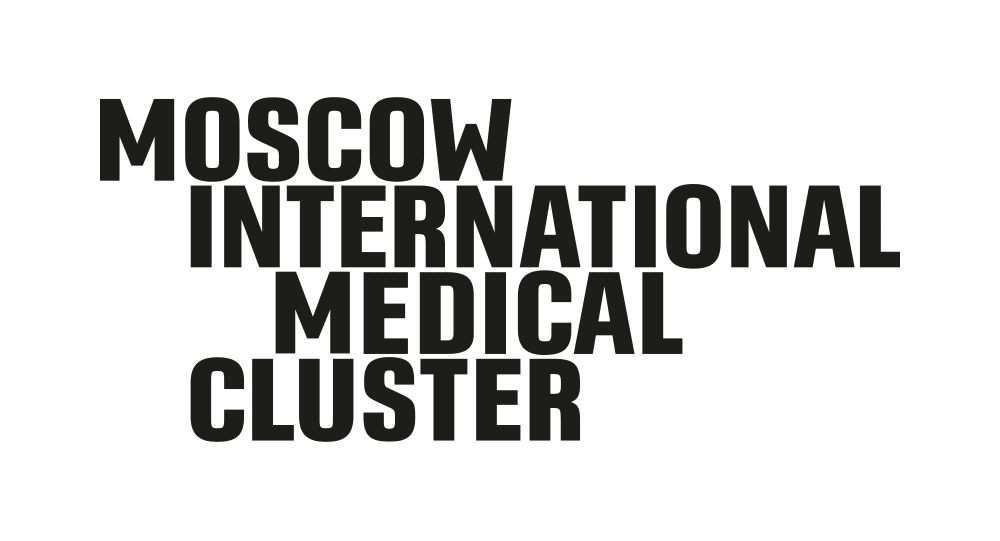
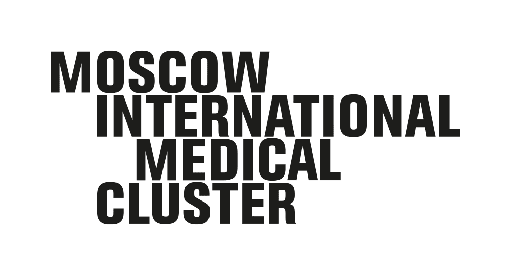
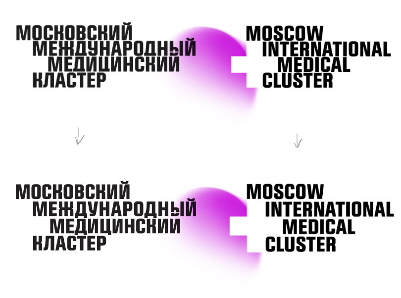
Finalizing the text part.


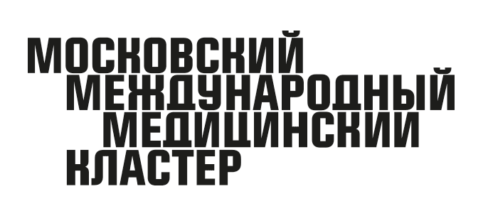
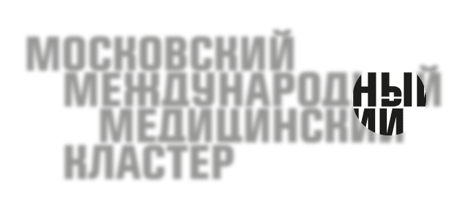
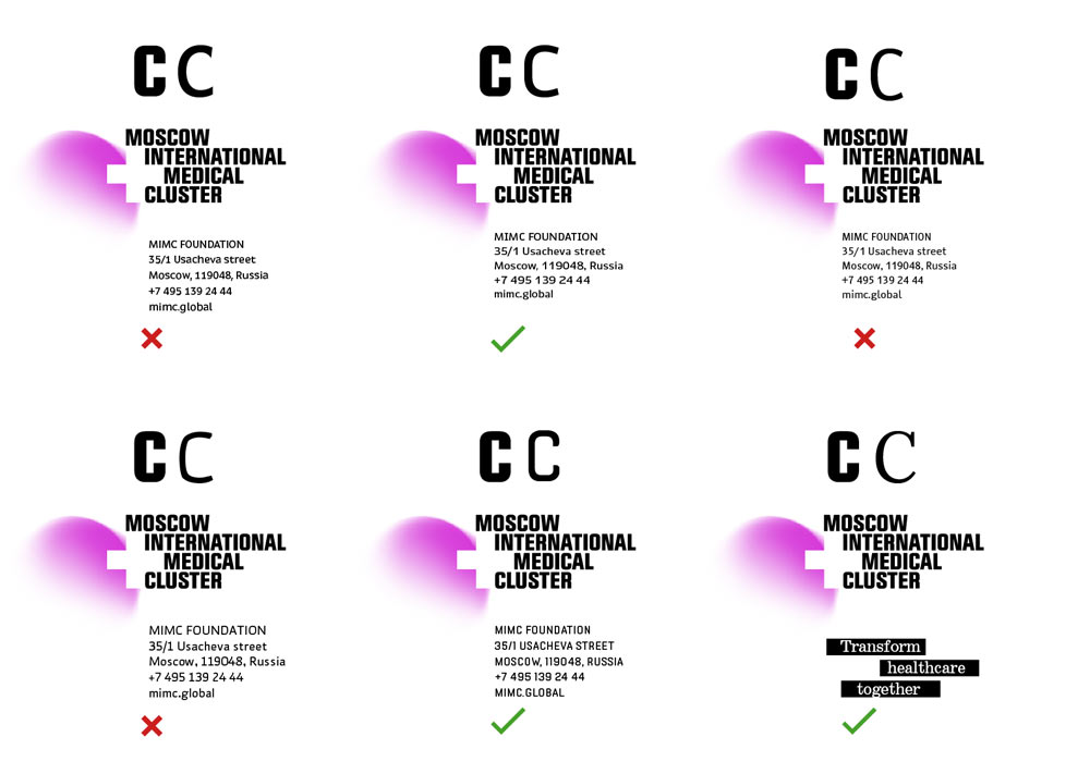
As it turns out, we also need to create a Russian version of the logo. Immediately the problem of small line spacing becomes evident: the letters Д, Ц and Й look bad.
The designer suggests to slice the letter Ы.
Searching for a better shape of Д, Л and У.
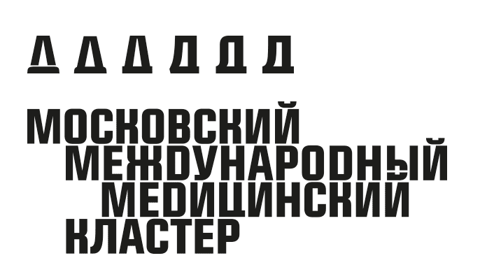
The problem with stems still isn’t solved. Increasing line spacing.
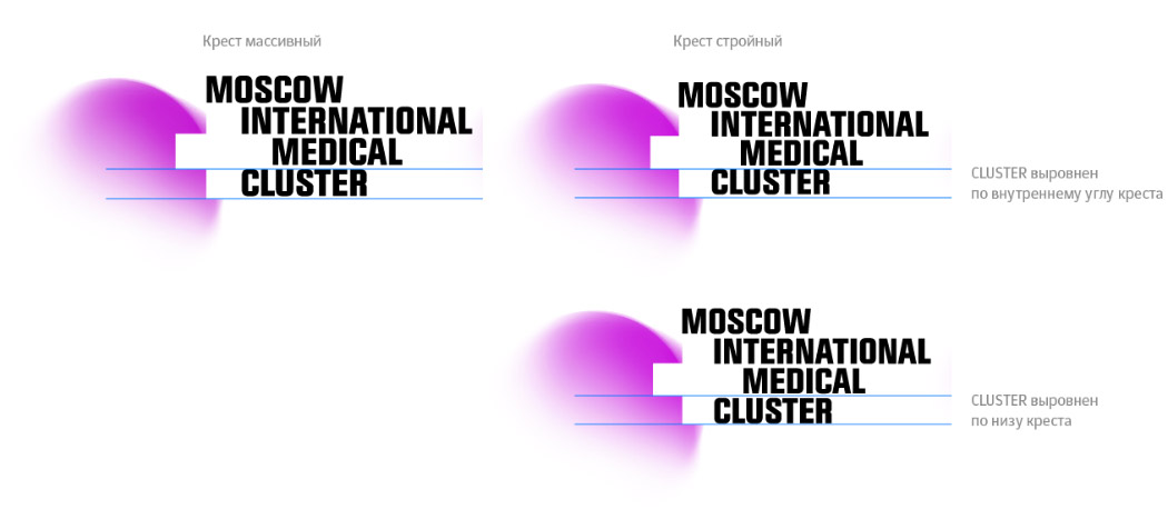
Searching for the best position and proportions of letters relative to the cross.
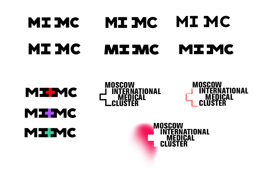
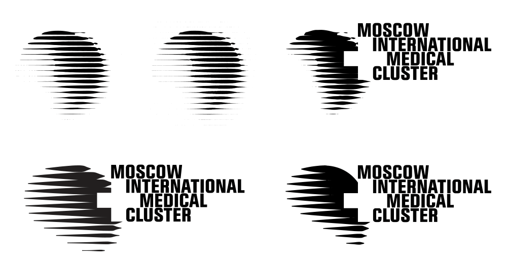
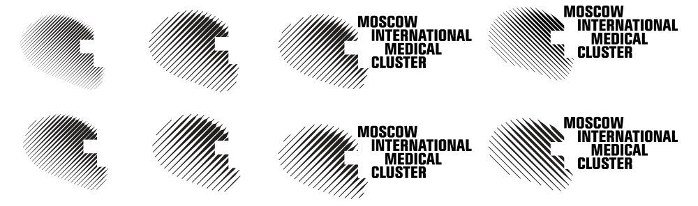
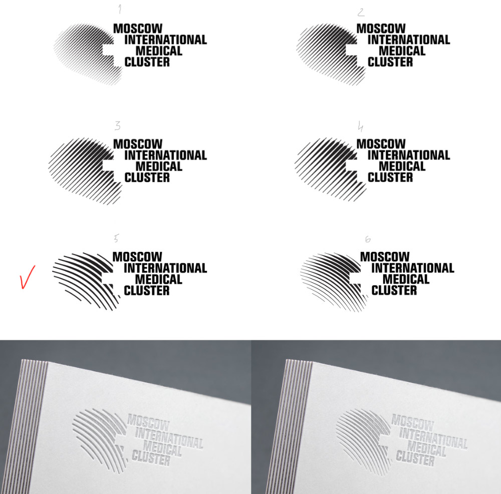
Returning to the search for the best monochrome design.
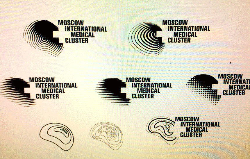
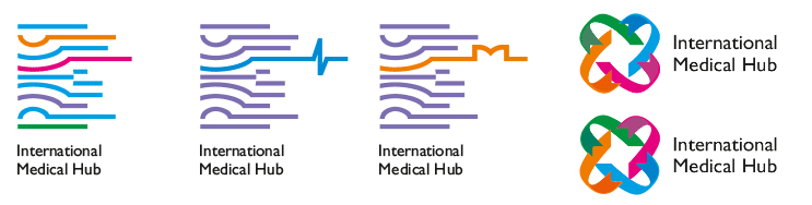
We like the dynamics and the rhythm, it’s like a sound wave. But the client believes that the straight lines are too aggressive and look like spears, arrows or a fence.
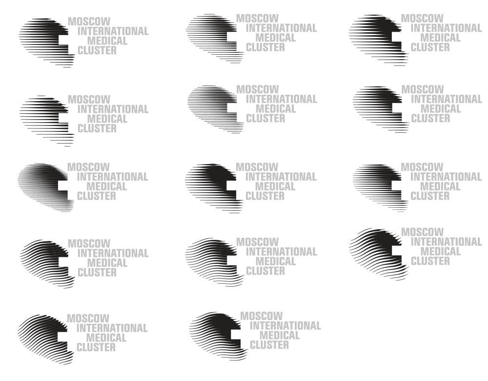
Still not what we need, but we’ll come back to it later.
Creating a sketch of the overall style. We want a bold dense set with modularity.
Testing the typeface size.
General set.
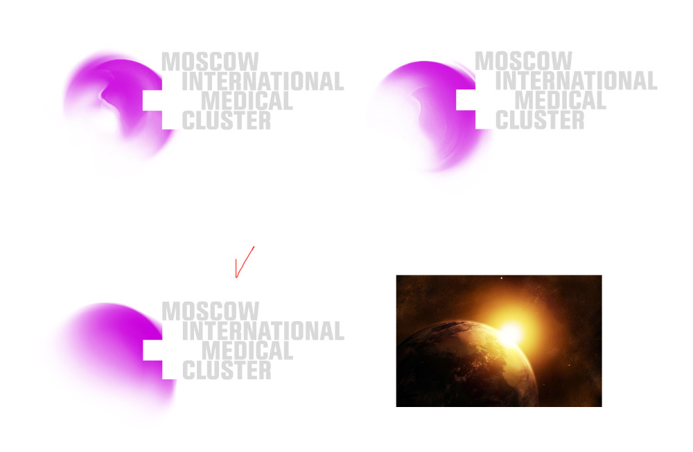
The overly gentle white backgrounds with blobs remind of perfume packaging.
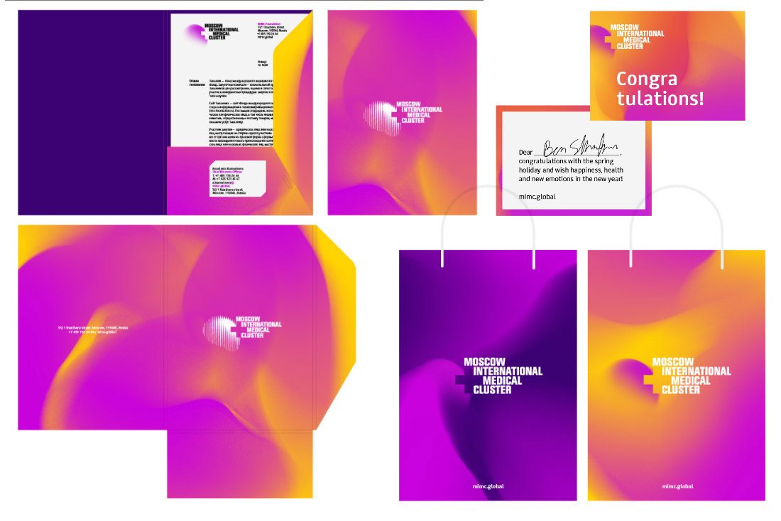
And this is too active, we need to be more careful with backgrounds. More clear backs and local color spots.
Choosing a display typeface.
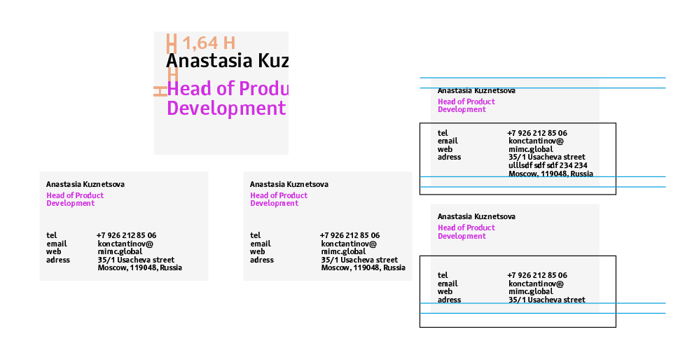
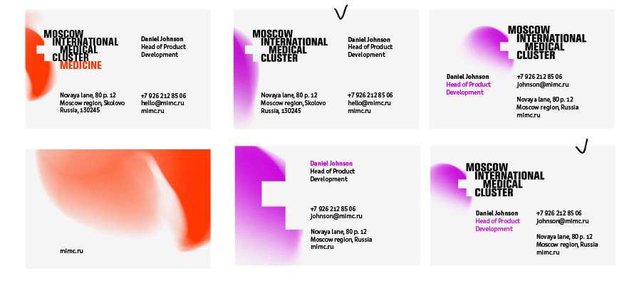
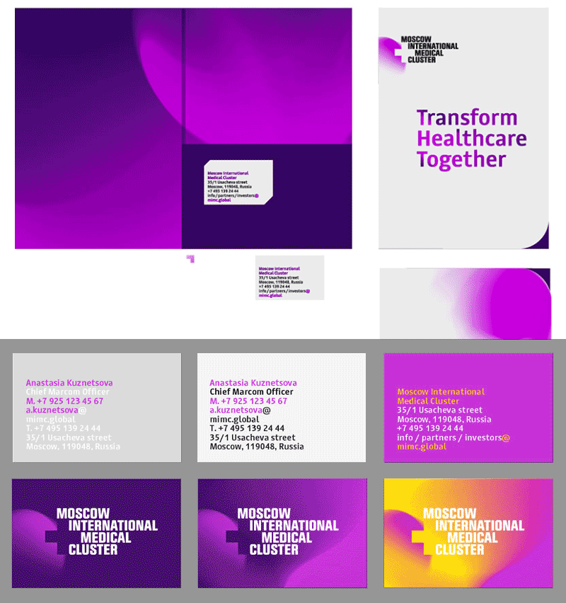
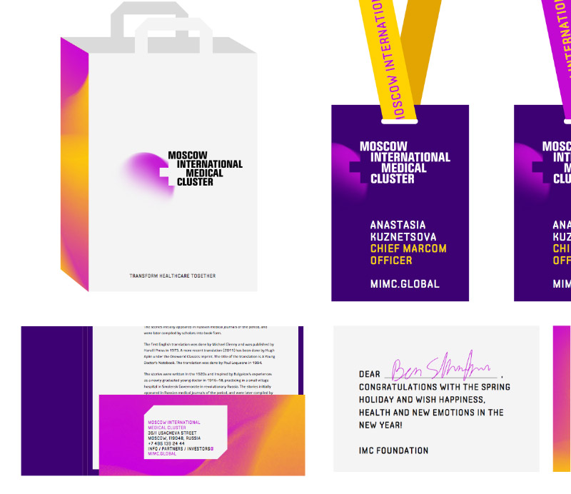
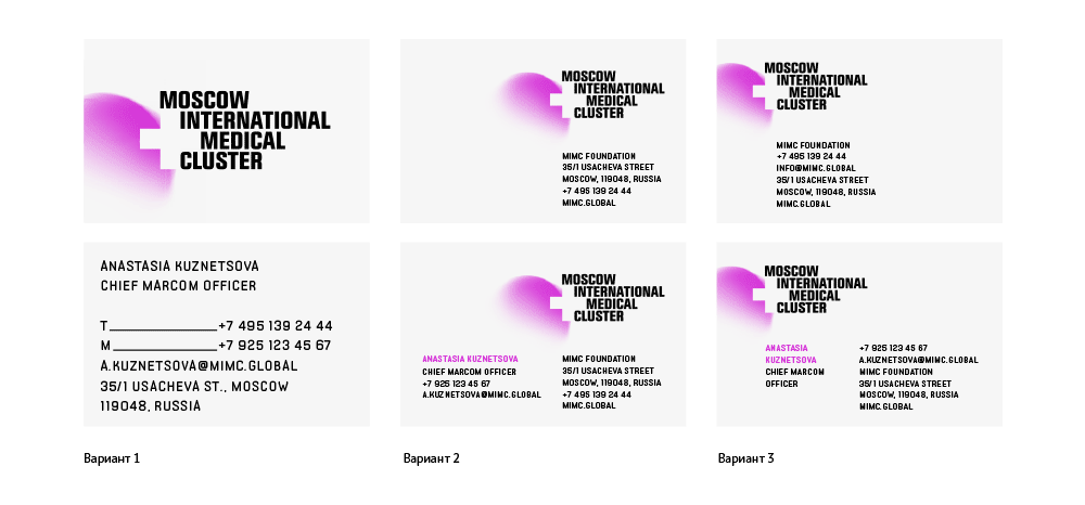
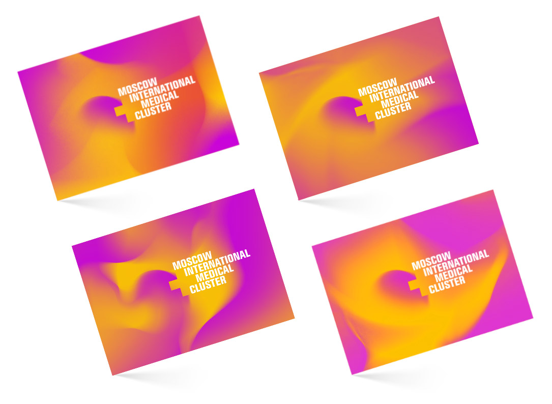
More business cards.
Trying out a more radical layout.
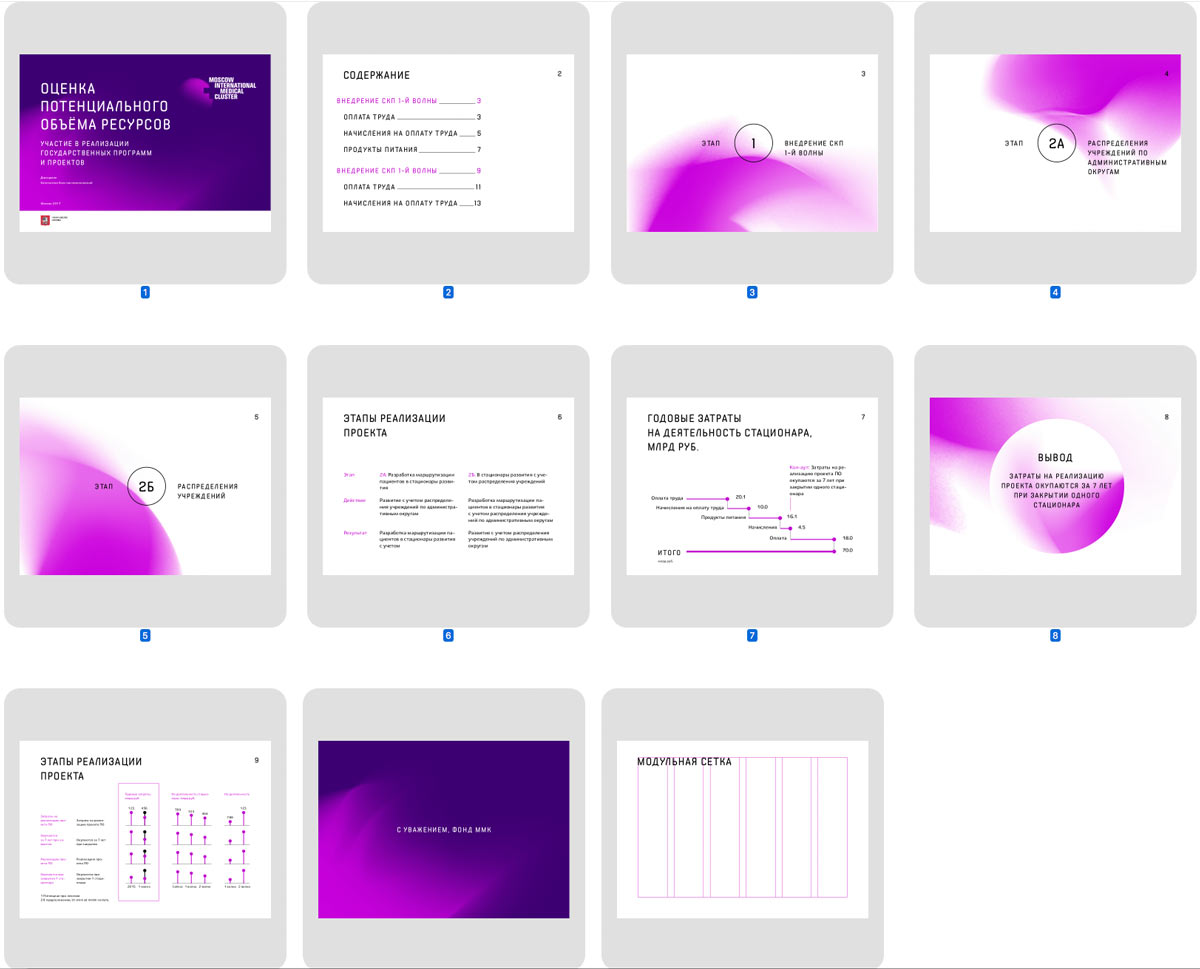
Working on presentation templates.
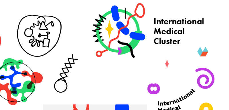
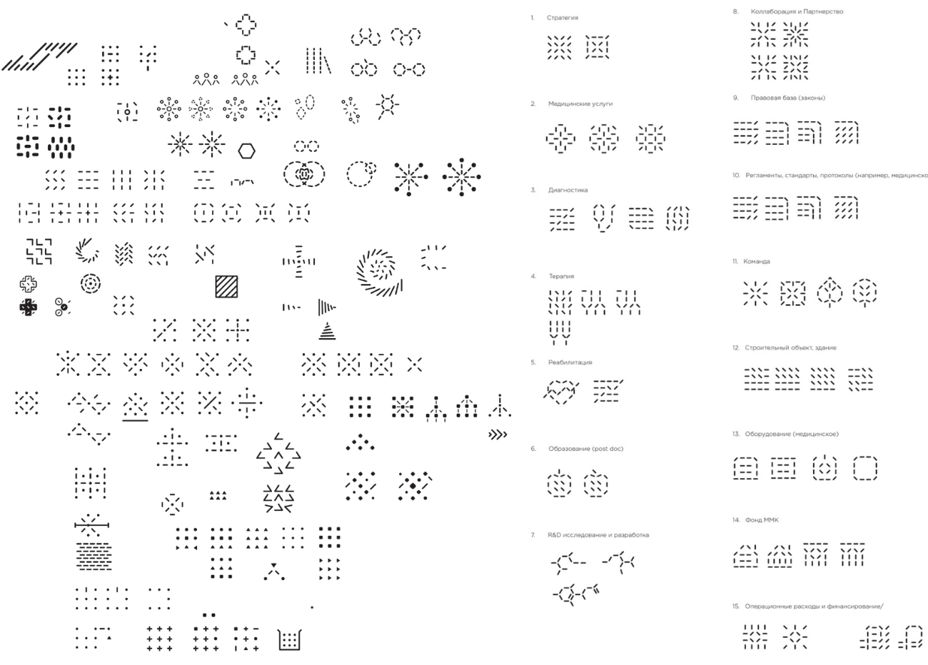
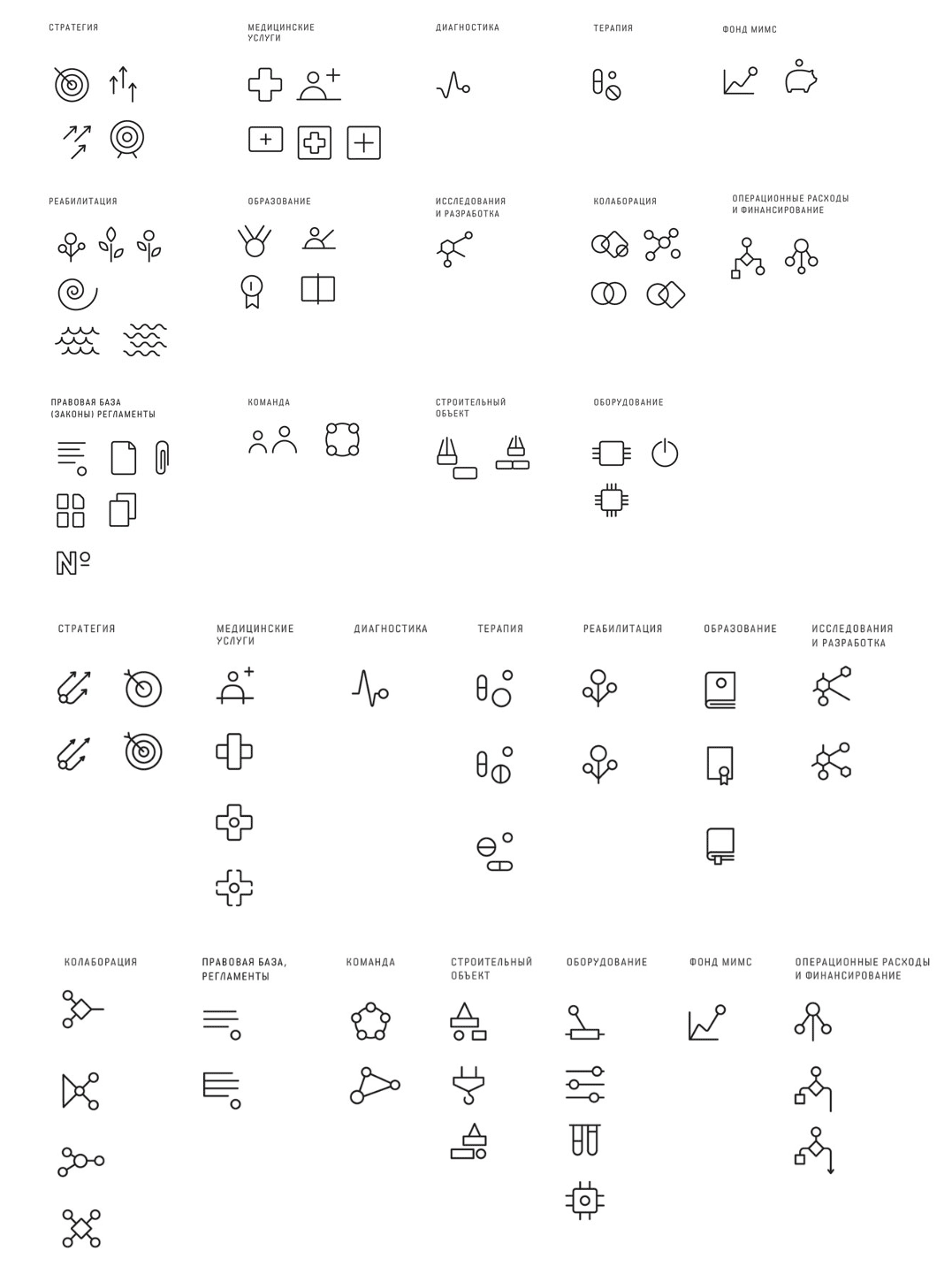
Drawing themed icons.
Finally getting approval for the monochrome version of the logo.
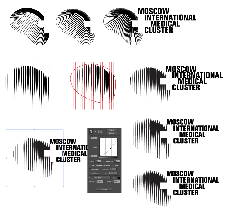
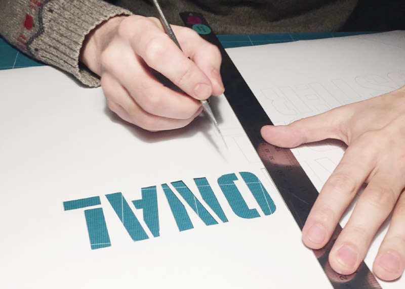
Testing the stencil. Ultimately deciding to create it out of two parts, separating the letters and the cross.
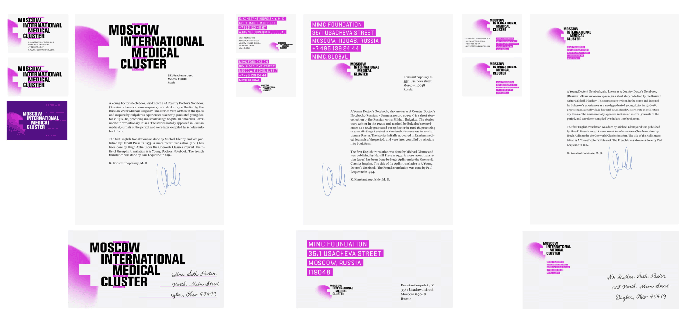
Finalizing the front side of the postcards.
Drawing the favicon.
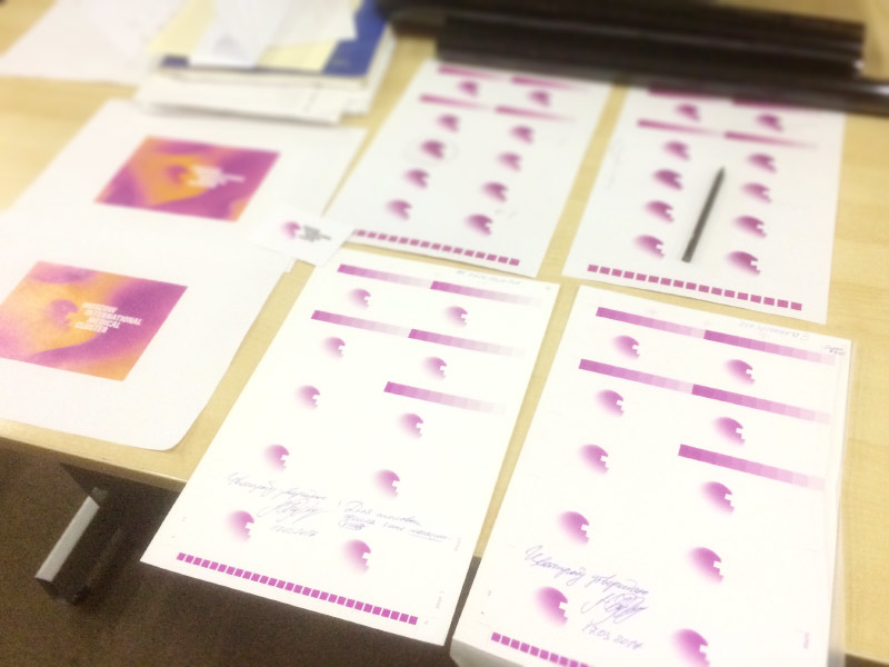
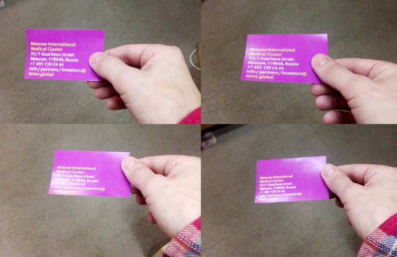
Slightly adjusting the purple color after color proofs come back. Making changes to guides and preparing mock-ups for printing.