Packaging design for the “Pikanta” product line
“Pikanta” is a Russian producer of canned vegetables, sauces, and syrups, operating since 1999. The company releases products under its own brand and also produces goods for large retail chains under their trademarks.
The brand decided to undergo a transformation: an independent marketing unit appeared, systematic work with the target audience, positioning, and visual style began. The studio developed a dynamic packaging design for vegetable products.
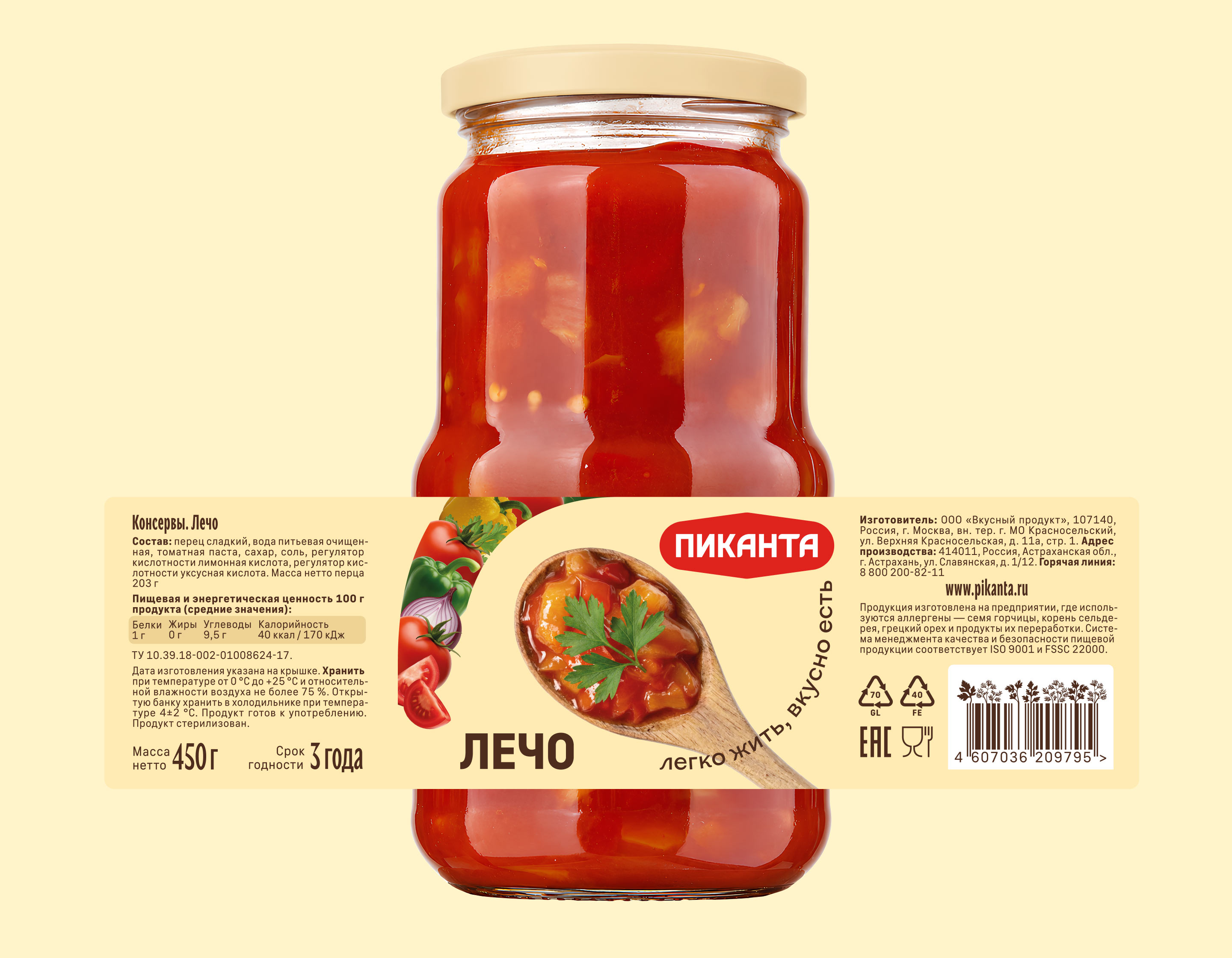
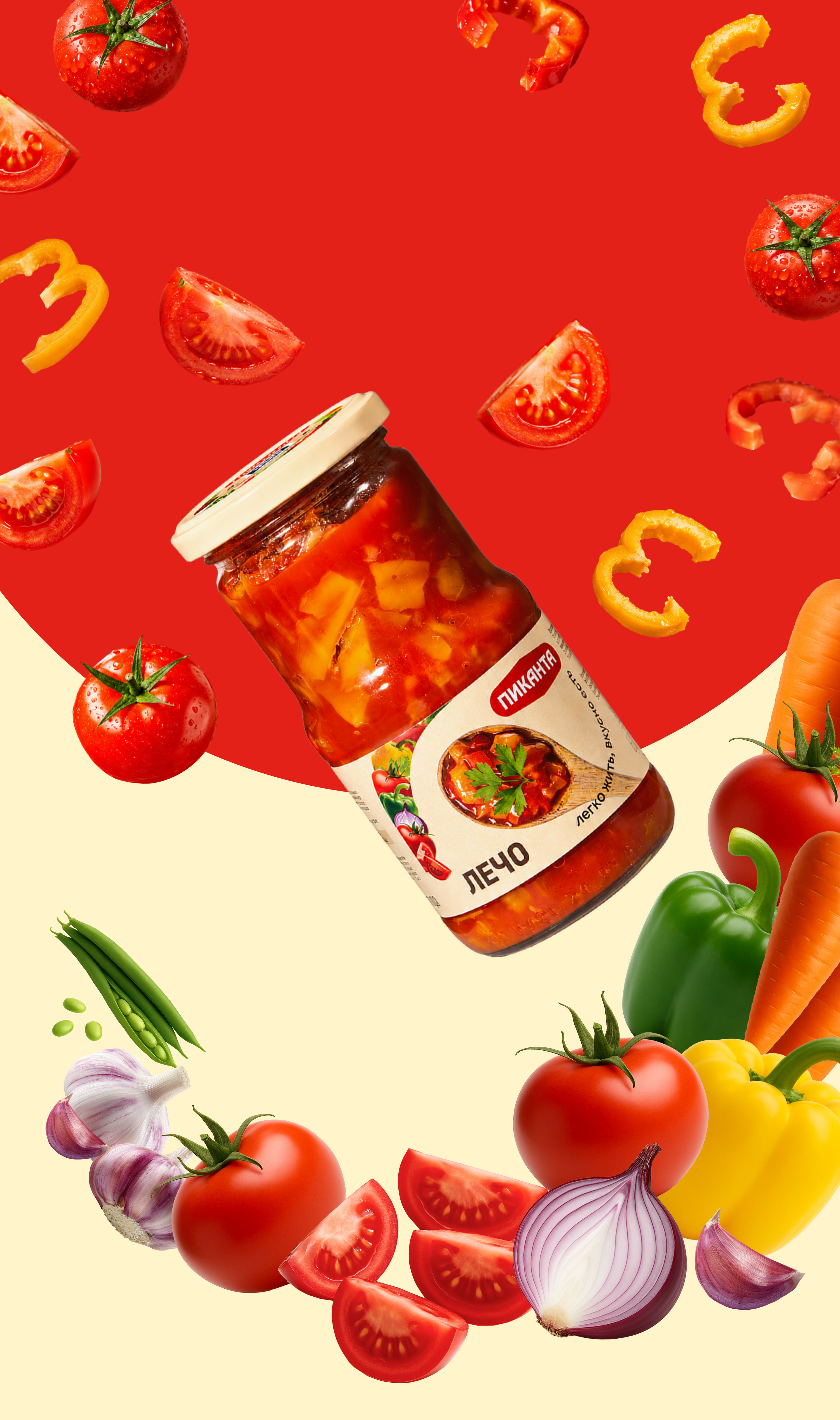
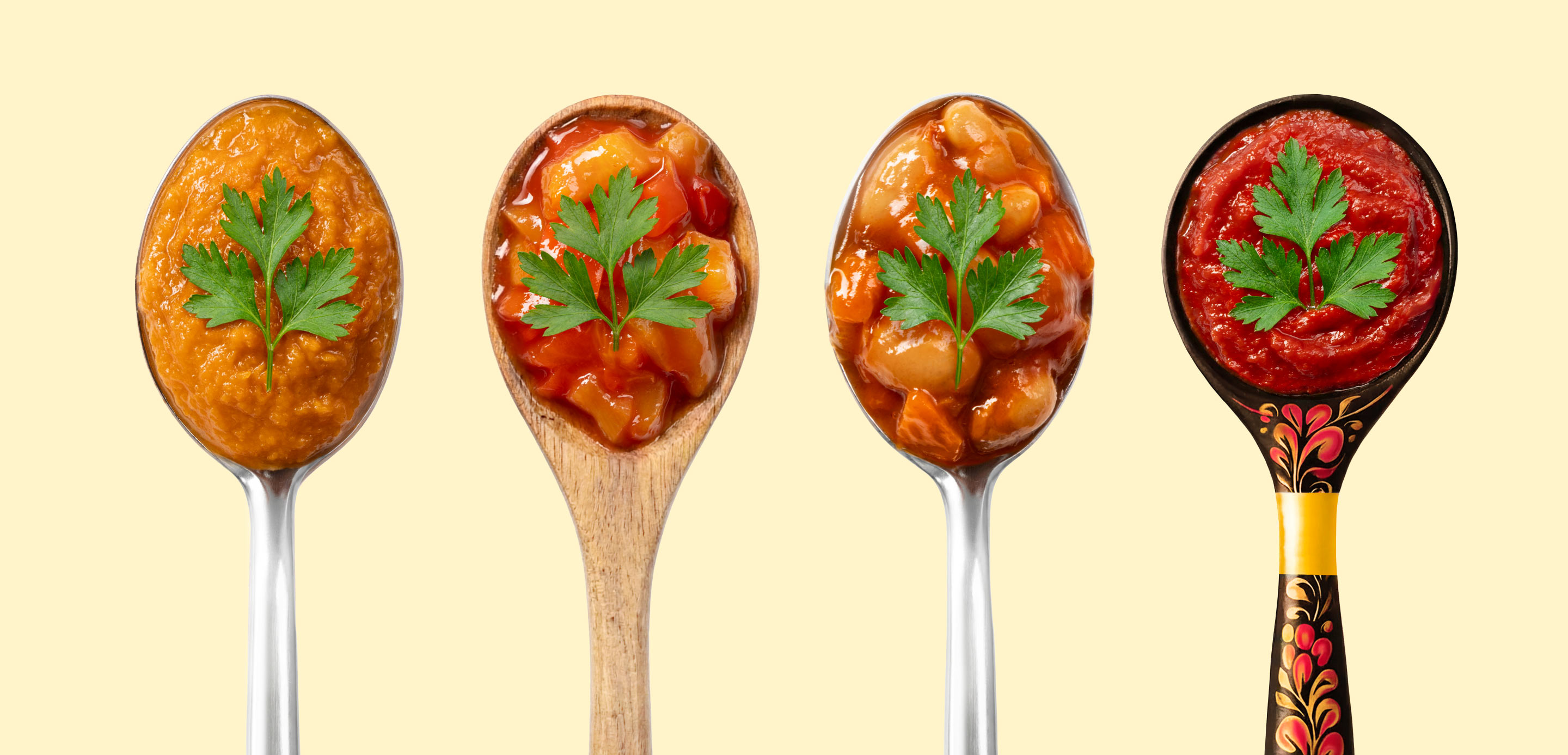
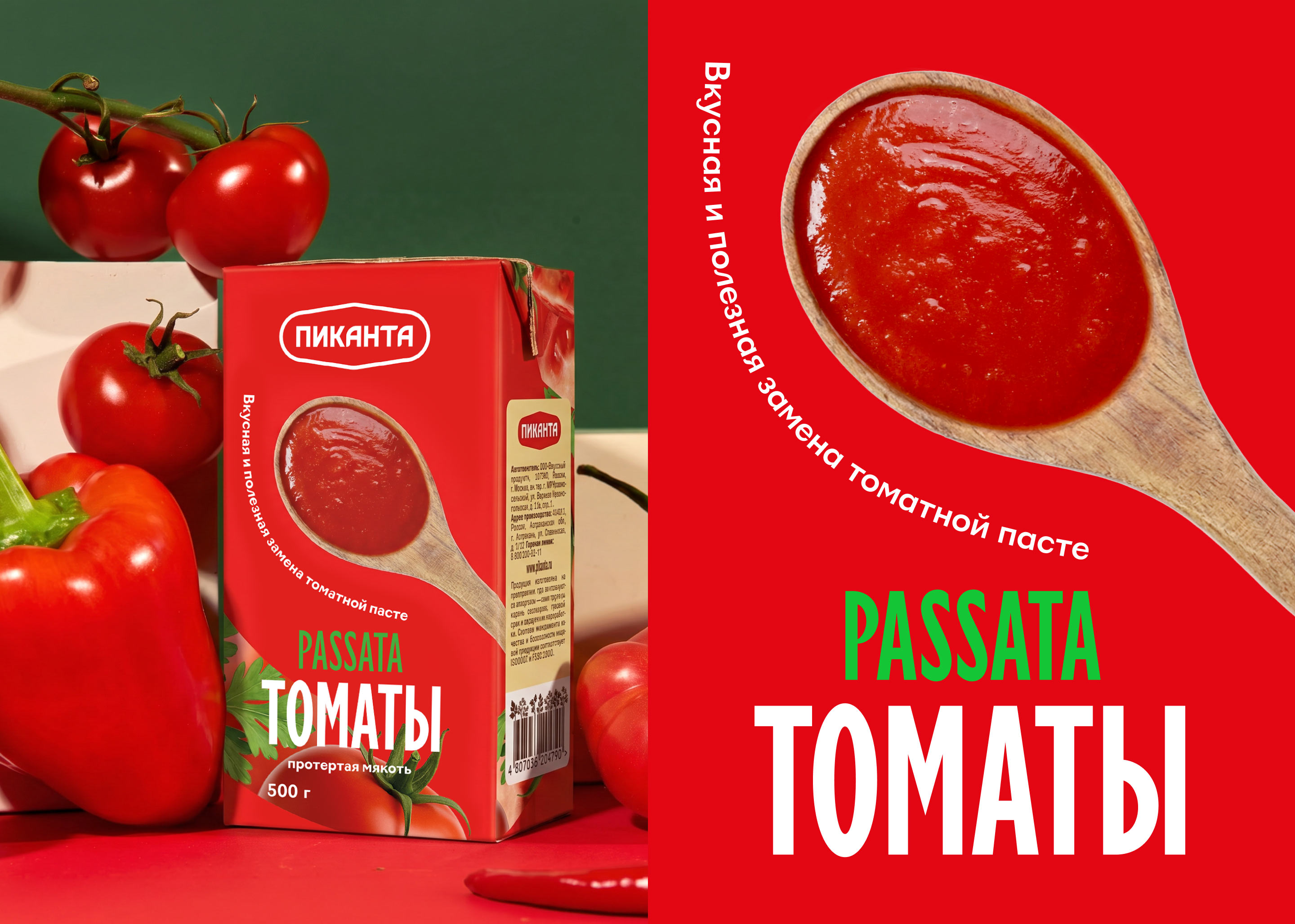
The graphic technique is based on a “whirl of flavors” — a vivid element that reflects the diversity of the product line.


At the center of the packaging is a spoon literally serving snacks and sauces to the customer in the best possible way. As the filling changes, the spoon changes as well: steel, wooden, painted — each product has its own.
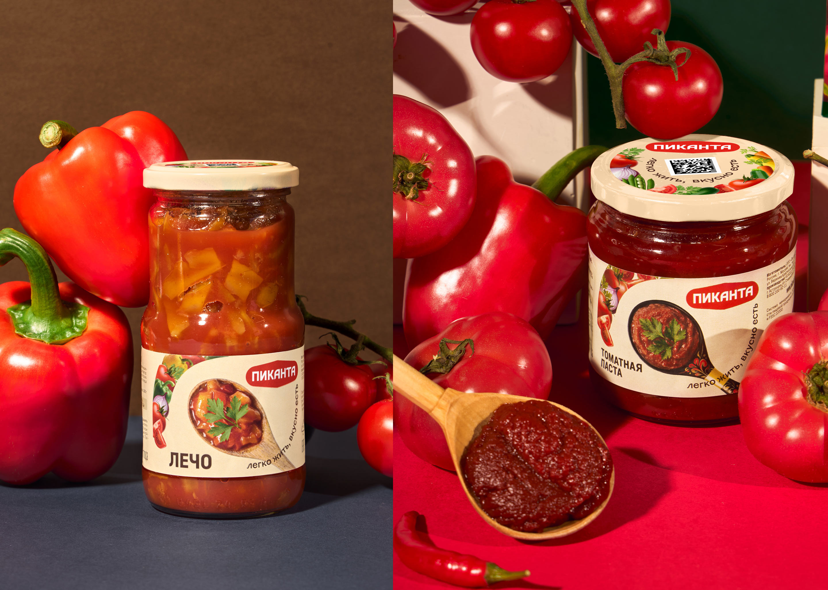
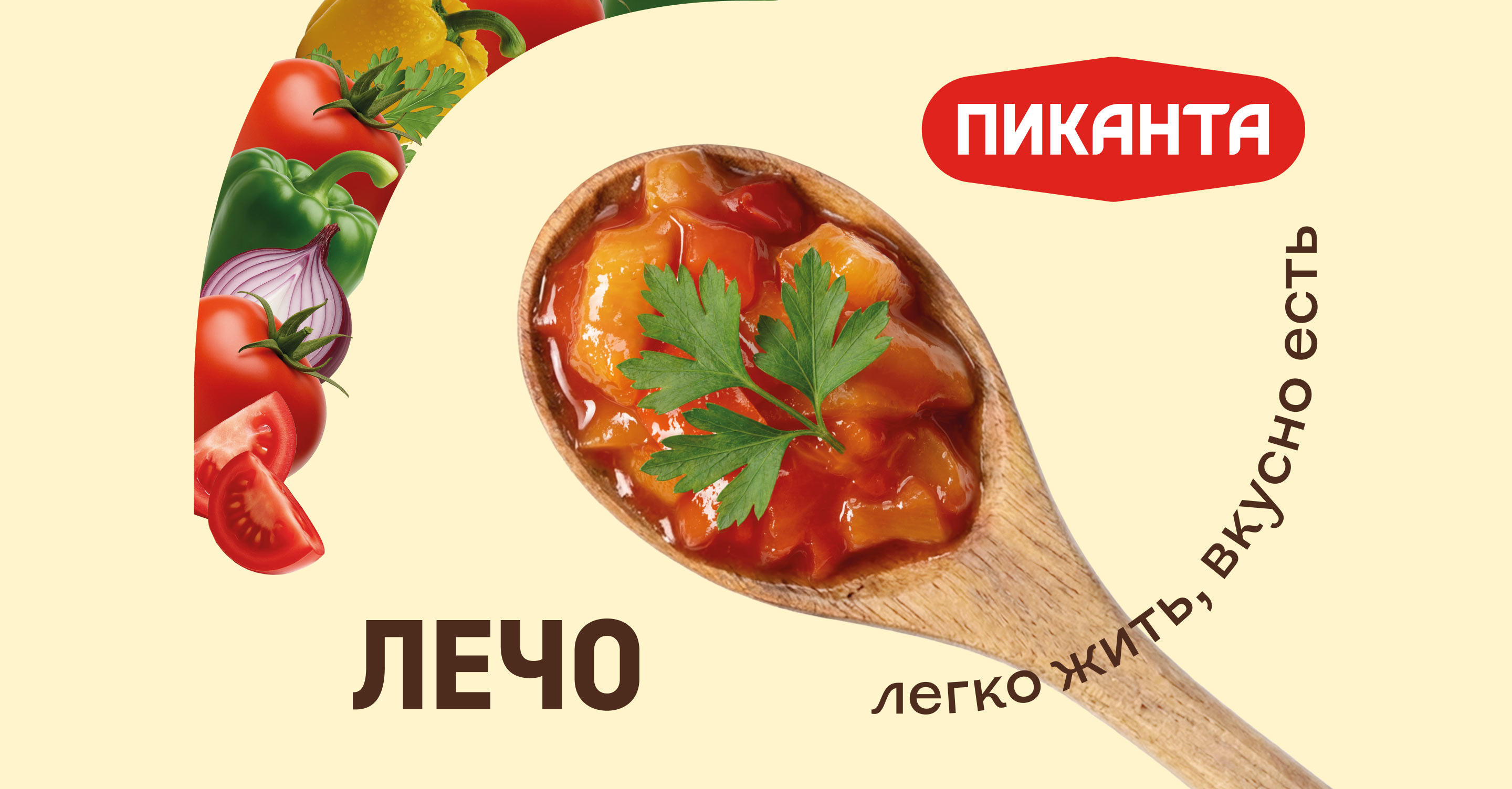
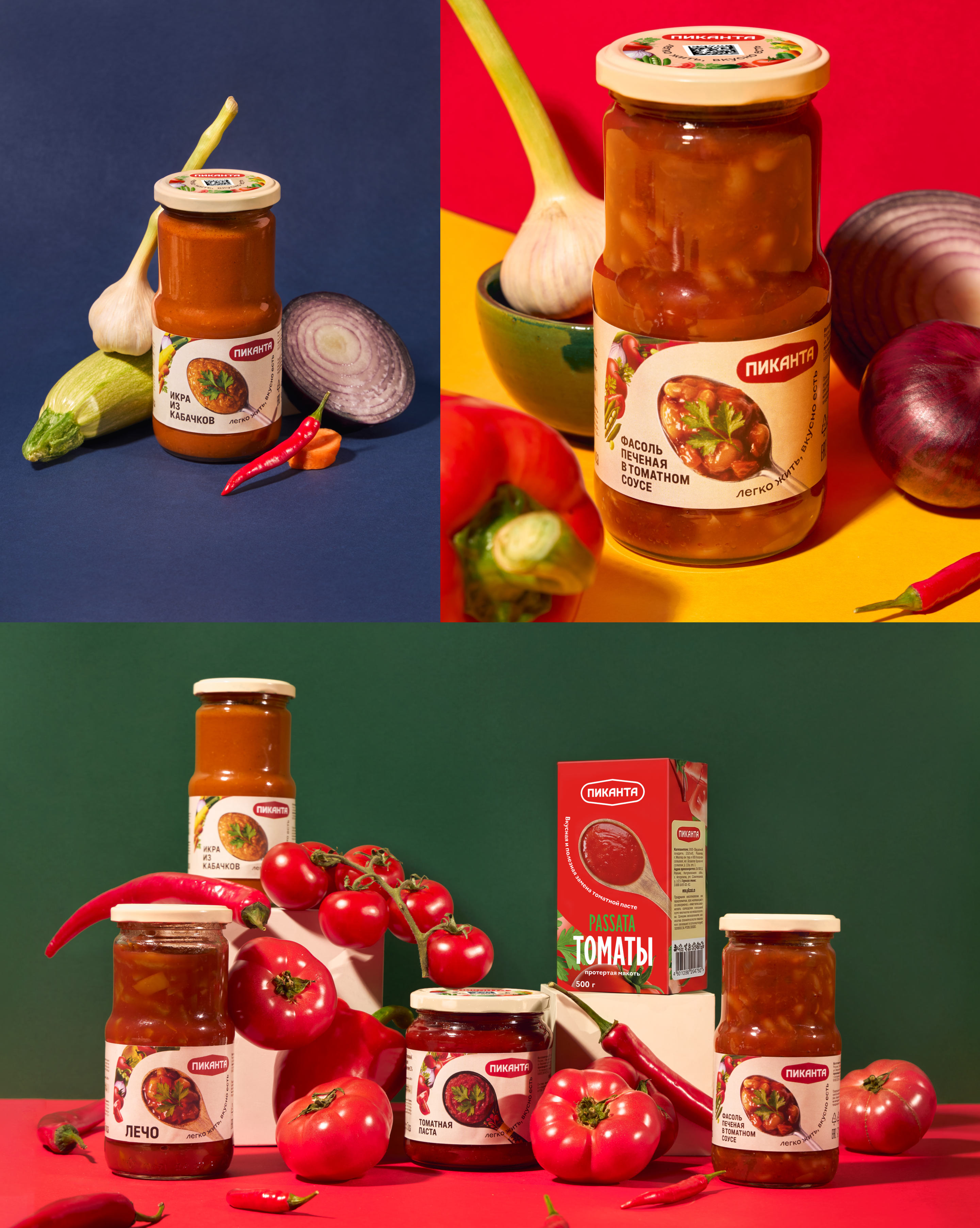
The composition is completed by the brand slogan: “Easy to live, tasty to eat.” The packaging design is easily adaptable and covers the entire Pikanta assortment while maintaining integrity, recognizability, and vividly highlighting the products on store shelves and marketplace showcases.

art director
designers
- Kydana Ignateva
- Ella Dovnar
