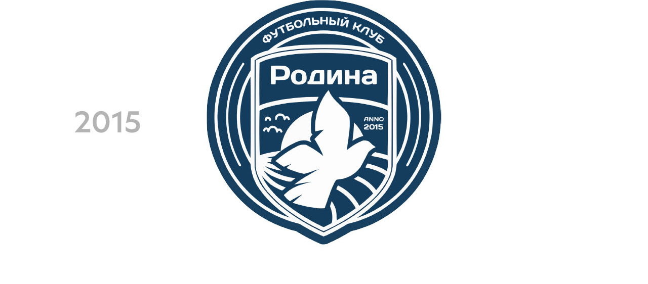
The Russian football club “Rodina” was founded in 2015. This season the club continues to search for and develop young football players.




Since its foundation, “Rodina” has greatly expanded, and now the club includes two professional teams, a youth team and its own academy — all this is growing and developing surrounded by devoted fans.
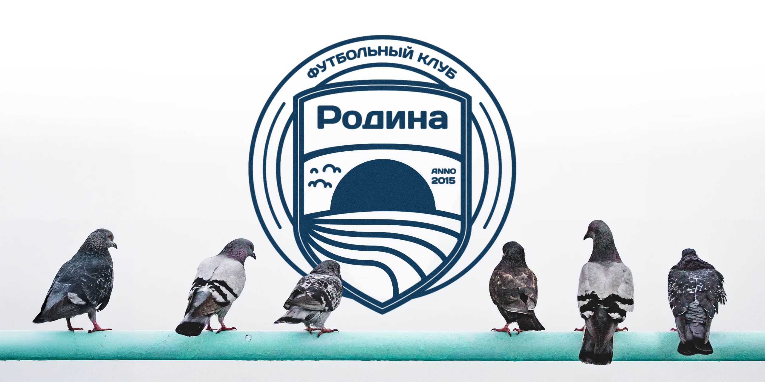
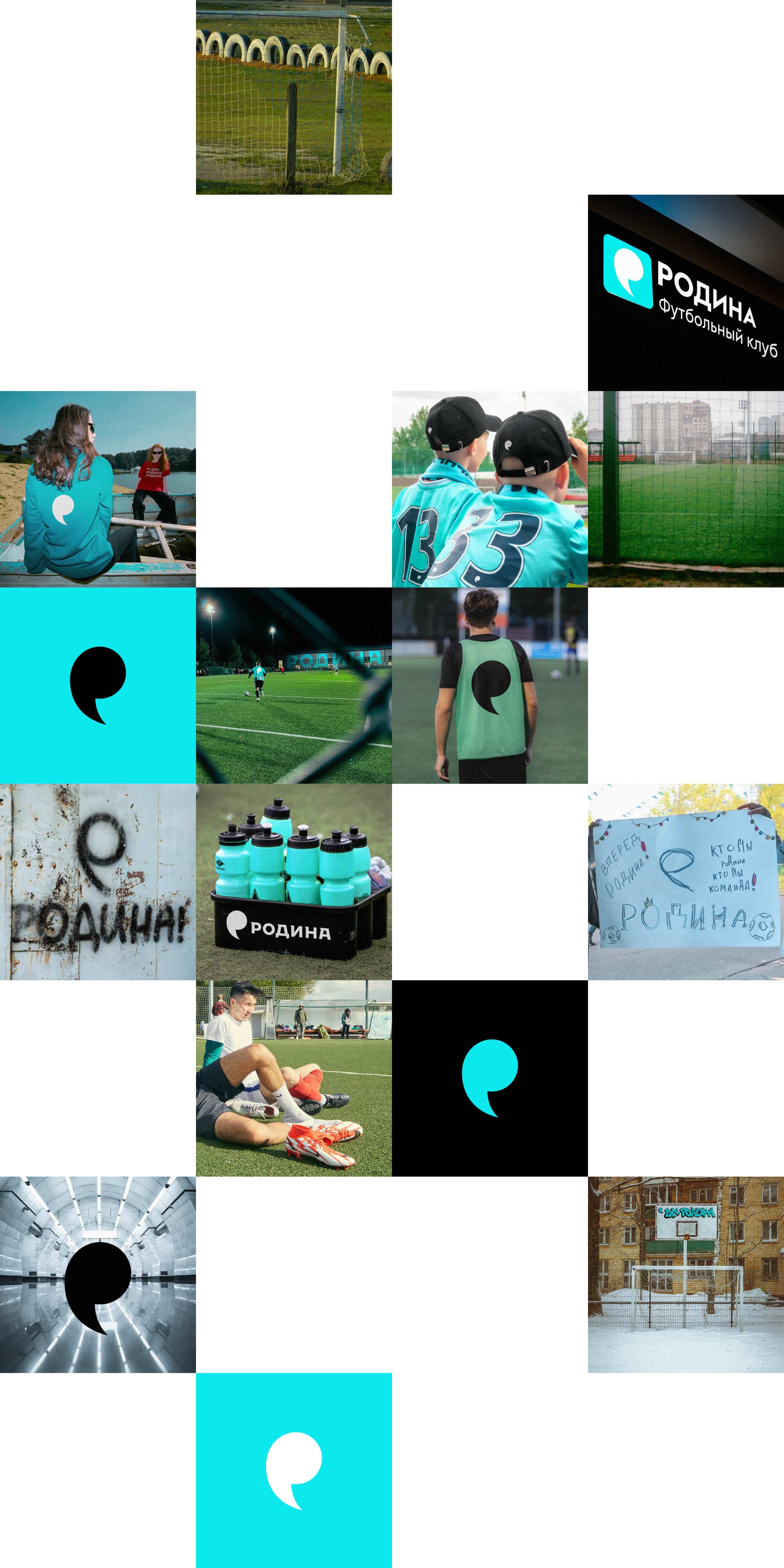
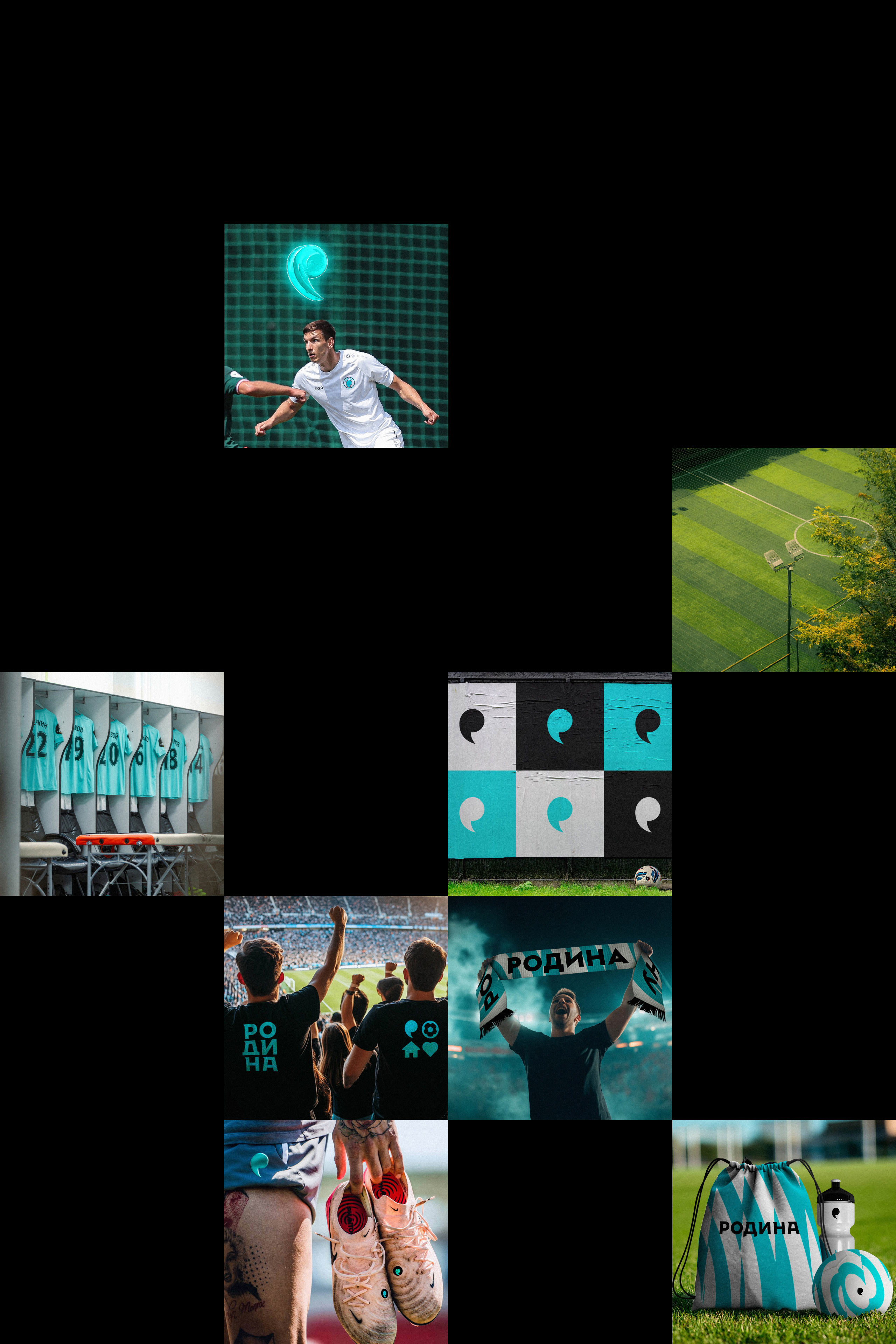
In the studio a fresh and brisk image was devised for the club. The basis of the concept was the idea of continuous movement, uniting everyone who cares about Russian football.

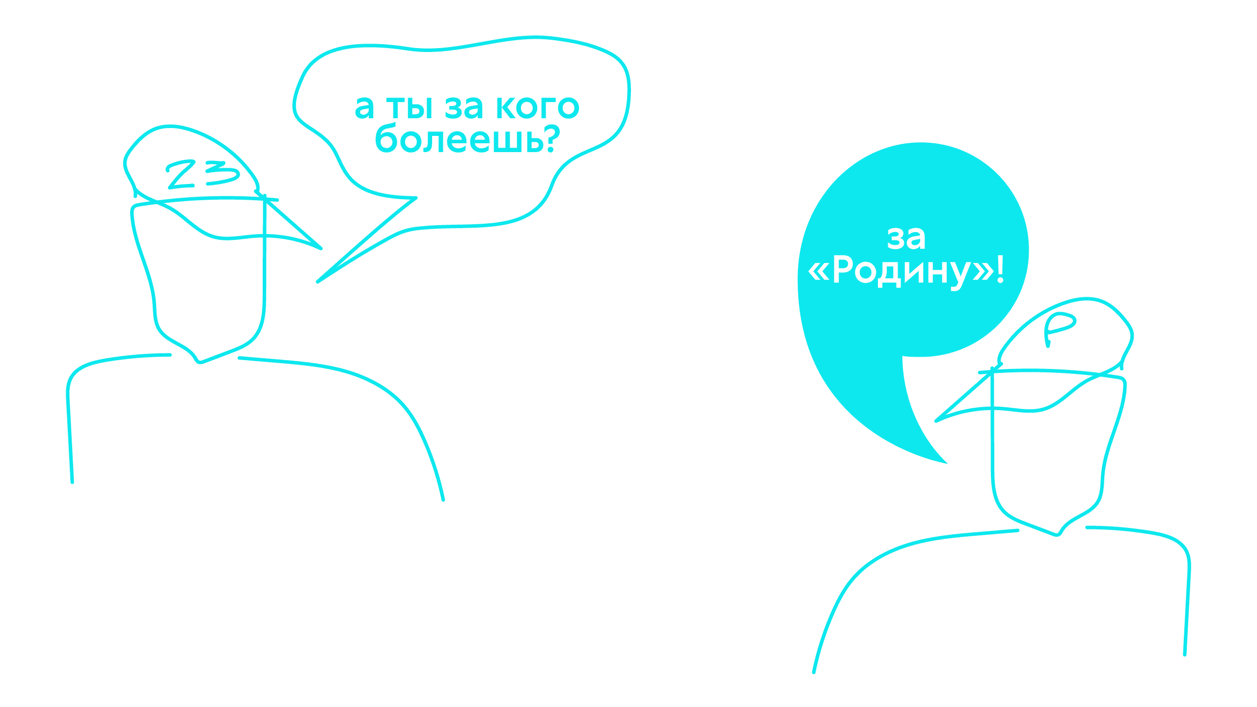
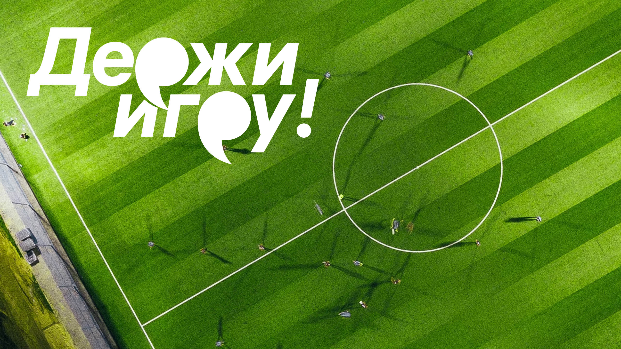
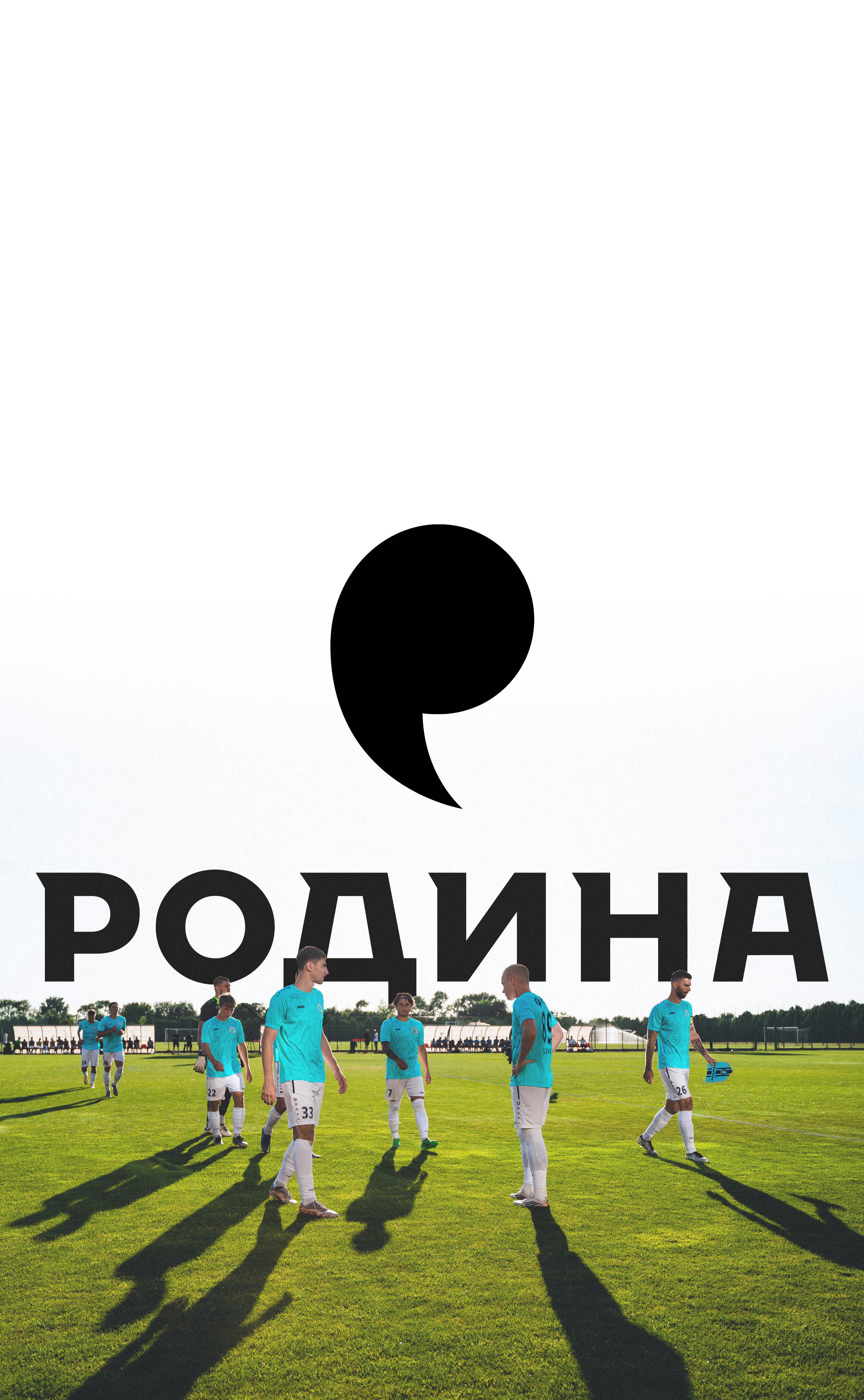
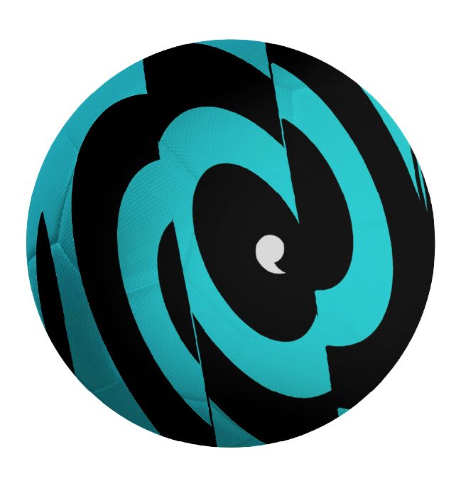
The trajectory of a flying ball as if instantly fixed at the decisive moment and turning into an independent symbol — a comma.
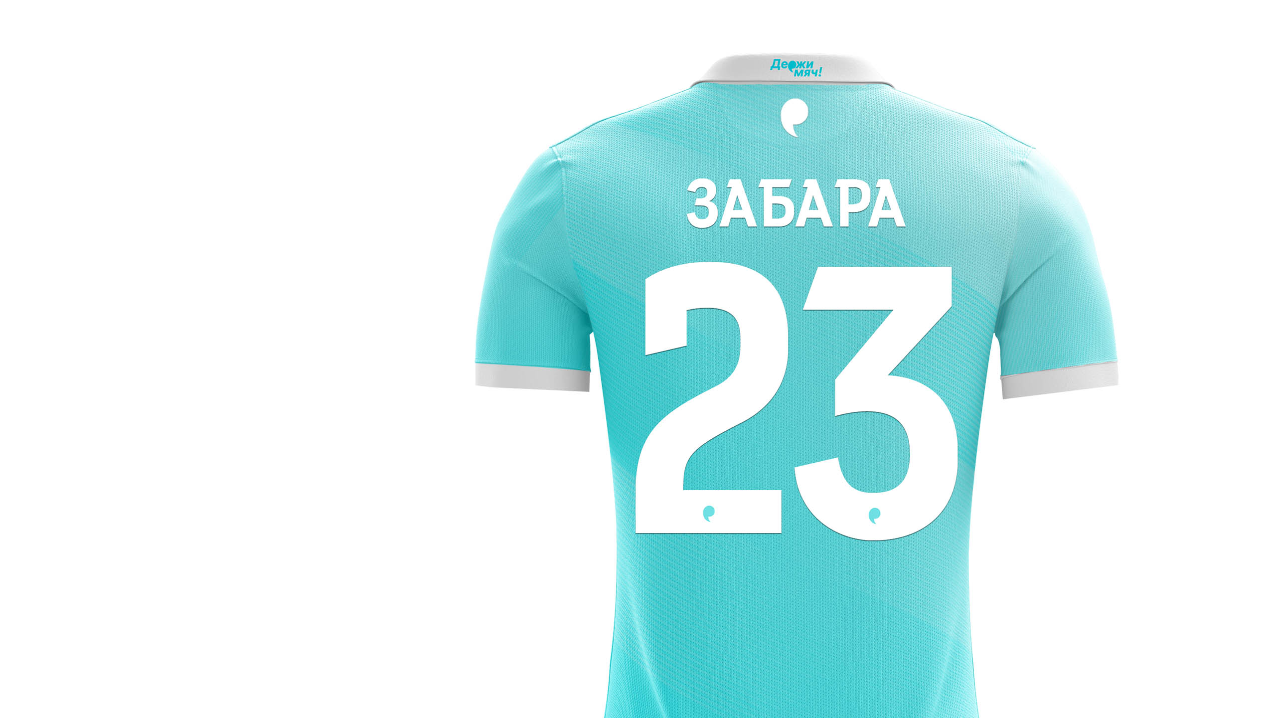
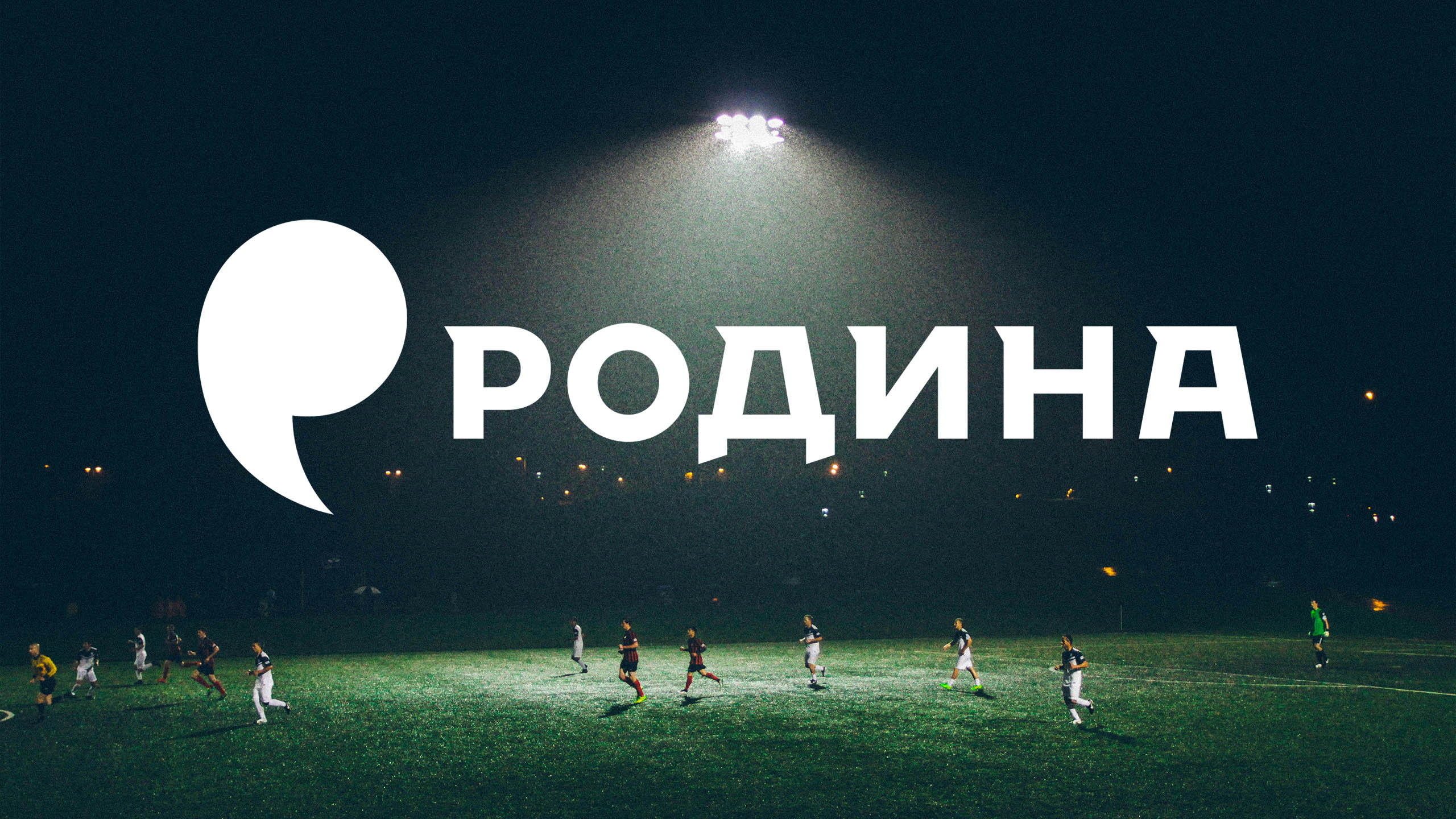
The sign hints that the club’s development is constantly continuing, and at the same time reminds of the first letter of the team’s name.


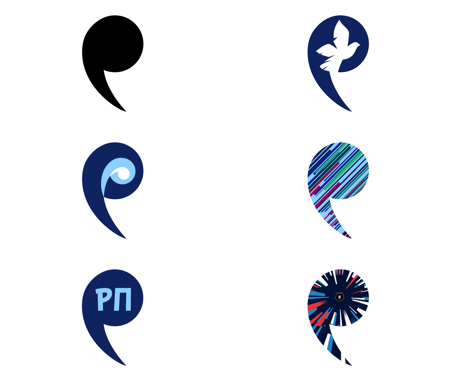
The capacious symbol is able, if necessary, to turn into anything.
The logo design became the result of a large-scale research, after which the studio also developed a brand platform and created a communication strategy for the updated “Rodina”.
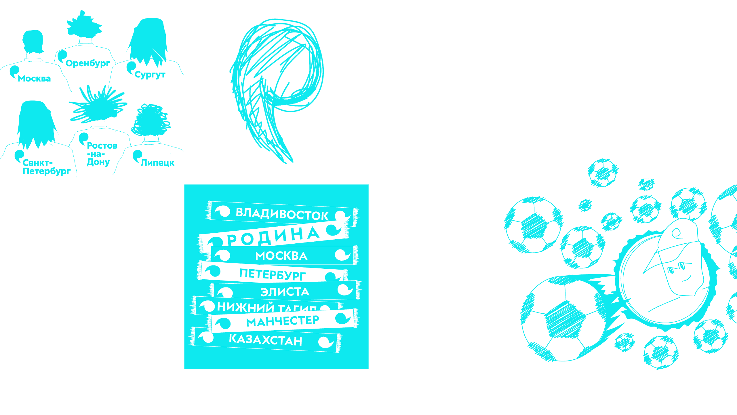
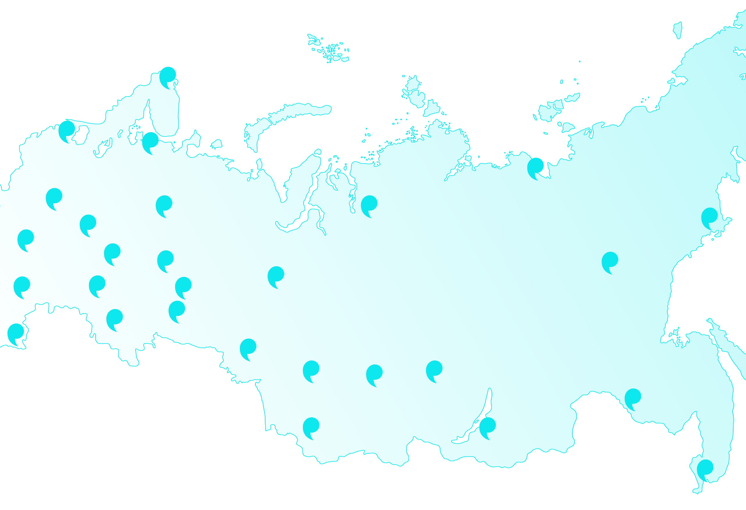
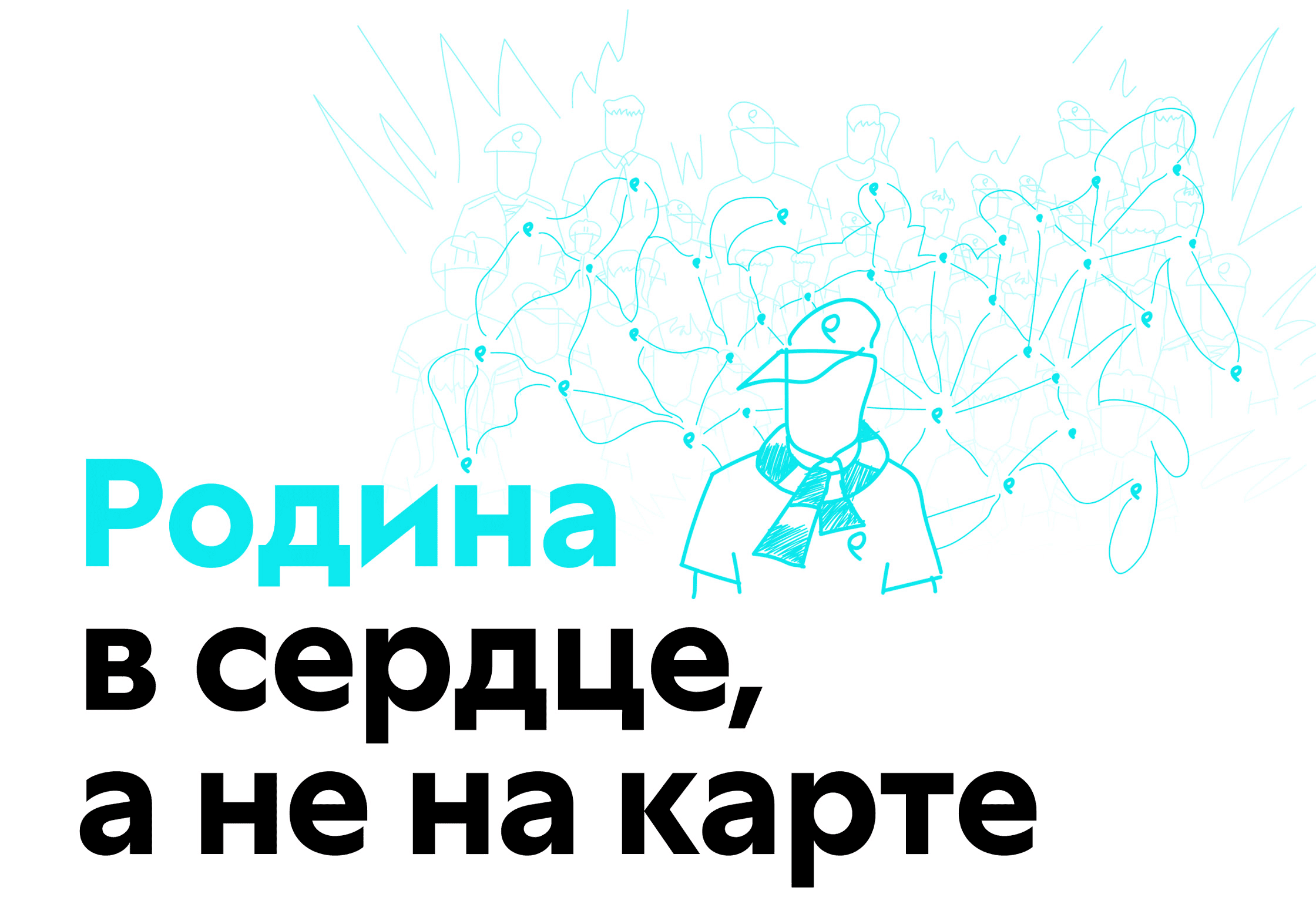
“Rodina” is a football club for which the place of registration in the passport is not important, but the emotional charge of the fans is.
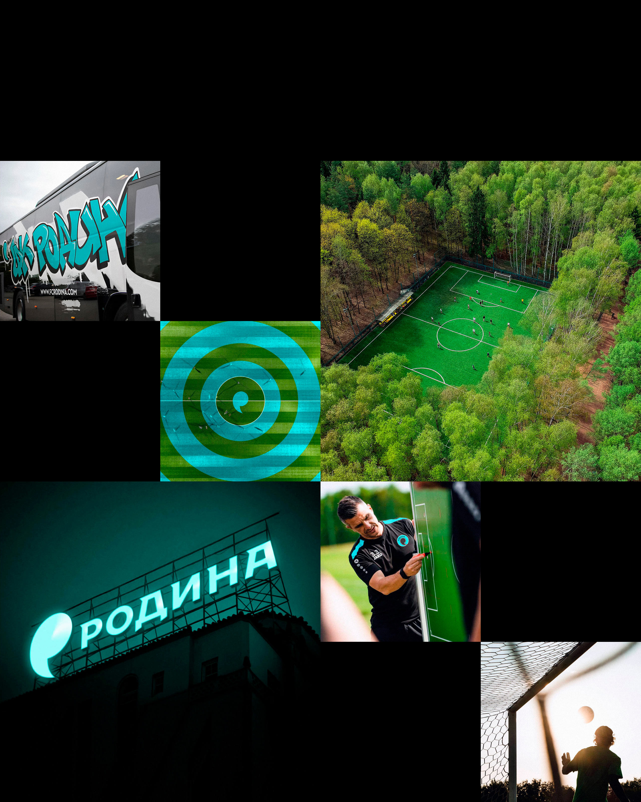
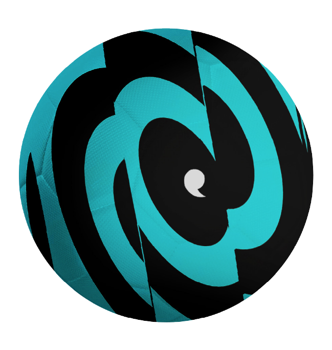
To unite all branded media, graphics with circle-waves were devised. It perfectly conveys the effect of sound vibrations from the roar of the crowd in the stands and speaks of the broad reach of the audience. Initially smooth circles dynamically break and distort depending on the context.
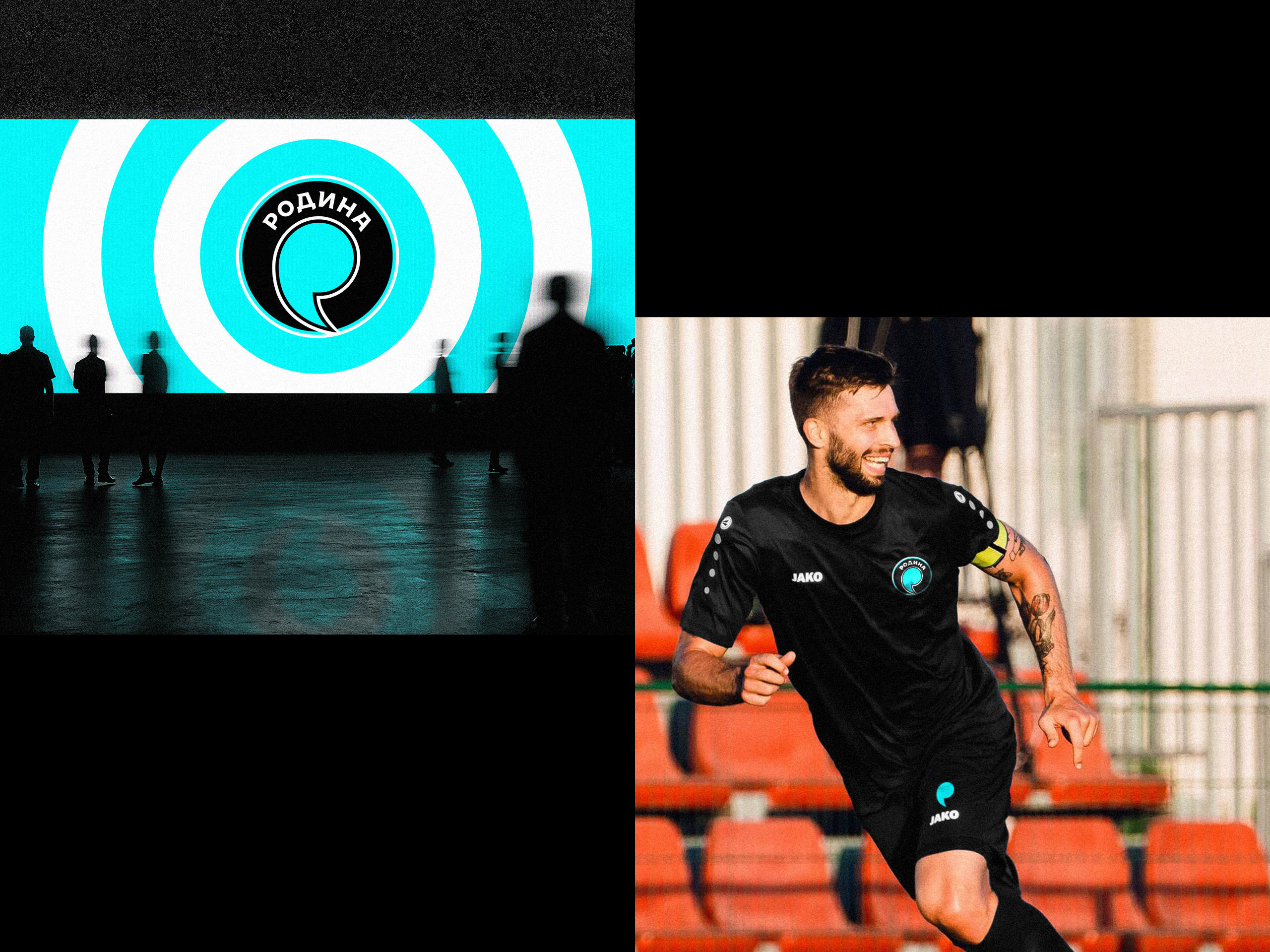
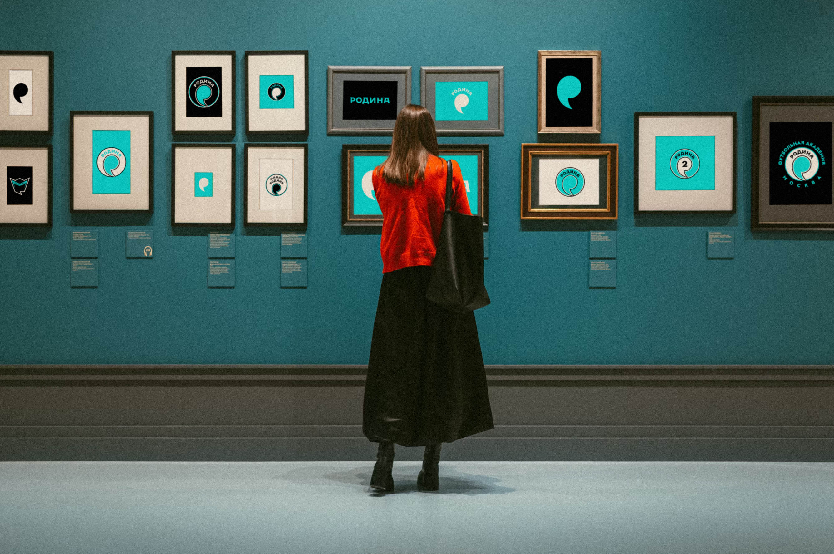
The main professional team of FC “Rodina” received a logo with the full version of the sign: here there are both two outline contours and the name of the club.
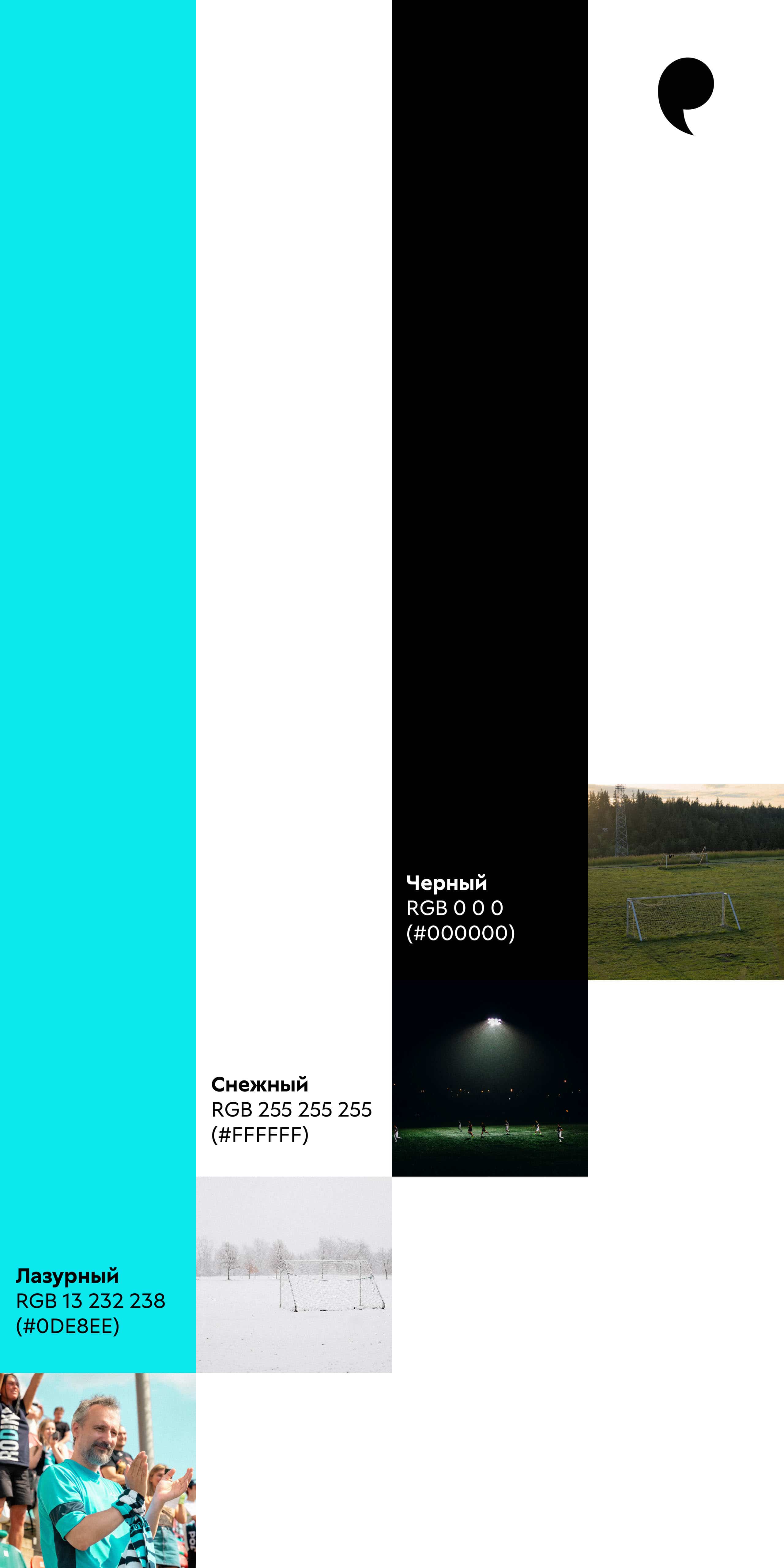
The colors of the emblem adapt to different conditions.
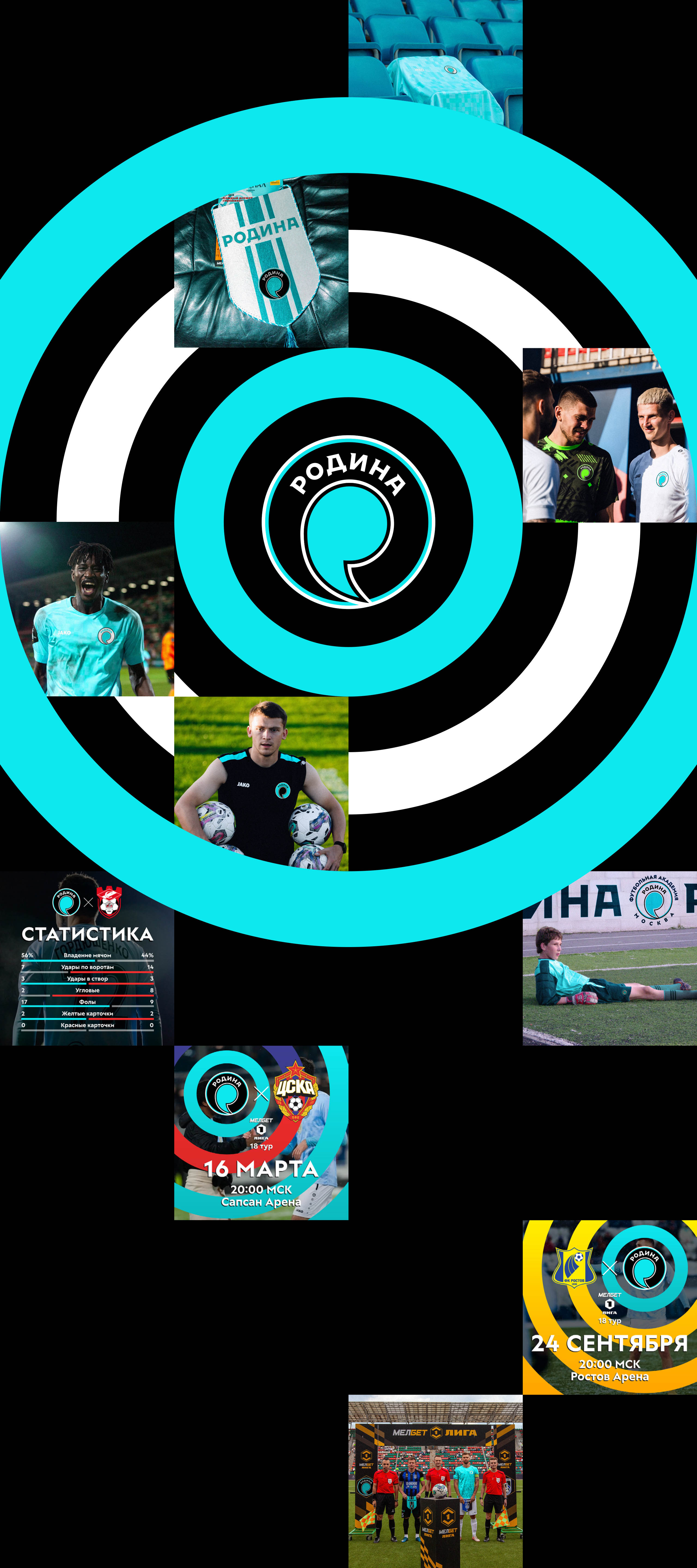
For each of the club’s teams its own version of the logo was created, supporting the main style. The emblem of the reserve squad is complemented by the number 2, and in the youth team’s logo the name “Malaya Rodina” appears.
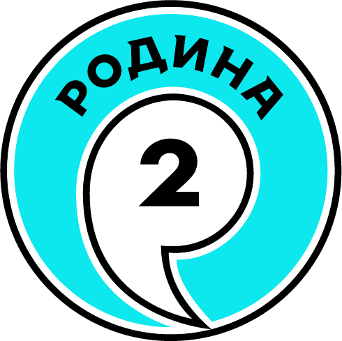
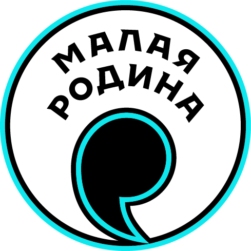
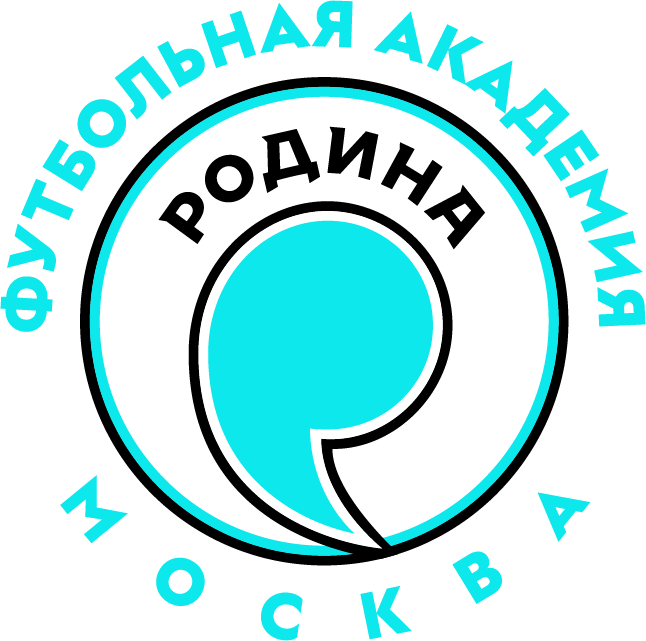
The logos obey common rules but are instantly identifiable thanks to different color spots.
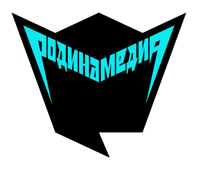
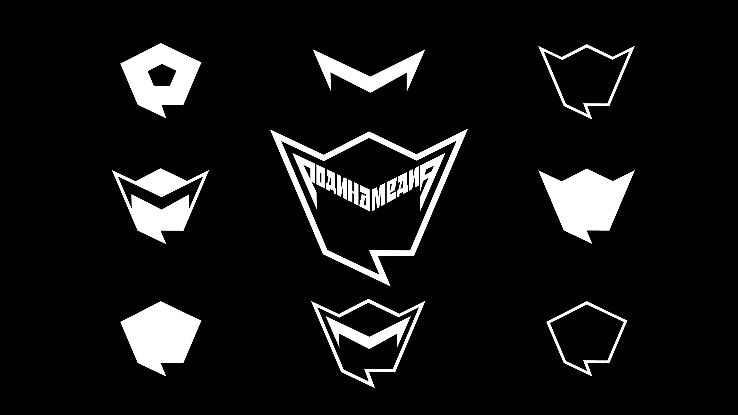
The media team’s sign resembles the emblem of the parent club but looks sharper and more angular. The composition is complemented by an original typeface design.
secret adviser (and also art director)
type designer
layout designer
- Vadim Musatov
- Art. Lebedev Studio expresses gratitude to Alexander Pogonin, Elena Chudesnova, Alexander Tarasov and Maria Almanova for their attention to detail and comprehensive support in working on the project
