Rumyantsevo business park logo
Rumyantsevo is a large business complex with office spaces and a shopping center that sells furniture and building materials. To ensure a more precise positioning and improve recognition, the management decided to create two separate brands, one for the business park and the other for the design center. A serious and confident logo for the company was created in the studio.
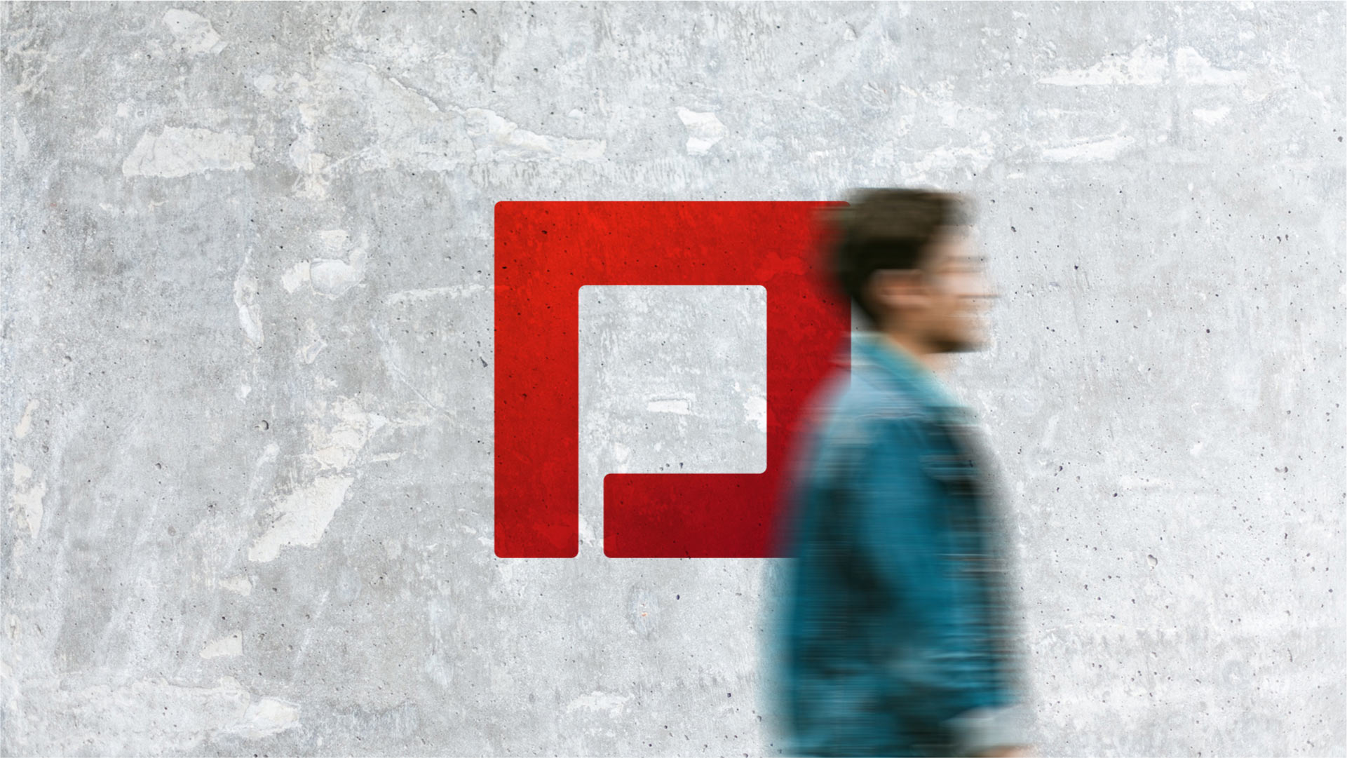
The straight, clear lines in the logo are all about punctuality and entrepreneurship, while the simple geometric shape itself, from which more complex forms are derived, is about creativity and design.
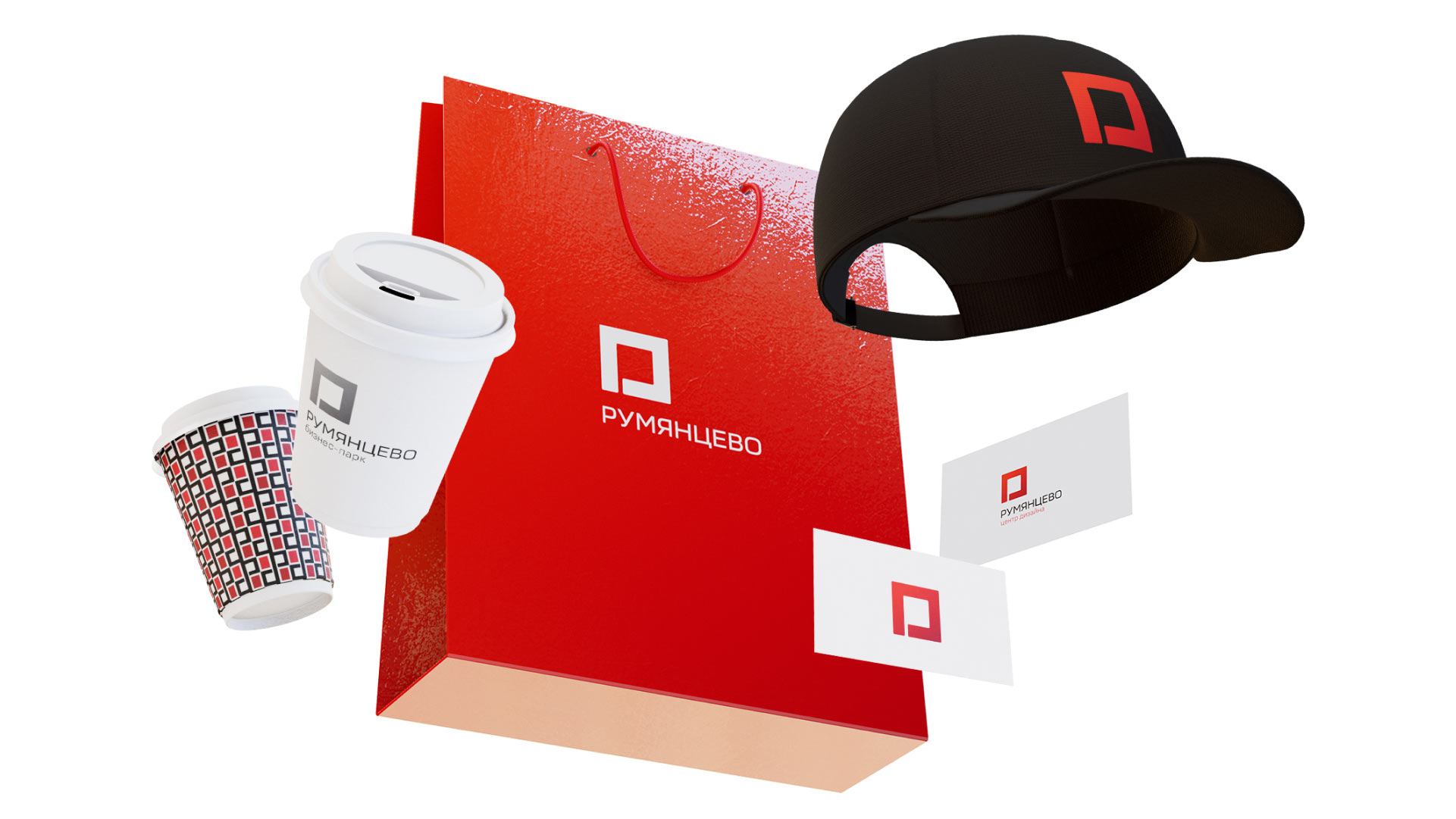
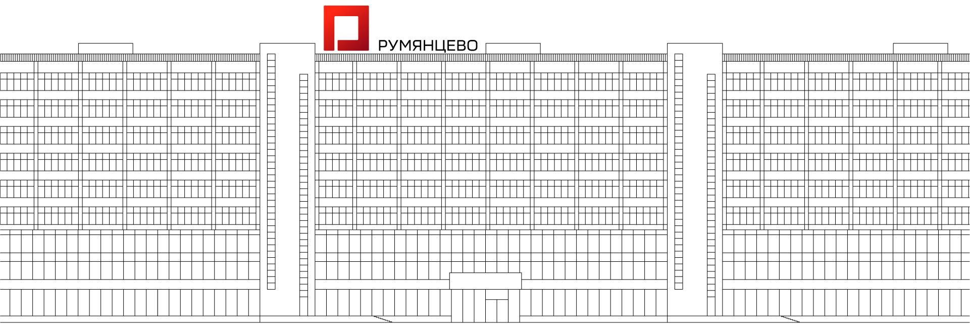
Versions of the logo with descriptors are used to separate the two brands. In the business park logo the symbol takes on a silver hue.

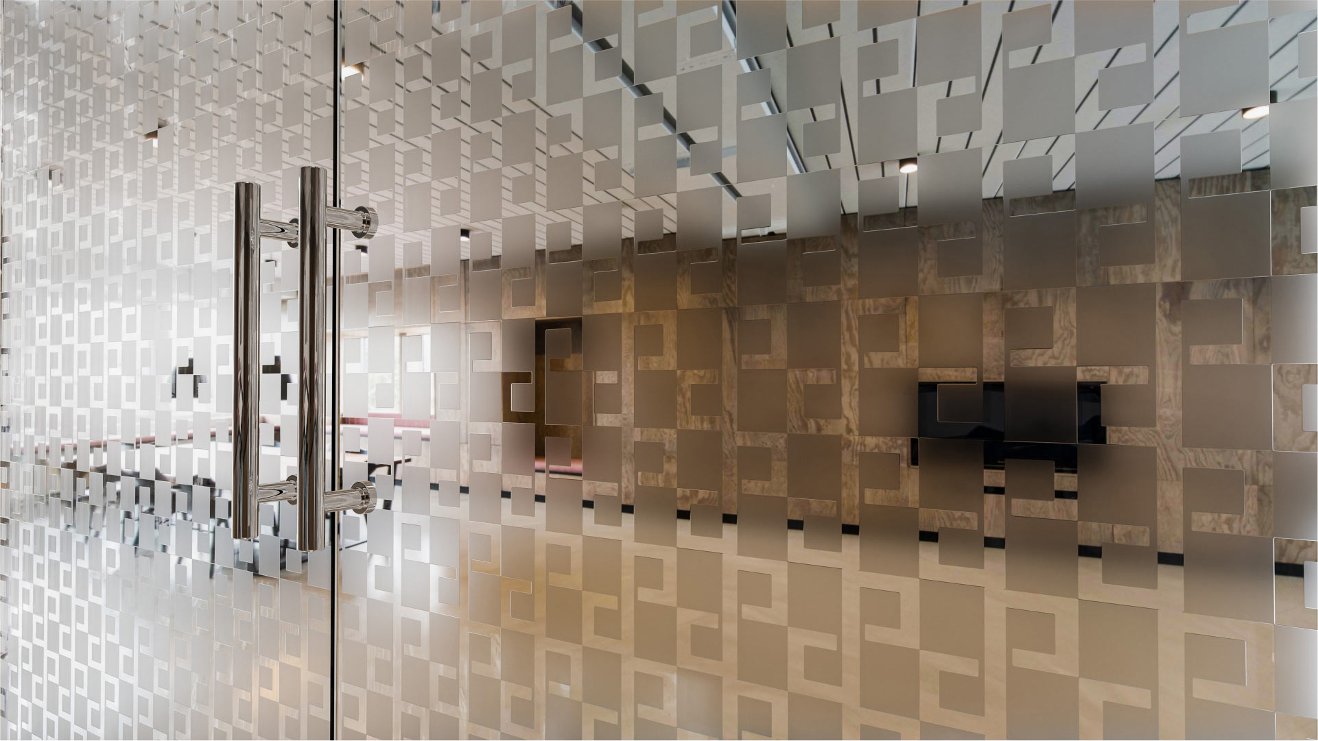
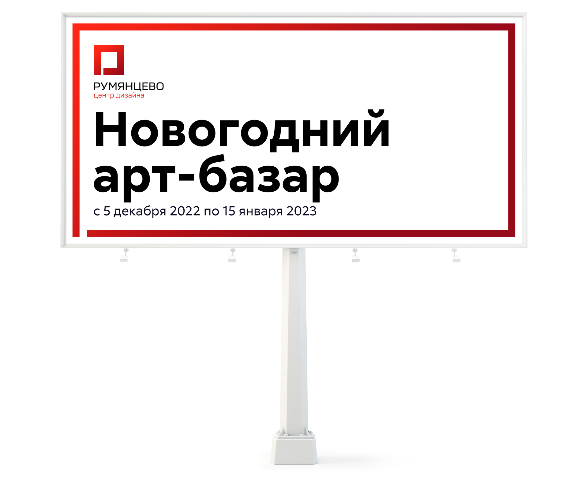
The signature frame is created by the same square and is used in the design of promotional media.
The pattern looks great on printed materials and souvenirs, as well as in interiors.